#animatedpositioned
Explore tagged Tumblr posts
Visit Tumblr Blog
Explore Tumblr blogs with no restrictions, modern design and the best experience.
Last Seen Tumblr Blogs


Fun Fact
Tumblr was the first site to host the blog for President Barack Obama in 2011.
Video
#AnimatedPositioned #Flutter #Widget https://www.instagram.com/p/CAwL74wHm40/?igshid=ejgaf06ilx6x
0 notes
Text
How to Use CompositedTransformFollower Class In Flutter?

In Flutter, By adding them to the overlay’s stack, you can print visual components on top of other widgets.
A widget is added to the overlay using an OverlayEntry, and the entry’s position within the overlay is selected using Positioned and AnimatedPositioned.
Companies can easily hire Flutter developers from our portal to implement the following widgets for their applications for building seamless business applications for their customers. Consult our developer for more support.
Similar to the Stack widget, this is helpful when you require an item to show on top of another widget. However, you may use this widget anywhere without changing your entire codebase.
You can do this using the CompositedTransformTarget, CompositedTransformWidget, LayerLink, Overlay, and OverlayEntry widgets.
Here is the constructor of the CompositedTransformFollower class.
CompositedTransformFollower({ Key? Key, required LayerLink link, bool showWhenUnlinked = true, Offset offset = Offset.zero, Alignment targetAnchor = Alignment.topLeft, Alignment followerAnchor = Alignment.topLeft, Widget? child} )
LayerLink link: This CompositedTransformFollower is linked to a CompositedTransformTarget by the link object.
Bool showWhenUnlinked: If showWhenUnlinked is true, the child is visible and not relocated when the widget is not linked; if it is false, the child is hidden.
Offset: The extra offset must be added to the associated CompositedTransformTarget’s target anchor to determine the position of this widget’s followed anchor.
Alignment targetAnchor: the location where followerAnchor will align itself on the connected CompositedTransformTarget as an anchor.
Alignment followerAnchor: The widget’s anchor point will align with the connected CompositedTransformTarget’s followerAnchor.
Widget? child: There can only be one child on this widget. Allow a widget with a child’s attributes, such as Row, Column, or Stack, to be this widget’s child to arrange numerous children. Then give the children that widget.
To “glue” the widgets together when an overlay entry needs to follow a “target” that is not on the overlay stack, use CompositedTransformTarget, CompositedTransformFollower, and LayerLink. To achieve this, you must:
A CompositedTransformFollower should be used to wrap the widget on the overlay.
A descendant of CompositedTransformTarget must be the follower.
A CompositedTransformTarget must be used to encase the target Widget.
The follower and target are joined together by a LayerLink instance.
Example:
import 'package:flutter/material.dart'; void main() { runApp(const MaterialApp(home: Slide())); } class Slide extends StatefulWidget { const Slide({Key? key}) : super(key: key); @override _SlideState createState() => _SlideState(); } class _SlideState extends State { final double indicatorWidth = 24.0; final double indicatorHeight = 300.0; final double slideHeight = 200.0; final double slideWidth = 400.0; final LayerLink layerLink = LayerLink(); OverlayEntry? overlayEntry; Offset indicatorOffset = const Offset(0, 0); Offset getIndicatorOffset(Offset dragOffset) { final double x = (dragOffset.dx - (indicatorWidth / 2.0)) .clamp(0.0, slideWidth - indicatorWidth); final double y = (slideHeight - indicatorHeight) / 2.0; return Offset(x, y); } void showIndicator(DragStartDetails details) { indicatorOffset = getIndicatorOffset(details.localPosition); overlayEntry = OverlayEntry( builder: (BuildContext context) { return Positioned( top: 0.0, left: 0.0, child: SizedBox( width: indicatorWidth, height: indicatorHeight, child: CompositedTransformFollower( offset: indicatorOffset, link: layerLink, child: Container( color: Colors.blue, ), )), ); }, ); Overlay.of(context)?.insert(overlayEntry!); } void updateIndicator(DragUpdateDetails details) { indicatorOffset = getIndicatorOffset(details.localPosition); overlayEntry?.markNeedsBuild(); } void hideIndicator(DragEndDetails details) { overlayEntry?.remove(); } @override Widget build(BuildContext context) { return Scaffold( appBar: AppBar(title: const Text('Overlay Indicator')), body: Center( child: CompositedTransformTarget( link: layerLink, child: Container( width: slideWidth, height: slideHeight, color: Colors.blue.withOpacity(0.2), child: GestureDetector( onPanStart: showIndicator, onPanUpdate: updateIndicator, onPanEnd: hideIndicator, ), ), ), ), ); } }
Output
Conclusion
Using the overlay and connecting the widgets is an easy and effective strategy for developing a user interface (UI) that floats widgets on top of other widgets. You discovered how to join these widgets with a LayerLink in this article.
0 notes
Text
Animating Apps With Flutter
Animating Apps With Flutter
Shubham
2019-10-14T13:30:59+02:002019-10-15T08:36:43+00:00
Apps for any platform are praised when they are intuitive, good-looking, and provide pleasant feedback to user interactions. Animation is one of the ways to do just that.
Flutter, a cross-platform framework, has matured in the past two years to include web and desktop support. It has garnered a reputation that apps developed with it are smooth and good-looking. With its rich animation support, declarative way of writing UI, “Hot Reload,” and other features, it is now a complete cross-platform framework.
If you are starting out with Flutter and want to learn an unconventional way of adding animation, then you are at the right place: we will explore the realm of animation and motion widgets, an implicit way of adding animations.
Flutter is based on the concept of widgets. Each visual component of an app is a widget — think of them as views in Android. Flutter provides animation support using an Animation class, an “AnimationController” object for management, and “Tween” to interpolate the range of data. These three components work together to provide smooth animation. Since this requires manual creation and management of animation, it is known as an explicit way of animating.
Now let me introduce you to animation and motion widgets. Flutter provides numerous widgets which inherently support animation. There’s no need to create an animation object or any controller, as all the animation is handled by this category of widgets. Just choose the appropriate widget for the required animation and pass in the widget’s properties values to animate. This technique is an implicit way of animating.
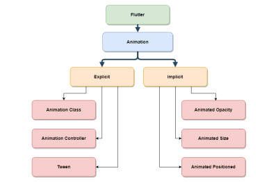
Animation hierarchy in Flutter. (Large preview)
The chart above roughly sets out the animation hierarchy in Flutter, how both explicit and implicit animation are supported.
Some of the animated widgets covered in this article are:
AnimatedOpacity
AnimatedCrossFade
AnimatedAlign
AnimatedPadding
AnimatedSize
AnimatedPositioned.
Flutter not only provides predefined animated widgets but also a generic widget called AnimatedWidget, which can be used to create custom implicitly animated widgets. As evident from the name, these widgets belong to the animated and motion widgets category, and so they have some common properties which allow us to make animations much smoother and better looking.
Let me explain these common properties now, as they will be used later in all examples.
duration The duration over which to animate the parameters.
reverseDuration The duration of the reverse animation.
curve The curve to apply when animating the parameters. The interpolated values can be taken from a linear distribution or, if and when specified, can be taken from a curve.
Let’s begin the journey by creating a simple app we’ll call “Quoted”. It will display a random quotation every time the app starts. Two things to note: first, all these quotations will be hardcoded in the application; and second, no user data will be saved.
Note: All of the files for these examples can be found on GitHub.
Getting Started
Flutter should be installed and you’ll need some familiarity with the basic flow before moving on. A good place to start is, “Using Google’s Flutter For Truly Cross-Platform Mobile Development”.
Create a new Flutter project in Android Studio.
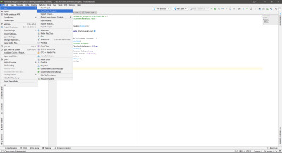
New flutter project menu in Android Studio. (Large preview)
This will open a new project wizard, where you can configure the project basics.
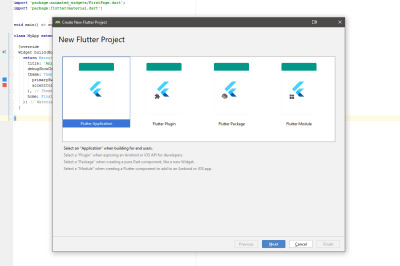
Flutter project type selection screen. (Large preview)
In the project type selection screen, there are various types of Flutter projects, each catering to a specific scenario.. For this tutorial, choose Flutter Application and press Next.
You now need to enter some project-specific information: the project name and path, company domain, and so on. Have a look at the image below.
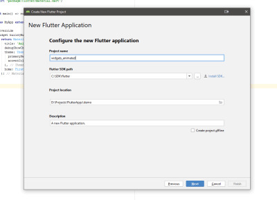
Flutter application configuration screen. (Large preview)
Add the project name, the Flutter SDK path, project location, and an optional project description. Press Next.
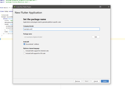
Flutter application package name screen. (Large preview)
Each application (be it Android or iOS) requires a unique package name. Typically, you use the reverse of your website domain; for example, com.google or com.yahoo. Press Finish to generate a working Flutter application.
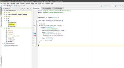
The generated sample project. (Large preview)
Once the project is generated, you should see the screen shown above. Open the main.dart file (highlighted in the screenshot). This is the main application file. The sample project is complete in itself, and can be run directly on an emulator or a physical device without any modification.
Replace the content of the main.dart file with the following code snippet:
import 'package:animated_widgets/FirstPage.dart'; import 'package:flutter/material.dart'; void main() => runApp(MyApp()); class MyApp extends StatelessWidget { @override Widget build(BuildContext context) { return MaterialApp( title: 'Animated Widgets', debugShowCheckedModeBanner: false, theme: ThemeData( primarySwatch: Colors.blue, accentColor: Colors.redAccent, ), home: FirstPage(), ); } }
This code cleans up the main.dart file by just adding simple information relevant to creating a new app. The class MyApp returns an object: a MaterialApp widget, which provides the basic structure for creating apps conforming to Material Design. To make the code more structured, create two new dart files inside the lib folder: FirstPage.dart and Quotes.dart.
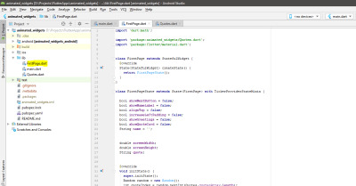
The FirstPage.dart file. (Large preview)
FirstPage.dart will contain all the code responsible for all the visual elements (widgets) required for our Quoted app. All the animation is handled in this file.
Note: Later in the article, all of the code snippets for each animated widget are added to this file as children of the Scaffold widget. For more information, This example on GitHub could be useful.
Start by adding the following code to FirstPage.dart. This is the partial code where other stuff will be added later.
import 'dart:math'; import 'package:animated_widgets/Quotes.dart'; import 'package:flutter/material.dart'; class FirstPage extends StatefulWidget { @override State createState() { return FirstPageState(); } } class FirstPageState extends State with TickerProviderStateMixin { bool showNextButton = false; bool showNameLabel = false; bool alignTop = false; bool increaseLeftPadding = false; bool showGreetings = false; bool showQuoteCard = false; String name = ''; double screenWidth; double screenHeight; String quote; @override void initState() { super.initState(); Random random = new Random(); int quoteIndex = random.nextInt(Quotes.quotesArray.length); quote = Quotes.quotesArray[quoteIndex]; } @override Widget build(BuildContext context) { screenWidth = MediaQuery.of(context).size.width; screenHeight = MediaQuery.of(context).size.height; return Scaffold( appBar: _getAppBar(), body: Stack( children: [ // All other children will be added here. // In this article, all the children widgets are contained // in their own separate methods. // Just method calls should be added here for the respective child. ], ), ); } }
The Quotes.dart file. (Large preview)
The Quotes.dart file contains a list of all the hardcoded quotations. One point to note here is that the list is a static object. This means it can be used at other places without creating a new object of the Quotes class. This is chosen by design, as the above list act simply as a utility.
Add the following code to this file:
class Quotes { static const quotesArray = [ "Good, better, best. Never let it rest. 'Til your good is better and your better is best", "It does not matter how slowly you go as long as you do not stop.", "Only I can change my life. No one can do it for me." ]; }
The project skeleton is now ready, so let’s flesh out Quoted a bit more.
AnimatedOpacity
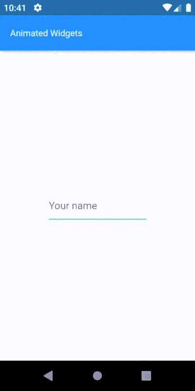
To lend a personal touch to the app, it would be nice to know the user’s name, so let’s ask for it and show a next button. Until the user enters their name, this button is hidden, and it will gracefully show up when a name is given. We need some kind of visibility animation for the button, but is there a widget for that? Yes, there is.
Enter AnimatedOpacity. This widget builds on the Opacity widget by adding implicit animation support. How do we use it? Remember our scenario: we need to show a next button with animated visibility. We wrap the button widget inside the AnimatedOpacity widget, feed in some proper values and add a condition to trigger the animation — and Flutter can handle the rest.
_getAnimatedOpacityButton() { return AnimatedOpacity( duration: Duration(seconds: 1), reverseDuration: Duration(seconds: 1), curve: Curves.easeInOut, opacity: showNextButton ? 1 : 0, child: _getButton(), ); }
Opacity animation of next button. (Large preview)
The AnimatedOpacity widget has two mandatory properties:
opacity A value of 1 means completely visible; 0 (zero) means hidden. While animating, Flutter interpolates values between these two extremes. You can see how a condition is placed to change the visibility, thus triggering animation.
child The child widget that will have its visibility animated.
You should now understand how really simple it is to add visibility animation with the implicit widget. And all such widgets follow the same guidelines and are easy to use. Let’s move on to the next one.
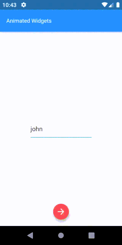
AnimatedCrossFade
We have the user’s name, but the widget is still waiting for input. In the previous step, as the user enters their name, we display the next button. Now, when the user presses the button, I want to stop accepting input and show the entered name. There are many ways to do it, of course, but perhaps we can hide away the input widget and show an uneditable text widget. Let’s try it out using the AnimatedCrossFade widget.
This widget requires two children, as the widget crossfades between them based on some condition. One important thing to keep in mind while using this widget is that both of the children should be the same width. If the height is different, then the taller widget gets clipped from the bottom. In this scenario, two widgets will be used as children: input and label.
_getAnimatedCrossfade() { return AnimatedCrossFade( duration: Duration(seconds: 1), alignment: Alignment.center, reverseDuration: Duration(seconds: 1), firstChild: _getNameInputWidget(), firstCurve: Curves.easeInOut, secondChild: _getNameLabelWidget(), secondCurve: Curves.easeInOut, crossFadeState: showNameLabel ? CrossFadeState.showSecond : CrossFadeState.showFirst, ); }
Cross-fading between the input widget and name widget. (Large preview)
This widget requires a different set of mandatory parameters:
crossFadeState This state works out which child to show.
firstChild Specifies the first child for this widget.
secondChild Specifies the second child.
AnimatedAlign
At this point, the name label is positioned at the center of the screen. It will look much better at the top, as we need the center of the screen to show quotes. Simply put, the alignment of the name label widget should be changed from center to top. And wouldn’t it be nice to animate this alignment change along with the previous cross-fade animation? Let’s do it.
As always, several techniques can be used to achieve this. Since the name label widget is already center-aligned, animating its alignment would be much simpler than manipulating the top and left values of the widget. The AnimatedAlign widget is perfect for this job.
To initiate this animation, a trigger is required. The sole purpose of this widget is to animate alignment change, so it has only a few properties: add a child, set its alignment, trigger the alignment change, and that’s it.
_getAnimatedAlignWidget() { return AnimatedAlign( duration: Duration(seconds: 1), curve: Curves.easeInOut, alignment: alignTop ? Alignment.topLeft : Alignment.center, child: _getAnimatedCrossfade(), ); }

Alignment animation of the name widget. (Large preview)
It has only two mandatory properties:
child: The child whose alignment will be modified.
alignment: Required alignment value.
This widget is really simple but the results are elegant. Moreover, we saw how easily we can use two different animated widgets to create a more complex animation. This is the beauty of animated widgets.
AnimatedPadding
Now we have the user’s name at the top, smoothly animated without much effort, using different kinds of animated widgets. Let’s add a greeting, “Hi,” before the name. Adding a text widget with value “Hi,” at the top will make it overlap the greeting text widget, looking like the image below.
The greeting and name widgets overlap. (Large preview)
What if the name text widget had some padding on the left? Increasing the left padding will definitely work, but wait: can we increase the padding with some animation? Yes, and that is what AnimatedPadding does. To make all this much better looking, let’s have the greetings text widget fade in and the name text widget’s padding increase at the same time.
_getAnimatedPaddingWidget() { return AnimatedPadding( duration: Duration(seconds: 1), curve: Curves.fastOutSlowIn, padding: increaseLeftPadding ? EdgeInsets.only(left: 28.0) : EdgeInsets.only(left: 0), child: _getAnimatedCrossfade(), ); }
Since the animation above should occur only after the previous animated alignment is complete, we need to delay triggering this animation. Digressing from the topic briefly, this is a good moment to talk about a popular mechanism to add delay. Flutter provides several such techniques, but the Future.delayed constructor is one of the simpler, cleaner and more readable approaches. For instance, to execute a piece of code after 1 second:
Future.delayed(Duration(seconds: 1), (){ sum = a + b; // This sum will be calculated after 1 second. print(sum); });
Since the delay duration is already known (calculated from previous animation durations), the animation can be triggered after this interval.
// Showing “Hi” after 1 second - greetings visibility trigger. _showGreetings() { Future.delayed(Duration(seconds: 1), () { setState(() { showGreetings = true; }); }); } // Increasing the padding for name label widget after 1 second - increase padding trigger. _increaseLeftPadding() { Future.delayed(Duration(seconds: 1), () { setState(() { increaseLeftPadding = true; }); }); }

Padding animation of the name widget. (Large preview)
This widget has only two mandatory properties:
child The child inside this widget, which padding will be applied to.
padding The amount of space to add.
AnimatedSize
Today, any app having some kind of animation will include zooming in to or out of visual components to grab user attention (commonly called scaling animation). Why not use the same technique here? We can show the user a motivational quote that zooms in from the center of the screen. Let me introduce you to the AnimatedSize widget, which enables the zoom-in and zoom-out effects, controlled by changing the size of its child.
This widget is a bit different from the others when it comes to the required parameters. We need what Flutter calls a “Ticker.” Flutter has a method to let objects know whenever a new frame event is triggered. It can be thought of as something that sends a signal saying, “Do it now! … Do it now! … Do it now! …”
The AnimatedSize widget requires a property — vsync — which accepts a ticker provider. The easiest way to get a ticker provider is to add a Mixin to the class. There are two basic ticker provider implementations: SingleTickerProviderStateMixin, which provides a single ticker; and TickerProviderStateMixin, which provides several.
The default implementation of a Ticker is used to mark the frames of an animation. In this case, the latter is employed. More about mixins.
// Helper method to create quotes card widget. _getQuoteCardWidget() { return Card( color: Colors.green, elevation: 8.0, child: _getAnimatedSizeWidget(), ); } // Helper method to create animated size widget and set its properties. _getAnimatedSizeWidget() { return AnimatedSize( duration: Duration(seconds: 1), curve: Curves.easeInOut, vsync: this, child: _getQuoteContainer(), ); } // Helper method to create the quotes container widget with different sizes. _getQuoteContainer() { return Container( height: showQuoteCard ? 100 : 0, width: showQuoteCard ? screenWidth - 32 : 0, child: Center( child: Padding( padding: EdgeInsets.symmetric(horizontal: 16), child: Text(quote, style: TextStyle(color: Colors.white, fontWeight: FontWeight.w400, fontSize: 14),), ), ), ); } // Trigger used to show the quote card widget. _showQuote() { Future.delayed(Duration(seconds: 2), () { setState(() { showQuoteCard = true; }); }); }

Scaling animation of the quotes widget. (Large preview)
Mandatory properties for this widget:
vsync The required ticker provider to coordinate animation and frame changes.<
child The child whose size changes will be animated.
The zoom in and zoom out animation is now easily tamed.
AnimatedPositioned
Great! The quotes zoom in from the center to grab the user’s attention. What if it slid up from the bottom while zooming in? Let’s try it. This motion involves playing with the position of the quote widget and animating the changes in position properties. AnimatedPositioned is the perfect candidate.
This widget automatically transitions the child’s position over a given duration whenever the specified position changes. One point to note: it works only if its parent widget is a “Stack.” This widget is pretty simple and straightforward to use. Let’s see.
// Helper method to create the animated positioned widget. // With position changes based on “showQuoteCard” flag. _getAnimatedPositionWidget() { return AnimatedPositioned( duration: Duration(seconds: 1), curve: Curves.easeInOut, child: _getQuoteCardWidget(), top: showQuoteCard ? screenHeight/2 - 100 : screenHeight, left: !showQuoteCard ? screenWidth/2 : 12, ); }
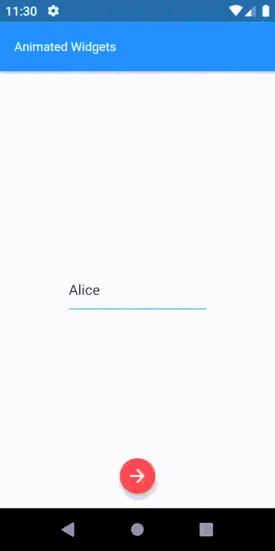
Position with scaling animation of quotes. (Large preview)
This widget has only one mandatory property:
child The widget whose position will be changed.
If the size of the child is not expected to change along with its position, a more performative alternative to this widget would be SlideTransition.
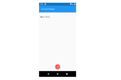
Here is our complete animation:

All the animated widgets together. (Large preview)
Conclusion
Animations are an integral part of user experience. Static apps or apps with janky animation not only lower user retention but also a developer’s reputation to deliver results.
Today, most popular apps have some kind of subtle animation to delight users. Animated feedback to user requests can also engage them to explore more. Flutter offers a lot of features for cross-platform development, including rich support for smooth and responsive animations.
Flutter has great plug-in support which allows us to use animations from other developers. Now that it has matured to version 1.9, with so much love from the community, Flutter is bound to get better in the future. I’d say now is a great time to learn Flutter!
Further Resources
“Animation And Motion Widgets,” Flutter Docs
“Introduction To Animations,” Flutter Docs
Flutter Codelabs
Editor’s Note: A huge Thank You to Ahmad Awais for his help in reviewing this article.

(dm, og, yk, il)
0 notes
Text
Flutter Elastic Navigation Sidebar | Flutter UI Tutorial
In this Flutter Tutorial we are going to be taking a look at some Advanced Flutter UI Concepts that you can use in many other ways in you own Flutter Mobile Applications.
In this Flutter UI Tutorial, we will be creating an Elastic Sidebar using Flutter CustomPaint widget. We will also be using various other widgets like Stack & Positioned. We will also take a look at AnimatedPositioned for…
View On WordPress
0 notes