#ask ava: an organizational tag and not an advice column (unless it needs to be)
Explore tagged Tumblr posts
Visit Tumblr Blog
Explore Tumblr blogs with no restrictions, modern design and the best experience.
Last Seen Tumblr Blogs


Fun Fact
Tumblr has 411 employees.
Note
i kept seeing your username pop up on sideblogs and in my notifs and genuinely had a few moments of is this real? is that ava-ava? like my brain could not fully trust my eyes! but it looks like you're really back and i'm so happy about it!!! tumblr’s felt your absence and having you here again just makes everything feel a little more complete! excited for whatever you do next but mostly just thrilled to have you around again <3
JAGODA, MY LOVE. Thank you for the warm welcome back! I have most definitely felt Tumblr's (aka my very sexy, beautiful, extremely talented queens') absence, so to know Tumblr might have felt the same about little ol' me is a relief.
Honestly, I did not even mean to take a hiatus slash retire when I did. I swear I blinked, and suddenly it had been months, then a whole year since I posted on Tumblr. And then again.
But I'm like Jackie Taylor. I could be dead, but I would never be truly dead. My dearly beloved mutuals are all Shauna, and even if I don't show up for several episodes, someone's influence is bound to bring me back. (Maybe this whole analogy is getting away from me, but! The point is that there's no keeping me away forever. Apparently. Even if I show up at random in someone's grocery store dream.)

#funnily enough we can thank wrestling and hockey for making me eye my two other blogs lmao#that's what got the ball rolling#i've been giffing casually for a few weeks now and it made me go 'wow maybe i did miss photoshop after all'#ANYWAY! i've missed u i love u etc#ughmerlin#ask ava: an organizational tag and not an advice column (unless it needs to be)
7 notes
·
View notes
Note
hi hi hi <33 what fonts did u use on ur barbie gifsets i'm truly in love and i'm SO inspired
Hi, lovely! In descending order:
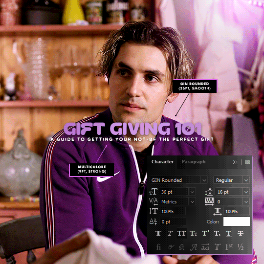
Multicolore (8pt, 6pt)
Sherlock (120pt, 24pt)
Tw Cen MT (10pt) set to Regular

Those out of the way, I’ll add that I am extremely finicky when it comes to typography, which mostly means that I go through a multitude of different fonts and font combos. I think I had roughly a dozen or so other fonts picked out for the title and annotations alike, so I’ll go ahead and list some of those as well. Great fonts to have even if you don’t end up using them for a Barbie-themed set.
Aaleyah — for “Barbie” title
Avenir (set to 35 Light) — for annotations
Barbie (one of the actual OG Barbie fonts)
Baroneys — for “Barbie” title
Buryland Script — for “Barbie” title
Daylight & Moonlight (set to Light) — for “Barbie” title
DK Sensory Overload — for date
Journey to Thailand — for “Barbie” title
Karla — for annotations
Lobster Two — for “Barbie” title
Montserrat — for date and annotations
Roboto — for annotations
Telegrafico — for annotations
TrashHand — for date
Wired Pop — for “Barbie” title

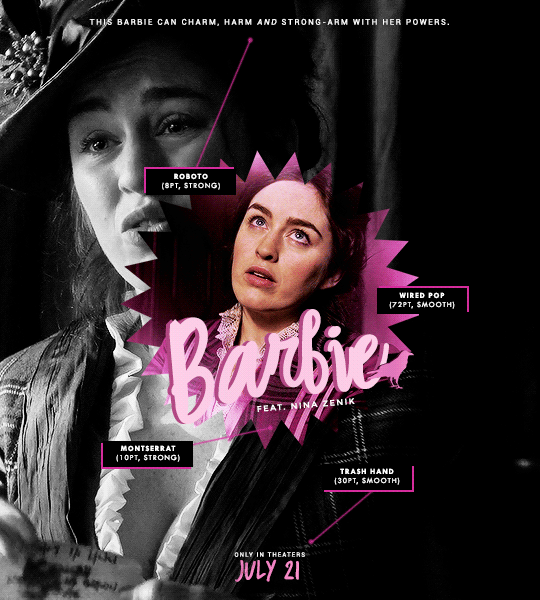
You can find more examples for a bunch of these fonts here and here.
#resources#fonts#uncleroys#ask ava: an organizational tag and not an advice column (unless it needs to be)#ps asks#completeresources#allresources#usergif
355 notes
·
View notes
Note
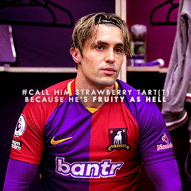
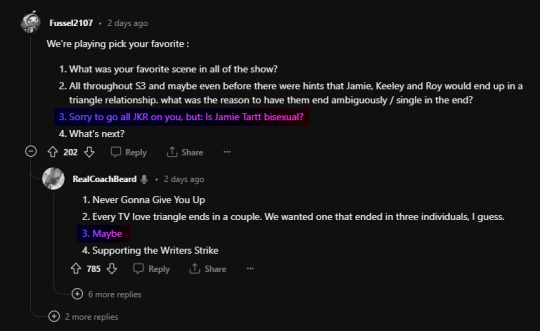
bestie that was the explicit statement, they wanna make sure we know the ot3 is not happening and jamie's straight 😭😭😭😭😭
That man is straighter than the Leaning Tower of Pisa. His wardrobe screams both Barbie and Ken, and I guarantee he'd want to fuck both Barbie and Ken in the upcoming Barbie movie. They're going to have to write "HE'S NOT BI" in permanent marker on his forehead to counteract literally just the dangly earring he wore in 3x03, and barely just.
The fact that his team, his coaches, and the funky gay journalist writing a book about them all collectively think he's fruity? The fact that he doesn't outright deny it, but expresses flattery instead? I think the writers choosing omission over denial is significant. And even if it goes nowhere in the narrative, what it does accomplish is allowing room and flexibility for the audience's perception, and that's enough for me. I will simply be a B.B.O. (bi by omission) truther.
#ted lasso#jamie tartt#i know what you are.jpg#ted lasso spoilers#lemoncupcake#ask ava: an organizational tag and not an advice column (unless it needs to be)#also i would like to add as a footnote that that man definitely jerked off to the roy kent poster he had at least once
300 notes
·
View notes
Note
hi! first of all i wanted to say i'm obsessed with your shadow and bone gifsets (all your gifsets tbh, you're super talented!), i was wondering how you were able to get the glitches on this gifset to be green & yellow like that? i just can't figure out how to change the colors like that using my normal method of using the rgb channels and i love the way the green and yellow works: /post/712882007539171328/and-yet-they-hesitated-the-knowledge-that-they
Gosh, thank you so much. You'd think after years of doing this, I'd be a little more equipped to handle compliments, but I still get flustered like it's the one of the first times all over again.
The set in question for anyone else wondering or trying to mess around with 3D/glitch effects and changing up the colors. And here is another example.
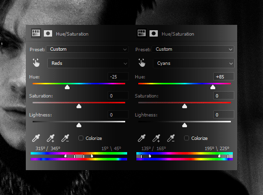
Hopefully this makes sense (and feel free to reach back out if it doesn't!) but I don't actually touch the RGB channels at all—or, at least, not later on in the process to actually shift the colors around. First, I do the default setting for the basic 3D effect, which is just the channel for reds activated:
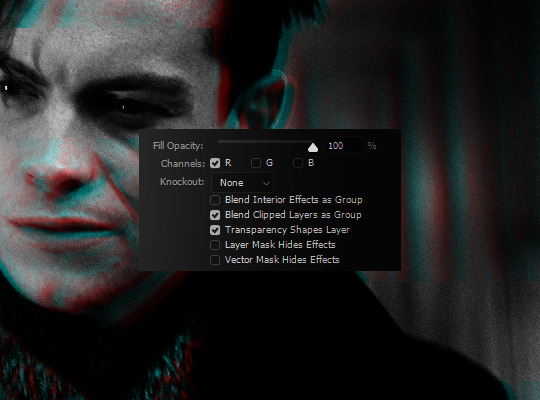
And then this is where the Hue/Saturation adjustment comes in handy. Because red and cyan are already such isolated color points, it means it's a piece of cake to shift both around as you see fit. I knew the final products (with the film and light leak overlays) were going to be orange-yellow and green, so I shifted my Reds to the right to be more yellow and my Cyans to the left to be more green.

As another example, here's pink and purple:
Keep in mind that working with a B&W base also makes things exponentially easier and that won't always be the case. Obviously, when your base gif isn't black and white, there are going to be reds and/or cyans (or greens and purples, if you tick off the G channel; or blues and yellows, if you tick off the B channel) so it requires a bit more effort and work in making sure that only your glitch layers are affected.
#aridante#ask ava: an organizational tag and not an advice column (unless it needs to be)#ps asks#usergif
136 notes
·
View notes
Note
hi ava, most talented gifmaker on tumblr!! first of all, obsessed with the gorgeous ted lasso sets you've been making <3 if no one has already asked and if you don't mind sharing, what's the larger font you used on this beautiful royjamie set? i'm a font hoarder collector and love the shape of the F lskjdfldskj. thank you in advance!! 🥰
I cannot believe one of the most talented people on the entirety of Tumblr dot com-org-gov just called me the most talented gifmaker. I am astonished. Confounded. Honored, obviously. But I, too, am a font hoarder collector (938 fonts and counting, and that's after getting rid of some recently) so I am always happy to share from my figurative vault.
It's called GIN Grotesk and I used the Rounded style.
91 notes
·
View notes
Note
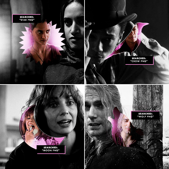
hi! i’m just wondering how you made your barbie poster gifsets? no worries if it’s too much to explain :)
@harliquinnz asked: Hi, could you explain how you made those Witcher Barbie posters please?
@mal-oretsevs asked: ava hellp, how did you do the barbie edits, the tutorial i found, i’m just slow and don’t understand 😭
I'm going to refer everyone to this tutorial I wrote for a different set. It’s the same general concept and gist, and it should cover all the essentials you need to know. The only real differences in what’s covered in the tutorial are, of course, the base gif size (540x600 instead of 540x540) and the shape used.
Other than that, the shape portion of the tutorial touches base on what I did and still do to create sets like this one, this one, this one, these poster sets, and yes, the Barbie posters.
You can find the fonts I used in this masterpost, and a simple Google search for “[insert object] png” usually does the trick when it comes to finding cutouts to use.
#if anyone finds they're still struggling please feel free to reach out again <3#bisexualaliens#harliquinnz#mal-oretsevs#ask ava: an organizational tag and not an advice column (unless it needs to be)#ps asks
38 notes
·
View notes
Note
looking back at the answer where you’re like they would have to say jamie “is not bi” for anyone to believe it and when someone straight up asked brendan if jamie was bi the other day he said “maybe”. like. we won
Brendan Hunt's AMA was literally a roller coaster ride. The man really swept the legs out from anyone believing the end was a dream sequence (which certainly was a choice; even though I wasn't a dream sequence truther, I was under the same impression as most that the ambiguity was intentional) while also giving what have to be some of the wildest takes on plot happenings (like Ted and Michelle's ending being the thing that's intentionally ambiguous, or boiling down the Roy and Jamie macho fiasco in the finale to "well, men are stupid and their dynamic was going too well") and... a whole host of other shenanigans.
But all of that aside, Bi Jamie Truthers won. I said, "I think the writers choosing omission over denial is significant." And I was right!
I'll even take his point on the Roy/Keeley/Jamie dynamic because hot single people can get together and decide to have a nice, steamy, incredibly bisexual threesome post-canon once they've worked out their issues.
#will add that i think they were past the love triangle debacle naturally#and they really didn't need to save the regression to it for the *final episode* of the season and potentially the show#BUT ANYWAY! HAPPY PRIDE MONTH TO OUR AMBIGUOUSLY BI BOY!#ted lasso#ted lasso spoilers#trentcrimmisgay#ask ava: an organizational tag and not an advice column (unless it needs to be)
21 notes
·
View notes
Note
uh hi. it's me again. I'm really sorry to bother you but how are able to make your gifs so clean and clear? ive been a gif creator for years and now recently ive been having a lot of trouble with pixels.
Never a bother! I’m always happy to help when and where I can.
I briefly touched on all of this in my FAQ but I really, truly do live by these steps when I gif, so I feel it bears repeating here as well, and with a little more detail.
Always, always work with HD footage. 4K (2160p) isn’t necessary, but I would say that 1080p definitely is. I think you can get away with giffing 720p if you absolutely need to, but the bigger your gif, the more necessary it becomes to work with footage that’s both high quality and high definition. Screen recording is fine—it’s something I used to do myself, though I’ve since stepped away from it—but you get the very most out of any given footage by clipping videos directly from a download or through screencapping.
Be sure to size your gifs correctly. It’s not as noticeable on mobile/the app, maybe, but on desktop under-sizing or over-sizing will take away from the quality of the gif. Your gifs might look blurry, pixelated, extra grainy, or even a combination of those things. For reference, here are the official sizes for photosets:

Sharpening is key. I’d even go a step farther and call it more important than sizing; sizing alone doesn’t get you very far in the “crisp and clear” department, though I’d caution that there is such a thing as oversharpening. Personally, I prefer to add Gaussian Blur to soften things up, but below are all the different methods of sharpening.
(You can find my sharpening settings and process here.)


Use the best possible Save for Web settings. I mean “best” in the most general sense of settings that are optimal, but also best suited for you and your gifs specifically. Like most other things, some of it comes down to personal preference: selective vs adaptive, pattern vs diffusion, which to pair together.
Where Pattern places pixels in a grid, Diffusion results in an effect that’s more randomized. And as per the Adobe site:
[Selective] creates a color table that favors broad areas of color and the preservation of web colors. This color table usually produces images with the greatest color integrity.
[Adaptive] creates a custom color table by sampling colors from the spectrum appearing most commonly in the image. For example, an image with only shades of green and blue produces a color table made primarily of greens and blues. Most images concentrate colors in particular areas of the spectrum.
Examples of each different setting under the cut.


The differences between Selective and Adaptive can range from minor to major, so while the differences here are, admittedly, pretty tame, that won’t always be the case. Because of how colors are processed, it’s something you’ll find to be dependent on a particular scene/gif. How light or dark it is, how many colors there are, how many shades of those colors exist within the gif, et cetera.
I myself favor Adaptive + Pattern, but will go back to Selective + Pattern if a gif calls for it—sticking with Pattern because I feel it produces the “cleanest” results. But I know loads of gifmakers whose preference is Diffusion, and others yet who will regularly switch between the two, so there’s no real “right” or “wrong” here, so long as the rest of your settings match up with these ones, I think:

#hopefully this helps!#but if you find that you're still having issues please feel free to reach out#halbarryislife#ask ava: an organizational tag and not an advice column (unless it needs to be)#ps asks#resources#tutorials
3K notes
·
View notes
Note
Hi! I love your tutorials, and I may also have a question 😊 I've been making gifs recently, but I am having trouble with Tumblr showing them correctly. For example, I work on them in photoshop and then post them on Tumblr via desktop and they look fine when it comes to brightness. However, when I look at them on the mobile app, they are so dark, it bothers me. If I adjust the brightness of my phone (which really hurts my eyes LoL) they look fine again, however when I put it back to the lower brightness it's darker again, while other people's gifs do look brighter than mine. How do you ensure the correct brightness without losing quality? I've seen brighter gifs, but when I look at those on PC they are super grainy. Thanks in advance for the help!
Hmm. I’ve never actually paid much attention to the brightness of gifs, or at least not in a comparative desktop-vs-mobile light. That could be because I so rarely use the app (and often as a last resort, because I truly hate the mobile experience) but something I do keep an eye on is colors and colorings, just because something that drives me bananas as an editor is the fact that colors can look anywhere from mildly to wildly different between screens.
A general piece of advice I’d give to you or any creator—and I emphasize any, because I’d give the same advice even if someone isn’t experiencing this specific issue or something similar to it—is to save your gifset as a draft instead of posting it straight away, if you don’t already do as much. This allows you to see how the gifset looks on both screens, and make adjustments accordingly.
Now, in terms of advice that’s specifically brightness-oriented, I would probably recommend... the backwards of a lot of people? Because I use Curves to do everything. Literally everything: brightening, adding contrast, even color correcting if Color Balance isn’t quite getting the job done for me. I used to use Levels, but never do anymore unless I’m trying to create a silhouette. I never use, or so much as look at, Exposure. And the only time you’ll see me use Brightness & Contrast is to actually lower the brightness for scenes that are on the too-bright side of things.
You might find you like other adjustment layers better, which is more than fine. I’m a firm believer in there being no one particular or exclusive way of doing anything in Photoshop. But since I keep my computer at max brightness and keep my phone near or at min brightness, and I haven’t seen much of a difference (beyond colors) in how my gifs look, I thought I’d give a quick rundown of what I do in case you’d like to try it out.
My ‘base’ layers tend to look like this:
Curves (for brightness or brightness and color correcting)
Color Balance
Curves (for a little bit of extra brightness and some contrast)
Curves (for contrast; sometimes disabled if a scene already has a decent amount of contrast, or if the first Curves layer does double-duty)
And this is what my Curves layers typically look like:

The trick to using Curves without making things too grainy, I’ve found, is to avoid any extremes. Instead of tinkering with that first Curves layer on the far left, I a) adjust the opacity of the layer as I see fit, and b) duplicate it when a scene is still dark and calls for some added brightness.

Alternatively: The droppers on the left side will do a lot of the work for you in both the brightening and color correcting departments if you know what you’re doing. (And, like anything in Photoshop, it really is just playing around with it until you get a feel of how it works.)
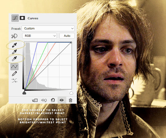
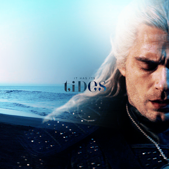
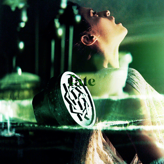
When picking the brightest point of a scene doesn’t brighten it to my standards, I go for the brightest point on or near a character’s skin (typically around the nose and forehead area; wherever the light hits them) or hair, if they have lighter hair like Ciri and Geralt do in The Witcher.
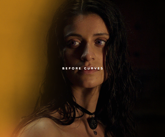
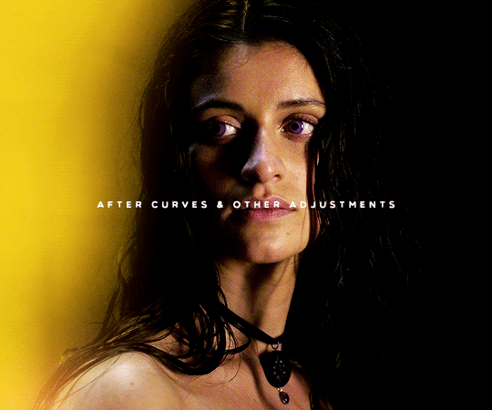
Here’s a quick Before and After look:
There’s obviously no 100% guarantee of retaining The Most Perfect Quality, especially when uploading on Tumblr, but as long as you’re working with HD footage (1080p or 2160p), sizing your gifs correctly, and choosing the right Save for Web settings, ensuring brightness shouldn’t mean loss of quality.
If you’re still experiencing issues with it, feel free to let me know! I’m always happy to work with people one-on-one.
#okie-dokie-artichokies#ask ava: an organizational tag and not an advice column (unless it needs to be)#ps asks
95 notes
·
View notes
Note
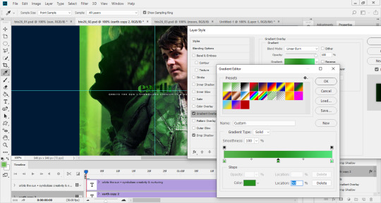
idk how to explain, but how do you make gradient text but in reverse colors with exclusion effect?
You explained it fine! I’m going off the assumption that you mean something like these:
I actually go for Difference instead of Exclusion. They do very, very similar things, so much so that I’d go so far as to say they’re near-identical, but if you play around with blending modes enough and compare those two in particular, you’ll find that Exclusion produces a lower contrast than Difference. But we’ll be working with white base text here—they’re actually-identical where white is concerned—so you’re welcome to pick whichever.
Once you have your font/s picked out and know where you want to place your text, set it to Difference (or Exclusion) so that it looks something like this:

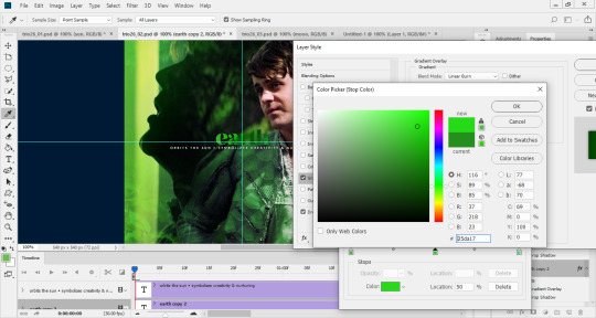
From there, it’s pretty much verbatim what I talked about in my original gradient text tutorial. We’re still going to double click on our text layer, then click on the Gradient Overlay tab of the Layer Style window that pops up, keeping in mind that we should pick colors that complement the gif and/or the overall set.
The only difference here is that we’ll also be playing around with the blending mode of the Gradient Overlay. The blending modes I tend to stick with are Linear Burn, Color Burn, Multiply, and Hard Light, but I’ve used Vivid Light and Linear Light as well.
This was my final product after setting my gradient to Multiply:
What blending mode you use is up to you, yes, but it ultimately depends on the background behind your text. Because of how both Difference and Exclusion work, some areas of your text can be harder to read, gradient or no. I recommend having your Layer Style window just a little to the side of your gif so that you can see for yourself what the different options (and colors, too!) look like as you scroll through them.
As an example: I didn’t like how light the middle of my text looked here, so I ended up deciding on a darker green for my gradient.
#i apologize for being like two weeks behind on my messages#rarara13#ask ava: an organizational tag and not an advice column (unless it needs to be)#ps asks#resources#tutorials
2K notes
·
View notes
Note
Hi. Long time lover lover, first time asker of photoshop related questions. I was wondering, if you explain the double text/thin white over line text from post/632522772600471552/we-get-to-see-this-man-who-weve-been-told-from that post? I didn't see it asked, but brain is dumb so I may have missed it. Thank you photoshop goddess, I burn a candle for your guidance and honor.
First of all, thank you for what has to be the funniest and most flattering way I have been asked for Photoshop help, down to the candle.
Adding a white outline is one of my favorite things to do with text and also super simple. I like to pair it with gradient + difference text, but I think it works with plain color text just fine—though I will add that you want to work with “thicker” fonts, as opposed to really fine ones like a lot of script fonts. (Basically: you want a font that allows an actual outline, and also one that will still be legible after adding said outline.)
Right click on your text layer where the text (“T”) symbol is, then choose Select Pixels. This should make a selection around your text so that it looks something like this:
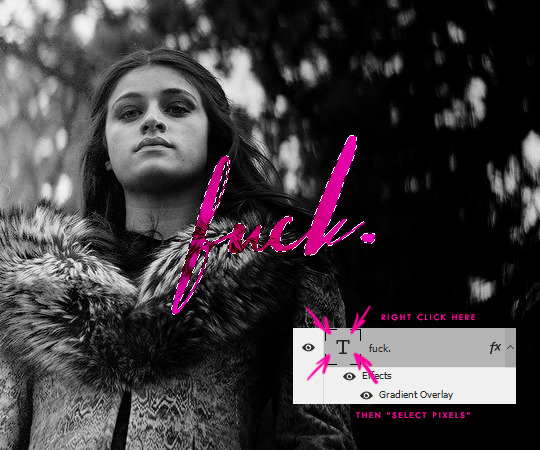
Create a new layer and then right click anywhere on your canvas. You should see an option called Stroke, which brings up this window:
If your settings don’t already match the ones in the screenshot, quickly match them up before clicking OK. All that’s left is to move the white outline a few pixels away from the text (I pretty much always stick to 3px, first to the right or left, then up or down) and you should be all set!
#darcylightninglewis#ask ava: an organizational tag and not an advice column (unless it needs to be)#ps asks#resources#tutorials
960 notes
·
View notes
Note
ma'am i am rolling out the red carpet for you right now for you, this is your comeback tour and it's so good to see you back ❤️
The way you've made me feel like a celebrity making some big on-screen return...
#WHY WAS COMEBACK TOUR SUCH A HARD THING TO THINK OF WHEN WE WERE TALKING ON DISCORD#i kept thinking ''revival and reunion tour both sound wrong WHAT IS THE WORD I'M LOOKING FOR''#i hope you know you belong on this red carpet with me#it literally took one (1) convo with you before i was like ''wouldn't it be silly goofy if i just installed photoshop''#yenvengerberg#ask ava: an organizational tag and not an advice column (unless it needs to be)
5 notes
·
View notes
Note
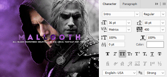
hi! hope you're having a wonderful day! if you don't mind me asking, which fonts did you use in this and this post? ❤
Hi, lovely! For Joey’s birthday set, I used Hello Stockholm and Encorpada Pro Black. And for the meme summary of The Witcher, I used Intro, which I've used... many a time. (Well. I say that, but they’re all frequent favorites that I keep cycling back to despite attempts to branch out to the other 700 fonts I have downloaded.)


#treacherousdiaz#ask ava: an organizational tag and not an advice column (unless it needs to be)#ps asks
64 notes
·
View notes
Note
hi Ava would you mind sharing what fonts you used in this edit? /post/674008497324785664/i-understand-now-how-special-she-is-when-chaos
Hi! The script font is good ol’ Hello Stockholm, which, if no one already guessed from the dozens of times I’ve used it, is an all-time favorite—and probably one of my most used fonts to boot. The sans serif font is Multicolore, though I’ll add as a little sidenote here that I’ve been bouncing back and forth between that and Tw Cen MT as my go-to “supporting” fonts.


#star-kovs#ask ava: an organizational tag and not an advice column (unless it needs to be)#ps asks#i owe many thanks to my beloved avia for the introduction to (and subsequent obsession with) multicolore
54 notes
·
View notes
Note
wow ava, your new header is so cool🩵
Ahhh, thank you so much! I spend far too much time on both my desktop and mobile headers, always, and I wanted one that captured the true essence and spirit of this blog—which is, obviously, the continued clownery for OT3s. 🤡
2 notes
·
View notes
Note
your icons are sooo gorgeous!!! thanks for making them <3
Gosh, thank you for appreciating them. Honestly, I'm just happy that people like them, because making icons is a bit of stress relief compared to the hodge-podge of gifmaking. Like yoga vs an intense cardio workout, if you will. I gather that might be a bit of a dramatic comparison, but there's definitely a level of "I can shut my brain off a bit while doing this" that I experience with making icons that I definitely do not experience while giffing.
Point being—my unneeded rambling aside—that it's a bit of a break from everything (both in Photoshop and in life) for me, and I'm glad that people enjoy them enough to use them. It makes me really happy to see. 🥺
#i am sorry to every individual who comes into my inbox and doesn't expect a long-winded response but gets one anyway#anakinobiwans#ask ava: an organizational tag and not an advice column (unless it needs to be)
4 notes
·
View notes