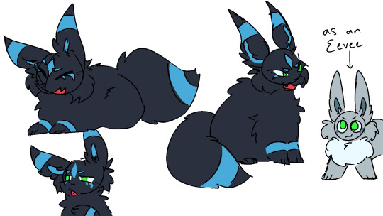
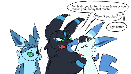
#aw great all my 3 eeveelutions are blue and green eyes
Text


a character design idea for a pokemon whos from the dark future and knew emerald & leaf personally
my current working lore is that emerald & leaf's parents got fucking stranded in the dark future since they tagged along with an injured celebi, who brought them here by accident
thanks to primal dialga Existing, they could get in the timeline but couldn't get out. also their first adventure when they got in was running the fuck away from primal dialga. this umbreon was one of those trainers' pokemon, and was 1 of the few pokemon who helped raise emerald and leaf
#art tag#umbreon#oc: leaf (pmd)#oc: emerald (pmd)#pmd#pokemon#pokemon mystery dungeon#anyways. shes actually an incredibly old oc that i went digging for to repurpose her here#her name is viki! if you recognize that then holy shit how#im surprised her design had green eyes. tbh#aw great all my 3 eeveelutions are blue and green eyes#thatsmy trademark now i guess#oh. hm. i guess this means they knew celebi from a very young age#let me restructure some events in my head
22 notes
·
View notes
Note
You have a lot of shinies now, so what's your top 5 fave shinies, top 5 better coloring than original, and top 5 worst looking ones ?
Sorry I took so long to answer this, I actually had to think about this for a couple days to really have a good answer. I hope y'all don't mind a long post because I want to explain my picks a little. I'll include links to the shiny in the list under the cut
5 favorite shinies:
Growlithe/Arcanine: This has been my favorite shiny since Gen 3 made their shiny not awful, and I finally got one in 19 eggs in SV! It's also one of my favorite pokemon.
Mimikyu: This might be unpopular and maybe (second) favorite pokemon bias, but adore the grey-scale of this shiny. I feel like it emulates the feel of the Gen 1 sprites, and it would make sense that Mimikyu, which wanted to be loved like Pikachu, would model itself after the original way it looked.
Umbreon: This might shock some people, because Sylveon is my favorite pokemon, but this is my favorite shiny Eeveelution. It just looks so cool! The blue stripes replacing the yellow is just so good. It just communicates cool Moon-inspired pokemon to me.
Rockruff: Another of my favorite pokemon that has an amazing shiny. It's a blue puppy! What's not to love? The shade of blue is also fantastic, just super cute. (can you tell I like blue shinies)
Gourgeist: We love a goth queen, tbh.
Honorable mentions: Mareep, Kantonian Ninetails, Galarian Zigzagoon-line (trans rights), Toucannon (bi rights), Sylveon (I only slightly prefer the original, still amazing), Sandygeist, Unovan Zorua, the Tapus
5 better than the original:
Wooloo: the reversed black and white just looks so good, I can't do it justice. Just a home run of a shiny.
Crobat: Bias because Zubat was my first shiny ever in Gen 2 (including the red Gyarados, I think). Also I just think it looks cool as hell. I got one in Sun and named her Babs because she looks like Batgirl with the pink and green scheme.
Camerupt: Talk about a major improvement! It's original design is... fine, like volcano camel, got it. The shiny just out shines (no pun intended) it in every way. The black and yellow work so well together, and while it doesn't scream "fire camel" it just looks so good.
Beautifly: Huge upgrade, imo. Looks super artistic, like a stained glass mosaic. Absolutely gorgeous, and it really pops compared to the original. Also, trans rights
Charizard: Wee-woo Genwunner alert! I might be biased, because Charmander was my original starter almost 25 years ago and remains one of my favorite Pokemon to this day. I still remember my original Charizard (MZ, no idea why I named it that I was 7), and when I saw it's shiny (in gen 3 when they fixed it) I knew I had to have one because it is just so dang cool.
5 Worse than the original: (excluding the obvious ones that are barely different than the originals)
Absol: I don't hate this shiny or anything, I just think the original Absol is a near perfect design. It does a great job of looking foreboding and kinda ominous, but the shiny doesn't quite do that.
Volcarona: It just feels like the colors on this shiny were picked randomly and both don't go together and look bad on this design. Serious downgrade all around, more negative points because I really like Volcarona
Primarina: This is one of my 5 favorite pokemon of all time, but this shiny makes me almost want to cry. I understand changing the "hair" from blue to blonde to try to like imitate the look of a traditional mermaid, but the change to the rest of the accents to that like pale yellow(?) is just bad. Primarina was a near perfect design, but the shiny is bad.
Snubbull: You would think I would like this because of the blue dominance on a dog pokemon, but it's just ugly to me. The Pink and blue-spot combo works for me on the original, but the reverse hurts my eyes. ALSO WHY ARE THE FEET ORANGE?!
Bruxish: One of my least favorite pokemon and just a terrible shiny. Colors feel totally random.
11 notes
·
View notes