#bc im too lazy to do lineart lmao
Text
appears looking at you with autism creature eyes. hello @sangerie your vs bros fankids (one of which i had a hand in making bc. glances at the reblogs/notes in @loopyarts post. i have confessed there fskakfafsga) are really really neat .u.
SPEAKING of loopyarts ty for allowing me to take inspo for nijis kids raid suit fit!! i really liked the softer yellow and the thicker lightning bolts on his pants you gave him so tysm for letting me yoink it <3
uh uhh individual pieces and also design/character rants under the cut bc. i wanna.
RAID SUIT RAMBLING TIME bc i spent the most time on those. also you might be asking 'why is only their hair rendered in those pieces?' well the answer is because i am Lazy. moving on . (/HJHJ i AM lazy but also rendering it further would mess up the colors and i didn't wanna do that lmao. carrying on..)
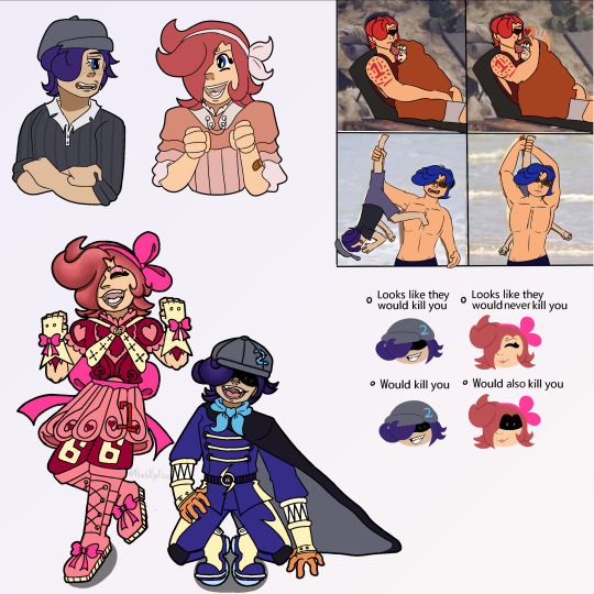
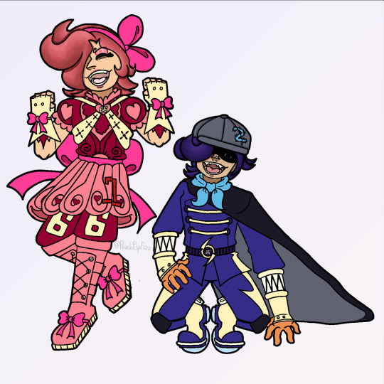
Ichiji's daughter i am so SO proud of her fit. i did not look up a reference or even inspo ideas at all, that all came from the ole noggin baybeee. anyways she is obviously based off a magical girl(s) fit bc she wants and DESERVES to be. also since Reiju doesn't have any kids of her own (based wine aunt) i also decided to let Little Red have some of her motifs instead of just purely Ichiji's!! primarily the 66 on her pants but also all the pink on her instead of just red :) and obviously she has her dads number and while she DOES have a (white? bc like daddy shes a special little princess /aff) cape i didn't include it here bc it looked reallly bad lmao. but she does have one tucked into the bow probably!! there she is, Sparkling Red Neo!!! (get it.. sparkling instead of sparking... bc magical girl.... im funny i think.) onto Little Ocean Boy
OKAY LET ME TALK ABOUT THE MOST MINISCULE YET MOST IMPORTANT DETAIL TO ME AND ME ALONE FIRST. that being the symbol on the brats belt. it was actually inspired/based off of this post which really stuck with me with me after reading it which i later realized was bc the "that something has been completely reversed" REMINDED ME OF THIS POST OF YOURS. i don't think im especially good at theory crafting but. idk i think there could be Something about how after judge came and turned germa into mercenaries their symbol turned from what once symbolized 'purity' into the skull of war mongers and then BACK to purity after 0124 get germa on the right path... poetry or smthn. ANYWAYS yah shoe shiners got a pretty basic fit bc like i said in the og ask, hes a sora warrior of the sea fan, once he saw the raidsuits irl methinks he'd want to stay pretty close to the og design. HOWEVER he refuses to drop the hat (much to Niji's dismay) and i came up with a reason besides 'its one piece and therefore there's GOTTA be a kid with a weird hat that they're attached to': and that is the fact that it hides his eyebrows. Little Red has the curly brows, all of Yonji's cabbage patch does too, and the brats the only one without. even if literally no one else notices or cares, he wants to hide the fact that he doesn't have em because it Separates him. and he doesn't want that. at all. he really, Really wants to be a part of this family (oh no i made it. angsty). ANYWAYS UHH YAYYY HE HAS A TWO ON HIS HAT (that he sewed on himself which is why i made sure you can see the stitch-lines) BC NIJIS HIS DAD WAHOO YIPPEE :D:D:D Dengeki Blue Neo: little shoe shiner edition!!
UHH second image is just a refined piece of that first doodle i sent you. with lineart and a better color pallet and all. actually looking at it again now i realize i forgot little brats freckles and i am now punching the air bc its too late to fix. just act like they're there. please :,,,) edit: nvm its the next morning i fixed that kjahsdah
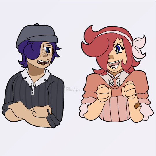
i don't even have much to say about the last two because i Think i am Rightgksfjgasjkfa but for the third i think the brats a bad influence on Little Red especially. ALSO FOR THE FOURTH NO I DIDNT FORGET ICHIJIS TATTOO. I AM JUST LAZY. (and I also forgot his tattoo :]) ANOTHER edit: i also. fixed this :]
CHRIST i am incapable of contacting you on Tumblr via any way that includes anything less than 250 words i am so sorry sangerie.. i hope you like these tho cause i really do tbh :3 (PS you have to take literally NONE of what I said here [mostly about shoe shiner] as like.. canon about them?? these are YOUR ocs obvi so please, change Little Red's raidsuit design if you find it unappealing!! make shoe shiner have a backstory of your own!!! i hope that isnt weird or rude to say, i just thought it was important too bc i threw sm at you so strongly ^^' okay thats all tysm for reading this it means to world to me byebye <3)


#one piece#vinsmoke ichiji#vinsmoke niji#one piece ichiji#one piece niji#others ocs tag#vinsmoke siblings#my art#im so happy with how the raid suits especially turned out like i can't get over it#i haven't been truly proud of an art piece for MONTHS this is so refreshing#like this aint perfect in a lotta other places but that alone is carrying this for me#also sangerie i am SO sorry if it looks like im virtually stalking you fjagskdakfsfa first the trans vs sisters and now this..#i promise im not there's just not a lot of ppl in the Vinsmokes tags and you and your stuff is really cool 😭 im normal i prommy /irony#okay ive literally said enough in the post im shutting up now gday or gnight take care#OH WAIT YEAH throwing in a#scopohobia tw#scopophobia cw#bc little brats eyes are borin into ya#OKAY now gday/night <3<3
32 notes
·
View notes
Text
ok one last post about the Project to truly exorcise it from my brain. just some process/design thoughts (also now that it's done if you want to read my liveblogged whinging for whatever reason here it is)
first off some stats because i kept stats like the nerd that i am:
time wise making this animatic took about 93.5 hours give or take (thanks procreate process replay) spread across exactly 2 months
anyway when i said i finished this project mostly through stubbornness and sunk cost fallacy this is what i meant lol like a lot of my thought process through this was just 'no way in hell am i letting some of these drawings disappear into my drafts forever'
on average each frame took about 2 hours 45 minutes but thats a bit of an overestimate since i forgot to count some of the animated bits from the first two lines (so id guess the actual number is more like.. 2 hours 20 minutes?)
btw that line with the starry apparition fading away? 12 hours total
the single longest and most painful frame to draw was the one of the crew walking through tu'narath (5 hours 30 minutes) because a. perspective b. architecture design c. for some reason i put a lot of detail into rendering the armour on all the githyanki i drew why on earth did i do that
(its especially painful bc that frame was one of the ones that didnt... feel like an important enough moment in the actual story of the show to be worth capturing the way the wish or even like, endellion is, i just needed to put that there for the storytelling flow or whatever of the animatic itself and it bothered me so much)
one other interesting little mishap was that i did all of these on canvas size 1080x720px (so that's why the youtube resolution isnt particularly high lmao) which is why procreate let me put an absolutely absurd amount of layers in one canvas (all 8 frames of with memories projected on the astral sea were done on one canvas. 159 layers) because the layer limit for that canvas size is 400 BUT. i accidentally started the starry apparition fade on an A4 canvas (my default canvas size for like all my normal fanart) and i only realised after finishing all the lineart and starting on colouring because i hit layer limit so i had to resize the canvas which did... interesting?? things to the lineart resolution
also if youre wondering how i drew K-LB that many times in something resembling timely fashion the answer is i sacrificed some... amount of sleep to 3d model and rig him in blender which. honestly? i consider it a roaring success
splitting the frames by bar was a Choice and certainly a choice ive.. had doubtsTM about but thats the kind of thing you cant really change without bringing the whole project crashing down so if the frames seem to move a bit too fast im so sorry there was really not much i could do there
idk if people actually noticed the very very tiny drawings of the crew moving around on the ship in the 4th line especially since they sometimes get obscured by the subtitles but the REASON for that is in my original drawings the subtitles went in the top left corner but they kept conflicting with other stuff so i just gave up and threw them to the bottom (also i originally included the chinese lyrics but then i got lazy lmao)
anyway that little detail like VR-LA angstily looking at the sea reminiscing about the JourneyTM and the crew sort of appearing along with the memories of their adventures together was one of those things that seemed SO COOL in my head but once i actually execute it its like. hmmmm not sure if that worked out the way you thought it would buddy. also the tiny crew was EXTREMELY hard to draw so put that down as another point in 'me subjecting myself to deeply painful and out there compositions for no good reason'
anyway i called this my magnum opus but i do actually have some thoughts about another one (a companion piece, if you will) for another song by the same band because now that i know what capcut can do im.. really itching to try something a little different because this like powerpoint presentation style? fully a product of me using iMovie as my only available video editing software for the past like 7 years of my life
#rwd#asto speaks#re: the projectTM#one last time using this dumbass tag lmao#honestly? also put another point in 'i worked on a project for so long it became just a Project to me and proceeded to get#absolutely blindsided by the emotional affect it has on people'#2 months. 2. months.#whatever actual emotion this idea was originally trying to draw from is long fucking gone buddy#like i did manage to re-experience some of it looking at the finished product but#i appreciate yalls screaming a lot i just truly did not anticipate it LMAO
5 notes
·
View notes
Text
i was gonna draw gabe but cas is so funny lmao (ft. my mc jiwon!)
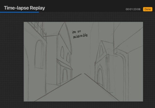
#gabe is coming next i promise#although there are some scenes from yesterday's chapter that i wanna draw#idk#probably gonna do more of this sketchy style going forward#bc im too lazy to do lineart lmao#playchoices#choices vip#choices id#choices immortal desires#choices fanart#fanart#cas harlow#mc: jiwon kim#my art#hydn.jpg
136 notes
·
View notes
Text

ok super quick style test for my comic using an old drawing lmao. its super unpolished cuz i was too lazy to plug in my tablet but i wanna get some thoughts before i commit to doing a whole graphic novel in this style. just worried that the cartoony character style clashes with the realistic-ish background idk ?? (and the bgs would be more detailed than this, again i was just lazy and it's 1:30 am and im tired)
for reference this was the original style i had planned but i feel like my character drawing skills have improved a lot since then, also the bgs took fucking forever to make bc of the lineart


11 notes
·
View notes
Note
hiya, I really love your art, and how you make your latest stuff look really vintage and aged, it’s really super cool and I was wondering if you’d be willing to share your process for that?? thank you so much and I hope you have a wonderful day!!! :D
aww thanks so much! and of course i can share my process, no prob!! ^^
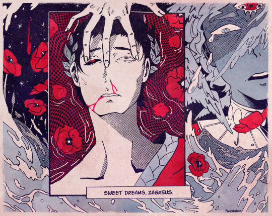
i’ll be using this piece as an example, and uh, for the context of it u might have to look on twitter lol. but whatever

it’ll be a bit long so everything is under the cut
(this is just based on my process, and i know its weird and csp specific.
feel free to pick and choose pieces from my process!)
and also the programs i used were procreate and csp and i have a mac. u could probably do this with other set ups, but this tutorial might not be super helpful near the end
i usually make my lineart in procreate and import it into csp as a .psd file

for this, in procreate, select the file you want to export and click PSD and then I airdrop it to my mac.
i think the only thing about the lineart i have tips on is to keep it toothy/gritty if that makes sense?
i use the 6B pencil in procreate with a bunch of tweaks to the pressure sensitivity and opacity/size change.
but anything with a good size jitter should do the job!
in csp i shade and color the piece.
picking out the colors is a whole other mess
feel free to ask about it but ill skip for now ;v;

flat colors

csp has a lot of nice halftone options!
group up ur lineart and everything thats black rn in a folder and above them set a clipping layer to add
fill it with a color lighter than black; the less pure blacks and white u have on a piece the better
feel free to go to town w the grunge or noise texture of ur choosing! the grittier the better bc during this step i try to get the feel of worn off ink. just make sure the linearts still visible, though. u went through all the trouble to make it after all! ^^
(i have specific brushes but again thats something else u can ask me about)
above all the layers, make a multiply layer and do something similar.
same advice as above

this is ur “paper” texture, tho, so try to keep it more even in tone so things don’t get too messy
(but if it works for u, feel free to do it! find what works is my advice!)
ok time for some super csp-specific steps (sorry to non-csp users)
the csp asset store/website(?) has a lot of nice textures and brushes available.
look through it if u haven't
it will make ur life so much easier
theres a really nice tileable watercolor texture set there
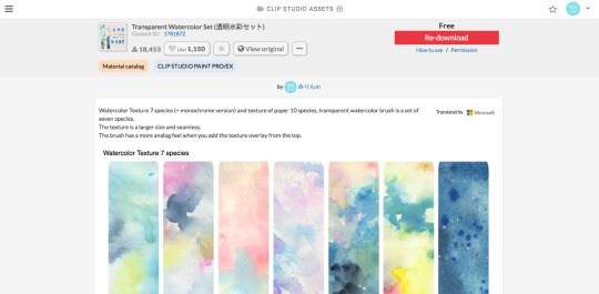
(this one specifically)
(it also had some really good paper texture bc whoever made this is a godsend)
i slap that over the color layer, set it to clipping, and mess with the blending modes
its usually a tossup between soft light, overlay, multiply, and the overlay texture effect tho
theres another optional step of using the overlay texture effect on a paper texture
i didn’t do it on this example sorry :’(
i think i used another watercolor texture set to soft light on this piece?
after that, if u want, i like setting a noise texture at a v low opacity over everything for extra jitter

(i use this one. u can just make it in csp and probably any other drawing software but im lazy lmao)
save it as a png/jpg/etc.
and ur done!
i do some extra stuff to the final image like scale everything down and add a bit of a 3D effect for a bit of extra kick
(but again thats a bit complex and specific so feel free to ask but ill keep it short
for your sanity’s sake)
(and once again, the final image! ta-da!)
some tips to keep in mind i guess
jitter, grit and noise textures are very good things when u want something to look rough
avoid pure blacks and whites; most paper isn’t printed pure black or white and it only gets more faded and colored with time
if ur super lost, look at reference!! theres a lot of good artists and media out there to get inspiration from, and looking at scans of actual old comics is a nice way to see if ur work looks aged
(also u don’t have to use old comics as reference; i like looking at old vcr footage for reference bc of the texture!! :D)
that’s all i have for my general process
uhh for specifics feel free to ask
i can make more tutorials but this one is a general overview, i just didn’t to take up too much of ur time….
but i really hope it helped! and im very sorry if it didn’t
i’ve never made a tutorial so im sorry if it didn’t answer ur question and also im sorry if this one’s not very useful
thank you for reading!!!
and thank you to whoever asked! :D
54 notes
·
View notes
Last Seen Blogs
gmmtvactresses
*ੈ✩‧₊˚ gmmtv women

asaantips-blog
Asaan Tips

sunnyboy03
Sunnyboy03
asaantips-blog
Asaan Tips

firststepbaby
Modern Baby Names