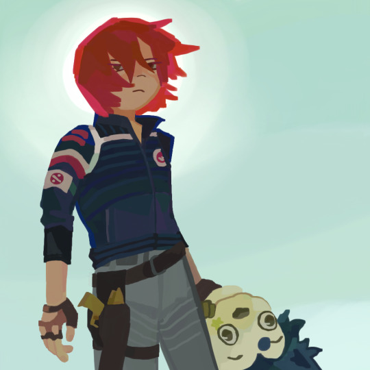
#because I couldn’t decide if I wanted to do it normal lineart and colour or just paint it
Text

STREET WALKIN’ CHEETAH WITH A CAPITAL G
#omtai art#my chemical romance#mcr#danger days#party poison#the true lives of the fabulous killjoys#digital art#digital paintings#fanart#illustration#Hi guys! i have autism#mcr my latest victim#more specifically danger days album I’m so#danger days was always my fav album from them but right now im glowing about it#I’m#GRAHHHHHH#(whiteknuckling the sink) I will not dye my hair red. i will not dye my hair red. i will not y#anyways enjoy this#it took me so fucking long#because I couldn’t decide if I wanted to do it normal lineart and colour or just paint it#I painted it in the end obviously#but still.#anyways I’m so happy with this i glub it
423 notes
·
View notes
Text
I did a palette challenge
This is probably the most seasonally inappropriate thing to post right now, but I recently did my first colour palette challenge. It was...definitely a challenge...
quick context here
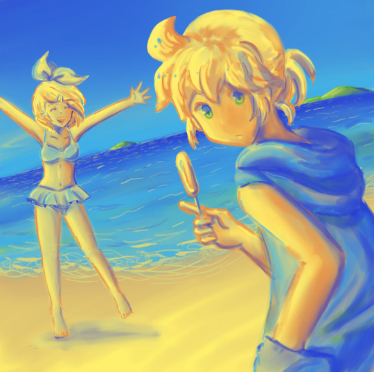
For some more context, one of my old university clubs was doing an illustration book. The theme was four seasons and the idea was all the contributors get assigned one of the seasons along with a palette. We were allowed to draw fanart so I thought it'd be a fun, low maintenance little project I could afford the time to do. I told the editor I would draw Rin and Len at the beach (I picked summer because I live in Australia, and choosing any other season for a Japanese university club's project would give me imposter syndrome).
Sooo, the day after the sign-up deadline I got an email from the editor which basically said: "Thanks for signing up. You're all locked in and there's no backing out now. The illustrations are due in less than a month. Apologies for the tight deadline, but please stick to it because we're actually trying to make it in time for the culture festival." Initially I thought they were only gunning for Comiket, which isn't until December. So I guess I had already partially screwed myself over by signing up thinking I'd have plenty of time to experiment.
Then I saw the palette. Now, I'm not sure if this is because this was my very first palette challenge ever, but my first thought was there is no way I am going to make something good out of this. I just couldn't see any harmony between the colours? Outside of bright blue, bright yellow (and possibly bright green?) I also struggled to see any links to summer. Why was there so much brown?? The colours just...didn't look good together? Is this what a summer palette normally looks like?
I think this initial impression also reveals a lot about how I normally see colours: which is at the surface level. Particularly as I tend to draw a lot of fanart, I paint colours exactly as I see them. Blonde hair is yellow, a white shirt is white etc. And shades would just be a darker variant of those colours. So when I draw Rin and Len, I would always resort to the familiar palettes I associate them with: yellows and orange, with dark yellow, orange or even brown and red for shadows.
I did once learn that a good way to do shadows is to use the opposite colour. But when it came to applying that knowledge, I could never make it work. Small changes always looked too drastic and I preferred to stick to my comfort zone.
Well, this time I was finally forced to step out of that comfort zone. I was given a good selection of browns and yellows to use on Rin and Len. But using the same yellows and browns for their hair, their skin and the sand would never work. In addition to shades, there were also highlights to think about.
I don't know if blending colours is considered cheating in a palette challenge, but that's what I did at first. Gradually blending in the other colours to my basic "surface level colours" could slightly alter their shade. But it wasn't enough. The colours didn't stand out. I actually needed something more drastic.
Long story short, I used the two blues for shade and highlights, as you can probably tell.
I think I've never been very good at selecting colours so this was actually a really good experience. When I first switched from traditional to digital painting, I felt (and still feel) one of the biggest differences is just how much choice there is. It was actually really daunting trying to figure out what colours I wanted because there were just so many to pick from.
Which is why having the colour restriction this time really helped, because I was forced to think about colours in a versatile way, which was something I hadn't really done much before.
I had to really think about which colours I wanted to use for shades, which to use for highlights, and how to make those stand out without adjusting the brightness, contrast, transparency etc (which our editor explicitly banned us from doing).
I was very unsure at first. But as I continued things started to look more natural. I was even confident enough to do some lineart using the blues.
I can conclude that the variety of shades really does give the painting more depth. I was wary of not overdoing the foreign shades as they do affect the overall tone in a big way. But the final product definitely looked a lot more interesting and unique than the normal stuff I do.
Will I be more experimental with my colour choice in the future? Maybe. I feel I was only able to do this because of the restrictions of a set palette. I'm sure if I tried again I would fail at the first step of deciding what palette to even use.
But that doesn't mean I won't try haha..
For those interested, I posted some WIP on twitter, along with the palette: https://twitter.com/Jira_chii/status/1180356468207304704?s=20
And here's the final work:

sorry for long post
1 note
·
View note