#but no amount of photoshop filters can fix my drawing skills
Note
I can just imagine Thor giving Loki’s big round belly sooo many kisses and soft belly rubs.
It’s so weird you should mention that, anon, because I just so happen to have a crappy rough sketch I did on 5 May (the first sketch of pregnant mer!Loki) and Thor is doing exactly what you said, and when I read this ask I was like… okay, we’ve got some cosmic mind-melding going on here so now I’ve gotta post it. Here it is, anon, just for you!

#i tried my best to pretty it up#but no amount of photoshop filters can fix my drawing skills#or lack of them#ask bender#merthorki#hjbenderart#rough sketch#thorki#thunderfrost#merloki#merthor#pregnant loki#daddy thor#thunderfish#merfolk#mermaid au
214 notes
·
View notes
Text
Project 1: Snippets
Hooray, my first Studio Arts project! I had a great time working on this- I can't remember the last time I was so excited to work on homework.
For this project, our task was to think about weird things we've heard people say, favorite quotes, song lyrics, et cetera and create images based on those "snippets." Like the Emo trash that I am, all three of my "snippets" were song lyrics. My first one, "Is anyone there? Oh... hi," is a line from Sad Machine, my favorite song from Porter Robinson. The second, "His hair, his smoke, his dreams," is a line from Colors, my sister's favorite song from Halsey. The third, "I'm drowning in a lifeboat," is a phrase used often by death's dynamic shroud.wmv, my mom's favorite Vaporwave artist (you read that right!) I chose those lines for the second and third because I intend to give the final prints as gifts to my sister and my mom, respectively.
Here, I'll briefly break down my process for each of them:
"I'm drowning in a lifeboat"
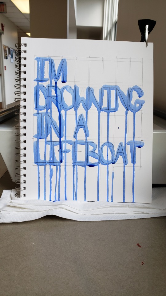
I started by creating a physical image. I sketched out the letters in pencil after very carefully drawing margin lines with a ruler. Then, I painted the letters vertically using heavy body acrylic thinned with water to make it appear like watercolor. While the paint was still wet, I photographed the page (using my hair clip to keep it from flopping over.) In Photoshop the following day, I resized and cropped the image, straightened it, added a Gaussian blur to smooth over the pixelation, then applied automatic color fixing operations.
The idea behind this image plays into my interpretation of the quote. I spent a long time painstakingly drawing out the letters and their spacing, but intentionally put very little effort into applying the paint neatly and even used the wrong kind of brush on purpose. Upon seeing this image out of context, one might think that the creator had a fair amount of skill with drawing, but next to no skill in painting. The point of all of this is to illustrate frustration. I interpret "I'm drowning in a lifeboat" to mean "I have the good foundation I need to be successful, so why am I still failing?" This image shows a good foundation in the drawn lines, but ultimately, it fails to be as neat and tidy as it set out to be.
"Colors"

I happened upon a stack of very old magazines someone left outside of McMaster and decided to use them to create a collage. I cropped the images and pieces of paper by folding and tearing, I arranged them in several different ways to see which configuration looked the best, then I pasted them in place. Despite the final image being in black and white, I used blue ink to write the text as an even deeper reference to the song. Then, I photographed the page in better lighting. In Photoshop, I resized and cropped the image, added a Gaussian blur, then applied a black-and-white filter. It didn't occur to me until days afterward that I needed to cite my images, and I'd put the magazines back in the pile where I found them! Would they still be there after several days of classes and rain? I'll cut to the chase: yes, they mostly were, but I had to do a bit of reverse image searching to find all the information needed. (This was about four days ago, and I'd written much more here, including the citations, but for some reason my post edits never saved so I've had to do all of this AGAIN.)
(Image sources: [top] Unknown historic photograph. [center] Moya, Rodrigo. "Che Melancólico." 1964. [bottom] Hopper, Dennis. "Double Standard." 1961.)
"Sad Machine"

For this one, I typed the quote into a Windows command terminal with the intent of the final image having a Vaporwave aesthetic. I tried photographing my computer screen for a more "lo-fi" look, but it looked unironically terrible and I decided to just use a screenshot. I used my computer's Snipping Tool to capture just the part that I needed, and I imported the capture into an 8"x8" blank artboard. To make the text clear and bright, I applied a very heavy-handed sharpening operation and turned down the saturation to get rid of color noise. Opening a new blank layer underneath the screencap, I created a two-color gradient and added color noise. I specifically chose to use blue with RGB values of 0, 255, 255 and magenta with RGB values of 255, 0, 255 (those colors probably have technical names that I don't know) because they're very popular in Vaporwave aesthetics and because I used those colors ad nauseam in my early days of making digital art in MS Paint and GIMP. I know that those colors don't quite print properly, though, but that's still in line with my intentions. Vaporwave aesthetics are characterized by mocking the technological ignorance of decades past and by imagery that can only truly exist on a computer. Imagine, if you will, someone amazed by the capabilities of their first home computer creating artwork to their heart's content using crazy full-saturation colors that simply cannot exist in the real world. They get their artwork printed and are disappointed in how their beautiful cyan and magenta turned out to be some sad pale blue and some dull reddish pink. And so the stark difference between the printed version and the uploaded web version of this snippet plays directly into its meaning.
2 notes
·
View notes
Text
Intensify For Mac

Intensify For Mac
Intensify Pro For Mac
Intensify Pro For Mac
Intensify For Apple Mac
Reveal the hidden beauty of your photos. Get instant results with dozens of pro presets. Or use powerful Structure, Sharpness, Detail and Pro contrast enhancements for.
Intensify Pro is for Mac photo enthusiasts who want their photos to stand out. Intensify Pro gives you powerful new ways to create dramatic results. Professionally created presets make it 'one.
Same functionality as on a mac? Canon 5D Mark II Canon 70-200mm f/2.8L IS USM Canon 35L Sigma 85 1.4 Helios 44M-6 58mm(M42) Zeiss 50mm 1.4 (C/Y) Canon 135L (2) 430EX II Photo Comments.
Intensify is the first product in a new line-up of softwares by McPhun targeted at professional photographers, and is available in two versions: Intensify sells for $19.99 and is only available on the Mac App Store; Intensify Pro, which adds the ability to run as a plug-in to popular host applications as well as several other features, has a.
Support OS: Mac OS X 10.8 or later The Verdict: 10/10 Do you want your images to look amazingly impressive? Intensify is here to help you. With thousands of professional photographers, Intensify makes your images vivid and eye-catching.
Updated on 5/20/2014 – Version 1.0.2
I had the opportunity to test a new software released today by MacPhun Software named Intensify Pro. According to MacPhun Software:
Intensify enables photographers of all skill levels to create powerful images using precision tools for enhancing detail. By offering superb control of contrast, structure, detail and sharpening across tonal ranges, Intensify is able to reveal otherwise hidden details and deliver the highest quality results no matter the style of image.
Intensify is the first product in a new line-up of softwares by McPhun targeted at professional photographers, and is available in two versions: Intensify sells for $19.99 and is only available on the Mac App Store; Intensify Pro, which adds the ability to run as a plug-in to popular host applications as well as several other features, has a suggested retail price of $59.99.
Intensify was named to Apple’s Mac App Store “Best of 2013” list and has ranked among the top 10 paid photography apps in the Mac App Store since its initial release in November 2013.
Even though MacPhun Software sells Intensify Pro as a detail enhancement software, what I find it is a complete package of image enhancement. In fact, Intensify Pro supports layers, smart brushes, RAW file format, and has tools that range from basic image tuning to various levels of contrast, detail and sharpness enhancements.
The Pro version of Intensify adds support to run as a plug-in to popular image editing software like Adobe Photoshop, Adobe Lightroom and Apple Aperture.
Intensify Pro in Action
When you open Intensify Pro, you are presented with a clean and well laid out interface. On the top there is a navigation bar with common zooming tools, a pup-up navigation window and before/after buttons. On the top right there are undo/redo buttons, and a set of four tools: the Hand Tool for moving your entire image within a window, the Draw Mode, the Erase Mask and the Gradient Tool.
Using the Draw Mode and the Erase Mask, you can craft masks using brushes. You can set brush size, opacity and softness, and you can clear and invert the mask. You can also toggle a show mask button that shows a red overlay of your mask over the image. The Gradient Tool allows you to create, well, gradients in your masks. This set of tools is very similar to Lightroom masking capabilities.
The masking capabilities are quite good, fast and reliable. This, paired with the layering capabilities of Intensify Pro, allows quite complex adjustments to images. What I miss here is a sort of feature like Lightroom’s auto mask or Perfect Photo Suite’s smart brush, and this could be a nice addition to a future release. Also, unlike Lightroom’s gradient tool, once you’ve positioned your gradient and applied it, you can’t move it anymore, but you can always reshape it using brushes.
On the right column of the interface there is the “core” of the software. On the top there is a layers panel where you can add and remove layers, set their opacity and toggle their visibility. Under the layers panel there are two buttons to switch from a presets view or an adjust view.
There is a good number of presets organised in folders. However there isn’t a preview of presets, but they’re applied instantly when you click on them. Also, under each preset there’s an opacity slider to tune their intensity. The default presets are quite over the top for my tastes, and they’re unusable at their default opacity, but they may be a good starting point. Obviously you can create your own presets and folders.
The Adjust view is where the “beast” is hidden. The depth of control over your image is amazing!
The first two panels are basic and common to a lot of softwares. You can fine tune colour temperature, exposure, overall contrast, highlights and shadows, vibrance and saturation. Quite identical to Lightroom’s Basic panel in the Develop module. There isn’t a colour picker to set the white balance though.
After this Basic Tune panel, there are the three core panels of Intensity Pro: Pro Contrast, Structure and Details.
Pro Contrast
In Pro Contrast you can adjust the contrast separately according to tonal ranges. You can set the contrast for highlights, midtones and shadows. Also, under each slider there’s an offset slider to adjust the median value for the contrast tonal range.
Intensify For Mac
It is intimidating at first and it takes a while to understand that offset slider, but after a little trial and error, the power of this contrast controls allows you to set the contrast precisely in a way no other tool allows you to do. Even the Pro Contrast filter in Google’s Nik Color Efex Pro isn’t as deep as Intensify Pro!
Structure and Details
Structure allows you to enhance low contrast areas of the image, helping reveal texture and details. You can control two levels of it: global and micro to target small or really small elements of the image.
You can control it separately for highlights, midtones and shadows (if you’ve used Google Silfer Efex Pro you know what that means). A softness slider allows you to set how soft or crisp this details should be, deciding how artistic or realistic the image is.
Details allows you to make the image crispier. You can act globally, on highlights or shadows on small, medium and large details. I find the effect of Details is quite strong, and it’s easy to overdo it. To obtain a natural effect I use it sparingly. However, the amount of control you have here is intimidating (in a good way!).
The Adjust view also contains a Micro Sharpness panel that allows to sharpen the image, and a Vignette panel to fine tune a vignette effect on the image. I don’t think I will ever use them in my own workflow, but they can be useful in some cases.
What’s new in the 1.0.2 release
The new Intensify release adds additional RAW file support for more cameras, more fully integrates features from Apple’s latest Macintosh OS (Mavericks), introduces the MacPhun Print Lab (powered by MILK Books) and adds the ability to export images to SmugMug, increasing the software’s sharing capabilities.
This is a small update. The big improvements are in the sharing capabilities with SmugMug and the MacPhun Print Lab, which I don’t think are really useful to the professional photographer. Being Intensify Pro an addition in the workflow (not a substitute for Lightroom or Aperture), I think they should focus in improving the editing capabilities rather than integrate it with SmugMug and such. This is a free update, so it’s ok. We’ll wait for the version 2.0 for something exciting.
Beware of colour spaces
MacPhun has solved the color spaces issue I pointed out on the initial release, and now it works correctly with ProPhotoRGB!
Before concluding, I want to write about a strange behaviour in handling colour spaces that looks like a bug.If you work in ProPhotoRGB in Photoshop, you can open correctly the image in Intensify Pro, but when you send it back to Photoshop, it somehow fails to save it with the correct profile, and you have to convert it manually.
This tells me Intensify Pro doesn’t work in the original colour space of the image, and I don’t like it!This happens only with ProPhotoRGB. I tested it with AdobeRGB images and it worked well.I hope MacPhun will fix this soon, because if they want to target professional photographers, they should know they much prefer to work in ProPhotoRGB for masters (a bigger colour space), and convert in sRGB only when exporting image copies for the web.
Conclusion
Intensify Pro is a great piece of software. Even though it doesn’t have groundbreaking technologies built in, in fact all the functions are already seen here and there in other plug-ins, Intensity Pro allows an unprecedented depth of control over contrast and detail in a single package.
It’s incredible, and quite intimidating, how deep the controls in Pro Contrast, Structure and Details go. Add to this the snappy performances and stability of the software, and you know that MacPhun has done a great job for its first professional package.
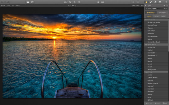
Here is a sample before/after of a recent image of mine, on which I tested
You can buy Intensify Pro here with a 10% discount using the coupon “DAVIDE2014”.
About MacPhun Software
MacPhun Software is a California based Mac app developer focusing on consumer photography and professional digital imaging markets, serving over 22 million customers worldwide.
Intensify Pro For Mac
First established in 2008 with a mission to create innovative photography software, Macphun’s products such as ColorStrokes, Snapheal, Focus 2, Intensify and Fx Photo Studio are consistently ranked among the top 15 in the paid photography category on the Mac App Stores around the world. The company has recently launched another new app–Lost Photos–a unique free app that enables anyone to re-discover forgotten photos in their email, save them to a folder on Mac or share via social networks.
Intensify Pro For Mac
If you enjoyed this article, consider to share it with your community. Also, consider to subscribe to this blog!
Intensify For Apple Mac
Disclaimer: if you purchase the software using one of the links in this article, I might earn a commission. Rest assured that my review is honest, and that it express my real opinion of the product.
0 notes
Text
Final Evaluation
At the beginning of this topic I only had a vague idea on what I could do on Photoshop but now I feel like I definitely know a lot more and have a better idea about all of the things that you can create on Photoshop, Illustrator and InDesign. Also on a more metaphorical note I feel that I have improved on my creative ability and my creative mind set, this means that I am able to generate more ideas for particular topics than I could before which is definitely a key skill that I am going to find very useful in the future. I also think that I have improved on my drawing skills although this course isn’t drawing based I have definitely gotten more confident drawing freehand than I was at the beginning of the course. Finally, I think that I have improved the most at my digital editing because that was definitely my biggest goal within this course because I felt I didn’t have any ability to edit digitally apart from maybe adding a filter onto a photo but now I can definitely say that I can do more than that now.
Throughout this project I have researched quite a few artists and a few that definitely stuck out to me are Paul Catherall from the architectural work, Alvin Langdon Coburn from the photography work and Chris Piascik from the doodle work. I found Paul Catherall’s work really interesting because I really liked the way that all of his pieces look and how different his work is to a lot of artists because he doesn’t use any outlining within his pieces, I also really enjoyed this topic and workshop that his work inspired. I feel like Catherall had a big impact on my work because it showed me that you can create amazing pieces of artwork from different block shapes. I also liked Alvin Langdon Coburn’s work because I love how abstract they are and how he has used photography in order to create these really interesting pieces, also I like how a lot of them are monochrome because it keeps the viewers’ attention on what is actually in the piece rather than what the colours are in the piece. I think that Alvin Langdon Coburn’s work has had a big impact on my work because it showed me that my work can be monochrome and still be really interesting and eye catching which I applied in my Photo Zine. Finally, I really liked Chris Piascik’s work because I liked his technique and way of creating his artwork and I think that his technique with drawing the continuous line and then creating artwork from it is really inspiring and has helped me when I was stuck for ideas and it let my creativity flow.
Throughout this topic I feel that I have definitely been happier with my outcomes the further into the course we were because I felt I had a better understanding of what I was doing as well as how I could execute it. Therefore I think that my favourite design in my portfolio are my architect work, the photogram work and my Don’t Panic pack. I think that the reason why I liked a lot of those outcomes was because I feel like they were less structured lessons especially the Don’t Panic work which I think I enjoyed creating the most. Also I really liked the architect work because again that was quite free because we were able to go out and take our own photos and then create our artwork from them rather than being given photos. Also the photogram workshop was quite free as well because we were able to create our own designs and layouts with the acetate and we could experiment in whatever ways we wanted to. Although, I found that in the Don’t Panic workshop sometimes I got really stuck on what I wanted to create although I always overcame it because I created a mind map with a lot of different ideas which definitely helped when I was stuck and didn’t know what I wanted to create.
I think that if I had gotten more time I would have definitely created a lot more outcomes and made sure that within each topic and workshop I always extended my work and pushed it to the limits. I would have also properly been more ambitious with what I was doing because I knew I had more time to create the same amount as I did during this term. I also think that I would have taken more chances because I would know that I would have enough time to start over and go with the safer option if I didn’t like the outcome or I didn’t think that it was right and I couldn’t fix it. I think that this assignment was definitely necessary because it was a way for everyone to get to around the same level and it was still really fun as well as informative and although I may not want to do it again I am definitely glad about what it taught me.
Overall, I think that this project was quite successful because it was a big learning curve because of how little I knew at the beginning of the project. Although, I am not 100% happy with all of my outcomes which I think was to be expected because I didn’t have the same skills that I have now at the beginning of the topic which means that I definitely am not as happy with the outcome of the doodle tasks compared to the Don’t Panic topic. I think that I prefer the little workshops because I feel like when I was doing the Don’t Panic work I was running out of ideas but when I was doing each of the workshops I wasn’t stuck on what to do and I felt that I had more ideas for the smaller topics.
0 notes
Last Seen Blogs

azrail-has-a-vendetta
"I AM the sexy bacon"

sims-is-strange
LiS sims stuff

sims-models
Sims Models

cloudywithchanceofrainestorm
Possession Subplot

sims-life-in-pixels
Pixel life