#color adjustment
Text

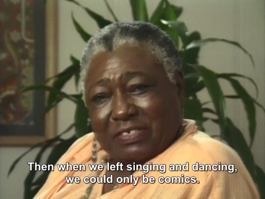


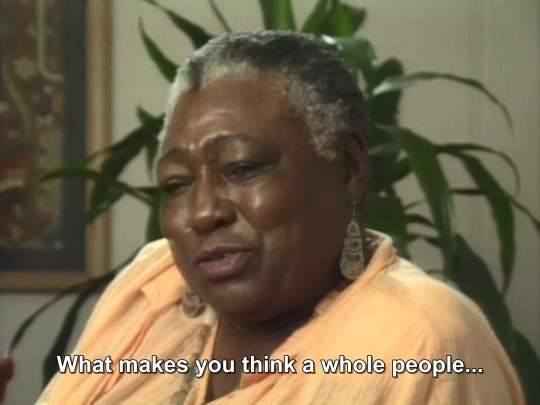
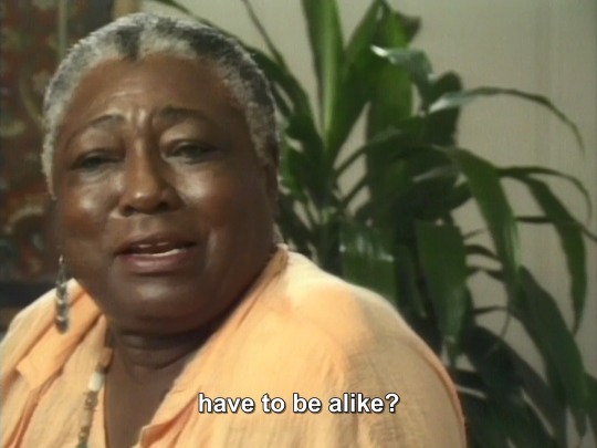

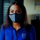
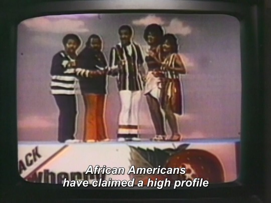
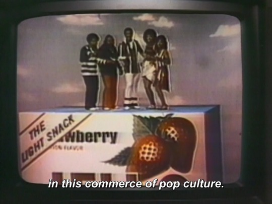
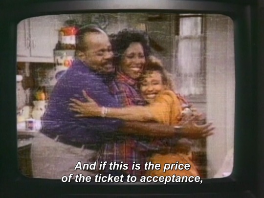
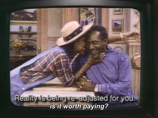
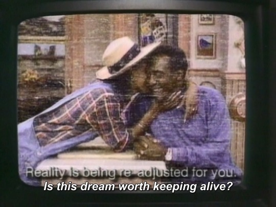
COLOR ADJUSTMENT (1990) dir. MARLON RIGGS
616 notes
·
View notes
Text
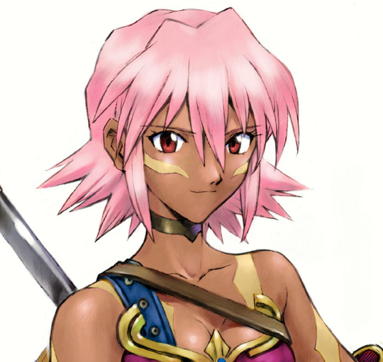
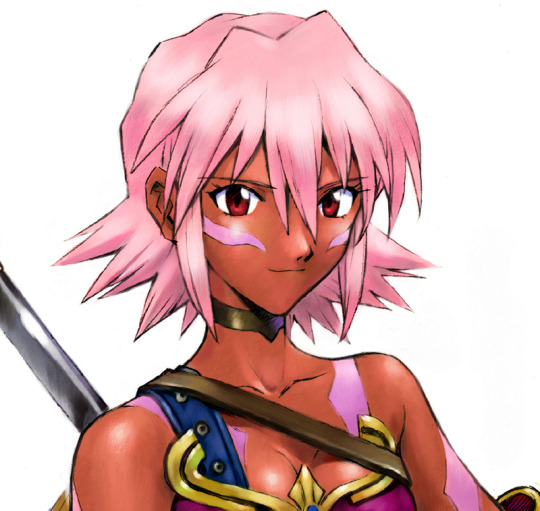
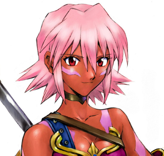


BlackRose from .hack with color correction to match in-game model. Based on smaller/blurry versions salvaged from the wayback machine's archived CC2 dothack webpage, which have been included for posterity.
#.hack#BlackRose#official art#official render#dothack#.hack games#illustration#3D model#fan edit#color adjustment#blademaster#The World R:1
11 notes
·
View notes
Text
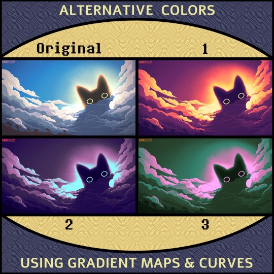
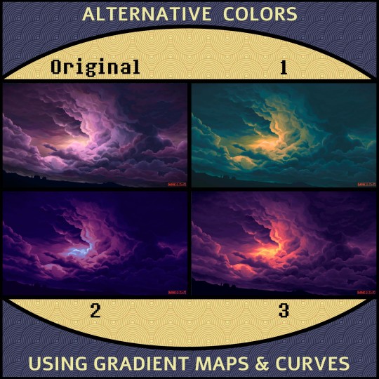
Alternative Color Versions of my artwork “Cat-eyes of the Storm”.
When the original didn’t look intimidating enough...
Which one is your favorite?
#void cat#art#drawing#digital art#alternative colors#filters#color adjustment#gradient map#storm#clouds
4 notes
·
View notes
Text
python opencv white balance an image
import cv2 import numpy as np def opencv_white_balance(cv_img): result = cv2.cvtColor(cv_img, cv2.COLOR_BGR2LAB) avg_a = np.average(result[:, :, 1]) avg_b = np.average(result[:, :, 2]) result[:, :, 1] = result[:, :, 1] - ((avg_a - 128) * (result[:, :, 0] / 255.0) * 1.1) result[:, :, 2] = result[:, :, 2] - ((avg_b - 128) * (result[:, :, 0] / 255.0) * 1.1) result = cv2.cvtColor(result, cv2.COLOR_LAB2BGR) return result
#python#opencv#white balance#color adjustment#images#image#photo#photograph#photo editing#programming#source code#snippet#coder#coding
2 notes
·
View notes
Text
Fast Color Work With The Color Adjustment Filter In ON1 Effects
If you are trying ON1 Photo RAW, the ON1 plug-ins like ON1 Effects or ON1 HDR, or upgrading your ON1 software to a newer version, please consider using my affiliate link. There is no extra cost to you and it helps support ON1 tutorials like this one. Ready to buy? Use the offer code SDP20 at checkout and SAVE 20%!
I love the Color Adjustment filter in ON1 Effects. For landscape photos, adjusting colors brings a scene to life and adds depth and dimension. Using the Color Adjustment filter, I can quickly target and adjust specific color ranges, often without having to do any masking. If masking is needed, ON1 has a slew of masking tools that make the masking job easy.
In this photo of the Swiss Alps, I wanted three improvements to color. First, more color and saturation in the oranges of the rocky peaks. Second, increasing the greens of the rolling hills. And third, a richer blue for the sky. A series of 3 Color Adjustment filters handled these changes with no fuss at all.
The first two adjustments were as simple as adding a Color Adjustment filter and choosing one of the styles in the filter. The Fall style boosted the oranges in the mountain and the Foliage style made the rolling hills greener.
For the sky, I added a third Color Adjustment and used the Sky style. I also used Mask AI to limit the filter’s impact to just the sky. There is a blueish cast over the distant ridges that I did not want to emphasize. Mask AI limited the effect to the sky in just a couple of clicks.
On your next photo, when you need to boost colors, check out the Color Adjustment filter in ON1 Effects. You can apply it several times and quickly target specific color ranges in your photo - often without the need to mask.
0 notes
Text

something something giant isopod sharing is caring pass the detritus
inprnt
#giant isopod#marine biology#artists on tumblr#inprnt#I tried coming up with a pun but nothing popped up#cackLES#there's also another print up on inprnt that I'm waiting to post when I have other stuff settled 👀#technically inprnt is getting to see stuff a little earlier haha#also been noticing how my process has changed haha it's interesting#like I'll spend waaaaaay more time now nitpicking/adjusting colors which is fine#but like before when I was still in old process mindset I'd get frustrated and think the colors weren't coming out right#when what I needed was to spend more time figuring it out
7K notes
·
View notes
Text
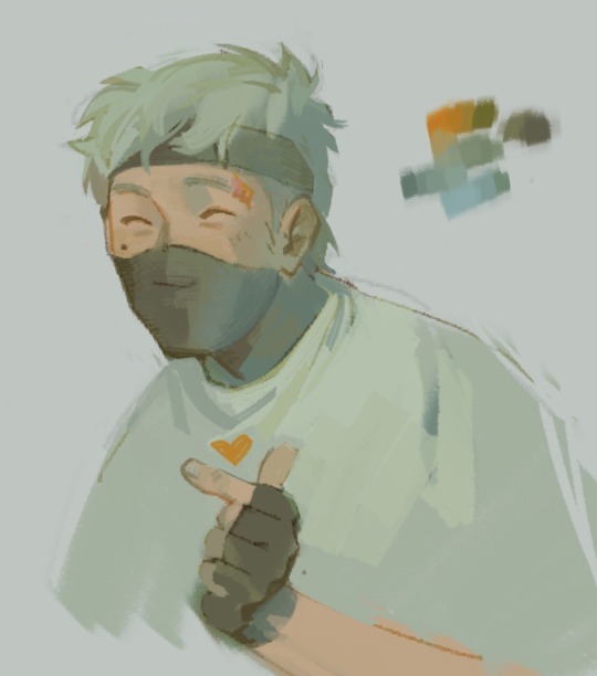
<3
#my art#ethoslab#don’t have much of a reason for this one lol just trying to figure out interesting colors without any filters/curve adjustments etc#also giving him the tall person slouch
2K notes
·
View notes
Text
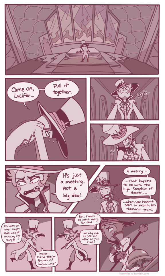
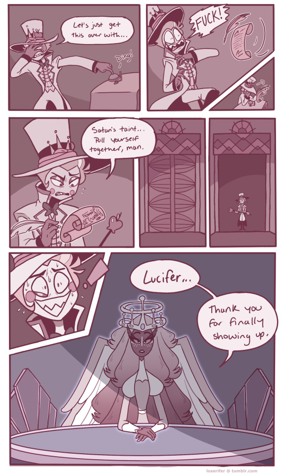
short comic im working on about lucifer's meeting with heaven because i love seeing him suffer >:)
Page 1-2/?
Next
reblogs are appreciated! :D
#hazbin hotel#lucifer morningstar#hazbin hotel sera#fanart#hazbin hotel fanart#comic#hazbin hotel comic#rays art#(edit: some colors were showing up different on my tablet#so i adjusted them)
2K notes
·
View notes
Text
I think 90% of my gripes with how modern anime looks comes down to flat color design/palettes.
Non-cohesive, washed-out color palettes can destroy lineart quality. I see this all the time when comparing an anime's lineart/layout to its colored/post-processed final product and it's heartbreaking. Compare this pre-color vs. final frame from Dungeon Meshi's OP.


So much sharpness and detail and weight gets washed out and flattened by 'meh' color design. I LOVE the flow and thickness and shadows in the fabrics on the left. The white against pastel really brings it out. Check out all the detail in their hair, the highlights in Rin's, the different hues to denote hair color, the blue tint in the clothes' shadows, and how all of that just gets... lost. It works, but it's not particularly good and does a disservice to the line-artist.
I'm using Dungeon Meshi as an example not because it's bad, I'm just especially disappointed because this is Studio Trigger we're talking about. The character animation is fantastic, but the color design is usually much more exciting. We're not seeing Trigger at their full potential, so I'm focusing on them.
Here's a very quick and messy color correct. Not meant to be taken seriously, just to provide comparison to see why colors can feel "washed out." Top is edit, bottom is original.
You can really see how desaturated and "white fluorescent lighting" the original color palettes are.
[Remember: the easiest way to make your colors more lively is to choose a warm or cool tint. From there, you can play around with bringing out complementary colors for a cohesive palette (I warmed Marcille's skintone and hair but made sure to bring out her deep blue clothes). Avoid using too many blend mode layers; hand-picking colors will really help you build your innate color sense and find a color style. Try using saturated colors in unexpected places! If you're coloring a night scene, try using deep blues or greens or magentas. You see these deep colors used all the time in older anime because they couldn't rely on a lightness scale to make colors darker, they had to use darker paints with specific hues. Don't overthink it, simpler is better!]
#not art#dungeon meshi#rant#i'm someone who can get obsessive over colors in my own art#will stare at the screen adjusting hues/saturation for hours#luckily i've gotten faster at color picking#but yeah modern anime's color design is saddening to me. the general trend leans towards white/grey desaturated palettes#simply because they're easier to pick digitally#this is not the colorists fault mind you. the anime industry's problems are also labor problems. artists are severely underpaid#and overworked. colorists literally aren't paid enough to do their best#there isn't a “creative drought” in the anime industry. this trend is widespread across studios purely BECAUSE it's not up to individuals#until work conditions improve anime will unfortunately continue to miss its fullest potential visually#don't even GET ME STARTED ON THE USE OF POST-PROCESSING FILTERS AND LIGHTING IN ANIME THOUGH#SOMEONE HOLD ME BACK. I HATE LENS FLARES I HATE GRADIENT SHADING I HATE CHROMATIC ABBERATION AND BLUR
2K notes
·
View notes
Text
we'll meet beyond the shore / we'll kiss just as before / happy we'll be beyond the sea / and never again i'll go sailing
#my art#one piece#one piece franky#nico robin#there exists a first attempt at this that took like eight hours and sucked majorly lmao#and a second point five attempt that i tried to color but that also didn't go so good !#dont have the brain power rn to adjust their canon colors to suit each-other in an illustration#frobin
2K notes
·
View notes
Text

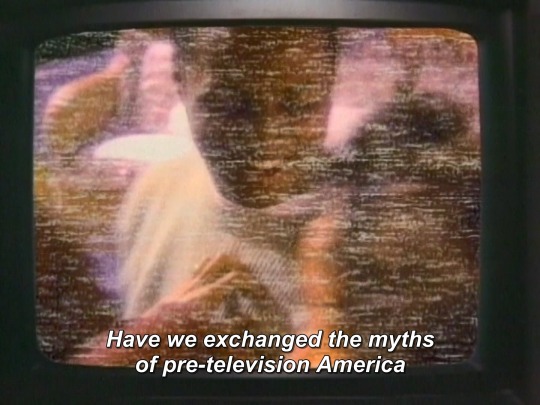


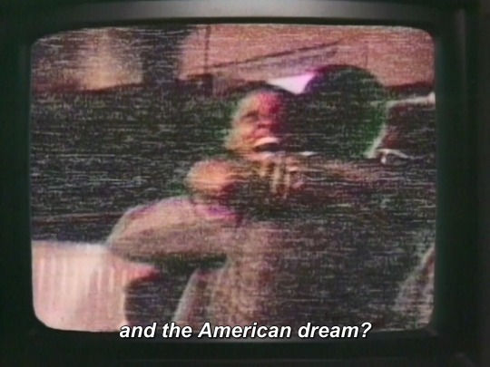
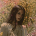
COLOR ADJUSTMENT (1992) dir. MARLON RIGGS
24 notes
·
View notes
Text
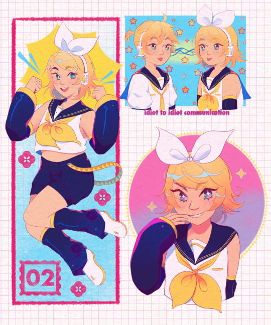
#kagamine rin#kagamine len#vocaloid#art#artists on tumblr#i feel like the colors need to adjusted but im too lazy
1K notes
·
View notes
Text


Mark Ryden x Paul Frank “Meat Purse”
#didnt find Sources for these but wanted to put em next to each other too sorry#theyve gotta be from the same place but the first one looks more like. color-adjusted idk should i have tried to make them match
2K notes
·
View notes
Text
Alternative Color Versions of my artwork “I Think it’s gonna Rain Soon”
Which one is your favorite?
#art#drawing#painting#digital art#clouds#cumulonimbus#color variations#edit#gradient map#color adjustment#filters
3 notes
·
View notes
Text


i am still soooo charmed by that one set of eyecatchers
#my art#zosan#one piece fanart#specifically as blue and i have been slowly working thru watching the raid on onigashima i have loved every time they do that thing where-#-they incorporate the motion of the scene into the motion of the first part of the eyecatcher#and then the other fist comes swinging w/ clownery lol#not specifically art for fic but like [anime villain glasses adjustment] i suppose i was thinking about my own Woeurke of Writinge...#ALSO in a very brief scrub-thru of some eps can you believe that you can literally only see part of sanji's shoulder in his yukata fit.#absolutely criminal. you can see the whole pattern when he's about to bitch out zoro re: hiyori but i had to guess at the pattern colors :^#i also know that yukata patterns can be like... modern/traditional or Gendered or in/formal but i have no idea of the specifics.....#one piece tag
2K notes
·
View notes
Text
dream from several days ago
#dream diary#artists on tumblr#flotsam diaries#sequential#...I said I was gonna sleep but that obviously didn't happen HAHA#anyways really happy that I was able to get the colors/vibes I wanted down fjhkgj :'D#a lot of nitpicking and adjusting hahah#also kororon/eve was on blast for the majority of drawing this hghhjf#alright good night/morning/something yall#edit: was thinking more and the feeling I wanted to get across I guess is like when someone voluntarily#reaches out to touch me/casually/platonically and it's like a 'you're touching me of your own free will??? o H'#because when I was growing up had a parent who wasn't physically affectionate/would kinda brush me off#and that uhhhh kinda internalized as I'm gross and therefore shouldn't touch other people#(lmao took covid lockdown and very good friends to basically destroy that feeling yay)#anYWAYS had feelings but didn't quite know how to verbalize it hahah
7K notes
·
View notes
Last Seen Blogs