#daredevil:love and war
Text
On Character Design
I sort of feel like the general "Boardroom Lizard" visual concept that's given us everything from Wilson Fisk to Mammoth Mogul or Lawrence Limburger has a bit of a limiting influence on pencilers, colorists and inkers.
In most cases, what you get is dark, flat colors with a few warm accents. A single-breasted suit for more casual sorts, double-breasted for fans of the eighties' Corporate Chic and for silhouettes in need of a more square frame, and the usual panoply of masculine accessories most suit-wearers wouldn't so much as consider, nowadays. It's hard not to shake the impression that some designers just hit up YouTube channels like Alpha M. or The Gentleman's Gazette and try and unrealistically cram everything into a single rendition of the Legtimate Businessman.
Then, there's 1986's Daredevil: Love & War. The story as penned by Frank Miller tries to underline both Murdock and Fisk's obsessive tendencies - one for justice rendered at nearly any cost, and the other for control also obtained through whatever means necessary. Both men are grasping for a certain illusion of safety and are coming at it from opposite ends of the same moral spectrum. As the title suggests, love interests also figure as propelling instances.
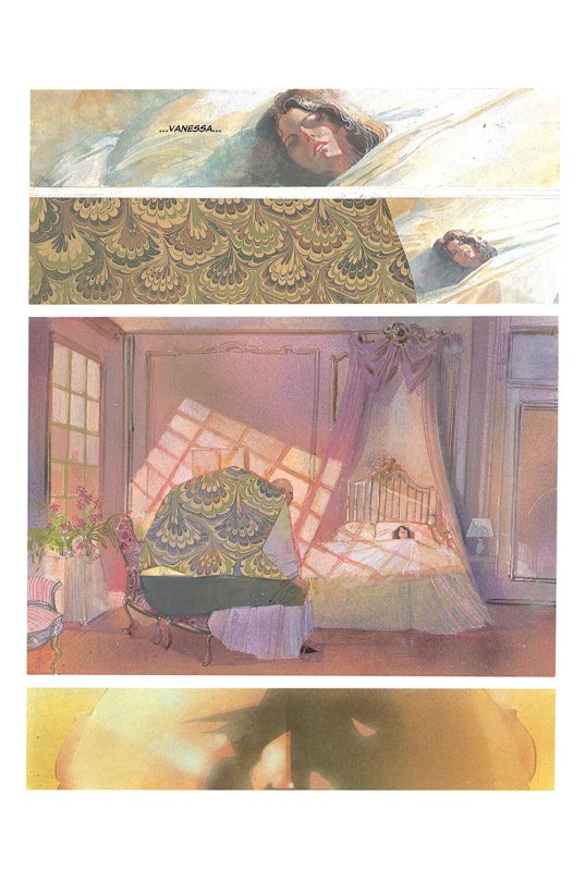
The thing is, what drew me to the story wasn't Miller's honestly occasionally po-faced Noir diatribes, so much as Bill Sienkiewicz's penmanship. Murdock looks more or less like he usually does, both in and out of costume - but Sienkiewicz's design for Fisk was later pulled out of the mothballs for Liev Schreiber's own rendition of Fisk, as seen in Spider-Man: Into the Spider-Verse. This is an almost Beast-like design (in reference to The Beauty and the Beast), contrasted by Vanessa's frail and diaphanous presence throughout the book. While she's basically a ghost ensconced in bedsheets, basically a reminder of her husband's precious few remaining shards of innocence, the Kingpin barely looks human.
When I think of similar concepts, names like Lex Luthor come to mind. Most modern renditions of Luthor never explicitly depict him as musclebound. Then there's other stylistic cousins of Fisk's, like the slightly more grounded design of Biker Mice from Mars' Lawrence Limburger, or others that depend entirely on the acting choices of those depicting them, like Ronny Cox's Dick Jones, in the original RoboCop. Cox, if found wearing anything other than his set of three-pieces, wouldn't have come across anywhere close as menacing. It's a bit of an interesting note to make, seeing as Kurtwood Smith desperately wanted out of his squeaky-clean typecasting. All he needed was Low-Grade Cyberpunk Slackwear and a set of Dad specs - and Clarence Boddicker was born.
Back to Sienkiewicz's concept. The era was one of, as I mentioned, flat colors. Back in 1986, layering in patterns in a page layout was a time-consuming process and a bit of a nightmare for your average bulk printing contractor. I still adore the watercolor finish of Love & War, and I have a hard time not imagining this particular Fisk as someone who looks at the era's army of Patrick Bateman clones and says something to the tone of "Screw them, I'm wearing so much paisley and herringbone over my unrealistic 500-plus-pounds of granite-slab comic-book flesh they'll either barf or wolf-whistle before drawing a gun in front of me."
The only thing missing to the portrait is a constant Dry Martini glass, or the revelation that Willie's not just a beast at Hapkido but that he also could lead Vanessa into a few Bossa Nova rounds, back when her health was steadier.
I mean, seriously. Look at this gorgeousness:
This big, sad man has absolutely zero self-esteem issues and probably push-kicks doors open with a hungry snarl, whenever he's not looming over his wife like an overprotective silverback gorilla with a pronounced thing for male haberdashery. Also, the mid-eighties' first few cell phone models probably looked ridiculously small in his hands. Dude was toting around something that felt like your average Nokia 3310 in his hand back when what you could expect out of mobile tech was 1987's massive Nokia Cityman!
I'd hug him, tell him to make sure Wifey gets plenty of fluids and sunshine, and maybe comment on him not necessarily needing to take all that latent grief and anxiety out on poor, superpowered blind people...
It's a bit amusing, considering how today's idea of the Unpredictable Boardroom Titan would probably have to go back to three-pieces and flat colors, to stand out amidst my last two workplaces' worth of loose blazers, graphic tees, skinny jeans and bright colors. Maybe 2022's idea of the Corporate Loose Cannon in Pop Culture should just mark a return to Italian graybeards pulling out designs from the Annie Lennox school and casually pushing for the legalization of cocaine...
#comic books#daredevil#daredevil:love and war#kingpin#wilson fisk#dick jones#robocop#clarence boddicker#character design#characters#bill sienkiewicz#frank miller#marvel#graphic novel
10 notes
·
View notes
Last Seen Blogs

kikiluvswonder-blog
Untitled

mutmaster
Sorry you had to see this

gatorpond
🐊the gator pond🐊

emzs-world
Emma 🌸

poke-manny
Poké Manny