#doing a proper website from scratch and with custom animations and other stuff
Explore tagged Tumblr posts
Visit Tumblr Blog
Explore Tumblr blogs with no restrictions, modern design and the best experience.
Last Seen Tumblr Blogs


Fun Fact
Post activity is at the highest at 4:00 pm EDT; notes peak at 10:00 pm EDT.
Text
Okay so my curious ass decided to go through work search in the usa (im not from the usa) but i literally dreamed my conclusion that graphic design needs varies a lot depending on the culture/society which is cool
#saw a lot of ui/ux designer roles and im like 😭 i just know how to build websites in wordpress which is nothing compared to actually#doing a proper website from scratch and with custom animations and other stuff#i have ptsd from coding a website from scratch pleas never make me do that again (i had to create servers and shit bro coding stuff)#BUT IN THE USA U GUYS USE A LOT WEBSITES AND where i live only big companies have one#txt
2 notes
·
View notes
Text
Architecture Visual Studio: Attract More Customers With CGI and Architectural Visualizations

The ability of an architect to convert average viewers or admirers of his works into customers is an indicator that he not only knows his stuff but did a fantastic job of translating his skills into value-laden benefits to prospective customers. Architectural firms can attract more customers by growing a solid reputation with the proper tools and maintaining it. With the help of a Vietnam architecture visual studio, an architect can quickly grow from an architectural design guru to a marketing expert. By visualizing your proficiency in 3D, you can attract more clients and make your business a success. Satisfied clients, in turn, willingly and eagerly recommend you to their friends and relatives, as well as post reviews and recommendations of your company.
Architectural studios and CGI Attract More Customers
Modern architects utilize architectural rendering services from the best architectural rendering companies to make 3D models for their clients that help prospective clients visualize the plans in a way not feasible using 2D drawings. These computer-generated models are also far more precise than traditional architectural drawings.
Where the architectural rendering services can deliver more than just interactive images from the 3D renders, they delve into architectural animation. This provides the visualizations with more video authenticity showing movies of a building rather than static images. When standard locational features are added, clients quickly start to see the possible connection a proposed building may have to the environment and its surrounding structures. This article focuses on ways to attract more customers, particularly with the help of the best architecture CGI studio.
Create a Dedicated Blog to Show Off Your Work
Every business needs an SEO-optimized website, and fresh, valuable content produced consistently is the hallmark of good SEO. The possibilities are limitless; there is so much information in texts and pictures that you can share on the blog. Yet, it seems that architects are only beginning to scratch the surface of what they can do with blog posts. These blog posts can hinge on the existing and future projects of the architecture firm, information about architectural design changes, and posts highlighting the firm's social responsibility or its clients.
Add More CGI Architectural Designs to Your Portfolio
For other experts, such as accountants, a portfolio is a checklist of financial assets or simply a large, thin case for carrying their loose papers. However, an architect’s portfolio is far more critical; it does not just hold documents; it also owns and showcases the architect’s career and, in some cases, his entire life work.
The architect’s 3D renders portfolio, which includes a set of creative work collected to show potential clients, needs an impeccable standard. Best architectural visualization studios allow you and your potential clients to get incredible images of buildings from any angle and time of the day, weather or season. You can include everything in your portfolio, from the live projects completed or in progress to ideas you have for future projects.
CGI in Video
Video marketing is today’s champion when it comes to promotion. First, video attracts more attention and yields more results on social media. Video also adds a tangibility that helps the performance of less concrete products, such as architectural services. Ultimately, video is more memorable than other marketing forms.
More and more social media outlets allow embedding videos into posts and running video advertising campaigns. You can include CGI imagery in videos or even virtual tools people will appreciate watching. It’s a powerful tool for bringing traffic, gaining recognition, and attracting more customers from social media and your website.
Final Words
Architectural visualizations loaded with CGI offer support for the text and ensure viewers readily comprehend the intended message. Although the text is exact and helpful in passing relevant information to potential clients, they are quickly forgotten. Younger clients are more likely to find them unengaging or boring. Instead, you can concentrate on attracting more clients to your brand through top archviz studios, generating more awareness, and inspiring message retention.
0 notes
Text
Striking a Balance Between Native and Custom Select Elements
Here’s the plan! We’re going to build a styled select element. Not just the outside, but the inside too. Total styling control. Plus we’re going to make it accessible. We’re not going to try to replicate everything that the browser does by default with a native <select> element. We’re going to literally use a <select> element when any assistive tech is used. But when a mouse is being used, we’ll show the styled version and make it function as a select element.
That’s what I mean by “hybrid” selects: they are both a native <select> and a styled alternate select in one design pattern.
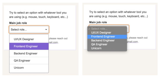
Custom selects (left) are often used in place of native selects (right) for aesthetics and design consistency.
Select, dropdown, navigation, menu… the name matters
While doing the research for this article, I thought about many names that get tossed around when talking about selects, the most common of which are “dropdown” and “menu.” There are two types of naming mistakes we could make: giving the same name to different things, or giving different names to the same thing. A select can suffer from both mistakes.
Before we move ahead, let me try to add clarity around using “dropdown” as a term. Here’s how I define the meaning of dropdown:
Dropdown: An interactive component that consists of a button that shows and hides a list of items, typically on mouse hover, click or tap. The list is not visible by default until the interaction starts. The list usually displays a block of content (i.e. options) on top of other content.
A lot of interfaces can look like a dropdown. But simply calling an element a “dropdown” is like using “fish” to describe an animal. What type of fish it is? A clownfish is not the same as a shark. The same goes for dropdowns.

Like there are different types of fish in the sea, there are different types of components that we might be talking about when we toss the word “dropdown” around:
Menu: A list of commands or actions that the user can perform within the page content.
Navigation: A list of links used for navigating through a website.
Select: A form control (<select>) that displays a list of options for the user to select within a form.
Deciding what type of dropdown we’re talking about can be a foggy task. Here are some examples from around the web that match how I would classify those three different types. This is based on my research and sometimes, when I can’t find a proper answer, intuition based on my experience.
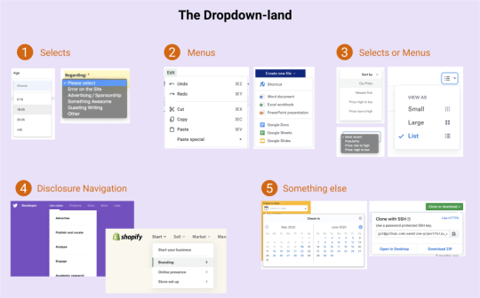
Dropdown-land: Five scenarios where different dropdowns are used across the internet. Read the table below for a detailed description.
Diagram LabelScenarioDropdown Type1The dropdown expects a selected option to be submitted within a form context (e.g. Select Age)Select2The dropdown does not need an active option (e.g. A list of actions: copy, paste and cut)Menu3The selected option influences the content. (e.g. sorting list)Menu or Select (more about it later)4The dropdown contains links to other pages. (e.g. A “meganav” with websites links)Disclosure Navigation5The dropdown has content that is not a list. (e.g. a date picker)Something else that should not be called dropdown
Not everyone perceives and interacts with the internet in the same way. Naming user interfaces and defining design patterns is a fundamental process, though one with a lot of room for personal interpretation. All of that variation is what drives the population of dropdown-land.
There is a dropdown type that is clearly a menu. Its usage is a hot topic in conversations about accessibility. I won’t talk much about it here, but let me just reinforce that the <menu> element is deprecated and no longer recommended. And here’s a detailed explanation about inclusive menus and menus buttons, including why ARIA menu role should not be used for site navigation.
We haven’t even touched on other elements that fall into a rather gray area that makes classifying dropdowns even murkier because of a lack of practical uses cases from the WCAG community.
Uff… that was a lot. Let’s forget about this dropdown-land mess and focus exclusively on the dropdown type that is clearly a <select> element.
Let’s talk about <select>
Styling form controls is an interesting journey. As MDN puts it, there’s the good, the bad, and the ugly. Good is stuff like <form> which is just a block-level element to style. Bad is stuff like checkboxes, which can be done but is somewhat cumbersome. <select> is definitely in ugly terrain.
A lot of articles have been written about it and, even in 2020, it’s still a challenge to create custom selects and some users still prefer the simple native ones.
Among developers, the <select> is the most frustrating form control by far, mainly because of its lack of styling support. The UX struggle behind it is so big that we look for other alternatives. Well, I guess the first rule of <select> is similar to ARIA: avoid using it if you can.
I could finish the article right here with “Don’t use <select>, period.” But let’s face reality: a select is still our best solution in a number of circumstances. That might include scenarios where we’re working with a list that contains a lot of options, layouts that are tight on space, or simply a lack of time or budget to design and implement a great custom interactive component from scratch.
Custom <select> requirements
When we make the decision to create a custom select — even if it’s just a “simple” one — these are the requirements we generally have to work with:
There is a button that contains the current selected option.
Clicking the box toggles the visibility of the options list (also called listbox).
Clicking an option in the listbox updates the selected value. The button text changes and the listbox is closed.
Clicking outside the component closes the listbox.
The trigger contains a small triangle icon pointing downward to indicate there are options.
Something like this:
CodePen Embed Fallback
Some of you may be thinking this works and is good to go. But wait… does it work for everyone? Not everyone uses a mouse (or touch screen). Plus, a native <select> element comes with more features we get for free and aren’t included in those requirements, such as:
The checked option is perceivable for all users regardless of their visual abilities.
The component can interact with a keyboard in a predictable way across all browsers (e.g. using arrow keys to navigate, Enter to select, Esc to cancel, etc.).
Assistive technologies (e.g. screen readers) announce the element clearly to users, including its role, name and state.
The listbox position is adjusted. (i.e. does not get cut off of the screen).
The element respects the user’s operating system preferences (e.g high contrast, color scheme, motion, etc.).
This is where the majority of the custom selects fail in some way. Take a look at some of the major UI components libraries. I won’t mention any because the web is ephemeral, but go give it a try. You’ll likely notice that the select component in one framework behaves differently from another.
Here are additional characteristics to watch for:
Is a listbox option immediately activated on focus when navigating with a keyboard?
Can you use Enter and/or Space to select an option?
Does the Tab key jump go to the next option in the listbox, or jump to the next form control?
What happens when you reach the last option in the listbox using arrow keys? Does it simply stay at the last item, does it go back to the first option, or worst of all, does focus move to the next form control?
Is it possible to jump directly to the last item in the listbox using the Page Down key?
Is it possible to scroll through the listbox items if there are more than what is currently in view?
This is a small sample of the features included in a native <select> element.
Once we decide to create our own custom select, we are forcing people to use it in a certain way that may not be what they expect.
But it gets worse. Even the native <select> behaves differently across browsers and screen readers. Once we decide to create our own custom select, we are forcing people to use it in a certain way that may not be what they expect. That’s a dangerous decision and it’s in those details where the devil lives.
Building a “hybrid” select
When we build a simple custom select, we are making a trade-off without noticing it. Specifically, we sacrifice functionality to aesthetics. It should be the other way around.
What if we instead deliver a native select by default and replace it with a more aesthetically pleasing one if possible? That’s where the “hybrid” select idea comes into action. It’s “hybrid” because it consists of two selects, showing the appropriate one at the right moment:
A native select, visible and accessible by default
A custom select, hidden until it’s safe to be interacted with a mouse
Let’s start with markup. First, we’ll add a native <select> with <option> items before the custom selector for this to work. (I’ll explain why in just a bit.)
Any form control must have a descriptive label. We could use <label>, but that would focus the native select when the label is clicked. To prevent that behavior, we’ll use a <span> and connect it to the select using aria-labelledby.
Finally, we need to tell Assistive Technologies to ignore the custom select, using aria-hidden="true". That way, only the native select is announced by them, no matter what.
<span class="selectLabel" id="jobLabel">Main job role</span> <div class="selectWrapper"> <select class="selectNative js-selectNative" aria-labelledby="jobLabel"> <!-- options --> <option></option> </select> <div class="selectCustom js-selectCustom" aria-hidden="true"> <!-- The beautiful custom select --> </div> </div>
This takes us to styling, where we not only make things look pretty, but where we handle the switch from one select to the other. We need just a few new declarations to make all the magic happen.
First, both native and custom selects must have the same width and height. This ensures people don’t see major differences in the layout when a switch happens.
.selectNative, .selectCustom { position: relative; width: 22rem; height: 4rem; }
There are two selects, but only one can dictate the space that holds them. The other needs to be absolutely positioned to take it out of the document flow. Let’s do that to the custom select because it’s the “replacement” that’s used only if it can be. We’ll hide it by default so it can’t be reached by anyone just yet.
.selectCustom { position: absolute; top: 0; left: 0; display: none; }
Here comes the “funny” part. We need to detect if someone is using a device where hover is part of the primary input, like a computer with a mouse. While we typically think of media queries for responsive breakpoints or checking feature support, we can use it to detect hover support too using @media query (hover :hover), which is supported by all major browsers. So, let’s use it to show the custom select only on devices that have hover:
@media (hover: hover) { .selectCustom { display: block; } }
Great, but what about people who use a keyboard to navigate even in devices that have hover? What we’ll do is hide the custom select when the native select is in focus. We can reach for an adjacent Sibling combinatioron (+). When the native select is in focus, hide the custom select next to it in the DOM order. (This is why the native select should be placed before the custom one.)
@media (hover: hover) { .selectNative:focus + .selectCustom { display: none; } }
That’s it! The trick to switch between both selects is done! There are other CSS ways to do it, of course, but this works nicely.
Last, we need a sprinkle of JavaScript. Let’s add some event listeners:
One for click events that trigger the custom select to open and reveal the options
One to sync both selects values. When one select value is changed, the other select value updates as well
One for basic keyboard navigation controls, like navigation with Up and Down keys, selecting options with the Enter or Space keys, and closing the select with Esc
CodePen Embed Fallback
Usability testing
I conducted a very small usability test where I asked a few people with disabilities to try the hybrid select component. The following devices and tools were tested using the latest versions of Chrome (81), Firefox (76) and Safari (13):
Desktop device using mouse only
Desktop device using keyboard only
VoiceOver on MacOS using keyboard
NVDA on Windows using keyboard
VoiceOver on iPhone and iPad using Safari
All these tests worked as expected, but I believe this could have even more usability tests with more diverse people and tools. If you have access to other devices or tools — such as JAWS, Dragon, etc. — please tell me how the test goes.
An issue was found during testing. Specifically, the issue was with the VoiceOver setting “Mouse pointers: Moves Voice Over cursor.” If the user opens the select with a mouse, the custom select will be opened (instead of the native) and the user won’t experience the native select.
What I most like about this approach is how it uses the best of both worlds without compromising the core functionality:
Users on mobile and tablets get the native select, which generally offers a better user experience than a custom select, including performance benefits.
Keyboard users get to interact with the native select the way they would expect.
Assistive Technologies can interact with the native select like normal.
Mouse users get to interact with the enhanced custom select.
This approach provides essential native functionality for everyone without the extra huge code effort to implement all the native features.
Don’t get me wrong. This technique is not a one-size-fits-all solution. It may work for simple selects but probably won’t work for cases that involve complex interactions. In those cases, we’d need to use ARIA and JavaScript to complement the gaps and create a truly accessible custom select.
A note about selects that look like menus
Let’s take a look back at the third Dropdown-land scenario. If you recall, it’s a dropdown that always has a checked option (e.g. sorting some content). I classified it in the gray area, as either a menu or a select.
Here’s my line of thought: Years ago, this type of dropdown was implemented mostly using a native <select>. Nowadays, it is common to see it implemented from scratch with custom styles (accessible or not). What we end up with is a select element that looks like a menu.
A <select> is a type of menu. Both have similar semantics and behavior, especially in a scenario that involves a list of options where one is always checked. Now, let me mention the WCAG 3.2.2 On Input (Level A) criterion:
Changing the setting of any user interface component should not automatically cause a change of context unless the user has been advised of the behavior before using the component.
Let’s put this in practice. Imagine a sortable list of students. Visually, it may be obvious that sorting is immediate, but that’s not necessarily true for everyone. So, when using <select>, we risk failing the WCAG guideline because the page content changed, and ignificantly re-arranging the content of a page is considered a change of context.
To ensure the criterion success, we must warn the user about the action before they interact with the element, or include a <button> immediately after the select to confirm the change.
<label for="sortStudents"> Sort students <!-- Warn the user about the change when a confirmation button is not present. --> <span class="visually-hidden">(Immediate effect upon selection)</span> </label> <select id="sortStudents"> ... </select>
That said, using a <select> or building a custom menu are both good approaches when it comes to simple menus that change the page content. Just remember that your decision will dictate the amount of work required to make the component fully accessible. This is a scenario where the hybrid select approach could be used.
Final words
This whole idea started as an innocent CSS trick but, after all of this research, I was reminded once more that creating unique experiences without compromising accessibility is not an easy task.
Building truly accessible select components (or any kind of dropdown) is harder than it looks. WCAG provides excellent guidance and best practices, but without specific examples and diverse practical uses cases, the guidelines are mostly aspirational. That’s not to mention the fact that ARIA support is tepid and that native <select> elements look and behave differently across browsers.
The “hybrid” select is just another attempt to create a good looking select while getting as many native features as possible. Don’t look at this technique experiment as an excuse to downplay accessibility, but rather as an attempt to serve both worlds. If you have the resources, time and the needed skills, please do it right and make sure to test it with different users before shipping your component to the world.
P.S. Remember to use a proper name when making a “dropdown” component. 😉
The post Striking a Balance Between Native and Custom Select Elements appeared first on CSS-Tricks.
Striking a Balance Between Native and Custom Select Elements published first on https://deskbysnafu.tumblr.com/
0 notes
Text
The Best Single Page WordPress Themes for Business | Templified
New Post has been published on https://templified.com/the-best-single-page-wordpress-themes-for-business/
The Best Single Page WordPress Themes for Business
Here’s a new collection of single page themes for amazing business websites. They’re great for all kinds of businesses, app promotions, general brick and mortar businesses. You get the deal. Let’s dig in!
Verko, One Page WordPress Applications Theme
This theme is called Verko, it’s a one-page WordPress theme that’s great for app launches, software promotion or anything else that only requires one page to tell the entire story of what it is your website is all about. At times, themes are little too intricate and detailed, not all websites truly require a multi-page theme, that’s where like Virgo comes in. This is a WordPress theme that focuses on marketing your products and services, it’s got landing page templates and it really helps you encourage all users to take the next step to contacting your business. That’s what a call to action is all about. You can use a photo or video to achieve this, Verko is suitable for just about any type of business or creative agency that wants Maximum Impact in delivering their message to potential customers. The steam was created with a minimalist, modern design, it offers masterful slider presentation and visual composer to help ensure incredible flexibility and a great user experience.
If you’ve been searching for a one page theme and you’ve come across this particular page, well, that’s good, I guess? But maybe this theme isn’t exactly what you want? If Verko isn’t doing it for you, then you may want to look at our full one page WordPress theme collection. That’s a great place to find exactly what you want to find. The whole collection is full of amazing stuff, it’s got a wide range of themes, each one of them has a little bit different set of features or a different style. The whole collection is full of fantastic themes that can work for any sort of one page theme website. So, anyway, hopefully, you can find what you want if the Verko theme isn’t right for you.
Demo More Information Get Hosting
LightOne, Clean, Modern One Page Parallax WordPress Theme
LightOne is a clean and bright WordPress creative theme that uses one page design, smooth parallax scrolling and big, bold images to get it’s point across.
LightOne is a well-designed one page Parallax WordPress theme that is great for digital creative companies that want to establish a great-looking website or rebrand an old, dated site. By using the power of visual composer and bootstrap, this user-friendly WordPress theme allows you to really wow your clients, and establish new business at the same time.
Let’s have a look at the great looking at home page style of the LightOne WordPress template.
You may wonder if the themes name is a reference to the light and bright, airy and minimal style of this template, or whether or not it’s referring to the lightweight code.
In fact, it’s both.
This 100% GPL license WordPress theme loads up fast, looks great on every device tested and it’s an amazing and modern website for advertising agencies, corporate Pages, creative companies, digital agencies, Freelancers and more. With a built-in blog, you can beat the bushes to attract new traffic, which is always something that creative companies need to do. You’ll certainly be providing a great looking theme that gives a great first impression to all of your visitors. If you want to showcase your creative work in a unique and fun manner, light one could be the solution you’ve been looking for.
If you’d like to see a more extensive selection of one page themes, why not have a look at our collection? We have assembled quite a group of single page templates, each one of them better than the last. That’s not to say we put the best one last, you might find that the first one is the best. I could keep going on and on and flattering about which one page theme is better than the other, but honestly, that’s all about your personal taste and the needs of your company. Anyway, I will be back with more one page templates soon, so see you later.
Demo More Information Get Hosting
SCRN, One Page Parallax WordPress Theme
SCRN is a one-page, responsive portfolio theme that is ready for any sort of work. No matter what you want to promote, this mobile-friendly theme has the minimalist one page design, along with unattractive blog, that you may have been looking for. It even supports videos in portfolio sections, something that not all one page themes seem to offer some of the main features of this theme include the responsive design, and advanced theme options panel for quick customization of your sight, plenty of different visual composer blocks for adding content and helping you to move things around, and sticky navigation. That is all important when building a one-page website.
What is it that makes one page WordPress themes so popular? Well, when it comes to the various layouts that are available to you, one page themes are a little bit more simple and easy to navigate. That doesn’t mean that your website is going to be simplistic or generic. Far from it, you can have all the dynamic look and feel that a multi-page theme offers, but using just one page.
If your website is specifically usually focused, perhaps a creative agency or a digital agency, you’re going to love one page themes for building a great-looking portfolio for your content. In addition, you can use the custom post managers to help you develop any type of custom posts with ease. However, that’s not what one page themes are bad. The Collection that we have built of WordPress one page themes, it’s a great way to find multiple different layouts that provide a great starting point for building your website.
Ensuring that your site has the proper layout is critical to the success of your website. If you have settled on a one page design for your site, but you want to add or change things in the future, many of the themes in our collection offer multi-page options down the road. He’s multi-purpose themes are a great way to ensure continuing flexibility and to make it so that you don’t have to completely start over from scratch if you decide to change the look of your sight.
Throughout our entire collection, you’ll find multiple different themes that offer both one page and multi-page styles, I think that we have found most of the best themes, but there are plenty more out there and more coming around every day. We are committed to adding more fantastic games all the time, with your help, we can achieve that. If you know of a fantastic one page WordPress theme, we would love to hear about it in the comments. We will try our best to ensure that we add all of the highest quality themes that there are to offer.
Demo More Information Get Hosting
Swenson, Full Featured Bootstrap One Page Theme
With Swenson, you’re getting a wonderful, soft almost ephemeral WordPress theme that still packs a bunch that belies it’s innocent and lovely design features. Installation is simple and set up requires no knowledge of code or web page development. This template’s construction, assembled with CSS3 and HTML5 combined with the popular Bootstrap 3 framework, allows for layout alternatives that are truly unique and fluid. The resultant websites display on any size screen and that use Swenson are entirely receptive. Both one page and multiple page websites can be built with ease.
That’s the blog demo, standard version. We’ve gathered up a ton more personal blog themes if that’s what you’ve come here for.
Now, despite the fact that Swenson is simple and user friendly, that does not mean it lacks in features, although Swenson is simple to work with. The parallax scrolling design that is popular offers easy navigation up and down the page. Entire customization of headers enables you to take control of website visitors’ first impressions. The premium Visual Composer plug in lets you drag various blocks of widgets, content or elements into place. Slideshows and other dynamic demonstrations with eye catching animations and transitions can be assembled using the Revolution Slider plugin. All of these features and more can be deployed or customized in the Redux alternatives panel.
That’s the rundown for Swenson and I think you’ll love what you see, should this be the theme you choose for your next website.
Demo Get Hosting
Honshi, WordPress Business Theme for One Page Websites
Simple and Clean, whether you want your website to offer a single page style or a multi-page book, Honshi is a themed well worth considering. This theme offers plenty of features that are similar to a lot of other creative agency or minimalist portfolio sites, one click installation to get your demo data up and running quickly, helping you achieve a solid base looked customized.
There’s also a powerful page builder that lets you do just about anything you want in terms of creating layouts for your posts and pages. In addition to that, Honshi gives you powerful admin panel that helps you create edits to the way out and look at your side, all without having to know anything about coding. There is an impressive documentation included and fantastic support as well.
This is a smooth and Sleek theme that was inspired by Nature. That’s a really neat thing, I think that as a one-page theme, that intuitive design and familiar style is going to really set it apart from the rest. Also, considering how flexible this theme is, it really doesn’t matter what type of site you are attempting to create, you will be left with a stunning and beautiful web page, no matter what the subject matter.
If you’re searching for even more options for building the best one page WordPress theme that you possibly can, you’re going to want to have a look at our full collection of themes. Businesses and websites that don’t have a gigantic amount of content, sometimes a one-page name is all you need. You can create a very interactive user experience that delivers your content first and foremost.
Our collection of one page themes for WordPress is great for self-hosted WordPress websites that want to seem that really delivers on content presentation, without the necessity to have multiple Pages involved. Some are great for portfolios or photography websites, others for businesses. Most of them are incredible multi-purpose themes that include one click demo import and all of them, of course, I have a single page option. All you’ll need to do is replace your content and get started quickly. There’s more to live than multi-page themes, you know what I mean? I think one page themes like this one are trending for a reason. People don’t have the time to wade through tons of pages, especially if the information is clearly presented in a professional and stylish way. That’s what this collection is all about, so check it out for more great themes.
Oh yes, many of them also offer WooCommerce support, allowing you to set up a shop quickly and efficiently. We’ve gathered up nothing but the most beautiful one page themes that can be easily adapted to suit your needs. Many of the themes also include multi-page options, although that’s probably not why you’re here if you are looking for a one-page theme. Still, it’s always nice to have flexibility going forward if you should decide to add more pages to your website.
DemoMore Information Get Hosting
0 notes
Text
4 Ad Serving Companies For Blogs
Ad Serving Companies For Blogs The Internet has really changed the way in which most of us communicate each day. E-mail, chat, and instant message have replaced, now and again, most of the traditional kinds of communication that took place earlier than the Internet coming on the scene. Another way of communicating is simply by blogs. Although there exist several different logic behind why you need to create a blog website, the way in which you decide to go about carrying it out is normally the same. Here are some pointers to acquire started. In the recent years blogging has gained plenty of popularity plus more plus more people are adopting money blogs to earn their living. A fun and interesting strategy to make money, blogs have become interesting to publish and browse. However it is less easy as it appears to be together requires doing lots of writing because of it, so if you're somebody that is a useful one at maintaining and writing them you then should take the job a step further and earn a great income from it. Having a blog design solution that is practical and personable is certainly one section of the online marketing arsenal for all web page owners. Indeed, any successful online business employs using a blog. Craigslist is one such place when a blog design solution actually works to direct designated people to your site. The popular social site was created with a person (yes, his real name is Craig) who sought to provide a party place on the internet for anybody who seeks to find compatible friends and acquaintances of assorted interests. By having no less than one or more entries every day on your blog, Craigslist members who've an interest in your website will flock for a business in countless volumes. Blogging at similar sites like MySpace and Facebook offer similar advantages. This is a easy way to ensure more exposure on your blog before a whole new audience and it's all free. Once they have visited your website, the standard readers in the blog where you posted, may subscribe to your website whenever they find that the info you provide is interesting. Run a search in Google to get sites which are prepared to take guest posts. In case you want to make it happen a substantial scale, then try contacting prominent blogs and have them when they would accept a guest post of your stuff. (more info) During the competition period from November 20, 2010 to January 31, 2011, each finalist uses blog posts, photos, videos along with other social websites tools to share with you their daily experiences with the medical services available in Thailand using a global audience. The goal is always to inform readers with what is available and to persuade these to find out more about Thailand's top medical tourism destinations. When internet site owners devise your blog design solution for website marketing schemes, they often disregard a smaller known avenue for producing the kind of results that bring enthusiastic visitors. Blogging on places for example MySpace, Facebook, and Craigslist can provide a continuous stream of happy customers you have especially focused. The most popular and well-known blogging sites Wordpress and Blogger will obviously yield a vast number of potential prospects, nevertheless the odds of them being as focused since the aforementioned clientele is not a forgone conclusion. Most statistical internet analyses indicates that blogging sections on MySpace, Facebook, and Craigslist contribute a much more qualitative base of individuals to a uniquely targeted internet site. The main ingredient in baking up an article may be a large dose of creativity. while creativity might come natural to many folks, some simply enters a block or one thing fot it effect that will drive someone crazy. several writers have literally torn their hair out once they get writers block and merely can't seem to acquire inventive juices flowing. First of all, we ought to ask the questions,? Why do blogs exist? And what exactly are they here for?? Well, in an ideal world ?good? blogs would help people connect, sharing knowledge and feelings about issues in your life. As they are journals written by individuals we may hope that they can?d be readable and open to comment by other people, not really a select number of friends. The key is speaking in a manner that is understandable through the masses, eliminate acronyms and local slang that only few will comprehend. Keep the sentences grammatically simple and generally short and concise. Blogging is usually an excellent strategy to develop many different income streams. As your blog grows more popular, you could start to sell ad' space within your sidebars. You might even consider adding Google Adsense code. That's only one monetization option you can decide to choose. There are plenty of others all attempting to grab your blog visitors' attention. Another of these is Text Link Ads. Another option is AdBrite. You can also sell right to individual private advertisers. If you sell six spaces on your own sidebar at $50 monthly, that's $300 monthly that you can bring in just through blogging! (more info) The most successful individuals have made a lot in investment in their chosen vocation before it turned profitable for the kids. Be ready for mistakes, people as you desire to make lots of them prior to getting success. You must learn and test out the organization models, monetizing models, themes, SEO and content. The only constant element ought to be a genuine urge to aid your readers. It works better than selling. When you have learnt consistently with all the trends of blogging industry, you would have financially viable blogs. Blogging is growing so that you can achieve a competitive advantage, this is even recognized by new web marketers. Obviously, you know what blogging is. Reading blogs might already be an integral part of your internet activities. You really need to start a blog. They are more speedily to begin with with as compared to traditional websites. Is it since it looks too costly and time consuming? Also, blogging requires no technical expertise of any sort. This is one of the few methods containing no bad side or risks involved. These are just some reasons to begin. Your business needs a blog in our online environment. Following 's what you should know concerning blogging. Generating a great sales revenue online could possibly be problematic though utilizing the assistance linked with Mark Ling you will find a way on the way to augment your personal online salary quickly working together with niche promoting and online marketing sites in order to build your personal small enterprise. Take a peek at the particular affilojetpack Review when it comes to info. Many individuals who run image blogs are photographers by trade, but photo blogging is likewise respected among hobbyists and amateur shutterbugs. To be sure, quite a lot of one of the most well-liked photo blogs have gained attention for the reason that pictures with them are from the highest artistic caliber, and a number of individuals that run these striking blogs are graduates of prestigious art schools and still have impressive professional portfolios. However, a few of one of the most famous and quite a few often visited photo blogs are as notable because of their concepts are you aware that pictures themselves. Certain photo blogs, like the popular "Cute Overload" which features picture after picture of adorable animals, are definitely more relating to the thematic content of the pictures than they are concerning the style in which the snapshots are taken. Your blog allow you put some personality in your business. Too many sellers think they should try to create formal, over-long sales pages to be able to convince website visitors to buy a few. You might have even paid an experienced copywriter to publish a proper website so that you can try to increase sales. Blogging is really a great deal more casual and you will put these potential customers confident by allowing them know you will find there's real person behind the business agenda. Your sales will increase if these potential customers understand somewhat with regards to you as a person. A template is only the kick off point to your website. If you use an unmodified standard design, readers are able to see through you. By using a facts you will gain a legitimate readership that understands how much time you put into your blog. You will learn about 3rd party and external template providers and judge whether you want a completely custom template by employing a designer. While designers can be very expensive, you will understand methods to implement what you need on the cheap. We even show you the way to create your own design from scratch should you be more comfortable with HTML. (more info) It mostly depends on your audience. Think of people reading your site: how elderly they may be, what their occupation is, their hobbies, interests, languages, etc. That will help you much if you want to add humor to your website article. Yes, sense of humor is incredibly much appreciated with circus and soap operas. Even Dr. House cracks off jokes constantly - that is why he is much liked by males and females also, though. Having your own private blog can indeed be looked at as demanding, however when you consider it, creating your individual blog is pretty uncomplicated. The point that makes things demanding is the matter that you need to make your blog seem intriguing for a followers and get them to popular with your viewers. This may require time and devotion certainly. To have a professional blog site, it will have standout content. You should create many pieces to maintain your blog refreshed with a continual basis. To support you in building your personal blog, the 3 things enumerated below could be instrumental for you. Undoubtedly that does not only ordinary internet surfers prefer blogs to static websites but those people who are generating income on line is anxious in blogs with these to clarify with their clients. But these days they went even further. They have mastered the blogs to work for the children automatically. How is that? Auto blogging my girlfriends! Automatic websites software can help you here with developing automated content websites or set up your site, optimize it, place your deal and accumulate revenue. The more blogs there is a more income you generate. Once you know creating article posts who use SEO, you will see big results for yourself. Posting as being a guest writer on another woman's blog is an excellent strategy to drive site visitors for a site. You can leverage other sites' traffic by writing a guest post for the kids. To ensure that the traffic is relevant for a site, be sure to only post on blogs within the same niche. 1. Before you create a blog, it is best to set certain goals and also to concentrate on what approach you wish to make. Is writing just a hobby and you just wish to write blogs to teach people and supply pieces of useful information? Do you need to blog as being a form of advertising tool for a product you imagine directly into convince others? Or have you been aiming to establish blogging for money career as you go along? Having these as the objective will clear your head, leading one to a less arduous way to develop a blog.(more info) AT THIS JUNCTURE -- As you can see because of this little info already given this article is in some form or manner linked to blog dewasa. It is not only related but can also be very helpful when searching for specifics of blog software free, blogthings, disney cruise line cruise forums and blogs, frank. Clergy collar supplies the various clergy shirts necessary for different clergies worldwide. You may check out the lines of shirts available that is certainly well suited for the specified clothing demanded from the diverse religious sects. Clergy shirts or clerical shirts, these are available detailed with the various clergy suits needed. Street wear and ordinary habits are available too. You may take advantage of an immediate delivery or a next day delivery in line with the urgency of needs. Since all clergies in spite of order or sect must wear clergy shirts, clergy collar produces the different clerical shirts required. Instead since the dot com bubble burst in the late 90's the world wide web again became a wasteland of nerd experimentation these days the nerd seed ended up planted in individuals that previously could have been turned off by all the science fiction and the math. As the aughts progressed and the internet had become the hot bed of commerce folks always did actually realize it might become another world grew along with many ways it absolutely was just an outgrowth of the the internet ended up being to start out with. Those forums were becoming the blog. "The Blog" was becoming the simplest part of Web 2.0. A world of "user generated content." No longer were people registering to the world wide web to visit sites about things they wished to find about. Now they are intended those sites. The shock waves of the were felt rapidly and became compounded as new platforms particularly social networking sites (Friendster begat MySpace, MySpace begat Facebook etc.) made people increasingly more comfortable and also enslaved by sharing themselves in addition to their opinions on the net. This will have the Google spider to index your new sites or web pages in a day or two and consider your site because of its database due to the criteria of the you are trying to find an easy, inexpensive and efficient method to make a great deal of content on your internet site, that your search engines like google will pick-up, head to Blogger and start a no cost blogging account and join the blogosphere.- The Love Affair between the Search Engines, Blogs and RSSI have been extolling the SEO advantages of Blogs since almost a couple of years ago. Although blogs and search engines like yahoo are not appearing to take pleasure from the free for those relationship they once had, the engines like google and blogs seem to be married 'for better and worst'.The romance and infatuation phase between search engines like yahoo and blogs has waned due to blog spam. However engines like google dare not divorce blogs because they usually cook up regularly updated content.Blogs may also be internet search engine friendly in design. As publishers we like blogs because it's a great way for us to update our sites with new content. Visitor blogging are vast changing the way in which Internet advertising is conducted. Aside from report submission to write directories, visitor blogging has become the one particular of the very most effective ways to enhance link building that happen to be also vital in your website's search engine optimisation. So to turn out to be an effective visitor blogger, you have got to possess superior traits and skills to make a successful guide. Below are many of the techniques to develop into an expert author for guest blogs. (more info) Till date, she holds many medal records. During the Afro-Asian Games in 2003, she won a Gold medal in Singles and doubles matches. She also won Gold inside mixed doubles matches and her team won Gold as well. During the Asian games in 2006 in Doha, she won a Gold medal inside the mixed doubles match accompanied by silver inside the Singles match. Her team won a Silver medal within this tournament. She won a Silver medal inside mixed doubles match in Guangzhou and Bronze medal in Singles match this season. She won a Bronze in 2002 Busan Mixed Doubles matches. During the Commonwealth Games kept in New Delhi this season, she won Silver medal in the Singles match and Bronze medal within the Women's doubles match. When internet site owners devise your site design solution for internet marketing schemes, they frequently disregard a lesser known avenue for producing the sort of results that bring enthusiastic visitors. Blogging on places including MySpace, Facebook, and Craigslist can offer a continuing stream of happy customers which you have specifically targeted. The most popular and popular blogging sites Wordpress and Blogger will obviously yield a large amount of prospective customers, though the probability of them being as focused because the aforementioned clientele is not a forgone conclusion. Most statistical internet analyses indicates that blogging sections on MySpace, Facebook, and Craigslist contribute a more qualitative base of website visitors to a uniquely targeted site. Blogging is often a career for a couple individuals. If individuals wonder precisely what they need to upload regarding social media marketing, it's a wise idea to believe without delay they've doubt in regards to the notion of social media. They may even miss the actual, that, social websites could be deemed a method to earn an income and also as a livelihood. Putting words into pictures within the readers system is an art. an obvious and crisp depiction requires a definite aptitude that only creativity offer. Similes and metaphors help lots, though the way a chunk gets entwined sentence after sentence, sentence by sentence then paragraph by paragraph into a complete article develops the essence of this article. If you have a well established online business you can include another automobile to communicate your message and pass facts about to your clients. Because blogs repeatedly have new content they're indexed regularly by the search engines like google. It is another method to obtain your reputation and your products out in to the search website space. You may use your blog post to aim towards extra keywords. (more info) During the competition period from November 20, 2010 to January 31, 2011, each finalist will use blogs, photos, videos along with other social networking tools to express their daily experiences using the medical services accessible in Thailand using a global audience. The goal would be to inform readers with what can be obtained and to persuade these to find out more about Thailand's top medical tourism destinations.
youtube
0 notes
Text
Zero To Million: 20 Profitable Business Ideas That Can Make You A Millionaire In 2017
Considering starting a new business? Then 2017 is interestingly your year to get it started. With improved technology, new and creative business ideas popping up everywhere, there is no better time to become a millionaire than now. If you are ready to take on entrepreneurship in 2017 but don’t know where to start, here are smart and profitable business ideas that can really make you a millionaire. Young online business professional Armed with these business ideas, your next stop is to acquire the necessary skills. Skill acquisition is a route any business minded person would happily trade alone with confidence anytime, any day, irrespective of age, race, color, nationality or gender. There are so many business skills out there that are profitable but let’s consider the very best and smart 20 business skills that are most likely to make you a millionaire in 2017. Note: Most of these are online business ideas. 1. Blogging Blogging is undoubtedly a great and profitable business idea you can venture into in 2017 for a greater return. If you can master great skills like web design, graphics design, programming, mobile app development, wordpress plugin development, wp template customization, content creation techniques, social networking, etc and go on to blog about it, you are in for it – next millionaire. 2. Social Media Marketing Social media marketing involves the process of attracting website traffic or attention through social media sites. From social media managers to social media marketers, social media strategist, social media analyzer, this is what they stand for – traffic generation. This business idea is really important these days because companies and big brands are in continual need of social media influencers to positively project their image or that of their products or services to their potential clients, customers or audience through social media buzz. 3. Content Creation and Marketing As a content creator or marketer, your skill is to create contents that will inform, educate, entertain and inspire your potential audience. This is a great business idea that is currently in a hot demand worldwide. Many bloggers have multi tasked themselves to the extent that they need third parties to be able to meet the needs of their core objectives – content creation. This business idea, therefore involves the creation and marketing of digital content like article, video, infographics to established online publication entities like bloggers and online firms. 4. Digital Marketing This business idea is all about the promotion of products or services through electronic media in general. From email marketing to PPC advertising, social media, mobile phones and electronic billboard, all are great business opportunities waiting for industrial experts to harvest. So, if you have great potentials in digital marketing, get yourself packaged, target great brands with great quotations, and in a short while, you will sure smile to the bank on a regular basis. 5. Information Marketing Every day, millions of internet users worldwide bombard search engines and forums alike in search of readily available and yet unavailable information to improve their lives. Imagine that you are able to package and thoroughly address five of such challenges and present same in a book, video or other medium; accompanied with a great awareness creation about such package, your congratulations await you. Information marketing is therefore, about providing useful and most needed information to information seekers with the aim of helping them solve their problems and in return, make some cool cash off it. 6. Affiliate Marketing This is equally a profitable business idea that doesn’t involve much effort from you. All that is required from you is mastering the basics – how it works. Affiliate marketing is simply promoting other people’s (usually an established company or brand) products for a commission right after a sale is made. Jumia, Konga, Slot and Yudala Affiliate Programs can fetch you millions if properly implemented. Knowing how to promote such company’s product through various media will really count in your favour. 7. Logo design/Branding Logo design is one branch of graphics design that is continually in need of unalloyed creativity and unique conceptualization. Many small businesses are coming up every now and then. There is therefore a great demand for these small businesses to stand out from the crowd for proper representation. If you can establish yourself as an expert in designing professional logos for them, then get ready for real business. As a “one way” logo designer myself, I can testify to this fact. You will need a good understanding of applications like Coreldraw, Adobe Illustrator, Photoshop, and/or Adobe Fireworks. 8. Web Banner Design With the recent boom in internet marketing, online advertising has since changed gear. If you can create beautifully designed banners from the scratch, you can work solely as a freelance banner designer or work with a team. There is hardly any website these days without two or more banner placements, hence the continual existence of business opportunity in online banner design industry. Having worked as a part time banner designer for years, I can recommend this business idea to any one, any time, any day. With good knowledge on how to design still banners, gif and flash animation, you surely will excel here. 9. Web Designing Web design business has really gone a long way in empowering youth financially. With thousands of blogs and websites coming up every now and then, you can never run out of business. This is a skill you can acquire with ease, from basic to advanced level within two months. And then you begin to make decent income monthly, weekly or on schedule. 10. SEO SEO is an acronym for Search Engine Optimization. SEO is the practical implementation of standard and some times, non standard rules in ensuring a website can easily be found via search engines for words and phrases that are relevant to what the site is all about. So the job of an SEO expert is to ensure that clients websites rank high on search engines result pages. One of the shortest possible way to be in hot demand over the net is to become an SEO geek. Master this skill and get ready to become a millionaire in 2017. 11. Web Development Don’t get it twisted. Web designing is different from web development. Web development actually focuses more on the backend transaction of the website. Site owners will always look out for great web developers to add that magical experience and feel on their website or blog. 12. App Development Mobile App development is the process of creating a mobile app that runs on various Mobile platforms like iOS, Android, Blackberry or Windows. This one is a hot cake that will perhaps never cool off. Mobile apps are created everyday to solve specific problems. This is one of the hottest skills needed in this 21st century. 13. Plugin Development Plugin development is all about organized customization, modification, and improvement of an existing theme based website like WordPress, Joomla, Drupal, etc. Instead of changing the core programming of of the website, you can simply add functionality to such website through plugin. WordPress plugin development, for example is a multimillion dollars business idea ready to be fully exploited in 2017. With a good PHP programming skill and a clear cut business model, anyone can excel in this business within a very short time. 14. Photography As far as there are cameras, people will never stop taking images of themselves. You can choose to specialize on technology, events, people, places or wildlife. An image taken at the right time and right place could go viral and make you famous. Monetary proceed from photography is like the ageless royalties return from patented intellectual properties. 15. Photo and Video editing This business idea will require the ability to edit images or videos to make it look extra-ordinary. With the rising popularity of Instagram, joining forces with the overwhelming possibilities of Twitter, Facebook and Google+, individuals, companies and brands all over the world need people that can edit their videos and pictures and make them look unique and highly presentable. 16. YouTube Video Making Yes, this one sounds familiar to most folks. Individuals, companies and brands need people who can create, edit, publish and perhaps manage their YouTube channels. Can you? Now if you’re good at editing professional YouTube Videos, you’re in for real business. 17. Importation Surprisingly for some people importation is actually a skill you need to learn because importing goods from other countries into Nigeria successfully is not something everybody can do. With the right knowledge and fair capital you are good to go. Even Jumia and Konga import most of their goods. 18. Coaching/Consultancy Newbies are here and there and they are really in need of an expert to advise and guide them on the right path to success. Now, if you’re an expert in one or two of the skills mentioned above, you will be paid handsomely for it. And that will make a great business opportunity for you. 19. Graphic Designing This has to do with having a good knowledge of how to use graphic packages like Photoshop, Corel Draw, etc to design things like flyers, banners, complimentary cards, invitation cards, ID cards, passport and a whole lot. I know a few friends who are doing very well with just designing stuffs for individual, organizations and companies. 20. Content Creation Many online business or bloggers struggle to consistently create high-quality content that will engage their target audiences and achieves their organizational goals. Hence outsourcing content creation is a great emerging business idea. Conclusion The beauty of the above outlined skills is that you don’t actually have to sit in a classroom and listen to one boring lecturer for 4 years. In fact, you can acquire any of these skills in the comfort of your home within the next 2-6 months without spending so much. So, which of these business ideas are you interested in? And of which are you currently taking advantage of? Any plus or minus? Have your say!
https://www.plafomia.com/2292/profitable-business-ideas-will-make-millionaire/
0 notes
Text
Striking a Balance Between Native and Custom Select Elements
Here’s the plan! We’re going to build a styled select element. Not just the outside, but the inside too. Total styling control. Plus we’re going to make it accessible. We’re not going to try to replicate everything that the browser does by default with a native <select> element. We’re going to literally use a <select> element when any assistive tech is used. But when a mouse is being used, we’ll show the styled version and make it function as a select element.
That’s what I mean by “hybrid” selects: they are both a native <select> and a styled alternate select in one design pattern.

Custom selects (left) are often used in place of native selects (right) for aesthetics and design consistency.
Select, dropdown, navigation, menu… the name matters
While doing the research for this article, I thought about many names that get tossed around when talking about selects, the most common of which are “dropdown” and “menu.” There are two types of naming mistakes we could make: giving the same name to different things, or giving different names to the same thing. A select can suffer from both mistakes.
Before we move ahead, let me try to add clarity around using “dropdown” as a term. Here’s how I define the meaning of dropdown:
Dropdown: An interactive component that consists of a button that shows and hides a list of items, typically on mouse hover, click or tap. The list is not visible by default until the interaction starts. The list usually displays a block of content (i.e. options) on top of other content.
A lot of interfaces can look like a dropdown. But simply calling an element a “dropdown” is like using “fish” to describe an animal. What type of fish it is? A clownfish is not the same as a shark. The same goes for dropdowns.

Like there are different types of fish in the sea, there are different types of components that we might be talking about when we toss the word “dropdown” around:
Menu: A list of commands or actions that the user can perform within the page content.
Navigation: A list of links used for navigating through a website.
Select: A form control (<select>) that displays a list of options for the user to select within a form.
Deciding what type of dropdown we’re talking about can be a foggy task. Here are some examples from around the web that match how I would classify those three different types. This is based on my research and sometimes, when I can’t find a proper answer, intuition based on my experience.

Dropdown-land: Five scenarios where different dropdowns are used across the internet. Read the table below for a detailed description.
Diagram LabelScenarioDropdown Type1The dropdown expects a selected option to be submitted within a form context (e.g. Select Age)Select2The dropdown does not need an active option (e.g. A list of actions: copy, paste and cut)Menu3The selected option influences the content. (e.g. sorting list)Menu or Select (more about it later)4The dropdown contains links to other pages. (e.g. A “meganav” with websites links)Disclosure Navigation5The dropdown has content that is not a list. (e.g. a date picker)Something else that should not be called dropdown
Not everyone perceives and interacts with the internet in the same way. Naming user interfaces and defining design patterns is a fundamental process, though one with a lot of room for personal interpretation. All of that variation is what drives the population of dropdown-land.
There is a dropdown type that is clearly a menu. Its usage is a hot topic in conversations about accessibility. I won’t talk much about it here, but let me just reinforce that the <menu> element is deprecated and no longer recommended. And here’s a detailed explanation about inclusive menus and menus buttons, including why ARIA menu role should not be used for site navigation.
We haven’t even touched on other elements that fall into a rather gray area that makes classifying dropdowns even murkier because of a lack of practical uses cases from the WCAG community.
Uff… that was a lot. Let’s forget about this dropdown-land mess and focus exclusively on the dropdown type that is clearly a <select> element.
Let’s talk about <select>
Styling form controls is an interesting journey. As MDN puts it, there’s the good, the bad, and the ugly. Good is stuff like <form> which is just a block-level element to style. Bad is stuff like checkboxes, which can be done but is somewhat cumbersome. <select> is definitely in ugly terrain.
A lot of articles have been written about it and, even in 2020, it’s still a challenge to create custom selects and some users still prefer the simple native ones.
Among developers, the <select> is the most frustrating form control by far, mainly because of its lack of styling support. The UX struggle behind it is so big that we look for other alternatives. Well, I guess the first rule of <select> is similar to ARIA: avoid using it if you can.
I could finish the article right here with “Don’t use <select>, period.” But let’s face reality: a select is still our best solution in a number of circumstances. That might include scenarios where we’re working with a list that contains a lot of options, layouts that are tight on space, or simply a lack of time or budget to design and implement a great custom interactive component from scratch.
Custom <select> requirements
When we make the decision to create a custom select — even if it’s just a “simple” one — these are the requirements we generally have to work with:
There is a button that contains the current selected option.
Clicking the box toggles the visibility of the options list (also called listbox).
Clicking an option in the listbox updates the selected value. The button text changes and the listbox is closed.
Clicking outside the component closes the listbox.
The trigger contains a small triangle icon pointing downward to indicate there are options.
Something like this:
CodePen Embed Fallback
Some of you may be thinking this works and is good to go. But wait… does it work for everyone? Not everyone uses a mouse (or touch screen). Plus, a native <select> element comes with more features we get for free and aren’t included in those requirements, such as:
The checked option is perceivable for all users regardless of their visual abilities.
The component can interact with a keyboard in a predictable way across all browsers (e.g. using arrow keys to navigate, Enter to select, Esc to cancel, etc.).
Assistive technologies (e.g. screen readers) announce the element clearly to users, including its role, name and state.
The listbox position is adjusted. (i.e. does not get cut off of the screen).
The element respects the user’s operating system preferences (e.g high contrast, color scheme, motion, etc.).
This is where the majority of the custom selects fail in some way. Take a look at some of the major UI components libraries. I won’t mention any because the web is ephemeral, but go give it a try. You’ll likely notice that the select component in one framework behaves differently from another.
Here are additional characteristics to watch for:
Is a listbox option immediately activated on focus when navigating with a keyboard?
Can you use Enter and/or Space to select an option?
Does the Tab key jump go to the next option in the listbox, or jump to the next form control?
What happens when you reach the last option in the listbox using arrow keys? Does it simply stay at the last item, does it go back to the first option, or worst of all, does focus move to the next form control?
Is it possible to jump directly to the last item in the listbox using the Page Down key?
Is it possible to scroll through the listbox items if there are more than what is currently in view?
This is a small sample of the features included in a native <select> element.
Once we decide to create our own custom select, we are forcing people to use it in a certain way that may not be what they expect.
But it gets worse. Even the native <select> behaves differently across browsers and screen readers. Once we decide to create our own custom select, we are forcing people to use it in a certain way that may not be what they expect. That’s a dangerous decision and it’s in those details where the devil lives.
Building a “hybrid” select
When we build a simple custom select, we are making a trade-off without noticing it. Specifically, we sacrifice functionality to aesthetics. It should be the other way around.
What if we instead deliver a native select by default and replace it with a more aesthetically pleasing one if possible? That’s where the “hybrid” select idea comes into action. It’s “hybrid” because it consists of two selects, showing the appropriate one at the right moment:
A native select, visible and accessible by default
A custom select, hidden until it’s safe to be interacted with a mouse
Let’s start with markup. First, we’ll add a native <select> with <option> items before the custom selector for this to work. (I’ll explain why in just a bit.)
Any form control must have a descriptive label. We could use <label>, but that would focus the native select when the label is clicked. To prevent that behavior, we’ll use a <span> and connect it to the select using aria-labelledby.
Finally, we need to tell Assistive Technologies to ignore the custom select, using aria-hidden="true". That way, only the native select is announced by them, no matter what.
<span class="selectLabel" id="jobLabel">Main job role</span> <div class="selectWrapper"> <select class="selectNative js-selectNative" aria-labelledby="jobLabel"> <!-- options --> <option></option> </select> <div class="selectCustom js-selectCustom" aria-hidden="true"> <!-- The beautiful custom select --> </div> </div>
This takes us to styling, where we not only make things look pretty, but where we handle the switch from one select to the other. We need just a few new declarations to make all the magic happen.
First, both native and custom selects must have the same width and height. This ensures people don’t see major differences in the layout when a switch happens.
.selectNative, .selectCustom { position: relative; width: 22rem; height: 4rem; }
There are two selects, but only one can dictate the space that holds them. The other needs to be absolutely positioned to take it out of the document flow. Let’s do that to the custom select because it’s the “replacement” that’s used only if it can be. We’ll hide it by default so it can’t be reached by anyone just yet.
.selectCustom { position: absolute; top: 0; left: 0; display: none; }
Here comes the “funny” part. We need to detect if someone is using a device where hover is part of the primary input, like a computer with a mouse. While we typically think of media queries for responsive breakpoints or checking feature support, we can use it to detect hover support too using @media query (hover :hover), which is supported by all major browsers. So, let’s use it to show the custom select only on devices that have hover:
@media (hover: hover) { .selectCustom { display: block; } }
Great, but what about people who use a keyboard to navigate even in devices that have hover? What we’ll do is hide the custom select when the native select is in focus. We can reach for an adjacent Sibling combinatioron (+). When the native select is in focus, hide the custom select next to it in the DOM order. (This is why the native select should be placed before the custom one.)
@media (hover: hover) { .selectNative:focus + .selectCustom { display: none; } }
That’s it! The trick to switch between both selects is done! There are other CSS ways to do it, of course, but this works nicely.
Last, we need a sprinkle of JavaScript. Let’s add some event listeners:
One for click events that trigger the custom select to open and reveal the options
One to sync both selects values. When one select value is changed, the other select value updates as well
One for basic keyboard navigation controls, like navigation with Up and Down keys, selecting options with the Enter or Space keys, and closing the select with Esc
CodePen Embed Fallback
Usability testing
I conducted a very small usability test where I asked a few people with disabilities to try the hybrid select component. The following devices and tools were tested using the latest versions of Chrome (81), Firefox (76) and Safari (13):
Desktop device using mouse only
Desktop device using keyboard only
VoiceOver on MacOS using keyboard
NVDA on Windows using keyboard
VoiceOver on iPhone and iPad using Safari
All these tests worked as expected, but I believe this could have even more usability tests with more diverse people and tools. If you have access to other devices or tools — such as JAWS, Dragon, etc. — please tell me how the test goes.
An issue was found during testing. Specifically, the issue was with the VoiceOver setting “Mouse pointers: Moves Voice Over cursor.” If the user opens the select with a mouse, the custom select will be opened (instead of the native) and the user won’t experience the native select.
What I most like about this approach is how it uses the best of both worlds without compromising the core functionality:
Users on mobile and tablets get the native select, which generally offers a better user experience than a custom select, including performance benefits.
Keyboard users get to interact with the native select the way they would expect.
Assistive Technologies can interact with the native select like normal.
Mouse users get to interact with the enhanced custom select.
This approach provides essential native functionality for everyone without the extra huge code effort to implement all the native features.
Don’t get me wrong. This technique is not a one-size-fits-all solution. It may work for simple selects but probably won’t work for cases that involve complex interactions. In those cases, we’d need to use ARIA and JavaScript to complement the gaps and create a truly accessible custom select.
A note about selects that look like menus
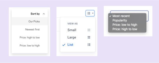
Let’s take a look back at the third Dropdown-land scenario. If you recall, it’s a dropdown that always has a checked option (e.g. sorting some content). I classified it in the gray area, as either a menu or a select.
Here’s my line of thought: Years ago, this type of dropdown was implemented mostly using a native <select>. Nowadays, it is common to see it implemented from scratch with custom styles (accessible or not). What we end up with is a select element that looks like a menu.

A <select> is a type of menu. Both have similar semantics and behavior, especially in a scenario that involves a list of options where one is always checked. Now, let me mention the WCAG 3.2.2 On Input (Level A) criterion:
Changing the setting of any user interface component should not automatically cause a change of context unless the user has been advised of the behavior before using the component.
Let’s put this in practice. Imagine a sortable list of students. Visually, it may be obvious that sorting is immediate, but that’s not necessarily true for everyone. So, when using <select>, we risk failing the WCAG guideline because the page content changed, and ignificantly re-arranging the content of a page is considered a change of context.
To ensure the criterion success, we must warn the user about the action before they interact with the element, or include a <button> immediately after the select to confirm the change.
<label for="sortStudents"> Sort students <!-- Warn the user about the change when a confirmation button is not present. --> <span class="visually-hidden">(Immediate effect upon selection)</span> </label> <select id="sortStudents"> ... </select>
That said, using a <select> or building a custom menu are both good approaches when it comes to simple menus that change the page content. Just remember that your decision will dictate the amount of work required to make the component fully accessible. This is a scenario where the hybrid select approach could be used.
Final words
This whole idea started as an innocent CSS trick but, after all of this research, I was reminded once more that creating unique experiences without compromising accessibility is not an easy task.
Building truly accessible select components (or any kind of dropdown) is harder than it looks. WCAG provides excellent guidance and best practices, but without specific examples and diverse practical uses cases, the guidelines are mostly aspirational. That’s not to mention the fact that ARIA support is tepid and that native <select> elements look and behave differently across browsers.
The “hybrid” select is just another attempt to create a good looking select while getting as many native features as possible. Don’t look at this technique experiment as an excuse to downplay accessibility, but rather as an attempt to serve both worlds. If you have the resources, time and the needed skills, please do it right and make sure to test it with different users before shipping your component to the world.
P.S. Remember to use a proper name when making a “dropdown” component. 😉
The post Striking a Balance Between Native and Custom Select Elements appeared first on CSS-Tricks.
Striking a Balance Between Native and Custom Select Elements published first on https://deskbysnafu.tumblr.com/
0 notes
Text
The Best Single Page WordPress Themes for Business | Templified
New Post has been published on https://templified.com/the-best-single-page-wordpress-themes-for-business/
The Best Single Page WordPress Themes for Business
Here’s a new collection of single page themes for amazing business websites. They’re great for all kinds of businesses, app promotions, general brick and mortar businesses. You get the deal. Let’s dig in!
Verko, One Page WordPress Applications Theme
This theme is called Verko, it’s a one-page WordPress theme that’s great for app launches, software promotion or anything else that only requires one page to tell the entire story of what it is your website is all about. At times, themes are little too intricate and detailed, not all websites truly require a multi-page theme, that’s where like Virgo comes in. This is a WordPress theme that focuses on marketing your products and services, it’s got landing page templates and it really helps you encourage all users to take the next step to contacting your business. That’s what a call to action is all about. You can use a photo or video to achieve this, Verko is suitable for just about any type of business or creative agency that wants Maximum Impact in delivering their message to potential customers. The steam was created with a minimalist, modern design, it offers masterful slider presentation and visual composer to help ensure incredible flexibility and a great user experience.
If you’ve been searching for a one page theme and you’ve come across this particular page, well, that’s good, I guess? But maybe this theme isn’t exactly what you want? If Verko isn’t doing it for you, then you may want to look at our full one page WordPress theme collection. That’s a great place to find exactly what you want to find. The whole collection is full of amazing stuff, it’s got a wide range of themes, each one of them has a little bit different set of features or a different style. The whole collection is full of fantastic themes that can work for any sort of one page theme website. So, anyway, hopefully, you can find what you want if the Verko theme isn’t right for you.
Demo More Information Get Hosting
LightOne, Clean, Modern One Page Parallax WordPress Theme
LightOne is a clean and bright WordPress creative theme that uses one page design, smooth parallax scrolling and big, bold images to get it’s point across.
LightOne is a well-designed one page Parallax WordPress theme that is great for digital creative companies that want to establish a great-looking website or rebrand an old, dated site. By using the power of visual composer and bootstrap, this user-friendly WordPress theme allows you to really wow your clients, and establish new business at the same time.
Let’s have a look at the great looking at home page style of the LightOne WordPress template.
You may wonder if the themes name is a reference to the light and bright, airy and minimal style of this template, or whether or not it’s referring to the lightweight code.
In fact, it’s both.
This 100% GPL license WordPress theme loads up fast, looks great on every device tested and it’s an amazing and modern website for advertising agencies, corporate Pages, creative companies, digital agencies, Freelancers and more. With a built-in blog, you can beat the bushes to attract new traffic, which is always something that creative companies need to do. You’ll certainly be providing a great looking theme that gives a great first impression to all of your visitors. If you want to showcase your creative work in a unique and fun manner, light one could be the solution you’ve been looking for.
If you’d like to see a more extensive selection of one page themes, why not have a look at our collection? We have assembled quite a group of single page templates, each one of them better than the last. That’s not to say we put the best one last, you might find that the first one is the best. I could keep going on and on and flattering about which one page theme is better than the other, but honestly, that’s all about your personal taste and the needs of your company. Anyway, I will be back with more one page templates soon, so see you later.
Demo More Information Get Hosting
SCRN, One Page Parallax WordPress Theme
SCRN is a one-page, responsive portfolio theme that is ready for any sort of work. No matter what you want to promote, this mobile-friendly theme has the minimalist one page design, along with unattractive blog, that you may have been looking for. It even supports videos in portfolio sections, something that not all one page themes seem to offer some of the main features of this theme include the responsive design, and advanced theme options panel for quick customization of your sight, plenty of different visual composer blocks for adding content and helping you to move things around, and sticky navigation. That is all important when building a one-page website.
What is it that makes one page WordPress themes so popular? Well, when it comes to the various layouts that are available to you, one page themes are a little bit more simple and easy to navigate. That doesn’t mean that your website is going to be simplistic or generic. Far from it, you can have all the dynamic look and feel that a multi-page theme offers, but using just one page.
If your website is specifically usually focused, perhaps a creative agency or a digital agency, you’re going to love one page themes for building a great-looking portfolio for your content. In addition, you can use the custom post managers to help you develop any type of custom posts with ease. However, that’s not what one page themes are bad. The Collection that we have built of WordPress one page themes, it’s a great way to find multiple different layouts that provide a great starting point for building your website.
Ensuring that your site has the proper layout is critical to the success of your website. If you have settled on a one page design for your site, but you want to add or change things in the future, many of the themes in our collection offer multi-page options down the road. He’s multi-purpose themes are a great way to ensure continuing flexibility and to make it so that you don’t have to completely start over from scratch if you decide to change the look of your sight.
Throughout our entire collection, you’ll find multiple different themes that offer both one page and multi-page styles, I think that we have found most of the best themes, but there are plenty more out there and more coming around every day. We are committed to adding more fantastic games all the time, with your help, we can achieve that. If you know of a fantastic one page WordPress theme, we would love to hear about it in the comments. We will try our best to ensure that we add all of the highest quality themes that there are to offer.
Demo More Information Get Hosting
Swenson, Full Featured Bootstrap One Page Theme
With Swenson, you’re getting a wonderful, soft almost ephemeral WordPress theme that still packs a bunch that belies it’s innocent and lovely design features. Installation is simple and set up requires no knowledge of code or web page development. This template’s construction, assembled with CSS3 and HTML5 combined with the popular Bootstrap 3 framework, allows for layout alternatives that are truly unique and fluid. The resultant websites display on any size screen and that use Swenson are entirely receptive. Both one page and multiple page websites can be built with ease.
That’s the blog demo, standard version. We’ve gathered up a ton more personal blog themes if that’s what you’ve come here for.
Now, despite the fact that Swenson is simple and user friendly, that does not mean it lacks in features, although Swenson is simple to work with. The parallax scrolling design that is popular offers easy navigation up and down the page. Entire customization of headers enables you to take control of website visitors’ first impressions. The premium Visual Composer plug in lets you drag various blocks of widgets, content or elements into place. Slideshows and other dynamic demonstrations with eye catching animations and transitions can be assembled using the Revolution Slider plugin. All of these features and more can be deployed or customized in the Redux alternatives panel.
That’s the rundown for Swenson and I think you’ll love what you see, should this be the theme you choose for your next website.
Demo Get Hosting
Honshi, WordPress Business Theme for One Page Websites
Simple and Clean, whether you want your website to offer a single page style or a multi-page book, Honshi is a themed well worth considering. This theme offers plenty of features that are similar to a lot of other creative agency or minimalist portfolio sites, one click installation to get your demo data up and running quickly, helping you achieve a solid base looked customized.
There’s also a powerful page builder that lets you do just about anything you want in terms of creating layouts for your posts and pages. In addition to that, Honshi gives you powerful admin panel that helps you create edits to the way out and look at your side, all without having to know anything about coding. There is an impressive documentation included and fantastic support as well.
This is a smooth and Sleek theme that was inspired by Nature. That’s a really neat thing, I think that as a one-page theme, that intuitive design and familiar style is going to really set it apart from the rest. Also, considering how flexible this theme is, it really doesn’t matter what type of site you are attempting to create, you will be left with a stunning and beautiful web page, no matter what the subject matter.
If you’re searching for even more options for building the best one page WordPress theme that you possibly can, you’re going to want to have a look at our full collection of themes. Businesses and websites that don’t have a gigantic amount of content, sometimes a one-page name is all you need. You can create a very interactive user experience that delivers your content first and foremost.
Our collection of one page themes for WordPress is great for self-hosted WordPress websites that want to seem that really delivers on content presentation, without the necessity to have multiple Pages involved. Some are great for portfolios or photography websites, others for businesses. Most of them are incredible multi-purpose themes that include one click demo import and all of them, of course, I have a single page option. All you’ll need to do is replace your content and get started quickly. There’s more to live than multi-page themes, you know what I mean? I think one page themes like this one are trending for a reason. People don’t have the time to wade through tons of pages, especially if the information is clearly presented in a professional and stylish way. That’s what this collection is all about, so check it out for more great themes.
Oh yes, many of them also offer WooCommerce support, allowing you to set up a shop quickly and efficiently. We’ve gathered up nothing but the most beautiful one page themes that can be easily adapted to suit your needs. Many of the themes also include multi-page options, although that’s probably not why you’re here if you are looking for a one-page theme. Still, it’s always nice to have flexibility going forward if you should decide to add more pages to your website.
DemoMore Information Get Hosting
0 notes