#don’t hate me for this but i like nocturne more than the original castlevania series >< nocturne’s just cuntier!!!
Text
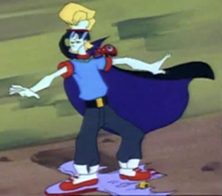
i love love loveeee castlevania nocturne! i’ve been binging it lately and i’m already growing terribly obsessed ><

#yayyy another piece of fiction to obsess over relentlessly for months!#the artstyle is the prettiest i say!#literally every character is so hot. have mercy on my soul#im almost finished with the series! one episode to go which I’m gonna savor ‘cause i know netflix won’t bring a new season for another year#y’all see my lovely wife annette over there!?#might i add that i love richette a crazy amount!#don’t hate me for this but i like nocturne more than the original castlevania series >< nocturne’s just cuntier!!!#gonna think about this show for the next three weeks . . .#❥ — rambles!#— (castlevania!)#— (castlevania: nocturne!)#❥ — annette!#❥ — richter!#❥ — richette!
69 notes
·
View notes
Text
Ranking Alucard's Designs, Best to Worst
I've had a rough day and feel like being mean. These are just my opinions. Some rules:
I’m not counting each game a character appears in unless the design is noticeably different. I don’t count different art styles as a different design. I’m not counting the mobile game skins with two exceptions. For the most part it’s just him but purple. However, for your pleasure, joker Alucard:

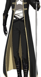
Symphony of the Night

No surprise. It’s his most iconic design. He’s gorgeous. I enjoy how he wears a mixture of human clothes (the jacket) and more stereotypical vampire clothing like the cape. Same with warm colors with black and silver.
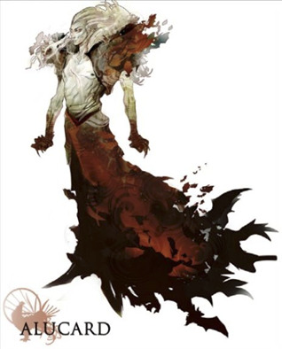
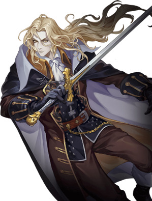
2. Grimoire of Souls

I love this design. I kiss it every night before I go to bed. I pray to it on Sundays. His waist makes me go feral. The only thing that bothers me is the brown lining. I wish they did something like the inside of his SotN jacket.
3. Moonlight Rhapsody – Outfit 3

I know absolutely nothing about this game. However, I love this skin. In my head when I imagine Alucard pre-Dracula betrayal this is it. The collar is a bit silly but I can look past it. I love the sleeves. The only critique I have is the brown and we’ll get to my feeling on Alucard wearing brown. But on this outfit, it’s not too bad.
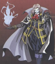
4. Nocturne
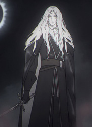
They gave him his gay little neck ruffle back nature is healing. I wish they kept the details on the coat, but I’ll happily take the trade. I like his face.
5. The cancelled Dracula’s Curse movie concept art
I need to know what the context behind this would have been. The skirt, the pauldrons, his bloody hands, HIS HAIR PUSHED BACK. The only thing I dislike is his black nipple.
6. Aria and Dawn of Sorrow
I like the suit. The red pocket square is nice. I think it is a really interesting choice for it to be red rather than yellow as a callback. I love the choice to make him resemble Dracula pre-vampirism. All of his color has been drained and replaced with black and red. I go back and forth on if I hate or like (for symbolic reasons) his tie-neck ruffle thing. But none of that is my real problem with the design. His shoes are hideous. The heel is good. He deserves a little heel. But what is going on with the white. It's ugly and going to be a bitch to keep clean. His slacks are too long. He’s a government agent, he can afford to go to a tailor.
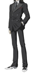
7. Season 1 & 2 of the show
I dislike the shirt. I’m not a big fan of how they drew his face either. But I like how they gave him Trevor’s chest scar.
8. Captain N
He’s so rad. But to be honest, Captain N Alucard has a special place in my heart. I remember when this was the closest thing to an animated series Castlevania had. It being this high is purely my nostalgia. I highly recommend watching the episode. It is pure 90s camp.
9. Season 4 of the show

Whore.
10. Grimoire of Souls – Blood and Loyalty

I can’t find a better look at this skin. He’s apparently dressed as a samurai. I like this purely because his hair is up. I don’t see enough of that. (artists pls you’d be doing the world a service)
11. Lords of Shadow 2

The only thing I like about this design is the coat. The dark blue with gold looks really good. I don’t like the belts, but I can ignore them. My issue is the armor. I hate the bronze so much. The armor on one hip is ugly. The ONLY thing that salvages this crime is the fact this Alucard is wearing the highest heels. This looks like an MMO armor set.
12. Judgement

I only unironically like 2 of Judgement’s designs. This is not one of them. I dislike it purely because of how boring it is. They put Simon in bondage gear, gave Trevor a boob window, and made Sypha a Catholic magical girl. But Alucard has to be more modest than the actual child. They could have fun with this but didn't. The most interesting thing about this design is they made a vintage couch into his cape.
13. Dracula’s Curse
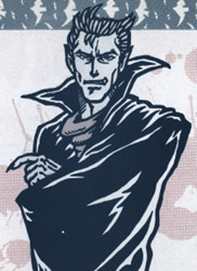
This is Alucard’s original design. It’s just your standard pop culture vampire. I like his little owl hair tufts.
14. Legends
I’m fine with changing up Alucard’s design. Hell, we got SotN because of changing it. However, why is he blue? It’s not this illustration either he is just light blue for some reason. I like the short hair. I think it’s a cute way to show this game takes place in the past. But again, purple? Really? His necktie is not doing it for me either. It looks really bad.
15. And finally, last and certainly least: Pachinko and Moonlight Rhapsody

The faces? Good. Hair? Good. But for some reason they made his coat brown. At LEAST for pachinko they had some gold gauntlets and brown gloves instead of his sleeve cuffs. But whatever fucked up person at Konami did the design for MR kept the sleeve cuffs. It’s not like there is the excuse of ‘Oh the inside is black’ because it’s yellow. Now you might be asking: Why is this the worst? I have similar issues with other designs. But here is the thing, they all did something new. This is just your standard SotN Alucard with a color palette change. It looks like a recolor skin but it’s the main one. It's a bad change but not one bad enough to not be boring.
20 notes
·
View notes
Last Seen Blogs
nesskimochi
Equanimity

artgblog
aRtGB

roe9nine
Rhoanin

preshme
Untitled

frida--y
thought I was a spaceman