#dude just hire me at this point to be a QA tester
Text

im trying to like make the new dash usable and just... it dont
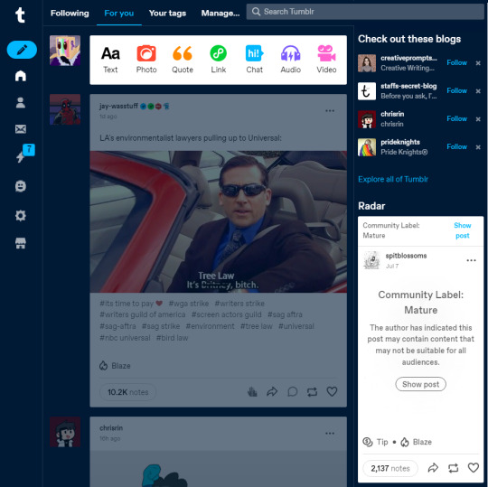
heres the main things im having trouble with in no particular order
there needs to be extra padding on top of the site, it feels claustrophobic without the buffer of the previous Top Dash
ad-free, domain, and store dont all need to have separate icons, just incorporate domain and ad-free into the store
settings are always the furthest down, idk if this is a rule but it feels very intuitive, same as account being at the top or at the bottom never in the middle
the icons are too small and more notably the text makes it very cluttered! you can have text for the store but other than the store and activity feed* the icons are generally the same as other sites and dont need explanations
*the activity feed also dont need text because its a tactile tab, as soon as notifications become a thing you have to worry about then you will click on the tab
the simple create a post button should be where the rest of the activity is, hiding it in the corner will do no good to anyone
this is a me specific problem but i have tumblr opened in a minimized window so i can use two tabs on the same screen and it feels crushing to be encapsulated on all sides by Stuff, let us navigate recommended blogs and the radar in the explore tab instead, it feels like that is where theyre supposed to be rather than on the main dash
personally i would love if search went back to the left hand side and maybe the sidebar thats replacing top bar went to the right side but those are minor issues
heres some other changes that i think would be good for the site in general
in the explore tab; dont default to Today, default to For You if you want to drive engagement, or trending, @staffs choice
rename Staffs Picks in the explore tab to Radar since they seem to be the same thing, staff doesnt have a great image so it might get more use in it if the dash name is used
like solitarelee said; it would be amazing to have custom dashs for different blog content, having a tab specifically for content from your followed tags is nice but having separate dashes can really be expanded on (and if you want to consider the option then this could be monetized as in you get 3-5 free custom dashes and then you pay per added dashboard, this should however be brought up to the users first because if the number is too low staff and automattic will simply be seen as evil)
PLEASE rename Manage to Labs or something, its much cooler and is more indicative of what you're getting from the tab as manage usually comes with Manage Settings, adding a beaker icon to the sidebar for labs content could even be a good idea to get people interested in it
i am begging on my hands and knees for staff to have a public dev log, please look at how the minecraft community eats up the mojang patch notes and understand that this would be good here too. warn us about upcoming changes like the dashboard update and treat us as costumers rather than shareholders, we dont want to solve an ARG to understand what you're going to do with our primary social site, we want to be told straight up whats happening so we can continue to make informed decisions about what we want to do with the site
something im surprised hasnt been done is tumblr adding an optional tutorial on how to use the site upon account creation, maybe it exists, maybe it doesnt, it should be optional and also the no tags warning should be able to be toggled in settings
#tumblr#long post#kinda#dude just hire me at this point to be a QA tester#rambles#im very tired dude
13 notes
·
View notes
Last Seen Blogs

exploringthefemalegaze
material collection

oficialibadep-blog
IBADEP

scentedvoidchild-blog
Untitled

bebe--howell
NEW DOMAIN --> BEBEHOWELL.COM

exorxion
exorxion