#dynastespress
Explore tagged Tumblr posts
Visit Tumblr Blog
Explore Tumblr blogs with no restrictions, modern design and the best experience.
Last Seen Tumblr Blogs


Fun Fact
Tumblr was the first site to host the blog for President Barack Obama in 2011.
Text


there she is. my pride and joy. i think this is the best quality bind i've ever done. i didn't make any of my usual tiny little mistakes (the textblock is glued in straight!), and i'm not even a little disappointed in the design.
for the covers, i used a fabric i've had since i was a very small child — it's a really thin fabric, so i was a little worried, but it performed beautifully for me. it's white with delicate little blue flowers evenly spaced. i embroidered the lattice pattern over it, centering the flower print in each diamond. (i was thinking of the way leather covers are tooled sometimes in a very similar way.)
you'll notice there's also a straight line of stitching at the inner edge on both the front and back. aside from aesthetic value, what that's actually doing is creating a clean edge on my fabric. i can't leave open edges on the front cover, of course, or they'll fray, so what i did is fold it under and stitch it in place. it worked much better than my previous attempts to glue it in place.
the spine is a nice dark brown (the same one i used for shane) that i hand stitched the title into. i'm getting better at doing letters without guides, and it's honestly such a relaxing part of the process.
the endpapers inside are a sky blue to match the flowers, and the ribbon bookmark i added as well matches the color scheme. the book itself was actually a copy of p+p that was my sister's before me and has been around almost as long as i can remember, so there's a lot of my childhood put into this book.
114 notes
·
View notes
Text
announcement
i'm moving all my bookbinding stuff to @dynastespress so if you follow me for bookbinding, go follow my sideblog
0 notes
Text
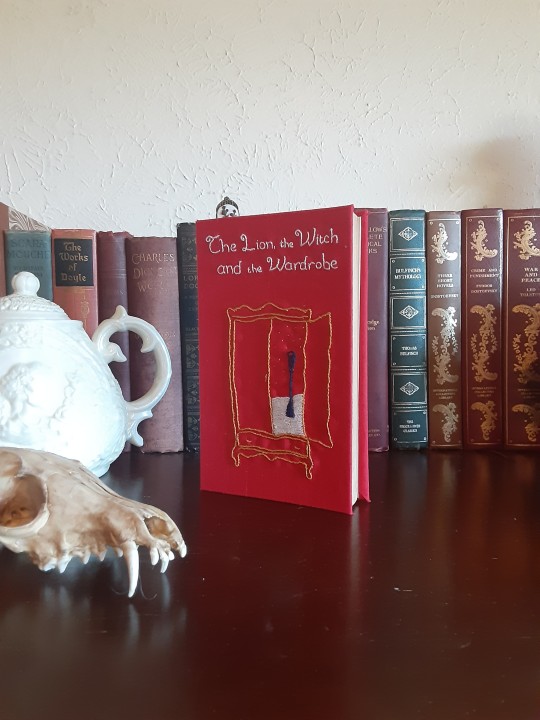

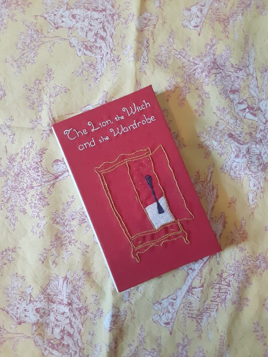
here's another throwback i still love. the embroidery came out a little wonky, but people have told me that's their favorite part of the book, and that it looks purposefully whimsical, so i've come to appreciate that as well.
this was my first bradel binding, and my favorite part of the whole thing is the stark white spine against the bright red covers. it's really such a look.
#bookbinding#rebind#dynastespress#bradel bind#embroidery#narnia#the lion the witch and the wardrobe#cs lewis
46 notes
·
View notes
Text


here's a copy of mansfield park i rebound (again for the farmer's market). i love the fabric i used for the spine (you can't really see, but it's a sturdy sea foam green with little white pills all over), and using paper on a cover again was such a relief. i forgot how easy it could be.
because i can't make anything without at least one mistake, the spine is actually too small. but you really can't tell mostly, so i'm not too upset about it.
i went back to embroidery for the title on this one, and i'm really glad i did. i think at this point i'm still turning out better results with that than anything else for titling.
21 notes
·
View notes
Text


here's an old bind i'm still very fond of. this was my first attempt at embroidery, and while i can definitely see i've improved a lot since then, i think my work on this one still holds up.
this was also the first time i'd made my own bookcloth, and that has honestly been a life saver in this process. i have so much more freedom with design options with the ability to make my own, and picking up fabric from thrift stores is honestly one of my favorite parts of the process.
this was also the first time i got a really clean hinge on a case bound book, although i didn't start getting that result consistently until very recently. (thank god for knitting needles!)
21 notes
·
View notes
Text


another recent bind for a farmer's market booth i set up! not my best, but not the worst either, i suppose.
the case ended up being too big somehow, but the fabric was too small, so i ended up having to make the endpapers bigger on one side than the other. which looked pretty silly for a while until i realized i could cut the sharp corners off, so now it looks like a half decent book.
the other thing i disliked ended up being the title on the front cover. i used paint pens again, which turned out alright, but the stripes on the fabric make it difficult to read.
1 note
·
View note
Text


i recently rebound this copy of shane as a gift for my sister. i had found this blue fabric at a thrift store and it obviously had to go on a western. i really love how it turned out all the way around.
firsts on this one include using paint pens for titling and doing a half bind completely in fabric. the first was simple and satisfying, the latter was. frustrating. but the results were still satisfying, and that's what counts.
the endpapers i used reminded my sister of old western dress fabrics, and i actually do love them, despite how busy it looks. they match nicely with the covers, and i think it's a nice touch.
1 note
·
View note