#elegantscript
Explore tagged Tumblr posts
Visit Tumblr Blog
Explore Tumblr blogs with no restrictions, modern design and the best experience.
Last Seen Tumblr Blogs


Fun Fact
Celebrities use Tumblr as well.
Text

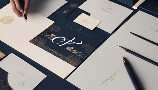
Elegant Thank You in Artistic Script Design
.
The image features elegant, flowing black script that beautifully spells out "Thank You," surrounded by decorative swirls and curves, creating a graceful and artistic design.
0 notes
Photo

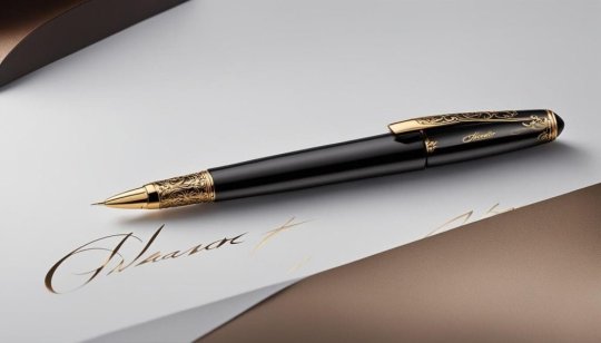
Pifavegus is an elegant, vintage-inspired font featuring ornate lettering reminiscent of ancient tomes, exuding a bold and sophisticated charm ideal for dramatic designs.
Link: https://l.dailyfont.com/jiGIh
#aff#Typography#Fonts#DesignInspiration#VintageVibes#ElegantScript#OldWorld#Charm#LuxuryLook#HighEndDesign#ClassicFont#OrnateLettering#BoldCharm#SophisticatedStyle#DramaticEffect#AncientTextures#RetroRevival#ArtDecoAesthetic#TimelessTypography
1 note
·
View note
Text
Italics Calligraphy: The Classic and Stylish Script

Italics Calligraphy: Embracing the Elegance of Classic Script
Welcome to the world of Italics calligraphy, where elegance and style meet the beauty of the written word. Whether you're a seasoned calligrapher or just starting out, Italics calligraphy is a script that will captivate your imagination and add a touch of sophistication to your projects. In this tutorial, we'll take you through the basics of Italics calligraphy, from its origins to the tools you'll need, and the essential techniques to create modern and stunning letterforms. Let's dive in and explore the beauty of Italics calligraphy! Key Takeaways - Italics calligraphy is a famous and versatile script with a rich history. - It originated during the Renaissance era and became popular across Europe. - To practice Italics calligraphy, you'll need broad-edged pens and suitable paper. - Basic strokes and rules guide the construction of Italics letterforms. - Lowercase letters in Italics calligraphy are constructed using basic strokes.
Origins of Italics Calligraphy
Italics calligraphy, also known as the Italic script or Cancellaresca, originated in Italy during the Renaissance era of the 14th to 15th centuries. Niccolò de’ Niccoli, a Florentine humanist, developed a cursive form of the Humanist minuscule to transcribe books more efficiently. This new script spread across Europe and became the preferred style of handwriting. However, its popularity declined with the invention of the typewriter. To understand the beauty and artistry of Italics calligraphy, it's important to delve into its rich history. The script emerged during the Renaissance era in Italy, pioneered by Niccolò de’ Niccoli, who sought a more efficient way to transcribe books. His development of a cursive form of the Humanist minuscule led to the birth of Italics calligraphy. This script quickly gained popularity and became the preferred style of handwriting across Europe. However, with the advent of the typewriter, Italics calligraphy started to wane in popularity as typewriters were unable to recreate the elegance and fluidity of the script. Despite this decline, the artistry and historical significance of Italics calligraphy continue to captivate calligraphers and enthusiasts around the world. Renaissance Era 14th to 15th centuries Originated in Italy Script name Italic script or Cancellaresca
Tools for Italics Calligraphy

When it comes to practicing Italics calligraphy, having the right tools is essential. The choice of pens and paper can greatly affect the quality of your lettering. Here are some recommended tools to help you get started: Pilot Parallel Pen The Pilot Parallel Pen is a popular choice for beginners. It features a broad-edged nib that allows for smooth and consistent ink flow. The pen uses ink cartridges, making it convenient and easy to use. With its sturdy construction and affordable price, the Pilot Parallel Pen is a great option for practicing Italics calligraphy. Traditional Straight Holder + Nib Combo For a more traditional feel, you can opt for a straight holder and nib combo. This setup offers versatility and customization options. Some recommended nibs for Italics calligraphy include the Brause bandzug nib, Leonardt Tape nib, Mitchell Roundhand nib, and Speedball C nib. These nibs provide a variety of line widths and can be paired with a straight holder for a classic calligraphy experience. When choosing paper for Italics calligraphy, look for low-absorbent smooth paper that allows the ink to glide smoothly. Marker pads, bleed-proof paper, HP Premium 32LB, Rhodia pads, watercolor paper, and Fabriano paper are all good options to consider. The right tools can make a world of difference in your Italics calligraphy journey. Whether you prefer the convenience of the Pilot Parallel Pen or the traditional feel of a straight holder and nib combo, investing in quality tools will allow you to achieve beautiful and consistent lettering. Pair your chosen tools with suitable paper, and you'll be well-equipped to explore the art of Italics calligraphy.
Sizing of Italics Script, Slant, and Pen Angle
When learning Italics calligraphy, understanding the basic strokes and rules is essential for achieving consistent and balanced letterforms. One of the fundamental aspects to grasp is the sizing of the script. The Italics script follows a 5:5:5 ratio, with the central body part, ascenders, and descenders all measuring five contiguous nib widths. This ratio ensures harmony and proportionality in your calligraphy. In addition to sizing, the slant and pen angle play crucial roles in creating the distinctive look of Italics calligraphy. The script is written with a slight forward slant of 5-7 degrees, giving it a dynamic and elegant appearance. To achieve this slant, hold your pen at an angle of 40-45 degrees. This angle allows for smooth and consistent strokes, enhancing the overall flow and rhythm of your writing. To better visualize the sizing, slant, and pen angle of Italics calligraphy, refer to the table below: Aspect Measurement Sizing 5:5:5 ratio (central body part, ascenders, descenders) Slant 5-7 degrees forward slant Pen Angle 40-45 degrees By adhering to these sizing proportions, slant, and pen angle, you can develop a well-balanced and harmonious Italics calligraphy style. Practice these techniques with dedication and precision to unlock the full beauty and expressiveness of this script.
Lowercase Letter Groups in Italics Calligraphy

In Italics calligraphy, the construction of lowercase letters involves utilizing basic strokes to create various letterforms. Understanding these basic strokes is essential for mastering the art of Italics calligraphy and achieving consistency in letter construction. Let's take a closer look at the different strokes and how they contribute to the overall formation of lowercase letters. Basic Strokes for Lowercase Alphabet The lowercase alphabet in Italics calligraphy is constructed using four fundamental strokes: - Underturn: This stroke is a downward motion that curves gently to the left at the bottom. - Overturn: The overturn stroke is an upward motion that curves gently to the right at the top. - Compound Curve: This stroke combines the underturn and overturn strokes, creating a fluid, curved shape. - Ascending Loop: The ascending loop stroke is an upward motion that forms a small loop at the top of the letter. By combining these basic strokes in different ways, lowercase letters in the Italics script can be created with elegance and consistency. Practicing each stroke individually and then integrating them into letter formation will help improve your calligraphy skills. "Mastering the art of Italics calligraphy involves understanding the basic strokes that form the foundation of lowercase letters." To aid in your practice, downloadable practice sheets are available that guide you through the construction of each lowercase letter. These practice sheets provide a valuable resource for developing muscle memory and achieving letterform consistency. Consistent practice and attention to detail will allow you to create beautifully crafted Italics calligraphy. Example of Lowercase Letter Groups Understanding the basic strokes and their application in forming lowercase letters can be further enhanced by visual examples. The table below showcases the basic strokes and their use in constructing lowercase letter groups in Italics calligraphy: Basic Stroke Letter Group Underturn a, c, e, o, s Overturn b, d, h, k, l Compound Curve m, n, p, q, r, u Ascending Loop f, g, j, y By practicing each lowercase letter group individually, you can familiarize yourself with the strokes specific to that group and refine your letter formation. Remember to start with a light touch and gradually apply more pressure to create varying line thickness, a characteristic of Italics calligraphy. With regular practice and dedication, you will gain confidence in constructing lowercase letters in Italics calligraphy, allowing you to create stunning pieces of calligraphic art.
Extra Tips for Italics Calligraphy

As you continue your journey in mastering Italics calligraphy, there are a few extra tips that can help improve your skills and enhance the quality of your work. Here are some useful recommendations: 1. Calligraphy Inks: When it comes to choosing the right ink for your Italics calligraphy, consider using high-quality calligraphy inks such as Winsor & Newton calligraphy inks, Sumi ink, or gouache. These inks offer rich pigmentation and smooth flow, allowing you to create beautiful and vibrant letters. 2. Ruler: A rolling ruler is a handy tool for drawing parallel lines in Italics calligraphy. It helps maintain consistency in spacing and alignment, resulting in a more professional and polished look. Use a ruler to guide your pen and ensure even strokes throughout your script. 3. Pencils and Erasers: For preliminary sketching or composing your letterforms, a mechanical pencil is a great tool. It allows you to create faint guidelines or lightly sketch your design before inking. Additionally, a kneaded eraser is handy for erasing any unwanted pencil marks while preserving the integrity of your paper. By incorporating these extra tips into your Italics calligraphy practice, you can elevate your skills and achieve more refined and visually appealing results. Experiment with different inks, use rulers for precision, and rely on pencils and erasers to perfect your letterforms. With practice and dedication, your Italics calligraphy will continue to improve and impress.
Applying Italics Calligraphy

Italics calligraphy is a versatile script that can be applied to various projects and crafts, adding an elegant touch to your creations. Whether you are looking to personalize greeting cards, embellish journal pages, create stunning scrapbook designs, or add a touch of sophistication to wedding calligraphy, Italics calligraphy is a perfect choice. When it comes to greeting cards, Italics calligraphy can help you create unique and eye-catching designs. From birthday cards to thank you notes, the flowing and graceful strokes of the script add a personal and artistic touch. You can experiment with different colors and embellishments to make your cards truly stand out. Journals are another great platform for showcasing your Italics calligraphy skills. Use the script for titles, headers, and quotations to create beautiful and inspiring journal pages. The elegant and timeless nature of Italics calligraphy adds a sense of sophistication to your journaling experience. “In a scrapbook, Italics calligraphy can be used to highlight important moments and captions, adding a touch of creativity and elegance to your pages.” Table: Applications of Italics Calligraphy Greeting Cards Journals Scrapbook Pages Wedding Calligraphy Create personalized and artistic designs Add elegance to titles and headers Highlight important moments and captions Address invitations and create wedding vows Add a personal and artistic touch Create inspiring and sophisticated pages Enhance creativity and elegance Add elegance and charm to wedding stationery For wedding calligraphy, Italics script is a popular choice for addressing invitations, creating wedding vows, and designing wedding books. The classic and old-world feel of the script adds an extra touch of elegance to these special occasions. Whether you are a beginner or experienced calligrapher, Italics calligraphy offers a world of possibilities for your creative projects. Embrace this beautiful script and let your imagination run wild as you apply it to various mediums.
Recommended Books for Learning Italics Calligraphy
https://www.youtube.com/watch?v=fjQVGtj-sQQ If you are serious about learning Italics calligraphy, there are two highly recommended books that can guide you through the process. These books provide detailed instructions, projects, and valuable tips to help you improve your skills and explore the art of Italics calligraphy. Whether you are a beginner or looking to advance your knowledge, these books are essential resources for your calligraphy journey. First Steps Calligraphy First Steps Calligraphy by Don Marsh is a fantastic introduction to basic Italics calligraphy. The book covers everything you need to know to start your calligraphy journey, including the history and principles of Italics script, recommended tools and materials, basic strokes and letterforms, and tips for practice and improvement. With step-by-step instructions and practice exercises, this book will help you develop a solid foundation in Italics calligraphy. Calligraphy School Calligraphy School is an excellent choice for those looking to further their Italics calligraphy skills. This book offers more advanced techniques and guidance for intermediate to advanced calligraphers. It covers topics such as flourishing, composition, layout design, and project ideas. With beautiful examples and inspiring projects, Calligraphy School will take your Italics calligraphy to the next level. Both books provide invaluable resources for learning Italics calligraphy and expanding your artistic horizons. Whether you prefer a beginner-friendly approach or a more advanced guide, these books offer a wealth of knowledge and inspiration to help you master the art of Italics calligraphy.
Conclusion
Beautiful Italics Calligraphy is a true art form that brings a touch of elegance and sophistication to any handwritten project. Whether you are a beginner or an experienced calligrapher, mastering Italics Calligraphy can elevate your artistic skills and enable you to create breathtaking pieces of art. With the right tools, persistent practice, and dedication, you can unlock the timeless appeal of Italics Calligraphy. This classic script has the power to captivate and inspire, allowing you to produce stunning works of art that showcase your creativity and attention to detail. Embrace the beauty of Italics Calligraphy and explore the endless possibilities it offers. From embellishing greeting cards to adding a touch of charm to wedding calligraphy, the versatility of this script knows no bounds. Let your imagination run free and bring your artistic visions to life through the strokes and curves of Italics Calligraphy. So why wait? Dive into the world of Italics Calligraphy, unleash your creativity, and embark on a journey of self-expression through the art of beautiful handwriting.
FAQ
What is Italics calligraphy? Italics calligraphy is a script style that originated in Italy during the Renaissance era. It is known for its dynamic and versatile nature, with many variations. It is widely used for various projects and crafts, adding a classic and stylish touch to any handwritten piece. What are the recommended tools for Italics calligraphy? The recommended tools for Italics calligraphy include broad-edged pens such as the Pilot Parallel Pen or traditional straight holder + nib combos like the Brause bandzug nib, Leonardt Tape nib, Mitchell Roundhand nib, and Speedball C nib. It is also important to use low-absorbent smooth paper to achieve optimal results. What are the basic strokes and rules for Italics calligraphy? Italics calligraphy follows a 5:5:5 ratio for the sizing of the script, with 5 contiguous nib widths for the central body part, ascenders, and descenders. The script is written with a slight forward slant and a pen angle of 40-45 degrees. The letterforms are contained within a parallelogram shape with a horizontal to vertical ratio of 2:3, ensuring consistency and balance. How do I construct lowercase letters in Italics calligraphy? Lowercase letters in Italics calligraphy are constructed using basic strokes. It is important to understand and practice these strokes to master the construction of the alphabet. Downloadable practice sheets are available to help with letter formation and consistency. Are there any extra tips for improving Italics calligraphy? Yes, for different effects, consider using Winsor & Newton calligraphy inks, Sumi ink, or gouache. A rolling ruler can be useful for drawing parallel lines, while a mechanical pencil and kneaded eraser can help create faint and fine lines. These tools enhance the quality and precision of your calligraphy. What are the applications of Italics calligraphy? Italics calligraphy can be applied to various projects and crafts, including embellishing greeting cards, titles and headers in journals and scrapbook pages, creating gift embellishments, and wedding calligraphy such as addressing invitations, wedding vows, and wedding books. Its classic and old-world feel adds elegance and charm to any application. Are there any recommended books for learning Italics calligraphy? Yes, there are several books available for learning Italics calligraphy. "The First Steps Calligraphy" by Don Marsh is a great introduction to basic Italics calligraphy, while "Calligraphy School" offers more advanced techniques and guidance. These books can serve as valuable resources for improving your skills and exploring the art of Italics calligraphy.
Source Links
- https://www.lettering-daily.com/italic-calligraphy/ - https://anartfulmom.com/italic-calligraphy-for-beginners/ - https://befonts.com/italic-hand-calligraphy-font.html Read the full article
#calligraphytechniques#chancerycalligraphy#ClassicLettering#cursivecalligraphy#ElegantScript#italiclettering#ItalicWriting#italicscalligraphystyles#ScriptMastery#StylishCalligraphy
0 notes
Text

iCiel Bambola – Font script Việt hóa thanh lịch & duyên dáng Nét chữ uốn lượn tinh xảo, đậm chất viết tay nghệ thuật – lý tưởng cho thiệp cưới, bao bì cao cấp & thiết kế trang trí. Hỗ trợ tiếng Việt đầy đủ. #FontChuẩn #Bambola #FontVietHoa #ElegantScript
0 notes
Photo

Elegant script with flowing curves, delicate flourishes, and subtle flair, evoking vintage charm and sophistication perfect for romance-themed content.
Link: https://l.dailyfont.com/JqMcv
#aff#Love#Romance#Sophistication#VintageCharm#ElegantScript#FlowingCurves#DelicateFlourishes#SubtleFlair#RelationshipGoals#CoupleGoals#ValentinesDay#AnniversaryGifts#WeddingInspiration#ProposalIdeas#LoveLetters#SweetNothings
0 notes
Text
Cursive Calligraphy Styles: Unleash Creativity and Self-Expression

Cursive Calligraphy Styles: Unleash Your Creativity with Fluid & Expressive Techniques
Welcome to our guide on cursive calligraphy styles and calligraphy scripts. If you're fascinated by the art of beautiful lettering, this article is for you. Whether you're a beginner or an experienced calligrapher, exploring different calligraphy alphabets can open up a world of creativity and self-expression. From traditional scripts like Copperplate and Blackletter to contemporary styles like brush lettering and hand lettering, there is a wide range of cursive calligraphy styles to choose from. And with the advent of digital tools, you can even create your own personalized calligraphy fonts! Key Takeaways: - Calligraphy alphabets come in various styles, from traditional to modern. - Practicing calligraphy can inspire creativity and lead to personalized fonts. - Writing the alphabet in calligraphy requires different strokes than regular cursive. - You can turn your calligraphy into a digital font with the right resources. - Copperplate calligraphy and its digital variations offer unique possibilities.
How to Write the Alphabet in Calligraphy?
Writing the alphabet in calligraphy requires a different approach compared to regular cursive handwriting. Each letter is constructed using a series of unique strokes, resulting in beautifully flowing and expressive letterforms. So, how can you write the alphabet in calligraphy? Let's explore the steps below. 1. Learn the Basic Strokes: In calligraphy, each letter is created using a combination of basic strokes. These strokes include entrance strokes, ovals, underturns, and more. By mastering these fundamental strokes, you can build any letter of the alphabet with ease. 2. Practice Lowercase Letters: Start by practicing lowercase letters as they form the foundation of calligraphy. Each lowercase letter has its own unique combination of strokes. For example, the letter "a" begins with an entrance stroke, followed by an oval shape and an underturn. Practice forming each letter individually until you feel comfortable with the flow and shape. 3. Explore Different Styles: Once you've mastered the basics, feel free to experiment with different calligraphy styles. Traditional styles like Copperplate and Spencerian offer elegance and sophistication, while modern styles like brush lettering and bounce lettering provide a more playful and artistic approach. The beauty of calligraphy lies in its versatility, allowing you to create unique and personalized alphabets. Remember, calligraphy is a form of artistic expression, so don't be afraid to add your own flair and creativity into your letterforms. With practice and dedication, you'll soon be writing the alphabet in calligraphy like a pro.
Turn Your Alphabet Into a Calligraphy Font
If you've been practicing your calligraphy alphabets and want to take your skills to the next level, why not turn your unique letterforms into a calligraphy font? Creating your own calligraphy font allows you to customize and personalize your writing style, and it can be a great way to share your creativity with others. There are various resources available to help you learn the process of creating your own calligraphy font. Online courses and tutorials can guide you through the steps, from digitizing your handwritten letters to adjusting spacing and kerning. Font generators are also a popular option, offering user-friendly interfaces and a range of customization options. Benefits of Creating a Calligraphy Font Turning your alphabet into a calligraphy font offers several advantages. First and foremost, it allows for consistency and efficiency in your writing. Instead of handwriting each letter individually, you can simply type your text using your custom font. This can save time and effort, particularly if you often need to write lengthy documents or create digital designs. Additionally, having your own calligraphy font gives you the freedom to use it in a variety of applications. Whether you're designing wedding invitations, branding materials, or social media graphics, your personalized font can add a unique touch to your work. It also provides an opportunity for collaboration and sharing, as you can distribute your font to others who may find it inspiring or useful. Benefits of Creating a Calligraphy Font Benefits Consistency and efficiency in writing Saves time and effort Use in various applications Adds a unique touch to work Potential for collaboration and sharing Inspire and help others Whether you choose to create your calligraphy font from scratch or utilize existing tools and resources, the process of turning your alphabet into a calligraphy font can be a rewarding and creative endeavor. So why not give it a try and see where your imagination takes you?
Copperplate Calligraphy Alphabets

Copperplate calligraphy is a beautiful and elegant script that is characterized by its distinct 19th-century style. It is often considered one of the most challenging calligraphy styles to master but offers a rewarding and graceful result. The Copperplate alphabet is written with a pointed pen, creating thin upstrokes and thick downstrokes, giving the script its unique contrast and flow. To create Copperplate calligraphy, careful attention is paid to the formation of each letter. The lowercase alphabet consists of curved, looped, and slanted strokes, creating a harmonious and rhythmic composition. The uppercase letters are larger and more ornate, featuring flourishes and exaggerated loops. Understanding the basic structure of Copperplate calligraphy alphabets is essential before exploring variations and personalization. Here is an example of the Copperplate calligraphy alphabet: Uppercase Lowercase A a B b C c D d E e F f G g H h I i J j K k L l M m N n O o P p Q q R r S s T t U u V v W w X x Y y Z z Mastering Copperplate calligraphy alphabets takes time and practice, but the results are worth it. The elegance and sophistication of this script make it a popular choice for formal invitations, certificates, and other special occasions. Whether you are a beginner or an experienced calligrapher, exploring Copperplate calligraphy alphabets can enhance your skills and add a touch of classic beauty to your creations.
Digital Copperplate Calligraphy Alphabets
Traditional calligraphy scripts, like Copperplate, can also be created digitally using modern tools such as the iPad and Procreate App. Digital calligraphy alphabets offer versatility and the ability to experiment with different styles and effects. With digital tools, you can easily adjust the thickness and angle of your strokes, add shading and texture, and even create realistic watercolor or metallic effects. One advantage of digital calligraphy is the ability to undo mistakes and make precise edits without starting over. This can save time and frustration, especially when working on complex compositions or large-scale projects. Additionally, digital calligraphy allows for easy sharing and collaboration, as you can save your work in various file formats and easily send it to others for feedback or printing. Benefits of Digital Calligraphy: - Flexibility to experiment with different styles, colors, and effects - Ability to easily correct or modify mistakes - Convenient sharing and collaboration - Opportunity to incorporate digital resources and assets While digital calligraphy offers many advantages, it's important to note that traditional calligraphy skills and techniques are still valuable. Learning to create calligraphy by hand helps develop a deeper understanding of letterforms, strokes, and rhythm, which can then be applied when using digital tools. So, even if you choose to primarily work digitally, it is still beneficial to practice traditional calligraphy to enhance your overall skills and creativity. Table: Comparison of Traditional and Digital Copperplate Calligraphy Aspect Traditional Calligraphy Digital Calligraphy Medium Paper, ink, and pointed pen iPad, Apple Pencil, and digital apps Editing Difficult to correct mistakes Easy to undo and make precise edits Experimentation Limitation to physical materials Endless possibilities of styles and effects Sharing Physical scans or photographs Digital file sharing and collaboration
Cursive fonts in Microsoft Word: Add a touch of elegance to your documents
When it comes to creating visually appealing and professional-looking documents in Microsoft Word, choosing the right font can make all the difference. Cursive fonts, with their elegant and flowing letterforms, can add a touch of sophistication to your text. Microsoft Word offers a variety of cursive fonts that are suitable for different design purposes. Here are some popular cursive fonts in Microsoft Word: - Bukhari Script: A bold and modern cursive font that exudes confidence and style. - Clicker Script: With its playful and casual vibe, this font is perfect for informal invitations and personal projects. - Euphoria Script: This elegant script font adds a touch of luxury and sophistication to any document. - Jimmy Script: A versatile cursive font that is ideal for both formal and informal designs. - Pinyon Script: With its calligraphic style, this font is perfect for adding a classic and timeless touch to your documents. - Playlist Script: This contemporary script font is great for creating modern and stylish designs. - Alex Brush: With its smooth and flowing letterforms, this font is ideal for creating elegant and graceful designs. - Sweet Apricot: This charming and whimsical cursive font adds a playful touch to any document. - Books Script: With its vintage-inspired style, this font is perfect for creating a nostalgic and retro feel. - Cloud Script: This delicate and airy cursive font is great for creating light and ethereal designs. Whether you're designing invitations, crafting personal projects, or creating professional documents, these cursive fonts in Microsoft Word offer a range of styles to suit your needs. Experiment with different fonts to find the one that best captures the tone and aesthetic you're looking for. Font Description Bukhari Script A bold and modern cursive font that exudes confidence and style. Clicker Script With its playful and casual vibe, this font is perfect for informal invitations and personal projects. Euphoria Script This elegant script font adds a touch of luxury and sophistication to any document. Jimmy Script A versatile cursive font that is ideal for both formal and informal designs. Pinyon Script With its calligraphic style, this font is perfect for adding a classic and timeless touch to your documents. With a wide selection of cursive fonts available, Microsoft Word allows you to enhance the visual impact of your documents and express your unique style. Whether you're designing invitations, creating personalized stationery, or adding a touch of elegance to your professional reports, these cursive fonts can help you achieve the desired aesthetic effortlessly.
Cursive Writing for Business Professionals: Enhancing Legibility, Speed, and Professionalism
https://www.youtube.com/watch?v=c191-IgIFoA Cursive writing offers a range of benefits for business professionals, making it a valuable skill to develop and incorporate into daily practices. Not only does cursive writing improve the legibility and aesthetics of your handwriting, but it also enhances speed and efficiency in note-taking. By mastering this elegant script, you can create a sophisticated and personalized touch in your correspondence, leaving a lasting impression on clients and colleagues. One of the key advantages of cursive writing is its ability to enhance legibility. The flowing nature of cursive letters improves the clarity and readability of your written communication. This is particularly important in professional settings where clear communication is paramount. Whether you're taking meeting notes or drafting memos, cursive writing can help ensure that your message is easily understood by others. Speed is another crucial factor for business professionals, and cursive writing can significantly enhance your note-taking efficiency. The connected strokes and fluidity of cursive letters enable a faster writing pace compared to block lettering or print handwriting. This can be particularly advantageous during meetings or when capturing important information in a time-sensitive environment. Lastly, cursive writing adds a touch of professionalism and personalization to your business correspondence. In a digital age dominated by electronic communication, handwritten notes stand out and convey a sense of care and effort. Incorporating cursive writing into your business documents, such as thank-you notes or client letters, can leave a lasting impression and strengthen professional relationships. Overall, cursive writing is a valuable skill for business professionals, offering improved legibility, enhanced speed, and a personal touch to your communication. By dedicating time to master this elegant script, you can elevate your professionalism and make a lasting impact on those you interact with in the professional sphere.
Getting Started with Cursive Writing
If you're eager to master the art of cursive writing, you've come to the right place. Cursive writing can add a touch of elegance and sophistication to your handwritten notes and correspondence. To begin your journey towards mastering cursive writing, you need to understand the basic letterforms and practice joining letters correctly. Consistent practice is key to improving your cursive writing skills. Start by focusing on letter slant and size, ensuring that they are consistent and uniform throughout your writing. This will not only enhance the aesthetics of your handwriting but also improve your speed and consistency. To add a creative flair to your cursive writing, consider incorporating flourishes. Flourishes are decorative strokes that can elevate the visual appeal of your writing. Experiment with different styles and sizes of flourishes to find the ones that suit your personal taste and add an artistic touch to your cursive script. Table: Essential Tips for Mastering Cursive Writing Tips Description Practice consistently Dedicate regular time to practice your cursive writing skills. Focus on letterforms Pay attention to the correct formation of each cursive letter. Join letters accurately Practice joining letters smoothly and accurately to create flowing cursive words. Work on slant and size Ensure that your cursive writing maintains a consistent slant and size for a polished look. Add unique flourishes Experiment with decorative flourishes to personalize your cursive writing. Remember, mastering cursive writing takes time and practice. Be patient with yourself and enjoy the process. With dedication and perseverance, you'll soon be able to effortlessly create beautiful and legible cursive scripts.
Using Cursive Writing in Business Documents
Incorporating cursive writing in business documents can enhance their visual appeal and communicate a sense of elegance and professionalism. Proper formatting and layout are essential to ensure that cursive text stands out and is easily readable. Cursive writing can be used strategically to emphasize key points in reports, presentations, and proposals. By underlining or highlighting important information in cursive, you can draw attention to critical details and make them stand out. This technique can be particularly useful when presenting data or statistics, as it helps the reader quickly grasp the main takeaways. Additionally, cursive writing adds a personal touch to business correspondence. When sending letters or thank-you notes, including a handwritten cursive signature can make a lasting impression on clients, partners, and colleagues. It conveys a sense of care and attention to detail, showcasing your dedication to fostering meaningful professional relationships. The Impact of Cursive in Business Documents When it comes to business documents, the use of cursive writing can have a significant impact on how your message is perceived. Here are a few ways cursive can enhance your documents: - Visual Appeal: Cursive writing adds an element of elegance and sophistication to documents, making them more visually engaging. - Professionalism: Incorporating cursive writing demonstrates attention to detail and a commitment to professionalism, setting you apart from competitors. - Personalization: Handwritten cursive elements, such as signatures or annotations, create a personal connection and show that you took the time to personalize the document. Remember to strike a balance when using cursive in business documents. While it can add a touch of refinement, excessive use or illegible handwriting may detract from the overall message. Use cursive strategically and sparingly to ensure maximum impact. Type of Document Recommended Use of Cursive Emails and Business Letters Include a cursive signature at the end of the email or letter for a personal touch. Presentations and Reports Use cursive to emphasize key points, headings, or subheadings to draw attention. Thank-You Notes and Invitations Handwrite the entire note or invitation using cursive for a personalized and thoughtful touch. By incorporating cursive writing in your business documents, you can elevate their professional appearance and leave a lasting impression on your audience. Summary: Using cursive writing in business documents can add visual appeal, professionalism, and personalization to your communications. Read the full article
#ArtisticWriting#CalligraphyDesign#calligraphypractice#calligraphytechniques#CreativeLettering#cursivecalligraphy#ElegantScript#ExpressiveCalligraphy#FluidStyles#HandwritingStyles
0 notes
Text
Copperplate Calligraphy: Elegance in Every Stroke

Copperplate Calligraphy Secrets Unveiled: Master Elegance in Every Stroke!
Copperplate calligraphy, also known as copperplate script, is a timeless art form that combines precision and grace to create stunning handwritten compositions. With its smooth curves and fine details, it exudes elegance in every stroke. Whether you're a seasoned calligrapher or just starting out, mastering copperplate calligraphy can elevate your writing to new levels of sophistication. Key Takeaways: - Copperplate calligraphy is a beautiful and elegant form of handwriting. - It requires practice and patience to master the basic strokes and letter forms. - Essential tools and materials for copperplate calligraphy include pointed pen nibs, oblique pen holders, calligraphy ink, calligraphy paper, and guidelines. - Consistency in letter size, shape, slant, and spacing is crucial for achieving a polished look. - Adding flourishes and advanced techniques can enhance the artistic touch and individual style of your copperplate calligraphy.
Essential Tools and Materials for Copperplate Calligraphy

When it comes to practicing copperplate calligraphy, having the right tools and materials is essential. Here are some key items that every calligrapher should have: - Pointed Pen Nibs: Pointed pen nibs are specifically designed for creating the thick and thin strokes that are characteristic of copperplate calligraphy. Popular options include the Zebra G and Leonardt Principal EF nibs, which offer excellent control and versatility. - Oblique Pen Holders: An oblique pen holder is recommended for copperplate calligraphy as it allows for the proper slant in your writing. This angled pen holder helps achieve the graceful curves that define copperplate calligraphy. - Calligraphy Ink: Quality calligraphy ink is crucial for smooth and consistent writing. Some popular choices include Higgins Eternal and Sumi ink, which offer excellent flow and rich color. - Calligraphy Paper: Choosing the right paper is important to prevent ink feathering and ensure optimal writing results. Look for calligraphy paper with a slight tooth, such as Rhodia or Strathmore, to provide the right balance of smoothness and grip. - Guidelines: Guidelines are a useful tool for maintaining consistent letter size, slant, and spacing. They act as a reference point to help you create uniform and visually appealing calligraphy. Having these essential tools and materials will set you on the path to mastering copperplate calligraphy. Experiment with different nibs, holders, inks, and papers to find the combination that works best for your style and preferences. Remember, practice is key, so keep honing your skills and exploring new techniques to create stunning copperplate calligraphy compositions. Tool/Material Description Pointed Pen Nibs Specialized nibs for creating the thick and thin strokes of copperplate calligraphy. Examples include Zebra G and Leonardt Principal EF. Oblique Pen Holders Pen holders with an angled design that helps achieve the proper slant in copperplate calligraphy writing. Calligraphy Ink Inks specifically formulated for smooth and consistent flow in calligraphy writing. Popular options include Higgins Eternal and Sumi ink. Calligraphy Paper Paper with a slight tooth that provides the right grip and prevents ink feathering. Rhodia and Strathmore are popular choices. Guidelines Reference lines or grids that assist in maintaining uniform letter size, slant, and spacing in copperplate calligraphy. By investing in these tools and materials, you'll be well-equipped to create beautiful copperplate calligraphy and unlock your creativity in every stroke. Expert Tip: Experiment and Explore Don't be afraid to experiment with different tools and materials. Each calligrapher has their own unique preferences, and what works for one person may not work for another. Explore various nibs, holders, inks, and papers to find your ideal combination and unleash your artistic potential.
Mastering the Basic Strokes of Copperplate Calligraphy
Before diving into letter forms, it's important to practice and master the basic strokes of copperplate calligraphy. These strokes serve as the building blocks for creating the elegant and flowing letters that define this art form. By honing your skills in these fundamental strokes, you'll gain the foundation needed to create beautiful copperplate calligraphy compositions. The first stroke to master is the entrance stroke, a thin, upward curve often used to begin lowercase letters. This stroke sets the stage for the elegant and graceful look of copperplate calligraphy. Next, focus on the underturn and overturn strokes, which are essential in creating the unique U-shaped forms seen in many copperplate letters. These strokes give the letters their distinctive and flowing appearance. The oval stroke is another key element of copperplate calligraphy. It is used to create rounded shapes like "o" and "a." With practice, you'll be able to achieve smooth and consistent oval strokes that add elegance to your writing. Lastly, the compound curve stroke combines convex and concave curves and is used in letters like "h" and "m." By mastering this stroke, you'll be able to create letters with a sense of balance and harmony. Table: Overview of Basic Strokes in Copperplate Calligraphy Stroke Description Entrance Stroke A thin, upward curve used to begin lowercase letters Underturn A stroke that creates a U-shaped form, moving from left to right Overturn A stroke that creates a U-shaped form, moving from right to left Oval A rounded stroke used to create shapes like "o" and "a" Compound Curve A stroke that combines convex and concave curves, used in letters like "h" and "m" By focusing on these basic strokes, you'll develop the necessary skills to create the elegant and graceful letters that define copperplate calligraphy. Practice each stroke individually, paying attention to your hand position, pressure, and movement. With dedication and persistence, you'll be able to master these fundamental strokes and take your copperplate calligraphy to new heights.
Exploring Copperplate Letter Forms and Spacing

Copperplate calligraphy is a form of handwriting that emphasizes the beauty of letter forms and the consistency of spacing. Whether you're a beginner or an experienced calligrapher, mastering the letter forms and understanding how to create an elegant slant can greatly enhance your copperplate calligraphy skills. The letter forms in copperplate calligraphy are characterized by the contrast between thick and thin strokes, which add depth and visual appeal to the writing. This contrast is achieved through the use of pointed pen nibs and proper techniques. The thick strokes are created by applying more pressure on the nib, while the thin strokes are achieved by releasing pressure. By mastering these techniques, you can achieve the desired thickness and thinness in your strokes, giving your copperplate calligraphy a professional and sophisticated look. Consistency in letter size, shape, and slant is also crucial in copperplate calligraphy. This consistency ensures that your writing appears uniform and visually pleasing. It's important to practice maintaining a consistent slant, as well as paying attention to the overall spacing between letters and words. Proper letter spacing contributes to the readability of your writing and creates a harmonious flow. Table: Common Copperplate Letter Forms and Spacing Letter Form Slant Thick and Thin Strokes Letter Spacing A Oval with a descending stem Right-slanting Contrasting thick and thin strokes Optimal spacing between other letters B Compound curve followed by a vertical line Right-slanting Contrasting thick and thin strokes Optimal spacing between other letters C Oval with a slight right-slanting curve Right-slanting Contrasting thick and thin strokes Optimal spacing between other letters D Compound curve followed by a vertical line Right-slanting Contrasting thick and thin strokes Optimal spacing between other letters By exploring the various letter forms and focusing on slant, thick and thin strokes, and letter spacing, you can elevate your copperplate calligraphy to a new level of elegance. With practice and attention to detail, you'll be able to create beautiful compositions that showcase the timeless beauty of copperplate calligraphy.
Mastering Uppercase Letters in Copperplate Calligraphy

In copperplate calligraphy, mastering uppercase letters, also known as majuscules, is an important step towards achieving elegance and sophistication in your writing. Majuscules are often constructed around the use of ovals, which are created by combining thick and thin strokes. These strokes give the letters a distinctive shape and add depth to your calligraphy. To create contrast, the shade stroke is used to add depth and dimension to the letters, while the hairline stroke adds delicate refinement. The compound curve stroke is particularly prominent in uppercase letters like "B" and "R" and involves combining convex and concave curves to create a flowing and harmonious shape. By focusing on these majuscule strokes and practicing proper construction, you'll be able to create uppercase letters that exude sophistication and style. Creating uppercase letters requires precision and attention to detail. Each stroke must be carefully executed to maintain uniformity and balance within the composition. By practicing consistently and paying attention to the intricacies of each stroke, you'll be able to develop your own unique style and add a touch of elegance to your calligraphy. Majuscule Stroke Examples: Letter Construction Example A Oval with shade and hairline stroke B Compound curve with shade and hairline stroke https://www.youtube.com/watch?v=2rHpzVpX7UU C Oval with shade and hairline stroke D Compound curve with shade and hairline stroke By mastering uppercase letters in copperplate calligraphy, you'll be able to elevate your compositions to a new level of elegance. The combination of precise strokes, attention to detail, and individual style will allow you to create visually stunning and sophisticated calligraphy.
Mastering Lowercase Letters in Copperplate Calligraphy
Now that you've become comfortable with uppercase letters in copperplate calligraphy, it's time to move on to lowercase letters, also known as minuscules. These smaller letters require a different set of strokes to create their unique shapes and forms. By mastering the underturn, overturn, loop, connector, and other minuscule strokes, you'll be able to add depth and harmony to your copperplate calligraphy compositions. The underturn stroke is essential in creating the U-shaped forms seen in many lowercase letters. It involves starting with a thin upward stroke, then transitioning into a thick downward curve. The overturn stroke, on the other hand, begins with a thick downward stroke, then transitions into a thin upward curve. Both of these strokes are fundamental in creating the elegant and flowing look of copperplate calligraphy. In addition to the underturn and overturn strokes, the loop and connector strokes are important in adding flourish and cohesion to your copperplate calligraphy. The loop stroke is used in letters like "g" and "j," creating a graceful loop at the bottom of the letter. The connector stroke, as the name suggests, helps to link letters together within a word, creating a seamless and visually appealing flow. As with any new technique, practice is key in mastering lowercase letters in copperplate calligraphy. By focusing on the proper construction of each stroke and paying attention to the overall harmony and balance of your composition, you'll be able to create lowercase letters that perfectly complement your uppercase letters and showcase your skill and creativity. Table: Minuscule Strokes in Copperplate Calligraphy Stroke Description Underturn A thin upward stroke transitioning into a thick downward curve. Overturn A thick downward stroke transitioning into a thin upward curve. Loop A graceful loop stroke at the bottom of letters like "g" and "j". Connector A stroke that links letters together within a word.
Writing Numbers and Punctuation in Copperplate Calligraphy
In the art of calligraphy copperplate writing, numbers and punctuation marks serve as essential elements that contribute to the overall structure and clarity of your compositions. By paying attention to these details, you can ensure that your message is easily understood and visually appealing. When writing numbers in copperplate calligraphy, it is important to maintain consistency in style and size. Whether you are writing single digits or larger numbers, ensure that each numeral is proportionate and follows the same design principles as the rest of your calligraphy. Attention to detail in forming each digit will enhance the overall cohesiveness of your composition. Remember to leave adequate space between numbers to maintain clarity and readability. Punctuation marks are equally important in copperplate calligraphy. They provide structure to your writing and help guide the reader through your composition. Each punctuation mark should be crafted with care and positioned appropriately in relation to the surrounding text. Take the time to give these marks the attention they deserve, as they can greatly impact the overall aesthetic and flow of your calligraphy piece. Punctuation Mark Description . Period , Comma ; Semicolon : Colon ! Exclamation Mark ? Question Mark By mastering the art of writing numbers and punctuation in copperplate calligraphy, you can elevate the structure, clarity, and overall impact of your compositions. Incorporate these elements thoughtfully and consistently to create visually stunning and expressive pieces of calligraphy art.
Adding Flourishes and Advanced Techniques to Copperplate Calligraphy
Now that you have mastered the basics of copperplate calligraphy, it's time to take your skills to the next level by adding flourishes and exploring advanced techniques. Flourishes are decorative elements that add an artistic touch to your calligraphy, making it uniquely yours. They can range from simple, elegant swirls to intricate, elaborate designs. When incorporating flourishes, remember to maintain consistency with the overall style of your composition. Consider the placement and size of your flourishes to ensure they enhance rather than overpower the main text. Experiment with different types of flourishes and find the ones that resonate with your individual style and creative vision. As you delve into advanced techniques, you can further refine and expand your repertoire of copperplate calligraphy. Try experimenting with alternative letterforms, such as variations on the basic strokes and alternate letter shapes. Explore different shading techniques to add depth and dimension to your writing. Push the boundaries of traditional copperplate calligraphy while still maintaining its elegance and grace. Quotes from Calligraphy Experts "Flourishes are like the signature of a calligrapher - they add a personal touch and convey the artist's unique style." - Emily Roberts, Calligraphy Enthusiast "Advanced techniques in copperplate calligraphy allow you to explore new possibilities and develop your own artistic voice." - Daniel Thompson, Professional Calligrapher Remember, practice is crucial when it comes to mastering these advanced techniques. Set aside dedicated time to experiment, refine, and perfect your skills. As you continue to grow as a calligrapher, your individual style will evolve, resulting in truly remarkable pieces of art. Embrace the beauty and creativity of copperplate calligraphy and let your imagination soar.
Conclusion
In conclusion, Copperplate Calligraphy is a timeless art form that allows you to express your creativity and add a touch of elegance to any piece of writing. By learning the foundational skills, practicing the basic strokes, and mastering letter forms and spacing, you can create beautiful compositions that showcase your attention to detail. Throughout this article, we have explored the essential tools and materials needed for Copperplate Calligraphy, as well as the importance of mastering the basic strokes and understanding letter forms and spacing. We have also discussed how to create stunning uppercase and lowercase letters, as well as the role of numbers and punctuation marks in your compositions. Finally, we encourage you to experiment with flourishes and advanced techniques to develop your own unique style and make your Copperplate Calligraphy truly stand out. With dedication and practice, you can master this art form and bring elegance and sophistication to your handwritten pieces. So, grab your pen and let your creativity flow through every stroke!
FAQ
What is copperplate calligraphy? Copperplate calligraphy is a beautiful and elegant form of handwriting that uses graceful curves and distinctive letter forms to create a unique and sophisticated style of writing. What tools and materials do I need for copperplate calligraphy? Essential tools and materials for copperplate calligraphy include pointed pen nibs, an oblique pen holder, quality calligraphy ink, suitable calligraphy paper, and guidelines for maintaining consistent letter size and spacing. Read the full article
0 notes
Link
0 notes
Text
Calligraphy in Wedding Decor: Romantic and Elegant Scripts

Calligraphy in Wedding Decor: Transform Your Big Day with Romantic and Elegant Scripts
Calligraphy adds a touch of romance and elegance to wedding decor. It can be used on various paper goods such as save-the-dates, invitations, ceremony programs, escort cards, place cards, and menus. Calligraphy can also be incorporated into non-traditional materials like acrylic sheets, cacti paddles, palm leaves, laser-cut or neon signs, name cake toppers, and printed balloons. The use of calligraphy in wedding decor creates a luxurious and personalized atmosphere, setting the tone for a romantic celebration. Read the full article
0 notes
Text
Calligraphy for Branding: Make Your Mark Stand Out
Calligraphy for Branding Secrets: How to Captivate Customers with Elegant Lettering!
Calligraphy for Branding! Are you looking to create a brand identity that truly stands out? Calligraphy might be the perfect solution for you. With its elegant and artistic style, calligraphy can help your brand make a lasting impression and communicate its core values effectively. Logo design with calligraphy is a popular choice for many businesses. The hand-lettered brand identities created with calligraphy add a touch of uniqueness and sophistication to your brand. Custom typography allows you to create a visual identity that is tailored to your brand's personality and values. Incorporating calligraphy in your brand messaging enhances visual aesthetics and creates an elegant and sophisticated look. Whether it's in your marketing materials, website design, or product packaging, calligraphy can elevate your brand image and make it stand out from the competition. Key Takeaways: - Calligraphy is a powerful tool for creating a distinctive and memorable brand identity. - Logo design with calligraphy adds elegance and sophistication to your brand. - Hand-lettered brand identities in calligraphy are popular in industries such as food, beauty, and fashion. - Custom typography allows brands to convey their unique value and personality. - Incorporating calligraphy in brand messaging enhances visual aesthetics and creates an elegant and sophisticated look.
The Importance of a Well-Designed Logo
A well-designed logo is a crucial element in establishing a strong brand identity. It serves as the face of your business, creating a first impression that can impact how customers perceive your brand. Incorporating calligraphy in your logo design can add a touch of elegance and sophistication, making it stand out from the competition. Calligraphy in marketing materials further reinforces your brand's visual identity. By utilizing script fonts in your brand logos, you can create a unique and memorable look that resonates with your target audience. Calligraphy on business cards, for example, can make a lasting impression when networking or meeting potential clients. In addition, hand-lettered social media content can elevate your brand's online presence. By incorporating calligraphy into your social media posts, you can add a personal and artistic touch that engages and captivates your followers. Whether it's quotes, captions, or promotional graphics, calligraphy can enhance the visual appeal of your social media content. "A well-designed logo is like a signature for your brand, instantly recognizable and representative of your values." Table: Benefits of Calligraphy in Logo Design Benefits Description Enhanced Brand Identity Incorporating calligraphy can add elegance and sophistication to your brand's visual identity, making it memorable and distinctive. Stand Out from Competition Utilizing script fonts and calligraphy in your logo sets you apart from competitors with generic or common design elements. Engaging Marketing Materials Calligraphy in marketing materials, such as business cards, brochures, and advertisements, creates a cohesive and visually appealing brand image. Unique Social Media Presence Hand-lettered social media content adds a personal and artistic touch, grabbing the attention of your followers and increasing engagement.
Creating Custom Calligraphy Logos

Hand-lettered brand identities are a powerful way to make your brand stand out from the competition. By incorporating calligraphy into your logo and visual identity, you can create a unique and memorable brand image that resonates with your target audience. Calligraphy is not limited to just logos. It can also be used effectively in other brand elements such as product packaging and advertising campaigns. Adding calligraphy to your product packaging can elevate the overall aesthetic and create a sense of elegance and sophistication. In advertising campaigns, calligraphy can be used to tell a story and connect with your audience on a deeper level. Brand storytelling through calligraphy is an effective way to convey your brand's values and create an emotional connection with your customers. By using calligraphy to tell stories and evoke emotions, you can build a strong and loyal customer base. Table: Examples of Calligraphy in Visual Identity Brand Visual Identity Beauty Brand Fashion Brand Food Brand

Incorporating calligraphy into your visual identity can help create a cohesive and captivating brand image. Whether you are a beauty, fashion, or food brand, calligraphy can add a touch of elegance and sophistication to your overall branding. By creating custom calligraphy logos and incorporating calligraphy into your brand elements, you can create a visually appealing and engaging brand image that sets you apart from the competition and resonates with your target audience.
Calligraphy Logo Design Process
Designing a calligraphy logo for your brand involves a thoughtful and creative process. From considering your brand collateral to incorporating calligraphy in your brand taglines, every step plays a crucial role in creating a visually appealing and memorable logo. When designing your calligraphy logo, it's important to think about how it will be used across different brand materials. Calligraphy can add an elegant touch to brand collateral such as stationery, packaging, and promotional items. By incorporating calligraphy in these materials, you can create a cohesive and aesthetically pleasing brand image. In addition to brand collateral, incorporating calligraphy in your brand taglines can make a powerful impact. A well-crafted calligraphy tagline can communicate your brand's values and personality effectively. It creates a memorable and unique brand voice that resonates with your target audience. When it comes to boutique brands, calligraphy is particularly popular. Its handmade and artistic appeal aligns well with the unique and artisanal image many boutique brands strive to portray. By incorporating calligraphy in your logo design, you can enhance the perception of your brand and create a distinct identity in the market. Calligraphy in Promotional Items Calligraphy in Retail Signage Including calligraphy in promotional items can make them visually appealing and memorable. Whether it's on merchandise, business cards, or brochures, calligraphy adds a touch of elegance and sophistication. Using calligraphy in retail signage can create a visually appealing atmosphere and enhance the overall customer experience. Whether it's on storefront signage or in-store displays, calligraphy adds a unique and captivating element to your brand. Designing a calligraphy logo requires careful consideration and attention to detail. By incorporating calligraphy in your brand collateral, taglines, and various brand materials, you can create a visually striking and memorable logo that represents your brand's values and identity.
Online Tools for Creating Calligraphy Logos

Creating a calligraphy logo for your brand has never been easier, thanks to a wide range of online tools available. These tools provide a convenient and cost-effective way to design stunning calligraphy logos that will make your brand stand out. Whether you are a beauty brand, an editorial publication, or an artisanal product retailer, there is a calligraphy style and tool that will suit your needs. If you are in the website design industry, incorporating calligraphy into your brand identity can add a touch of elegance and sophistication. It can create a luxurious and visually appealing online presence, perfect for beauty brands that want to make a lasting impression. Additionally, calligraphy can be used in editorial design to create artistic and visually captivating layouts that will engage your audience. Artisanal products can benefit greatly from calligraphy logos, as it adds a unique and handmade touch to their branding. Whether you sell handmade jewelry, organic skincare products, or gourmet food items, calligraphy can create a sense of craftsmanship and authenticity. And if your brand specializes in luxury packaging, calligraphy can elevate the perceived value and create a sense of exclusivity. "Calligraphy logos add a unique and sophisticated touch to your brand's visual identity. With online tools, you can easily create a stunning calligraphy logo that will make a lasting impression on your customers." — Branding Expert Table: Online Tools for Creating Calligraphy Logos Tool Description Logo Maker An easy-to-use tool that allows you to customize calligraphy fonts, colors, and layouts to create a unique logo for your brand. Typography Generator Create custom calligraphy typography for your brand's website, social media, and marketing materials with this user-friendly tool. Logo Design Studio Design a professional calligraphy logo with this all-in-one platform that offers a wide range of calligraphy fonts and design templates. Brand Identity Builder This tool allows you to create a cohesive brand identity with calligraphy logos, colors, and typography, ensuring a consistent brand image. With these online tools, you have the power to create a stunning calligraphy logo that will elevate your brand's visual identity. Whether you are a beauty brand, an editorial publication, or an artisanal product retailer, incorporating calligraphy into your branding can make a significant impact. So why wait? Start designing your calligraphy logo today and make your brand truly unforgettable.
Importance of High-Quality Output
When it comes to calligraphy logos, high-quality output is essential to make a lasting impression on your audience. Whether you are designing a monogram for your brand or incorporating calligraphy in your brand manuals, brand stationery, brand activations, or hospitality branding, the quality of your calligraphy logo speaks volumes about your brand's professionalism and attention to detail. A monogram design for brands is an excellent way to utilize calligraphy in a concise and visually appealing manner. It gives your brand a unique and sophisticated touch that sets it apart from competitors. Incorporating calligraphy in brand manuals ensures consistency in your brand's communication, making it easier for your team to maintain a cohesive visual identity. Calligraphy in Brand Stationery Calligraphy for Brand Activations Calligraphy in Hospitality Branding Brand stationery, such as letterheads and business cards, represents your brand when communicating with clients and partners. By incorporating calligraphy in your stationery design, you create a sophisticated and memorable brand image. Brand activations provide an opportunity to create a personalized and immersive brand experience for your audience. Using calligraphy in your activations, such as signage or interactive elements, adds an artistic and captivating touch. In the hospitality industry, branding plays a crucial role in creating a welcoming and luxurious atmosphere for guests. Calligraphy in hospitality branding, such as hotel signage or menu design, elevates the overall customer experience and adds a touch of elegance. In conclusion, investing in high-quality output when designing calligraphy logos is key to making a strong brand statement. From monogram designs to brand stationery and activations, calligraphy adds a touch of sophistication and professionalism to your brand's visual identity. Whether you are in the hospitality industry or any other sector, incorporating calligraphy in your branding efforts can create a memorable and visually appealing brand image.
Benefits of Calligraphy in Brand Storytelling
Calligraphy has become an essential tool for brands looking to create a unique and engaging brand narrative. By incorporating calligraphy in their storytelling, brands can evoke emotions, captivate their audience, and build a strong brand identity. Here are some of the key benefits of using calligraphy in brand storytelling: Enhanced Visual Appeal: Calligraphy adds an artistic and visually appealing touch to brand storytelling. The elegant and unique letterforms create a sense of beauty and craftsmanship, making the brand stand out from the crowd. Whether it's in brand presentations, marketing campaigns, or social media posts, calligraphy adds a level of sophistication that captures attention. Conveying Brand Values: Calligraphy can effectively communicate a brand's values and personality. The choice of calligraphy style, colors, and layout can convey a sense of tradition, modernity, luxury, or playfulness, depending on the brand's positioning. By carefully selecting calligraphy elements, brands can create a visual representation of their core values and connect with their target audience. "Calligraphy allows brands to tell their story in a visually captivating way, creating a deeper emotional connection with their audience." Captivating Brand Exhibitions: Brand exhibitions provide an opportunity for brands to showcase their products, services, and brand story in a dynamic and immersive environment. Calligraphy can play a pivotal role in creating visually stunning installations, signage, and artwork that engage and captivate visitors. The unique and handcrafted nature of calligraphy adds a sense of authenticity and allure to brand exhibitions. By embracing calligraphy in brand storytelling, brands can create a memorable and immersive brand experience that resonates with their audience and sets them apart from competitors. Benefits of Calligraphy in Brand Storytelling 1 Enhanced Visual Appeal 2 Conveying Brand Values 3 Captivating Brand Exhibitions Calligraphy allows brands to tell their story in a visually captivating way, creating a deeper emotional connection with their audience. The benefits of using calligraphy in brand storytelling are clear - it enhances visual appeal, conveys brand values, and creates captivating brand exhibitions. By leveraging the unique and elegant nature of calligraphy, brands can create a brand narrative that is both visually appealing and emotionally compelling.
Artisanal Brand Image with Calligraphy
Incorporating calligraphy into your brand image can create an artisanal and high-end aesthetic that sets you apart from the competition. Calligraphy adds elegance and sophistication to your visual identity, making a strong and memorable impression on your audience. By using personalized calligraphy in your brand design, you can create a unique and artistic logo that reflects your brand's values and personality. Not only does calligraphy enhance your brand's logo and marketing materials, but it can also be used in environmental graphics to create a visually appealing space. Whether it's a retail store, restaurant, or office, incorporating calligraphy into signage and wall art adds a touch of elegance and creates a cohesive brand experience for customers. Furthermore, calligraphy can be a powerful tool in brand events. By incorporating personalized calligraphy elements, such as handwritten name cards or signage, you can create a personalized and immersive experience for your attendees. This attention to detail and personalized touch will leave a lasting impression on your audience and reinforce your brand's commitment to providing exceptional experiences. Table: Benefits of Calligraphy in Brand Events 1. Creates a personalized and immersive experience 2. Leaves a lasting impression on attendees 3. Reinforces brand commitment to exceptional experiences Lastly, calligraphy can play a significant role in cultural brand initiatives. By incorporating traditional calligraphy styles or collaborating with calligraphy artists from different cultures, you can celebrate tradition and heritage while adding a unique touch to your branding. Whether it's designing a logo or creating brand materials for a specific cultural event, calligraphy adds depth and authenticity to your brand's message. Calligraphy in Cultural Brand Initiatives "Through the use of calligraphy, we aim to honor the rich heritage and traditions of our culture while creating a visually striking brand identity that resonates with our audience." - Jane Smith, Creative Director Overall, incorporating calligraphy into your brand image can elevate your brand's visual identity, create a personalized and immersive experience for your audience, and celebrate tradition and heritage. Whether it's through your logo design, environmental graphics, brand events, or cultural initiatives, calligraphy adds a touch of elegance and sophistication that helps your brand stand out and make a lasting impression.
Customization Options and Design Resources
https://www.youtube.com/watch?v=rmjmpLQXv6M When it comes to creating a unique calligraphy logo, customization options are key. Brands have the ability to adjust colors, sizes, fonts, and orientations of calligraphy elements to perfectly tailor the logo to their specific requirements. This level of customization ensures that the logo accurately represents the brand's identity and resonates with its target audience. In addition to customization options, design resources play a crucial role in creating visually appealing calligraphy logos. With a wide range of icons, fonts, and color options at their disposal, brands can explore different styles and combinations to create a logo that truly stands out. These design resources provide endless possibilities and give brands the flexibility to create a logo that aligns with their vision and brand aesthetics. Calligraphy in Tech Brand Identities Calligraphy has found its place in tech brand identities, adding a touch of elegance and sophistication to a predominantly digital industry. It creates a visual contrast by combining traditional arts with modern technology, making it a powerful tool for tech brands looking to create a unique and memorable visual identity. Calligraphy for Health and Wellness Brands In the health and wellness industry, calligraphy is often used to create a sense of calm and relaxation. Its flowing and organic forms evoke a feeling of tranquility, which aligns perfectly with the goals and values of health and wellness brands. Read the full article
#artisticlogos#branddifferentiation#calligraphybranding#CorporateCalligraphy#CreativeTypography#customlettering#distinctivemarks#ElegantScripts#uniqueidentity#visualidentity
0 notes