#gleamingglasses chat
Note
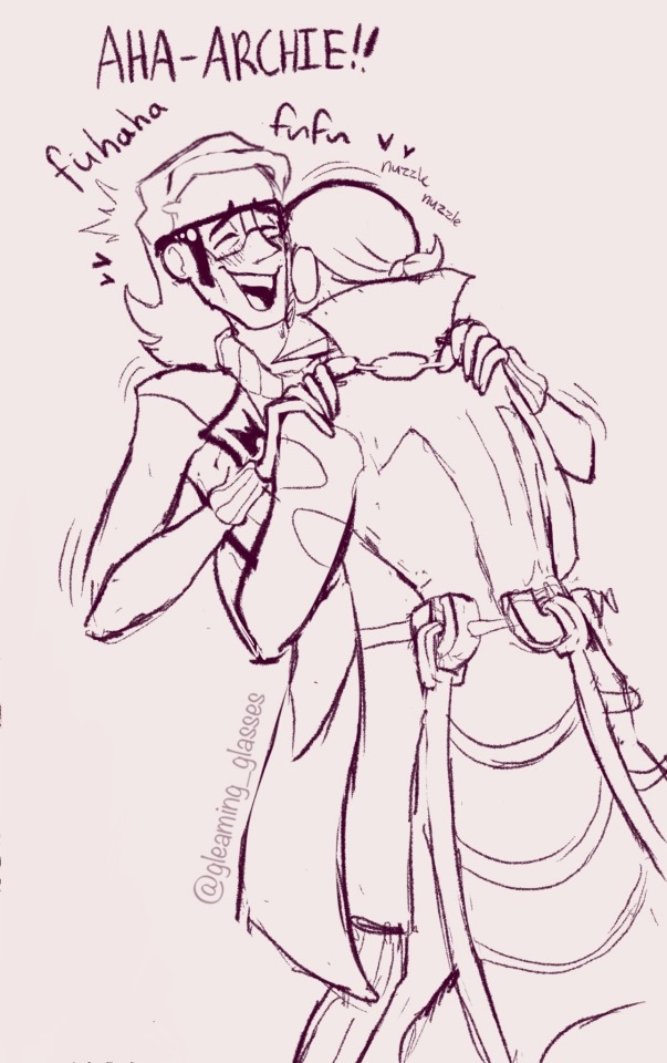
Maxie and Archie first meeting 👍
Or
Maxie and Archie on their first date 💖
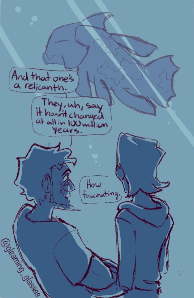
First date
Archie used all his best fish facts to impress Maxie👌
#gleamingglasses art#gleamingglasses chat#fanart#pokémon#pokémon fanart#hardenshipping#aqua leader archie#archie pokemon#pokemon archie#pokemon maxie#maxie pokemon#magma leader maxie#maxie x archie#oras archie#oras maxie#pokémon omega ruby#omega ruby#pokémon alpha sapphire#alpha sapphire#hoenn
225 notes
·
View notes
Text


Supportive
#gleamingglasses art#gleamingglasses chat#fanart#pokémon#pokémon fanart#hardenshipping#aqua leader archie#archie pokemon#pokemon archie#pokemon maxie#maxie pokemon#magma leader maxie#maxie x archie#oras archie#oras maxie#pokémon oras#pkmn oras#oras#hoenn#team magma#team aqua#magma admin courtney
243 notes
·
View notes
Note
I've always had a sappy little thought in my head that Archie loves playing with and/or braiding Maxie's hair. It's surprisingly soft and he makes an effort to tie little shells in it and it makes him and Maxie very happy 😭 ♥

Love this one
#gleamingglasses art#gleamingglasses chat#fanart#pokémon#pokémon fanart#hardenshipping#aqua leader archie#archie pokemon#pokemon archie#pokemon maxie#maxie pokemon#magma leader maxie#oras archie#oras maxie#maxie x archie#hoenn#team magma#team aqua#pokémon oras#pkmn oras#oras
157 notes
·
View notes
Text

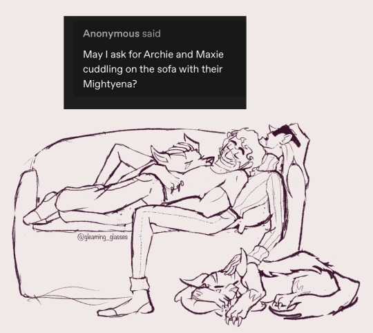
Stuff with their pokemon👌
#gleamingglasses art#gleamingglasses chat#fanart#pokémon#pokémon fanart#hardenshipping#aqua leader archie#archie pokemon#pokemon archie#pokemon maxie#maxie pokemon#magma leader maxie#maxie x archie#oras maxie#oras archie#pokémon oras#pkmn oras#oras#hoenn#team magma#team aqua
164 notes
·
View notes
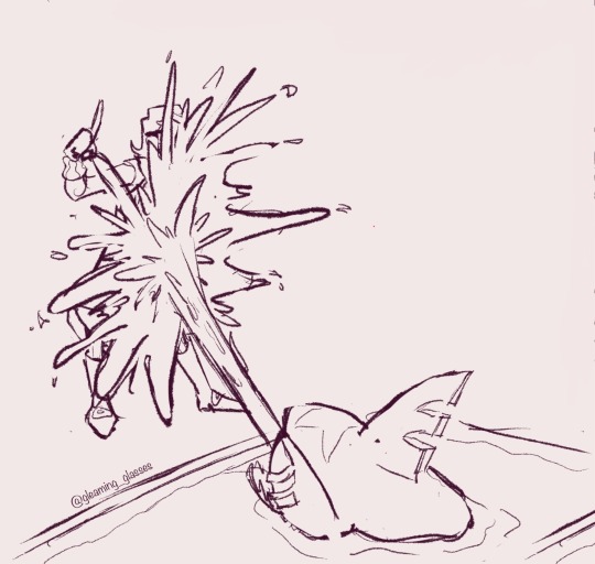
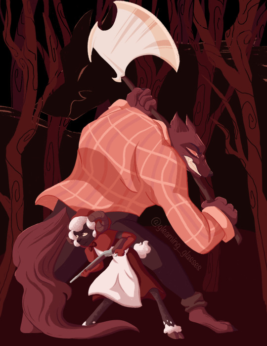
Note
Could I get an either one of them defending a weakened or wounded other?
I feel that Archie would go absolutely feral defending Maxie. And a feral Maxie would be even more scary.
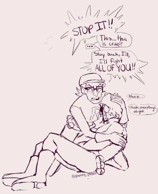
Losing battle
#gleamingglasses art#gleamingglasses chat#fanart#pokémon#pokémon fanart#hardenshipping#aqua leader archie#archie pokemon#pokemon archie#pokemon maxie#maxie pokemon#magma leader maxie#oras archie#oras maxie#maxie x archie#pokémon oras#pkmn oras#oras#hoenn#team magma#team aqua
166 notes
·
View notes
Text

Pokespe asks👌 Honestly feel like Archie finding Maxie in the distortion world might be a bit more standoffish, at least at first
#gleamingglasses chat#gleamingglasses art#fanart#pokémon#pokémon fanart#aqua leader archie#archie pokemon#pokemon archie#pokemon maxie#maxie pokemon#pokespe#team magma#team aqua#hoenn
159 notes
·
View notes
Note
How do you feel about perfectworldshipping? :3
It’s cool👌

this is basically how I think of them
191 notes
·
View notes
Note
Here’s a fluff idea. Feel free to ignore~ I can imagine that Archie loves to bury his face and beard into Maxie’s neck, making that tickle like hell. <3

Agreed and a personal fav👌
#gleamingglasses art#gleamingglasses chat#fanart#pokémon#pokémon fanart#archie pokemon#hardenshipping#aqua leader archie#pokemon archie#pokemon maxie#maxie pokemon#magma leader maxie#team magma#team aqua#pokemon hoenn#pokémon omega ruby#omega ruby#pokémon alpha sapphire#alpha sapphire#oras archie#oras maxie#pokémon oras#oras
266 notes
·
View notes
Text
I sorta feel like Pokémon’s villain lineup has the same energy as Disney’s princess lineup it’s literally some of their most marketable characters standing next to each other vaguely looking at you while standing in a void


Like,,,

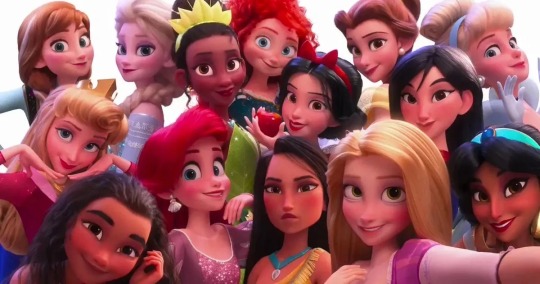
Idk I don’t think I’m wrong
#pokémon#Pokémon villain#team rocket giovanni#magma leader maxie#aqua leader archie#galactic boss cyrus#ghetsis harmonia gropius#plasma leader ghetsis#lysander#branch chief faba#ghetsis pokemon#disney#disney princess#feel free to ignore me this isn’t really anything#i thought of this in the shower#gleamingglasses chat
511 notes
·
View notes
Note
Max is a total wine mom


Maxie is THE wine mom
#gleamingglasses chat#literal menace behavior#like bro you’re on the clock#get a grip#pokémon#pokemon rse#rse#pokémon rse#pkmn rse#pokémon oras#oras#pokemon maxie#maxie pokemon#magma leader maxie#team magma#hardenshipping#pokespe
353 notes
·
View notes
Note
Okay but important Cowboy Maxie question:
Is the hat shaped like an M

It wasn’t meant to be lol, I see the vision but to me an M style hat gives more pirate then cowboy, I do like the third one though so who knows maybe I’ll change it a bit👌
#gleamingglasses art#gleamingglasses chat#swap au#fanart#pokémon#pokémon fanart#pokemon maxie#maxie pokemon
70 notes
·
View notes
Text
tfw you’re about to commit dastardly deeds and sinister schemes
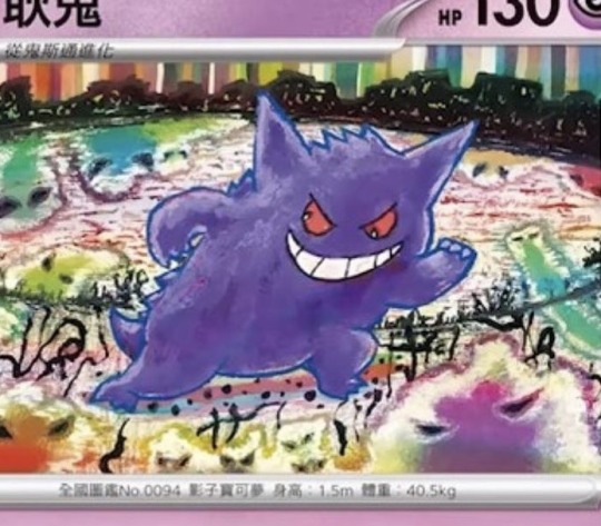
#gleamingglasses chat#pokemon#pokémon cards#Pokémon card#gengar#pokemon tcg#pokemon trading card game#I love the recent art for the cards it’s so pretty#pokemon gengar#gengar pokemon
193 notes
·
View notes
Note
you have been FEEDING US the harden content recently
thank you for your service, soldier 🫡
Thank you! I love making art of them but it wouldn’t be half as fun without ya’ll here, I’m so glad you like it💕
41 notes
·
View notes
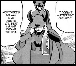
Text
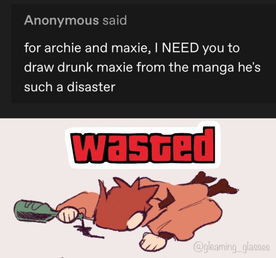
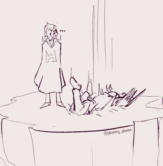
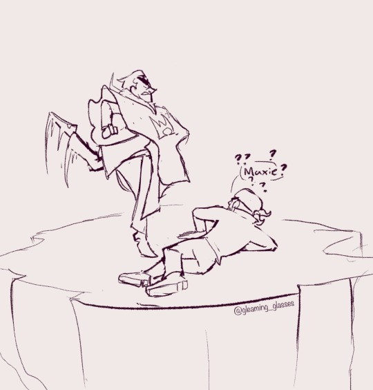
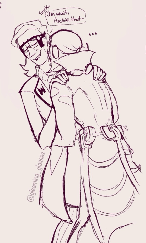
I wanna make a piece based around the Pokémon Ruby and Sapphire Manga but I’ve never actually,, read it lol
So if anyone could confirm/deny that Maxie chugging wine and Archie in the suit of armor are at least from the same story or timeline or whatever I’d really appreciate it
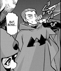
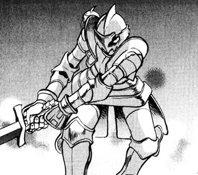
147 notes
·
View notes
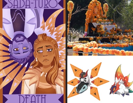
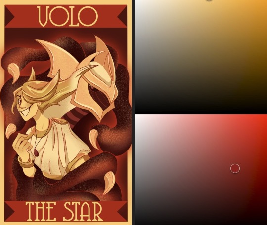
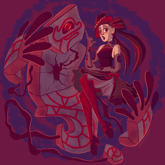
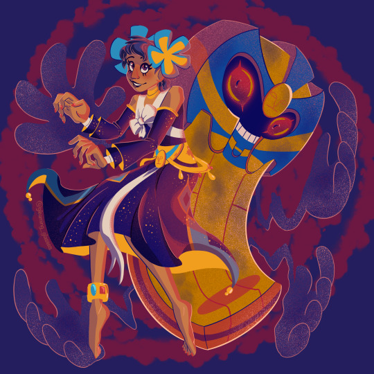
Note
hi there! i’ve seen your pokemon villain tarot pieces and i think they’re really neat, and the colors especially are very striking - how do you choose the color palettes for them?
Thank you so much! I can go into each one since they all had their own inspirations so if you’re interested in knowing more about that then read on!
For starters, I set the limitation that each card has a base pallete of two hues to help with consistency. Lighting, shading, and effects could be different hues, but the base could only be two. I also decided that I wouldn’t use any pure white, black, or achromatic greys as they felt like loopholes in the two hue rule.
Sada and Turo already had a distinct orange and purple theme, so it made sense to lean into that. While trying to think of things to fill up empty space that matched the palette, I thought of how orange marigolds are used to decorate during Dia de los Muertos and that both Sada and Turo had a variant of volcarona, who has orange wings. With that in mind, I decided to decorate the wings in the shape of a flower as a way to tie it back to the death theme.
For Volo I decided to use the yellow already present in his design and red as a show of how intense his feelings were at that point, a powerful palette for a powerful trainer. The red also helped tie in giratina who I knew would be an important part of the composition. I wanted this palette to convey a feeling of intensity, way more than any other card.
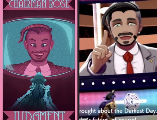
Chairman Rose was tricky, compared to other villains he doesn’t have too strong a signature color. I decided to lean into his name (rose) and do pink with blue to be the screen he’s on in the stadium and Leon’s figure at the bottom. I went with such a non threatening palette to reflect how Rose was not seen as a threat by the player for large part of the game. He leaned into a friendly demeanor and so I felt the palette should reflect that.
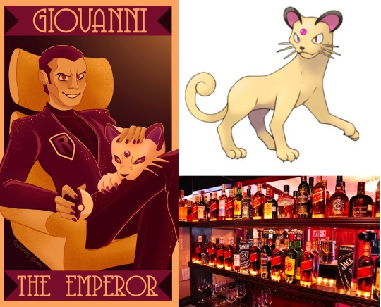
For Giovanni at first I thought to use his signature colors of red and black. However, if I did that it wouldn’t be pure black, but rather a very dark shade of some other color, and I didn’t like how that was looking. I started thinking of things Giovanni reminded me of and one thing was wine, which tends to make me think of bright yellows and deep reds or pinks. I also knew I wanted his persian in the card and personally like the head canon that it’s shiny, so using those yellows and pinks worked really well!
Guzma, Lusamine, N, and Ghetsis each had relations to each other in game and I wanted their cards to reflect that. For N and Ghetsis, that would be by them sharing green and being surrounded by dragons. Ghetsis colors were mostly inspired by his coat and the colors of a shiny hydreigon. For Lusamine and Guzma it was by sharing purple and by having guzma hang by Lusamine’s arm. After that I leaned into the gold in Guzma’s design and a bright blue for an eerie, otherworldly effect of Lusamine.

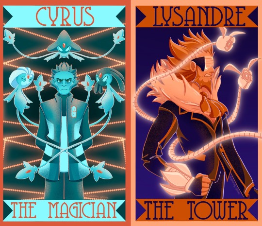
Lysandre and Cyrus got similar palettes for opposite reasons. Lysandre’s signature color is orange while Cyrus’ is cyan. Blue and orange together make for good contrast with being complementary colors. I gave Lysandre dark blues to help make the oranges pop. Meanwhile Cyrus got bright orange to reference the red chain.
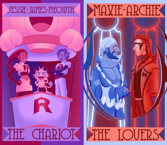
Finally, for Jessie, James, Meowth, Maxie, and Archie, I felt their signature colors were so well known that I had to use them. It wouldn’t make sense to use anything other than red and blue for Maxie and Archie. Maybe there’s some leeway with Jessie and James, but for them I figured if I didn’t use one of their colors, then I shouldn’t use either, and why would I do that when purple and pink work so well for them! And they came together nicely on Meowth.
And that’s all of them! I hope that answered your question👍
48 notes
·
View notes
Note
trick or treat! happy halloween! 🎃✨
Treat🎉
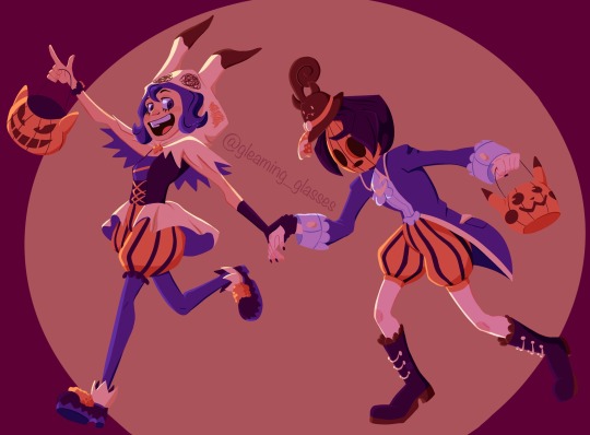

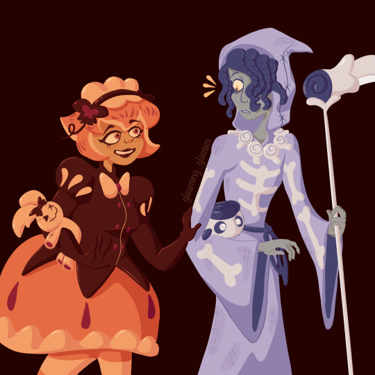
Art of Halloweens past
Happy Halloween!🎃
45 notes
·
View notes
Last Seen Blogs
sisthisbetterbeagoodidea
Random-ish thoughts I guess; with DC, Cats and Supernatural?
bankeharrell21
The Love of Murphy 620
allforthegamelovers
you are a pipe dream 🚬
destielslostkid
anna
folksytulip-blog
Folksy Tulip