#gotta say copy and pasting from a world building app is not a good idea based on definitely not my own experience with this
Text
more! creativity! about my boy! basically just the adventures leading up to lu
adventure 1
ganondorf curses the land into darkness with the Triforce after the 7 wise men try to seal him, basically turning the world into a dark world x twilight realm
link travels to the sacred realm using the master sword after being informed by the sheikah elder Impa of his namesake and what a vision from the princess with the blood of the goddess depicted
dungeon dungeon dungeon in the sacred realm to update+ the master sword so she isn't breaking every 19 min now he can access the sky! His loftwing has been waiting a hot minute
another 7 dungeons to free the sages yay
there's a fuck ton of enemies bc of the darkness too so he gets rid of that by clearing the dungeon which house a fraction of ganondorfs evil (that's how he trapped the sages)
Ganonpork gets sealed partly in the master sword and partly in the sacred realm to stop him from every regained his true power bc that will surely work
master sword gets laid to rest for the time being but link misses his funky little sword so he gets one made by the gorons that's similar to a great sword used by an old hero but also looks kinda like is old friend
also: he starts in hateno! my boy is hateno born and has gone to kakariko a lot :]
no guardian field btw we don't need trauma
adventure 2
shad man and vaati guy are working together
twink man follows a shadow that looks suspiciously like him into a hole and his balance is terrible so he slips and falls
linkus ends up in a parallel world that seems too kind and pretty. turns out there's some disney tower thingy that after 3 chimes of a corrupted magic bell the world will fall into a never ending darkness. It chimes once every morning at 6 am
linky meets the minish! he also finds a funky sword that makes 3 translucent copies of himself all in different colours (red blue vio)
The minish direct him to a shrine with a cool looking not suspicious ocarina that happens to be coloured dark blue and is once again haphazardly shoved in the direction of the great faeiry of time who teaches him a weird song that really messed up time a bit. also does some mask collecting but only for the kids back at hateno he swears
4 dungeons +1 where shad pulls a ghirahim and does a little dance and a little murder against link but no one dies so it's good
vaati is a backstabbing bastard and uses shad. very rude imo
vaati is defeated again and sealed in the four sword again and the world is saved again
link finds his way out somehow and desperately tries to avoid adventure <3 good luck buddy
adventure 3
heros spirit longs for adventure ig
he goes sailing :) surely nothing wrong will happen :)
something wrong happened
he doesn't realize it but he kinda went sleep mode
meets a redhead pirate not malon not zelda but somewhere in between and she's turns into a rock bc of a dark blob of evil that calls itself a nightmare
adventure time 8 dungeons plus a hunt for a shiny triangle that's not at all the triforce
Third plot point: finds an island
beats the nightmare and everything disappears. It's not his fault n they aren't dead but they DEFINITELY aren't where he is. he's currently stranded so.. good luck
he finds his way back to Hyrule! no more adventures surely...
hopefully?
adventure 4 (it's starting to get excessive..)
the one time he's gone Ganon is resurrected????
ganon got tired of being imprisoned and used a cool alterego to escape the sacred realm
hey!! Link is busy w oos and ooa (no ganon tho. only twinrova) so ganon said lmao what a time to be alive and released HIMSELF from the sacred realm using this weirdo names aghanim who totally isn't ganon in a trenchcoat
Zelda is about to be sacrificed! for magic reasons! idk think skyward sword or minish cap ganon just isn't happy with the ENTIRE TRIFORCE so he went for zelda (hylia's) power too
link comes in guns blazing and fails miserably. he has to go get a weird triangle now bc zelda attempted and succeeded at splitting every piece of the triforce into 8 individual pieces (24 total)
gets the funky triangle back whoops ganons back n he seals him away again and hopefully he'll stay away? please?
link makes friends with literally. every single fairy out there plus one so now they all love him.
fair enough I mean
adventure 5. last one I swear
hyrule warriors! he meets so many people and then they all leave :( but now he's somewhere between mature-bubbly-suspicious of every single damn thing especially if it has an eye associated with it
Inciting incident: "oh, what's that gate looking thing?"
it's just Hyrule warriors
It's just Hyrule warriors.
Ganon gets his cheeks clapped. you know the drill
world is saved! let's hope he doesn't have to chase a shadow through time in his next adventure *hint. nudge nudge
#merged linked universe au#mergedlinkeduniverseau#this guy.. is taking up my brain. stinky blorbo#gotta say copy and pasting from a world building app is not a good idea based on definitely not my own experience with this
7 notes
·
View notes
Text
;;blood pain ii
A voice message. That was what had led Naoto Kurogane on this wild chase.
Supposedly, a ‘copy’ of him, created to believe that he not only was the original Naoto, but that he’d lived in Spirale his entire life, had been infected by some sort of virus. That virus was going to kill them... And, if they died, so would he.
To be honest, they didn’t even need to put stakes like that on his shoulders. Hearing the first bit was more than enough to persuade him into action.
He looked down at his phone, squinting at the location displayed on it. ‘Fibonacci Ward’.

“Gah, stay still, idiot..! What’s making him run from place to place like this?”
His copy had been doing this the past few hours. Never staying in one place, always being just out of Naoto’s reach. He’d be at a total loss to his copy’s motives for this... if he didn’t already have a glimpse into them.
Shortly after he’d woken up this morning, there had been a steady stream of memories flowing into his mind. A life he never got the chance to live. Where he’d been able to live his life as the head of the Terumi family. Where he wasn’t in constant, life-threatening danger. A peaceful life, here in the walls of Spirale.
It was in such bad taste, he wondered if somebody running this place had it in for him.
That aside, it gave him a bit of an idea on where to look. There was little reason for his copy to go anywhere in Fibonacci, unless he was headed back home. But why would he be headed to ‘Naoto Kurogane’s’ home? Why there, and not his estate in Cotes?
He couldn’t figure that out, but it was his best lead. So off he went, arriving at the housing area just a long, tiresome sprint. Pulling up right in front of his house and thoroughly checking the interior to find... nothing.
Not a soul in sight. No alternate self, nothing.
“Alright. Where the hell are you?”
Was his hunch wrong? He stepped outside, wondering where to check next. There wasn’t any other place in the Fibonacci Ward his copy could’ve been checking, if he followed reason. Where was he?
Suddenly, he heard commotion.
“Where... Where are you...?!”
There, coming from the houses further down, he saw a young man bearing traditional Japanese clothes, looking around as though in a frenzy. Not a bizarre sight on its own, until his eyes met the boy’s face. Their eyes locked, mutual gaze frozen as they processed the other’s presence.
Naoto Kurogane and Naoto Terumi locked eyes for that single moment.
And then, Terumi’s expression shifted to pure, unrelenting horror.

“Y-You...!!”
He turned to run.
“Hey, wait!”
But Kurogane was quick to close in on him, quickly grabbing his other self by the arm.
“Let go!!! Lemme go, dammit!!”

“Settle down. We need to talk, you and me.”
That didn’t seem to calm Terumi down any, and the boy continued to struggle.
This was going nowhere.
And Naoto Kurogane’s patience was running thin.

“--I’m not gonna repeat myself.”

“Settle. Down.”
The smell of iron stained the air as Kurogane’s grip tightened. Terumi flinched, turning to see his other self staring him down. Crimson mist surrounded them both, with the original’s piercing red eyes glaring straight into his soul. Suddenly, Naoto Terumi felt any strength he had leaving his body.
“...Damn it...”
It didn’t take long for Naoto to cut to the chase. Using the voicemail as proof, he explained everything. The virus, the potential death awaiting his copy, everything. All the while the copy was forced to listen... Listen as all he believed was crushed right before him. Listen as his very life was reduced to nothing more than some farce--just a stepping stone for some original to move past.
“...”
He was silent, after all was said and done. What could he respond to any of this with?
“And that’s why we need to use this weird app, SGO. If we use this, we can save you. Get you fixed up, cure whatever this weird virus is. All I need from you is for you to let me do this.”
Terumi turned to look at Kurogane as though he’d just said he was going to sprout wings and fly.
“You want me to trust you to do that? To just--to just cram me in some app, is that what you’re saying?!”
“What? No, what I’m saying is that I’m trying to save you! You’re going to die if I don’t do this!”
Kurogane held up the phone, displaying the rather chintzy-looking app interface for his other to see clearly.
“Just tap this button, and we can solve all of this. You can go back to your old life, with your family, your friends, everything. Just like it was.”
And then, something snapped in Terumi.

“--Just like it was?”
“Huh?”
Terumi yanked his arm from Kurogane’s grip, and without any restraint, the boy’s outrage came flooding out.
“How am I supposed to just go back to the way things were like this?! To pretending my life has any sort of purpose?! If I’m supposed to be some... some ‘copy’, then what the hell does it even matter!! I refuse to believe I’m any kind of cheap knock-off of the ‘real’ Naoto!!”

“You keep waving that damn phone around like it’s supposed to mean anything--how do I even know to trust you?! Maybe you’re the copy!! This could all be some elaborate trap! How am I supposed to know you’re the original, how am I supposed to trust you on that?! How am I--”

“THAT’S ENOUGH!”
Kurogane’s voiced boomed in a manner he never thought capable from him.
“...Look. This isn’t about who’s real or who isn’t. Maybe you are the original Naoto. Maybe I am the copy. Who knows? Who cares? That doesn’t mean either of us suddenly doesn’t matter. What does matter, though, is that if I don’t do this, you are going to die. Both of us are going to die. I wouldn’t lie about this, and you can trust me on this, because I know you wouldn’t lie about this, either.”

“Naoto. No matter what, you’re you. I’m me. And we need to work together on this. Okay?”
There was silence between the two of them. Terumi suddenly found himself unable to look his other in the eye. After a few moments of crushing silence, he spoke.
“Pyrrha.”
“Pyrrha? What about her?”
“Pyrrha--The Pyrrha from my world, I need to... I need to know that she’s alright. She’s gotta be caught up in all this too, right? I can’t leave until I know she’s safe from this virus stuff too.”
The Pyrrha from his world? Were they friends in that world, too?

“Pyrrha’s probably out chasing her other self like the rest of us... If I can get in touch with her, that’ll give us a good lead on finding your Pyrrha.”
And so, with Terumi watching him with bated breath, Kurogane flipped open his contacts. After a string of character inputs and a press of the send button, he’d stand, waiting for her response.
“Alright. Now we wait.”
Terumi closed in, placing a hand on his other’s shoulder to peer at his phone.
And, for a split second, Naoto Kurogane felt something. It felt like a shock of some kind, like something had been transferred the moment the two of them made contact. He felt his mind stutter for just a moment, before returning to normal.
Not knowing what exactly it was, he wrote it off as just his other accidentally discharging some build-up static on him, and continued to stare at his notifications.
1 note
·
View note
Text
July 15th Morning Tweets...
July 15th Morning Tweets...
---
Martina McBride - “Hark! The Herald Angels Sing” - the song was made more beautiful by this woman’s voice…I feel women sound less and less like that, and also tend to look less womanly in appearance and more like girls…I mean women have a particular build (…can you say build with women?! I don’t mean broad shoulders like me or other guys and I’m not exactly referring to the body like a coke bottle from rap songs…)…there’s also something to their faces…can’t put my finger on it, but maybe women look like Wonder Woman or Gal Gadot acting as Wonder Woman, where as present day women looking like girls seem…playful?! in appearance…is that actually a thing or style?
---
From the @TouchofModern app, you can always find innovative interesting stuff at discount prices. On a very dull level, compared to buying a fitness item of sorts, I found these really good quality shirts…what do I mean by quality? The material is good, the design is good, feels good, I think I’m thinking texture?!-it’s also good. The t-shirt brand I’m talking about are from a London/Spain based brand called “Felix Hardy.” Polo Ralph Lauren sells jeans that allow ur legs to bend and move around- I mean you get what you pay for, but I think Felix Hardy sells better shirts…
---
so with all the philosophy Ive been sharing, I came across Matthew 16. A part of it goes, "The Yeast of the Pharisees and Sadducees" . It states, -
-5 When they went across the lake, the disciples forgot to take bread. 6 “Be careful,” Jesus said to them. “Be on your guard against the yeast of the Pharisees and Sadducees.” 7 They discussed this among themselves and said, “It is because we didn’t bring any bread.”-
-8 Aware of their discussion, Jesus asked, “You of little faith, why are you talking among yourselves about having no bread? 9 Do you still not understand?-
- so yeast of the pharisees and sauducees...like 5 loaves miraculously feeding 5000 men or yeast expanding, an idea in our heads can spiral or take life for better or worse. be mindful of wrong ideas and the spiral they can take you. -
-be mindful of what the known and hidden orchestrators put out...you may only be aware of one group...be mindful, or “Be on your guard against the yeast of the Pharisees and Sadducees.”
-In that BiblicalPassage, Christ says, "When they wentAcross the lake, the disciples forgot 2 take bread. “Be careful,” Jesus said 2them. “Be on ur guard againstTheYeast ofPharisees &Sadducees.” 7 They discussed this amongThemselves &said, “It is b/c we didn’t bring any bread.”-
- This is Christ saying, "take in His words and what religions offer, with an open mind, a kind heart, and INSIGHT-i.e. learn to interpret things and not just take things literally. -
-whether in life, reading, or understanding a person and their actions, look at context i.e. what came before, happening now, and the potential for future events...-
- it goes back to what I think I said yesterday about parables being like computer zip files. The way to unzip them is with insight and life experience. To repeat my specific words from yesterday: -
-Here’s a computer metaphor: parables are like computer zip files or compressed files. A zip file is a file that can contain multiple files and folders in the convenience of one smaller file.-
-You use a program to unzip that one file to reveal the multiple files and folders. The parables are zip files and you can gain a myriad of advice, lessons, truth from the same story. -
- From the 10 Commandments to the Golden Rule, in place of long volumes of texts using multiple meaning parables,
Christ tries to give an easy, concise, “not-having-to-know-too-many-things” version to Salvation. -
-But you need a strong mind, need to use insight, need to interpret, and not JUST take things literally.
---
So let’s assume mind reading can happen…you gotta ask to what extent…if someone were to say they can detect my thoughts, or let’s even assume I’m relayed while I slab aftershave all over my face, or while I’m in my boxers around the house, or taking a nap in my man cave of a bedrooms-which I have yet to gain the energy fo clean/organize…I mean what are my actual thoughts…I’m sure for fun it can be said he’s thinking this/that…but then, in those instances, do the orchestrators say I’m thinking what I’m writing in my blog? Aren’t those “thoughts?” When I write on the fly-perhaps I’m seen- can the orchestrators tell which direction I’m going with my writing?! So if mind reading is about thoughts, and you can’t detect my deep and “sometimes” philosophical mind, how can anyone say they’re reading my thoughts? Is that the orchestrators mistakenly saying they detect “ impulses “ or the “sea of random things” floating through the mind?! Now Ive indicated this idea in past blog posts, maybe among the earliest of them, but I guess I have to repeat myself. So let’s assume the orchestrators detect the sea of randomness in a person’s mind…how many of those random things, popping up in the mind, do you agree with, act on, or make a “willful choice” to “contemplate further.” ?
I’m a guy and a Libran guy. I find women beautiful and enjoy killing time with women. Even in kindergarten, my best friend was a girl and I’d hover around her and keep watch while she talked in a circle with her friends. My father wanted sons, but I want at least one daughter and one son, the daughter of whom, I will probably call, “Lara.”
But back to alleged mind reading. Being a guy and, for sh*tz and giggles, a Libran guy, I see a beautiful or hot girl, my mind, like any other guy, will take directions. But reality is, while that’s happening, I could just be waiting to drop off a box at UPS. My focus is getting in and getting out of UPS, for that instant of time. I’d like to think my mind is governed by several copies of the baby version of my younger sibling. He’s a treasure and a doctor. So figuratively speaking, while waiting on that line at UPS, one of the copies of my sibling will scream, “Breakfast”, while another will scream, “ohhhh beautiful girl”, but how many will “I” act on amidst the screaming copies of my younger sibling? While my body may agree with hunger or attractions, my mind may have different plans. The orchestrators may say he thinks ur beautiful, but that’s like on impulse, without further understanding she doesn’t meet my type of smile requirements. So then, ultimately, would I consider her beautiful, for my needs? Can the alleged mind readers detect that, if it’s not actually explicitly said? I mean, my morning writings are thoughts, are those anticipated? If it’s on the basis of cr*p reading of the mind that people don’t talk to me, I tend to be shameless to the point that I walk around my room naked, under the belief I’m relayed all the time. I would totally value the person who tells me what’s going on and help me move on with my life, after all these years. All this said, this is not to takeaway from my belief that this mind crap and instruction based commanding of people, may have a role in the end of the world, as stated in yesterday’s (Wednesday morning) tweets/tumblr post. Don’t hesitate to talk to me, above all talk to me about “the situation” . I mean some confirmation/acknowledgment for living like this, for figuring out things through evidence/observation through the course of years-it’d be a reward through which youd make my day. Even if I lose a chance at being 6 ft tall or a billion dollars, I don’t care. You and me, we can start something together and say screw you to the world…Christians say the “Our Father” prayer…I say that more important than “Give us this day our daily bread.” Is “Thy Kingdom Come”. While it may refer to an actual Kingdom, there is another Kingdom in every mind. When we say that, we ask for the heaven state of mind in our heads. It brings about a strong state of mind that can handle and attain everything. It is about believing without doubt.In defense of this, Christ even says, “Seek first the Kingdom, and all these things will be given to you.” A mind close to God, that’s trained to handle anything, can achieve anything and reach new heights. In the “Our Father”, we say at the end: “For Thine is the Kingdom, the Power, and the Glory, forever and ever, Amen.”
“For Thine is the Kingdom (Throne of the Mind, where we, with our mental voice, reside amidst a sea of impulses and thoughts), the Power ( the power to influence minds and hearts belongs to God and should not be misused as “our own”, “ for human purposes”, to stupidly mind read/ mind control for government projects or social entertainment
-for this power is Holy.
Biblically, it is said, “But whoso shall cause one of these little ones who believe in Me to fall, it were better for him that a millstone were hung about his neck, and that he were drowned in the depth of the sea.”
This is open to interpretation. The little ones or children represent innocence/purity, or an untainted mind. The crime of assaulting a mind is so severe, it would be better for that person to tie a stone around his neck and drown in the sea. To use a form of the Power of God to do it, you gotta ask, what are these people?!), and the Glory ( my survival alone, the words I relay, not from my intellect. When you see me, act natural and according to what comes to mind upon seeing me. Credit/Glory goes to The Divine. I’m just a passerby. I’m a nobody who likes to wear shades or get involved with computer work and buy his coffee and play rummy/card games with friend-girls or girl-friend. Don’t turn me into a role model, an icon, or associate me with fancy labels, for that poses danger to the First of the 10 Commandments.
Be natural, gain perspective from the relayed.)
---
Religion is not about restricting your life, but to, if nothing else, give you an open mind and kind heart. Sometimes the rules and regulations make us judge one another, or give us high end superficial morals, or we get lost in the details. But they’re really guidelines to doing what’s appropriate for your life with insight. Religion can give different groups of a people an identity. Through Islam, a large group of people aim to speak one language of Arabic, and identify as one people beyond Pakistan, Afghanistan, or any of the other Middle Eastern countries.
One culture, one “new nation” identity, one language, one system to open the mind and promote kindness of heart, is the goal of religion. It is to make us our best selves and unite the world as One, be it under the label of “Earthlings” or whatever: something beyond American or I dunno Iraqi or whatever. Just be on guard: Discipline will lead to a good mind, but so that ur not robotic or overly serious, remember to train the heart. The Divine sees us as The Divine’s children. Maintain innocence and a mind open to adjusting/learning, like children.
---
On another note, from observation over 30 years, I feel strict religious practices lead to things like obesity and other vices. I mean people are humans and humans have needs. Life consists of the idea of balance and taking care of your hopes, needs, desires. I mean, you may try not to drink alcohol because you think, among some peoples, that God wouldn’t approve. But that Friday/Saturday night with friends or doing/planning something fun, gives you something to look forward to. In the process of looking ur best for a party, throughout the week, you may better take care of ur health, work out, or eat right and in portions. I feel those who “have the attitude of” “alcohol is sinful” possibly also have mentalities that usually lead to vices like overeating.
In abstaining from one pleasure, you may give urself something to look forward to, by eating the best tasting foods frequently. You may eat a lot of sweets. I mean we’re human, we’ll have desires and vices. Regarding desire, it’s not desire that’s bad or questionable , but what you may possibly do to fulfill your desire or carry out your desire. You may think what else is there to enjoy in life or what else can I afford or do. This “could be” problematic. For one thing, you’ll end up obese, and an unhealthy lifestyle and eating habits can make ur mind cloudy. A cloudy mind makes bad choices or get themselves in more vices like being an inattentive spouse to ur partners conversations or a mediocre listener to your kids. These things can spiral as life from dawn to dusk is in motion in our surroundings and in the hunger and satiating of that literal/metaphorical hunger, daily. Motion!
I mean for the overly religious, a beer or two, or a shot of I dunno Johnny walker black label?! won’t kill you. In the process, it may be avenue to an insightful conversation with a potential friend. With something like sinful alcohol or whatever, I think no one thinks about whether the pros outweigh the cons, and the patterns of behavior it can lead to. While a shot of alcohol may be relaxing, too much can lead to bad choices like roaming busy streets, drunk. Alcohol is also bad for ur muscles if you wanna get jacked. But to each his own as is appropriate for their life in that particular instance of time in their lives.
On a related note, when I went out to a coffee shop mid to late Wednesday morning, it was really hot. I just showered, and was sweating a lot. After having blogged something philosophical, I started thinking about the Sikh men in the beards and turbans or the Muslim women in hijabs or even…is it called burka?(in reference to the long black gown/hoodie)…these are devoted people focused on Union with God. For a woman- I’m just guessing here- ur hair is one of ur assets. It might even be something you treasure. You, being a beautiful creature of the Divine, hiding ur silky or so hair, as a sacrifice, visible only to ur loved ones seeing ur appearance, is truly admirable. I’m sure that sacrifice won’t go ignored and will be spiritually rewarding. And regarding some of the Sikh men I’ve seen…these are some good looking dudes…I mean they’re tall, have the perfect tan, noticeable builds, and the Sikhs I’ve run into tend to skip grades in school. I knew someone who decided the turban and beard weren’t necessary, and he had a lions mane of hair and a face that shone like the sun…these men and women make these uncomfortable clothing accessory choices, not radiating the beauty God gave them, for God. In seeing this, and wishing you guys and girls the best, just wanted to share a thought. I’m a Christian. What do you think counts more in God’s eyes for me? Mechanically going to Church every Sunday and acting super perfect for the sake of what others think, or implementing the Golden Rule in my daily life? (Love God first and foremost, and your neighbor as yourself.) Does God appreciate more what I do with the gifts He gave me and me living my life in a way I can tell my Heavenly Father about my day at the end of that particular day? Does God care whether there is hair gel in my balding head on my fat mess of a body or does He value more the time I spend WITH Him in prayer and For Him in life through my words and actions? With that in mind, while the hijab or the beards and turbans will direct extra blessings ur way, I don’t think it should be required of your religions. All the hub-ub against Muslims…I mean these woman of Mediterranean and Middle Eastern descent are radiant and are like the I-Dream-of-Jeanie partners to their spouses, and their foods: from lamb gyros to the Afghan Chicken and Rice with the special sauce-some good stuff to be aware of…
---
lets assume you’re not seeing SOME of these postings today, on twitter, or tumblr, for the first time...maybe it was witnessed while being typed, as I’m typing, on the Notes app on my iphone...were the orchestrators aware that I’d mention my take on the Yeast of the Pharisees and Sauducees today? What are they calling this nonsense? Mind reading? Predictive Analytics?-A waste of time, an insult to human dignity, a testament to their indecency...
0 notes
Text
13 Great Landing Page Examples You Gotta Save for Your Swipe File
Here’s our starting principle:
A polished, professional landing page can improve your conversion rates. (And a messy one can hurt them.)
Pretty simple, right? You’ve probably heard something similar before. But what the heck does it mean to be “polished” and “professional” on a landing page, anyway? And when it comes to conversions, what’s the magical x-factor that sets exceptional marketers apart?
With these questions in mind, we want to show off some fresh landing page examples to inspire your next creation. Go ahead and save their smartest, slickest, and snappiest elements for your swipe file.
Throughout, we’ll offer an Unbounce-certified perspective on what makes each page so darn good—and, occasionally, how each could be improved. (Incidentally, all of ’em show off what you can do with the Unbounce Builder.) Let’s go.
What makes a landing page effective?
Before looking at the examples, it’s worth highlighting some of the qualities that most great landing pages share. (Ain’t got time for that? Jump ahead for the top landing page examples.)
Here are a few fundamental practices of high-converting landing pages:
Use a clear and concise value statement (above the fold) so visitors understand the purpose of your page immediately.
Match your primary headline to the ad your visitor clicked to land on the page in the first place (or the button of the email CTA, for example).
Include social proof and testimonials to back up your claims.
Focus the whole page on a single offer, with just one primary call to action (CTA).
Use a conversion-centered layout to make your CTA stand out (think about whitespace, color, contrast, and directional cues).
Test new ideas using A/B testing. Sometimes what works will surprise you.
Not sure your own landing pages are hitting the mark? Try out Unbounce’s Landing Page Analyzer to get a personalized checklist of tactics that can kick your conversions up a notch.
The Best Landing Page Examples of 2019 [Updated!]
1. Athabasca University
Image courtesy of Athabasca University. (Click to see the whole thing.)
Athabasca University pioneered distance education in Canada in the 1970s. Today, it uses landing pages to boost its online enrolment initiatives, including this example representing its 14 certificate programs. It’s a smart choice since landing pages allow AU to focus a visitor’s attention on a particular slice of its many online program offerings.
Industry: Education
Why it inspires…
Smart copy: It might be worth testing out a more direct headline, but the copy here matches the school’s other branding initiatives elsewhere. It’s also very sharp. The target is clear: people who might further their education but don’t feel they have time to pursue it. This landing page says otherwise (in words and in its hero image).
You-oriented copy: This page is all about me (or, uh, “you”) and not about the “Great and Powerful” Athabasca University. Marketers working in education understand the need to appeal to self-interest better than many of their counterparts in other industries, who can slip into bragging. I’m not sure what part of Maslow’s hierarchy of needs calls for tech bro flexing, but AU does better by appealing to a desire for self-actualization.
Testimonials: A little bit of inspiration never hurts. Here, the social proof shows pathways to personal success before people make a significant investment. I’d test to see if doubling down doesn’t produce even better results here. Giving each testimonial more visibility and offering a smidge more biography—along with portraits to humanize them—might provide a little boost. (Of course, it might not. But that’s why we test!)
Z-pattern: This page is a classic example of a Z-pattern at work. That is—its visual hierarchy takes advantage of the way people typically scan a webpage. In this case, the eye is encouraged to travel from the Athabasca University logo to their tagline (“Open. Flexible. Everywhere.”), then diagonally across the heading to the supporting copy, and then finally right to the call to action. (Pow!) Other visual queues also encourage the eye to move down (including, cleverly, the pointed tip of Athabasca crest).
2. blow LTD.
Image courtesy of blow LTD.. (Click to see the whole thing.)
If you look past the buzzy “Uber for beauty” thing, UK brand blow LTD. solves a genuine problem in a genius way. They offer affordable, professional beauty services that come to you, and—more importantly—you can book an appointment with one of their pros straight from their app. Smartly, landing pages are a big part of their campaign strategy. The example, for instance, promotes in-home eyelash extensions in clever ways.
Industry: Beauty
Why it inspires…
Crystal-clear value statement: This landing page doesn’t mess around with cute copy (e.g., “Eyes That Amaze”). Instead, it clearly states the offer and relies on value (and maybe a little bit of novelty) to win over prospective customers. A promise doesn’t get more unambiguous than “Eyelash Extensions At Home,” and that’s precisely why this headline is so effective.
Promo code: Providing a promo code to visitors sweetens the pot, but it’s also doing something more. The call to action (“Book Eyelash Extensions”) redirects to their main website, where they might get distracted or frustrated. The promo provides extra motivation to carry visitors through to complete a booking. Want these savings? Then ya’d best use that code before you forget.
Social proof: People are understandably picky about who does their hair and makeup, so providing social proof is a must. The testimonials here have been selected to highlight the personalized nature of the experience too. Since blow LTD. only works if prospects feel they can trust their professionals, providing social proof helps humanize the service and start building relationships.
Simple steps: Looking further down the page, we might pause over the “How It Works” section. In this post-Uber world, the service offered by blow LTD. is pretty easy to understand, so why bother including a three-step breakdown of it? That’s just the point, though. This landing page includes these steps to highlight this simplicity. I mean, come on—step three is “Sit Back & Relax.” That’s something I can get behind.
Subtle app promotion: Rather than aggressively funneling visitors into an app, the landing page ends with a gentle reminder that you can download the app on your iPhone or Android. (I’d test a mobile variant of the CTA that goes straight to the app.) Some people will certainly get excited about booking with blow LTD. on the go, but visitors don’t feel too pressured to whip out their smartphone. Once a visitor has converted, there’ll be plenty of other opportunities to onboard them to the app.
3. Blue Forest Farms (Agency: Champ/Cannabis Creative)
Image courtesy of Blue Forest Farms. (Click to see the whole thing.)
We love this incredible design for Blue Forest Farms by Champ and Cannabis Creative. Hemp farmers sometimes have trouble disassociating themselves from cannabis culture. (Tie-dye colors, bong water, and that funky smell coming from your older brother’s van.) But this stellar B2B landing page takes modernized and, dare we say, adult approach to wholesale hemp oil extracts. From its clean design to persuasive copy, it makes a strong case that this is an industry that demands to be taken seriously.
Industry: Hemp
Why it inspires…
Expert copy: Unlike B2C landing pages, this page speaks to a professional crowd. By which I mean, people who know what it means when plant extract contains “natural terpenes” and has been “decarboxylated.” We might suggest going with a more impactful headline, but wholesalers are likely very aware of the benefits. Cutting to the chase can’t be a bad thing.
A ‘refined’ approach: Blue Forest Farms market hemp oil in several states, from crude oil to white label products ready for the market. Beyond just listing these options, this landing page lays out the process through which their hemp is refined, emphasizing the care and craft that go into it.
Low-intensity lead gen: I’ve seen shorter forms, but the lead gen here is relatively straightforward for B2B. (They could test including first and last name in the same field and change some of the language.) It’s smart to leave an optional field for additional notes since wholesale deals are far more complex than most.
Simple design: The kind of conversation that needs to happen in wholesale will stretch beyond a single landing page. Instead of cramming too much information onto the page, Blue Forest Farms keep it short and sweet to encourage contact as soon as possible.
4. Border Buddy
Image courtesy of Border Buddy. (Click to see the whole thing.)
Ever try to cross the border with a 10-pound wheel of Wisconsin cheddar strapped into the passenger seat (and disguised as your wife)? Me neither. But if I did, I’d want Border Buddy behind me. This landing page works by evoking common anxieties and then offering to solve them without fuss.
Industry: Customs
Why it works…
Presenting the problem: The headline starts with the pain and insecurity (“Importing and Exporting Is Hard”) that any visitor who hits this landing page from a PPC campaign is likely to be feeling. Crucially, though, the promise of a solution appears with equal clarity above the fold: “We do the hard part for you,” says Border Buddy. Perfect.
Simplicity: Bringing your purchases across the border can get very messy, so keeping this landing page clean is essential. There’s no more information here than what you need to know. No legalese either. You’ll have a customs broker worrying about all those small details for you.
Speed: At Unbounce, we have a lot to say about the impact that page speed can have on your conversion rates. But Border Buddy is already ahead of the curve on this one. On mobile, this landing page takes less than three seconds to hit first meaningful paint. Border Buddy avoids weighing down the page with unnecessary media or scripts, ensuring immediate visitor engagement. (Prepping an SVG version of their logo could shave a few kilobytes off of what’s already a very lean page.)
Unexpected vibrancy: Sometimes marketers associate the push for faster speeds with a need to sacrifice the visual appeal of a landing page. This example from Border Buddy shows it that doesn’t have to be the case. They’ve made careful choices in terms of font, layout, and visuals to maximize impact and reinforce branding (without distracting the visitor).
F-pattern: Like the Z-pattern, the F-pattern layout mimics the way our eyes move across the screen when we look at content. It reduces cognitive load and ensures that the key pieces of the message (including the call to action) are located in the places that they’ll most noticeable.
Slow-loading pages can cost you conversions. Find out more about optimizing your landing page for speed, like Border Buddy did, with Unbounce’s Speed Boost and AMP support.
5. Bouquet Bar (Agency: Power Digital Marketing)
Image courtesy of Bouquet Bar. (Click to see the whole thing.)
Power Digital Marketing created this gorgeous landing page for Bouquet Bar. Though other landing pages target specific holidays, this one says that you don’t need an excuse to treat someone you love (or, y’know, need to impress) to a bouquet. You can do it “Just Because.” Ryan Picardal, the designer who worked on it, describes their goals:
For a fairly new brand, our team realized that we needed to capitalize on not only driving sales from these landing pages, but also expanding their audience. In order to achieve that, we needed to focus on putting enticing messaging and imagery at the forefront, and ensure that all key benefits Bouquet Bar provides are clearly visible and eye-catching.
Industry: Florist/Gifts
Why it works…
Choose your own adventure: While maintaining focus is important, sometimes a single call to action doesn’t quite capture the types of visitors your landing page receives. In these cases, it can be quite effective to provide multiple options. For buyers who want to craft something personal, the first call to action invites you to create your own bouquet. But for those short on time or imagination, “curated selections” provide a shortcut to celebrating an important person or occasion.
Just Because: 75% of roses sold in the US are purchased by men for Valentine’s Day. And 25% of all adults report buying flowers as gifts on Mother’s Day. It’s likely Bouquet Bar does a significant amount of business around these two days, but the “just because” messaging here invites business during the other 363 days of the year.
The right color palette: This point touches on Bouquet Bar’s overall branding, but it’s worth pointing out in the context of the “Just Because” page. Orange, particularly the deep shade they’ve chosen, aligns with the brand’s warm, sophisticated personality. A lot of what gets labeled as the psychology of color is fairly dubious—using pink won’t suddenly make your funeral home appear more cheerful—but the accents here definitely support the identity that Bouquet Bar wants to establish.
Evocative photography: The gallery helps contextualize the product as an “expression of love, gratitude and friendship” by showcasing people receiving the gift. Images of people can be more effective at evoking emotions than words, so a company like Bouquet Bar is wise to employ them here. The photos also, much more practically, show scale. This can be a real concern when purchasing products sight unseen. It’s an excellent lesson for anyone practicing ecommerce.
6. Class Creator
Image courtesy of Class Creator. (Click to see the whole thing.)
Australia-based Class Creator uses this Unbounce landing page to make inroads in the US market (and, hopefully, help the company secure US partners) when school’s between sessions in their home country. The page showcases many of the product’s features as well as the primary benefits. It targets high-level decision makers who need as much information as possible before they buy.
Industry: Education/SaaS
Why it works..
Breakin’ the rules: I know what you’re going to say. “That’s not a landing page. It’s a homepage. It breaks all the rules. Just look at that navigation bar! Look at all those different links. The Attention Ratio is out of control!” Grumble, grumble, grumble. But there’s a lesson here for anyone looking for landing page inspiration: stay flexible. Tim Bowman, Class Creator’s CEO, told me they’ve found it more success with this homepage than a traditional conversion-focused landing page. I wanted to include it here as an example of just what you can do.
Floating navigation bar: If you must include a navigation bar, it’s best to keep it in view at all times. This also lets Class Creator keep the primary call to action (“Demo School”) at the top of the page so that no scrolling is necessary for their visitors to find it.
The numbers don’t lie: Above the fold Class Creator marshals some pretty serious numbers as a form of social proof. They leverage the 10,000+ educators in 13 countries who’re already using their software as a powerful persuasive device.
Easy access to a product demo: In the SaaS space, it’s remarkably common to see companies throw up too many barriers between potential customers and demoing their product. (“Submit your firstborn for access to our 5-minute free trial.”) Class Creator knows that it’s essential for prospects to get their hands dirty with a demo or trial version of the software. This ensures that they get to evaluate the product in action, generating qualified leads (with a simple email form) and carrying them further down the funnel.
Smart use of lightboxes: This landing page (acting as a homepage) already has a ton to say about Class Creator. Relegating any additional information to lightboxes works to keep it out of the way. It’d certainly be worth their while testing different versions of this page that swap out features for benefits or put the testimonials in a more prevalent place.
Editor’s Note. If you’re looking for the creative freedom to make whatever you want, the Unbounce Builder offers that flexibility, whether you want to make a popup or sticky bar, a long-form landing page, or an SEO-optimized page. Learn more here.
7. Good Eggs
Image courtesy of Good Eggs. (Click to see the whole thing.)
The good people at Good Eggs know how to use slick marketing (just look at their rockin’ homepage!). In fact, I think a lot of their landing pages would be a great fit for this post about about landing page design. This particular example, which promotes free coconut water, is no exception, but it also offers a masterclass in restraint. It shows how to use a promo to score conversions without becoming overbearing.
Industry: Grocery Delivery
Why it inspires…
Freebies: Free seems universally good. But in this case, the promise of free is doing more than appealing to our instinctual love of not paying for stuff. It builds good will, provides a sample of a product that Good Egg carries, and quickly establishes a lifestyle match between the service and the visitor. What do I mean by lifestyle match? Well, if you’re thrilled by the getting free coconut water from Harmless Harvest, you already know Good Eggs will be a great fit for you.
Added value: At first, I was taken aback by the headline here because I thought you’d hit harder with the whole free thing (like, I dunno, “Free Coconut Water” could work?). But it’s likely the average Good Eggs customer has more on their mind just getting a deal. Here, the promotion helps show off brand values of wellness, sustainability, and ethical labor practices. So it’s not just free, it’s also a good thing.
Testimonials: It can be a little risky to mention your competitors, but Good Eggs gets around this problem by letting a customer do it for them. Sometimes testimonials can get a little samey, repeating the same point in different voices. (That’s not always a bad thing.) Here, though, they’ve been carefully selected to reinforce the three value propositions listed above.
8. Jet Pet
Image courtesy of Jet Pet. (Click to see the whole thing.)
For every person living in Vancouver, there must be at least six dogs. Jet Pet understands this city’s love of pooches, and they’re big fans of using the Unbounce Builder to advertise their premium dog boarding service and three locations to locals. We’ve included it here because this landing page is an inspiration for anyone targeting a select geographic area.
Industry: Pet Care/Boarding
Why it works…
Clear value statement: A simple heading (“Dog Boarding Vancouver”) lets the searcher know they’ve hit the jackpot. For paid campaigns, Jet Pet can also use Unbounce’s Dynamic Keyword Replacement (DTR) to swap in a search keyword (“Dog Kennels Vancouver”) for improved message match. Then, when a prospect clicks on an ad in Google, they’re brought to a page with a headline that matches their expectations.
Two-stage form: Typically, using multi-step forms can lead to higher conversion rates than a single long form. Here, a two-stage form reduces psychological friction in two ways. First, it minimizes the perceived effort in signing up for the service. (And even if the second form proves frustrating, someone who’s already filled out the first form is invested and more likely to continue onward. Sunk cost fallacy FTW.) Second, a two-stage form can delay asking for more “sensitive” questions until later.
Friendliness: Speaking of the form, I love that the first thing they ask you (and the only required field on the first page) is your dog’s name. I’d expect this question if I walked into one of their locations with my pup on a leash, but seeing the same question here made me smile. Jet Pet’s page is full of friendly gestures like this one that make them memorable.
Trust building: Trusting somebody else with your dog requires significant peace of mind. So it’s important that Jet Pet uses copy that builds that trust and leaves their customers feeling secure that they’ve left Fido with ”loving experts” who have his best interest in mind. The reassuring language that Jet Pet uses across the page reinforces this message, including emotionally loaded terms like “care,” “safe,” and “love.”
Video testimonials: You don’t always need a video to have an effective testimonial, but in Jet Pet’s case, I think this is a smart move. There’s a lot of questionable testimony out there, so showing actual dog owners speaking to the camera helps build further credibility. (I’d love to see the dogs in these videos too.)
9. Mooala (Agency: BuzzShift)
Image courtesy of Mooala.. (Click to see the whole thing.)
So it turns out you can milk a banana. Who knew? (Mooala Organic, that’s who.) Created by BuzzShift, the landing page reflects the brand’s playfulness and sense of fun embodied by their mascot. It’s also straightforward in a way that inspires a lot of confidence in their product. Cameron Gawley, BuzzShift’s co-founder and CEO, puts the choices here in a whole-funnel context:
This specific page worked well in the consideration phase of our social ads. Our goal was to add value via a coupon, by capturing an email as a soft conversion and then nurture them forward in the rest of the journey. Most brands have a huge opportunity to grow lower their CPA and increase conversions by focusing more on awareness and consideration.
Industry: Beverages/Dairy Alternatives
Why it inspires…
From landing page to offline purchase: As Gawley points out, the promise of a coupon does double duty as a soft conversion. It builds an email nurture track and encourages an in-store purchase. Since tasting is believing, this is a crucial component of Mooala’s digital marketing strategy.
Meeting objections head-on: Banana haters gonna banana hate. But Mooala should be commended for immediately kicking one possible objection to the curb: “What is Bananamilk, you ask? It’s not a sugary-sweet banana smoothie, as you might think.” By boldly tackling this concern, the copy helps reset expectations and promote the product as “a light, dairy alternative that you can enjoy guilt-free.”
A smartly placed animation: Videos and animations can be extraordinarily useful, but they can also serve as a distraction if not positioned correctly. I love the inclusion of animation at the bottom of the page, where it’ll draw the eye toward the CTA instead of distracting from Mooala’s primary messaging.
Social queues: Encouraging visitors to follow the brand’s social media accounts increases the opportunities to be delightful and stay top of mind.
10. Pared
Image courtesy of Pared. (Click to see the whole thing.)
We’re happy to show off this slick landing page from Pared, an app that matches (or, ahem, pairs) restaurants to pre-qualified kitchen staff. Like the example from Class Creator, Pared doesn’t need a complicated website to get their message out there. Unbounce’s drag-and-drop builder gives them the ability to make changes and track conversions. According to Dave Lu, Pared’s president and co-founder, it’s been effective, even three years later:
From day one, I was able to quickly pull together a website and landing page for my startup. Because of Unbounce, I can iterate and A/B test changes without needing to involve a designer or developer. This is tremendously liberating and powerful for any marketer.
Industry: Restaurants/Staffing
Why it inspires…
Speaks to its niche: Pared isn’t a service for everyone and they know it. Instead, they have a specific clientele whose needs they match in a big way. This landing page starts with one particular problem these people encounter: “Never be short-staffed again,” and goes from there. (They use other web assets for recruiting Pared Pros.)
Explainer video: The landing page includes a short explainer that runs viewers through the problem and their solution to it in simple, approachable language. App landing pages, in particular, benefit from these types of videos.
Big names and logos: The page includes logos from a wide variety of recognizable eateries and restaurants who use the service. It also includes killer testimonials from chef-owners at San Francisco institutions like Little Gem, Octavia, and Jaridiniere (now sadly gone).
11. Twinwoods Adventure (Agency: Bluespark Digital)
Image courtesy of Twinwoods Adventure. (Click to see the whole thing.)
You need to see the real page for the full effect. This landing page for Twinwoods Adventure captures the thrill of indoor skydiving through a captivating (and humorous) hero animation and tons of incredible action shots. Bluespark Digital created a page that buzzes with energy and excitement while staying focused on the conversion.
Industry: Adventure
Why it inspires…
Capturing the experience: Twinwoods Adventure sell an experience, so social proof is critical in carrying visitors over the golden line from curiosity to conversion. (You can return a lousy product, after all, but bad experiences will be with you for life.) The page hits you with the double whammy of testimonials and review scores from Google, Facebook, and TripAdvisor.
Hype video: Some concepts demand video. Indoor skydiving is one of them. The mid-page video here does an incredible job of creating hype for the experience by showing off a range of skill levels. If you thought the wind tunnel was nothing but an oversized hairdryer, boy, you were wrong.
Keep the number handy: Like many of the pages we’ve featured, the design encourages scrolling downwards (clicking the arrow below the CTA carries you to the benefits). But Twinwoods likely do a lot of booking over the phone, so a floating phone number keeps that particular call-to-action visible no matter where people end up on the page.
Additional info: Before you get me into a jumpsuit, I’ve got more questions. (Like, where’d you guys get the wind tunnel anyway?) That’s why it’s a relief to find the info I need tucked away on the page. Arguably, these sections could be a little more evident as buttons, but Twinwoods Adventure smartly includes this additional info without stretching the page.
12. Wavehuggers (Agency: Everett Andrew Marketing)
Image courtesy of Wavehuggers. (Click to see the whole thing.)
Created by Everett Andrew Marketing, this brilliant landing page connects safety and fun together through carefully selected visuals and clear, concise messaging. According to Mark Chapman, Founder and President of Everett Andrew, this design was all about standing out:
Our goal in creating the page was to cut through the clutter and crowded market of businesses here in southern California offering surf lessons—both on Google and Facebook. Getting each important conversion component (i.e. social proof, urgency, hero shot, CTA, etc.) into the page, mostly above the fold, was tricky but in the end we found a way to segment these out so each part catches the eye.
Industry: Surf Lessons
Why it inspires…
Yelp score: Even the crummiest of products or services can gather together a few positive testimonials. (“The CEO’s mom thinks we’re cool.”) That’s why high scores from Yelp, TripAdvisor, Amazon, or Google can complement testimonials, as they do here. It’s much more challenging to maintain strong scores on these sites. (Just remember that visitors can always verify your score for themselves.)
Timed special offer: Like many of the examples here, Wavehuggers add urgency to the landing page with a limited time promotion. It may not seem like much—this kind of thing is almost a marketing cliche at this point—but even small tweaks like adding “for a limited time only” to a promo code can affect your conversion rates.
Safety, comfort, fun: Prospects are likely seeking out lessons to feel more comfortable on the water. Everything on this landing page focuses on the promise of a positive experience. The copy on this landing page reassures them throughout that surfing is “not as scary as you might think.”
Real customers: The photographs here don’t have the polish of some of the others on this list (see Western Rise below), but guess what? They shouldn’t. A stunning stock photograph of a professional surfer hanging ten would be far less effective than these visuals of kids having fun on their boards. From the cursive fonts to the hand-drawn arrows, Wavehuggers’ style reflects the relaxed vibes of surfer culture.
13. Western Rise
Image courtesy of Western Rise. (Click to see the whole thing.)
Sometimes when prepping a piece like this one, you end up buying the product. I’m very, very close to pulling the trigger on a pair of Western Rise’s AT Slim Rivet Pants. And why not? This sharp landing page quickly establishes the appeal of the product through visuals and copy that stresses the benefits of these “elevated” pants. It may be time to give up on my ratty jeans altogether.
Industry: Clothier
Why it works…
Bold visuals: These pants may be handmade in Los Angeles, but many of the photos here (including the hero shot) scream Brooklyn. It’s easy to imagine wearing the AT Slim Rivet Pants as you peddle your fixie through traffic, balancing a latte on your handlebars on the way to a chic rooftop cocktail party.
Stressing the benefits: I never thought I’d be writing about the common pain points associated with wearing pants, but here we are. On this landing page, Western Rise addresses them all. Jeans are prone to tearing and tend to overheat. Chinos get dirty and wrinkled. Dress pants are for squares, man. By promising versatility (“pants for all day, every day”) and keeping the benefits up front, Western Rise offers a solution to a problem you didn’t know you had.
“Tech specs”: Though there’s some clever copy on display here, Western Rise is extremely straightforward about the features of the AT Slim Rivet Pants in the “Tech specs” section on the page. They provide precise details about materials (“Durable Nylon Canvas” and “Gusseted Crotch”) and design (“Media Pocket” and “Extendable Hem”) in a clear, concise way.
ABT: Always Be Testing
There you have it. These are some of the best landing page examples I’ve come across here at Unbounce, selected to represent a wide swath of industries with many different conversion goals. I hope you’ve found some qualities to inspire you.
But I have one final piece of advice for you: no page is ever perfect—or, more to the point, every page can be better. And what works for one page (with one target market) won’t necessarily work for you. With this in mind, you should always be testing your landing pages. If you’ve got a page you’re already planning to tinker with, try running it through our Landing Page Analyzer for some actionable steps you can take.
Be the Michael Jordan of landing pages
When I was in middle school, I had a friend who gave up playing basketball after watching Michael Jordan in the NBA Finals. “I’ll never get anywhere near his level,” he told me, “so what’s the point?”
Great landing page examples like the ones above should inspire you. But sometimes seeing other people’s awesomeness can have the opposite effect.
But don’t give up!
The good news is that everything you see here was built with Unbounce’s drag-and-drop builder. Though many take advantage of custom scripts to kick it up a notch, all these examples started in the same place as you will—with a brand, a blank page, and a big idea. Heck, some of these inspiring landing pages even started as Unbounce templates, though you’d never know it by looking at them. And we’re not tellin’.
So swipe a few ideas from these examples, load up your favorite template, and, yeah… be the Michael Jordan of landing pages.
If you’ve got a landing page you’d like to show off—yours or even somebody else’s—please share below.
from Marketing https://unbounce.com/landing-page-examples/best-landing-page-examples/
via http://www.rssmix.com/
0 notes
Text
13 Great Landing Page Examples You Gotta Save for Your Swipe File
Here’s our starting principle:
A polished, professional landing page can improve your conversion rates. (And a messy one can hurt them.)
Pretty simple, right? You’ve probably heard something similar before. But what the heck does it mean to be “polished” and “professional” on a landing page, anyway? And when it comes to conversions, what’s the magical x-factor that sets exceptional marketers apart?
With these questions in mind, we want to show off some fresh landing page examples to inspire your next creation. Go ahead and save their smartest, slickest, and snappiest elements for your swipe file.
Throughout, we’ll offer an Unbounce-certified perspective on what makes each page so darn good—and, occasionally, how each could be improved. (Incidentally, all of ’em show off what you can do with the Unbounce Builder.) Let’s go.
What makes a landing page effective?
Before looking at the examples, it’s worth highlighting some of the qualities that most great landing pages share. (Ain’t got time for that? Jump ahead for the top landing page examples.)
Here are a few fundamental practices of high-converting landing pages:
Use a clear and concise value statement (above the fold) so visitors understand the purpose of your page immediately.
Match your primary headline to the ad your visitor clicked to land on the page in the first place (or the button of the email CTA, for example).
Include social proof and testimonials to back up your claims.
Focus the whole page on a single offer, with just one primary call to action (CTA).
Use a conversion-centered layout to make your CTA stand out (think about whitespace, color, contrast, and directional cues).
Test new ideas using A/B testing. Sometimes what works will surprise you.
Not sure your own landing pages are hitting the mark? Try out Unbounce’s Landing Page Analyzer to get a personalized checklist of tactics that can kick your conversions up a notch.
The Best Landing Page Examples of 2019 [Updated!]
1. Athabasca University
Image courtesy of Athabasca University. (Click to see the whole thing.)
Athabasca University pioneered distance education in Canada in the 1970s. Today, it uses landing pages to boost its online enrolment initiatives, including this example representing its 14 certificate programs. It’s a smart choice since landing pages allow AU to focus a visitor’s attention on a particular slice of its many online program offerings.
Industry: Education
Why it inspires…
Smart copy: It might be worth testing out a more direct headline, but the copy here matches the school’s other branding initiatives elsewhere. It’s also very sharp. The target is clear: people who might further their education but don’t feel they have time to pursue it. This landing page says otherwise (in words and in its hero image).
You-oriented copy: This page is all about me (or, uh, “you”) and not about the “Great and Powerful” Athabasca University. Marketers working in education understand the need to appeal to self-interest better than many of their counterparts in other industries, who can slip into bragging. I’m not sure what part of Maslow’s hierarchy of needs calls for tech bro flexing, but AU does better by appealing to a desire for self-actualization.
Testimonials: A little bit of inspiration never hurts. Here, the social proof shows pathways to personal success before people make a significant investment. I’d test to see if doubling down doesn’t produce even better results here. Giving each testimonial more visibility and offering a smidge more biography—along with portraits to humanize them—might provide a little boost. (Of course, it might not. But that’s why we test!)
Z-pattern: This page is a classic example of a Z-pattern at work. That is—its visual hierarchy takes advantage of the way people typically scan a webpage. In this case, the eye is encouraged to travel from the Athabasca University logo to their tagline (“Open. Flexible. Everywhere.”), then diagonally across the heading to the supporting copy, and then finally right to the call to action. (Pow!) Other visual queues also encourage the eye to move down (including, cleverly, the pointed tip of Athabasca crest).
2. blow LTD.
Image courtesy of blow LTD.. (Click to see the whole thing.)
If you look past the buzzy “Uber for beauty” thing, UK brand blow LTD. solves a genuine problem in a genius way. They offer affordable, professional beauty services that come to you, and—more importantly—you can book an appointment with one of their pros straight from their app. Smartly, landing pages are a big part of their campaign strategy. The example, for instance, promotes in-home eyelash extensions in clever ways.
Industry: Beauty
Why it inspires…
Crystal-clear value statement: This landing page doesn’t mess around with cute copy (e.g., “Eyes That Amaze”). Instead, it clearly states the offer and relies on value (and maybe a little bit of novelty) to win over prospective customers. A promise doesn’t get more unambiguous than “Eyelash Extensions At Home,” and that’s precisely why this headline is so effective.
Promo code: Providing a promo code to visitors sweetens the pot, but it’s also doing something more. The call to action (“Book Eyelash Extensions”) redirects to their main website, where they might get distracted or frustrated. The promo provides extra motivation to carry visitors through to complete a booking. Want these savings? Then ya’d best use that code before you forget.
Social proof: People are understandably picky about who does their hair and makeup, so providing social proof is a must. The testimonials here have been selected to highlight the personalized nature of the experience too. Since blow LTD. only works if prospects feel they can trust their professionals, providing social proof helps humanize the service and start building relationships.
Simple steps: Looking further down the page, we might pause over the “How It Works” section. In this post-Uber world, the service offered by blow LTD. is pretty easy to understand, so why bother including a three-step breakdown of it? That’s just the point, though. This landing page includes these steps to highlight this simplicity. I mean, come on—step three is “Sit Back & Relax.” That’s something I can get behind.
Subtle app promotion: Rather than aggressively funneling visitors into an app, the landing page ends with a gentle reminder that you can download the app on your iPhone or Android. (I’d test a mobile variant of the CTA that goes straight to the app.) Some people will certainly get excited about booking with blow LTD. on the go, but visitors don’t feel too pressured to whip out their smartphone. Once a visitor has converted, there’ll be plenty of other opportunities to onboard them to the app.
3. Blue Forest Farms (Agency: Champ/Cannabis Creative)
Image courtesy of Blue Forest Farms. (Click to see the whole thing.)
We love this incredible design for Blue Forest Farms by Champ and Cannabis Creative. Hemp farmers sometimes have trouble disassociating themselves from cannabis culture. (Tie-dye colors, bong water, and that funky smell coming from your older brother’s van.) But this stellar B2B landing page takes modernized and, dare we say, adult approach to wholesale hemp oil extracts. From its clean design to persuasive copy, it makes a strong case that this is an industry that demands to be taken seriously.
Industry: Hemp
Why it inspires…
Expert copy: Unlike B2C landing pages, this page speaks to a professional crowd. By which I mean, people who know what it means when plant extract contains “natural terpenes” and has been “decarboxylated.” We might suggest going with a more impactful headline, but wholesalers are likely very aware of the benefits. Cutting to the chase can’t be a bad thing.
A ‘refined’ approach: Blue Forest Farms market hemp oil in several states, from crude oil to white label products ready for the market. Beyond just listing these options, this landing page lays out the process through which their hemp is refined, emphasizing the care and craft that go into it.
Low-intensity lead gen: I’ve seen shorter forms, but the lead gen here is relatively straightforward for B2B. (They could test including first and last name in the same field and change some of the language.) It’s smart to leave an optional field for additional notes since wholesale deals are far more complex than most.
Simple design: The kind of conversation that needs to happen in wholesale will stretch beyond a single landing page. Instead of cramming too much information onto the page, Blue Forest Farms keep it short and sweet to encourage contact as soon as possible.
4. Border Buddy
Image courtesy of Border Buddy. (Click to see the whole thing.)
Ever try to cross the border with a 10-pound wheel of Wisconsin cheddar strapped into the passenger seat (and disguised as your wife)? Me neither. But if I did, I’d want Border Buddy behind me. This landing page works by evoking common anxieties and then offering to solve them without fuss.
Industry: Customs
Why it works…
Presenting the problem: The headline starts with the pain and insecurity (“Importing and Exporting Is Hard”) that any visitor who hits this landing page from a PPC campaign is likely to be feeling. Crucially, though, the promise of a solution appears with equal clarity above the fold: “We do the hard part for you,” says Border Buddy. Perfect.
Simplicity: Bringing your purchases across the border can get very messy, so keeping this landing page clean is essential. There’s no more information here than what you need to know. No legalese either. You’ll have a customs broker worrying about all those small details for you.
Speed: At Unbounce, we have a lot to say about the impact that page speed can have on your conversion rates. But Border Buddy is already ahead of the curve on this one. On mobile, this landing page takes less than three seconds to hit first meaningful paint. Border Buddy avoids weighing down the page with unnecessary media or scripts, ensuring immediate visitor engagement. (Prepping an SVG version of their logo could shave a few kilobytes off of what’s already a very lean page.)
Unexpected vibrancy: Sometimes marketers associate the push for faster speeds with a need to sacrifice the visual appeal of a landing page. This example from Border Buddy shows it that doesn’t have to be the case. They’ve made careful choices in terms of font, layout, and visuals to maximize impact and reinforce branding (without distracting the visitor).
F-pattern: Like the Z-pattern, the F-pattern layout mimics the way our eyes move across the screen when we look at content. It reduces cognitive load and ensures that the key pieces of the message (including the call to action) are located in the places that they’ll most noticeable.
Slow-loading pages can cost you conversions. Find out more about optimizing your landing page for speed, like Border Buddy did, with Unbounce’s Speed Boost and AMP support.
5. Bouquet Bar (Agency: Power Digital Marketing)
Image courtesy of Bouquet Bar. (Click to see the whole thing.)
Power Digital Marketing created this gorgeous landing page for Bouquet Bar. Though other landing pages target specific holidays, this one says that you don’t need an excuse to treat someone you love (or, y’know, need to impress) to a bouquet. You can do it “Just Because.” Ryan Picardal, the designer who worked on it, describes their goals:
For a fairly new brand, our team realized that we needed to capitalize on not only driving sales from these landing pages, but also expanding their audience. In order to achieve that, we needed to focus on putting enticing messaging and imagery at the forefront, and ensure that all key benefits Bouquet Bar provides are clearly visible and eye-catching.
Industry: Florist/Gifts
Why it works…
Choose your own adventure: While maintaining focus is important, sometimes a single call to action doesn’t quite capture the types of visitors your landing page receives. In these cases, it can be quite effective to provide multiple options. For buyers who want to craft something personal, the first call to action invites you to create your own bouquet. But for those short on time or imagination, “curated selections” provide a shortcut to celebrating an important person or occasion.
Just Because: 75% of roses sold in the US are purchased by men for Valentine’s Day. And 25% of all adults report buying flowers as gifts on Mother’s Day. It’s likely Bouquet Bar does a significant amount of business around these two days, but the “just because” messaging here invites business during the other 363 days of the year.
The right color palette: This point touches on Bouquet Bar’s overall branding, but it’s worth pointing out in the context of the “Just Because” page. Orange, particularly the deep shade they’ve chosen, aligns with the brand’s warm, sophisticated personality. A lot of what gets labeled as the psychology of color is fairly dubious—using pink won’t suddenly make your funeral home appear more cheerful—but the accents here definitely support the identity that Bouquet Bar wants to establish.
Evocative photography: The gallery helps contextualize the product as an “expression of love, gratitude and friendship” by showcasing people receiving the gift. Images of people can be more effective at evoking emotions than words, so a company like Bouquet Bar is wise to employ them here. The photos also, much more practically, show scale. This can be a real concern when purchasing products sight unseen. It’s an excellent lesson for anyone practicing ecommerce.
6. Class Creator
Image courtesy of Class Creator. (Click to see the whole thing.)
Australia-based Class Creator uses this Unbounce landing page to make inroads in the US market (and, hopefully, help the company secure US partners) when school’s between sessions in their home country. The page showcases many of the product’s features as well as the primary benefits. It targets high-level decision makers who need as much information as possible before they buy.
Industry: Education/SaaS
Why it works..
Breakin’ the rules: I know what you’re going to say. “That’s not a landing page. It’s a homepage. It breaks all the rules. Just look at that navigation bar! Look at all those different links. The Attention Ratio is out of control!” Grumble, grumble, grumble. But there’s a lesson here for anyone looking for landing page inspiration: stay flexible. Tim Bowman, Class Creator’s CEO, told me they’ve found it more success with this homepage than a traditional conversion-focused landing page. I wanted to include it here as an example of just what you can do.
Floating navigation bar: If you must include a navigation bar, it’s best to keep it in view at all times. This also lets Class Creator keep the primary call to action (“Demo School”) at the top of the page so that no scrolling is necessary for their visitors to find it.
The numbers don’t lie: Above the fold Class Creator marshals some pretty serious numbers as a form of social proof. They leverage the 10,000+ educators in 13 countries who’re already using their software as a powerful persuasive device.
Easy access to a product demo: In the SaaS space, it’s remarkably common to see companies throw up too many barriers between potential customers and demoing their product. (“Submit your firstborn for access to our 5-minute free trial.”) Class Creator knows that it’s essential for prospects to get their hands dirty with a demo or trial version of the software. This ensures that they get to evaluate the product in action, generating qualified leads (with a simple email form) and carrying them further down the funnel.
Smart use of lightboxes: This landing page (acting as a homepage) already has a ton to say about Class Creator. Relegating any additional information to lightboxes works to keep it out of the way. It’d certainly be worth their while testing different versions of this page that swap out features for benefits or put the testimonials in a more prevalent place.
Editor’s Note. If you’re looking for the creative freedom to make whatever you want, the Unbounce Builder offers that flexibility, whether you want to make a popup or sticky bar, a long-form landing page, or an SEO-optimized page. Learn more here.
7. Good Eggs
Image courtesy of Good Eggs. (Click to see the whole thing.)
The good people at Good Eggs know how to use slick marketing (just look at their rockin’ homepage!). In fact, I think a lot of their landing pages would be a great fit for this post about about landing page design. This particular example, which promotes free coconut water, is no exception, but it also offers a masterclass in restraint. It shows how to use a promo to score conversions without becoming overbearing.
Industry: Grocery Delivery
Why it inspires…
Freebies: Free seems universally good. But in this case, the promise of free is doing more than appealing to our instinctual love of not paying for stuff. It builds good will, provides a sample of a product that Good Egg carries, and quickly establishes a lifestyle match between the service and the visitor. What do I mean by lifestyle match? Well, if you’re thrilled by the getting free coconut water from Harmless Harvest, you already know Good Eggs will be a great fit for you.
Added value: At first, I was taken aback by the headline here because I thought you’d hit harder with the whole free thing (like, I dunno, “Free Coconut Water” could work?). But it’s likely the average Good Eggs customer has more on their mind just getting a deal. Here, the promotion helps show off brand values of wellness, sustainability, and ethical labor practices. So it’s not just free, it’s also a good thing.
Testimonials: It can be a little risky to mention your competitors, but Good Eggs gets around this problem by letting a customer do it for them. Sometimes testimonials can get a little samey, repeating the same point in different voices. (That’s not always a bad thing.) Here, though, they’ve been carefully selected to reinforce the three value propositions listed above.
8. Jet Pet
Image courtesy of Jet Pet. (Click to see the whole thing.)
For every person living in Vancouver, there must be at least six dogs. Jet Pet understands this city’s love of pooches, and they’re big fans of using the Unbounce Builder to advertise their premium dog boarding service and three locations to locals. We’ve included it here because this landing page is an inspiration for anyone targeting a select geographic area.
Industry: Pet Care/Boarding
Why it works…
Clear value statement: A simple heading (“Dog Boarding Vancouver”) lets the searcher know they’ve hit the jackpot. For paid campaigns, Jet Pet can also use Unbounce’s Dynamic Keyword Replacement (DTR) to swap in a search keyword (“Dog Kennels Vancouver”) for improved message match. Then, when a prospect clicks on an ad in Google, they’re brought to a page with a headline that matches their expectations.
Two-stage form: Typically, using multi-step forms can lead to higher conversion rates than a single long form. Here, a two-stage form reduces psychological friction in two ways. First, it minimizes the perceived effort in signing up for the service. (And even if the second form proves frustrating, someone who’s already filled out the first form is invested and more likely to continue onward. Sunk cost fallacy FTW.) Second, a two-stage form can delay asking for more “sensitive” questions until later.
Friendliness: Speaking of the form, I love that the first thing they ask you (and the only required field on the first page) is your dog’s name. I’d expect this question if I walked into one of their locations with my pup on a leash, but seeing the same question here made me smile. Jet Pet’s page is full of friendly gestures like this one that make them memorable.
Trust building: Trusting somebody else with your dog requires significant peace of mind. So it’s important that Jet Pet uses copy that builds that trust and leaves their customers feeling secure that they’ve left Fido with ”loving experts” who have his best interest in mind. The reassuring language that Jet Pet uses across the page reinforces this message, including emotionally loaded terms like “care,” “safe,” and “love.”
Video testimonials: You don’t always need a video to have an effective testimonial, but in Jet Pet’s case, I think this is a smart move. There’s a lot of questionable testimony out there, so showing actual dog owners speaking to the camera helps build further credibility. (I’d love to see the dogs in these videos too.)
9. Mooala (Agency: BuzzShift)
Image courtesy of Mooala.. (Click to see the whole thing.)
So it turns out you can milk a banana. Who knew? (Mooala Organic, that’s who.) Created by BuzzShift, the landing page reflects the brand’s playfulness and sense of fun embodied by their mascot. It’s also straightforward in a way that inspires a lot of confidence in their product. Cameron Gawley, BuzzShift’s co-founder and CEO, puts the choices here in a whole-funnel context:
This specific page worked well in the consideration phase of our social ads. Our goal was to add value via a coupon, by capturing an email as a soft conversion and then nurture them forward in the rest of the journey. Most brands have a huge opportunity to grow lower their CPA and increase conversions by focusing more on awareness and consideration.
Industry: Beverages/Dairy Alternatives
Why it inspires…
From landing page to offline purchase: As Gawley points out, the promise of a coupon does double duty as a soft conversion. It builds an email nurture track and encourages an in-store purchase. Since tasting is believing, this is a crucial component of Mooala’s digital marketing strategy.
Meeting objections head-on: Banana haters gonna banana hate. But Mooala should be commended for immediately kicking one possible objection to the curb: “What is Bananamilk, you ask? It’s not a sugary-sweet banana smoothie, as you might think.” By boldly tackling this concern, the copy helps reset expectations and promote the product as “a light, dairy alternative that you can enjoy guilt-free.”
A smartly placed animation: Videos and animations can be extraordinarily useful, but they can also serve as a distraction if not positioned correctly. I love the inclusion of animation at the bottom of the page, where it’ll draw the eye toward the CTA instead of distracting from Mooala’s primary messaging.
Social queues: Encouraging visitors to follow the brand’s social media accounts increases the opportunities to be delightful and stay top of mind.
10. Pared
Image courtesy of Pared. (Click to see the whole thing.)
We’re happy to show off this slick landing page from Pared, an app that matches (or, ahem, pairs) restaurants to pre-qualified kitchen staff. Like the example from Class Creator, Pared doesn’t need a complicated website to get their message out there. Unbounce’s drag-and-drop builder gives them the ability to make changes and track conversions. According to Dave Lu, Pared’s president and co-founder, it’s been effective, even three years later:
From day one, I was able to quickly pull together a website and landing page for my startup. Because of Unbounce, I can iterate and A/B test changes without needing to involve a designer or developer. This is tremendously liberating and powerful for any marketer.
Industry: Restaurants/Staffing
Why it inspires…
Speaks to its niche: Pared isn’t a service for everyone and they know it. Instead, they have a specific clientele whose needs they match in a big way. This landing page starts with one particular problem these people encounter: “Never be short-staffed again,” and goes from there. (They use other web assets for recruiting Pared Pros.)
Explainer video: The landing page includes a short explainer that runs viewers through the problem and their solution to it in simple, approachable language. App landing pages, in particular, benefit from these types of videos.
Big names and logos: The page includes logos from a wide variety of recognizable eateries and restaurants who use the service. It also includes killer testimonials from chef-owners at San Francisco institutions like Little Gem, Octavia, and Jaridiniere (now sadly gone).
11. Twinwoods Adventure (Agency: Bluespark Digital)
Image courtesy of Twinwoods Adventure. (Click to see the whole thing.)
You need to see the real page for the full effect. This landing page for Twinwoods Adventure captures the thrill of indoor skydiving through a captivating (and humorous) hero animation and tons of incredible action shots. Bluespark Digital created a page that buzzes with energy and excitement while staying focused on the conversion.
Industry: Adventure
Why it inspires…
Capturing the experience: Twinwoods Adventure sell an experience, so social proof is critical in carrying visitors over the golden line from curiosity to conversion. (You can return a lousy product, after all, but bad experiences will be with you for life.) The page hits you with the double whammy of testimonials and review scores from Google, Facebook, and TripAdvisor.
Hype video: Some concepts demand video. Indoor skydiving is one of them. The mid-page video here does an incredible job of creating hype for the experience by showing off a range of skill levels. If you thought the wind tunnel was nothing but an oversized hairdryer, boy, you were wrong.
Keep the number handy: Like many of the pages we’ve featured, the design encourages scrolling downwards (clicking the arrow below the CTA carries you to the benefits). But Twinwoods likely do a lot of booking over the phone, so a floating phone number keeps that particular call-to-action visible no matter where people end up on the page.
Additional info: Before you get me into a jumpsuit, I’ve got more questions. (Like, where’d you guys get the wind tunnel anyway?) That’s why it’s a relief to find the info I need tucked away on the page. Arguably, these sections could be a little more evident as buttons, but Twinwoods Adventure smartly includes this additional info without stretching the page.
12. Wavehuggers (Agency: Everett Andrew Marketing)
Image courtesy of Wavehuggers. (Click to see the whole thing.)
Created by Everett Andrew Marketing, this brilliant landing page connects safety and fun together through carefully selected visuals and clear, concise messaging. According to Mark Chapman, Founder and President of Everett Andrew, this design was all about standing out:
Our goal in creating the page was to cut through the clutter and crowded market of businesses here in southern California offering surf lessons—both on Google and Facebook. Getting each important conversion component (i.e. social proof, urgency, hero shot, CTA, etc.) into the page, mostly above the fold, was tricky but in the end we found a way to segment these out so each part catches the eye.
Industry: Surf Lessons
Why it inspires…
Yelp score: Even the crummiest of products or services can gather together a few positive testimonials. (“The CEO’s mom thinks we’re cool.”) That’s why high scores from Yelp, TripAdvisor, Amazon, or Google can complement testimonials, as they do here. It’s much more challenging to maintain strong scores on these sites. (Just remember that visitors can always verify your score for themselves.)
Timed special offer: Like many of the examples here, Wavehuggers add urgency to the landing page with a limited time promotion. It may not seem like much—this kind of thing is almost a marketing cliche at this point—but even small tweaks like adding “for a limited time only” to a promo code can affect your conversion rates.
Safety, comfort, fun: Prospects are likely seeking out lessons to feel more comfortable on the water. Everything on this landing page focuses on the promise of a positive experience. The copy on this landing page reassures them throughout that surfing is “not as scary as you might think.”
Real customers: The photographs here don’t have the polish of some of the others on this list (see Western Rise below), but guess what? They shouldn’t. A stunning stock photograph of a professional surfer hanging ten would be far less effective than these visuals of kids having fun on their boards. From the cursive fonts to the hand-drawn arrows, Wavehuggers’ style reflects the relaxed vibes of surfer culture.
13. Western Rise
Image courtesy of Western Rise. (Click to see the whole thing.)
Sometimes when prepping a piece like this one, you end up buying the product. I’m very, very close to pulling the trigger on a pair of Western Rise’s AT Slim Rivet Pants. And why not? This sharp landing page quickly establishes the appeal of the product through visuals and copy that stresses the benefits of these “elevated” pants. It may be time to give up on my ratty jeans altogether.
Industry: Clothier
Why it works…
Bold visuals: These pants may be handmade in Los Angeles, but many of the photos here (including the hero shot) scream Brooklyn. It’s easy to imagine wearing the AT Slim Rivet Pants as you peddle your fixie through traffic, balancing a latte on your handlebars on the way to a chic rooftop cocktail party.
Stressing the benefits: I never thought I’d be writing about the common pain points associated with wearing pants, but here we are. On this landing page, Western Rise addresses them all. Jeans are prone to tearing and tend to overheat. Chinos get dirty and wrinkled. Dress pants are for squares, man. By promising versatility (“pants for all day, every day”) and keeping the benefits up front, Western Rise offers a solution to a problem you didn’t know you had.
“Tech specs”: Though there’s some clever copy on display here, Western Rise is extremely straightforward about the features of the AT Slim Rivet Pants in the “Tech specs” section on the page. They provide precise details about materials (“Durable Nylon Canvas” and “Gusseted Crotch”) and design (“Media Pocket” and “Extendable Hem”) in a clear, concise way.
ABT: Always Be Testing
There you have it. These are some of the best landing page examples I’ve come across here at Unbounce, selected to represent a wide swath of industries with many different conversion goals. I hope you’ve found some qualities to inspire you.
But I have one final piece of advice for you: no page is ever perfect—or, more to the point, every page can be better. And what works for one page (with one target market) won’t necessarily work for you. With this in mind, you should always be testing your landing pages. If you’ve got a page you’re already planning to tinker with, try running it through our Landing Page Analyzer for some actionable steps you can take.
Be the Michael Jordan of landing pages
When I was in middle school, I had a friend who gave up playing basketball after watching Michael Jordan in the NBA Finals. “I’ll never get anywhere near his level,” he told me, “so what’s the point?”
Great landing page examples like the ones above should inspire you. But sometimes seeing other people’s awesomeness can have the opposite effect.
But don’t give up!
The good news is that everything you see here was built with Unbounce’s drag-and-drop builder. Though many take advantage of custom scripts to kick it up a notch, all these examples started in the same place as you will—with a brand, a blank page, and a big idea. Heck, some of these inspiring landing pages even started as Unbounce templates, though you’d never know it by looking at them. And we’re not tellin’.
So swipe a few ideas from these examples, load up your favorite template, and, yeah… be the Michael Jordan of landing pages.
If you’ve got a landing page you’d like to show off—yours or even somebody else’s—please share below.
from Digital https://unbounce.com/landing-page-examples/best-landing-page-examples/
via http://www.rssmix.com/
0 notes
Text
13 Great Landing Page Examples You Gotta Save for Your Swipe File
Here’s our starting principle:
A polished, professional landing page can improve your conversion rates. (And a messy one can hurt them.)
Pretty simple, right? You’ve probably heard something similar before. But what the heck does it mean to be “polished” and “professional” on a landing page, anyway? And when it comes to conversions, what’s the magical x-factor that sets exceptional marketers apart?
With these questions in mind, we want to show off some fresh landing page examples to inspire your next creation. Go ahead and save their smartest, slickest, and snappiest elements for your swipe file.
Throughout, we’ll offer an Unbounce-certified perspective on what makes each page so darn good—and, occasionally, how each could be improved. (Incidentally, all of ’em show off what you can do with the Unbounce Builder.) Let’s go.
What makes a landing page effective?
Before looking at the examples, it’s worth highlighting some of the qualities that most great landing pages share. (Ain’t got time for that? Jump ahead for the top landing page examples.)
Here are a few fundamental practices of high-converting landing pages:
Use a clear and concise value statement (above the fold) so visitors understand the purpose of your page immediately.
Match your primary headline to the ad your visitor clicked to land on the page in the first place (or the button of the email CTA, for example).
Include social proof and testimonials to back up your claims.
Focus the whole page on a single offer, with just one primary call to action (CTA).
Use a conversion-centered layout to make your CTA stand out (think about whitespace, color, contrast, and directional cues).
Test new ideas using A/B testing. Sometimes what works will surprise you.
Not sure your own landing pages are hitting the mark? Try out Unbounce’s Landing Page Analyzer to get a personalized checklist of tactics that can kick your conversions up a notch.
The Best Landing Page Examples of 2019 [Updated!]
1. Athabasca University
Image courtesy of Athabasca University. (Click to see the whole thing.)
Athabasca University pioneered distance education in Canada in the 1970s. Today, it uses landing pages to boost its online enrolment initiatives, including this example representing its 14 certificate programs. It’s a smart choice since landing pages allow AU to focus a visitor’s attention on a particular slice of its many online program offerings.
Industry: Education
Why it inspires…
Smart copy: It might be worth testing out a more direct headline, but the copy here matches the school’s other branding initiatives elsewhere. It’s also very sharp. The target is clear: people who might further their education but don’t feel they have time to pursue it. This landing page says otherwise (in words and in its hero image).
You-oriented copy: This page is all about me (or, uh, “you”) and not about the “Great and Powerful” Athabasca University. Marketers working in education understand the need to appeal to self-interest better than many of their counterparts in other industries, who can slip into bragging. I’m not sure what part of Maslow’s hierarchy of needs calls for tech bro flexing, but AU does better by appealing to a desire for self-actualization.
Testimonials: A little bit of inspiration never hurts. Here, the social proof shows pathways to personal success before people make a significant investment. I’d test to see if doubling down doesn’t produce even better results here. Giving each testimonial more visibility and offering a smidge more biography—along with portraits to humanize them—might provide a little boost. (Of course, it might not. But that’s why we test!)
Z-pattern: This page is a classic example of a Z-pattern at work. That is—its visual hierarchy takes advantage of the way people typically scan a webpage. In this case, the eye is encouraged to travel from the Athabasca University logo to their tagline (“Open. Flexible. Everywhere.”), then diagonally across the heading to the supporting copy, and then finally right to the call to action. (Pow!) Other visual queues also encourage the eye to move down (including, cleverly, the pointed tip of Athabasca crest).
2. blow LTD.
Image courtesy of blow LTD.. (Click to see the whole thing.)
If you look past the buzzy “Uber for beauty” thing, UK brand blow LTD. solves a genuine problem in a genius way. They offer affordable, professional beauty services that come to you, and—more importantly—you can book an appointment with one of their pros straight from their app. Smartly, landing pages are a big part of their campaign strategy. The example, for instance, promotes in-home eyelash extensions in clever ways.
Industry: Beauty
Why it inspires…
Crystal-clear value statement: This landing page doesn’t mess around with cute copy (e.g., “Eyes That Amaze”). Instead, it clearly states the offer and relies on value (and maybe a little bit of novelty) to win over prospective customers. A promise doesn’t get more unambiguous than “Eyelash Extensions At Home,” and that’s precisely why this headline is so effective.
Promo code: Providing a promo code to visitors sweetens the pot, but it’s also doing something more. The call to action (“Book Eyelash Extensions”) redirects to their main website, where they might get distracted or frustrated. The promo provides extra motivation to carry visitors through to complete a booking. Want these savings? Then ya’d best use that code before you forget.
Social proof: People are understandably picky about who does their hair and makeup, so providing social proof is a must. The testimonials here have been selected to highlight the personalized nature of the experience too. Since blow LTD. only works if prospects feel they can trust their professionals, providing social proof helps humanize the service and start building relationships.
Simple steps: Looking further down the page, we might pause over the “How It Works” section. In this post-Uber world, the service offered by blow LTD. is pretty easy to understand, so why bother including a three-step breakdown of it? That’s just the point, though. This landing page includes these steps to highlight this simplicity. I mean, come on—step three is “Sit Back & Relax.” That’s something I can get behind.
Subtle app promotion: Rather than aggressively funneling visitors into an app, the landing page ends with a gentle reminder that you can download the app on your iPhone or Android. (I’d test a mobile variant of the CTA that goes straight to the app.) Some people will certainly get excited about booking with blow LTD. on the go, but visitors don’t feel too pressured to whip out their smartphone. Once a visitor has converted, there’ll be plenty of other opportunities to onboard them to the app.
3. Blue Forest Farms (Agency: Champ/Cannabis Creative)
Image courtesy of Blue Forest Farms. (Click to see the whole thing.)
We love this incredible design for Blue Forest Farms by Champ and Cannabis Creative. Hemp farmers sometimes have trouble disassociating themselves from cannabis culture. (Tie-dye colors, bong water, and that funky smell coming from your older brother’s van.) But this stellar B2B landing page takes modernized and, dare we say, adult approach to wholesale hemp oil extracts. From its clean design to persuasive copy, it makes a strong case that this is an industry that demands to be taken seriously.
Industry: Hemp
Why it inspires…
Expert copy: Unlike B2C landing pages, this page speaks to a professional crowd. By which I mean, people who know what it means when plant extract contains “natural terpenes” and has been “decarboxylated.” We might suggest going with a more impactful headline, but wholesalers are likely very aware of the benefits. Cutting to the chase can’t be a bad thing.
A ‘refined’ approach: Blue Forest Farms market hemp oil in several states, from crude oil to white label products ready for the market. Beyond just listing these options, this landing page lays out the process through which their hemp is refined, emphasizing the care and craft that go into it.
Low-intensity lead gen: I’ve seen shorter forms, but the lead gen here is relatively straightforward for B2B. (They could test including first and last name in the same field and change some of the language.) It’s smart to leave an optional field for additional notes since wholesale deals are far more complex than most.
Simple design: The kind of conversation that needs to happen in wholesale will stretch beyond a single landing page. Instead of cramming too much information onto the page, Blue Forest Farms keep it short and sweet to encourage contact as soon as possible.
4. Border Buddy
Image courtesy of Border Buddy. (Click to see the whole thing.)
Ever try to cross the border with a 10-pound wheel of Wisconsin cheddar strapped into the passenger seat (and disguised as your wife)? Me neither. But if I did, I’d want Border Buddy behind me. This landing page works by evoking common anxieties and then offering to solve them without fuss.
Industry: Customs
Why it works…
Presenting the problem: The headline starts with the pain and insecurity (“Importing and Exporting Is Hard”) that any visitor who hits this landing page from a PPC campaign is likely to be feeling. Crucially, though, the promise of a solution appears with equal clarity above the fold: “We do the hard part for you,” says Border Buddy. Perfect.
Simplicity: Bringing your purchases across the border can get very messy, so keeping this landing page clean is essential. There’s no more information here than what you need to know. No legalese either. You’ll have a customs broker worrying about all those small details for you.
Speed: At Unbounce, we have a lot to say about the impact that page speed can have on your conversion rates. But Border Buddy is already ahead of the curve on this one. On mobile, this landing page takes less than three seconds to hit first meaningful paint. Border Buddy avoids weighing down the page with unnecessary media or scripts, ensuring immediate visitor engagement. (Prepping an SVG version of their logo could shave a few kilobytes off of what’s already a very lean page.)
Unexpected vibrancy: Sometimes marketers associate the push for faster speeds with a need to sacrifice the visual appeal of a landing page. This example from Border Buddy shows it that doesn’t have to be the case. They’ve made careful choices in terms of font, layout, and visuals to maximize impact and reinforce branding (without distracting the visitor).
F-pattern: Like the Z-pattern, the F-pattern layout mimics the way our eyes move across the screen when we look at content. It reduces cognitive load and ensures that the key pieces of the message (including the call to action) are located in the places that they’ll most noticeable.
Slow-loading pages can cost you conversions. Find out more about optimizing your landing page for speed, like Border Buddy did, with Unbounce’s Speed Boost and AMP support.
5. Bouquet Bar (Agency: Power Digital Marketing)
Image courtesy of Bouquet Bar. (Click to see the whole thing.)
Power Digital Marketing created this gorgeous landing page for Bouquet Bar. Though other landing pages target specific holidays, this one says that you don’t need an excuse to treat someone you love (or, y’know, need to impress) to a bouquet. You can do it “Just Because.” Ryan Picardal, the designer who worked on it, describes their goals:
For a fairly new brand, our team realized that we needed to capitalize on not only driving sales from these landing pages, but also expanding their audience. In order to achieve that, we needed to focus on putting enticing messaging and imagery at the forefront, and ensure that all key benefits Bouquet Bar provides are clearly visible and eye-catching.
Industry: Florist/Gifts
Why it works…
Choose your own adventure: While maintaining focus is important, sometimes a single call to action doesn’t quite capture the types of visitors your landing page receives. In these cases, it can be quite effective to provide multiple options. For buyers who want to craft something personal, the first call to action invites you to create your own bouquet. But for those short on time or imagination, “curated selections” provide a shortcut to celebrating an important person or occasion.
Just Because: 75% of roses sold in the US are purchased by men for Valentine’s Day. And 25% of all adults report buying flowers as gifts on Mother’s Day. It’s likely Bouquet Bar does a significant amount of business around these two days, but the “just because” messaging here invites business during the other 363 days of the year.
The right color palette: This point touches on Bouquet Bar’s overall branding, but it’s worth pointing out in the context of the “Just Because” page. Orange, particularly the deep shade they’ve chosen, aligns with the brand’s warm, sophisticated personality. A lot of what gets labeled as the psychology of color is fairly dubious—using pink won’t suddenly make your funeral home appear more cheerful—but the accents here definitely support the identity that Bouquet Bar wants to establish.
Evocative photography: The gallery helps contextualize the product as an “expression of love, gratitude and friendship” by showcasing people receiving the gift. Images of people can be more effective at evoking emotions than words, so a company like Bouquet Bar is wise to employ them here. The photos also, much more practically, show scale. This can be a real concern when purchasing products sight unseen. It’s an excellent lesson for anyone practicing ecommerce.
6. Class Creator
Image courtesy of Class Creator. (Click to see the whole thing.)
Australia-based Class Creator uses this Unbounce landing page to make inroads in the US market (and, hopefully, help the company secure US partners) when school’s between sessions in their home country. The page showcases many of the product’s features as well as the primary benefits. It targets high-level decision makers who need as much information as possible before they buy.
Industry: Education/SaaS
Why it works..
Breakin’ the rules: I know what you’re going to say. “That’s not a landing page. It’s a homepage. It breaks all the rules. Just look at that navigation bar! Look at all those different links. The Attention Ratio is out of control!” Grumble, grumble, grumble. But there’s a lesson here for anyone looking for landing page inspiration: stay flexible. Tim Bowman, Class Creator’s CEO, told me they’ve found it more success with this homepage than a traditional conversion-focused landing page. I wanted to include it here as an example of just what you can do.
Floating navigation bar: If you must include a navigation bar, it’s best to keep it in view at all times. This also lets Class Creator keep the primary call to action (“Demo School”) at the top of the page so that no scrolling is necessary for their visitors to find it.
The numbers don’t lie: Above the fold Class Creator marshals some pretty serious numbers as a form of social proof. They leverage the 10,000+ educators in 13 countries who’re already using their software as a powerful persuasive device.
Easy access to a product demo: In the SaaS space, it’s remarkably common to see companies throw up too many barriers between potential customers and demoing their product. (“Submit your firstborn for access to our 5-minute free trial.”) Class Creator knows that it’s essential for prospects to get their hands dirty with a demo or trial version of the software. This ensures that they get to evaluate the product in action, generating qualified leads (with a simple email form) and carrying them further down the funnel.
Smart use of lightboxes: This landing page (acting as a homepage) already has a ton to say about Class Creator. Relegating any additional information to lightboxes works to keep it out of the way. It’d certainly be worth their while testing different versions of this page that swap out features for benefits or put the testimonials in a more prevalent place.
Editor’s Note. If you’re looking for the creative freedom to make whatever you want, the Unbounce Builder offers that flexibility, whether you want to make a popup or sticky bar, a long-form landing page, or an SEO-optimized page. Learn more here.
7. Good Eggs
Image courtesy of Good Eggs. (Click to see the whole thing.)
The good people at Good Eggs know how to use slick marketing (just look at their rockin’ homepage!). In fact, I think a lot of their landing pages would be a great fit for this post about about landing page design. This particular example, which promotes free coconut water, is no exception, but it also offers a masterclass in restraint. It shows how to use a promo to score conversions without becoming overbearing.
Industry: Grocery Delivery
Why it inspires…
Freebies: Free seems universally good. But in this case, the promise of free is doing more than appealing to our instinctual love of not paying for stuff. It builds good will, provides a sample of a product that Good Egg carries, and quickly establishes a lifestyle match between the service and the visitor. What do I mean by lifestyle match? Well, if you’re thrilled by the getting free coconut water from Harmless Harvest, you already know Good Eggs will be a great fit for you.
Added value: At first, I was taken aback by the headline here because I thought you’d hit harder with the whole free thing (like, I dunno, “Free Coconut Water” could work?). But it’s likely the average Good Eggs customer has more on their mind just getting a deal. Here, the promotion helps show off brand values of wellness, sustainability, and ethical labor practices. So it’s not just free, it’s also a good thing.
Testimonials: It can be a little risky to mention your competitors, but Good Eggs gets around this problem by letting a customer do it for them. Sometimes testimonials can get a little samey, repeating the same point in different voices. (That’s not always a bad thing.) Here, though, they’ve been carefully selected to reinforce the three value propositions listed above.
8. Jet Pet
Image courtesy of Jet Pet. (Click to see the whole thing.)
For every person living in Vancouver, there must be at least six dogs. Jet Pet understands this city’s love of pooches, and they’re big fans of using the Unbounce Builder to advertise their premium dog boarding service and three locations to locals. We’ve included it here because this landing page is an inspiration for anyone targeting a select geographic area.
Industry: Pet Care/Boarding
Why it works…
Clear value statement: A simple heading (“Dog Boarding Vancouver”) lets the searcher know they’ve hit the jackpot. For paid campaigns, Jet Pet can also use Unbounce’s Dynamic Keyword Replacement (DTR) to swap in a search keyword (“Dog Kennels Vancouver”) for improved message match. Then, when a prospect clicks on an ad in Google, they’re brought to a page with a headline that matches their expectations.
Two-stage form: Typically, using multi-step forms can lead to higher conversion rates than a single long form. Here, a two-stage form reduces psychological friction in two ways. First, it minimizes the perceived effort in signing up for the service. (And even if the second form proves frustrating, someone who’s already filled out the first form is invested and more likely to continue onward. Sunk cost fallacy FTW.) Second, a two-stage form can delay asking for more “sensitive” questions until later.
Friendliness: Speaking of the form, I love that the first thing they ask you (and the only required field on the first page) is your dog’s name. I’d expect this question if I walked into one of their locations with my pup on a leash, but seeing the same question here made me smile. Jet Pet’s page is full of friendly gestures like this one that make them memorable.
Trust building: Trusting somebody else with your dog requires significant peace of mind. So it’s important that Jet Pet uses copy that builds that trust and leaves their customers feeling secure that they’ve left Fido with ”loving experts” who have his best interest in mind. The reassuring language that Jet Pet uses across the page reinforces this message, including emotionally loaded terms like “care,” “safe,” and “love.”
Video testimonials: You don’t always need a video to have an effective testimonial, but in Jet Pet’s case, I think this is a smart move. There’s a lot of questionable testimony out there, so showing actual dog owners speaking to the camera helps build further credibility. (I’d love to see the dogs in these videos too.)
9. Mooala (Agency: BuzzShift)
Image courtesy of Mooala.. (Click to see the whole thing.)
So it turns out you can milk a banana. Who knew? (Mooala Organic, that’s who.) Created by BuzzShift, the landing page reflects the brand’s playfulness and sense of fun embodied by their mascot. It’s also straightforward in a way that inspires a lot of confidence in their product. Cameron Gawley, BuzzShift’s co-founder and CEO, puts the choices here in a whole-funnel context:
This specific page worked well in the consideration phase of our social ads. Our goal was to add value via a coupon, by capturing an email as a soft conversion and then nurture them forward in the rest of the journey. Most brands have a huge opportunity to grow lower their CPA and increase conversions by focusing more on awareness and consideration.
Industry: Beverages/Dairy Alternatives
Why it inspires…
From landing page to offline purchase: As Gawley points out, the promise of a coupon does double duty as a soft conversion. It builds an email nurture track and encourages an in-store purchase. Since tasting is believing, this is a crucial component of Mooala’s digital marketing strategy.
Meeting objections head-on: Banana haters gonna banana hate. But Mooala should be commended for immediately kicking one possible objection to the curb: “What is Bananamilk, you ask? It’s not a sugary-sweet banana smoothie, as you might think.” By boldly tackling this concern, the copy helps reset expectations and promote the product as “a light, dairy alternative that you can enjoy guilt-free.”
A smartly placed animation: Videos and animations can be extraordinarily useful, but they can also serve as a distraction if not positioned correctly. I love the inclusion of animation at the bottom of the page, where it’ll draw the eye toward the CTA instead of distracting from Mooala’s primary messaging.
Social queues: Encouraging visitors to follow the brand’s social media accounts increases the opportunities to be delightful and stay top of mind.
10. Pared
Image courtesy of Pared. (Click to see the whole thing.)
We’re happy to show off this slick landing page from Pared, an app that matches (or, ahem, pairs) restaurants to pre-qualified kitchen staff. Like the example from Class Creator, Pared doesn’t need a complicated website to get their message out there. Unbounce’s drag-and-drop builder gives them the ability to make changes and track conversions. According to Dave Lu, Pared’s president and co-founder, it’s been effective, even three years later:
From day one, I was able to quickly pull together a website and landing page for my startup. Because of Unbounce, I can iterate and A/B test changes without needing to involve a designer or developer. This is tremendously liberating and powerful for any marketer.
Industry: Restaurants/Staffing
Why it inspires…
Speaks to its niche: Pared isn’t a service for everyone and they know it. Instead, they have a specific clientele whose needs they match in a big way. This landing page starts with one particular problem these people encounter: “Never be short-staffed again,” and goes from there. (They use other web assets for recruiting Pared Pros.)
Explainer video: The landing page includes a short explainer that runs viewers through the problem and their solution to it in simple, approachable language. App landing pages, in particular, benefit from these types of videos.
Big names and logos: The page includes logos from a wide variety of recognizable eateries and restaurants who use the service. It also includes killer testimonials from chef-owners at San Francisco institutions like Little Gem, Octavia, and Jaridiniere (now sadly gone).
11. Twinwoods Adventure (Agency: Bluespark Digital)
Image courtesy of Twinwoods Adventure. (Click to see the whole thing.)
You need to see the real page for the full effect. This landing page for Twinwoods Adventure captures the thrill of indoor skydiving through a captivating (and humorous) hero animation and tons of incredible action shots. Bluespark Digital created a page that buzzes with energy and excitement while staying focused on the conversion.
Industry: Adventure
Why it inspires…
Capturing the experience: Twinwoods Adventure sell an experience, so social proof is critical in carrying visitors over the golden line from curiosity to conversion. (You can return a lousy product, after all, but bad experiences will be with you for life.) The page hits you with the double whammy of testimonials and review scores from Google, Facebook, and TripAdvisor.
Hype video: Some concepts demand video. Indoor skydiving is one of them. The mid-page video here does an incredible job of creating hype for the experience by showing off a range of skill levels. If you thought the wind tunnel was nothing but an oversized hairdryer, boy, you were wrong.
Keep the number handy: Like many of the pages we’ve featured, the design encourages scrolling downwards (clicking the arrow below the CTA carries you to the benefits). But Twinwoods likely do a lot of booking over the phone, so a floating phone number keeps that particular call-to-action visible no matter where people end up on the page.
Additional info: Before you get me into a jumpsuit, I’ve got more questions. (Like, where’d you guys get the wind tunnel anyway?) That’s why it’s a relief to find the info I need tucked away on the page. Arguably, these sections could be a little more evident as buttons, but Twinwoods Adventure smartly includes this additional info without stretching the page.
12. Wavehuggers (Agency: Everett Andrew Marketing)
Image courtesy of Wavehuggers. (Click to see the whole thing.)
Created by Everett Andrew Marketing, this brilliant landing page connects safety and fun together through carefully selected visuals and clear, concise messaging. According to Mark Chapman, Founder and President of Everett Andrew, this design was all about standing out:
Our goal in creating the page was to cut through the clutter and crowded market of businesses here in southern California offering surf lessons—both on Google and Facebook. Getting each important conversion component (i.e. social proof, urgency, hero shot, CTA, etc.) into the page, mostly above the fold, was tricky but in the end we found a way to segment these out so each part catches the eye.
Industry: Surf Lessons
Why it inspires…
Yelp score: Even the crummiest of products or services can gather together a few positive testimonials. (“The CEO’s mom thinks we’re cool.”) That’s why high scores from Yelp, TripAdvisor, Amazon, or Google can complement testimonials, as they do here. It’s much more challenging to maintain strong scores on these sites. (Just remember that visitors can always verify your score for themselves.)
Timed special offer: Like many of the examples here, Wavehuggers add urgency to the landing page with a limited time promotion. It may not seem like much—this kind of thing is almost a marketing cliche at this point—but even small tweaks like adding “for a limited time only” to a promo code can affect your conversion rates.
Safety, comfort, fun: Prospects are likely seeking out lessons to feel more comfortable on the water. Everything on this landing page focuses on the promise of a positive experience. The copy on this landing page reassures them throughout that surfing is “not as scary as you might think.”
Real customers: The photographs here don’t have the polish of some of the others on this list (see Western Rise below), but guess what? They shouldn’t. A stunning stock photograph of a professional surfer hanging ten would be far less effective than these visuals of kids having fun on their boards. From the cursive fonts to the hand-drawn arrows, Wavehuggers’ style reflects the relaxed vibes of surfer culture.
13. Western Rise
Image courtesy of Western Rise. (Click to see the whole thing.)
Sometimes when prepping a piece like this one, you end up buying the product. I’m very, very close to pulling the trigger on a pair of Western Rise’s AT Slim Rivet Pants. And why not? This sharp landing page quickly establishes the appeal of the product through visuals and copy that stresses the benefits of these “elevated” pants. It may be time to give up on my ratty jeans altogether.
Industry: Clothier
Why it works…
Bold visuals: These pants may be handmade in Los Angeles, but many of the photos here (including the hero shot) scream Brooklyn. It’s easy to imagine wearing the AT Slim Rivet Pants as you peddle your fixie through traffic, balancing a latte on your handlebars on the way to a chic rooftop cocktail party.
Stressing the benefits: I never thought I’d be writing about the common pain points associated with wearing pants, but here we are. On this landing page, Western Rise addresses them all. Jeans are prone to tearing and tend to overheat. Chinos get dirty and wrinkled. Dress pants are for squares, man. By promising versatility (“pants for all day, every day”) and keeping the benefits up front, Western Rise offers a solution to a problem you didn’t know you had.
“Tech specs”: Though there’s some clever copy on display here, Western Rise is extremely straightforward about the features of the AT Slim Rivet Pants in the “Tech specs” section on the page. They provide precise details about materials (“Durable Nylon Canvas” and “Gusseted Crotch”) and design (“Media Pocket” and “Extendable Hem”) in a clear, concise way.
ABT: Always Be Testing
There you have it. These are some of the best landing page examples I’ve come across here at Unbounce, selected to represent a wide swath of industries with many different conversion goals. I hope you’ve found some qualities to inspire you.
But I have one final piece of advice for you: no page is ever perfect—or, more to the point, every page can be better. And what works for one page (with one target market) won’t necessarily work for you. With this in mind, you should always be testing your landing pages. If you’ve got a page you’re already planning to tinker with, try running it through our Landing Page Analyzer for some actionable steps you can take.
Be the Michael Jordan of landing pages
When I was in middle school, I had a friend who gave up playing basketball after watching Michael Jordan in the NBA Finals. “I’ll never get anywhere near his level,” he told me, “so what’s the point?”
Great landing page examples like the ones above should inspire you. But sometimes seeing other people’s awesomeness can have the opposite effect.
But don’t give up!
The good news is that everything you see here was built with Unbounce’s drag-and-drop builder. Though many take advantage of custom scripts to kick it up a notch, all these examples started in the same place as you will—with a brand, a blank page, and a big idea. Heck, some of these inspiring landing pages even started as Unbounce templates, though you’d never know it by looking at them. And we’re not tellin’.
So swipe a few ideas from these examples, load up your favorite template, and, yeah… be the Michael Jordan of landing pages.
If you’ve got a landing page you’d like to show off—yours or even somebody else’s—please share below.
from Marketing https://unbounce.com/landing-page-examples/best-landing-page-examples/
via http://www.rssmix.com/
0 notes
Text
13 Great Landing Page Examples You Gotta Save for Your Swipe File
Here’s our starting principle:
A polished, professional landing page can improve your conversion rates. (And a messy one can hurt them.)
Pretty simple, right? You’ve probably heard something similar before. But what the heck does it mean to be “polished” and “professional” on a landing page, anyway? And when it comes to conversions, what’s the magical x-factor that sets exceptional marketers apart?
With these questions in mind, we want to show off some fresh landing page examples to inspire your next creation. Go ahead and save their smartest, slickest, and snappiest elements for your swipe file.
Throughout, we’ll offer an Unbounce-certified perspective on what makes each page so darn good—and, occasionally, how each could be improved. (Incidentally, all of ’em show off what you can do with the Unbounce Builder.) Let’s go.
What makes a landing page effective?
Before looking at the examples, it’s worth highlighting some of the qualities that most great landing pages share. (Ain’t got time for that? Jump ahead for the top landing page examples.)
Here are a few fundamental practices of high-converting landing pages:
Use a clear and concise value statement (above the fold) so visitors understand the purpose of your page immediately.
Match your primary headline to the ad your visitor clicked to land on the page in the first place (or the button of the email CTA, for example).
Include social proof and testimonials to back up your claims.
Focus the whole page on a single offer, with just one primary call to action (CTA).
Use a conversion-centered layout to make your CTA stand out (think about whitespace, color, contrast, and directional cues).
Test new ideas using A/B testing. Sometimes what works will surprise you.
Not sure your own landing pages are hitting the mark? Try out Unbounce’s Landing Page Analyzer to get a personalized checklist of tactics that can kick your conversions up a notch.
The Best Landing Page Examples of 2019 [Updated!]
1. Athabasca University
Image courtesy of Athabasca University. (Click to see the whole thing.)
Athabasca University pioneered distance education in Canada in the 1970s. Today, it uses landing pages to boost its online enrolment initiatives, including this example representing its 14 certificate programs. It’s a smart choice since landing pages allow AU to focus a visitor’s attention on a particular slice of its many online program offerings.
Industry: Education
Why it inspires…
Smart copy: It might be worth testing out a more direct headline, but the copy here matches the school’s other branding initiatives elsewhere. It’s also very sharp. The target is clear: people who might further their education but don’t feel they have time to pursue it. This landing page says otherwise (in words and in its hero image).
You-oriented copy: This page is all about me (or, uh, “you”) and not about the “Great and Powerful” Athabasca University. Marketers working in education understand the need to appeal to self-interest better than many of their counterparts in other industries, who can slip into bragging. I’m not sure what part of Maslow’s hierarchy of needs calls for tech bro flexing, but AU does better by appealing to a desire for self-actualization.
Testimonials: A little bit of inspiration never hurts. Here, the social proof shows pathways to personal success before people make a significant investment. I’d test to see if doubling down doesn’t produce even better results here. Giving each testimonial more visibility and offering a smidge more biography—along with portraits to humanize them—might provide a little boost. (Of course, it might not. But that’s why we test!)
Z-pattern: This page is a classic example of a Z-pattern at work. That is—its visual hierarchy takes advantage of the way people typically scan a webpage. In this case, the eye is encouraged to travel from the Athabasca University logo to their tagline (“Open. Flexible. Everywhere.”), then diagonally across the heading to the supporting copy, and then finally right to the call to action. (Pow!) Other visual queues also encourage the eye to move down (including, cleverly, the pointed tip of Athabasca crest).
2. blow LTD.
Image courtesy of blow LTD.. (Click to see the whole thing.)
If you look past the buzzy “Uber for beauty” thing, UK brand blow LTD. solves a genuine problem in a genius way. They offer affordable, professional beauty services that come to you, and—more importantly—you can book an appointment with one of their pros straight from their app. Smartly, landing pages are a big part of their campaign strategy. The example, for instance, promotes in-home eyelash extensions in clever ways.
Industry: Beauty
Why it inspires…
Crystal-clear value statement: This landing page doesn’t mess around with cute copy (e.g., “Eyes That Amaze”). Instead, it clearly states the offer and relies on value (and maybe a little bit of novelty) to win over prospective customers. A promise doesn’t get more unambiguous than “Eyelash Extensions At Home,” and that’s precisely why this headline is so effective.
Promo code: Providing a promo code to visitors sweetens the pot, but it’s also doing something more. The call to action (“Book Eyelash Extensions”) redirects to their main website, where they might get distracted or frustrated. The promo provides extra motivation to carry visitors through to complete a booking. Want these savings? Then ya’d best use that code before you forget.
Social proof: People are understandably picky about who does their hair and makeup, so providing social proof is a must. The testimonials here have been selected to highlight the personalized nature of the experience too. Since blow LTD. only works if prospects feel they can trust their professionals, providing social proof helps humanize the service and start building relationships.
Simple steps: Looking further down the page, we might pause over the “How It Works” section. In this post-Uber world, the service offered by blow LTD. is pretty easy to understand, so why bother including a three-step breakdown of it? That’s just the point, though. This landing page includes these steps to highlight this simplicity. I mean, come on—step three is “Sit Back & Relax.” That’s something I can get behind.
Subtle app promotion: Rather than aggressively funneling visitors into an app, the landing page ends with a gentle reminder that you can download the app on your iPhone or Android. (I’d test a mobile variant of the CTA that goes straight to the app.) Some people will certainly get excited about booking with blow LTD. on the go, but visitors don’t feel too pressured to whip out their smartphone. Once a visitor has converted, there’ll be plenty of other opportunities to onboard them to the app.
3. Blue Forest Farms (Agency: Champ/Cannabis Creative)
Image courtesy of Blue Forest Farms. (Click to see the whole thing.)
We love this incredible design for Blue Forest Farms by Champ and Cannabis Creative. Hemp farmers sometimes have trouble disassociating themselves from cannabis culture. (Tie-dye colors, bong water, and that funky smell coming from your older brother���s van.) But this stellar B2B landing page takes modernized and, dare we say, adult approach to wholesale hemp oil extracts. From its clean design to persuasive copy, it makes a strong case that this is an industry that demands to be taken seriously.
Industry: Hemp
Why it inspires…
Expert copy: Unlike B2C landing pages, this page speaks to a professional crowd. By which I mean, people who know what it means when plant extract contains “natural terpenes” and has been “decarboxylated.” We might suggest going with a more impactful headline, but wholesalers are likely very aware of the benefits. Cutting to the chase can’t be a bad thing.
A ‘refined’ approach: Blue Forest Farms market hemp oil in several states, from crude oil to white label products ready for the market. Beyond just listing these options, this landing page lays out the process through which their hemp is refined, emphasizing the care and craft that go into it.
Low-intensity lead gen: I’ve seen shorter forms, but the lead gen here is relatively straightforward for B2B. (They could test including first and last name in the same field and change some of the language.) It’s smart to leave an optional field for additional notes since wholesale deals are far more complex than most.
Simple design: The kind of conversation that needs to happen in wholesale will stretch beyond a single landing page. Instead of cramming too much information onto the page, Blue Forest Farms keep it short and sweet to encourage contact as soon as possible.
4. Border Buddy
Image courtesy of Border Buddy. (Click to see the whole thing.)
Ever try to cross the border with a 10-pound wheel of Wisconsin cheddar strapped into the passenger seat (and disguised as your wife)? Me neither. But if I did, I’d want Border Buddy behind me. This landing page works by evoking common anxieties and then offering to solve them without fuss.
Industry: Customs
Why it works…
Presenting the problem: The headline starts with the pain and insecurity (“Importing and Exporting Is Hard”) that any visitor who hits this landing page from a PPC campaign is likely to be feeling. Crucially, though, the promise of a solution appears with equal clarity above the fold: “We do the hard part for you,” says Border Buddy. Perfect.
Simplicity: Bringing your purchases across the border can get very messy, so keeping this landing page clean is essential. There’s no more information here than what you need to know. No legalese either. You’ll have a customs broker worrying about all those small details for you.
Speed: At Unbounce, we have a lot to say about the impact that page speed can have on your conversion rates. But Border Buddy is already ahead of the curve on this one. On mobile, this landing page takes less than three seconds to hit first meaningful paint. Border Buddy avoids weighing down the page with unnecessary media or scripts, ensuring immediate visitor engagement. (Prepping an SVG version of their logo could shave a few kilobytes off of what’s already a very lean page.)
Unexpected vibrancy: Sometimes marketers associate the push for faster speeds with a need to sacrifice the visual appeal of a landing page. This example from Border Buddy shows it that doesn’t have to be the case. They’ve made careful choices in terms of font, layout, and visuals to maximize impact and reinforce branding (without distracting the visitor).
F-pattern: Like the Z-pattern, the F-pattern layout mimics the way our eyes move across the screen when we look at content. It reduces cognitive load and ensures that the key pieces of the message (including the call to action) are located in the places that they’ll most noticeable.
Slow-loading pages can cost you conversions. Find out more about optimizing your landing page for speed, like Border Buddy did, with Unbounce’s Speed Boost and AMP support.
5. Bouquet Bar (Agency: Power Digital Marketing)
Image courtesy of Bouquet Bar. (Click to see the whole thing.)
Power Digital Marketing created this gorgeous landing page for Bouquet Bar. Though other landing pages target specific holidays, this one says that you don’t need an excuse to treat someone you love (or, y’know, need to impress) to a bouquet. You can do it “Just Because.” Ryan Picardal, the designer who worked on it, describes their goals:
For a fairly new brand, our team realized that we needed to capitalize on not only driving sales from these landing pages, but also expanding their audience. In order to achieve that, we needed to focus on putting enticing messaging and imagery at the forefront, and ensure that all key benefits Bouquet Bar provides are clearly visible and eye-catching.
Industry: Florist/Gifts
Why it works…
Choose your own adventure: While maintaining focus is important, sometimes a single call to action doesn’t quite capture the types of visitors your landing page receives. In these cases, it can be quite effective to provide multiple options. For buyers who want to craft something personal, the first call to action invites you to create your own bouquet. But for those short on time or imagination, “curated selections” provide a shortcut to celebrating an important person or occasion.
Just Because: 75% of roses sold in the US are purchased by men for Valentine’s Day. And 25% of all adults report buying flowers as gifts on Mother’s Day. It’s likely Bouquet Bar does a significant amount of business around these two days, but the “just because” messaging here invites business during the other 363 days of the year.
The right color palette: This point touches on Bouquet Bar’s overall branding, but it’s worth pointing out in the context of the “Just Because” page. Orange, particularly the deep shade they’ve chosen, aligns with the brand’s warm, sophisticated personality. A lot of what gets labeled as the psychology of color is fairly dubious—using pink won’t suddenly make your funeral home appear more cheerful—but the accents here definitely support the identity that Bouquet Bar wants to establish.
Evocative photography: The gallery helps contextualize the product as an “expression of love, gratitude and friendship” by showcasing people receiving the gift. Images of people can be more effective at evoking emotions than words, so a company like Bouquet Bar is wise to employ them here. The photos also, much more practically, show scale. This can be a real concern when purchasing products sight unseen. It’s an excellent lesson for anyone practicing ecommerce.
6. Class Creator
Image courtesy of Class Creator. (Click to see the whole thing.)
Australia-based Class Creator uses this Unbounce landing page to make inroads in the US market (and, hopefully, help the company secure US partners) when school’s between sessions in their home country. The page showcases many of the product’s features as well as the primary benefits. It targets high-level decision makers who need as much information as possible before they buy.
Industry: Education/SaaS
Why it works..
Breakin’ the rules: I know what you’re going to say. “That’s not a landing page. It’s a homepage. It breaks all the rules. Just look at that navigation bar! Look at all those different links. The Attention Ratio is out of control!” Grumble, grumble, grumble. But there’s a lesson here for anyone looking for landing page inspiration: stay flexible. Tim Bowman, Class Creator’s CEO, told me they’ve found it more success with this homepage than a traditional conversion-focused landing page. I wanted to include it here as an example of just what you can do.
Floating navigation bar: If you must include a navigation bar, it’s best to keep it in view at all times. This also lets Class Creator keep the primary call to action (“Demo School”) at the top of the page so that no scrolling is necessary for their visitors to find it.
The numbers don’t lie: Above the fold Class Creator marshals some pretty serious numbers as a form of social proof. They leverage the 10,000+ educators in 13 countries who’re already using their software as a powerful persuasive device.
Easy access to a product demo: In the SaaS space, it’s remarkably common to see companies throw up too many barriers between potential customers and demoing their product. (“Submit your firstborn for access to our 5-minute free trial.”) Class Creator knows that it’s essential for prospects to get their hands dirty with a demo or trial version of the software. This ensures that they get to evaluate the product in action, generating qualified leads (with a simple email form) and carrying them further down the funnel.
Smart use of lightboxes: This landing page (acting as a homepage) already has a ton to say about Class Creator. Relegating any additional information to lightboxes works to keep it out of the way. It’d certainly be worth their while testing different versions of this page that swap out features for benefits or put the testimonials in a more prevalent place.
Editor’s Note. If you’re looking for the creative freedom to make whatever you want, the Unbounce Builder offers that flexibility, whether you want to make a popup or sticky bar, a long-form landing page, or an SEO-optimized page. Learn more here.
7. Good Eggs
Image courtesy of Good Eggs. (Click to see the whole thing.)
The good people at Good Eggs know how to use slick marketing (just look at their rockin’ homepage!). In fact, I think a lot of their landing pages would be a great fit for this post about about landing page design. This particular example, which promotes free coconut water, is no exception, but it also offers a masterclass in restraint. It shows how to use a promo to score conversions without becoming overbearing.
Industry: Grocery Delivery
Why it inspires…
Freebies: Free seems universally good. But in this case, the promise of free is doing more than appealing to our instinctual love of not paying for stuff. It builds good will, provides a sample of a product that Good Egg carries, and quickly establishes a lifestyle match between the service and the visitor. What do I mean by lifestyle match? Well, if you’re thrilled by the getting free coconut water from Harmless Harvest, you already know Good Eggs will be a great fit for you.
Added value: At first, I was taken aback by the headline here because I thought you’d hit harder with the whole free thing (like, I dunno, “Free Coconut Water” could work?). But it’s likely the average Good Eggs customer has more on their mind just getting a deal. Here, the promotion helps show off brand values of wellness, sustainability, and ethical labor practices. So it’s not just free, it’s also a good thing.
Testimonials: It can be a little risky to mention your competitors, but Good Eggs gets around this problem by letting a customer do it for them. Sometimes testimonials can get a little samey, repeating the same point in different voices. (That’s not always a bad thing.) Here, though, they’ve been carefully selected to reinforce the three value propositions listed above.
8. Jet Pet
Image courtesy of Jet Pet. (Click to see the whole thing.)
For every person living in Vancouver, there must be at least six dogs. Jet Pet understands this city’s love of pooches, and they’re big fans of using the Unbounce Builder to advertise their premium dog boarding service and three locations to locals. We’ve included it here because this landing page is an inspiration for anyone targeting a select geographic area.
Industry: Pet Care/Boarding
Why it works…
Clear value statement: A simple heading (“Dog Boarding Vancouver”) lets the searcher know they’ve hit the jackpot. For paid campaigns, Jet Pet can also use Unbounce’s Dynamic Keyword Replacement (DTR) to swap in a search keyword (“Dog Kennels Vancouver”) for improved message match. Then, when a prospect clicks on an ad in Google, they’re brought to a page with a headline that matches their expectations.
Two-stage form: Typically, using multi-step forms can lead to higher conversion rates than a single long form. Here, a two-stage form reduces psychological friction in two ways. First, it minimizes the perceived effort in signing up for the service. (And even if the second form proves frustrating, someone who’s already filled out the first form is invested and more likely to continue onward. Sunk cost fallacy FTW.) Second, a two-stage form can delay asking for more “sensitive” questions until later.
Friendliness: Speaking of the form, I love that the first thing they ask you (and the only required field on the first page) is your dog’s name. I’d expect this question if I walked into one of their locations with my pup on a leash, but seeing the same question here made me smile. Jet Pet’s page is full of friendly gestures like this one that make them memorable.
Trust building: Trusting somebody else with your dog requires significant peace of mind. So it’s important that Jet Pet uses copy that builds that trust and leaves their customers feeling secure that they’ve left Fido with ”loving experts” who have his best interest in mind. The reassuring language that Jet Pet uses across the page reinforces this message, including emotionally loaded terms like “care,” “safe,” and “love.”
Video testimonials: You don’t always need a video to have an effective testimonial, but in Jet Pet’s case, I think this is a smart move. There’s a lot of questionable testimony out there, so showing actual dog owners speaking to the camera helps build further credibility. (I’d love to see the dogs in these videos too.)
9. Mooala (Agency: BuzzShift)
Image courtesy of Mooala.. (Click to see the whole thing.)
So it turns out you can milk a banana. Who knew? (Mooala Organic, that’s who.) Created by BuzzShift, the landing page reflects the brand’s playfulness and sense of fun embodied by their mascot. It’s also straightforward in a way that inspires a lot of confidence in their product. Cameron Gawley, BuzzShift’s co-founder and CEO, puts the choices here in a whole-funnel context:
This specific page worked well in the consideration phase of our social ads. Our goal was to add value via a coupon, by capturing an email as a soft conversion and then nurture them forward in the rest of the journey. Most brands have a huge opportunity to grow lower their CPA and increase conversions by focusing more on awareness and consideration.
Industry: Beverages/Dairy Alternatives
Why it inspires…
From landing page to offline purchase: As Crowley points out, the promise of a coupon does double duty as a soft conversion. It builds an email nurture track and encourages an in-store purchase. Since tasting is believing, this is a crucial component of Mooala’s digital marketing strategy.
Meeting objections head-on: Banana haters gonna banana hate. But Mooala should be commended for immediately kicking one possible objection to the curb: “What is Bananamilk, you ask? It’s not a sugary-sweet banana smoothie, as you might think.” By boldly tackling this concern, the copy helps reset expectations and promote the product as “a light, dairy alternative that you can enjoy guilt-free.”
A smartly placed animation: Videos and animations can be extraordinarily useful, but they can also serve as a distraction if not positioned correctly. I love the inclusion of animation at the bottom of the page, where it’ll draw the eye toward the CTA instead of distracting from Mooala’s primary messaging.
Social queues: Encouraging visitors to follow the brand’s social media accounts increases the opportunities to be delightful and stay top of mind.
10. Pared
Image courtesy of Pared. (Click to see the whole thing.)
We’re happy to show off this slick landing page from Pared, an app that matches (or, ahem, pairs) restaurants to pre-qualified kitchen staff. Like the example from Class Creator, Pared doesn’t need a complicated website to get their message out there. Unbounce’s drag-and-drop builder gives them the ability to make changes and track conversions. According to Dave Lu, Pared’s president and co-founder, it’s been effective, even three years later:
From day one, I was able to quickly pull together a website and landing page for my startup. Because of Unbounce, I can iterate and A/B test changes without needing to involve a designer or developer. This is tremendously liberating and powerful for any marketer.
Industry: Restaurants/Staffing
Why it inspires…
Speaks to its niche: Pared isn’t a service for everyone and they know it. Instead, they have a specific clientele whose needs they match in a big way. This landing page starts with one particular problem these people encounter: “Never be short-staffed again,” and goes from there. (They use other web assets for recruiting Pared Pros.)
Explainer video: The landing page includes a short explainer that runs viewers through the problem and their solution to it in simple, approachable language. App landing pages, in particular, benefit from these types of videos.
Big names and logos: The page includes logos from a wide variety of recognizable eateries and restaurants who use the service. It also includes killer testimonials from chef-owners at San Francisco institutions like Little Gem, Octavia, and Jaridiniere (now sadly gone).
11. Twinwoods Adventure (Agency: Bluespark Digital)
Image courtesy of Twinwoods Adventure. (Click to see the whole thing.)
You need to see the real page for the full effect. This landing page for Twinwoods Adventure captures the thrill of indoor skydiving through a captivating (and humorous) hero animation and tons of incredible action shots. Bluespark Digital created a page that buzzes with energy and excitement while staying focused on the conversion.
Industry: Adventure
Why it inspires…
Capturing the experience: Twinwoods Adventure sell an experience, so social proof is critical in carrying visitors over the golden line from curiosity to conversion. (You can return a lousy product, after all, but bad experiences will be with you for life.) The page hits you with the double whammy of testimonials and review scores from Google, Facebook, and TripAdvisor.
Hype video: Some concepts demand video. Indoor skydiving is one of them. The mid-page video here does an incredible job of creating hype for the experience by showing off a range of skill levels. If you thought the wind tunnel was nothing but an oversized hairdryer, boy, you were wrong.
Keep the number handy: Like many of the pages we’ve featured, the design encourages scrolling downwards (clicking the arrow below the CTA carries you to the benefits). But Twinwoods likely do a lot of booking over the phone, so a floating phone number keeps that particular call-to-action visible no matter where people end up on the page.
Additional info: Before you get me into a jumpsuit, I’ve got more questions. (Like, where’d you guys get the wind tunnel anyway?) That’s why it’s a relief to find the info I need tucked away on the page. Arguably, these sections could be a little more evident as buttons, but Twinwoods Adventure smartly includes this additional info without stretching the page.
12. Wavehuggers (Agency: Everett Andrew Marketing)
Image courtesy of Wavehuggers. (Click to see the whole thing.)
Created by Everett Andrew Marketing, this brilliant landing page connects safety and fun together through carefully selected visuals and clear, concise messaging. According to Mark Chapman, Founder and President of Everett Andrew, this design was all about standing out:
Our goal in creating the page was to cut through the clutter and crowded market of businesses here in southern California offering surf lessons—both on Google and Facebook. Getting each important conversion component (i.e. social proof, urgency, hero shot, CTA, etc.) into the page, mostly above the fold, was tricky but in the end we found a way to segment these out so each part catches the eye.
Industry: Surf Lessons
Why it inspires…
Yelp score: Even the crummiest of products or services can gather together a few positive testimonials. (“The CEO’s mom thinks we’re cool.”) That’s why high scores from Yelp, TripAdvisor, Amazon, or Google can complement testimonials, as they do here. It’s much more challenging to maintain strong scores on these sites. (Just remember that visitors can always verify your score for themselves.)
Timed special offer: Like many of the examples here, Wavehuggers add urgency to the landing page with a limited time promotion. It may not seem like much—this kind of thing is almost a marketing cliche at this point—but even small tweaks like adding “for a limited time only” to a promo code can affect your conversion rates.
Safety, comfort, fun: Prospects are likely seeking out lessons to feel more comfortable on the water. Everything on this landing page focuses on the promise of a positive experience. The copy on this landing page reassures them throughout that surfing is “not as scary as you might think.”
Real customers: The photographs here don’t have the polish of some of the others on this list (see Western Rise below), but guess what? They shouldn’t. A stunning stock photograph of a professional surfer hanging ten would be far less effective than these visuals of kids having fun on their boards. From the cursive fonts to the hand-drawn arrows, Wavehuggers’ style reflects the relaxed vibes of surfer culture.
13. Western Rise
Image courtesy of Western Rise. (Click to see the whole thing.)
Sometimes when prepping a piece like this one, you end up buying the product. I’m very, very close to pulling the trigger on a pair of Western Rise’s AT Slim Rivet Pants. And why not? This sharp landing page quickly establishes the appeal of the product through visuals and copy that stresses the benefits of these “elevated” pants. It may be time to give up on my ratty jeans altogether.
Industry: Clothier
Why it works…
Bold visuals: These pants may be handmade in Los Angeles, but many of the photos here (including the hero shot) scream Brooklyn. It’s easy to imagine wearing the AT Slim Rivet Pants as you peddle your fixie through traffic, balancing a latte on your handlebars on the way to a chic rooftop cocktail party.
Stressing the benefits: I never thought I’d be writing about the common pain points associated with wearing pants, but here we are. On this landing page, Western Rise addresses them all. Jeans are prone to tearing and tend to overheat. Chinos get dirty and wrinkled. Dress pants are for squares, man. By promising versatility (“pants for all day, every day”) and keeping the benefits up front, Western Rise offers a solution to a problem you didn’t know you had.
“Tech specs”: Though there’s some clever copy on display here, Western Rise is extremely straightforward about the features of the AT Slim Rivet Pants in the “Tech specs” section on the page. They provide precise details about materials (“Durable Nylon Canvas” and “Gusseted Crotch”) and design (“Media Pocket” and “Extendable Hem”) in a clear, concise way.
ABT: Always Be Testing
There you have it. These are some of the best landing page examples I’ve come across here at Unbounce, selected to represent a wide swath of industries with many different conversion goals. I hope you’ve found some qualities to inspire you.
But I have one final piece of advice for you: no page is ever perfect—or, more to the point, every page can be better. And what works for one page (with one target market) won’t necessarily work for you. With this in mind, you should always be testing your landing pages. If you’ve got a page you’re already planning to tinker with, try running it through our Landing Page Analyzer for some actionable steps you can take.
Be the Michael Jordan of landing pages
When I was in middle school, I had a friend who gave up playing basketball after watching Michael Jordan in the NBA Finals. “I’ll never get anywhere near his level,” he told me, “so what’s the point?”
Great landing page examples like the ones above should inspire you. But sometimes seeing other people’s awesomeness can have the opposite effect.
But don’t give up!
The good news is that everything you see here was built with Unbounce’s drag-and-drop builder. Though many take advantage of custom scripts to kick it up a notch, all these examples started in the same place as you will—with a brand, a blank page, and a big idea. Heck, some of these inspiring landing pages even started as Unbounce templates, though you’d never know it by looking at them. And we’re not tellin’.
So swipe a few ideas from these examples, load up your favorite template, and, yeah… be the Michael Jordan of landing pages.
If you’ve got a landing page you’d like to show off—yours or even somebody else’s—please share below.
0 notes
Text
13 Great Landing Page Examples You Gotta Save for Your Swipe File
Here’s our starting principle:
A polished, professional landing page can improve your conversion rates. (And a messy one can hurt them.)
Pretty simple, right? You’ve probably heard something similar before. But what the heck does it mean to be “polished” and “professional” on a landing page, anyway? And when it comes to conversions, what’s the magical x-factor that sets exceptional marketers apart?
With these questions in mind, we want to show off some fresh landing page examples to inspire your next creation. Go ahead and save their smartest, slickest, and snappiest elements for your swipe file.
Throughout, we’ll offer an Unbounce-certified perspective on what makes each page so darn good—and, occasionally, how each could be improved. (Incidentally, all of ’em show off what you can do with the Unbounce Builder.) Let’s go.
What makes a landing page effective?
Before looking at the examples, it’s worth highlighting some of the qualities that most great landing pages share. (Ain’t got time for that? Jump ahead for the top landing page examples.)
Here are a few fundamental practices of high-converting landing pages:
Use a clear and concise value statement (above the fold) so visitors understand the purpose of your page immediately.
Match your primary headline to the ad your visitor clicked to land on the page in the first place (or the button of the email CTA, for example).
Include social proof and testimonials to back up your claims.
Focus the whole page on a single offer, with just one primary call to action (CTA).
Use a conversion-centered layout to make your CTA stand out (think about whitespace, color, contrast, and directional cues).
Test new ideas using A/B testing. Sometimes what works will surprise you.
Not sure your own landing pages are hitting the mark? Try out Unbounce’s Landing Page Analyzer to get a personalized checklist of tactics that can kick your conversions up a notch.
The Best Landing Page Examples of 2019 [Updated!]
1. Athabasca University
Image courtesy of Athabasca University. (Click to see the whole thing.)
Athabasca University pioneered distance education in Canada in the 1970s. Today, it uses landing pages to boost its online enrolment initiatives, including this example representing its 14 certificate programs. It’s a smart choice since landing pages allow AU to focus a visitor’s attention on a particular slice of its many online program offerings.
Industry: Education
Why it inspires…
Smart copy: It might be worth testing out a more direct headline, but the copy here matches the school’s other branding initiatives elsewhere. It’s also very sharp. The target is clear: people who might further their education but don’t feel they have time to pursue it. This landing page says otherwise (in words and in its hero image).
You-oriented copy: This page is all about me (or, uh, “you”) and not about the “Great and Powerful” Athabasca University. Marketers working in education understand the need to appeal to self-interest better than many of their counterparts in other industries, who can slip into bragging. I’m not sure what part of Maslow’s hierarchy of needs calls for tech bro flexing, but AU does better by appealing to a desire for self-actualization.
Testimonials: A little bit of inspiration never hurts. Here, the social proof shows pathways to personal success before people make a significant investment. I’d test to see if doubling down doesn’t produce even better results here. Giving each testimonial more visibility and offering a smidge more biography—along with portraits to humanize them—might provide a little boost. (Of course, it might not. But that’s why we test!)
Z-pattern: This page is a classic example of a Z-pattern at work. That is—its visual hierarchy takes advantage of the way people typically scan a webpage. In this case, the eye is encouraged to travel from the Athabasca University logo to their tagline (“Open. Flexible. Everywhere.”), then diagonally across the heading to the supporting copy, and then finally right to the call to action. (Pow!) Other visual queues also encourage the eye to move down (including, cleverly, the pointed tip of Athabasca crest).
2. blow LTD.
Image courtesy of blow LTD.. (Click to see the whole thing.)
If you look past the buzzy “Uber for beauty” thing, UK brand blow LTD. solves a genuine problem in a genius way. They offer affordable, professional beauty services that come to you, and—more importantly—you can book an appointment with one of their pros straight from their app. Smartly, landing pages are a big part of their campaign strategy. The example, for instance, promotes in-home eyelash extensions in clever ways.
Industry: Beauty
Why it inspires…
Crystal-clear value statement: This landing page doesn’t mess around with cute copy (e.g., “Eyes That Amaze”). Instead, it clearly states the offer and relies on value (and maybe a little bit of novelty) to win over prospective customers. A promise doesn’t get more unambiguous than “Eyelash Extensions At Home,” and that’s precisely why this headline is so effective.
Promo code: Providing a promo code to visitors sweetens the pot, but it’s also doing something more. The call to action (“Book Eyelash Extensions”) redirects to their main website, where they might get distracted or frustrated. The promo provides extra motivation to carry visitors through to complete a booking. Want these savings? Then ya’d best use that code before you forget.
Social proof: People are understandably picky about who does their hair and makeup, so providing social proof is a must. The testimonials here have been selected to highlight the personalized nature of the experience too. Since blow LTD. only works if prospects feel they can trust their professionals, providing social proof helps humanize the service and start building relationships.
Simple steps: Looking further down the page, we might pause over the “How It Works” section. In this post-Uber world, the service offered by blow LTD. is pretty easy to understand, so why bother including a three-step breakdown of it? That’s just the point, though. This landing page includes these steps to highlight this simplicity. I mean, come on—step three is “Sit Back & Relax.” That’s something I can get behind.
Subtle app promotion: Rather than aggressively funneling visitors into an app, the landing page ends with a gentle reminder that you can download the app on your iPhone or Android. (I’d test a mobile variant of the CTA that goes straight to the app.) Some people will certainly get excited about booking with blow LTD. on the go, but visitors don’t feel too pressured to whip out their smartphone. Once a visitor has converted, there’ll be plenty of other opportunities to onboard them to the app.
3. Blue Forest Farms (Agency: Champ/Cannabis Creative)
Image courtesy of Blue Forest Farms. (Click to see the whole thing.)
We love this incredible design for Blue Forest Farms by Champ and Cannabis Creative. Hemp farmers sometimes have trouble disassociating themselves from cannabis culture. (Tie-dye colors, bong water, and that funky smell coming from your older brother’s van.) But this stellar B2B landing page takes modernized and, dare we say, adult approach to wholesale hemp oil extracts. From its clean design to persuasive copy, it makes a strong case that this is an industry that demands to be taken seriously.
Industry: Hemp
Why it inspires…
Expert copy: Unlike B2C landing pages, this page speaks to a professional crowd. By which I mean, people who know what it means when plant extract contains “natural terpenes” and has been “decarboxylated.” We might suggest going with a more impactful headline, but wholesalers are likely very aware of the benefits. Cutting to the chase can’t be a bad thing.
A ‘refined’ approach: Blue Forest Farms market hemp oil in several states, from crude oil to white label products ready for the market. Beyond just listing these options, this landing page lays out the process through which their hemp is refined, emphasizing the care and craft that go into it.
Low-intensity lead gen: I’ve seen shorter forms, but the lead gen here is relatively straightforward for B2B. (They could test including first and last name in the same field and change some of the language.) It’s smart to leave an optional field for additional notes since wholesale deals are far more complex than most.
Simple design: The kind of conversation that needs to happen in wholesale will stretch beyond a single landing page. Instead of cramming too much information onto the page, Blue Forest Farms keep it short and sweet to encourage contact as soon as possible.
4. Border Buddy
Image courtesy of Border Buddy. (Click to see the whole thing.)
Ever try to cross the border with a 10-pound wheel of Wisconsin cheddar strapped into the passenger seat (and disguised as your wife)? Me neither. But if I did, I’d want Border Buddy behind me. This landing page works by evoking common anxieties and then offering to solve them without fuss.
Industry: Customs
Why it works…
Presenting the problem: The headline starts with the pain and insecurity (“Importing and Exporting Is Hard”) that any visitor who hits this landing page from a PPC campaign is likely to be feeling. Crucially, though, the promise of a solution appears with equal clarity above the fold: “We do the hard part for you,” says Border Buddy. Perfect.
Simplicity: Bringing your purchases across the border can get very messy, so keeping this landing page clean is essential. There’s no more information here than what you need to know. No legalese either. You’ll have a customs broker worrying about all those small details for you.
Speed: At Unbounce, we have a lot to say about the impact that page speed can have on your conversion rates. But Border Buddy is already ahead of the curve on this one. On mobile, this landing page takes less than three seconds to hit first meaningful paint. Border Buddy avoids weighing down the page with unnecessary media or scripts, ensuring immediate visitor engagement. (Prepping an SVG version of their logo could shave a few kilobytes off of what’s already a very lean page.)
Unexpected vibrancy: Sometimes marketers associate the push for faster speeds with a need to sacrifice the visual appeal of a landing page. This example from Border Buddy shows it that doesn’t have to be the case. They’ve made careful choices in terms of font, layout, and visuals to maximize impact and reinforce branding (without distracting the visitor).
F-pattern: Like the Z-pattern, the F-pattern layout mimics the way our eyes move across the screen when we look at content. It reduces cognitive load and ensures that the key pieces of the message (including the call to action) are located in the places that they’ll most noticeable.
Slow-loading pages can cost you conversions. Find out more about optimizing your landing page for speed, like Border Buddy did, with Unbounce’s Speed Boost and AMP support.
5. Bouquet Bar (Agency: Power Digital Marketing)
Image courtesy of Bouquet Bar. (Click to see the whole thing.)
Power Digital Marketing created this gorgeous landing page for Bouquet Bar. Though other landing pages target specific holidays, this one says that you don’t need an excuse to treat someone you love (or, y’know, need to impress) to a bouquet. You can do it “Just Because.” Ryan Picardal, the designer who worked on it, describes their goals:
For a fairly new brand, our team realized that we needed to capitalize on not only driving sales from these landing pages, but also expanding their audience. In order to achieve that, we needed to focus on putting enticing messaging and imagery at the forefront, and ensure that all key benefits Bouquet Bar provides are clearly visible and eye-catching.
Industry: Florist/Gifts
Why it works…
Choose your own adventure: While maintaining focus is important, sometimes a single call to action doesn’t quite capture the types of visitors your landing page receives. In these cases, it can be quite effective to provide multiple options. For buyers who want to craft something personal, the first call to action invites you to create your own bouquet. But for those short on time or imagination, “curated selections” provide a shortcut to celebrating an important person or occasion.
Just Because: 75% of roses sold in the US are purchased by men for Valentine’s Day. And 25% of all adults report buying flowers as gifts on Mother’s Day. It’s likely Bouquet Bar does a significant amount of business around these two days, but the “just because” messaging here invites business during the other 363 days of the year.
The right color palette: This point touches on Bouquet Bar’s overall branding, but it’s worth pointing out in the context of the “Just Because” page. Orange, particularly the deep shade they’ve chosen, aligns with the brand’s warm, sophisticated personality. A lot of what gets labeled as the psychology of color is fairly dubious—using pink won’t suddenly make your funeral home appear more cheerful—but the accents here definitely support the identity that Bouquet Bar wants to establish.
Evocative photography: The gallery helps contextualize the product as an “expression of love, gratitude and friendship” by showcasing people receiving the gift. Images of people can be more effective at evoking emotions than words, so a company like Bouquet Bar is wise to employ them here. The photos also, much more practically, show scale. This can be a real concern when purchasing products sight unseen. It’s an excellent lesson for anyone practicing ecommerce.
6. Class Creator
Image courtesy of Class Creator. (Click to see the whole thing.)
Australia-based Class Creator uses this Unbounce landing page to make inroads in the US market (and, hopefully, help the company secure US partners) when school’s between sessions in their home country. The page showcases many of the product’s features as well as the primary benefits. It targets high-level decision makers who need as much information as possible before they buy.
Industry: Education/SaaS
Why it works..
Breakin’ the rules: I know what you’re going to say. “That’s not a landing page. It’s a homepage. It breaks all the rules. Just look at that navigation bar! Look at all those different links. The Attention Ratio is out of control!” Grumble, grumble, grumble. But there’s a lesson here for anyone looking for landing page inspiration: stay flexible. Tim Bowman, Class Creator’s CEO, told me they’ve found it more success with this homepage than a traditional conversion-focused landing page. I wanted to include it here as an example of just what you can do.
Floating navigation bar: If you must include a navigation bar, it’s best to keep it in view at all times. This also lets Class Creator keep the primary call to action (“Demo School”) at the top of the page so that no scrolling is necessary for their visitors to find it.
The numbers don’t lie: Above the fold Class Creator marshals some pretty serious numbers as a form of social proof. They leverage the 10,000+ educators in 13 countries who’re already using their software as a powerful persuasive device.
Easy access to a product demo: In the SaaS space, it’s remarkably common to see companies throw up too many barriers between potential customers and demoing their product. (“Submit your firstborn for access to our 5-minute free trial.”) Class Creator knows that it’s essential for prospects to get their hands dirty with a demo or trial version of the software. This ensures that they get to evaluate the product in action, generating qualified leads (with a simple email form) and carrying them further down the funnel.
Smart use of lightboxes: This landing page (acting as a homepage) already has a ton to say about Class Creator. Relegating any additional information to lightboxes works to keep it out of the way. It’d certainly be worth their while testing different versions of this page that swap out features for benefits or put the testimonials in a more prevalent place.
Editor’s Note. If you’re looking for the creative freedom to make whatever you want, the Unbounce Builder offers that flexibility, whether you want to make a popup or sticky bar, a long-form landing page, or an SEO-optimized page. Learn more here.
7. Good Eggs
Image courtesy of Good Eggs. (Click to see the whole thing.)
The good people at Good Eggs know how to use slick marketing (just look at their rockin’ homepage!). In fact, I think a lot of their landing pages would be a great fit for this post about about landing page design. This particular example, which promotes free coconut water, is no exception, but it also offers a masterclass in restraint. It shows how to use a promo to score conversions without becoming overbearing.
Industry: Grocery Delivery
Why it inspires…
Freebies: Free seems universally good. But in this case, the promise of free is doing more than appealing to our instinctual love of not paying for stuff. It builds good will, provides a sample of a product that Good Egg carries, and quickly establishes a lifestyle match between the service and the visitor. What do I mean by lifestyle match? Well, if you’re thrilled by the getting free coconut water from Harmless Harvest, you already know Good Eggs will be a great fit for you.
Added value: At first, I was taken aback by the headline here because I thought you’d hit harder with the whole free thing (like, I dunno, “Free Coconut Water” could work?). But it’s likely the average Good Eggs customer has more on their mind just getting a deal. Here, the promotion helps show off brand values of wellness, sustainability, and ethical labor practices. So it’s not just free, it’s also a good thing.
Testimonials: It can be a little risky to mention your competitors, but Good Eggs gets around this problem by letting a customer do it for them. Sometimes testimonials can get a little samey, repeating the same point in different voices. (That’s not always a bad thing.) Here, though, they’ve been carefully selected to reinforce the three value propositions listed above.
8. Jet Pet
Image courtesy of Jet Pet. (Click to see the whole thing.)
For every person living in Vancouver, there must be at least six dogs. Jet Pet understands this city’s love of pooches, and they’re big fans of using the Unbounce Builder to advertise their premium dog boarding service and three locations to locals. We’ve included it here because this landing page is an inspiration for anyone targeting a select geographic area.
Industry: Pet Care/Boarding
Why it works…
Clear value statement: A simple heading (“Dog Boarding Vancouver”) lets the searcher know they’ve hit the jackpot. For paid campaigns, Jet Pet can also use Unbounce’s Dynamic Keyword Replacement (DTR) to swap in a search keyword (“Dog Kennels Vancouver”) for improved message match. Then, when a prospect clicks on an ad in Google, they’re brought to a page with a headline that matches their expectations.
Two-stage form: Typically, using multi-step forms can lead to higher conversion rates than a single long form. Here, a two-stage form reduces psychological friction in two ways. First, it minimizes the perceived effort in signing up for the service. (And even if the second form proves frustrating, someone who’s already filled out the first form is invested and more likely to continue onward. Sunk cost fallacy FTW.) Second, a two-stage form can delay asking for more “sensitive” questions until later.
Friendliness: Speaking of the form, I love that the first thing they ask you (and the only required field on the first page) is your dog’s name. I’d expect this question if I walked into one of their locations with my pup on a leash, but seeing the same question here made me smile. Jet Pet’s page is full of friendly gestures like this one that make them memorable.
Trust building: Trusting somebody else with your dog requires significant peace of mind. So it’s important that Jet Pet uses copy that builds that trust and leaves their customers feeling secure that they’ve left Fido with ”loving experts” who have his best interest in mind. The reassuring language that Jet Pet uses across the page reinforces this message, including emotionally loaded terms like “care,” “safe,” and “love.”
Video testimonials: You don’t always need a video to have an effective testimonial, but in Jet Pet’s case, I think this is a smart move. There’s a lot of questionable testimony out there, so showing actual dog owners speaking to the camera helps build further credibility. (I’d love to see the dogs in these videos too.)
9. Mooala (Agency: BuzzShift)
Image courtesy of Mooala.. (Click to see the whole thing.)
So it turns out you can milk a banana. Who knew? (Mooala Organic, that’s who.) Created by BuzzShift, the landing page reflects the brand’s playfulness and sense of fun embodied by their mascot. It’s also straightforward in a way that inspires a lot of confidence in their product. Cameron Gawley, BuzzShift’s co-founder and CEO, puts the choices here in a whole-funnel context:
This specific page worked well in the consideration phase of our social ads. Our goal was to add value via a coupon, by capturing an email as a soft conversion and then nurture them forward in the rest of the journey. Most brands have a huge opportunity to grow lower their CPA and increase conversions by focusing more on awareness and consideration.
Industry: Beverages/Dairy Alternatives
Why it inspires…
From landing page to offline purchase: As Crowley points out, the promise of a coupon does double duty as a soft conversion. It builds an email nurture track and encourages an in-store purchase. Since tasting is believing, this is a crucial component of Mooala’s digital marketing strategy.
Meeting objections head-on: Banana haters gonna banana hate. But Mooala should be commended for immediately kicking one possible objection to the curb: “What is Bananamilk, you ask? It’s not a sugary-sweet banana smoothie, as you might think.” By boldly tackling this concern, the copy helps reset expectations and promote the product as “a light, dairy alternative that you can enjoy guilt-free.”
A smartly placed animation: Videos and animations can be extraordinarily useful, but they can also serve as a distraction if not positioned correctly. I love the inclusion of animation at the bottom of the page, where it’ll draw the eye toward the CTA instead of distracting from Mooala’s primary messaging.
Social queues: Encouraging visitors to follow the brand’s social media accounts increases the opportunities to be delightful and stay top of mind.
10. Pared
Image courtesy of Pared. (Click to see the whole thing.)
We’re happy to show off this slick landing page from Pared, an app that matches (or, ahem, pairs) restaurants to pre-qualified kitchen staff. Like the example from Class Creator, Pared doesn’t need a complicated website to get their message out there. Unbounce’s drag-and-drop builder gives them the ability to make changes and track conversions. According to Dave Lu, Pared’s president and co-founder, it’s been effective, even three years later:
From day one, I was able to quickly pull together a website and landing page for my startup. Because of Unbounce, I can iterate and A/B test changes without needing to involve a designer or developer. This is tremendously liberating and powerful for any marketer.
Industry: Restaurants/Staffing
Why it inspires…
Speaks to its niche: Pared isn’t a service for everyone and they know it. Instead, they have a specific clientele whose needs they match in a big way. This landing page starts with one particular problem these people encounter: “Never be short-staffed again,” and goes from there. (They use other web assets for recruiting Pared Pros.)
Explainer video: The landing page includes a short explainer that runs viewers through the problem and their solution to it in simple, approachable language. App landing pages, in particular, benefit from these types of videos.
Big names and logos: The page includes logos from a wide variety of recognizable eateries and restaurants who use the service. It also includes killer testimonials from chef-owners at San Francisco institutions like Little Gem, Octavia, and Jaridiniere (now sadly gone).
11. Twinwoods Adventure (Agency: Bluespark Digital)
Image courtesy of Twinwoods Adventure. (Click to see the whole thing.)
You need to see the real page for the full effect. This landing page for Twinwoods Adventure captures the thrill of indoor skydiving through a captivating (and humorous) hero animation and tons of incredible action shots. Bluespark Digital created a page that buzzes with energy and excitement while staying focused on the conversion.
Industry: Adventure
Why it inspires…
Capturing the experience: Twinwoods Adventure sell an experience, so social proof is critical in carrying visitors over the golden line from curiosity to conversion. (You can return a lousy product, after all, but bad experiences will be with you for life.) The page hits you with the double whammy of testimonials and review scores from Google, Facebook, and TripAdvisor.
Hype video: Some concepts demand video. Indoor skydiving is one of them. The mid-page video here does an incredible job of creating hype for the experience by showing off a range of skill levels. If you thought the wind tunnel was nothing but an oversized hairdryer, boy, you were wrong.
Keep the number handy: Like many of the pages we’ve featured, the design encourages scrolling downwards (clicking the arrow below the CTA carries you to the benefits). But Twinwoods likely do a lot of booking over the phone, so a floating phone number keeps that particular call-to-action visible no matter where people end up on the page.
Additional info: Before you get me into a jumpsuit, I’ve got more questions. (Like, where’d you guys get the wind tunnel anyway?) That’s why it’s a relief to find the info I need tucked away on the page. Arguably, these sections could be a little more evident as buttons, but Twinwoods Adventure smartly includes this additional info without stretching the page.
12. Wavehuggers (Agency: Everett Andrew Marketing)
Image courtesy of Wavehuggers. (Click to see the whole thing.)
Created by Everett Andrew Marketing, this brilliant landing page connects safety and fun together through carefully selected visuals and clear, concise messaging. According to Mark Chapman, Founder and President of Everett Andrew, this design was all about standing out:
Our goal in creating the page was to cut through the clutter and crowded market of businesses here in southern California offering surf lessons—both on Google and Facebook. Getting each important conversion component (i.e. social proof, urgency, hero shot, CTA, etc.) into the page, mostly above the fold, was tricky but in the end we found a way to segment these out so each part catches the eye.
Industry: Surf Lessons
Why it inspires…
Yelp score: Even the crummiest of products or services can gather together a few positive testimonials. (“The CEO’s mom thinks we’re cool.”) That’s why high scores from Yelp, TripAdvisor, Amazon, or Google can complement testimonials, as they do here. It’s much more challenging to maintain strong scores on these sites. (Just remember that visitors can always verify your score for themselves.)
Timed special offer: Like many of the examples here, Wavehuggers add urgency to the landing page with a limited time promotion. It may not seem like much—this kind of thing is almost a marketing cliche at this point—but even small tweaks like adding “for a limited time only” to a promo code can affect your conversion rates.
Safety, comfort, fun: Prospects are likely seeking out lessons to feel more comfortable on the water. Everything on this landing page focuses on the promise of a positive experience. The copy on this landing page reassures them throughout that surfing is “not as scary as you might think.”
Real customers: The photographs here don’t have the polish of some of the others on this list (see Western Rise below), but guess what? They shouldn’t. A stunning stock photograph of a professional surfer hanging ten would be far less effective than these visuals of kids having fun on their boards. From the cursive fonts to the hand-drawn arrows, Wavehuggers’ style reflects the relaxed vibes of surfer culture.
13. Western Rise
Image courtesy of Western Rise. (Click to see the whole thing.)
Sometimes when prepping a piece like this one, you end up buying the product. I’m very, very close to pulling the trigger on a pair of Western Rise’s AT Slim Rivet Pants. And why not? This sharp landing page quickly establishes the appeal of the product through visuals and copy that stresses the benefits of these “elevated” pants. It may be time to give up on my ratty jeans altogether.
Industry: Clothier
Why it works…
Bold visuals: These pants may be handmade in Los Angeles, but many of the photos here (including the hero shot) scream Brooklyn. It’s easy to imagine wearing the AT Slim Rivet Pants as you peddle your fixie through traffic, balancing a latte on your handlebars on the way to a chic rooftop cocktail party.
Stressing the benefits: I never thought I’d be writing about the common pain points associated with wearing pants, but here we are. On this landing page, Western Rise addresses them all. Jeans are prone to tearing and tend to overheat. Chinos get dirty and wrinkled. Dress pants are for squares, man. By promising versatility (“pants for all day, every day”) and keeping the benefits up front, Western Rise offers a solution to a problem you didn’t know you had.
“Tech specs”: Though there’s some clever copy on display here, Western Rise is extremely straightforward about the features of the AT Slim Rivet Pants in the “Tech specs” section on the page. They provide precise details about materials (“Durable Nylon Canvas” and “Gusseted Crotch”) and design (“Media Pocket” and “Extendable Hem”) in a clear, concise way.
ABT: Always Be Testing
There you have it. These are some of the best landing page examples I’ve come across here at Unbounce, selected to represent a wide swath of industries with many different conversion goals. I hope you’ve found some qualities to inspire you.
But I have one final piece of advice for you: no page is ever perfect—or, more to the point, every page can be better. And what works for one page (with one target market) won’t necessarily work for you. With this in mind, you should always be testing your landing pages. If you’ve got a page you’re already planning to tinker with, try running it through our Landing Page Analyzer for some actionable steps you can take.
Be the Michael Jordan of landing pages
When I was in middle school, I had a friend who gave up playing basketball after watching Michael Jordan in the NBA Finals. “I’ll never get anywhere near his level,” he told me, “so what’s the point?”
Great landing page examples like the ones above should inspire you. But sometimes seeing other people’s awesomeness can have the opposite effect.
But don’t give up!
The good news is that everything you see here was built with Unbounce’s drag-and-drop builder. Though many take advantage of custom scripts to kick it up a notch, all these examples started in the same place as you will—with a brand, a blank page, and a big idea. Heck, some of these inspiring landing pages even started as Unbounce templates, though you’d never know it by looking at them. And we’re not tellin’.
So swipe a few ideas from these examples, load up your favorite template, and, yeah… be the Michael Jordan of landing pages.
If you’ve got a landing page you’d like to show off—yours or even somebody else’s—please share below.
from Marketing https://unbounce.com/landing-page-examples/best-landing-page-examples/
via http://www.rssmix.com/
0 notes
Text
13 Great Landing Page Examples You Gotta Save for Your Swipe File
Here’s our starting principle:
A polished, professional landing page can improve your conversion rates. (And a messy one can hurt them.)
Pretty simple, right? You’ve probably heard something similar before. But what the heck does it mean to be “polished” and “professional” on a landing page, anyway? And when it comes to conversions, what’s the magical x-factor that sets exceptional marketers apart?
With these questions in mind, we want to show off some fresh landing page examples to inspire your next creation. Go ahead and save their smartest, slickest, and snappiest elements for your swipe file.
Throughout, we’ll offer an Unbounce-certified perspective on what makes each page so darn good—and, occasionally, how each could be improved. (Incidentally, all of ’em show off what you can do with the Unbounce Builder.) Let’s go.
What makes a landing page effective?
Before looking at the examples, it’s worth highlighting some of the qualities that most great landing pages share. (Ain’t got time for that? Jump ahead for the top landing page examples.)
Here are a few fundamental practices of high-converting landing pages:
Use a clear and concise value statement (above the fold) so visitors understand the purpose of your page immediately.
Match your primary headline to the ad your visitor clicked to land on the page in the first place (or the button of the email CTA, for example).
Include social proof and testimonials to back up your claims.
Focus the whole page on a single offer, with just one primary call to action (CTA).
Use a conversion-centered layout to make your CTA stand out (think about whitespace, color, contrast, and directional cues).
Test new ideas using A/B testing. Sometimes what works will surprise you.
Not sure your own landing pages are hitting the mark? Try out Unbounce’s Landing Page Analyzer to get a personalized checklist of tactics that can kick your conversions up a notch.
The Best Landing Page Examples of 2019 [Updated!]
1. Athabasca University
Image courtesy of Athabasca University. (Click to see the whole thing.)
Athabasca University pioneered distance education in Canada in the 1970s. Today, it uses landing pages to boost its online enrolment initiatives, including this example representing its 14 certificate programs. It’s a smart choice since landing pages allow AU to focus a visitor’s attention on a particular slice of its many online program offerings.
Industry: Education
Why it inspires…
Smart copy: It might be worth testing out a more direct headline, but the copy here matches the school’s other branding initiatives elsewhere. It’s also very sharp. The target is clear: people who might further their education but don’t feel they have time to pursue it. This landing page says otherwise (in words and in its hero image).
You-oriented copy: This page is all about me (or, uh, “you”) and not about the “Great and Powerful” Athabasca University. Marketers working in education understand the need to appeal to self-interest better than many of their counterparts in other industries, who can slip into bragging. I’m not sure what part of Maslow’s hierarchy of needs calls for tech bro flexing, but AU does better by appealing to a desire for self-actualization.
Testimonials: A little bit of inspiration never hurts. Here, the social proof shows pathways to personal success before people make a significant investment. I’d test to see if doubling down doesn’t produce even better results here. Giving each testimonial more visibility and offering a smidge more biography—along with portraits to humanize them—might provide a little boost. (Of course, it might not. But that’s why we test!)
Z-pattern: This page is a classic example of a Z-pattern at work. That is—its visual hierarchy takes advantage of the way people typically scan a webpage. In this case, the eye is encouraged to travel from the Athabasca University logo to their tagline (“Open. Flexible. Everywhere.”), then diagonally across the heading to the supporting copy, and then finally right to the call to action. (Pow!) Other visual queues also encourage the eye to move down (including, cleverly, the pointed tip of Athabasca crest).
2. blow LTD.
Image courtesy of blow LTD.. (Click to see the whole thing.)
If you look past the buzzy “Uber for beauty” thing, UK brand blow LTD. solves a genuine problem in a genius way. They offer affordable, professional beauty services that come to you, and—more importantly—you can book an appointment with one of their pros straight from their app. Smartly, landing pages are a big part of their campaign strategy. The example, for instance, promotes in-home eyelash extensions in clever ways.
Industry: Beauty
Why it inspires…
Crystal-clear value statement: This landing page doesn’t mess around with cute copy (e.g., “Eyes That Amaze”). Instead, it clearly states the offer and relies on value (and maybe a little bit of novelty) to win over prospective customers. A promise doesn’t get more unambiguous than “Eyelash Extensions At Home,” and that’s precisely why this headline is so effective.
Promo code: Providing a promo code to visitors sweetens the pot, but it’s also doing something more. The call to action (“Book Eyelash Extensions”) redirects to their main website, where they might get distracted or frustrated. The promo provides extra motivation to carry visitors through to complete a booking. Want these savings? Then ya’d best use that code before you forget.
Social proof: People are understandably picky about who does their hair and makeup, so providing social proof is a must. The testimonials here have been selected to highlight the personalized nature of the experience too. Since blow LTD. only works if prospects feel they can trust their professionals, providing social proof helps humanize the service and start building relationships.
Simple steps: Looking further down the page, we might pause over the “How It Works” section. In this post-Uber world, the service offered by blow LTD. is pretty easy to understand, so why bother including a three-step breakdown of it? That’s just the point, though. This landing page includes these steps to highlight this simplicity. I mean, come on—step three is “Sit Back & Relax.” That’s something I can get behind.
Subtle app promotion: Rather than aggressively funneling visitors into an app, the landing page ends with a gentle reminder that you can download the app on your iPhone or Android. (I’d test a mobile variant of the CTA that goes straight to the app.) Some people will certainly get excited about booking with blow LTD. on the go, but visitors don’t feel too pressured to whip out their smartphone. Once a visitor has converted, there’ll be plenty of other opportunities to onboard them to the app.
3. Blue Forest Farms (Agency: Champ/Cannabis Creative)
Image courtesy of Blue Forest Farms. (Click to see the whole thing.)
We love this incredible design for Blue Forest Farms by Champ and Cannabis Creative. Hemp farmers sometimes have trouble disassociating themselves from cannabis culture. (Tie-dye colors, bong water, and that funky smell coming from your older brother’s van.) But this stellar B2B landing page takes modernized and, dare we say, adult approach to wholesale hemp oil extracts. From its clean design to persuasive copy, it makes a strong case that this is an industry that demands to be taken seriously.
Industry: Hemp
Why it inspires…
Expert copy: Unlike B2C landing pages, this page speaks to a professional crowd. By which I mean, people who know what it means when plant extract contains “natural terpenes” and has been “decarboxylated.” We might suggest going with a more impactful headline, but wholesalers are likely very aware of the benefits. Cutting to the chase can’t be a bad thing.
A ‘refined’ approach: Blue Forest Farms market hemp oil in several states, from crude oil to white label products ready for the market. Beyond just listing these options, this landing page lays out the process through which their hemp is refined, emphasizing the care and craft that go into it.
Low-intensity lead gen: I’ve seen shorter forms, but the lead gen here is relatively straightforward for B2B. (They could test including first and last name in the same field and change some of the language.) It’s smart to leave an optional field for additional notes since wholesale deals are far more complex than most.
Simple design: The kind of conversation that needs to happen in wholesale will stretch beyond a single landing page. Instead of cramming too much information onto the page, Blue Forest Farms keep it short and sweet to encourage contact as soon as possible.
4. Border Buddy
Image courtesy of Border Buddy. (Click to see the whole thing.)
Ever try to cross the border with a 10-pound wheel of Wisconsin cheddar strapped into the passenger seat (and disguised as your wife)? Me neither. But if I did, I’d want Border Buddy behind me. This landing page works by evoking common anxieties and then offering to solve them without fuss.
Industry: Customs
Why it works…
Presenting the problem: The headline starts with the pain and insecurity (“Importing and Exporting Is Hard”) that any visitor who hits this landing page from a PPC campaign is likely to be feeling. Crucially, though, the promise of a solution appears with equal clarity above the fold: “We do the hard part for you,” says Border Buddy. Perfect.
Simplicity: Bringing your purchases across the border can get very messy, so keeping this landing page clean is essential. There’s no more information here than what you need to know. No legalese either. You’ll have a customs broker worrying about all those small details for you.
Speed: At Unbounce, we have a lot to say about the impact that page speed can have on your conversion rates. But Border Buddy is already ahead of the curve on this one. On mobile, this landing page takes less than three seconds to hit first meaningful paint. Border Buddy avoids weighing down the page with unnecessary media or scripts, ensuring immediate visitor engagement. (Prepping an SVG version of their logo could shave a few kilobytes off of what’s already a very lean page.)
Unexpected vibrancy: Sometimes marketers associate the push for faster speeds with a need to sacrifice the visual appeal of a landing page. This example from Border Buddy shows it that doesn’t have to be the case. They’ve made careful choices in terms of font, layout, and visuals to maximize impact and reinforce branding (without distracting the visitor).
F-pattern: Like the Z-pattern, the F-pattern layout mimics the way our eyes move across the screen when we look at content. It reduces cognitive load and ensures that the key pieces of the message (including the call to action) are located in the places that they’ll most noticeable.
Slow-loading pages can cost you conversions. Find out more about optimizing your landing page for speed, like Border Buddy did, with Unbounce’s Speed Boost and AMP support.
5. Bouquet Bar (Agency: Power Digital Marketing)
Image courtesy of Bouquet Bar. (Click to see the whole thing.)
Power Digital Marketing created this gorgeous landing page for Bouquet Bar. Though other landing pages target specific holidays, this one says that you don’t need an excuse to treat someone you love (or, y’know, need to impress) to a bouquet. You can do it “Just Because.” Ryan Picardal, the designer who worked on it, describes their goals:
For a fairly new brand, our team realized that we needed to capitalize on not only driving sales from these landing pages, but also expanding their audience. In order to achieve that, we needed to focus on putting enticing messaging and imagery at the forefront, and ensure that all key benefits Bouquet Bar provides are clearly visible and eye-catching.
Industry: Florist/Gifts
Why it works…
Choose your own adventure: While maintaining focus is important, sometimes a single call to action doesn’t quite capture the types of visitors your landing page receives. In these cases, it can be quite effective to provide multiple options. For buyers who want to craft something personal, the first call to action invites you to create your own bouquet. But for those short on time or imagination, “curated selections” provide a shortcut to celebrating an important person or occasion.
Just Because: 75% of roses sold in the US are purchased by men for Valentine’s Day. And 25% of all adults report buying flowers as gifts on Mother’s Day. It’s likely Bouquet Bar does a significant amount of business around these two days, but the “just because” messaging here invites business during the other 363 days of the year.
The right color palette: This point touches on Bouquet Bar’s overall branding, but it’s worth pointing out in the context of the “Just Because” page. Orange, particularly the deep shade they’ve chosen, aligns with the brand’s warm, sophisticated personality. A lot of what gets labeled as the psychology of color is fairly dubious—using pink won’t suddenly make your funeral home appear more cheerful—but the accents here definitely support the identity that Bouquet Bar wants to establish.
Evocative photography: The gallery helps contextualize the product as an “expression of love, gratitude and friendship” by showcasing people receiving the gift. Images of people can be more effective at evoking emotions than words, so a company like Bouquet Bar is wise to employ them here. The photos also, much more practically, show scale. This can be a real concern when purchasing products sight unseen. It’s an excellent lesson for anyone practicing ecommerce.
6. Class Creator
Image courtesy of Class Creator. (Click to see the whole thing.)
Australia-based Class Creator uses this Unbounce landing page to make inroads in the US market (and, hopefully, help the company secure US partners) when school’s between sessions in their home country. The page showcases many of the product’s features as well as the primary benefits. It targets high-level decision makers who need as much information as possible before they buy.
Industry: Education/SaaS
Why it works..
Breakin’ the rules: I know what you’re going to say. “That’s not a landing page. It’s a homepage. It breaks all the rules. Just look at that navigation bar! Look at all those different links. The Attention Ratio is out of control!” Grumble, grumble, grumble. But there’s a lesson here for anyone looking for landing page inspiration: stay flexible. Tim Bowman, Class Creator’s CEO, told me they’ve found it more success with this homepage than a traditional conversion-focused landing page. I wanted to include it here as an example of just what you can do.
Floating navigation bar: If you must include a navigation bar, it’s best to keep it in view at all times. This also lets Class Creator keep the primary call to action (“Demo School”) at the top of the page so that no scrolling is necessary for their visitors to find it.
The numbers don’t lie: Above the fold Class Creator marshals some pretty serious numbers as a form of social proof. They leverage the 10,000+ educators in 13 countries who’re already using their software as a powerful persuasive device.
Easy access to a product demo: In the SaaS space, it’s remarkably common to see companies throw up too many barriers between potential customers and demoing their product. (“Submit your firstborn for access to our 5-minute free trial.”) Class Creator knows that it’s essential for prospects to get their hands dirty with a demo or trial version of the software. This ensures that they get to evaluate the product in action, generating qualified leads (with a simple email form) and carrying them further down the funnel.
Smart use of lightboxes: This landing page (acting as a homepage) already has a ton to say about Class Creator. Relegating any additional information to lightboxes works to keep it out of the way. It’d certainly be worth their while testing different versions of this page that swap out features for benefits or put the testimonials in a more prevalent place.
Editor’s Note. If you’re looking for the creative freedom to make whatever you want, the Unbounce Builder offers that flexibility, whether you want to make a popup or sticky bar, a long-form landing page, or an SEO-optimized page. Learn more here.
7. Good Eggs
Image courtesy of Good Eggs. (Click to see the whole thing.)
The good people at Good Eggs know how to use slick marketing (just look at their rockin’ homepage!). In fact, I think a lot of their landing pages would be a great fit for this post about about landing page design. This particular example, which promotes free coconut water, is no exception, but it also offers a masterclass in restraint. It shows how to use a promo to score conversions without becoming overbearing.
Industry: Grocery Delivery
Why it inspires…
Freebies: Free seems universally good. But in this case, the promise of free is doing more than appealing to our instinctual love of not paying for stuff. It builds good will, provides a sample of a product that Good Egg carries, and quickly establishes a lifestyle match between the service and the visitor. What do I mean by lifestyle match? Well, if you’re thrilled by the getting free coconut water from Harmless Harvest, you already know Good Eggs will be a great fit for you.
Added value: At first, I was taken aback by the headline here because I thought you’d hit harder with the whole free thing (like, I dunno, “Free Coconut Water” could work?). But it’s likely the average Good Eggs customer has more on their mind just getting a deal. Here, the promotion helps show off brand values of wellness, sustainability, and ethical labor practices. So it’s not just free, it’s also a good thing.
Testimonials: It can be a little risky to mention your competitors, but Good Eggs gets around this problem by letting a customer do it for them. Sometimes testimonials can get a little samey, repeating the same point in different voices. (That’s not always a bad thing.) Here, though, they’ve been carefully selected to reinforce the three value propositions listed above.
8. Jet Pet
Image courtesy of Jet Pet. (Click to see the whole thing.)
For every person living in Vancouver, there must be at least six dogs. Jet Pet understands this city’s love of pooches, and they’re big fans of using the Unbounce Builder to advertise their premium dog boarding service and three locations to locals. We’ve included it here because this landing page is an inspiration for anyone targeting a select geographic area.
Industry: Pet Care/Boarding
Why it works…
Clear value statement: A simple heading (“Dog Boarding Vancouver”) lets the searcher know they’ve hit the jackpot. For paid campaigns, Jet Pet can also use Unbounce’s Dynamic Keyword Replacement (DTR) to swap in a search keyword (“Dog Kennels Vancouver”) for improved message match. Then, when a prospect clicks on an ad in Google, they’re brought to a page with a headline that matches their expectations.
Two-stage form: Typically, using multi-step forms can lead to higher conversion rates than a single long form. Here, a two-stage form reduces psychological friction in two ways. First, it minimizes the perceived effort in signing up for the service. (And even if the second form proves frustrating, someone who’s already filled out the first form is invested and more likely to continue onward. Sunk cost fallacy FTW.) Second, a two-stage form can delay asking for more “sensitive” questions until later.
Friendliness: Speaking of the form, I love that the first thing they ask you (and the only required field on the first page) is your dog’s name. I’d expect this question if I walked into one of their locations with my pup on a leash, but seeing the same question here made me smile. Jet Pet’s page is full of friendly gestures like this one that make them memorable.
Trust building: Trusting somebody else with your dog requires significant peace of mind. So it’s important that Jet Pet uses copy that builds that trust and leaves their customers feeling secure that they’ve left Fido with ”loving experts” who have his best interest in mind. The reassuring language that Jet Pet uses across the page reinforces this message, including emotionally loaded terms like “care,” “safe,” and “love.”
Video testimonials: You don’t always need a video to have an effective testimonial, but in Jet Pet’s case, I think this is a smart move. There’s a lot of questionable testimony out there, so showing actual dog owners speaking to the camera helps build further credibility. (I’d love to see the dogs in these videos too.)
9. Mooala (Agency: BuzzShift)
Image courtesy of Mooala.. (Click to see the whole thing.)
So it turns out you can milk a banana. Who knew? (Mooala Organic, that’s who.) Created by BuzzShift, the landing page reflects the brand’s playfulness and sense of fun embodied by their mascot. It’s also straightforward in a way that inspires a lot of confidence in their product. Cameron Gawley, BuzzShift’s co-founder and CEO, puts the choices here in a whole-funnel context:
This specific page worked well in the consideration phase of our social ads. Our goal was to add value via a coupon, by capturing an email as a soft conversion and then nurture them forward in the rest of the journey. Most brands have a huge opportunity to grow lower their CPA and increase conversions by focusing more on awareness and consideration.
Industry: Beverages/Dairy Alternatives
Why it inspires…
From landing page to offline purchase: As Crowley points out, the promise of a coupon does double duty as a soft conversion. It builds an email nurture track and encourages an in-store purchase. Since tasting is believing, this is a crucial component of Mooala’s digital marketing strategy.
Meeting objections head-on: Banana haters gonna banana hate. But Mooala should be commended for immediately kicking one possible objection to the curb: “What is Bananamilk, you ask? It’s not a sugary-sweet banana smoothie, as you might think.” By boldly tackling this concern, the copy helps reset expectations and promote the product as “a light, dairy alternative that you can enjoy guilt-free.”
A smartly placed animation: Videos and animations can be extraordinarily useful, but they can also serve as a distraction if not positioned correctly. I love the inclusion of animation at the bottom of the page, where it’ll draw the eye toward the CTA instead of distracting from Mooala’s primary messaging.
Social queues: Encouraging visitors to follow the brand’s social media accounts increases the opportunities to be delightful and stay top of mind.
10. Pared
Image courtesy of Pared. (Click to see the whole thing.)
We’re happy to show off this slick landing page from Pared, an app that matches (or, ahem, pairs) restaurants to pre-qualified kitchen staff. Like the example from Class Creator, Pared doesn’t need a complicated website to get their message out there. Unbounce’s drag-and-drop builder gives them the ability to make changes and track conversions. According to Dave Lu, Pared’s president and co-founder, it’s been effective, even three years later:
From day one, I was able to quickly pull together a website and landing page for my startup. Because of Unbounce, I can iterate and A/B test changes without needing to involve a designer or developer. This is tremendously liberating and powerful for any marketer.
Industry: Restaurants/Staffing
Why it inspires…
Speaks to its niche: Pared isn’t a service for everyone and they know it. Instead, they have a specific clientele whose needs they match in a big way. This landing page starts with one particular problem these people encounter: “Never be short-staffed again,” and goes from there. (They use other web assets for recruiting Pared Pros.)
Explainer video: The landing page includes a short explainer that runs viewers through the problem and their solution to it in simple, approachable language. App landing pages, in particular, benefit from these types of videos.
Big names and logos: The page includes logos from a wide variety of recognizable eateries and restaurants who use the service. It also includes killer testimonials from chef-owners at San Francisco institutions like Little Gem, Octavia, and Jaridiniere (now sadly gone).
11. Twinwoods Adventure (Agency: Bluespark Digital)
Image courtesy of Twinwoods Adventure. (Click to see the whole thing.)
You need to see the real page for the full effect. This landing page for Twinwoods Adventure captures the thrill of indoor skydiving through a captivating (and humorous) hero animation and tons of incredible action shots. Bluespark Digital created a page that buzzes with energy and excitement while staying focused on the conversion.
Industry: Adventure
Why it inspires…
Capturing the experience: Twinwoods Adventure sell an experience, so social proof is critical in carrying visitors over the golden line from curiosity to conversion. (You can return a lousy product, after all, but bad experiences will be with you for life.) The page hits you with the double whammy of testimonials and review scores from Google, Facebook, and TripAdvisor.
Hype video: Some concepts demand video. Indoor skydiving is one of them. The mid-page video here does an incredible job of creating hype for the experience by showing off a range of skill levels. If you thought the wind tunnel was nothing but an oversized hairdryer, boy, you were wrong.
Keep the number handy: Like many of the pages we’ve featured, the design encourages scrolling downwards (clicking the arrow below the CTA carries you to the benefits). But Twinwoods likely do a lot of booking over the phone, so a floating phone number keeps that particular call-to-action visible no matter where people end up on the page.
Additional info: Before you get me into a jumpsuit, I’ve got more questions. (Like, where’d you guys get the wind tunnel anyway?) That’s why it’s a relief to find the info I need tucked away on the page. Arguably, these sections could be a little more evident as buttons, but Twinwoods Adventure smartly includes this additional info without stretching the page.
12. Wavehuggers (Agency: Everett Andrew Marketing)
Image courtesy of Wavehuggers. (Click to see the whole thing.)
Created by Everett Andrew Marketing, this brilliant landing page connects safety and fun together through carefully selected visuals and clear, concise messaging. According to Mark Chapman, Founder and President of Everett Andrew, this design was all about standing out:
Our goal in creating the page was to cut through the clutter and crowded market of businesses here in southern California offering surf lessons—both on Google and Facebook. Getting each important conversion component (i.e. social proof, urgency, hero shot, CTA, etc.) into the page, mostly above the fold, was tricky but in the end we found a way to segment these out so each part catches the eye.
Industry: Surf Lessons
Why it inspires…
Yelp score: Even the crummiest of products or services can gather together a few positive testimonials. (“The CEO’s mom thinks we’re cool.”) That’s why high scores from Yelp, TripAdvisor, Amazon, or Google can complement testimonials, as they do here. It’s much more challenging to maintain strong scores on these sites. (Just remember that visitors can always verify your score for themselves.)
Timed special offer: Like many of the examples here, Wavehuggers add urgency to the landing page with a limited time promotion. It may not seem like much—this kind of thing is almost a marketing cliche at this point—but even small tweaks like adding “for a limited time only” to a promo code can affect your conversion rates.
Safety, comfort, fun: Prospects are likely seeking out lessons to feel more comfortable on the water. Everything on this landing page focuses on the promise of a positive experience. The copy on this landing page reassures them throughout that surfing is “not as scary as you might think.”
Real customers: The photographs here don’t have the polish of some of the others on this list (see Western Rise below), but guess what? They shouldn’t. A stunning stock photograph of a professional surfer hanging ten would be far less effective than these visuals of kids having fun on their boards. From the cursive fonts to the hand-drawn arrows, Wavehuggers’ style reflects the relaxed vibes of surfer culture.
13. Western Rise
Image courtesy of Western Rise. (Click to see the whole thing.)
Sometimes when prepping a piece like this one, you end up buying the product. I’m very, very close to pulling the trigger on a pair of Western Rise’s AT Slim Rivet Pants. And why not? This sharp landing page quickly establishes the appeal of the product through visuals and copy that stresses the benefits of these “elevated” pants. It may be time to give up on my ratty jeans altogether.
Industry: Clothier
Why it works…
Bold visuals: These pants may be handmade in Los Angeles, but many of the photos here (including the hero shot) scream Brooklyn. It’s easy to imagine wearing the AT Slim Rivet Pants as you peddle your fixie through traffic, balancing a latte on your handlebars on the way to a chic rooftop cocktail party.
Stressing the benefits: I never thought I’d be writing about the common pain points associated with wearing pants, but here we are. On this landing page, Western Rise addresses them all. Jeans are prone to tearing and tend to overheat. Chinos get dirty and wrinkled. Dress pants are for squares, man. By promising versatility (“pants for all day, every day”) and keeping the benefits up front, Western Rise offers a solution to a problem you didn’t know you had.
“Tech specs”: Though there’s some clever copy on display here, Western Rise is extremely straightforward about the features of the AT Slim Rivet Pants in the “Tech specs” section on the page. They provide precise details about materials (“Durable Nylon Canvas” and “Gusseted Crotch”) and design (“Media Pocket” and “Extendable Hem”) in a clear, concise way.
ABT: Always Be Testing
There you have it. These are some of the best landing page examples I’ve come across here at Unbounce, selected to represent a wide swath of industries with many different conversion goals. I hope you’ve found some qualities to inspire you.
But I have one final piece of advice for you: no page is ever perfect—or, more to the point, every page can be better. And what works for one page (with one target market) won’t necessarily work for you. With this in mind, you should always be testing your landing pages. If you’ve got a page you’re already planning to tinker with, try running it through our Landing Page Analyzer for some actionable steps you can take.
Be the Michael Jordan of landing pages
When I was in middle school, I had a friend who gave up playing basketball after watching Michael Jordan in the NBA Finals. “I’ll never get anywhere near his level,” he told me, “so what’s the point?”
Great landing page examples like the ones above should inspire you. But sometimes seeing other people’s awesomeness can have the opposite effect.
But don’t give up!
The good news is that everything you see here was built with Unbounce’s drag-and-drop builder. Though many take advantage of custom scripts to kick it up a notch, all these examples started in the same place as you will—with a brand, a blank page, and a big idea. Heck, some of these inspiring landing pages even started as Unbounce templates, though you’d never know it by looking at them. And we’re not tellin’.
So swipe a few ideas from these examples, load up your favorite template, and, yeah… be the Michael Jordan of landing pages.
If you’ve got a landing page you’d like to show off—yours or even somebody else’s—please share below.
13 Great Landing Page Examples You Gotta Save for Your Swipe File published first on https://nickpontemrktg.wordpress.com/
0 notes
Text
13 Great Landing Page Examples You Gotta Save for Your Swipe File
Here’s our starting principle:
A polished, professional landing page can improve your conversion rates. (And a messy one can hurt them.)
Pretty simple, right? You’ve probably heard something similar before. But what the heck does it mean to be “polished” and “professional” on a landing page, anyway? And when it comes to conversions, what’s the magical x-factor that sets exceptional marketers apart?
With these questions in mind, we want to show off some fresh landing page examples to inspire your next creation. Go ahead and save their smartest, slickest, and snappiest elements for your swipe file.
Throughout, we’ll offer an Unbounce-certified perspective on what makes each page so darn good—and, occasionally, how each could be improved. (Incidentally, all of ’em show off what you can do with the Unbounce Builder.) Let’s go.
What makes a landing page effective?
Before looking at the examples, it’s worth highlighting some of the qualities that most great landing pages share. (Ain’t got time for that? Jump ahead for the top landing page examples.)
Here are a few fundamental practices of high-converting landing pages:
Use a clear and concise value statement (above the fold) so visitors understand the purpose of your page immediately.
Match your primary headline to the ad your visitor clicked to land on the page in the first place (or the button of the email CTA, for example).
Include social proof and testimonials to back up your claims.
Focus the whole page on a single offer, with just one primary call to action (CTA).
Use a conversion-centered layout to make your CTA stand out (think about whitespace, color, contrast, and directional cues).
Test new ideas using A/B testing. Sometimes what works will surprise you.
Not sure your own landing pages are hitting the mark? Try out Unbounce’s Landing Page Analyzer to get a personalized checklist of tactics that can kick your conversions up a notch.
The Best Landing Page Examples of 2019 [Updated!]
1. Athabasca University
Image courtesy of Athabasca University. (Click to see the whole thing.)
Athabasca University pioneered distance education in Canada in the 1970s. Today, it uses landing pages to boost its online enrolment initiatives, including this example representing its 14 certificate programs. It’s a smart choice since landing pages allow AU to focus a visitor’s attention on a particular slice of its many online program offerings.
Industry: Education
Why it inspires…
Smart copy: It might be worth testing out a more direct headline, but the copy here matches the school’s other branding initiatives elsewhere. It’s also very sharp. The target is clear: people who might further their education but don’t feel they have time to pursue it. This landing page says otherwise (in words and in its hero image).
You-oriented copy: This page is all about me (or, uh, “you”) and not about the “Great and Powerful” Athabasca University. Marketers working in education understand the need to appeal to self-interest better than many of their counterparts in other industries, who can slip into bragging. I’m not sure what part of Maslow’s hierarchy of needs calls for tech bro flexing, but AU does better by appealing to a desire for self-actualization.
Testimonials: A little bit of inspiration never hurts. Here, the social proof shows pathways to personal success before people make a significant investment. I’d test to see if doubling down doesn’t produce even better results here. Giving each testimonial more visibility and offering a smidge more biography—along with portraits to humanize them—might provide a little boost. (Of course, it might not. But that’s why we test!)
Z-pattern: This page is a classic example of a Z-pattern at work. That is—its visual hierarchy takes advantage of the way people typically scan a webpage. In this case, the eye is encouraged to travel from the Athabasca University logo to their tagline (“Open. Flexible. Everywhere.”), then diagonally across the heading to the supporting copy, and then finally right to the call to action. (Pow!) Other visual queues also encourage the eye to move down (including, cleverly, the pointed tip of Athabasca crest).
2. blow LTD.
Image courtesy of blow LTD.. (Click to see the whole thing.)
If you look past the buzzy “Uber for beauty” thing, UK brand blow LTD. solves a genuine problem in a genius way. They offer affordable, professional beauty services that come to you, and—more importantly—you can book an appointment with one of their pros straight from their app. Smartly, landing pages are a big part of their campaign strategy. The example, for instance, promotes in-home eyelash extensions in clever ways.
Industry: Beauty
Why it inspires…
Crystal-clear value statement: This landing page doesn’t mess around with cute copy (e.g., “Eyes That Amaze”). Instead, it clearly states the offer and relies on value (and maybe a little bit of novelty) to win over prospective customers. A promise doesn’t get more unambiguous than “Eyelash Extensions At Home,” and that’s precisely why this headline is so effective.
Promo code: Providing a promo code to visitors sweetens the pot, but it’s also doing something more. The call to action (“Book Eyelash Extensions”) redirects to their main website, where they might get distracted or frustrated. The promo provides extra motivation to carry visitors through to complete a booking. Want these savings? Then ya’d best use that code before you forget.
Social proof: People are understandably picky about who does their hair and makeup, so providing social proof is a must. The testimonials here have been selected to highlight the personalized nature of the experience too. Since blow LTD. only works if prospects feel they can trust their professionals, providing social proof helps humanize the service and start building relationships.
Simple steps: Looking further down the page, we might pause over the “How It Works” section. In this post-Uber world, the service offered by blow LTD. is pretty easy to understand, so why bother including a three-step breakdown of it? That’s just the point, though. This landing page includes these steps to highlight this simplicity. I mean, come on—step three is “Sit Back & Relax.” That’s something I can get behind.
Subtle app promotion: Rather than aggressively funneling visitors into an app, the landing page ends with a gentle reminder that you can download the app on your iPhone or Android. (I’d test a mobile variant of the CTA that goes straight to the app.) Some people will certainly get excited about booking with blow LTD. on the go, but visitors don’t feel too pressured to whip out their smartphone. Once a visitor has converted, there’ll be plenty of other opportunities to onboard them to the app.
3. Blue Forest Farms (Agency: Champ/Cannabis Creative)
Image courtesy of Blue Forest Farms. (Click to see the whole thing.)
We love this incredible design for Blue Forest Farms by Champ and Cannabis Creative. Hemp farmers sometimes have trouble disassociating themselves from cannabis culture. (Tie-dye colors, bong water, and that funky smell coming from your older brother’s van.) But this stellar B2B landing page takes modernized and, dare we say, adult approach to wholesale hemp oil extracts. From its clean design to persuasive copy, it makes a strong case that this is an industry that demands to be taken seriously.
Industry: Hemp
Why it inspires…
Expert copy: Unlike B2C landing pages, this page speaks to a professional crowd. By which I mean, people who know what it means when plant extract contains “natural terpenes” and has been “decarboxylated.” We might suggest going with a more impactful headline, but wholesalers are likely very aware of the benefits. Cutting to the chase can’t be a bad thing.
A ‘refined’ approach: Blue Forest Farms market hemp oil in several states, from crude oil to white label products ready for the market. Beyond just listing these options, this landing page lays out the process through which their hemp is refined, emphasizing the care and craft that go into it.
Low-intensity lead gen: I’ve seen shorter forms, but the lead gen here is relatively straightforward for B2B. (They could test including first and last name in the same field and change some of the language.) It’s smart to leave an optional field for additional notes since wholesale deals are far more complex than most.
Simple design: The kind of conversation that needs to happen in wholesale will stretch beyond a single landing page. Instead of cramming too much information onto the page, Blue Forest Farms keep it short and sweet to encourage contact as soon as possible.
4. Border Buddy
Image courtesy of Border Buddy. (Click to see the whole thing.)
Ever try to cross the border with a 10-pound wheel of Wisconsin cheddar strapped into the passenger seat (and disguised as your wife)? Me neither. But if I did, I’d want Border Buddy behind me. This landing page works by evoking common anxieties and then offering to solve them without fuss.
Industry: Customs
Why it works…
Presenting the problem: The headline starts with the pain and insecurity (“Importing and Exporting Is Hard”) that any visitor who hits this landing page from a PPC campaign is likely to be feeling. Crucially, though, the promise of a solution appears with equal clarity above the fold: “We do the hard part for you,” says Border Buddy. Perfect.
Simplicity: Bringing your purchases across the border can get very messy, so keeping this landing page clean is essential. There’s no more information here than what you need to know. No legalese either. You’ll have a customs broker worrying about all those small details for you.
Speed: At Unbounce, we have a lot to say about the impact that page speed can have on your conversion rates. But Border Buddy is already ahead of the curve on this one. On mobile, this landing page takes less than three seconds to hit first meaningful paint. Border Buddy avoids weighing down the page with unnecessary media or scripts, ensuring immediate visitor engagement. (Prepping an SVG version of their logo could shave a few kilobytes off of what’s already a very lean page.)
Unexpected vibrancy: Sometimes marketers associate the push for faster speeds with a need to sacrifice the visual appeal of a landing page. This example from Border Buddy shows it that doesn’t have to be the case. They’ve made careful choices in terms of font, layout, and visuals to maximize impact and reinforce branding (without distracting the visitor).
F-pattern: Like the Z-pattern, the F-pattern layout mimics the way our eyes move across the screen when we look at content. It reduces cognitive load and ensures that the key pieces of the message (including the call to action) are located in the places that they’ll most noticeable.
Slow-loading pages can cost you conversions. Find out more about optimizing your landing page for speed, like Border Buddy did, with Unbounce’s Speed Boost and AMP support.
5. Bouquet Bar (Agency: Power Digital Marketing)
Image courtesy of Bouquet Bar. (Click to see the whole thing.)
Power Digital Marketing created this gorgeous landing page for Bouquet Bar. Though other landing pages target specific holidays, this one says that you don’t need an excuse to treat someone you love (or, y’know, need to impress) to a bouquet. You can do it “Just Because.” Ryan Picardal, the designer who worked on it, describes their goals:
For a fairly new brand, our team realized that we needed to capitalize on not only driving sales from these landing pages, but also expanding their audience. In order to achieve that, we needed to focus on putting enticing messaging and imagery at the forefront, and ensure that all key benefits Bouquet Bar provides are clearly visible and eye-catching.
Industry: Florist/Gifts
Why it works…
Choose your own adventure: While maintaining focus is important, sometimes a single call to action doesn’t quite capture the types of visitors your landing page receives. In these cases, it can be quite effective to provide multiple options. For buyers who want to craft something personal, the first call to action invites you to create your own bouquet. But for those short on time or imagination, “curated selections” provide a shortcut to celebrating an important person or occasion.
Just Because: 75% of roses sold in the US are purchased by men for Valentine’s Day. And 25% of all adults report buying flowers as gifts on Mother’s Day. It’s likely Bouquet Bar does a significant amount of business around these two days, but the “just because” messaging here invites business during the other 363 days of the year.
The right color palette: This point touches on Bouquet Bar’s overall branding, but it’s worth pointing out in the context of the “Just Because” page. Orange, particularly the deep shade they’ve chosen, aligns with the brand’s warm, sophisticated personality. A lot of what gets labeled as the psychology of color is fairly dubious—using pink won’t suddenly make your funeral home appear more cheerful—but the accents here definitely support the identity that Bouquet Bar wants to establish.
Evocative photography: The gallery helps contextualize the product as an “expression of love, gratitude and friendship” by showcasing people receiving the gift. Images of people can be more effective at evoking emotions than words, so a company like Bouquet Bar is wise to employ them here. The photos also, much more practically, show scale. This can be a real concern when purchasing products sight unseen. It’s an excellent lesson for anyone practicing ecommerce.
6. Class Creator
Image courtesy of Class Creator. (Click to see the whole thing.)
Australia-based Class Creator uses this Unbounce landing page to make inroads in the US market (and, hopefully, help the company secure US partners) when school’s between sessions in their home country. The page showcases many of the product’s features as well as the primary benefits. It targets high-level decision makers who need as much information as possible before they buy.
Industry: Education/SaaS
Why it works..
Breakin’ the rules: I know what you’re going to say. “That’s not a landing page. It’s a homepage. It breaks all the rules. Just look at that navigation bar! Look at all those different links. The Attention Ratio is out of control!” Grumble, grumble, grumble. But there’s a lesson here for anyone looking for landing page inspiration: stay flexible. Tim Bowman, Class Creator’s CEO, told me they’ve found it more success with this homepage than a traditional conversion-focused landing page. I wanted to include it here as an example of just what you can do.
Floating navigation bar: If you must include a navigation bar, it’s best to keep it in view at all times. This also lets Class Creator keep the primary call to action (“Demo School”) at the top of the page so that no scrolling is necessary for their visitors to find it.
The numbers don’t lie: Above the fold Class Creator marshals some pretty serious numbers as a form of social proof. They leverage the 10,000+ educators in 13 countries who’re already using their software as a powerful persuasive device.
Easy access to a product demo: In the SaaS space, it’s remarkably common to see companies throw up too many barriers between potential customers and demoing their product. (“Submit your firstborn for access to our 5-minute free trial.”) Class Creator knows that it’s essential for prospects to get their hands dirty with a demo or trial version of the software. This ensures that they get to evaluate the product in action, generating qualified leads (with a simple email form) and carrying them further down the funnel.
Smart use of lightboxes: This landing page (acting as a homepage) already has a ton to say about Class Creator. Relegating any additional information to lightboxes works to keep it out of the way. It’d certainly be worth their while testing different versions of this page that swap out features for benefits or put the testimonials in a more prevalent place.
Editor’s Note. If you’re looking for the creative freedom to make whatever you want, the Unbounce Builder offers that flexibility, whether you want to make a popup or sticky bar, a long-form landing page, or an SEO-optimized page. Learn more here.
7. Good Eggs
Image courtesy of Good Eggs. (Click to see the whole thing.)
The good people at Good Eggs know how to use slick marketing (just look at their rockin’ homepage!). In fact, I think a lot of their landing pages would be a great fit for this post about about landing page design. This particular example, which promotes free coconut water, is no exception, but it also offers a masterclass in restraint. It shows how to use a promo to score conversions without becoming overbearing.
Industry: Grocery Delivery
Why it inspires…
Freebies: Free seems universally good. But in this case, the promise of free is doing more than appealing to our instinctual love of not paying for stuff. It builds good will, provides a sample of a product that Good Egg carries, and quickly establishes a lifestyle match between the service and the visitor. What do I mean by lifestyle match? Well, if you’re thrilled by the getting free coconut water from Harmless Harvest, you already know Good Eggs will be a great fit for you.
Added value: At first, I was taken aback by the headline here because I thought you’d hit harder with the whole free thing (like, I dunno, “Free Coconut Water” could work?). But it’s likely the average Good Eggs customer has more on their mind just getting a deal. Here, the promotion helps show off brand values of wellness, sustainability, and ethical labor practices. So it’s not just free, it’s also a good thing.
Testimonials: It can be a little risky to mention your competitors, but Good Eggs gets around this problem by letting a customer do it for them. Sometimes testimonials can get a little samey, repeating the same point in different voices. (That’s not always a bad thing.) Here, though, they’ve been carefully selected to reinforce the three value propositions listed above.
8. Jet Pet
Image courtesy of Jet Pet. (Click to see the whole thing.)
For every person living in Vancouver, there must be at least six dogs. Jet Pet understands this city’s love of pooches, and they’re big fans of using the Unbounce Builder to advertise their premium dog boarding service and three locations to locals. We’ve included it here because this landing page is an inspiration for anyone targeting a select geographic area.
Industry: Pet Care/Boarding
Why it works…
Clear value statement: A simple heading (“Dog Boarding Vancouver”) lets the searcher know they’ve hit the jackpot. For paid campaigns, Jet Pet can also use Unbounce’s Dynamic Keyword Replacement (DTR) to swap in a search keyword (“Dog Kennels Vancouver”) for improved message match. Then, when a prospect clicks on an ad in Google, they’re brought to a page with a headline that matches their expectations.
Two-stage form: Typically, using multi-step forms can lead to higher conversion rates than a single long form. Here, a two-stage form reduces psychological friction in two ways. First, it minimizes the perceived effort in signing up for the service. (And even if the second form proves frustrating, someone who’s already filled out the first form is invested and more likely to continue onward. Sunk cost fallacy FTW.) Second, a two-stage form can delay asking for more “sensitive” questions until later.
Friendliness: Speaking of the form, I love that the first thing they ask you (and the only required field on the first page) is your dog’s name. I’d expect this question if I walked into one of their locations with my pup on a leash, but seeing the same question here made me smile. Jet Pet’s page is full of friendly gestures like this one that make them memorable.
Trust building: Trusting somebody else with your dog requires significant peace of mind. So it’s important that Jet Pet uses copy that builds that trust and leaves their customers feeling secure that they’ve left Fido with ”loving experts” who have his best interest in mind. The reassuring language that Jet Pet uses across the page reinforces this message, including emotionally loaded terms like “care,” “safe,” and “love.”
Video testimonials: You don’t always need a video to have an effective testimonial, but in Jet Pet’s case, I think this is a smart move. There’s a lot of questionable testimony out there, so showing actual dog owners speaking to the camera helps build further credibility. (I’d love to see the dogs in these videos too.)
9. Mooala (Agency: BuzzShift)
Image courtesy of Mooala.. (Click to see the whole thing.)
So it turns out you can milk a banana. Who knew? (Mooala Organic, that’s who.) Created by BuzzShift, the landing page reflects the brand’s playfulness and sense of fun embodied by their mascot. It’s also straightforward in a way that inspires a lot of confidence in their product. Cameron Gawley, BuzzShift’s co-founder and CEO, puts the choices here in a whole-funnel context:
This specific page worked well in the consideration phase of our social ads. Our goal was to add value via a coupon, by capturing an email as a soft conversion and then nurture them forward in the rest of the journey. Most brands have a huge opportunity to grow lower their CPA and increase conversions by focusing more on awareness and consideration.
Industry: Beverages/Dairy Alternatives
Why it inspires…
From landing page to offline purchase: As Crowley points out, the promise of a coupon does double duty as a soft conversion. It builds an email nurture track and encourages an in-store purchase. Since tasting is believing, this is a crucial component of Mooala’s digital marketing strategy.
Meeting objections head-on: Banana haters gonna banana hate. But Mooala should be commended for immediately kicking one possible objection to the curb: “What is Bananamilk, you ask? It’s not a sugary-sweet banana smoothie, as you might think.” By boldly tackling this concern, the copy helps reset expectations and promote the product as “a light, dairy alternative that you can enjoy guilt-free.”
A smartly placed animation: Videos and animations can be extraordinarily useful, but they can also serve as a distraction if not positioned correctly. I love the inclusion of animation at the bottom of the page, where it’ll draw the eye toward the CTA instead of distracting from Mooala’s primary messaging.
Social queues: Encouraging visitors to follow the brand’s social media accounts increases the opportunities to be delightful and stay top of mind.
10. Pared
Image courtesy of Pared. (Click to see the whole thing.)
We’re happy to show off this slick landing page from Pared, an app that matches (or, ahem, pairs) restaurants to pre-qualified kitchen staff. Like the example from Class Creator, Pared doesn’t need a complicated website to get their message out there. Unbounce’s drag-and-drop builder gives them the ability to make changes and track conversions. According to Dave Lu, Pared’s president and co-founder, it’s been effective, even three years later:
From day one, I was able to quickly pull together a website and landing page for my startup. Because of Unbounce, I can iterate and A/B test changes without needing to involve a designer or developer. This is tremendously liberating and powerful for any marketer.
Industry: Restaurants/Staffing
Why it inspires…
Speaks to its niche: Pared isn’t a service for everyone and they know it. Instead, they have a specific clientele whose needs they match in a big way. This landing page starts with one particular problem these people encounter: “Never be short-staffed again,” and goes from there. (They use other web assets for recruiting Pared Pros.)
Explainer video: The landing page includes a short explainer that runs viewers through the problem and their solution to it in simple, approachable language. App landing pages, in particular, benefit from these types of videos.
Big names and logos: The page includes logos from a wide variety of recognizable eateries and restaurants who use the service. It also includes killer testimonials from chef-owners at San Francisco institutions like Little Gem, Octavia, and Jaridiniere (now sadly gone).
11. Twinwoods Adventure (Agency: Bluespark Digital)
Image courtesy of Twinwoods Adventure. (Click to see the whole thing.)
You need to see the real page for the full effect. This landing page for Twinwoods Adventure captures the thrill of indoor skydiving through a captivating (and humorous) hero animation and tons of incredible action shots. Bluespark Digital created a page that buzzes with energy and excitement while staying focused on the conversion.
Industry: Adventure
Why it inspires…
Capturing the experience: Twinwoods Adventure sell an experience, so social proof is critical in carrying visitors over the golden line from curiosity to conversion. (You can return a lousy product, after all, but bad experiences will be with you for life.) The page hits you with the double whammy of testimonials and review scores from Google, Facebook, and TripAdvisor.
Hype video: Some concepts demand video. Indoor skydiving is one of them. The mid-page video here does an incredible job of creating hype for the experience by showing off a range of skill levels. If you thought the wind tunnel was nothing but an oversized hairdryer, boy, you were wrong.
Keep the number handy: Like many of the pages we’ve featured, the design encourages scrolling downwards (clicking the arrow below the CTA carries you to the benefits). But Twinwoods likely do a lot of booking over the phone, so a floating phone number keeps that particular call-to-action visible no matter where people end up on the page.
Additional info: Before you get me into a jumpsuit, I’ve got more questions. (Like, where’d you guys get the wind tunnel anyway?) That’s why it’s a relief to find the info I need tucked away on the page. Arguably, these sections could be a little more evident as buttons, but Twinwoods Adventure smartly includes this additional info without stretching the page.
12. Wavehuggers (Agency: Everett Andrew Marketing)
Image courtesy of Wavehuggers. (Click to see the whole thing.)
Created by Everett Andrew Marketing, this brilliant landing page connects safety and fun together through carefully selected visuals and clear, concise messaging. According to Mark Chapman, Founder and President of Everett Andrew, this design was all about standing out:
Our goal in creating the page was to cut through the clutter and crowded market of businesses here in southern California offering surf lessons—both on Google and Facebook. Getting each important conversion component (i.e. social proof, urgency, hero shot, CTA, etc.) into the page, mostly above the fold, was tricky but in the end we found a way to segment these out so each part catches the eye.
Industry: Surf Lessons
Why it inspires…
Yelp score: Even the crummiest of products or services can gather together a few positive testimonials. (“The CEO’s mom thinks we’re cool.”) That’s why high scores from Yelp, TripAdvisor, Amazon, or Google can complement testimonials, as they do here. It’s much more challenging to maintain strong scores on these sites. (Just remember that visitors can always verify your score for themselves.)
Timed special offer: Like many of the examples here, Wavehuggers add urgency to the landing page with a limited time promotion. It may not seem like much—this kind of thing is almost a marketing cliche at this point—but even small tweaks like adding “for a limited time only” to a promo code can affect your conversion rates.
Safety, comfort, fun: Prospects are likely seeking out lessons to feel more comfortable on the water. Everything on this landing page focuses on the promise of a positive experience. The copy on this landing page reassures them throughout that surfing is “not as scary as you might think.”
Real customers: The photographs here don’t have the polish of some of the others on this list (see Western Rise below), but guess what? They shouldn’t. A stunning stock photograph of a professional surfer hanging ten would be far less effective than these visuals of kids having fun on their boards. From the cursive fonts to the hand-drawn arrows, Wavehuggers’ style reflects the relaxed vibes of surfer culture.
13. Western Rise
Image courtesy of Western Rise. (Click to see the whole thing.)
Sometimes when prepping a piece like this one, you end up buying the product. I’m very, very close to pulling the trigger on a pair of Western Rise’s AT Slim Rivet Pants. And why not? This sharp landing page quickly establishes the appeal of the product through visuals and copy that stresses the benefits of these “elevated” pants. It may be time to give up on my ratty jeans altogether.
Industry: Clothier
Why it works…
Bold visuals: These pants may be handmade in Los Angeles, but many of the photos here (including the hero shot) scream Brooklyn. It’s easy to imagine wearing the AT Slim Rivet Pants as you peddle your fixie through traffic, balancing a latte on your handlebars on the way to a chic rooftop cocktail party.
Stressing the benefits: I never thought I’d be writing about the common pain points associated with wearing pants, but here we are. On this landing page, Western Rise addresses them all. Jeans are prone to tearing and tend to overheat. Chinos get dirty and wrinkled. Dress pants are for squares, man. By promising versatility (“pants for all day, every day”) and keeping the benefits up front, Western Rise offers a solution to a problem you didn’t know you had.
“Tech specs”: Though there’s some clever copy on display here, Western Rise is extremely straightforward about the features of the AT Slim Rivet Pants in the “Tech specs” section on the page. They provide precise details about materials (“Durable Nylon Canvas” and “Gusseted Crotch”) and design (“Media Pocket” and “Extendable Hem”) in a clear, concise way.
ABT: Always Be Testing
There you have it. These are some of the best landing page examples I’ve come across here at Unbounce, selected to represent a wide swath of industries with many different conversion goals. I hope you’ve found some qualities to inspire you.
But I have one final piece of advice for you: no page is ever perfect—or, more to the point, every page can be better. And what works for one page (with one target market) won’t necessarily work for you. With this in mind, you should always be testing your landing pages. If you’ve got a page you’re already planning to tinker with, try running it through our Landing Page Analyzer for some actionable steps you can take.
Be the Michael Jordan of landing pages
When I was in middle school, I had a friend who gave up playing basketball after watching Michael Jordan in the NBA Finals. “I’ll never get anywhere near his level,” he told me, “so what’s the point?”
Great landing page examples like the ones above should inspire you. But sometimes seeing other people’s awesomeness can have the opposite effect.
But don’t give up!
The good news is that everything you see here was built with Unbounce’s drag-and-drop builder. Though many take advantage of custom scripts to kick it up a notch, all these examples started in the same place as you will—with a brand, a blank page, and a big idea. Heck, some of these inspiring landing pages even started as Unbounce templates, though you’d never know it by looking at them. And we’re not tellin’.
So swipe a few ideas from these examples, load up your favorite template, and, yeah… be the Michael Jordan of landing pages.
If you’ve got a landing page you’d like to show off—yours or even somebody else’s—please share below.
13 Great Landing Page Examples You Gotta Save for Your Swipe File published first on http://nickpontemktg.blogspot.com/
0 notes
Text
13 Great Landing Page Examples You Gotta Save for Your Swipe File
Here’s our starting principle:
A polished, professional landing page can improve your conversion rates. (And a messy one can hurt them.)
Pretty simple, right? You’ve probably heard something similar before. But what the heck does it mean to be “polished” and “professional” on a landing page, anyway? And when it comes to conversions, what’s the magical x-factor that sets exceptional marketers apart?
With these questions in mind, we want to show off some fresh landing page examples to inspire your next creation. Go ahead and save their smartest, slickest, and snappiest elements for your swipe file.
Throughout, we’ll offer an Unbounce-certified perspective on what makes each page so darn good—and, occasionally, how each could be improved. (Incidentally, all of ’em show off what you can do with the Unbounce Builder.) Let’s go.
What makes a landing page effective?
Before looking at the examples, it’s worth highlighting some of the qualities that most great landing pages share. (Ain’t got time for that? Jump ahead for the top landing page examples.)
Here are a few fundamental practices of high-converting landing pages:
Use a clear and concise value statement (above the fold) so visitors understand the purpose of your page immediately.
Match your primary headline to the ad your visitor clicked to land on the page in the first place (or the button of the email CTA, for example).
Include social proof and testimonials to back up your claims.
Focus the whole page on a single offer, with just one primary call to action (CTA).
Use a conversion-centered layout to make your CTA stand out (think about whitespace, color, contrast, and directional cues).
Test new ideas using A/B testing. Sometimes what works will surprise you.
Not sure your own landing pages are hitting the mark? Try out Unbounce’s Landing Page Analyzer to get a personalized checklist of tactics that can kick your conversions up a notch.
The Best Landing Page Examples of 2019 [Updated!]
1. Athabasca University
Image courtesy of Athabasca University. (Click to see the whole thing.)
Athabasca University pioneered distance education in Canada in the 1970s. Today, it uses landing pages to boost its online enrolment initiatives, including this example representing its 14 certificate programs. It’s a smart choice since landing pages allow AU to focus a visitor’s attention on a particular slice of its many online program offerings.
Industry: Education
Why it inspires…
Smart copy: It might be worth testing out a more direct headline, but the copy here matches the school’s other branding initiatives elsewhere. It’s also very sharp. The target is clear: people who might further their education but don’t feel they have time to pursue it. This landing page says otherwise (in words and in its hero image).
You-oriented copy: This page is all about me (or, uh, “you”) and not about the “Great and Powerful” Athabasca University. Marketers working in education understand the need to appeal to self-interest better than many of their counterparts in other industries, who can slip into bragging. I’m not sure what part of Maslow’s hierarchy of needs calls for tech bro flexing, but AU does better by appealing to a desire for self-actualization.
Testimonials: A little bit of inspiration never hurts. Here, the social proof shows pathways to personal success before people make a significant investment. I’d test to see if doubling down doesn’t produce even better results here. Giving each testimonial more visibility and offering a smidge more biography—along with portraits to humanize them—might provide a little boost. (Of course, it might not. But that’s why we test!)
Z-pattern: This page is a classic example of a Z-pattern at work. That is—its visual hierarchy takes advantage of the way people typically scan a webpage. In this case, the eye is encouraged to travel from the Athabasca University logo to their tagline (“Open. Flexible. Everywhere.”), then diagonally across the heading to the supporting copy, and then finally right to the call to action. (Pow!) Other visual queues also encourage the eye to move down (including, cleverly, the pointed tip of Athabasca crest).
2. blow LTD.
Image courtesy of blow LTD.. (Click to see the whole thing.)
If you look past the buzzy “Uber for beauty” thing, UK brand blow LTD. solves a genuine problem in a genius way. They offer affordable, professional beauty services that come to you, and—more importantly—you can book an appointment with one of their pros straight from their app. Smartly, landing pages are a big part of their campaign strategy. The example, for instance, promotes in-home eyelash extensions in clever ways.
Industry: Beauty
Why it inspires…
Crystal-clear value statement: This landing page doesn’t mess around with cute copy (e.g., “Eyes That Amaze”). Instead, it clearly states the offer and relies on value (and maybe a little bit of novelty) to win over prospective customers. A promise doesn’t get more unambiguous than “Eyelash Extensions At Home,” and that’s precisely why this headline is so effective.
Promo code: Providing a promo code to visitors sweetens the pot, but it’s also doing something more. The call to action (“Book Eyelash Extensions”) redirects to their main website, where they might get distracted or frustrated. The promo provides extra motivation to carry visitors through to complete a booking. Want these savings? Then ya’d best use that code before you forget.
Social proof: People are understandably picky about who does their hair and makeup, so providing social proof is a must. The testimonials here have been selected to highlight the personalized nature of the experience too. Since blow LTD. only works if prospects feel they can trust their professionals, providing social proof helps humanize the service and start building relationships.
Simple steps: Looking further down the page, we might pause over the “How It Works” section. In this post-Uber world, the service offered by blow LTD. is pretty easy to understand, so why bother including a three-step breakdown of it? That’s just the point, though. This landing page includes these steps to highlight this simplicity. I mean, come on—step three is “Sit Back & Relax.” That’s something I can get behind.
Subtle app promotion: Rather than aggressively funneling visitors into an app, the landing page ends with a gentle reminder that you can download the app on your iPhone or Android. (I’d test a mobile variant of the CTA that goes straight to the app.) Some people will certainly get excited about booking with blow LTD. on the go, but visitors don’t feel too pressured to whip out their smartphone. Once a visitor has converted, there’ll be plenty of other opportunities to onboard them to the app.
3. Blue Forest Farms (Agency: Champ/Cannabis Creative)
Image courtesy of Blue Forest Farms. (Click to see the whole thing.)
We love this incredible design for Blue Forest Farms by Champ and Cannabis Creative. Hemp farmers sometimes have trouble disassociating themselves from cannabis culture. (Tie-dye colors, bong water, and that funky smell coming from your older brother’s van.) But this stellar B2B landing page takes modernized and, dare we say, adult approach to wholesale hemp oil extracts. From its clean design to persuasive copy, it makes a strong case that this is an industry that demands to be taken seriously.
Industry: Hemp
Why it inspires…
Expert copy: Unlike B2C landing pages, this page speaks to a professional crowd. By which I mean, people who know what it means when plant extract contains “natural terpenes” and has been “decarboxylated.” We might suggest going with a more impactful headline, but wholesalers are likely very aware of the benefits. Cutting to the chase can’t be a bad thing.
A ‘refined’ approach: Blue Forest Farms market hemp oil in several states, from crude oil to white label products ready for the market. Beyond just listing these options, this landing page lays out the process through which their hemp is refined, emphasizing the care and craft that go into it.
Low-intensity lead gen: I’ve seen shorter forms, but the lead gen here is relatively straightforward for B2B. (They could test including first and last name in the same field and change some of the language.) It’s smart to leave an optional field for additional notes since wholesale deals are far more complex than most.
Simple design: The kind of conversation that needs to happen in wholesale will stretch beyond a single landing page. Instead of cramming too much information onto the page, Blue Forest Farms keep it short and sweet to encourage contact as soon as possible.
4. Border Buddy
Image courtesy of Border Buddy. (Click to see the whole thing.)
Ever try to cross the border with a 10-pound wheel of Wisconsin cheddar strapped into the passenger seat (and disguised as your wife)? Me neither. But if I did, I’d want Border Buddy behind me. This landing page works by evoking common anxieties and then offering to solve them without fuss.
Industry: Customs
Why it works…
Presenting the problem: The headline starts with the pain and insecurity (“Importing and Exporting Is Hard”) that any visitor who hits this landing page from a PPC campaign is likely to be feeling. Crucially, though, the promise of a solution appears with equal clarity above the fold: “We do the hard part for you,” says Border Buddy. Perfect.
Simplicity: Bringing your purchases across the border can get very messy, so keeping this landing page clean is essential. There’s no more information here than what you need to know. No legalese either. You’ll have a customs broker worrying about all those small details for you.
Speed: At Unbounce, we have a lot to say about the impact that page speed can have on your conversion rates. But Border Buddy is already ahead of the curve on this one. On mobile, this landing page takes less than three seconds to hit first meaningful paint. Border Buddy avoids weighing down the page with unnecessary media or scripts, ensuring immediate visitor engagement. (Prepping an SVG version of their logo could shave a few kilobytes off of what’s already a very lean page.)
Unexpected vibrancy: Sometimes marketers associate the push for faster speeds with a need to sacrifice the visual appeal of a landing page. This example from Border Buddy shows it that doesn’t have to be the case. They’ve made careful choices in terms of font, layout, and visuals to maximize impact and reinforce branding (without distracting the visitor).
F-pattern: Like the Z-pattern, the F-pattern layout mimics the way our eyes move across the screen when we look at content. It reduces cognitive load and ensures that the key pieces of the message (including the call to action) are located in the places that they’ll most noticeable.
Slow-loading pages can cost you conversions. Find out more about optimizing your landing page for speed, like Border Buddy did, with Unbounce’s Speed Boost and AMP support.
5. Bouquet Bar (Agency: Power Digital Marketing)
Image courtesy of Bouquet Bar. (Click to see the whole thing.)
Power Digital Marketing created this gorgeous landing page for Bouquet Bar. Though other landing pages target specific holidays, this one says that you don’t need an excuse to treat someone you love (or, y’know, need to impress) to a bouquet. You can do it “Just Because.” Ryan Picardal, the designer who worked on it, describes their goals:
For a fairly new brand, our team realized that we needed to capitalize on not only driving sales from these landing pages, but also expanding their audience. In order to achieve that, we needed to focus on putting enticing messaging and imagery at the forefront, and ensure that all key benefits Bouquet Bar provides are clearly visible and eye-catching.
Industry: Florist/Gifts
Why it works…
Choose your own adventure: While maintaining focus is important, sometimes a single call to action doesn’t quite capture the types of visitors your landing page receives. In these cases, it can be quite effective to provide multiple options. For buyers who want to craft something personal, the first call to action invites you to create your own bouquet. But for those short on time or imagination, “curated selections” provide a shortcut to celebrating an important person or occasion.
Just Because: 75% of roses sold in the US are purchased by men for Valentine’s Day. And 25% of all adults report buying flowers as gifts on Mother’s Day. It’s likely Bouquet Bar does a significant amount of business around these two days, but the “just because” messaging here invites business during the other 363 days of the year.
The right color palette: This point touches on Bouquet Bar’s overall branding, but it’s worth pointing out in the context of the “Just Because” page. Orange, particularly the deep shade they’ve chosen, aligns with the brand’s warm, sophisticated personality. A lot of what gets labeled as the psychology of color is fairly dubious—using pink won’t suddenly make your funeral home appear more cheerful—but the accents here definitely support the identity that Bouquet Bar wants to establish.
Evocative photography: The gallery helps contextualize the product as an “expression of love, gratitude and friendship” by showcasing people receiving the gift. Images of people can be more effective at evoking emotions than words, so a company like Bouquet Bar is wise to employ them here. The photos also, much more practically, show scale. This can be a real concern when purchasing products sight unseen. It’s an excellent lesson for anyone practicing ecommerce.
6. Class Creator
Image courtesy of Class Creator. (Click to see the whole thing.)
Australia-based Class Creator uses this Unbounce landing page to make inroads in the US market (and, hopefully, help the company secure US partners) when school’s between sessions in their home country. The page showcases many of the product’s features as well as the primary benefits. It targets high-level decision makers who need as much information as possible before they buy.
Industry: Education/SaaS
Why it works..
Breakin’ the rules: I know what you’re going to say. “That’s not a landing page. It’s a homepage. It breaks all the rules. Just look at that navigation bar! Look at all those different links. The Attention Ratio is out of control!” Grumble, grumble, grumble. But there’s a lesson here for anyone looking for landing page inspiration: stay flexible. Tim Bowman, Class Creator’s CEO, told me they’ve found it more success with this homepage than a traditional conversion-focused landing page. I wanted to include it here as an example of just what you can do.
Floating navigation bar: If you must include a navigation bar, it’s best to keep it in view at all times. This also lets Class Creator keep the primary call to action (“Demo School”) at the top of the page so that no scrolling is necessary for their visitors to find it.
The numbers don’t lie: Above the fold Class Creator marshals some pretty serious numbers as a form of social proof. They leverage the 10,000+ educators in 13 countries who’re already using their software as a powerful persuasive device.
Easy access to a product demo: In the SaaS space, it’s remarkably common to see companies throw up too many barriers between potential customers and demoing their product. (“Submit your firstborn for access to our 5-minute free trial.”) Class Creator knows that it’s essential for prospects to get their hands dirty with a demo or trial version of the software. This ensures that they get to evaluate the product in action, generating qualified leads (with a simple email form) and carrying them further down the funnel.
Smart use of lightboxes: This landing page (acting as a homepage) already has a ton to say about Class Creator. Relegating any additional information to lightboxes works to keep it out of the way. It’d certainly be worth their while testing different versions of this page that swap out features for benefits or put the testimonials in a more prevalent place.
Editor’s Note. If you’re looking for the creative freedom to make whatever you want, the Unbounce Builder offers that flexibility, whether you want to make a popup or sticky bar, a long-form landing page, or an SEO-optimized page. Learn more here.
7. Good Eggs
Image courtesy of Good Eggs. (Click to see the whole thing.)
The good people at Good Eggs know how to use slick marketing (just look at their rockin’ homepage!). In fact, I think a lot of their landing pages would be a great fit for this post about about landing page design. This particular example, which promotes free coconut water, is no exception, but it also offers a masterclass in restraint. It shows how to use a promo to score conversions without becoming overbearing.
Industry: Grocery Delivery
Why it inspires…
Freebies: Free seems universally good. But in this case, the promise of free is doing more than appealing to our instinctual love of not paying for stuff. It builds good will, provides a sample of a product that Good Egg carries, and quickly establishes a lifestyle match between the service and the visitor. What do I mean by lifestyle match? Well, if you’re thrilled by the getting free coconut water from Harmless Harvest, you already know Good Eggs will be a great fit for you.
Added value: At first, I was taken aback by the headline here because I thought you’d hit harder with the whole free thing (like, I dunno, “Free Coconut Water” could work?). But it’s likely the average Good Eggs customer has more on their mind just getting a deal. Here, the promotion helps show off brand values of wellness, sustainability, and ethical labor practices. So it’s not just free, it’s also a good thing.
Testimonials: It can be a little risky to mention your competitors, but Good Eggs gets around this problem by letting a customer do it for them. Sometimes testimonials can get a little samey, repeating the same point in different voices. (That’s not always a bad thing.) Here, though, they’ve been carefully selected to reinforce the three value propositions listed above.
8. Jet Pet
Image courtesy of Jet Pet. (Click to see the whole thing.)
For every person living in Vancouver, there must be at least six dogs. Jet Pet understands this city’s love of pooches, and they’re big fans of using the Unbounce Builder to advertise their premium dog boarding service and three locations to locals. We’ve included it here because this landing page is an inspiration for anyone targeting a select geographic area.
Industry: Pet Care/Boarding
Why it works…
Clear value statement: A simple heading (“Dog Boarding Vancouver”) lets the searcher know they’ve hit the jackpot. For paid campaigns, Jet Pet can also use Unbounce’s Dynamic Keyword Replacement (DTR) to swap in a search keyword (“Dog Kennels Vancouver”) for improved message match. Then, when a prospect clicks on an ad in Google, they’re brought to a page with a headline that matches their expectations.
Two-stage form: Typically, using multi-step forms can lead to higher conversion rates than a single long form. Here, a two-stage form reduces psychological friction in two ways. First, it minimizes the perceived effort in signing up for the service. (And even if the second form proves frustrating, someone who’s already filled out the first form is invested and more likely to continue onward. Sunk cost fallacy FTW.) Second, a two-stage form can delay asking for more “sensitive” questions until later.
Friendliness: Speaking of the form, I love that the first thing they ask you (and the only required field on the first page) is your dog’s name. I’d expect this question if I walked into one of their locations with my pup on a leash, but seeing the same question here made me smile. Jet Pet’s page is full of friendly gestures like this one that make them memorable.
Trust building: Trusting somebody else with your dog requires significant peace of mind. So it’s important that Jet Pet uses copy that builds that trust and leaves their customers feeling secure that they’ve left Fido with ”loving experts” who have his best interest in mind. The reassuring language that Jet Pet uses across the page reinforces this message, including emotionally loaded terms like “care,” “safe,” and “love.”
Video testimonials: You don’t always need a video to have an effective testimonial, but in Jet Pet’s case, I think this is a smart move. There’s a lot of questionable testimony out there, so showing actual dog owners speaking to the camera helps build further credibility. (I’d love to see the dogs in these videos too.)
9. Mooala (Agency: BuzzShift)
Image courtesy of Mooala.. (Click to see the whole thing.)
So it turns out you can milk a banana. Who knew? (Mooala Organic, that’s who.) Created by BuzzShift, the landing page reflects the brand’s playfulness and sense of fun embodied by their mascot. It’s also straightforward in a way that inspires a lot of confidence in their product. Cameron Gawley, BuzzShift’s co-founder and CEO, puts the choices here in a whole-funnel context:
This specific page worked well in the consideration phase of our social ads. Our goal was to add value via a coupon, by capturing an email as a soft conversion and then nurture them forward in the rest of the journey. Most brands have a huge opportunity to grow lower their CPA and increase conversions by focusing more on awareness and consideration.
Industry: Beverages/Dairy Alternatives
Why it inspires…
From landing page to offline purchase: As Crowley points out, the promise of a coupon does double duty as a soft conversion. It builds an email nurture track and encourages an in-store purchase. Since tasting is believing, this is a crucial component of Mooala’s digital marketing strategy.
Meeting objections head-on: Banana haters gonna banana hate. But Mooala should be commended for immediately kicking one possible objection to the curb: “What is Bananamilk, you ask? It’s not a sugary-sweet banana smoothie, as you might think.” By boldly tackling this concern, the copy helps reset expectations and promote the product as “a light, dairy alternative that you can enjoy guilt-free.”
A smartly placed animation: Videos and animations can be extraordinarily useful, but they can also serve as a distraction if not positioned correctly. I love the inclusion of animation at the bottom of the page, where it’ll draw the eye toward the CTA instead of distracting from Mooala’s primary messaging.
Social queues: Encouraging visitors to follow the brand’s social media accounts increases the opportunities to be delightful and stay top of mind.
10. Pared
Image courtesy of Pared. (Click to see the whole thing.)
We’re happy to show off this slick landing page from Pared, an app that matches (or, ahem, pairs) restaurants to pre-qualified kitchen staff. Like the example from Class Creator, Pared doesn’t need a complicated website to get their message out there. Unbounce’s drag-and-drop builder gives them the ability to make changes and track conversions. According to Dave Lu, Pared’s president and co-founder, it’s been effective, even three years later:
From day one, I was able to quickly pull together a website and landing page for my startup. Because of Unbounce, I can iterate and A/B test changes without needing to involve a designer or developer. This is tremendously liberating and powerful for any marketer.
Industry: Restaurants/Staffing
Why it inspires…
Speaks to its niche: Pared isn’t a service for everyone and they know it. Instead, they have a specific clientele whose needs they match in a big way. This landing page starts with one particular problem these people encounter: “Never be short-staffed again,” and goes from there. (They use other web assets for recruiting Pared Pros.)
Explainer video: The landing page includes a short explainer that runs viewers through the problem and their solution to it in simple, approachable language. App landing pages, in particular, benefit from these types of videos.
Big names and logos: The page includes logos from a wide variety of recognizable eateries and restaurants who use the service. It also includes killer testimonials from chef-owners at San Francisco institutions like Little Gem, Octavia, and Jaridiniere (now sadly gone).
11. Twinwoods Adventure (Agency: Bluespark Digital)
Image courtesy of Twinwoods Adventure. (Click to see the whole thing.)
You need to see the real page for the full effect. This landing page for Twinwoods Adventure captures the thrill of indoor skydiving through a captivating (and humorous) hero animation and tons of incredible action shots. Bluespark Digital created a page that buzzes with energy and excitement while staying focused on the conversion.
Industry: Adventure
Why it inspires…
Capturing the experience: Twinwoods Adventure sell an experience, so social proof is critical in carrying visitors over the golden line from curiosity to conversion. (You can return a lousy product, after all, but bad experiences will be with you for life.) The page hits you with the double whammy of testimonials and review scores from Google, Facebook, and TripAdvisor.
Hype video: Some concepts demand video. Indoor skydiving is one of them. The mid-page video here does an incredible job of creating hype for the experience by showing off a range of skill levels. If you thought the wind tunnel was nothing but an oversized hairdryer, boy, you were wrong.
Keep the number handy: Like many of the pages we’ve featured, the design encourages scrolling downwards (clicking the arrow below the CTA carries you to the benefits). But Twinwoods likely do a lot of booking over the phone, so a floating phone number keeps that particular call-to-action visible no matter where people end up on the page.
Additional info: Before you get me into a jumpsuit, I’ve got more questions. (Like, where’d you guys get the wind tunnel anyway?) That’s why it’s a relief to find the info I need tucked away on the page. Arguably, these sections could be a little more evident as buttons, but Twinwoods Adventure smartly includes this additional info without stretching the page.
12. Wavehuggers (Agency: Everett Andrew Marketing)
Image courtesy of Wavehuggers. (Click to see the whole thing.)
Created by Everett Andrew Marketing, this brilliant landing page connects safety and fun together through carefully selected visuals and clear, concise messaging. According to Mark Chapman, Founder and President of Everett Andrew, this design was all about standing out:
Our goal in creating the page was to cut through the clutter and crowded market of businesses here in southern California offering surf lessons—both on Google and Facebook. Getting each important conversion component (i.e. social proof, urgency, hero shot, CTA, etc.) into the page, mostly above the fold, was tricky but in the end we found a way to segment these out so each part catches the eye.
Industry: Surf Lessons
Why it inspires…
Yelp score: Even the crummiest of products or services can gather together a few positive testimonials. (“The CEO’s mom thinks we’re cool.”) That’s why high scores from Yelp, TripAdvisor, Amazon, or Google can complement testimonials, as they do here. It’s much more challenging to maintain strong scores on these sites. (Just remember that visitors can always verify your score for themselves.)
Timed special offer: Like many of the examples here, Wavehuggers add urgency to the landing page with a limited time promotion. It may not seem like much—this kind of thing is almost a marketing cliche at this point—but even small tweaks like adding “for a limited time only” to a promo code can affect your conversion rates.
Safety, comfort, fun: Prospects are likely seeking out lessons to feel more comfortable on the water. Everything on this landing page focuses on the promise of a positive experience. The copy on this landing page reassures them throughout that surfing is “not as scary as you might think.”
Real customers: The photographs here don’t have the polish of some of the others on this list (see Western Rise below), but guess what? They shouldn’t. A stunning stock photograph of a professional surfer hanging ten would be far less effective than these visuals of kids having fun on their boards. From the cursive fonts to the hand-drawn arrows, Wavehuggers’ style reflects the relaxed vibes of surfer culture.
13. Western Rise
Image courtesy of Western Rise. (Click to see the whole thing.)
Sometimes when prepping a piece like this one, you end up buying the product. I’m very, very close to pulling the trigger on a pair of Western Rise’s AT Slim Rivet Pants. And why not? This sharp landing page quickly establishes the appeal of the product through visuals and copy that stresses the benefits of these “elevated” pants. It may be time to give up on my ratty jeans altogether.
Industry: Clothier
Why it works…
Bold visuals: These pants may be handmade in Los Angeles, but many of the photos here (including the hero shot) scream Brooklyn. It’s easy to imagine wearing the AT Slim Rivet Pants as you peddle your fixie through traffic, balancing a latte on your handlebars on the way to a chic rooftop cocktail party.
Stressing the benefits: I never thought I’d be writing about the common pain points associated with wearing pants, but here we are. On this landing page, Western Rise addresses them all. Jeans are prone to tearing and tend to overheat. Chinos get dirty and wrinkled. Dress pants are for squares, man. By promising versatility (“pants for all day, every day”) and keeping the benefits up front, Western Rise offers a solution to a problem you didn’t know you had.
“Tech specs”: Though there’s some clever copy on display here, Western Rise is extremely straightforward about the features of the AT Slim Rivet Pants in the “Tech specs” section on the page. They provide precise details about materials (“Durable Nylon Canvas” and “Gusseted Crotch”) and design (“Media Pocket” and “Extendable Hem”) in a clear, concise way.
ABT: Always Be Testing
There you have it. These are some of the best landing page examples I’ve come across here at Unbounce, selected to represent a wide swath of industries with many different conversion goals. I hope you’ve found some qualities to inspire you.
But I have one final piece of advice for you: no page is ever perfect—or, more to the point, every page can be better. And what works for one page (with one target market) won’t necessarily work for you. With this in mind, you should always be testing your landing pages. If you’ve got a page you’re already planning to tinker with, try running it through our Landing Page Analyzer for some actionable steps you can take.
Be the Michael Jordan of landing pages
When I was in middle school, I had a friend who gave up playing basketball after watching Michael Jordan in the NBA Finals. “I’ll never get anywhere near his level,” he told me, “so what’s the point?”
Great landing page examples like the ones above should inspire you. But sometimes seeing other people’s awesomeness can have the opposite effect.
But don’t give up!
The good news is that everything you see here was built with Unbounce’s drag-and-drop builder. Though many take advantage of custom scripts to kick it up a notch, all these examples started in the same place as you will—with a brand, a blank page, and a big idea. Heck, some of these inspiring landing pages even started as Unbounce templates, though you’d never know it by looking at them. And we’re not tellin’.
So swipe a few ideas from these examples, load up your favorite template, and, yeah… be the Michael Jordan of landing pages.
If you’ve got a landing page you’d like to show off—yours or even somebody else’s—please share below.
https://unbounce.com/landing-page-examples/best-landing-page-examples/
0 notes
Text
The Best Landing Page Examples You Gotta Save for Your Swipe File
Here’s our starting principle:
A polished, professional landing page can improve your conversion rates. (And a messy one can hurt them.)
Pretty simple, right? You’ve probably heard something similar before. But what the heck does it mean to be “polished” and “professional” on a landing page, anyway? And when it comes to conversions, what’s the magical x-factor that sets exceptional marketers apart?
With these questions in mind, we want to show off some fresh landing page examples to inspire your next creation. Go ahead and save their smartest, slickest, and snappiest elements for your swipe file.
Throughout, we’ll offer an Unbounce-certified perspective on what makes each page so darn good—and, occasionally, how each could be improved. (Incidentally, all of ’em show off what you can do with the Unbounce Builder.) Let’s go.
What makes a landing page effective?
Before looking at the examples, it’s worth highlighting some of the qualities that most great landing pages share. (Ain’t got time for that? Jump ahead for the top landing page examples.)
Here are a few fundamental practices of high-converting landing pages:
Use a clear and concise value statement (above the fold) so visitors understand the purpose of your page immediately.
Match your primary headline to the ad your visitor clicked to land on the page in the first place (or the button of the email CTA, for example).
Include social proof and testimonials to back up your claims.
Focus the whole page on a single offer, with just one primary call to action (CTA).
Use a conversion-centered layout to make your CTA stand out (think about whitespace, color, contrast, and directional cues).
Test new ideas using A/B testing. Sometimes what works will surprise you.
Not sure your own landing pages are hitting the mark? Try out Unbounce’s Landing Page Analyzer to get a personalized checklist of tactics that can kick your conversions up a notch.
The Best Landing Page Examples
1. Athabasca University
Image courtesy of Athabasca University. (Click to see the whole thing.)
Athabasca University pioneered distance education in Canada in the 1970s. Today, it uses landing pages to boost its online enrolment initiatives, including this example representing its 14 certificate programs. It’s a smart choice since landing pages allow AU to focus a visitor’s attention on a particular slice of its many online program offerings.
Industry: Education
Why it inspires…
Smart copy: It might be worth testing out a more direct headline, but the copy here matches the school’s other branding initiatives elsewhere. It’s also very sharp. The target is clear: people who might further their education but don’t feel they have time to pursue it. This landing page says otherwise (in words and in its hero image).
You-oriented copy: This page is all about me (or, uh, “you”) and not about the “Great and Powerful” Athabasca University. Marketers working in education understand the need to appeal to self-interest better than many of their counterparts in other industries, who can slip into bragging. I’m not sure what part of Maslow’s hierarchy of needs calls for tech bro flexing, but AU does better by appealing to a desire for self-actualization.
Testimonials: A little bit of inspiration never hurts. Here, the social proof shows pathways to personal success before people make a significant investment. I’d test to see if doubling down doesn’t produce even better results here. Giving each testimonial more visibility and offering a smidge more biography—along with portraits to humanize them—might provide a little boost. (Of course, it might not. But that’s why we test!)
Z-pattern: This page is a classic example of a Z-pattern at work. That is—its visual hierarchy takes advantage of the way people typically scan a webpage. In this case, the eye is encouraged to travel from the Athabasca University logo to their tagline (“Open. Flexible. Everywhere.”), then diagonally across the heading to the supporting copy, and then finally right to the call to action. (Pow!) Other visual queues also encourage the eye to move down (including, cleverly, the pointed tip of Athabasca crest).
2. blow LTD.
Image courtesy of blow LTD.. (Click to see the whole thing.)
If you look past the buzzy “Uber for beauty” thing, UK brand blow LTD. solves a genuine problem in a genius way. They offer affordable, professional beauty services that come to you, and—more importantly—you can book an appointment with one of their pros straight from their app. Smartly, landing pages are a big part of their campaign strategy. The example, for instance, promotes in-home eyelash extensions in clever ways.
Industry: Beauty
Why it inspires…
Crystal-clear value statement: This landing page doesn’t mess around with cute copy (e.g., “Eyes That Amaze”). Instead, it clearly states the offer and relies on value (and maybe a little bit of novelty) to win over prospective customers. A promise doesn’t get more unambiguous than “Eyelash Extensions At Home,” and that’s precisely why this headline is so effective.
Promo code: Providing a promo code to visitors sweetens the pot, but it’s also doing something more. The call to action (“Book Eyelash Extensions”) redirects to their main website, where they might get distracted or frustrated. The promo provides extra motivation to carry visitors through to complete a booking. Want these savings? Then ya’d best use that code before you forget.
Social proof: People are understandably picky about who does their hair and makeup, so providing social proof is a must. The testimonials here have been selected to highlight the personalized nature of the experience too. Since blow LTD. only works if prospects feel they can trust their professionals, providing social proof helps humanize the service and start building relationships.
Simple steps: Looking further down the page, we might pause over the “How It Works” section. In this post-Uber world, the service offered by blow LTD. is pretty easy to understand, so why bother including a three-step breakdown of it? That’s just the point, though. This landing page includes these steps to highlight this simplicity. I mean, come on—step three is “Sit Back & Relax.” That’s something I can get behind.
Subtle app promotion: Rather than aggressively funneling visitors into an app, the landing page ends with a gentle reminder that you can download the app on your iPhone or Android. (I’d test a mobile variant of the CTA that goes straight to the app.) Some people will certainly get excited about booking with blow LTD. on the go, but visitors don’t feel too pressured to whip out their smartphone. Once a visitor has converted, there’ll be plenty of other opportunities to onboard them to the app.
3. Border Buddy
Image courtesy of Border Buddy. (Click to see the whole thing.)
Ever try to cross the border with a 10-pound wheel of Wisconsin cheddar strapped into the passenger seat (and disguised as your wife)? Me neither. But if I did, I’d want Border Buddy behind me. This landing page works by evoking common anxieties and then offering to solve them without fuss.
Industry: Customs
Why it works…
Presenting the problem: The headline starts with the pain and insecurity (“Importing and Exporting Is Hard”) that any visitor who hits this landing page from a PPC campaign is likely to be feeling. Crucially, though, the promise of a solution appears with equal clarity above the fold: “We do the hard part for you,” says Border Buddy. Perfect.
Simplicity: Bringing your purchases across the border can get very messy, so keeping this landing page clean is essential. There’s no more information here than what you need to know. No legalese either. You’ll have a customs broker worrying about all those small details for you.
Speed: At Unbounce, we have a lot to say about the impact that page speed can have on your conversion rates. But Border Buddy is already ahead of the curve on this one. On mobile, this landing page takes less than three seconds to hit first meaningful paint. Border Buddy avoids weighing down the page with unnecessary media or scripts, ensuring immediate visitor engagement. (Prepping an SVG version of their logo could shave a few kilobytes off of what’s already a very lean page.)
Unexpected vibrancy: Sometimes marketers associate the push for faster speeds with a need to sacrifice the visual appeal of a landing page. This example from Border Buddy shows it that doesn’t have to be the case. They’ve made careful choices in terms of font, layout, and visuals to maximize impact and reinforce branding (without distracting the visitor).
F-pattern: Like the Z-pattern, the F-pattern layout mimics the way our eyes move across the screen when we look at content. It reduces cognitive load and ensures that the key pieces of the message (including the call to action) are located in the places that they’ll most noticeable.
Slow-loading pages can cost you conversions. Find out more about optimizing your landing page for speed, like Border Buddy did, with Unbounce’s Speed Boost and AMP support.
4. Bouquet Bar (Agency: Power Digital Marketing)
Image courtesy of Bouquet Bar. (Click to see the whole thing.)
Power Digital Marketing created this gorgeous landing page for Bouquet Bar. Though other landing pages target specific holidays, this one says that you don’t need an excuse to treat someone you love (or, y’know, need to impress) to a bouquet. You can do it “Just Because.” Ryan Picardal, the designer who worked on it, describes their goals:
For a fairly new brand, our team realized that we needed to capitalize on not only driving sales from these landing pages, but also expanding their audience. In order to achieve that, we needed to focus on putting enticing messaging and imagery at the forefront, and ensure that all key benefits Bouquet Bar provides are clearly visible and eye-catching.
Industry: Florist/Gifts
Why it works…
Choose your own adventure: While maintaining focus is important, sometimes a single call to action doesn’t quite capture the types of visitors your landing page receives. In these cases, it can be quite effective to provide multiple options. For buyers who want to craft something personal, the first call to action invites you to create your own bouquet. But for those short on time or imagination, “curated selections” provide a shortcut to celebrating an important person or occasion.
Just Because: 75% of roses sold in the US are purchased by men for Valentine’s Day. And 25% of all adults report buying flowers as gifts on Mother’s Day. It’s likely Bouquet Bar does a significant amount of business around these two days, but the “just because” messaging here invites business during the other 363 days of the year.
The right color palette: This point touches on Bouquet Bar’s overall branding, but it’s worth pointing out in the context of the “Just Because” page. Orange, particularly the deep shade they’ve chosen, aligns with the brand’s warm, sophisticated personality. A lot of what gets labeled as the psychology of color is fairly dubious—using pink won’t suddenly make your funeral home appear more cheerful—but the accents here definitely support the identity that Bouquet Bar wants to establish.
Evocative photography: The gallery helps contextualize the product as an “expression of love, gratitude and friendship” by showcasing people receiving the gift. Images of people can be more effective at evoking emotions than words, so a company like Bouquet Bar is wise to employ them here. The photos also, much more practically, show scale. This can be a real concern when purchasing products sight unseen. It’s an excellent lesson for anyone practicing ecommerce.
5. Class Creator
Image courtesy of Class Creator. (Click to see the whole thing.)
Australia-based Class Creator uses this Unbounce landing page to make inroads in the US market (and, hopefully, help the company secure US partners) when school’s between sessions in their home country. The page showcases many of the product’s features as well as the primary benefits. It targets high-level decision makers who need as much information as possible before they buy.
Industry: Education/SaaS
Why it works..
Breakin’ the rules: I know what you’re going to say. “That’s not a landing page. It’s a homepage. It breaks all the rules. Just look at that navigation bar! Look at all those different links. The Attention Ratio is out of control!” Grumble, grumble, grumble. But there’s a lesson here for anyone looking for landing page inspiration: stay flexible. Tim Bowman, Class Creator’s CEO, told me they’ve found it more success with this homepage than a traditional conversion-focused landing page. I wanted to include it here as an example of just what you can do.
Floating navigation bar: If you must include a navigation bar, it’s best to keep it in view at all times. This also lets Class Creator keep the primary call to action (“Demo School”) at the top of the page so that no scrolling is necessary for their visitors to find it.
The numbers don’t lie: Above the fold Class Creator marshals some pretty serious numbers as a form of social proof. They leverage the 10,000+ educators in 13 countries who’re already using their software as a powerful persuasive device.
Easy access to a product demo: In the SaaS space, it’s remarkably common to see companies throw up too many barriers between potential customers and demoing their product. (“Submit your firstborn for access to our 5-minute free trial.”) Class Creator knows that it’s essential for prospects to get their hands dirty with a demo or trial version of the software. This ensures that they get to evaluate the product in action, generating qualified leads (with a simple email form) and carrying them further down the funnel.
Smart use of lightboxes: This landing page (acting as a homepage) already has a ton to say about Class Creator. Relegating any additional information to lightboxes works to keep it out of the way. It’d certainly be worth their while testing different versions of this page that swap out features for benefits or put the testimonials in a more prevalent place.
Editor’s Note. If you’re looking for the creative freedom to make whatever you want, the Unbounce Builder offers that flexibility, whether you want to make a popup or sticky bar, a long-form landing page, or an SEO-optimized page. Learn more here.
6. Good Eggs
Image courtesy of Good Eggs. (Click to see the whole thing.)
The good people at Good Eggs know how to use slick marketing (just look at their rockin’ homepage!). In fact, I think a lot of their landing pages would be a great fit for this post about about landing page design. This particular example, which promotes free coconut water, is no exception, but it also offers a masterclass in restraint. It shows how to use a promo to score conversions without becoming overbearing.
Industry: Grocery Delivery
Why it inspires…
Freebies: Free seems universally good. But in this case, the promise of free is doing more than appealing to our instinctual love of not paying for stuff. It builds good will, provides a sample of a product that Good Egg carries, and quickly establishes a lifestyle match between the service and the visitor. What do I mean by lifestyle match? Well, if you’re thrilled by the getting free coconut water from Harmless Harvest, you already know Good Eggs will be a great fit for you.
Added value: At first, I was taken aback by the headline here because I thought you’d hit harder with the whole free thing (like, I dunno, “Free Coconut Water” could work?). But it’s likely the average Good Eggs customer has more on their mind just getting a deal. Here, the promotion helps show off brand values of wellness, sustainability, and ethical labor practices. So it’s not just free, it’s also a good thing.
Testimonials: It can be a little risky to mention your competitors, but Good Eggs gets around this problem by letting a customer do it for them. Sometimes testimonials can get a little samey, repeating the same point in different voices. (That’s not always a bad thing.) Here, though, they’ve been carefully selected to reinforce the three value propositions listed above.
7. Jet Pet
Image courtesy of Jet Pet. (Click to see the whole thing.)
For every person living in Vancouver, there must be at least six dogs. Jet Pet understands this city’s love of pooches, and they’re big fans of using the Unbounce Builder to advertise their premium dog boarding service and three locations to locals. We’ve included it here because this landing page is an inspiration for anyone targeting a select geographic area.
Industry: Pet Care/Boarding
Why it works…
Clear value statement: A simple heading (“Dog Boarding Vancouver”) lets the searcher know they’ve hit the jackpot. For paid campaigns, Jet Pet can also use Unbounce’s Dynamic Keyword Replacement (DTR) to swap in a search keyword (“Dog Kennels Vancouver”) for improved message match. Then, when a prospect clicks on an ad in Google, they’re brought to a page with a headline that matches their expectations.
Two-stage form: Typically, using multi-step forms can lead to higher conversion rates than a single long form. Here, a two-stage form reduces psychological friction in two ways. First, it minimizes the perceived effort in signing up for the service. (And even if the second form proves frustrating, someone who’s already filled out the first form is invested and more likely to continue onward. Sunk cost fallacy FTW.) Second, a two-stage form can delay asking for more “sensitive” questions until later.
Friendliness: Speaking of the form, I love that the first thing they ask you (and the only required field on the first page) is your dog’s name. I’d expect this question if I walked into one of their locations with my pup on a leash, but seeing the same question here made me smile. Jet Pet’s page is full of friendly gestures like this one that make them memorable.
Trust building: Trusting somebody else with your dog requires significant peace of mind. So it’s important that Jet Pet uses copy that builds that trust and leaves their customers feeling secure that they’ve left Fido with ”loving experts” who have his best interest in mind. The reassuring language that Jet Pet uses across the page reinforces this message, including emotionally loaded terms like “care,” “safe,” and “love.”
Video testimonials: You don’t always need a video to have an effective testimonial, but in Jet Pet’s case, I think this is a smart move. There’s a lot of questionable testimony out there, so showing actual dog owners speaking to the camera helps build further credibility. (I’d love to see the dogs in these videos too.)
8. Wavehuggers (Agency: Everett Andrew Marketing)
Image courtesy of Wavehuggers. (Click to see the whole thing.)
Created by Everett Andrew Marketing, this brilliant landing page connects safety and fun together through carefully selected visuals and clear, concise messaging. According to Mark Chapman, Founder and President of Everett Andrew, this design was all about standing out:
Our goal in creating the page was to cut through the clutter and crowded market of businesses here in southern California offering surf lessons—both on Google and Facebook. Getting each important conversion component (i.e. social proof, urgency, hero shot, CTA, etc.) into the page, mostly above the fold, was tricky but in the end we found a way to segment these out so each part catches the eye.
Industry: Surf Lessons
Why it inspires…
Yelp score: Even the crummiest of products or services can gather together a few positive testimonials. (“The CEO’s mom thinks we’re cool.”) That’s why high scores from Yelp, TripAdvisor, Amazon, or Google can complement testimonials, as they do here. It’s much more challenging to maintain strong scores on these sites. (Just remember that visitors can always verify your score for themselves.)
Timed special offer: Like many of the examples here, Wavehuggers add urgency to the landing page with a limited time promotion. It may not seem like much—this kind of thing is almost a marketing cliche at this point—but even small tweaks like adding “for a limited time only” to a promo code can affect your conversion rates.
Safety, comfort, fun: Prospects are likely seeking out lessons to feel more comfortable on the water. Everything on this landing page focuses on the promise of a positive experience. The copy on this landing page reassures them throughout that surfing is “not as scary as you might think.”
Real customers: The photographs here don’t have the polish of some of the others on this list (see Western Rise below), but guess what? They shouldn’t. A stunning stock photograph of a professional surfer hanging ten would be far less effective than these visuals of kids having fun on their boards. From the cursive fonts to the hand-drawn arrows, Wavehuggers’ style reflects the relaxed vibes of surfer culture.
9. Western Rise
Image courtesy of Western Rise. (Click to see the whole thing.)
Sometimes when prepping a piece like this one, you end up buying the product. I’m very, very close to pulling the trigger on a pair of Western Rise’s AT Slim Rivet Pants. And why not? This sharp landing page quickly establishes the appeal of the product through visuals and copy that stresses the benefits of these “elevated” pants. It may be time to give up on my ratty jeans altogether.
Industry: Clothier
Why it works…
Bold visuals: These pants may be handmade in Los Angeles, but many of the photos here (including the hero shot) scream Brooklyn. It’s easy to imagine wearing the AT Slim Rivet Pants as you peddle your fixie through traffic, balancing a latte on your handlebars on the way to a chic rooftop cocktail party.
Stressing the benefits: I never thought I’d be writing about the common pain points associated with wearing pants, but here we are. On this landing page, Western Rise addresses them all. Jeans are prone to tearing and tend to overheat. Chinos get dirty and wrinkled. Dress pants are for squares, man. By promising versatility (“pants for all day, every day”) and keeping the benefits up front, Western Rise offers a solution to a problem you didn’t know you had.
“Tech specs”: Though there’s some clever copy on display here, Western Rise is extremely straightforward about the features of the AT Slim Rivet Pants in the “Tech specs” section on the page. They provide precise details about materials (“Durable Nylon Canvas” and “Gusseted Crotch”) and design (“Media Pocket” and “Extendable Hem”) in a clear, concise way.
ABT: Always Be Testing
There you have it. These are some of the best landing page examples I’ve come across here at Unbounce, selected to represent a wide swath of industries with many different conversion goals. I hope you’ve found some qualities to inspire you.
But I have one final piece of advice for you: no page is ever perfect—or, more to the point, every page can be better. And what works for one page (with one target market) won’t necessarily work for you. With this in mind, you should always be testing your landing pages. If you’ve got a page you’re already planning to tinker with, try running it through our Landing Page Analyzer for some actionable steps you can take.
Be the Michael Jordan of landing pages
When I was in middle school, I had a friend who gave up playing basketball after watching Michael Jordan in the NBA Finals. “I’ll never get anywhere near his level,” he told me, “so what’s the point?”
Great landing page examples like the ones above should inspire you. But sometimes seeing other people’s awesomeness can have the opposite effect.
But don’t give up!
The good news is that everything you see here was built with Unbounce’s drag-and-drop builder. Though many take advantage of custom scripts to kick it up a notch, all these examples started in the same place as you will—with a brand, a blank page, and a big idea. Heck, some of these inspiring landing pages even started as Unbounce templates, though you’d never know it by looking at them. And we’re not tellin’.
So swipe a few ideas from these examples, load up your favorite template, and, yeah… be the Michael Jordan of landing pages.
If you’ve got a landing page you’d like to show off—yours or even somebody else’s—please share below.
from RSSMix.com Mix ID 8217493 https://unbounce.com/landing-page-examples/best-landing-page-examples/
0 notes
Text
The Best Landing Page Examples You Gotta Save for Your Swipe File
Here’s our starting principle:
A polished, professional landing page can improve your conversion rates. (And a messy one can hurt them.)
Pretty simple, right? You’ve probably heard something similar before. But what the heck does it mean to be “polished” and “professional” on a landing page, anyway? And when it comes to conversions, what’s the magical x-factor that sets exceptional marketers apart?
With these questions in mind, we want to show off some fresh landing page examples to inspire your next creation. Go ahead and save their smartest, slickest, and snappiest elements for your swipe file.
Throughout, we’ll offer an Unbounce-certified perspective on what makes each page so darn good—and, occasionally, how each could be improved. (Incidentally, all of ’em show off what you can do with the Unbounce Builder.) Let’s go.
What makes a landing page effective?
Before looking at the examples, it’s worth highlighting some of the qualities that most great landing pages share. (Ain’t got time for that? Jump ahead for the top landing page examples.)
Here are a few fundamental practices of high-converting landing pages:
Use a clear and concise value statement (above the fold) so visitors understand the purpose of your page immediately.
Match your primary headline to the ad your visitor clicked to land on the page in the first place (or the button of the email CTA, for example).
Include social proof and testimonials to back up your claims.
Focus the whole page on a single offer, with just one primary call to action (CTA).
Use a conversion-centered layout to make your CTA stand out (think about whitespace, color, contrast, and directional cues).
Test new ideas using A/B testing. Sometimes what works will surprise you.
Not sure your own landing pages are hitting the mark? Try out Unbounce’s Landing Page Analyzer to get a personalized checklist of tactics that can kick your conversions up a notch.
The Best Landing Page Examples
1. Athabasca University
Image courtesy of Athabasca University. (Click to see the whole thing.)
Athabasca University pioneered distance education in Canada in the 1970s. Today, it uses landing pages to boost its online enrolment initiatives, including this example representing its 14 certificate programs. It’s a smart choice since landing pages allow AU to focus a visitor’s attention on a particular slice of its many online program offerings.
Industry: Education
Why it inspires…
Smart copy: It might be worth testing out a more direct headline, but the copy here matches the school’s other branding initiatives elsewhere. It’s also very sharp. The target is clear: people who might further their education but don’t feel they have time to pursue it. This landing page says otherwise (in words and in its hero image).
You-oriented copy: This page is all about me (or, uh, “you”) and not about the “Great and Powerful” Athabasca University. Marketers working in education understand the need to appeal to self-interest better than many of their counterparts in other industries, who can slip into bragging. I’m not sure what part of Maslow’s hierarchy of needs calls for tech bro flexing, but AU does better by appealing to a desire for self-actualization.
Testimonials: A little bit of inspiration never hurts. Here, the social proof shows pathways to personal success before people make a significant investment. I’d test to see if doubling down doesn’t produce even better results here. Giving each testimonial more visibility and offering a smidge more biography—along with portraits to humanize them—might provide a little boost. (Of course, it might not. But that’s why we test!)
Z-pattern: This page is a classic example of a Z-pattern at work. That is—its visual hierarchy takes advantage of the way people typically scan a webpage. In this case, the eye is encouraged to travel from the Athabasca University logo to their tagline (“Open. Flexible. Everywhere.”), then diagonally across the heading to the supporting copy, and then finally right to the call to action. (Pow!) Other visual queues also encourage the eye to move down (including, cleverly, the pointed tip of Athabasca crest).
2. blow LTD.
Image courtesy of blow LTD.. (Click to see the whole thing.)
If you look past the buzzy “Uber for beauty” thing, UK brand blow LTD. solves a genuine problem in a genius way. They offer affordable, professional beauty services that come to you, and—more importantly—you can book an appointment with one of their pros straight from their app. Smartly, landing pages are a big part of their campaign strategy. The example, for instance, promotes in-home eyelash extensions in clever ways.
Industry: Beauty
Why it inspires…
Crystal-clear value statement: This landing page doesn’t mess around with cute copy (e.g., “Eyes That Amaze”). Instead, it clearly states the offer and relies on value (and maybe a little bit of novelty) to win over prospective customers. A promise doesn’t get more unambiguous than “Eyelash Extensions At Home,” and that’s precisely why this headline is so effective.
Promo code: Providing a promo code to visitors sweetens the pot, but it’s also doing something more. The call to action (“Book Eyelash Extensions”) redirects to their main website, where they might get distracted or frustrated. The promo provides extra motivation to carry visitors through to complete a booking. Want these savings? Then ya’d best use that code before you forget.
Social proof: People are understandably picky about who does their hair and makeup, so providing social proof is a must. The testimonials here have been selected to highlight the personalized nature of the experience too. Since blow LTD. only works if prospects feel they can trust their professionals, providing social proof helps humanize the service and start building relationships.
Simple steps: Looking further down the page, we might pause over the “How It Works” section. In this post-Uber world, the service offered by blow LTD. is pretty easy to understand, so why bother including a three-step breakdown of it? That’s just the point, though. This landing page includes these steps to highlight this simplicity. I mean, come on—step three is “Sit Back & Relax.” That’s something I can get behind.
Subtle app promotion: Rather than aggressively funneling visitors into an app, the landing page ends with a gentle reminder that you can download the app on your iPhone or Android. (I’d test a mobile variant of the CTA that goes straight to the app.) Some people will certainly get excited about booking with blow LTD. on the go, but visitors don’t feel too pressured to whip out their smartphone. Once a visitor has converted, there’ll be plenty of other opportunities to onboard them to the app.
3. Border Buddy
Image courtesy of Border Buddy. (Click to see the whole thing.)
Ever try to cross the border with a 10-pound wheel of Wisconsin cheddar strapped into the passenger seat (and disguised as your wife)? Me neither. But if I did, I’d want Border Buddy behind me. This landing page works by evoking common anxieties and then offering to solve them without fuss.
Industry: Customs
Why it works…
Presenting the problem: The headline starts with the pain and insecurity (“Importing and Exporting Is Hard”) that any visitor who hits this landing page from a PPC campaign is likely to be feeling. Crucially, though, the promise of a solution appears with equal clarity above the fold: “We do the hard part for you,” says Border Buddy. Perfect.
Simplicity: Bringing your purchases across the border can get very messy, so keeping this landing page clean is essential. There’s no more information here than what you need to know. No legalese either. You’ll have a customs broker worrying about all those small details for you.
Speed: At Unbounce, we have a lot to say about the impact that page speed can have on your conversion rates. But Border Buddy is already ahead of the curve on this one. On mobile, this landing page takes less than three seconds to hit first meaningful paint. Border Buddy avoids weighing down the page with unnecessary media or scripts, ensuring immediate visitor engagement. (Prepping an SVG version of their logo could shave a few kilobytes off of what’s already a very lean page.)
Unexpected vibrancy: Sometimes marketers associate the push for faster speeds with a need to sacrifice the visual appeal of a landing page. This example from Border Buddy shows it that doesn’t have to be the case. They’ve made careful choices in terms of font, layout, and visuals to maximize impact and reinforce branding (without distracting the visitor).
F-pattern: Like the Z-pattern, the F-pattern layout mimics the way our eyes move across the screen when we look at content. It reduces cognitive load and ensures that the key pieces of the message (including the call to action) are located in the places that they’ll most noticeable.
Slow-loading pages can cost you conversions. Find out more about optimizing your landing page for speed, like Border Buddy did, with Unbounce’s Speed Boost and AMP support.
4. Bouquet Bar (Agency: Power Digital Marketing)
Image courtesy of Bouquet Bar. (Click to see the whole thing.)
Power Digital Marketing created this gorgeous landing page for Bouquet Bar. Though other landing pages target specific holidays, this one says that you don’t need an excuse to treat someone you love (or, y’know, need to impress) to a bouquet. You can do it “Just Because.” Ryan Picardal, the designer who worked on it, describes their goals:
For a fairly new brand, our team realized that we needed to capitalize on not only driving sales from these landing pages, but also expanding their audience. In order to achieve that, we needed to focus on putting enticing messaging and imagery at the forefront, and ensure that all key benefits Bouquet Bar provides are clearly visible and eye-catching.
Industry: Florist/Gifts
Why it works…
Choose your own adventure: While maintaining focus is important, sometimes a single call to action doesn’t quite capture the types of visitors your landing page receives. In these cases, it can be quite effective to provide multiple options. For buyers who want to craft something personal, the first call to action invites you to create your own bouquet. But for those short on time or imagination, “curated selections” provide a shortcut to celebrating an important person or occasion.
Just Because: 75% of roses sold in the US are purchased by men for Valentine’s Day. And 25% of all adults report buying flowers as gifts on Mother’s Day. It’s likely Bouquet Bar does a significant amount of business around these two days, but the “just because” messaging here invites business during the other 363 days of the year.
The right color palette: This point touches on Bouquet Bar’s overall branding, but it’s worth pointing out in the context of the “Just Because” page. Orange, particularly the deep shade they’ve chosen, aligns with the brand’s warm, sophisticated personality. A lot of what gets labeled as the psychology of color is fairly dubious—using pink won’t suddenly make your funeral home appear more cheerful—but the accents here definitely support the identity that Bouquet Bar wants to establish.
Evocative photography: The gallery helps contextualize the product as an “expression of love, gratitude and friendship” by showcasing people receiving the gift. Images of people can be more effective at evoking emotions than words, so a company like Bouquet Bar is wise to employ them here. The photos also, much more practically, show scale. This can be a real concern when purchasing products sight unseen. It’s an excellent lesson for anyone practicing ecommerce.
5. Class Creator
Image courtesy of Class Creator. (Click to see the whole thing.)
Australia-based Class Creator uses this Unbounce landing page to make inroads in the US market (and, hopefully, help the company secure US partners) when school’s between sessions in their home country. The page showcases many of the product’s features as well as the primary benefits. It targets high-level decision makers who need as much information as possible before they buy.
Industry: Education/SaaS
Why it works..
Breakin’ the rules: I know what you’re going to say. “That’s not a landing page. It’s a homepage. It breaks all the rules. Just look at that navigation bar! Look at all those different links. The Attention Ratio is out of control!” Grumble, grumble, grumble. But there’s a lesson here for anyone looking for landing page inspiration: stay flexible. Tim Bowman, Class Creator’s CEO, told me they’ve found it more success with this homepage than a traditional conversion-focused landing page. I wanted to include it here as an example of just what you can do.
Floating navigation bar: If you must include a navigation bar, it’s best to keep it in view at all times. This also lets Class Creator keep the primary call to action (“Demo School”) at the top of the page so that no scrolling is necessary for their visitors to find it.
The numbers don’t lie: Above the fold Class Creator marshals some pretty serious numbers as a form of social proof. They leverage the 10,000+ educators in 13 countries who’re already using their software as a powerful persuasive device.
Easy access to a product demo: In the SaaS space, it’s remarkably common to see companies throw up too many barriers between potential customers and demoing their product. (“Submit your firstborn for access to our 5-minute free trial.”) Class Creator knows that it’s essential for prospects to get their hands dirty with a demo or trial version of the software. This ensures that they get to evaluate the product in action, generating qualified leads (with a simple email form) and carrying them further down the funnel.
Smart use of lightboxes: This landing page (acting as a homepage) already has a ton to say about Class Creator. Relegating any additional information to lightboxes works to keep it out of the way. It’d certainly be worth their while testing different versions of this page that swap out features for benefits or put the testimonials in a more prevalent place.
Editor’s Note. If you’re looking for the creative freedom to make whatever you want, the Unbounce Builder offers that flexibility, whether you want to make a popup or sticky bar, a long-form landing page, or an SEO-optimized page. Learn more here.
6. Good Eggs
Image courtesy of Good Eggs. (Click to see the whole thing.)
The good people at Good Eggs know how to use slick marketing (just look at their rockin’ homepage!). In fact, I think a lot of their landing pages would be a great fit for this post about about landing page design. This particular example, which promotes free coconut water, is no exception, but it also offers a masterclass in restraint. It shows how to use a promo to score conversions without becoming overbearing.
Industry: Grocery Delivery
Why it inspires…
Freebies: Free seems universally good. But in this case, the promise of free is doing more than appealing to our instinctual love of not paying for stuff. It builds good will, provides a sample of a product that Good Egg carries, and quickly establishes a lifestyle match between the service and the visitor. What do I mean by lifestyle match? Well, if you’re thrilled by the getting free coconut water from Harmless Harvest, you already know Good Eggs will be a great fit for you.
Added value: At first, I was taken aback by the headline here because I thought you’d hit harder with the whole free thing (like, I dunno, “Free Coconut Water” could work?). But it’s likely the average Good Eggs customer has more on their mind just getting a deal. Here, the promotion helps show off brand values of wellness, sustainability, and ethical labor practices. So it’s not just free, it’s also a good thing.
Testimonials: It can be a little risky to mention your competitors, but Good Eggs gets around this problem by letting a customer do it for them. Sometimes testimonials can get a little samey, repeating the same point in different voices. (That’s not always a bad thing.) Here, though, they’ve been carefully selected to reinforce the three value propositions listed above.
7. Jet Pet
Image courtesy of Jet Pet. (Click to see the whole thing.)
For every person living in Vancouver, there must be at least six dogs. Jet Pet understands this city’s love of pooches, and they’re big fans of using the Unbounce Builder to advertise their premium dog boarding service and three locations to locals. We’ve included it here because this landing page is an inspiration for anyone targeting a select geographic area.
Industry: Pet Care/Boarding
Why it works…
Clear value statement: A simple heading (“Dog Boarding Vancouver”) lets the searcher know they’ve hit the jackpot. For paid campaigns, Jet Pet can also use Unbounce’s Dynamic Keyword Replacement (DTR) to swap in a search keyword (“Dog Kennels Vancouver”) for improved message match. Then, when a prospect clicks on an ad in Google, they’re brought to a page with a headline that matches their expectations.
Two-stage form: Typically, using multi-step forms can lead to higher conversion rates than a single long form. Here, a two-stage form reduces psychological friction in two ways. First, it minimizes the perceived effort in signing up for the service. (And even if the second form proves frustrating, someone who’s already filled out the first form is invested and more likely to continue onward. Sunk cost fallacy FTW.) Second, a two-stage form can delay asking for more “sensitive” questions until later.
Friendliness: Speaking of the form, I love that the first thing they ask you (and the only required field on the first page) is your dog’s name. I’d expect this question if I walked into one of their locations with my pup on a leash, but seeing the same question here made me smile. Jet Pet’s page is full of friendly gestures like this one that make them memorable.
Trust building: Trusting somebody else with your dog requires significant peace of mind. So it’s important that Jet Pet uses copy that builds that trust and leaves their customers feeling secure that they’ve left Fido with ”loving experts” who have his best interest in mind. The reassuring language that Jet Pet uses across the page reinforces this message, including emotionally loaded terms like “care,” “safe,” and “love.”
Video testimonials: You don’t always need a video to have an effective testimonial, but in Jet Pet’s case, I think this is a smart move. There’s a lot of questionable testimony out there, so showing actual dog owners speaking to the camera helps build further credibility. (I’d love to see the dogs in these videos too.)
8. Wavehuggers (Agency: Everett Andrew Marketing)
Image courtesy of Wavehuggers. (Click to see the whole thing.)
Created by Everett Andrew Marketing, this brilliant landing page connects safety and fun together through carefully selected visuals and clear, concise messaging. According to Mark Chapman, Founder and President of Everett Andrew, this design was all about standing out:
Our goal in creating the page was to cut through the clutter and crowded market of businesses here in southern California offering surf lessons—both on Google and Facebook. Getting each important conversion component (i.e. social proof, urgency, hero shot, CTA, etc.) into the page, mostly above the fold, was tricky but in the end we found a way to segment these out so each part catches the eye.
Industry: Surf Lessons
Why it inspires…
Yelp score: Even the crummiest of products or services can gather together a few positive testimonials. (“The CEO’s mom thinks we’re cool.”) That’s why high scores from Yelp, TripAdvisor, Amazon, or Google can complement testimonials, as they do here. It’s much more challenging to maintain strong scores on these sites. (Just remember that visitors can always verify your score for themselves.)
Timed special offer: Like many of the examples here, Wavehuggers add urgency to the landing page with a limited time promotion. It may not seem like much—this kind of thing is almost a marketing cliche at this point—but even small tweaks like adding “for a limited time only” to a promo code can affect your conversion rates.
Safety, comfort, fun: Prospects are likely seeking out lessons to feel more comfortable on the water. Everything on this landing page focuses on the promise of a positive experience. The copy on this landing page reassures them throughout that surfing is “not as scary as you might think.”
Real customers: The photographs here don’t have the polish of some of the others on this list (see Western Rise below), but guess what? They shouldn’t. A stunning stock photograph of a professional surfer hanging ten would be far less effective than these visuals of kids having fun on their boards. From the cursive fonts to the hand-drawn arrows, Wavehuggers’ style reflects the relaxed vibes of surfer culture.
9. Western Rise
Image courtesy of Western Rise. (Click to see the whole thing.)
Sometimes when prepping a piece like this one, you end up buying the product. I’m very, very close to pulling the trigger on a pair of Western Rise’s AT Slim Rivet Pants. And why not? This sharp landing page quickly establishes the appeal of the product through visuals and copy that stresses the benefits of these “elevated” pants. It may be time to give up on my ratty jeans altogether.
Industry: Clothier
Why it works…
Bold visuals: These pants may be handmade in Los Angeles, but many of the photos here (including the hero shot) scream Brooklyn. It’s easy to imagine wearing the AT Slim Rivet Pants as you peddle your fixie through traffic, balancing a latte on your handlebars on the way to a chic rooftop cocktail party.
Stressing the benefits: I never thought I’d be writing about the common pain points associated with wearing pants, but here we are. On this landing page, Western Rise addresses them all. Jeans are prone to tearing and tend to overheat. Chinos get dirty and wrinkled. Dress pants are for squares, man. By promising versatility (“pants for all day, every day”) and keeping the benefits up front, Western Rise offers a solution to a problem you didn’t know you had.
“Tech specs”: Though there’s some clever copy on display here, Western Rise is extremely straightforward about the features of the AT Slim Rivet Pants in the “Tech specs” section on the page. They provide precise details about materials (“Durable Nylon Canvas” and “Gusseted Crotch”) and design (“Media Pocket” and “Extendable Hem”) in a clear, concise way.
ABT: Always Be Testing
There you have it. These are some of the best landing page examples I’ve come across here at Unbounce, selected to represent a wide swath of industries with many different conversion goals. I hope you’ve found some qualities to inspire you.
But I have one final piece of advice for you: no page is ever perfect—or, more to the point, every page can be better. And what works for one page (with one target market) won’t necessarily work for you. With this in mind, you should always be testing your landing pages. If you��ve got a page you’re already planning to tinker with, try running it through our Landing Page Analyzer for some actionable steps you can take.
Be the Michael Jordan of landing pages
When I was in middle school, I had a friend who gave up playing basketball after watching Michael Jordan in the NBA Finals. “I’ll never get anywhere near his level,” he told me, “so what’s the point?”
Great landing page examples like the ones above should inspire you. But sometimes seeing other people’s awesomeness can have the opposite effect.
But don’t give up!
The good news is that everything you see here was built with Unbounce’s drag-and-drop builder. Though many take advantage of custom scripts to kick it up a notch, all these examples started in the same place as you will—with a brand, a blank page, and a big idea. Heck, some of these inspiring landing pages even started as Unbounce templates, though you’d never know it by looking at them. And we’re not tellin’.
So swipe a few ideas from these examples, load up your favorite template, and, yeah… be the Michael Jordan of landing pages.
If you’ve got a landing page you’d like to show off—yours or even somebody else’s—please share below.
from RSSMix.com Mix ID 8217493 https://unbounce.com/landing-page-examples/best-landing-page-examples/
0 notes
Text
The Best Landing Page Examples You Gotta Save for Your Swipe File
Here’s our starting principle:
A polished, professional landing page can improve your conversion rates. (And a messy one can hurt them.)
Pretty simple, right? You’ve probably heard something similar before. But what the heck does it mean to be “polished” and “professional” on a landing page, anyway? And when it comes to conversions, what’s the magical x-factor that sets exceptional marketers apart?
With these questions in mind, we want to show off some fresh landing page examples to inspire your next creation. Go ahead and save their smartest, slickest, and snappiest elements for your swipe file.
Throughout, we’ll offer an Unbounce-certified perspective on what makes each page so darn good—and, occasionally, how each could be improved. (Incidentally, all of ’em show off what you can do with the Unbounce Builder.) Let’s go.
What makes a landing page effective?
Before looking at the examples, it’s worth highlighting some of the qualities that most great landing pages share. (Ain’t got time for that? Jump ahead for the top landing page examples.)
Here are a few fundamental practices of high-converting landing pages:
Use a clear and concise value statement (above the fold) so visitors understand the purpose of your page immediately.
Match your primary headline to the ad your visitor clicked to land on the page in the first place (or the button of the email CTA, for example).
Include social proof and testimonials to back up your claims.
Focus the whole page on a single offer, with just one primary call to action (CTA).
Use a conversion-centered layout to make your CTA stand out (think about whitespace, color, contrast, and directional cues).
Test new ideas using A/B testing. Sometimes what works will surprise you.
Not sure your own landing pages are hitting the mark? Try out Unbounce’s Landing Page Analyzer to get a personalized checklist of tactics that can kick your conversions up a notch.
The Best Landing Page Examples
1. Athabasca University
Image courtesy of Athabasca University. (Click to see the whole thing.)
Athabasca University pioneered distance education in Canada in the 1970s. Today, it uses landing pages to boost its online enrolment initiatives, including this example representing its 14 certificate programs. It’s a smart choice since landing pages allow AU to focus a visitor’s attention on a particular slice of its many online program offerings.
Industry: Education
Why it inspires…
Smart copy: It might be worth testing out a more direct headline, but the copy here matches the school’s other branding initiatives elsewhere. It’s also very sharp. The target is clear: people who might further their education but don’t feel they have time to pursue it. This landing page says otherwise (in words and in its hero image).
You-oriented copy: This page is all about me (or, uh, “you”) and not about the “Great and Powerful” Athabasca University. Marketers working in education understand the need to appeal to self-interest better than many of their counterparts in other industries, who can slip into bragging. I’m not sure what part of Maslow’s hierarchy of needs calls for tech bro flexing, but AU does better by appealing to a desire for self-actualization.
Testimonials: A little bit of inspiration never hurts. Here, the social proof shows pathways to personal success before people make a significant investment. I’d test to see if doubling down doesn’t produce even better results here. Giving each testimonial more visibility and offering a smidge more biography—along with portraits to humanize them—might provide a little boost. (Of course, it might not. But that’s why we test!)
Z-pattern: This page is a classic example of a Z-pattern at work. That is—its visual hierarchy takes advantage of the way people typically scan a webpage. In this case, the eye is encouraged to travel from the Athabasca University logo to their tagline (“Open. Flexible. Everywhere.”), then diagonally across the heading to the supporting copy, and then finally right to the call to action. (Pow!) Other visual queues also encourage the eye to move down (including, cleverly, the pointed tip of Athabasca crest).
2. blow LTD.
Image courtesy of blow LTD.. (Click to see the whole thing.)
If you look past the buzzy “Uber for beauty” thing, UK brand blow LTD. solves a genuine problem in a genius way. They offer affordable, professional beauty services that come to you, and—more importantly—you can book an appointment with one of their pros straight from their app. Smartly, landing pages are a big part of their campaign strategy. The example, for instance, promotes in-home eyelash extensions in clever ways.
Industry: Beauty
Why it inspires…
Crystal-clear value statement: This landing page doesn’t mess around with cute copy (e.g., “Eyes That Amaze”). Instead, it clearly states the offer and relies on value (and maybe a little bit of novelty) to win over prospective customers. A promise doesn’t get more unambiguous than “Eyelash Extensions At Home,” and that’s precisely why this headline is so effective.
Promo code: Providing a promo code to visitors sweetens the pot, but it’s also doing something more. The call to action (“Book Eyelash Extensions”) redirects to their main website, where they might get distracted or frustrated. The promo provides extra motivation to carry visitors through to complete a booking. Want these savings? Then ya’d best use that code before you forget.
Social proof: People are understandably picky about who does their hair and makeup, so providing social proof is a must. The testimonials here have been selected to highlight the personalized nature of the experience too. Since blow LTD. only works if prospects feel they can trust their professionals, providing social proof helps humanize the service and start building relationships.
Simple steps: Looking further down the page, we might pause over the “How It Works” section. In this post-Uber world, the service offered by blow LTD. is pretty easy to understand, so why bother including a three-step breakdown of it? That’s just the point, though. This landing page includes these steps to highlight this simplicity. I mean, come on—step three is “Sit Back & Relax.” That’s something I can get behind.
Subtle app promotion: Rather than aggressively funneling visitors into an app, the landing page ends with a gentle reminder that you can download the app on your iPhone or Android. (I’d test a mobile variant of the CTA that goes straight to the app.) Some people will certainly get excited about booking with blow LTD. on the go, but visitors don’t feel too pressured to whip out their smartphone. Once a visitor has converted, there’ll be plenty of other opportunities to onboard them to the app.
3. Border Buddy
Image courtesy of Border Buddy. (Click to see the whole thing.)
Ever try to cross the border with a 10-pound wheel of Wisconsin cheddar strapped into the passenger seat (and disguised as your wife)? Me neither. But if I did, I’d want Border Buddy behind me. This landing page works by evoking common anxieties and then offering to solve them without fuss.
Industry: Customs
Why it works…
Presenting the problem: The headline starts with the pain and insecurity (“Importing and Exporting Is Hard”) that any visitor who hits this landing page from a PPC campaign is likely to be feeling. Crucially, though, the promise of a solution appears with equal clarity above the fold: “We do the hard part for you,” says Border Buddy. Perfect.
Simplicity: Bringing your purchases across the border can get very messy, so keeping this landing page clean is essential. There’s no more information here than what you need to know. No legalese either. You’ll have a customs broker worrying about all those small details for you.
Speed: At Unbounce, we have a lot to say about the impact that page speed can have on your conversion rates. But Border Buddy is already ahead of the curve on this one. On mobile, this landing page takes less than three seconds to hit first meaningful paint. Border Buddy avoids weighing down the page with unnecessary media or scripts, ensuring immediate visitor engagement. (Prepping an SVG version of their logo could shave a few kilobytes off of what’s already a very lean page.)
Unexpected vibrancy: Sometimes marketers associate the push for faster speeds with a need to sacrifice the visual appeal of a landing page. This example from Border Buddy shows it that doesn’t have to be the case. They’ve made careful choices in terms of font, layout, and visuals to maximize impact and reinforce branding (without distracting the visitor).
F-pattern: Like the Z-pattern, the F-pattern layout mimics the way our eyes move across the screen when we look at content. It reduces cognitive load and ensures that the key pieces of the message (including the call to action) are located in the places that they’ll most noticeable.
Slow-loading pages can cost you conversions. Find out more about optimizing your landing page for speed, like Border Buddy did, with Unbounce’s Speed Boost and AMP support.
4. Bouquet Bar (Agency: Power Digital Marketing)
Image courtesy of Bouquet Bar. (Click to see the whole thing.)
Power Digital Marketing created this gorgeous landing page for Bouquet Bar. Though other landing pages target specific holidays, this one says that you don’t need an excuse to treat someone you love (or, y’know, need to impress) to a bouquet. You can do it “Just Because.” Ryan Picardal, the designer who worked on it, describes their goals:
For a fairly new brand, our team realized that we needed to capitalize on not only driving sales from these landing pages, but also expanding their audience. In order to achieve that, we needed to focus on putting enticing messaging and imagery at the forefront, and ensure that all key benefits Bouquet Bar provides are clearly visible and eye-catching.
Industry: Florist/Gifts
Why it works…
Choose your own adventure: While maintaining focus is important, sometimes a single call to action doesn’t quite capture the types of visitors your landing page receives. In these cases, it can be quite effective to provide multiple options. For buyers who want to craft something personal, the first call to action invites you to create your own bouquet. But for those short on time or imagination, “curated selections” provide a shortcut to celebrating an important person or occasion.
Just Because: 75% of roses sold in the US are purchased by men for Valentine’s Day. And 25% of all adults report buying flowers as gifts on Mother’s Day. It’s likely Bouquet Bar does a significant amount of business around these two days, but the “just because” messaging here invites business during the other 363 days of the year.
The right color palette: This point touches on Bouquet Bar’s overall branding, but it’s worth pointing out in the context of the “Just Because” page. Orange, particularly the deep shade they’ve chosen, aligns with the brand’s warm, sophisticated personality. A lot of what gets labeled as the psychology of color is fairly dubious—using pink won’t suddenly make your funeral home appear more cheerful—but the accents here definitely support the identity that Bouquet Bar wants to establish.
Evocative photography: The gallery helps contextualize the product as an “expression of love, gratitude and friendship” by showcasing people receiving the gift. Images of people can be more effective at evoking emotions than words, so a company like Bouquet Bar is wise to employ them here. The photos also, much more practically, show scale. This can be a real concern when purchasing products sight unseen. It’s an excellent lesson for anyone practicing ecommerce.
5. Class Creator
Image courtesy of Class Creator. (Click to see the whole thing.)
Australia-based Class Creator uses this Unbounce landing page to make inroads in the US market (and, hopefully, help the company secure US partners) when school’s between sessions in their home country. The page showcases many of the product’s features as well as the primary benefits. It targets high-level decision makers who need as much information as possible before they buy.
Industry: Education/SaaS
Why it works..
Breakin’ the rules: I know what you’re going to say. “That’s not a landing page. It’s a homepage. It breaks all the rules. Just look at that navigation bar! Look at all those different links. The Attention Ratio is out of control!” Grumble, grumble, grumble. But there’s a lesson here for anyone looking for landing page inspiration: stay flexible. Tim Bowman, Class Creator’s CEO, told me they’ve found it more success with this homepage than a traditional conversion-focused landing page. I wanted to include it here as an example of just what you can do.
Floating navigation bar: If you must include a navigation bar, it’s best to keep it in view at all times. This also lets Class Creator keep the primary call to action (“Demo School”) at the top of the page so that no scrolling is necessary for their visitors to find it.
The numbers don’t lie: Above the fold Class Creator marshals some pretty serious numbers as a form of social proof. They leverage the 10,000+ educators in 13 countries who’re already using their software as a powerful persuasive device.
Easy access to a product demo: In the SaaS space, it’s remarkably common to see companies throw up too many barriers between potential customers and demoing their product. (“Submit your firstborn for access to our 5-minute free trial.”) Class Creator knows that it’s essential for prospects to get their hands dirty with a demo or trial version of the software. This ensures that they get to evaluate the product in action, generating qualified leads (with a simple email form) and carrying them further down the funnel.
Smart use of lightboxes: This landing page (acting as a homepage) already has a ton to say about Class Creator. Relegating any additional information to lightboxes works to keep it out of the way. It’d certainly be worth their while testing different versions of this page that swap out features for benefits or put the testimonials in a more prevalent place.
Editor’s Note. If you’re looking for the creative freedom to make whatever you want, the Unbounce Builder offers that flexibility, whether you want to make a popup or sticky bar, a long-form landing page, or an SEO-optimized page. Learn more here.
6. Good Eggs
Image courtesy of Good Eggs. (Click to see the whole thing.)
The good people at Good Eggs know how to use slick marketing (just look at their rockin’ homepage!). In fact, I think a lot of their landing pages would be a great fit for this post about about landing page design. This particular example, which promotes free coconut water, is no exception, but it also offers a masterclass in restraint. It shows how to use a promo to score conversions without becoming overbearing.
Industry: Grocery Delivery
Why it inspires…
Freebies: Free seems universally good. But in this case, the promise of free is doing more than appealing to our instinctual love of not paying for stuff. It builds good will, provides a sample of a product that Good Egg carries, and quickly establishes a lifestyle match between the service and the visitor. What do I mean by lifestyle match? Well, if you’re thrilled by the getting free coconut water from Harmless Harvest, you already know Good Eggs will be a great fit for you.
Added value: At first, I was taken aback by the headline here because I thought you’d hit harder with the whole free thing (like, I dunno, “Free Coconut Water” could work?). But it’s likely the average Good Eggs customer has more on their mind just getting a deal. Here, the promotion helps show off brand values of wellness, sustainability, and ethical labor practices. So it’s not just free, it’s also a good thing.
Testimonials: It can be a little risky to mention your competitors, but Good Eggs gets around this problem by letting a customer do it for them. Sometimes testimonials can get a little samey, repeating the same point in different voices. (That’s not always a bad thing.) Here, though, they’ve been carefully selected to reinforce the three value propositions listed above.
7. Jet Pet
Image courtesy of Jet Pet. (Click to see the whole thing.)
For every person living in Vancouver, there must be at least six dogs. Jet Pet understands this city’s love of pooches, and they’re big fans of using the Unbounce Builder to advertise their premium dog boarding service and three locations to locals. We’ve included it here because this landing page is an inspiration for anyone targeting a select geographic area.
Industry: Pet Care/Boarding
Why it works…
Clear value statement: A simple heading (“Dog Boarding Vancouver”) lets the searcher know they’ve hit the jackpot. For paid campaigns, Jet Pet can also use Unbounce’s Dynamic Keyword Replacement (DTR) to swap in a search keyword (“Dog Kennels Vancouver”) for improved message match. Then, when a prospect clicks on an ad in Google, they’re brought to a page with a headline that matches their expectations.
Two-stage form: Typically, using multi-step forms can lead to higher conversion rates than a single long form. Here, a two-stage form reduces psychological friction in two ways. First, it minimizes the perceived effort in signing up for the service. (And even if the second form proves frustrating, someone who’s already filled out the first form is invested and more likely to continue onward. Sunk cost fallacy FTW.) Second, a two-stage form can delay asking for more “sensitive” questions until later.
Friendliness: Speaking of the form, I love that the first thing they ask you (and the only required field on the first page) is your dog’s name. I’d expect this question if I walked into one of their locations with my pup on a leash, but seeing the same question here made me smile. Jet Pet’s page is full of friendly gestures like this one that make them memorable.
Trust building: Trusting somebody else with your dog requires significant peace of mind. So it’s important that Jet Pet uses copy that builds that trust and leaves their customers feeling secure that they’ve left Fido with ”loving experts” who have his best interest in mind. The reassuring language that Jet Pet uses across the page reinforces this message, including emotionally loaded terms like “care,” “safe,” and “love.”
Video testimonials: You don’t always need a video to have an effective testimonial, but in Jet Pet’s case, I think this is a smart move. There’s a lot of questionable testimony out there, so showing actual dog owners speaking to the camera helps build further credibility. (I’d love to see the dogs in these videos too.)
8. Wavehuggers (Agency: Everett Andrew Marketing)
Image courtesy of Wavehuggers. (Click to see the whole thing.)
Created by Everett Andrew Marketing, this brilliant landing page connects safety and fun together through carefully selected visuals and clear, concise messaging. According to Mark Chapman, Founder and President of Everett Andrew, this design was all about standing out:
Our goal in creating the page was to cut through the clutter and crowded market of businesses here in southern California offering surf lessons—both on Google and Facebook. Getting each important conversion component (i.e. social proof, urgency, hero shot, CTA, etc.) into the page, mostly above the fold, was tricky but in the end we found a way to segment these out so each part catches the eye.
Industry: Surf Lessons
Why it inspires…
Yelp score: Even the crummiest of products or services can gather together a few positive testimonials. (“The CEO’s mom thinks we’re cool.”) That’s why high scores from Yelp, TripAdvisor, Amazon, or Google can complement testimonials, as they do here. It’s much more challenging to maintain strong scores on these sites. (Just remember that visitors can always verify your score for themselves.)
Timed special offer: Like many of the examples here, Wavehuggers add urgency to the landing page with a limited time promotion. It may not seem like much—this kind of thing is almost a marketing cliche at this point—but even small tweaks like adding “for a limited time only” to a promo code can affect your conversion rates.
Safety, comfort, fun: Prospects are likely seeking out lessons to feel more comfortable on the water. Everything on this landing page focuses on the promise of a positive experience. The copy on this landing page reassures them throughout that surfing is “not as scary as you might think.”
Real customers: The photographs here don’t have the polish of some of the others on this list (see Western Rise below), but guess what? They shouldn’t. A stunning stock photograph of a professional surfer hanging ten would be far less effective than these visuals of kids having fun on their boards. From the cursive fonts to the hand-drawn arrows, Wavehuggers’ style reflects the relaxed vibes of surfer culture.
9. Western Rise
Image courtesy of Western Rise. (Click to see the whole thing.)
Sometimes when prepping a piece like this one, you end up buying the product. I’m very, very close to pulling the trigger on a pair of Western Rise’s AT Slim Rivet Pants. And why not? This sharp landing page quickly establishes the appeal of the product through visuals and copy that stresses the benefits of these “elevated” pants. It may be time to give up on my ratty jeans altogether.
Industry: Clothier
Why it works…
Bold visuals: These pants may be handmade in Los Angeles, but many of the photos here (including the hero shot) scream Brooklyn. It’s easy to imagine wearing the AT Slim Rivet Pants as you peddle your fixie through traffic, balancing a latte on your handlebars on the way to a chic rooftop cocktail party.
Stressing the benefits: I never thought I’d be writing about the common pain points associated with wearing pants, but here we are. On this landing page, Western Rise addresses them all. Jeans are prone to tearing and tend to overheat. Chinos get dirty and wrinkled. Dress pants are for squares, man. By promising versatility (“pants for all day, every day”) and keeping the benefits up front, Western Rise offers a solution to a problem you didn’t know you had.
“Tech specs”: Though there’s some clever copy on display here, Western Rise is extremely straightforward about the features of the AT Slim Rivet Pants in the “Tech specs” section on the page. They provide precise details about materials (“Durable Nylon Canvas” and “Gusseted Crotch”) and design (“Media Pocket” and “Extendable Hem”) in a clear, concise way.
ABT: Always Be Testing
There you have it. These are some of the best landing page examples I’ve come across here at Unbounce, selected to represent a wide swath of industries with many different conversion goals. I hope you’ve found some qualities to inspire you.
But I have one final piece of advice for you: no page is ever perfect—or, more to the point, every page can be better. And what works for one page (with one target market) won’t necessarily work for you. With this in mind, you should always be testing your landing pages. If you’ve got a page you’re already planning to tinker with, try running it through our Landing Page Analyzer for some actionable steps you can take.
Be the Michael Jordan of landing pages
When I was in middle school, I had a friend who gave up playing basketball after watching Michael Jordan in the NBA Finals. “I’ll never get anywhere near his level,” he told me, “so what’s the point?”
Great landing page examples like the ones above should inspire you. But sometimes seeing other people’s awesomeness can have the opposite effect.
But don’t give up!
The good news is that everything you see here was built with Unbounce’s drag-and-drop builder. Though many take advantage of custom scripts to kick it up a notch, all these examples started in the same place as you will—with a brand, a blank page, and a big idea. Heck, some of these inspiring landing pages even started as Unbounce templates, though you’d never know it by looking at them. And we’re not tellin’.
So swipe a few ideas from these examples, load up your favorite template, and, yeah… be the Michael Jordan of landing pages.
If you’ve got a landing page you’d like to show off—yours or even somebody else’s—please share below.
from RSSMix.com Mix ID 8217493 https://unbounce.com/landing-page-examples/best-landing-page-examples/
0 notes
Text
13 Great Landing Page Examples You Gotta Save for Your Swipe File
Here’s our starting principle:
A polished, professional landing page can improve your conversion rates. (And a messy one can hurt them.)
Pretty simple, right? You’ve probably heard something similar before. But what the heck does it mean to be “polished” and “professional” on a landing page, anyway? And when it comes to conversions, what’s the magical x-factor that sets exceptional marketers apart?
With these questions in mind, we want to show off some fresh landing page examples to inspire your next creation. Go ahead and save their smartest, slickest, and snappiest elements for your swipe file.
Throughout, we’ll offer an Unbounce-certified perspective on what makes each page so darn good—and, occasionally, how each could be improved. (Incidentally, all of ’em show off what you can do with the Unbounce Builder.) Let’s go.
What makes a landing page effective?
Before looking at the examples, it’s worth highlighting some of the qualities that most great landing pages share. (Ain’t got time for that? Jump ahead for the top landing page examples.)
Here are a few fundamental practices of high-converting landing pages:
Use a clear and concise value statement (above the fold) so visitors understand the purpose of your page immediately.
Match your primary headline to the ad your visitor clicked to land on the page in the first place (or the button of the email CTA, for example).
Include social proof and testimonials to back up your claims.
Focus the whole page on a single offer, with just one primary call to action (CTA).
Use a conversion-centered layout to make your CTA stand out (think about whitespace, color, contrast, and directional cues).
Test new ideas using A/B testing. Sometimes what works will surprise you.
Not sure your own landing pages are hitting the mark? Try out Unbounce’s Landing Page Analyzer to get a personalized checklist of tactics that can kick your conversions up a notch.
The Best Landing Page Examples of 2019 [Updated!]
1. Athabasca University
Image courtesy of Athabasca University. (Click to see the whole thing.)
Athabasca University pioneered distance education in Canada in the 1970s. Today, it uses landing pages to boost its online enrolment initiatives, including this example representing its 14 certificate programs. It’s a smart choice since landing pages allow AU to focus a visitor’s attention on a particular slice of its many online program offerings.
Industry: Education
Why it inspires…
Smart copy: It might be worth testing out a more direct headline, but the copy here matches the school’s other branding initiatives elsewhere. It’s also very sharp. The target is clear: people who might further their education but don’t feel they have time to pursue it. This landing page says otherwise (in words and in its hero image).
You-oriented copy: This page is all about me (or, uh, “you”) and not about the “Great and Powerful” Athabasca University. Marketers working in education understand the need to appeal to self-interest better than many of their counterparts in other industries, who can slip into bragging. I’m not sure what part of Maslow’s hierarchy of needs calls for tech bro flexing, but AU does better by appealing to a desire for self-actualization.
Testimonials: A little bit of inspiration never hurts. Here, the social proof shows pathways to personal success before people make a significant investment. I’d test to see if doubling down doesn’t produce even better results here. Giving each testimonial more visibility and offering a smidge more biography—along with portraits to humanize them—might provide a little boost. (Of course, it might not. But that’s why we test!)
Z-pattern: This page is a classic example of a Z-pattern at work. That is—its visual hierarchy takes advantage of the way people typically scan a webpage. In this case, the eye is encouraged to travel from the Athabasca University logo to their tagline (“Open. Flexible. Everywhere.”), then diagonally across the heading to the supporting copy, and then finally right to the call to action. (Pow!) Other visual queues also encourage the eye to move down (including, cleverly, the pointed tip of Athabasca crest).
2. blow LTD.
Image courtesy of blow LTD.. (Click to see the whole thing.)
If you look past the buzzy “Uber for beauty” thing, UK brand blow LTD. solves a genuine problem in a genius way. They offer affordable, professional beauty services that come to you, and—more importantly—you can book an appointment with one of their pros straight from their app. Smartly, landing pages are a big part of their campaign strategy. The example, for instance, promotes in-home eyelash extensions in clever ways.
Industry: Beauty
Why it inspires…
Crystal-clear value statement: This landing page doesn’t mess around with cute copy (e.g., “Eyes That Amaze”). Instead, it clearly states the offer and relies on value (and maybe a little bit of novelty) to win over prospective customers. A promise doesn’t get more unambiguous than “Eyelash Extensions At Home,” and that’s precisely why this headline is so effective.
Promo code: Providing a promo code to visitors sweetens the pot, but it’s also doing something more. The call to action (“Book Eyelash Extensions”) redirects to their main website, where they might get distracted or frustrated. The promo provides extra motivation to carry visitors through to complete a booking. Want these savings? Then ya’d best use that code before you forget.
Social proof: People are understandably picky about who does their hair and makeup, so providing social proof is a must. The testimonials here have been selected to highlight the personalized nature of the experience too. Since blow LTD. only works if prospects feel they can trust their professionals, providing social proof helps humanize the service and start building relationships.
Simple steps: Looking further down the page, we might pause over the “How It Works” section. In this post-Uber world, the service offered by blow LTD. is pretty easy to understand, so why bother including a three-step breakdown of it? That’s just the point, though. This landing page includes these steps to highlight this simplicity. I mean, come on—step three is “Sit Back & Relax.” That’s something I can get behind.
Subtle app promotion: Rather than aggressively funneling visitors into an app, the landing page ends with a gentle reminder that you can download the app on your iPhone or Android. (I’d test a mobile variant of the CTA that goes straight to the app.) Some people will certainly get excited about booking with blow LTD. on the go, but visitors don’t feel too pressured to whip out their smartphone. Once a visitor has converted, there’ll be plenty of other opportunities to onboard them to the app.
3. Blue Forest Farms (Agency: Champ/Cannabis Creative)
Image courtesy of Blue Forest Farms. (Click to see the whole thing.)
We love this incredible design for Blue Forest Farms by Champ and Cannabis Creative. Hemp farmers sometimes have trouble disassociating themselves from cannabis culture. (Tie-dye colors, bong water, and that funky smell coming from your older brother’s van.) But this stellar B2B landing page takes modernized and, dare we say, adult approach to wholesale hemp oil extracts. From its clean design to persuasive copy, it makes a strong case that this is an industry that demands to be taken seriously.
Industry: Hemp
Why it inspires…
Expert copy: Unlike B2C landing pages, this page speaks to a professional crowd. By which I mean, people who know what it means when plant extract contains “natural terpenes” and has been “decarboxylated.” We might suggest going with a more impactful headline, but wholesalers are likely very aware of the benefits. Cutting to the chase can’t be a bad thing.
A ‘refined’ approach: Blue Forest Farms market hemp oil in several states, from crude oil to white label products ready for the market. Beyond just listing these options, this landing page lays out the process through which their hemp is refined, emphasizing the care and craft that go into it.
Low-intensity lead gen: I’ve seen shorter forms, but the lead gen here is relatively straightforward for B2B. (They could test including first and last name in the same field and change some of the language.) It’s smart to leave an optional field for additional notes since wholesale deals are far more complex than most.
Simple design: The kind of conversation that needs to happen in wholesale will stretch beyond a single landing page. Instead of cramming too much information onto the page, Blue Forest Farms keep it short and sweet to encourage contact as soon as possible.
4. Border Buddy
Image courtesy of Border Buddy. (Click to see the whole thing.)
Ever try to cross the border with a 10-pound wheel of Wisconsin cheddar strapped into the passenger seat (and disguised as your wife)? Me neither. But if I did, I’d want Border Buddy behind me. This landing page works by evoking common anxieties and then offering to solve them without fuss.
Industry: Customs
Why it works…
Presenting the problem: The headline starts with the pain and insecurity (“Importing and Exporting Is Hard”) that any visitor who hits this landing page from a PPC campaign is likely to be feeling. Crucially, though, the promise of a solution appears with equal clarity above the fold: “We do the hard part for you,” says Border Buddy. Perfect.
Simplicity: Bringing your purchases across the border can get very messy, so keeping this landing page clean is essential. There’s no more information here than what you need to know. No legalese either. You’ll have a customs broker worrying about all those small details for you.
Speed: At Unbounce, we have a lot to say about the impact that page speed can have on your conversion rates. But Border Buddy is already ahead of the curve on this one. On mobile, this landing page takes less than three seconds to hit first meaningful paint. Border Buddy avoids weighing down the page with unnecessary media or scripts, ensuring immediate visitor engagement. (Prepping an SVG version of their logo could shave a few kilobytes off of what’s already a very lean page.)
Unexpected vibrancy: Sometimes marketers associate the push for faster speeds with a need to sacrifice the visual appeal of a landing page. This example from Border Buddy shows it that doesn’t have to be the case. They’ve made careful choices in terms of font, layout, and visuals to maximize impact and reinforce branding (without distracting the visitor).
F-pattern: Like the Z-pattern, the F-pattern layout mimics the way our eyes move across the screen when we look at content. It reduces cognitive load and ensures that the key pieces of the message (including the call to action) are located in the places that they’ll most noticeable.
Slow-loading pages can cost you conversions. Find out more about optimizing your landing page for speed, like Border Buddy did, with Unbounce’s Speed Boost and AMP support.
5. Bouquet Bar (Agency: Power Digital Marketing)
Image courtesy of Bouquet Bar. (Click to see the whole thing.)
Power Digital Marketing created this gorgeous landing page for Bouquet Bar. Though other landing pages target specific holidays, this one says that you don’t need an excuse to treat someone you love (or, y’know, need to impress) to a bouquet. You can do it “Just Because.” Ryan Picardal, the designer who worked on it, describes their goals:
For a fairly new brand, our team realized that we needed to capitalize on not only driving sales from these landing pages, but also expanding their audience. In order to achieve that, we needed to focus on putting enticing messaging and imagery at the forefront, and ensure that all key benefits Bouquet Bar provides are clearly visible and eye-catching.
Industry: Florist/Gifts
Why it works…
Choose your own adventure: While maintaining focus is important, sometimes a single call to action doesn’t quite capture the types of visitors your landing page receives. In these cases, it can be quite effective to provide multiple options. For buyers who want to craft something personal, the first call to action invites you to create your own bouquet. But for those short on time or imagination, “curated selections” provide a shortcut to celebrating an important person or occasion.
Just Because: 75% of roses sold in the US are purchased by men for Valentine’s Day. And 25% of all adults report buying flowers as gifts on Mother’s Day. It’s likely Bouquet Bar does a significant amount of business around these two days, but the “just because” messaging here invites business during the other 363 days of the year.
The right color palette: This point touches on Bouquet Bar’s overall branding, but it’s worth pointing out in the context of the “Just Because” page. Orange, particularly the deep shade they’ve chosen, aligns with the brand’s warm, sophisticated personality. A lot of what gets labeled as the psychology of color is fairly dubious—using pink won’t suddenly make your funeral home appear more cheerful—but the accents here definitely support the identity that Bouquet Bar wants to establish.
Evocative photography: The gallery helps contextualize the product as an “expression of love, gratitude and friendship” by showcasing people receiving the gift. Images of people can be more effective at evoking emotions than words, so a company like Bouquet Bar is wise to employ them here. The photos also, much more practically, show scale. This can be a real concern when purchasing products sight unseen. It’s an excellent lesson for anyone practicing ecommerce.
6. Class Creator
Image courtesy of Class Creator. (Click to see the whole thing.)
Australia-based Class Creator uses this Unbounce landing page to make inroads in the US market (and, hopefully, help the company secure US partners) when school’s between sessions in their home country. The page showcases many of the product’s features as well as the primary benefits. It targets high-level decision makers who need as much information as possible before they buy.
Industry: Education/SaaS
Why it works..
Breakin’ the rules: I know what you’re going to say. “That’s not a landing page. It’s a homepage. It breaks all the rules. Just look at that navigation bar! Look at all those different links. The Attention Ratio is out of control!” Grumble, grumble, grumble. But there’s a lesson here for anyone looking for landing page inspiration: stay flexible. Tim Bowman, Class Creator’s CEO, told me they’ve found it more success with this homepage than a traditional conversion-focused landing page. I wanted to include it here as an example of just what you can do.
Floating navigation bar: If you must include a navigation bar, it’s best to keep it in view at all times. This also lets Class Creator keep the primary call to action (“Demo School”) at the top of the page so that no scrolling is necessary for their visitors to find it.
The numbers don’t lie: Above the fold Class Creator marshals some pretty serious numbers as a form of social proof. They leverage the 10,000+ educators in 13 countries who’re already using their software as a powerful persuasive device.
Easy access to a product demo: In the SaaS space, it’s remarkably common to see companies throw up too many barriers between potential customers and demoing their product. (“Submit your firstborn for access to our 5-minute free trial.”) Class Creator knows that it’s essential for prospects to get their hands dirty with a demo or trial version of the software. This ensures that they get to evaluate the product in action, generating qualified leads (with a simple email form) and carrying them further down the funnel.
Smart use of lightboxes: This landing page (acting as a homepage) already has a ton to say about Class Creator. Relegating any additional information to lightboxes works to keep it out of the way. It’d certainly be worth their while testing different versions of this page that swap out features for benefits or put the testimonials in a more prevalent place.
Editor’s Note. If you’re looking for the creative freedom to make whatever you want, the Unbounce Builder offers that flexibility, whether you want to make a popup or sticky bar, a long-form landing page, or an SEO-optimized page. Learn more here.
7. Good Eggs
Image courtesy of Good Eggs. (Click to see the whole thing.)
The good people at Good Eggs know how to use slick marketing (just look at their rockin’ homepage!). In fact, I think a lot of their landing pages would be a great fit for this post about about landing page design. This particular example, which promotes free coconut water, is no exception, but it also offers a masterclass in restraint. It shows how to use a promo to score conversions without becoming overbearing.
Industry: Grocery Delivery
Why it inspires…
Freebies: Free seems universally good. But in this case, the promise of free is doing more than appealing to our instinctual love of not paying for stuff. It builds good will, provides a sample of a product that Good Egg carries, and quickly establishes a lifestyle match between the service and the visitor. What do I mean by lifestyle match? Well, if you’re thrilled by the getting free coconut water from Harmless Harvest, you already know Good Eggs will be a great fit for you.
Added value: At first, I was taken aback by the headline here because I thought you’d hit harder with the whole free thing (like, I dunno, “Free Coconut Water” could work?). But it’s likely the average Good Eggs customer has more on their mind just getting a deal. Here, the promotion helps show off brand values of wellness, sustainability, and ethical labor practices. So it’s not just free, it’s also a good thing.
Testimonials: It can be a little risky to mention your competitors, but Good Eggs gets around this problem by letting a customer do it for them. Sometimes testimonials can get a little samey, repeating the same point in different voices. (That’s not always a bad thing.) Here, though, they’ve been carefully selected to reinforce the three value propositions listed above.
8. Jet Pet
Image courtesy of Jet Pet. (Click to see the whole thing.)
For every person living in Vancouver, there must be at least six dogs. Jet Pet understands this city’s love of pooches, and they’re big fans of using the Unbounce Builder to advertise their premium dog boarding service and three locations to locals. We’ve included it here because this landing page is an inspiration for anyone targeting a select geographic area.
Industry: Pet Care/Boarding
Why it works…
Clear value statement: A simple heading (“Dog Boarding Vancouver”) lets the searcher know they’ve hit the jackpot. For paid campaigns, Jet Pet can also use Unbounce’s Dynamic Keyword Replacement (DTR) to swap in a search keyword (“Dog Kennels Vancouver”) for improved message match. Then, when a prospect clicks on an ad in Google, they’re brought to a page with a headline that matches their expectations.
Two-stage form: Typically, using multi-step forms can lead to higher conversion rates than a single long form. Here, a two-stage form reduces psychological friction in two ways. First, it minimizes the perceived effort in signing up for the service. (And even if the second form proves frustrating, someone who’s already filled out the first form is invested and more likely to continue onward. Sunk cost fallacy FTW.) Second, a two-stage form can delay asking for more “sensitive” questions until later.
Friendliness: Speaking of the form, I love that the first thing they ask you (and the only required field on the first page) is your dog’s name. I’d expect this question if I walked into one of their locations with my pup on a leash, but seeing the same question here made me smile. Jet Pet’s page is full of friendly gestures like this one that make them memorable.
Trust building: Trusting somebody else with your dog requires significant peace of mind. So it’s important that Jet Pet uses copy that builds that trust and leaves their customers feeling secure that they’ve left Fido with ”loving experts” who have his best interest in mind. The reassuring language that Jet Pet uses across the page reinforces this message, including emotionally loaded terms like “care,” “safe,” and “love.”
Video testimonials: You don’t always need a video to have an effective testimonial, but in Jet Pet’s case, I think this is a smart move. There’s a lot of questionable testimony out there, so showing actual dog owners speaking to the camera helps build further credibility. (I’d love to see the dogs in these videos too.)
9. Mooala (Agency: BuzzShift)
Image courtesy of Mooala.. (Click to see the whole thing.)
So it turns out you can milk a banana. Who knew? (Mooala Organic, that’s who.) Created by BuzzShift, the landing page reflects the brand’s playfulness and sense of fun embodied by their mascot. It’s also straightforward in a way that inspires a lot of confidence in their product. Cameron Gawley, BuzzShift’s co-founder and CEO, puts the choices here in a whole-funnel context:
This specific page worked well in the consideration phase of our social ads. Our goal was to add value via a coupon, by capturing an email as a soft conversion and then nurture them forward in the rest of the journey. Most brands have a huge opportunity to grow lower their CPA and increase conversions by focusing more on awareness and consideration.
Industry: Beverages/Dairy Alternatives
Why it inspires…
From landing page to offline purchase: As Crowley points out, the promise of a coupon does double duty as a soft conversion. It builds an email nurture track and encourages an in-store purchase. Since tasting is believing, this is a crucial component of Mooala’s digital marketing strategy.
Meeting objections head-on: Banana haters gonna banana hate. But Mooala should be commended for immediately kicking one possible objection to the curb: “What is Bananamilk, you ask? It’s not a sugary-sweet banana smoothie, as you might think.” By boldly tackling this concern, the copy helps reset expectations and promote the product as “a light, dairy alternative that you can enjoy guilt-free.”
A smartly placed animation: Videos and animations can be extraordinarily useful, but they can also serve as a distraction if not positioned correctly. I love the inclusion of animation at the bottom of the page, where it’ll draw the eye toward the CTA instead of distracting from Mooala’s primary messaging.
Social queues: Encouraging visitors to follow the brand’s social media accounts increases the opportunities to be delightful and stay top of mind.
10. Pared
Image courtesy of Pared. (Click to see the whole thing.)
We’re happy to show off this slick landing page from Pared, an app that matches (or, ahem, pairs) restaurants to pre-qualified kitchen staff. Like the example from Class Creator, Pared doesn’t need a complicated website to get their message out there. Unbounce’s drag-and-drop builder gives them the ability to make changes and track conversions. According to Dave Lu, Pared’s president and co-founder, it’s been effective, even three years later:
From day one, I was able to quickly pull together a website and landing page for my startup. Because of Unbounce, I can iterate and A/B test changes without needing to involve a designer or developer. This is tremendously liberating and powerful for any marketer.
Industry: Restaurants/Staffing
Why it inspires…
Speaks to its niche: Pared isn’t a service for everyone and they know it. Instead, they have a specific clientele whose needs they match in a big way. This landing page starts with one particular problem these people encounter: “Never be short-staffed again,” and goes from there. (They use other web assets for recruiting Pared Pros.)
Explainer video: The landing page includes a short explainer that runs viewers through the problem and their solution to it in simple, approachable language. App landing pages, in particular, benefit from these types of videos.
Big names and logos: The page includes logos from a wide variety of recognizable eateries and restaurants who use the service. It also includes killer testimonials from chef-owners at San Francisco institutions like Little Gem, Octavia, and Jaridiniere (now sadly gone).
11. Twinwoods Adventure (Agency: Bluespark Digital)
Image courtesy of Twinwoods Adventure. (Click to see the whole thing.)
You need to see the real page for the full effect. This landing page for Twinwoods Adventure captures the thrill of indoor skydiving through a captivating (and humorous) hero animation and tons of incredible action shots. Bluespark Digital created a page that buzzes with energy and excitement while staying focused on the conversion.
Industry: Adventure
Why it inspires…
Capturing the experience: Twinwoods Adventure sell an experience, so social proof is critical in carrying visitors over the golden line from curiosity to conversion. (You can return a lousy product, after all, but bad experiences will be with you for life.) The page hits you with the double whammy of testimonials and review scores from Google, Facebook, and TripAdvisor.
Hype video: Some concepts demand video. Indoor skydiving is one of them. The mid-page video here does an incredible job of creating hype for the experience by showing off a range of skill levels. If you thought the wind tunnel was nothing but an oversized hairdryer, boy, you were wrong.
Keep the number handy: Like many of the pages we’ve featured, the design encourages scrolling downwards (clicking the arrow below the CTA carries you to the benefits). But Twinwoods likely do a lot of booking over the phone, so a floating phone number keeps that particular call-to-action visible no matter where people end up on the page.
Additional info: Before you get me into a jumpsuit, I’ve got more questions. (Like, where’d you guys get the wind tunnel anyway?) That’s why it’s a relief to find the info I need tucked away on the page. Arguably, these sections could be a little more evident as buttons, but Twinwoods Adventure smartly includes this additional info without stretching the page.
12. Wavehuggers (Agency: Everett Andrew Marketing)
Image courtesy of Wavehuggers. (Click to see the whole thing.)
Created by Everett Andrew Marketing, this brilliant landing page connects safety and fun together through carefully selected visuals and clear, concise messaging. According to Mark Chapman, Founder and President of Everett Andrew, this design was all about standing out:
Our goal in creating the page was to cut through the clutter and crowded market of businesses here in southern California offering surf lessons—both on Google and Facebook. Getting each important conversion component (i.e. social proof, urgency, hero shot, CTA, etc.) into the page, mostly above the fold, was tricky but in the end we found a way to segment these out so each part catches the eye.
Industry: Surf Lessons
Why it inspires…
Yelp score: Even the crummiest of products or services can gather together a few positive testimonials. (“The CEO’s mom thinks we’re cool.”) That’s why high scores from Yelp, TripAdvisor, Amazon, or Google can complement testimonials, as they do here. It’s much more challenging to maintain strong scores on these sites. (Just remember that visitors can always verify your score for themselves.)
Timed special offer: Like many of the examples here, Wavehuggers add urgency to the landing page with a limited time promotion. It may not seem like much—this kind of thing is almost a marketing cliche at this point—but even small tweaks like adding “for a limited time only” to a promo code can affect your conversion rates.
Safety, comfort, fun: Prospects are likely seeking out lessons to feel more comfortable on the water. Everything on this landing page focuses on the promise of a positive experience. The copy on this landing page reassures them throughout that surfing is “not as scary as you might think.”
Real customers: The photographs here don’t have the polish of some of the others on this list (see Western Rise below), but guess what? They shouldn’t. A stunning stock photograph of a professional surfer hanging ten would be far less effective than these visuals of kids having fun on their boards. From the cursive fonts to the hand-drawn arrows, Wavehuggers’ style reflects the relaxed vibes of surfer culture.
13. Western Rise
Image courtesy of Western Rise. (Click to see the whole thing.)
Sometimes when prepping a piece like this one, you end up buying the product. I’m very, very close to pulling the trigger on a pair of Western Rise’s AT Slim Rivet Pants. And why not? This sharp landing page quickly establishes the appeal of the product through visuals and copy that stresses the benefits of these “elevated” pants. It may be time to give up on my ratty jeans altogether.
Industry: Clothier
Why it works…
Bold visuals: These pants may be handmade in Los Angeles, but many of the photos here (including the hero shot) scream Brooklyn. It’s easy to imagine wearing the AT Slim Rivet Pants as you peddle your fixie through traffic, balancing a latte on your handlebars on the way to a chic rooftop cocktail party.
Stressing the benefits: I never thought I’d be writing about the common pain points associated with wearing pants, but here we are. On this landing page, Western Rise addresses them all. Jeans are prone to tearing and tend to overheat. Chinos get dirty and wrinkled. Dress pants are for squares, man. By promising versatility (“pants for all day, every day”) and keeping the benefits up front, Western Rise offers a solution to a problem you didn’t know you had.
“Tech specs”: Though there’s some clever copy on display here, Western Rise is extremely straightforward about the features of the AT Slim Rivet Pants in the “Tech specs” section on the page. They provide precise details about materials (“Durable Nylon Canvas” and “Gusseted Crotch”) and design (“Media Pocket” and “Extendable Hem”) in a clear, concise way.
ABT: Always Be Testing
There you have it. These are some of the best landing page examples I’ve come across here at Unbounce, selected to represent a wide swath of industries with many different conversion goals. I hope you’ve found some qualities to inspire you.
But I have one final piece of advice for you: no page is ever perfect—or, more to the point, every page can be better. And what works for one page (with one target market) won’t necessarily work for you. With this in mind, you should always be testing your landing pages. If you’ve got a page you’re already planning to tinker with, try running it through our Landing Page Analyzer for some actionable steps you can take.
Be the Michael Jordan of landing pages
When I was in middle school, I had a friend who gave up playing basketball after watching Michael Jordan in the NBA Finals. “I’ll never get anywhere near his level,” he told me, “so what’s the point?”
Great landing page examples like the ones above should inspire you. But sometimes seeing other people’s awesomeness can have the opposite effect.
But don’t give up!
The good news is that everything you see here was built with Unbounce’s drag-and-drop builder. Though many take advantage of custom scripts to kick it up a notch, all these examples started in the same place as you will—with a brand, a blank page, and a big idea. Heck, some of these inspiring landing pages even started as Unbounce templates, though you’d never know it by looking at them. And we’re not tellin’.
So swipe a few ideas from these examples, load up your favorite template, and, yeah… be the Michael Jordan of landing pages.
If you’ve got a landing page you’d like to show off—yours or even somebody else’s—please share below.
from Marketing https://unbounce.com/landing-page-examples/best-landing-page-examples/
via http://www.rssmix.com/
0 notes
Text
13 Great Landing Page Examples You Gotta Save for Your Swipe File
Here’s our starting principle:
A polished, professional landing page can improve your conversion rates. (And a messy one can hurt them.)
Pretty simple, right? You’ve probably heard something similar before. But what the heck does it mean to be “polished” and “professional” on a landing page, anyway? And when it comes to conversions, what’s the magical x-factor that sets exceptional marketers apart?
With these questions in mind, we want to show off some fresh landing page examples to inspire your next creation. Go ahead and save their smartest, slickest, and snappiest elements for your swipe file.
Throughout, we’ll offer an Unbounce-certified perspective on what makes each page so darn good—and, occasionally, how each could be improved. (Incidentally, all of ’em show off what you can do with the Unbounce Builder.) Let’s go.
What makes a landing page effective?
Before looking at the examples, it’s worth highlighting some of the qualities that most great landing pages share. (Ain’t got time for that? Jump ahead for the top landing page examples.)
Here are a few fundamental practices of high-converting landing pages:
Use a clear and concise value statement (above the fold) so visitors understand the purpose of your page immediately.
Match your primary headline to the ad your visitor clicked to land on the page in the first place (or the button of the email CTA, for example).
Include social proof and testimonials to back up your claims.
Focus the whole page on a single offer, with just one primary call to action (CTA).
Use a conversion-centered layout to make your CTA stand out (think about whitespace, color, contrast, and directional cues).
Test new ideas using A/B testing. Sometimes what works will surprise you.
Not sure your own landing pages are hitting the mark? Try out Unbounce’s Landing Page Analyzer to get a personalized checklist of tactics that can kick your conversions up a notch.
The Best Landing Page Examples of 2019 [Updated!]
1. Athabasca University
Image courtesy of Athabasca University. (Click to see the whole thing.)
Athabasca University pioneered distance education in Canada in the 1970s. Today, it uses landing pages to boost its online enrolment initiatives, including this example representing its 14 certificate programs. It’s a smart choice since landing pages allow AU to focus a visitor’s attention on a particular slice of its many online program offerings.
Industry: Education
Why it inspires…
Smart copy: It might be worth testing out a more direct headline, but the copy here matches the school’s other branding initiatives elsewhere. It’s also very sharp. The target is clear: people who might further their education but don’t feel they have time to pursue it. This landing page says otherwise (in words and in its hero image).
You-oriented copy: This page is all about me (or, uh, “you”) and not about the “Great and Powerful” Athabasca University. Marketers working in education understand the need to appeal to self-interest better than many of their counterparts in other industries, who can slip into bragging. I’m not sure what part of Maslow’s hierarchy of needs calls for tech bro flexing, but AU does better by appealing to a desire for self-actualization.
Testimonials: A little bit of inspiration never hurts. Here, the social proof shows pathways to personal success before people make a significant investment. I’d test to see if doubling down doesn’t produce even better results here. Giving each testimonial more visibility and offering a smidge more biography—along with portraits to humanize them—might provide a little boost. (Of course, it might not. But that’s why we test!)
Z-pattern: This page is a classic example of a Z-pattern at work. That is—its visual hierarchy takes advantage of the way people typically scan a webpage. In this case, the eye is encouraged to travel from the Athabasca University logo to their tagline (“Open. Flexible. Everywhere.”), then diagonally across the heading to the supporting copy, and then finally right to the call to action. (Pow!) Other visual queues also encourage the eye to move down (including, cleverly, the pointed tip of Athabasca crest).
2. blow LTD.
Image courtesy of blow LTD.. (Click to see the whole thing.)
If you look past the buzzy “Uber for beauty” thing, UK brand blow LTD. solves a genuine problem in a genius way. They offer affordable, professional beauty services that come to you, and—more importantly—you can book an appointment with one of their pros straight from their app. Smartly, landing pages are a big part of their campaign strategy. The example, for instance, promotes in-home eyelash extensions in clever ways.
Industry: Beauty
Why it inspires…
Crystal-clear value statement: This landing page doesn’t mess around with cute copy (e.g., “Eyes That Amaze”). Instead, it clearly states the offer and relies on value (and maybe a little bit of novelty) to win over prospective customers. A promise doesn’t get more unambiguous than “Eyelash Extensions At Home,” and that’s precisely why this headline is so effective.
Promo code: Providing a promo code to visitors sweetens the pot, but it’s also doing something more. The call to action (“Book Eyelash Extensions”) redirects to their main website, where they might get distracted or frustrated. The promo provides extra motivation to carry visitors through to complete a booking. Want these savings? Then ya’d best use that code before you forget.
Social proof: People are understandably picky about who does their hair and makeup, so providing social proof is a must. The testimonials here have been selected to highlight the personalized nature of the experience too. Since blow LTD. only works if prospects feel they can trust their professionals, providing social proof helps humanize the service and start building relationships.
Simple steps: Looking further down the page, we might pause over the “How It Works” section. In this post-Uber world, the service offered by blow LTD. is pretty easy to understand, so why bother including a three-step breakdown of it? That’s just the point, though. This landing page includes these steps to highlight this simplicity. I mean, come on—step three is “Sit Back & Relax.” That’s something I can get behind.
Subtle app promotion: Rather than aggressively funneling visitors into an app, the landing page ends with a gentle reminder that you can download the app on your iPhone or Android. (I’d test a mobile variant of the CTA that goes straight to the app.) Some people will certainly get excited about booking with blow LTD. on the go, but visitors don’t feel too pressured to whip out their smartphone. Once a visitor has converted, there’ll be plenty of other opportunities to onboard them to the app.
3. Blue Forest Farms (Agency: Champ/Cannabis Creative)
Image courtesy of Blue Forest Farms. (Click to see the whole thing.)
We love this incredible design for Blue Forest Farms by Champ and Cannabis Creative. Hemp farmers sometimes have trouble disassociating themselves from cannabis culture. (Tie-dye colors, bong water, and that funky smell coming from your older brother’s van.) But this stellar B2B landing page takes modernized and, dare we say, adult approach to wholesale hemp oil extracts. From its clean design to persuasive copy, it makes a strong case that this is an industry that demands to be taken seriously.
Industry: Hemp
Why it inspires…
Expert copy: Unlike B2C landing pages, this page speaks to a professional crowd. By which I mean, people who know what it means when plant extract contains “natural terpenes” and has been “decarboxylated.” We might suggest going with a more impactful headline, but wholesalers are likely very aware of the benefits. Cutting to the chase can’t be a bad thing.
A ‘refined’ approach: Blue Forest Farms market hemp oil in several states, from crude oil to white label products ready for the market. Beyond just listing these options, this landing page lays out the process through which their hemp is refined, emphasizing the care and craft that go into it.
Low-intensity lead gen: I’ve seen shorter forms, but the lead gen here is relatively straightforward for B2B. (They could test including first and last name in the same field and change some of the language.) It’s smart to leave an optional field for additional notes since wholesale deals are far more complex than most.
Simple design: The kind of conversation that needs to happen in wholesale will stretch beyond a single landing page. Instead of cramming too much information onto the page, Blue Forest Farms keep it short and sweet to encourage contact as soon as possible.
4. Border Buddy
Image courtesy of Border Buddy. (Click to see the whole thing.)
Ever try to cross the border with a 10-pound wheel of Wisconsin cheddar strapped into the passenger seat (and disguised as your wife)? Me neither. But if I did, I’d want Border Buddy behind me. This landing page works by evoking common anxieties and then offering to solve them without fuss.
Industry: Customs
Why it works…
Presenting the problem: The headline starts with the pain and insecurity (“Importing and Exporting Is Hard”) that any visitor who hits this landing page from a PPC campaign is likely to be feeling. Crucially, though, the promise of a solution appears with equal clarity above the fold: “We do the hard part for you,” says Border Buddy. Perfect.
Simplicity: Bringing your purchases across the border can get very messy, so keeping this landing page clean is essential. There’s no more information here than what you need to know. No legalese either. You’ll have a customs broker worrying about all those small details for you.
Speed: At Unbounce, we have a lot to say about the impact that page speed can have on your conversion rates. But Border Buddy is already ahead of the curve on this one. On mobile, this landing page takes less than three seconds to hit first meaningful paint. Border Buddy avoids weighing down the page with unnecessary media or scripts, ensuring immediate visitor engagement. (Prepping an SVG version of their logo could shave a few kilobytes off of what’s already a very lean page.)
Unexpected vibrancy: Sometimes marketers associate the push for faster speeds with a need to sacrifice the visual appeal of a landing page. This example from Border Buddy shows it that doesn’t have to be the case. They’ve made careful choices in terms of font, layout, and visuals to maximize impact and reinforce branding (without distracting the visitor).
F-pattern: Like the Z-pattern, the F-pattern layout mimics the way our eyes move across the screen when we look at content. It reduces cognitive load and ensures that the key pieces of the message (including the call to action) are located in the places that they’ll most noticeable.
Slow-loading pages can cost you conversions. Find out more about optimizing your landing page for speed, like Border Buddy did, with Unbounce’s Speed Boost and AMP support.
5. Bouquet Bar (Agency: Power Digital Marketing)
Image courtesy of Bouquet Bar. (Click to see the whole thing.)
Power Digital Marketing created this gorgeous landing page for Bouquet Bar. Though other landing pages target specific holidays, this one says that you don’t need an excuse to treat someone you love (or, y’know, need to impress) to a bouquet. You can do it “Just Because.” Ryan Picardal, the designer who worked on it, describes their goals:
For a fairly new brand, our team realized that we needed to capitalize on not only driving sales from these landing pages, but also expanding their audience. In order to achieve that, we needed to focus on putting enticing messaging and imagery at the forefront, and ensure that all key benefits Bouquet Bar provides are clearly visible and eye-catching.
Industry: Florist/Gifts
Why it works…
Choose your own adventure: While maintaining focus is important, sometimes a single call to action doesn’t quite capture the types of visitors your landing page receives. In these cases, it can be quite effective to provide multiple options. For buyers who want to craft something personal, the first call to action invites you to create your own bouquet. But for those short on time or imagination, “curated selections” provide a shortcut to celebrating an important person or occasion.
Just Because: 75% of roses sold in the US are purchased by men for Valentine’s Day. And 25% of all adults report buying flowers as gifts on Mother’s Day. It’s likely Bouquet Bar does a significant amount of business around these two days, but the “just because” messaging here invites business during the other 363 days of the year.
The right color palette: This point touches on Bouquet Bar’s overall branding, but it’s worth pointing out in the context of the “Just Because” page. Orange, particularly the deep shade they’ve chosen, aligns with the brand’s warm, sophisticated personality. A lot of what gets labeled as the psychology of color is fairly dubious—using pink won’t suddenly make your funeral home appear more cheerful—but the accents here definitely support the identity that Bouquet Bar wants to establish.
Evocative photography: The gallery helps contextualize the product as an “expression of love, gratitude and friendship” by showcasing people receiving the gift. Images of people can be more effective at evoking emotions than words, so a company like Bouquet Bar is wise to employ them here. The photos also, much more practically, show scale. This can be a real concern when purchasing products sight unseen. It’s an excellent lesson for anyone practicing ecommerce.
6. Class Creator
Image courtesy of Class Creator. (Click to see the whole thing.)
Australia-based Class Creator uses this Unbounce landing page to make inroads in the US market (and, hopefully, help the company secure US partners) when school’s between sessions in their home country. The page showcases many of the product’s features as well as the primary benefits. It targets high-level decision makers who need as much information as possible before they buy.
Industry: Education/SaaS
Why it works..
Breakin’ the rules: I know what you’re going to say. “That’s not a landing page. It’s a homepage. It breaks all the rules. Just look at that navigation bar! Look at all those different links. The Attention Ratio is out of control!” Grumble, grumble, grumble. But there’s a lesson here for anyone looking for landing page inspiration: stay flexible. Tim Bowman, Class Creator’s CEO, told me they’ve found it more success with this homepage than a traditional conversion-focused landing page. I wanted to include it here as an example of just what you can do.
Floating navigation bar: If you must include a navigation bar, it’s best to keep it in view at all times. This also lets Class Creator keep the primary call to action (“Demo School”) at the top of the page so that no scrolling is necessary for their visitors to find it.
The numbers don’t lie: Above the fold Class Creator marshals some pretty serious numbers as a form of social proof. They leverage the 10,000+ educators in 13 countries who’re already using their software as a powerful persuasive device.
Easy access to a product demo: In the SaaS space, it’s remarkably common to see companies throw up too many barriers between potential customers and demoing their product. (“Submit your firstborn for access to our 5-minute free trial.”) Class Creator knows that it’s essential for prospects to get their hands dirty with a demo or trial version of the software. This ensures that they get to evaluate the product in action, generating qualified leads (with a simple email form) and carrying them further down the funnel.
Smart use of lightboxes: This landing page (acting as a homepage) already has a ton to say about Class Creator. Relegating any additional information to lightboxes works to keep it out of the way. It’d certainly be worth their while testing different versions of this page that swap out features for benefits or put the testimonials in a more prevalent place.
Editor’s Note. If you’re looking for the creative freedom to make whatever you want, the Unbounce Builder offers that flexibility, whether you want to make a popup or sticky bar, a long-form landing page, or an SEO-optimized page. Learn more here.
7. Good Eggs
Image courtesy of Good Eggs. (Click to see the whole thing.)
The good people at Good Eggs know how to use slick marketing (just look at their rockin’ homepage!). In fact, I think a lot of their landing pages would be a great fit for this post about about landing page design. This particular example, which promotes free coconut water, is no exception, but it also offers a masterclass in restraint. It shows how to use a promo to score conversions without becoming overbearing.
Industry: Grocery Delivery
Why it inspires…
Freebies: Free seems universally good. But in this case, the promise of free is doing more than appealing to our instinctual love of not paying for stuff. It builds good will, provides a sample of a product that Good Egg carries, and quickly establishes a lifestyle match between the service and the visitor. What do I mean by lifestyle match? Well, if you’re thrilled by the getting free coconut water from Harmless Harvest, you already know Good Eggs will be a great fit for you.
Added value: At first, I was taken aback by the headline here because I thought you’d hit harder with the whole free thing (like, I dunno, “Free Coconut Water” could work?). But it’s likely the average Good Eggs customer has more on their mind just getting a deal. Here, the promotion helps show off brand values of wellness, sustainability, and ethical labor practices. So it’s not just free, it’s also a good thing.
Testimonials: It can be a little risky to mention your competitors, but Good Eggs gets around this problem by letting a customer do it for them. Sometimes testimonials can get a little samey, repeating the same point in different voices. (That’s not always a bad thing.) Here, though, they’ve been carefully selected to reinforce the three value propositions listed above.
8. Jet Pet
Image courtesy of Jet Pet. (Click to see the whole thing.)
For every person living in Vancouver, there must be at least six dogs. Jet Pet understands this city’s love of pooches, and they’re big fans of using the Unbounce Builder to advertise their premium dog boarding service and three locations to locals. We’ve included it here because this landing page is an inspiration for anyone targeting a select geographic area.
Industry: Pet Care/Boarding
Why it works…
Clear value statement: A simple heading (“Dog Boarding Vancouver”) lets the searcher know they’ve hit the jackpot. For paid campaigns, Jet Pet can also use Unbounce’s Dynamic Keyword Replacement (DTR) to swap in a search keyword (“Dog Kennels Vancouver”) for improved message match. Then, when a prospect clicks on an ad in Google, they’re brought to a page with a headline that matches their expectations.
Two-stage form: Typically, using multi-step forms can lead to higher conversion rates than a single long form. Here, a two-stage form reduces psychological friction in two ways. First, it minimizes the perceived effort in signing up for the service. (And even if the second form proves frustrating, someone who’s already filled out the first form is invested and more likely to continue onward. Sunk cost fallacy FTW.) Second, a two-stage form can delay asking for more “sensitive” questions until later.
Friendliness: Speaking of the form, I love that the first thing they ask you (and the only required field on the first page) is your dog’s name. I’d expect this question if I walked into one of their locations with my pup on a leash, but seeing the same question here made me smile. Jet Pet’s page is full of friendly gestures like this one that make them memorable.
Trust building: Trusting somebody else with your dog requires significant peace of mind. So it’s important that Jet Pet uses copy that builds that trust and leaves their customers feeling secure that they’ve left Fido with ”loving experts” who have his best interest in mind. The reassuring language that Jet Pet uses across the page reinforces this message, including emotionally loaded terms like “care,” “safe,” and “love.”
Video testimonials: You don’t always need a video to have an effective testimonial, but in Jet Pet’s case, I think this is a smart move. There’s a lot of questionable testimony out there, so showing actual dog owners speaking to the camera helps build further credibility. (I’d love to see the dogs in these videos too.)
9. Mooala (Agency: BuzzShift)
Image courtesy of Mooala.. (Click to see the whole thing.)
So it turns out you can milk a banana. Who knew? (Mooala Organic, that’s who.) Created by BuzzShift, the landing page reflects the brand’s playfulness and sense of fun embodied by their mascot. It’s also straightforward in a way that inspires a lot of confidence in their product. Cameron Gawley, BuzzShift’s co-founder and CEO, puts the choices here in a whole-funnel context:
This specific page worked well in the consideration phase of our social ads. Our goal was to add value via a coupon, by capturing an email as a soft conversion and then nurture them forward in the rest of the journey. Most brands have a huge opportunity to grow lower their CPA and increase conversions by focusing more on awareness and consideration.
Industry: Beverages/Dairy Alternatives
Why it inspires…
From landing page to offline purchase: As Crowley points out, the promise of a coupon does double duty as a soft conversion. It builds an email nurture track and encourages an in-store purchase. Since tasting is believing, this is a crucial component of Mooala’s digital marketing strategy.
Meeting objections head-on: Banana haters gonna banana hate. But Mooala should be commended for immediately kicking one possible objection to the curb: “What is Bananamilk, you ask? It’s not a sugary-sweet banana smoothie, as you might think.” By boldly tackling this concern, the copy helps reset expectations and promote the product as “a light, dairy alternative that you can enjoy guilt-free.”
A smartly placed animation: Videos and animations can be extraordinarily useful, but they can also serve as a distraction if not positioned correctly. I love the inclusion of animation at the bottom of the page, where it’ll draw the eye toward the CTA instead of distracting from Mooala’s primary messaging.
Social queues: Encouraging visitors to follow the brand’s social media accounts increases the opportunities to be delightful and stay top of mind.
10. Pared
Image courtesy of Pared. (Click to see the whole thing.)
We’re happy to show off this slick landing page from Pared, an app that matches (or, ahem, pairs) restaurants to pre-qualified kitchen staff. Like the example from Class Creator, Pared doesn’t need a complicated website to get their message out there. Unbounce’s drag-and-drop builder gives them the ability to make changes and track conversions. According to Dave Lu, Pared’s president and co-founder, it’s been effective, even three years later:
From day one, I was able to quickly pull together a website and landing page for my startup. Because of Unbounce, I can iterate and A/B test changes without needing to involve a designer or developer. This is tremendously liberating and powerful for any marketer.
Industry: Restaurants/Staffing
Why it inspires…
Speaks to its niche: Pared isn’t a service for everyone and they know it. Instead, they have a specific clientele whose needs they match in a big way. This landing page starts with one particular problem these people encounter: “Never be short-staffed again,” and goes from there. (They use other web assets for recruiting Pared Pros.)
Explainer video: The landing page includes a short explainer that runs viewers through the problem and their solution to it in simple, approachable language. App landing pages, in particular, benefit from these types of videos.
Big names and logos: The page includes logos from a wide variety of recognizable eateries and restaurants who use the service. It also includes killer testimonials from chef-owners at San Francisco institutions like Little Gem, Octavia, and Jaridiniere (now sadly gone).
11. Twinwoods Adventure (Agency: Bluespark Digital)
Image courtesy of Twinwoods Adventure. (Click to see the whole thing.)
You need to see the real page for the full effect. This landing page for Twinwoods Adventure captures the thrill of indoor skydiving through a captivating (and humorous) hero animation and tons of incredible action shots. Bluespark Digital created a page that buzzes with energy and excitement while staying focused on the conversion.
Industry: Adventure
Why it inspires…
Capturing the experience: Twinwoods Adventure sell an experience, so social proof is critical in carrying visitors over the golden line from curiosity to conversion. (You can return a lousy product, after all, but bad experiences will be with you for life.) The page hits you with the double whammy of testimonials and review scores from Google, Facebook, and TripAdvisor.
Hype video: Some concepts demand video. Indoor skydiving is one of them. The mid-page video here does an incredible job of creating hype for the experience by showing off a range of skill levels. If you thought the wind tunnel was nothing but an oversized hairdryer, boy, you were wrong.
Keep the number handy: Like many of the pages we’ve featured, the design encourages scrolling downwards (clicking the arrow below the CTA carries you to the benefits). But Twinwoods likely do a lot of booking over the phone, so a floating phone number keeps that particular call-to-action visible no matter where people end up on the page.
Additional info: Before you get me into a jumpsuit, I’ve got more questions. (Like, where’d you guys get the wind tunnel anyway?) That’s why it’s a relief to find the info I need tucked away on the page. Arguably, these sections could be a little more evident as buttons, but Twinwoods Adventure smartly includes this additional info without stretching the page.
12. Wavehuggers (Agency: Everett Andrew Marketing)
Image courtesy of Wavehuggers. (Click to see the whole thing.)
Created by Everett Andrew Marketing, this brilliant landing page connects safety and fun together through carefully selected visuals and clear, concise messaging. According to Mark Chapman, Founder and President of Everett Andrew, this design was all about standing out:
Our goal in creating the page was to cut through the clutter and crowded market of businesses here in southern California offering surf lessons—both on Google and Facebook. Getting each important conversion component (i.e. social proof, urgency, hero shot, CTA, etc.) into the page, mostly above the fold, was tricky but in the end we found a way to segment these out so each part catches the eye.
Industry: Surf Lessons
Why it inspires…
Yelp score: Even the crummiest of products or services can gather together a few positive testimonials. (“The CEO’s mom thinks we’re cool.”) That’s why high scores from Yelp, TripAdvisor, Amazon, or Google can complement testimonials, as they do here. It’s much more challenging to maintain strong scores on these sites. (Just remember that visitors can always verify your score for themselves.)
Timed special offer: Like many of the examples here, Wavehuggers add urgency to the landing page with a limited time promotion. It may not seem like much—this kind of thing is almost a marketing cliche at this point—but even small tweaks like adding “for a limited time only” to a promo code can affect your conversion rates.
Safety, comfort, fun: Prospects are likely seeking out lessons to feel more comfortable on the water. Everything on this landing page focuses on the promise of a positive experience. The copy on this landing page reassures them throughout that surfing is “not as scary as you might think.”
Real customers: The photographs here don’t have the polish of some of the others on this list (see Western Rise below), but guess what? They shouldn’t. A stunning stock photograph of a professional surfer hanging ten would be far less effective than these visuals of kids having fun on their boards. From the cursive fonts to the hand-drawn arrows, Wavehuggers’ style reflects the relaxed vibes of surfer culture.
13. Western Rise
Image courtesy of Western Rise. (Click to see the whole thing.)
Sometimes when prepping a piece like this one, you end up buying the product. I’m very, very close to pulling the trigger on a pair of Western Rise’s AT Slim Rivet Pants. And why not? This sharp landing page quickly establishes the appeal of the product through visuals and copy that stresses the benefits of these “elevated” pants. It may be time to give up on my ratty jeans altogether.
Industry: Clothier
Why it works…
Bold visuals: These pants may be handmade in Los Angeles, but many of the photos here (including the hero shot) scream Brooklyn. It’s easy to imagine wearing the AT Slim Rivet Pants as you peddle your fixie through traffic, balancing a latte on your handlebars on the way to a chic rooftop cocktail party.
Stressing the benefits: I never thought I’d be writing about the common pain points associated with wearing pants, but here we are. On this landing page, Western Rise addresses them all. Jeans are prone to tearing and tend to overheat. Chinos get dirty and wrinkled. Dress pants are for squares, man. By promising versatility (“pants for all day, every day”) and keeping the benefits up front, Western Rise offers a solution to a problem you didn’t know you had.
“Tech specs”: Though there’s some clever copy on display here, Western Rise is extremely straightforward about the features of the AT Slim Rivet Pants in the “Tech specs” section on the page. They provide precise details about materials (“Durable Nylon Canvas” and “Gusseted Crotch”) and design (“Media Pocket” and “Extendable Hem”) in a clear, concise way.
ABT: Always Be Testing
There you have it. These are some of the best landing page examples I’ve come across here at Unbounce, selected to represent a wide swath of industries with many different conversion goals. I hope you’ve found some qualities to inspire you.
But I have one final piece of advice for you: no page is ever perfect—or, more to the point, every page can be better. And what works for one page (with one target market) won’t necessarily work for you. With this in mind, you should always be testing your landing pages. If you’ve got a page you’re already planning to tinker with, try running it through our Landing Page Analyzer for some actionable steps you can take.
Be the Michael Jordan of landing pages
When I was in middle school, I had a friend who gave up playing basketball after watching Michael Jordan in the NBA Finals. “I’ll never get anywhere near his level,” he told me, “so what’s the point?”
Great landing page examples like the ones above should inspire you. But sometimes seeing other people’s awesomeness can have the opposite effect.
But don’t give up!
The good news is that everything you see here was built with Unbounce’s drag-and-drop builder. Though many take advantage of custom scripts to kick it up a notch, all these examples started in the same place as you will—with a brand, a blank page, and a big idea. Heck, some of these inspiring landing pages even started as Unbounce templates, though you’d never know it by looking at them. And we’re not tellin’.
So swipe a few ideas from these examples, load up your favorite template, and, yeah… be the Michael Jordan of landing pages.
If you’ve got a landing page you’d like to show off—yours or even somebody else’s—please share below.
from Digital https://unbounce.com/landing-page-examples/best-landing-page-examples/
via http://www.rssmix.com/
0 notes
Last Seen Blogs

uberstip
iSteve

kraeuterkurse-luzern
Kräuterkurse Luzern

outlandishandpolished-blog
Outlandish & Polished

bugbear55
BUGBEAR
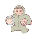
crumb-crumblet-s-crumbington
crumblet