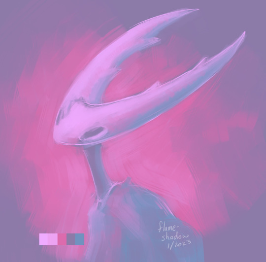
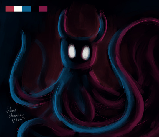
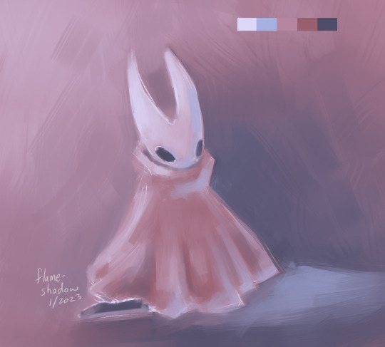
#grabbed some color palettes and did some single layer quick paints
Text
siblings
#grabbed some color palettes and did some single layer quick paints#hollow knight#hollow#hornet#ghost#flameshadowart#i used coolers for generating palettes#id in alt
113 notes
·
View notes
Text
Erik’s Picks - January 2020 (Parts 1 and 2)
Our Picks From The January Collection (Part 1)
Humor us with a quick thought experiment.
Where do you think Google looks to hire from when they’re trying to find the next great minds in computer science? Or how about Tesla when they need a new batch of brilliant and youthful mechanical engineers?
If you guessed from universities across the nation, you're correct. Universities cultivate the next generation of great minds, but while there are professional outlets for business and engineering, what happens to the raw creative talent that is developed in art schools?
The honest truth is that this talent largely never sees the light of day as students graduate and have difficulty translating their skills to the market. At ArtStartArt, we strive to bring this creative talent to light and provide our audience the opportunity to access it in an unprecedented manner.
The work in our January Collection is a great representation of this talent, and it goes so deep this month that we need to break this email into two parts. Read on below for our first batch of picks this month, and as always, thank you for the support.
Erik & Alok | ArtStartArt Co-Founders
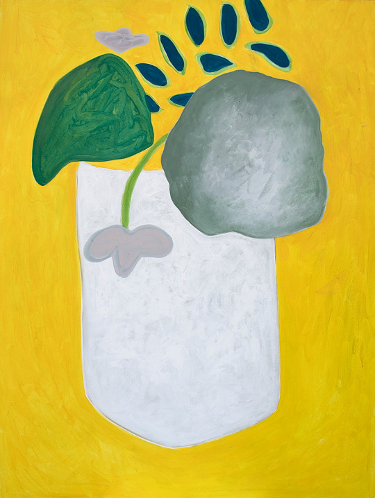
Andri Kidd is a recent graduate of the prestigious School of the Art Institute of Chicago and an ASA Select artist. There are only a few artists we've run across as an undergraduate that have such a strong sense of the type of art they want to create, and Andri is one of those artists. Andri claims to "love the playful, the wholesome, and the unapologetic," and when we look at Andri's art and descriptions on the site, we are quickly transported into a whimsical headspace. At $180, this small painting on wood panel is of immense value.
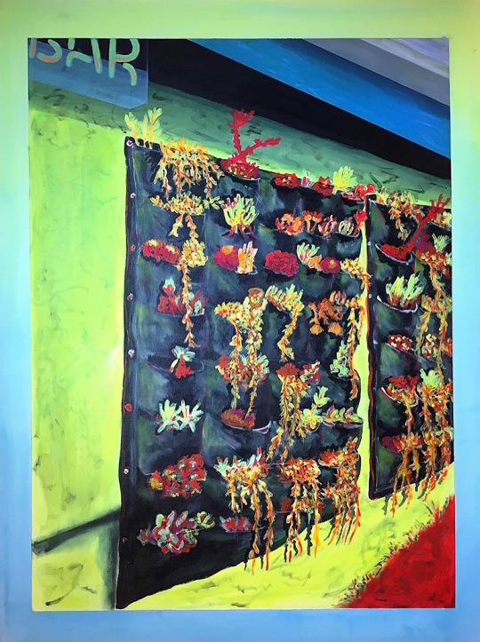
Nathan Sing is a native Texan and an ASA Select artist. As an undergrad, Nathan exhibited with us at East Austin Studio Tour and his work was purchased by a prominent collector here in Austin. Nathan's work leverages iconic landscape scenes and modernizes them in a way that doesn't feel forced. Nathan makes the type of art that is guaranteed to make a statement and start a conversation regardless of where it is placed and at 3 feet by 4 feet, this succulent-themed painting has universal appeal.
Rachel Parnell is a recent graduate from UT Austin and an ASA Select artist. We haven't seen Rachel's work since 2017, when ArtStartArt was just a pilot at 3 local schools and not a national marketplace. Even at that time, Rachel sold almost all the work from her senior portfolio that she listed on the site and we're beyond excited to be able to showcase her work again. In this latest body of work, Rachel continues her tradition of storytelling through layering; the covering, uncovering, scratching, and drawing on top of previous layers in order to arrive at a final composition. All of Rachel's work is large scale, ready to hang, and a couple of her listings this month even include an artist frame in the price.
Katerina Vasquez is an undergraduate artist showcasing work for the first time on the platform. This figure study is deftly created and is a harbinger of success for Katerina if she keeps up this trajectory. If you don't already own a figurative work, we challenge you to take the leap in 2020 (consider it a resolution) and this piece is a great place to start.

Lizeth Terrazas is a recent graduate from UT Austin and an ASA Select artist. You know, sometimes our audience dings us for featuring too much figurative work, but to be honest we can't help ourselves. Artists at this stage make so much good figurative work that we'd be remiss not to showcase it. Lizeth's work fits in that vein and this intaglio titled "Cuerpos Bailando" would look stunning matted and framed. Heck, at $125, if someone doesn't grab this piece we may have to ourselves.

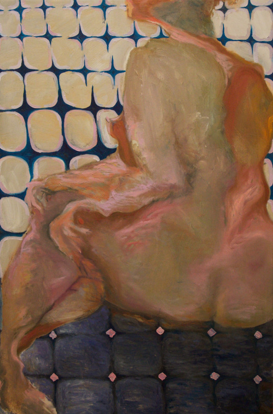
Yiming Sun is an undergraduate artist showcasing work for the first time on the platform. We're addicted to this painting and it’s the one this month we can’t take our minds off of. From the otherworldly color palette, to the rendering of the skin, to the divine tiling in the foreground and background, this is a masterpiece without question. Yiming has the rare talent and vision to follow in the footsteps of the greats artists she references as influences and this is a rare opportunity to own something of this caliber before is it inaccessible for most of us.
Our Picks From The January Collection (Part 2)
You know, everyone collects art for different reasons. Some collect art to support artists or their local community, some collect as an investment, and others collect to beautify their spaces.
When you're in the early stages of collecting (as most folks are), you've got a ton of wall space for new work, but once you get the bug, and have been collecting for several years you start to run out of space. At an art fair recently we meet some serious collectors who described this exact situation to us, and it turns out there's a few terms when you've got a collections that's outgrown your walls: Leaners and Cullers.
Leaners refers to the fact that your walls are so filled that a good portion of your art is leaning against a wall and is not hung.
Cullers refers to the fact that you have so much art that you've been forced to reduce your collection at one point or another.
You may not have any Leaners or Cullers yet, but our January Collection, only available for two more weeks on the site, is chock-full of great art to fill your walls. If you're already a serious collector, well then, what's another Leaner?
Below is part two of our picks this month and I hope you enjoy adding to your collection!
Erik | ArtStartArt Co-Founder
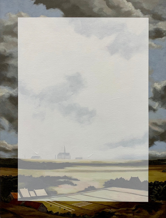
Dario Buchelli is an MFA student at Texas Christian University. Dario recently exhibited a painting with us at East Austin Studio Tour and his current body of work is our favorite yet. Dario's work "involves appropriation of images of other artist’s works as they are found in the internet" and these pieces in particular are inspired by 17th century Dutch landscape painters. I can't speak highly enough of these sublime and uniquely modern paintings and this is another piece this month that I am scheming to add to my personal collection if it's not acquired in the next couple of weeks. This series of paintings by Dario also happen to be some of the most exceptional values on ASA this month. It's hard to articulate how rare it is to have an original painting, of this caliber and uniqueness, by an MFA artist, of this size, available for around $500. If you like this piece, you'll regret not getting it now, trust me.
Josh Barish is an undergrad at Massachusetts College of Art and Design. For a couple months Josh only submitted a single piece to the site each month (even though we urged him to submit more as his talent was immediately obvious to us). However, now that some of his work has sold, he's listed a handful of gems for January, and this painting, Inside Us, takes our breath away. In some ways, this painting looks like it could have been plucked from the wall of a Byzantine monument. It has that timeless symbology and impact, and the glow of the red and gold radiate a powerful mystery. We're in awe of how simple and impactful this stunning composition is, and if you're drawn to it - wait until you see in person.

Alexander Lozano is a Texas-based sculptor and an ASA Select artist. Over the years, we've visited dozens of studio arts facilities in person and the scale and quality of the facilities at the UT Arlington Studio Art Center are some of the best we've ever seen. As a product of the UT Arlington glass program, Alexander had access to exceptional facilities that have allowed him to excel at his craft, and as a result he's created truly exceptional glass pieces. If you've never owned a piece of hand blown glass, then you should know it is entirely different from any other glass vessel you have seen or touched. The weight will surprise you and the feel is buttery. The way the milky glass flows in this form and mirrors the wavy edge and sculpted base are just a couple of details that transcend this form into the finest of art. Also, this piece is wonderfully large. You could put fruit in it as a center piece, or leave it empty and elevated on a shelf. Whatever you do with it, you'll find yourself coveting it - I guarantee it.

Nickolas Holden is a Texas-based photographer and an ASA Select artist. This mystifying and perhaps ominous image was produced by a 4x5 large format camera (an incredibly high fidelity way to produce images that many of the world's greats use today) and is printed at a very large scale. When framed, this piece can hold its own on almost any sized wall. I can tell you as someone who spent 4 years in school studying and practicing photography that Nickolas has the eye and intuition of a true photographer. He's drawn to scenes and people that seem to hold the beauty and enigma of the natural world, and then he's able to capture them with his camera in a way that lets us sense them too. His work is of the kind that I urge people to own, because when framed and hung, these photographs create the transformative experience in a person that opens a new way of seeing in the world.

Miranda Terry is a recent graduate from Texas State University and an ASA Select artist. We've watched Miranda's work evolve over her last 2 years of college and now post-graduation and it's been entirely fulling to watch her development as an artist (just take a look at all her previous sold work on her profile). I actually met Miranda in person a couple of years back after one of her early sales (when I did a little of the packaging couriering myself), and I knew then she embodied the type of artist we wanted to support. Motivated, sharp, visionary and uniquely talented, Miranda is a creator I deeply admire. This new body of works on paper are flat out spectacular. The absolute sophistication (and playfulness) in color and composition complimented by the natural deckled edge and slightly irregular paper shape make these pieces crave-able. I feel strongly someone should purchase more than one and display them individually framed as a collection, and by golly at this price there isn't a good reason not to. Also, did I mentioned Miranda and her colleague Onix (also a Select artist) were recently commissioned to paint a mural at Texas State University? They are going places.

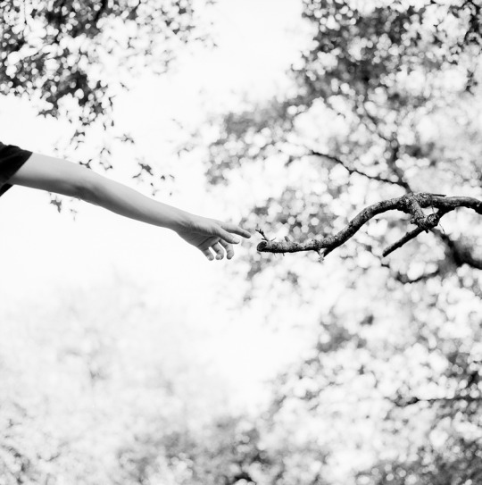
Zachary Brock is an undergrad photographer at Trinity University. We've featured Zach on numerous occasions and it's because he keeps producing work that moves us to the core. This modern interpretation of Michelangelo's fresco is wonderfully fresh and a bit surreal. This is one of those photographs that tens of thousands of people over the years may have tried to make and only a couple get it right. Zach did. The subtle bow of the figures arm and the clarity of focus in the folds of the hand. The divine distance between the branch and the finger and the small bud that's perhaps taking life at the end of the limb. The sense that both are stretching towards one another. These are only a few surface observations of what make this photograph magic and to the owner, more will reveal themselves over time. Zach's work is destined for a gallery at some point, and we're honored to be able to feature it at this stage in his career.
0 notes
Text
It is my great pleasure to introduce readers to British artist Michele Clamp, scientist turned watercolourist.
The Interview
Who are you and what do you do?
My name is Michele Clamp and I am a watercolour artist.
Why do you do what you do?
I am tempted to reply ‘Because I can’. If you had the opportunity to create beautiful things that reflect who you are as a person and how you see the world why wouldn’t anyone? But maybe that’s too glib an answer. On a day to day basis painting simply makes life worth living. Even when the work goes badly (as it often does) it is still worthwhile. Painting is difficult, frustrating, unpredictable, and often not taken seriously by many. And objectively I am unlikely to go down in art history and sometimes it seems unlikely I’ll make a living at it. But none of that detracts from the satisfaction of setting your brushes down at the end of the day with something new on the easel. If, as I am lucky to have happen, other people want to take your work into their homes and it gives them pleasure in their lives so much the better.
Hare Today. Michele Clamp. Watercolour 14”x11”
Rose-breasted grosbeak. Michele Clamp. Watercolour 14”x11”
How do you work?
Regularly. That’s the main thing. I have a routine – go upstairs to the studio, put the lights on, put the radio on. Open the palette, top up any colors that are running low. Arrange the brushes and get the water pot filled with fresh water. Tape a fresh piece of paper to the empty board resting on the easel. It’s almost a ritual and it’s necessary. I am then in the right frame of mind to prod around in my subconscious to find out what I am itching to do.
As I am a watercolour painter and paint quickly I almost always complete a painting in a single session. This creates a lot of forward momentum as the weeks go by and I can move from subject to subject quickly. Other times I’ll work in series over a month or so. It could be birds one month, cityscapes another.
Even if a brush isn’t put to paper on any given day ideas are bubbling through my mind. These could be ideas for subject matter, design or style. A big portion involves reflecting on past works that may or may not have succeeded. What do I like, want don’t I like. Did I capture the light or the mood? Did it capture something about the moment that I didn’t expect and can I build on that.
Cockwomble. Michele Clamp. Watercolour 11”x14”
Puffins. Michele Clamp. Watercolour 11”x14”
What is your background?
Like many artists my interest was sparked in childhood. My father was a talented amateur artist when he was young but only had a limited amount of time to spend on it when I was a child. Even so I remember sitting beside him as he sketched outside. I had my own small sketchbook and tried to learn from him as he drew landscapes in the Essex countryside, marking in color and lighting notes as he went. These were intended to be preparatory sketches for larger oil paintings but sadly these almost never came to pass. However, I had almost no detectable talent at that point. My mother is still incredulous that I’ve ended up painting as she often remarks how bad I was in those years. It turned out that the art bug didn’t bite me hard until I was about 13. Somehow something clicked in a school art lesson. Mrs Amner our art teacher had put a group of us in front of a huge old mechanical typewriter and we were instructed to draw it. Not an easy subject for us but the longer I looked the more the complex mechanical shapes made sense and my pencil followed suit. I’d discovered the pleasure of truly seeing something and representing it on paper.
I loved painting and drawing throughout the rest of my school years and did them both in parallel with science and maths. When it came to deciding on college I plumped for science and went on to do a degree in physics at Oxford followed by a PhD. Art was on the back burner for many years. I had a wonderful career in science and worked in many interesting areas including the Human Genome Project. My science career took me from Oxford to Cambridge to MIT and Harvard and I was extremely lucky to be part of the genomics revolution over the past couple of decades.
I always knew I’d come back to art at some point although I didn’t know when. It’s little appreciated that science is a hugely creative endeavor. Like art it’s also all-consuming – you can’t dabble and expect to do it well. So after emerging 5 years ago from immersion in the research world I needed a creative outlet again. And watercolour was there waiting.
From 2012 to the end of last year I balanced painting with working. This year, however, we bit the bullet, quit our jobs and I get to paint full time. It’s bliss.
Sunflowers. Michele Clamp. Watercolour 11”x14”
Brass callipers. Michele Clamp. Watercolour 14”x11”
What is integral to the work of an artist?
Ah. There’s a quote about science by the famous physicist Richard Feynman that pops into my mind here. ‘The first principle is that you must not fool yourself and you are the easiest person to fool.’ So honesty, humility, and at least an attempt to keep the ego on a short leash.
What role does an artist have in society?
Wow. That’s a biggie.
What has been a seminal experience?
These are all hard questions but this one stumped me for a long while. I have to admit that I am not one of those artists that hate everything they do. Not that I’m uncritical (not at all) but I’m usually pretty positive about the work I produce. Very rarely does something emerge that is totally worthless in my eyes. I am self-aware enough to realise that I am hugely biased and lucky enough that I don’t need huge amounts of external validation. A year after I had returned to painting, however, something happened that made me think this wasn’t just an activity to please me. I used to go to a lot of classes at the local adult education centre in Cambridge, Mass. and they’d regularly run shows with students work. When I’d been painting for about a year I managed to get 8 pieces into their summer show. I’d put prices on them but really had no expectations in that area. When I arrived at the opening I was astounded that 3 had already sold. As the evening went on 3 more sold and I was emailed by someone later to buy another one. One painting was so popular the organisers emailed me to ask if I had anything similar as they’d had so many requests. It gave me huge confidence that this wasn’t just a solo journey.
Trinity College, Oxford. Michele Clamp. Watercolour 14”x11
Baptist Church, Marlborough, MA. Michele Clamp. Watercolour 14”x11”
How has your practice changed over time?
The big thing was understanding how important just showing up is.
What art do you identify most with?
We live in a very noisy world. So shouty art is not my thing. Art that screams at you and grabs you by the lapels is not for me. I like art that slowly gets under your skin. Art that creeps up on you over a period of time. Art that you come back to after years away and go ‘Ah yes now I get it’. Subtlety, nuance, layers, longevity. I’m British – what do you expect?
What work do you most enjoy doing?
Oh that’s easy – good work. Definitely good work. Seriously though it’s easier to answer that by thinking about the work I don’t enjoy doing. And that is work that I do when I start taking myself too seriously. Stuff that I plan when things are going well and I think I’m really getting to the next level. I get really ambitious and start large complicated paintings and work really hard and all the fun goes out of it. I start fooling myself in other words. I learned early on that your really good work comes from painting what you want to paint. However you don’t consciously choose what you want to paint – it comes from somewhere below the surface and it takes practice to let that side of yourself free.
Sunlit. Michele Clamp. 11”x14”
Liberty Boat. Michele Clamp. Watercolour 11”x14”
What is your favourite artwork?
That is far too difficult a question to answer. If I absolutely had to pick one it would be John Sell Cotman’s Chirk aqueduct. It’s a watercolour (of course) and I first came across it as a kid in one of my parent’s art books. It has everything I love – subtle colors, strong design and I enjoy it a little more every time I come across it. The composition is slightly off kilter – it looks as though it doesn’t quite fit on the page. It’s a little disconcerting the first few times you come across it but it’s that little bit of quirkiness that offsets the restrained colors and apparent lack of action.
Is the artistic life lonely? What do you do to counteract it?
Hmm. Is it any lonelier than all the corporate nonsense I’ve had to deal with elsewhere? Performance reviews, 360 assessments, endless pointless meetings, snotty emails, deadlines and justifications? Nope, not really. Just don’t look at the bank balance.
Hethersett Church, Norfolk UK. Michele Clamp. Watercolour 8”x10”
What is the best piece of advice you have been given?
A few months after I’d started painting again regularly I was showing someone photos of what I’d been doing on my phone. I was still feeling my way but some were good, some not so good, but there was definitely something worthwhile there. On one photo they stopped – it was a quick watercolour still life sketch. I’d managed to do something with lush colour and broad brushstrokes and it had confidence and ease and energy. ‘Oh Michele’ they said, ‘If only you could live your life the way you paint’. That comment has always stayed with me.
What wouldn’t you do without?
My husband James Cuff. Constantly supportive and encouraging even when things aren’t going well. And makes a mean gin and tonic.
Thank you for the insightful interview Michele. To see more of Michele’s work please contact her on the details below.
Website : micheleclamp.com
For Sale: micheleclamp.com/paintings-for-sale
Instagram: @micheleclamp
Email: [email protected]
Facebook: MicheleClampArt
Beauty, one brushstroke at a time.
Artist Interview: Michele Clamp It is my great pleasure to introduce readers to British artist Michele Clamp, scientist turned watercolourist.
0 notes
Text
I’ve just launched a brand new Da Vinci Trio that I hope you’ll enjoy as much as I do! (please read on for my marble mixes using these colors as well as lots of sample paintings). Da Vinci Trios are those awesome little artist-curated sets with three 8ml watercolor tubes and mixing suggestions that first launched in April 2018.
My new Da Vinci Trio is called the “Vintage” trio because mixing these colors took me back to my childhood during the 70’s with faded blue jeans, greens and golds, along with pops of orange and brown. Yeah, I contemplated calling it “That 70’s Trio,” but vintage works just fine as well, since it’s not really limited to a decade. But, for me at least, it created a trip down memory lane and the start of a wonderful journey to embark upon.
Painted Using Only My “Vintage” Da Vinci Trio
If you did happen to be around during the 70’s, you’ll no doubt remember those shiny kitchen appliances that actually came in a few colors, but two of the most popular colors were Harvest Gold and Avocado Green. These would be nestled into place and surrounded by deep brown wood cabinetry. Yep, even the Tupperware containers were made to match! It was, perhaps, a bit overkill in a single kitchen, but as a palette, I find using Harvest Gold and Avocado green to be really quite lovely. It works just wonderfully for memories of miniature golf or, as it turns out, it’s pretty perfect for painting actual avocados.
Painted Using Only My “Vintage” Da Vinci Trio
Painted Using Only My “Vintage” Da Vinci Trio
If you’d like to learn more about Da Vinci Trios, please be sure to check out the initial launch post here, or if you’d like to learn more about Da Vinci Watercolors, be sure to read Jessica’s full review here! Read on to learn all about my new trio!
Charlie’s “Vintage” Da Vinci Trio
SO, what are these three wonderful colors that created such fun and nostalgia for me in creating my Vintage Trio? A lovely mix of Aureolin, Vermilion, and Indigo! When I was deciding on what trio to create, I mixed these colors on a whim and was immediately hooked.
Aureolin (Mixture) (PY40/PY3 – Transparent)
This lovely and light yellow is beautiful on its own and creates a nice glow as an underpainting in a light wash. It’s great to add a bit of pop to citrus fruits or to mix with other colors, which is primarily how I use it. Despite its lighter color, there’s a richness and intensity there so a little can go a very long way. With just the tiniest drop of Indigo, you can get a lovely and bright green that almost glows or you can add a bit more to get an earthy shade of green. Similarly, a tiny drop of Vermilion can create a fiery orange glow.
Vermilion (Hue) (PR188/PO62 – Semi-transparent)
This color is definitely one of my new favorites. In lighter washes, it’s a lovely orange shade, but used with very little water or built up with several washes, you can get a beautiful red that can look even redder based on the colors with which you surround it (check out those tomatoes below!) Though this and Indigo won’t combine to give you purple, you will get a gorgeous chocolatey brown that already has a reddish tint to make those food sketches of chocolate treats look even more appetizing.
Indigo (PB27/PV19 – Transparent)
As an illustrator, I immediately fell in love with this deep and rich blue. It’s a wonderful way to quickly add dark contrast to my sketches, while doing so with a hue to keep things from looking too dull. It’s become my a new favorite as well and you’ll find it making an appearance in most of my daily sketches. If you follow daily illustrations, you’ll notice that I like things to look extra bright and happy. In order to achieve those effects, it’s actually the darker tones that make the paper white and lighter colors really pop. So this moody blue is totally perfect for elevating the mood a bit and creating that bright level of contrast.
My Marble Mixing Chart
Here’s a few of my marble mixes you can get from this “Vintage” trio. As I mentioned in my first trio post, my inner child doesn’t like to make swatches, so I always make marbles instead. Because of the quick style in which I paint, often without letting every layer dry completely, these marbles are a bit more accurate to how I actually mix color.
Also, as before, this isn’t a triad, so you won’t be able to get a bright purple from this mix, but you can get just about every single color that was popular when I was a little kid in the 70’s, so that’s why I called this one “Vintage,” which yes, also makes me feel old, but thankfully not old enough to qualify for “antique” yet. Though this trio works quite well when painting them.
Painted Using Only My “Vintage” Da Vinci Trio
Painted Using Only My “Vintage” Da Vinci Trio
These are not shy colors, so it often takes only the tiniest drop of another color in this palette to transform them. Or a perfectly balanced combo of two of them to get a specific color for a mix. Here’s an example with Aureolin and Indigo. Note, how just a drop of Indigo in Aureolin creates a very bright, almost acid green, while just a drop more quickly moves it to a calmer, forest green. While an equal blend makes for a faded green that I find rather pretty.
When it comes to Neutrals and this palette, you can actually get a gorgeous grey from a delicately balanced combo of Vermilion and Indigo. Adding extra of either color will bring you to the deep blue blacks and deep rich browns that are quite lovely in this mix. And mixing all three with a lot of water can give you some lovely pastel neutrals like a faded green or even a dusty pink.
To be honest, I tend to splash colors about a bit on my palette and don’t approach color in a horribly scientific way, preferring to go by impulse alone. Sometimes, okay most of the time, I grab for the accidental mixes that occur when my paint blends together on the palette. So it’s not easy for me to explain each and every mix, since some of them happen in the messy moment and I’m still finding them and making them up as I go along!
What I always suggest is a fair amount of playing and splashing when you want to try new mixes. It’s in those more playful and less controlled moments that the unexpected discoveries are made. Below you can see some examples of these neutrals at play in an elephant and her baby that was created with only Vermilion and Indigo, and a pen and ink set that adds just a few pops of Aureolin at the very end, simply to give the illusion of having more colors present.
I adore the range that I can get from these colors and the fond memories that flood back to me, harkening back to a time when many of these colors were are all the rage. A bold, yet still more subdued palette before those bright pastels and neons blasted their way into the 80’s.
Charlie’s “Vintage” Da Vinci Watercolor Trio – Watercolor Marble Mixing Chart
Here’s a full chart of my marble mixes so you can get an idea of the range you can achieve with these colors. I make these marbles by first painting with water, leaving white for the highlights, then I jump in with various colors, pushing colors a bit toward the edges to both create the outline of the marble, but also to quickly see the darkest shades as well. The shadow is dashed in with whatever remains on my brush, which often, depending on the colors is a more neutral shade as the colors have then blended together.
I love this technique, because you can create each marble in a quick single pass, an entire chart like this one in less than 10 minutes, and simply wait for it all to dry at the very end to see the final magical color mixes that are revealed. Plus, it’s just really fun to DO!
My “Vintage” Trio – Even More Painting Examples
I had a blast using this trio and found myself reaching for these colors on a fairly regular basis recently. So here are some more examples of what you can make with this little set. When I first began testing these colors, things stayed very vintage, from camper vans to that 70’s sensation of the Pet Rock.
Painted Using Only My “Vintage” Trio
Painted Using Only My “Vintage” Trio
Painted Using Only My “Vintage” Trio
I quickly discovered that this Vintage Trio can be used to paint just about anything at all, and decided to give animals a try. Yep, these colors will work well for that too, and allow you to paint all sorts of animals, from parrots to alpacas!
Painted Using Only My “Vintage” Trio
Painted Using Only My “Vintage” Trio
Painted Using Only My “Vintage” Trio
And lastly, here are some examples of the rich tomato reds and glowing amber colors you can get with this trio, and, I did mention chocolate, right? Below are those delicious browns that might look a bit dated today on kitchen cabinetry, but can make chocolate desserts look really yummy! And a vintage trio would certainly not be complete without paying homage to the TV dinner.
Painted Using Only My “Vintage” Trio
Painted Using Only My “Vintage” Trio
Painted Using Only My “Vintage” Trio
Painted Using Only My “Vintage” Trio
Conclusion
Painted Using Only My “Vintage” Trio – Available NOW!
I hope you’ve enjoyed my overview of mixes in my “Vintage” trio and I do hope I’ve appropriately wooed you into clicking here to purchase this set for yourself or someone you love! Each trio is only $19.95, with three 8ml tubes, a little brochure with info on the artist as well as a mixing chart (or yeah, marbles in my case). This is a wonderfully fun and affordable way to try new colors, so I do hope you’ll give mine a try and share what you make with me!
I love this Da Vinci Trio project as it’s a blast to do and, most of all, really fun to see what the other artists come up with in their trio. You’ll find many Doodlewash featured artists in the mix, so please check out their wonderful trios and support them as well (dare I say, collect them all!): Jane Blundell, Denise Soden, Kate Powell, Jennifer McLean,and Tonya Lee.
Da Vinci Watercolor Trios are available now!
Click Here To Shop Them ALL And Make Your Own #DaVinciMoment!
My NEW Da Vinci Watercolor "Vintage" Trio! has launched! Check it out! - #DaVinciMoment #watercolor #watercolour #artsupplies #artist #doodlewash #WorldWatercolorGroup I've just launched a brand new Da Vinci Trio that I hope you'll enjoy as much as I do!
0 notes
Text
It is my great pleasure to introduce readers to British artist Michele Clamp, scientist turned watercolourist.
The Interview
Who are you and what do you do?
My name is Michele Clamp and I am a watercolour artist.
Why do you do what you do?
I am tempted to reply ‘Because I can’. If you had the opportunity to create beautiful things that reflect who you are as a person and how you see the world why wouldn’t anyone? But maybe that’s too glib an answer. On a day to day basis painting simply makes life worth living. Even when the work goes badly (as it often does) it is still worthwhile. Painting is difficult, frustrating, unpredictable, and often not taken seriously by many. And objectively I am unlikely to go down in art history and sometimes it seems unlikely I’ll make a living at it. But none of that detracts from the satisfaction of setting your brushes down at the end of the day with something new on the easel. If, as I am lucky to have happen, other people want to take your work into their homes and it gives them pleasure in their lives so much the better.
Hare Today. Michele Clamp. Watercolour 14”x11”
Rose-breasted grosbeak. Michele Clamp. Watercolour 14”x11”
How do you work?
Regularly. That’s the main thing. I have a routine – go upstairs to the studio, put the lights on, put the radio on. Open the palette, top up any colors that are running low. Arrange the brushes and get the water pot filled with fresh water. Tape a fresh piece of paper to the empty board resting on the easel. It’s almost a ritual and it’s necessary. I am then in the right frame of mind to prod around in my subconscious to find out what I am itching to do.
As I am a watercolour painter and paint quickly I almost always complete a painting in a single session. This creates a lot of forward momentum as the weeks go by and I can move from subject to subject quickly. Other times I’ll work in series over a month or so. It could be birds one month, cityscapes another.
Even if a brush isn’t put to paper on any given day ideas are bubbling through my mind. These could be ideas for subject matter, design or style. A big portion involves reflecting on past works that may or may not have succeeded. What do I like, want don’t I like. Did I capture the light or the mood? Did it capture something about the moment that I didn’t expect and can I build on that.
Cockwomble. Michele Clamp. Watercolour 11”x14”
Puffins. Michele Clamp. Watercolour 11”x14”
What is your background?
Like many artists my interest was sparked in childhood. My father was a talented amateur artist when he was young but only had a limited amount of time to spend on it when I was a child. Even so I remember sitting beside him as he sketched outside. I had my own small sketchbook and tried to learn from him as he drew landscapes in the Essex countryside, marking in color and lighting notes as he went. These were intended to be preparatory sketches for larger oil paintings but sadly these almost never came to pass. However, I had almost no detectable talent at that point. My mother is still incredulous that I’ve ended up painting as she often remarks how bad I was in those years. It turned out that the art bug didn’t bite me hard until I was about 13. Somehow something clicked in a school art lesson. Mrs Amner our art teacher had put a group of us in front of a huge old mechanical typewriter and we were instructed to draw it. Not an easy subject for us but the longer I looked the more the complex mechanical shapes made sense and my pencil followed suit. I’d discovered the pleasure of truly seeing something and representing it on paper.
I loved painting and drawing throughout the rest of my school years and did them both in parallel with science and maths. When it came to deciding on college I plumped for science and went on to do a degree in physics at Oxford followed by a PhD. Art was on the back burner for many years. I had a wonderful career in science and worked in many interesting areas including the Human Genome Project. My science career took me from Oxford to Cambridge to MIT and Harvard and I was extremely lucky to be part of the genomics revolution over the past couple of decades.
I always knew I’d come back to art at some point although I didn’t know when. It’s little appreciated that science is a hugely creative endeavor. Like art it’s also all-consuming – you can’t dabble and expect to do it well. So after emerging 5 years ago from immersion in the research world I needed a creative outlet again. And watercolour was there waiting.
From 2012 to the end of last year I balanced painting with working. This year, however, we bit the bullet, quit our jobs and I get to paint full time. It’s bliss.
Sunflowers. Michele Clamp. Watercolour 11”x14”
Brass callipers. Michele Clamp. Watercolour 14”x11”
What is integral to the work of an artist?
Ah. There’s a quote about science by the famous physicist Richard Feynman that pops into my mind here. ‘The first principle is that you must not fool yourself and you are the easiest person to fool.’ So honesty, humility, and at least an attempt to keep the ego on a short leash.
What role does an artist have in society?
Wow. That’s a biggie.
What has been a seminal experience?
These are all hard questions but this one stumped me for a long while. I have to admit that I am not one of those artists that hate everything they do. Not that I’m uncritical (not at all) but I’m usually pretty positive about the work I produce. Very rarely does something emerge that is totally worthless in my eyes. I am self-aware enough to realise that I am hugely biased and lucky enough that I don’t need huge amounts of external validation. A year after I had returned to painting, however, something happened that made me think this wasn’t just an activity to please me. I used to go to a lot of classes at the local adult education centre in Cambridge, Mass. and they’d regularly run shows with students work. When I’d been painting for about a year I managed to get 8 pieces into their summer show. I’d put prices on them but really had no expectations in that area. When I arrived at the opening I was astounded that 3 had already sold. As the evening went on 3 more sold and I was emailed by someone later to buy another one. One painting was so popular the organisers emailed me to ask if I had anything similar as they’d had so many requests. It gave me huge confidence that this wasn’t just a solo journey.
Trinity College, Oxford. Michele Clamp. Watercolour 14”x11
Baptist Church, Marlborough, MA. Michele Clamp. Watercolour 14”x11”
How has your practice changed over time?
The big thing was understanding how important just showing up is.
What art do you identify most with?
We live in a very noisy world. So shouty art is not my thing. Art that screams at you and grabs you by the lapels is not for me. I like art that slowly gets under your skin. Art that creeps up on you over a period of time. Art that you come back to after years away and go ‘Ah yes now I get it’. Subtlety, nuance, layers, longevity. I’m British – what do you expect?
What work do you most enjoy doing?
Oh that’s easy – good work. Definitely good work. Seriously though it’s easier to answer that by thinking about the work I don’t enjoy doing. And that is work that I do when I start taking myself too seriously. Stuff that I plan when things are going well and I think I’m really getting to the next level. I get really ambitious and start large complicated paintings and work really hard and all the fun goes out of it. I start fooling myself in other words. I learned early on that your really good work comes from painting what you want to paint. However you don’t consciously choose what you want to paint – it comes from somewhere below the surface and it takes practice to let that side of yourself free.
Sunlit. Michele Clamp. 11”x14”
Liberty Boat. Michele Clamp. Watercolour 11”x14”
What is your favourite artwork?
That is far too difficult a question to answer. If I absolutely had to pick one it would be John Sell Cotman’s Chirk aqueduct. It’s a watercolour (of course) and I first came across it as a kid in one of my parent’s art books. It has everything I love – subtle colors, strong design and I enjoy it a little more every time I come across it. The composition is slightly off kilter – it looks as though it doesn’t quite fit on the page. It’s a little disconcerting the first few times you come across it but it’s that little bit of quirkiness that offsets the restrained colors and apparent lack of action.
Is the artistic life lonely? What do you do to counteract it?
Hmm. Is it any lonelier than all the corporate nonsense I’ve had to deal with elsewhere? Performance reviews, 360 assessments, endless pointless meetings, snotty emails, deadlines and justifications? Nope, not really. Just don’t look at the bank balance.
Hethersett Church, Norfolk UK. Michele Clamp. Watercolour 8”x10”
What is the best piece of advice you have been given?
A few months after I’d started painting again regularly I was showing someone photos of what I’d been doing on my phone. I was still feeling my way but some were good, some not so good, but there was definitely something worthwhile there. On one photo they stopped – it was a quick watercolour still life sketch. I’d managed to do something with lush colour and broad brushstrokes and it had confidence and ease and energy. ‘Oh Michele’ they said, ‘If only you could live your life the way you paint’. That comment has always stayed with me.
What wouldn’t you do without?
My husband James Cuff. Constantly supportive and encouraging even when things aren’t going well. And makes a mean gin and tonic.
Thank you for the insightful interview Michele. To see more of Michele’s work please contact her on the details below.
Website : micheleclamp.com
For Sale: micheleclamp.com/paintings-for-sale
Instagram: @micheleclamp
Email: [email protected]
Facebook: MicheleClampArt
Beauty, one brushstroke at a time.
Artist Interview: Michele Clamp It is my great pleasure to introduce readers to British artist Michele Clamp, scientist turned watercolourist.
0 notes
Last Seen Blogs

papy52-fan
Sans titre

eloquentpie
the eloquent pie-hole

little-paradiz
Lovely things around dat fkng world

hubsandspokes
hubs and spokes

kirby126
I like things.