#i never got tutorial requests/help with ps questions before so this was a welcome surprise
Note
Hey! Sorry for asking, but for your colour palette gifsets, you put the colours in as gradient layers, correct? And what do you set them as? Color, hue, normal? Usually, when it's, for example, pastel colors, if I put it as "color" and even sometimes as "hue", it'll become the primary colour. Light pink will show as red. How do you make them show as the colour you selected? Thank you!
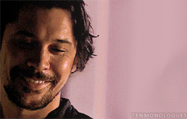
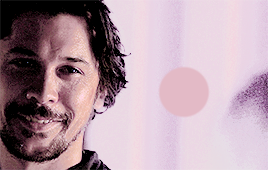
Hey anon! Don’t apologize, I’m more than willing to help out and give tutorials for how I make my gifs! So to answer your question, I did none of that! I didn’t change the blending modes, and if I did use a gradient layer, I used it only when I wanted to cover something up or make the gif have more of a smoother finish. I don’t know if you want a full blown tutorial but I’ll do one for you anyways because there’s a lot of steps, if that’s okay. And since you mentioned light pink, I’ll use this gif of The 100′s very own Bellamy Blake from this gifset as an example for this tutorial.
I tried to explain myself as best as I could and I used a lot of pictures so this is pretty long.
Continued under the cut
So as I said above, I didn’t change the blending modes of any of my layers and I didn’t use gradient layers initially! What I really did was use a lot of adjustment layers to change the background.
The good thing about this scene is that there are a lot of red and orange tones. Pink is basically a lighter hue of red so it was pretty easy to change the background. That’s a good tip to keep in mind in general when you want to make colour palette gifs. (But of course, there are exceptions to that ) :)
STEP 1: So once I did my initial colouring (Levels, Brightness, etc.), I added a transparent layer with a swatch of my chosen colour, and used that as a reference for colouring. I always kept it visible as I was changing the background.
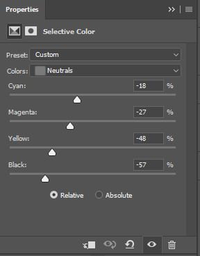
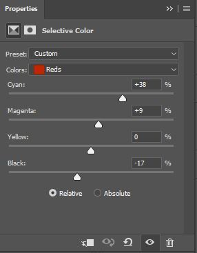
STEP 2: For the first layer, I used Selective Colour and I went to the Neutrals. These were my settings:
Which yielded this result:

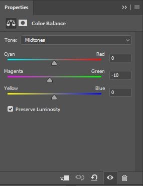
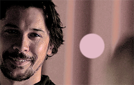
STEP 3: The next adjustment layer was Colour Balance and focusing on the Midtones, I added more purple to make it have a more purplish hue to match the purplish hue of the swatch:

STEP 4: I used Selective Colour again to make the pink a bit more pale by adjusting the Reds:
STEP 5: Afterwards, I used my least favourite adjustment layer, Curves. The purpose of curves was to make the background brighter so that it could match the brightness of the swatched pink:
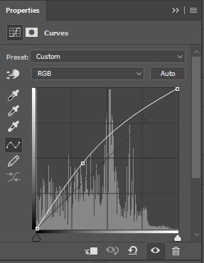
You can use other brightening adjustment layers, but I find Curves to be more “powerful” which is good for if you want more of a drastic change in brightness, which is what I wanted.
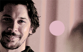
STEP 6: The brightness was perfect but the colour of the background was paler than the swatch so I added a Vibrance layer to bring out a bit more colour to the pink:
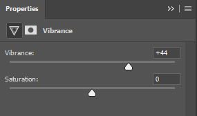
It looks the same as the last picture but I promise, there’s a slight difference!:
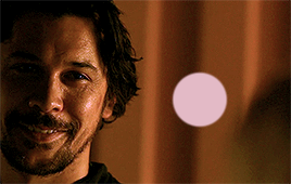
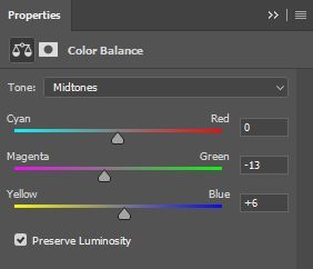
STEP 7: Lastly, to really really match the swatch, I added another Colour Balance layer and focusing on the Midtones again, these were my settings and results:

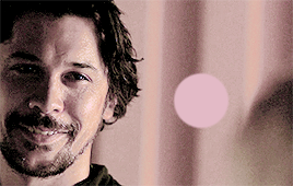
STEP 8: I felt that the background matched the swatch perfectly (more or less) so in order to not make this colouring affect Bellamy, I just grouped all the above layers together, added a layer mask to the group, and with a soft brush set to black, I coloured over Bellamy and got this:
So this is pretty good. BUT, Bellamy looked a bit out of place since his colouring here was due to the original red/orange background. Therefore, I wanted to match Bellamy to the new background without making him “pinkwashed” like the above pictures and keep the golden undertones of his skin tone.
STEP 9: So, I clicked on that group with all the adjustment layers (step 8) and pressed “Ctrl+J” (Command+J if you have a Mac) to duplicate that group. I deleted the layer mask of this duplicate group:

This is what my gif looked like with both the grouped layers and its duplicate visible:
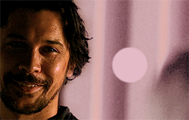
STEP 10: I wanted this colouring to affect Bellamy only this time so I added a layer mask to this duplicate group, and with a soft brush set to black, I coloured over the background. I set the opacity of this duplicate group to 25% and this was the result:
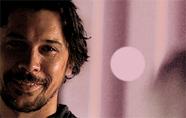
Bellamy isn’t as red/orange as before and he blends into the background a bit better. The melanin of his skintone is still there and isn’t super washed out either so that’s good.
STEP 11 (Optional): So I’m pretty much done and you can stop here. But I went the extra step and added some gradient layers so that I could get rid of Clarke’s head in the right corner there as well as mute those dark lines from the background a little bit. I used the Gradient Tool and a Gradient Fill Layer to get my final result:
Use the swatch colour to create the gradients (I didn’t for some reason) and there you go! No blend mode changes or anything like that, just a ton of adjustment layers!
I hope this was the answer you were looking for anon and I hope this wasn’t too confusing. If it was confusing or if you want me to explain something else, shoot me another message and I’ll be glad to help you out even more :)
Thank you for the ask!
#completeresources#chaoticresources#itsphotoshop#yeahps#photoshop tutorials#colouring tutorials#ten answers#about my gifs#i hope this was helpful anon!#i never got tutorial requests/help with ps questions before so this was a welcome surprise#i'm honoured and thanks for reaching out to me! 🤧
89 notes
·
View notes
Last Seen Blogs
amaditalks
Amadi Talks

twtul
Blog with no name
sparvverius
allegory, allegorier, allegoriest

autism-therapy-career-college
Autism Therapy Career College
yourchenai
One and only Chen