#photoshop tutorials
Explore tagged Tumblr posts
Visit Tumblr Blog
Explore Tumblr blogs with no restrictions, modern design and the best experience.
Last Seen Tumblr Blogs


Fun Fact
Post activity is at the highest at 4:00 pm EDT; notes peak at 10:00 pm EDT.
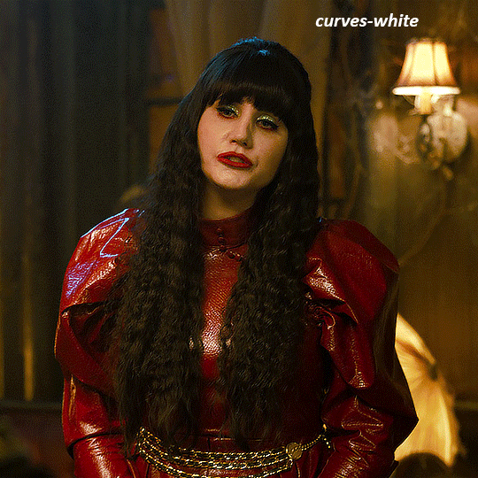
Text

WORKING WITH YOUTUBE QUALITY - HOW TO GET THE BEST RESULTS
helloooo, i recently feel as though i have found the key when it comes to dealing with youtube quality and i thought it was worthwhile sharing! i'm finding that when you're stuck with 1080p videos only, (although there is a lot more 4k downloads these days, thankfully) the quality is pretty poor. BUT, this is speaking exclusively about the quality of youtube 1080p - if you use a site such as sharemania, that's usually acceptable and good quality and doesn't deliver poor results.
but alas, this is about youtube, so let's get into it! this process will simply go over all the ins and outs of working with youtube quality, and will not look into the entire giffing process. i'll be using photoshop 2025, but it should work on any version!
Download your video.
firstly, start by downloading your video with 4k video downloader. (<- this will lead directly to a dl of 4k video downloader if you don't have it already! link is all safe and official <3) i can't really think of any other downloader because i haven't used any apart from this one. it's safe and secure and does a really good job.
you'll want to choose the 1080p option that is the BIGGER file amount. not every video will have that, but i believe that the bigger file size is the youtube premium 1080p. take what you can get with them 😭
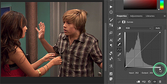
2. Load frames, crop, convert to smart object...
just get your normal prep work done! make sure to leave out sharpening. you should essentially just be here:

(if my process looks a bit odd or if, on the other hand, you'd like to know my process, you can check that here.)
3. sharpening.
THIS is the point that changes how your youtube file comes out. often times, you'll find the gif comes out with chunks, squares and overall poor quality. kind of like if i used my regular sharpening:

chunky! gross! trashy! i'm seeing too many pixels and things aren't looking the right way that i'd like. (tbh, it's not the worst i've seen - but you can definitely notice when there's light.) if i went on as it is now and continued to colour it, it would continue to look bad.
so, here's what you'll do.
i use multiple sharpening actions, for different purposes: one for hq downloads, so any movies, tv or downloaded/4k music videos, one making icons and the other for lower quality media and photos. the one that i typically use for youtube quality is @/anyataylorjoy's sharpening action (which many gifmakers use, so i wouldn't be surprised if you do already have it!) which is what you'll use. apply the action, using the 'sharper' lot.

^ that's the settings.
4. sharpening pt 2. (noise)
now, you'll need to add noise to offset how harsh the rest of the gif still comes up.
apply these exact settings onto the gif and ensure that monochromatic is enabled.

sometimes, 2% noise might make it look worse, or not be enough. i personally wouldn't go to anything more than 3%, (i don't think you'll ever want to use 3%) and wouldn't go lower than 1%.

it's grainy looking at the moment, just as is. from here, i'll colour it, and then if i think it's no good, i'll go back and clear the noise filter and toggle it. that's just how the process works, don't stress if it doesn't always go your way 😭 that's just gifmaking!
here's the final product!

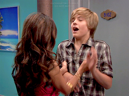
and here's another example too, i know this one has a lot going on colour wise, so it can be good to look at it working on something with less bright colours:

as compared to before! before shows the gif was really smooth, as compared to in chappell's, were the lighting was just kind of messing with everything. you're more likely to come across videos that are that weird smooth quality, so i'd say that 7 times out of 10 you'll be applying these settings to something more along the lines of doechii's!

the before :)
#*tutorial#**l.myeditss#gif tutorial#gifmaking tutorial#photoshop tutorials#just a little something :D#flashing tw
456 notes
·
View notes
Text

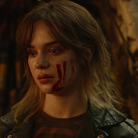
I was asked to put together a demonstration on how I did the analog selection effect in the first gif of my Final Girl set which mostly involved elaborate keyframe work and was like a living hell. This will be a much more simplified version for comprehensive ease, but still very wordy.
This tutorial is for intermediate/experienced level gifmakers who are already familiar with gif-making, keyframes, and layer masks, and this will serve more as a guide than anything.
If you are not comfortably experienced with the above, this may be difficult to follow because I won't be elaborating on every detail, but if you're still interested in recreating something like this regardless, I suggest checking out the below tutorials first:
Giffing 101: A Comprehensive Guide by redbelles
Clipping masks vs. layer masks by kal-kestis on usergif
Shapes and putting gifs inside them by nobie
Create your canvas, make your shapes and align them in the positions you want them to be in. Then get the gifs you plan on filling your shapes with created on standby.
Things to keep in mind before starting: 1. Many of you may have already learned through experience that photoshop has a tendency to create duplicate frames when you are working with multiple gifs on one canvas. It typically occurs when you don't have the same number of frames in all the gifs that you're combining onto your canvas, or rather, your clips are not perfectly aligned. OR when you are working with keyframes, but this time we will have an exception to that rule for what're doing so I won't be discussing the 0.03-interval rule here but if you're curious, it's fully explained this this tutorial by nik on usergif.
To be on the safe side, load in the same number of frames for all gifs. I usually just load in however many frames for each, and then I trim the clips on both ends to be the same, but they have to be exact. If even a single integer is out of place in timeline, you could still risk getting duplicate frames at the end. 2. When making an edit like this, you have to consider the amount of time you have from start to end to make the transitions and rationally plan them out in the space you have available. The more shapes you use, the more frames your gifs will need to be composed of.
3. If you're trying to get the same effect as in my Final Girl edit, where the black & white is default, and the color phases in and out, my goal here is for the color to be visible for at least 10-15 frames each gif, so with 3 gifs, I figured around 65-70 frames would be a good range.

For my first gif, I intentionally loaded in my gamble of 68 frames. For the other two, I loaded in all that was capped in the folders, moved the clips into the positions I wanted them to be in, put them in their designated layer masks, and then trimmed the clips on both sides to match the initial 68-frame clip. ❗️Remember that they have to be exactly aligned like this and all other trimmed off clips deleted before you start your key-framing❗️

Next you wanna make a group for each gif (highlighted in yellow for visibility) to put your coloring adjustments into with a layer mask for their designated shapes, which should look like this in your layers, and like the below in timeline once aligned with the rest of the clips.

I also just tucked the shape layers into the coloring groups to clean it up. But if you plan on creating frames for the gifs, I suggest you move those layers to the bottom and keep them until the end when they can be used for borders, but if not you can make new shapes later.
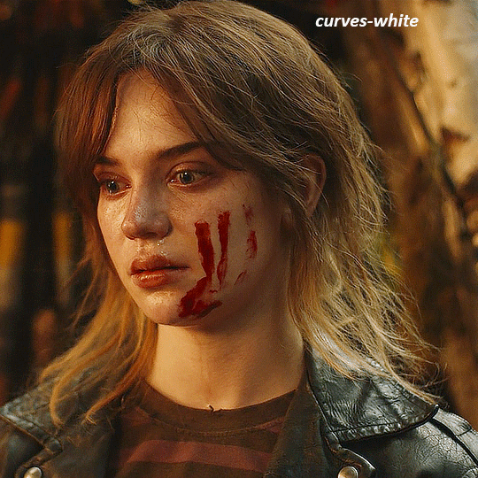
Assign a black & white gradient map to each gif with a clipping mask on top of your coloring groups.

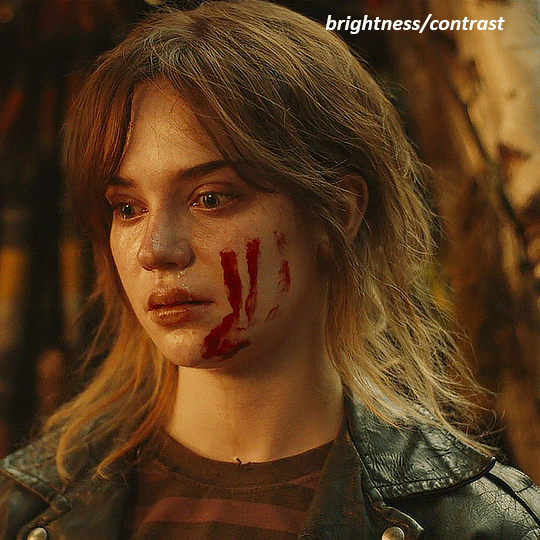
Now lets say you're not pleased with the outcome of the black & white like for mine, it desperately needs brighting and contrast.
Add your brighting adjustments as needed, and give every adjustment its corresponding layer mask like below.

Next, duplicate both your gif layer and your coloring group, then select both duplicates, as well as your new b&w color adjustments and convert them into a smart object together.
You should now have your original gif + original coloring group, and one single black & white gif on top.

Do this with the rest of the gifs! If you want, you can also combine your original gif and coloring group into a smart object so you have one colored gif, and one black & white counterpart for each.

Now we add the key frames!
You're going to be adding opacity keyframes to your black and white gif layers only. Decide which gif you want the color reveal to start with, and what your reveal pattern is going to be.
I chose to reveal the color of my first gif 11 marks in, which means I need to add a key frame at the 10th mark as well. This is because we don't want a literal "fade-out" effect, we want the change to be immediate. The first key should be at 100% opacity, and the second at 0%. You shouldn't have to worry about duplicate frames upon conversion because all keyframes will only be 1 integer apart.

Once you've decided where your next reveal will start on your second gif of choice, repeat the process.
Then you have to add more 2 more key frames to the prior gif to transition it back into black & white. This needs to occur simultaneously as the next gif transitions into color. Where one starts, another ends, and where one ends, another starts, etc.

Follow this process until you have 2 pairs of keyframes on all your gifs (your final gif should only have 1 pair). Whether you want the transitions to be evenly spaced is your choice and I think it looks cleaner that way. For my final girl set, I was trying to simulate an analog effect similar to making a player selection in an old video game so they were placed methodically to be "jumpy". But play with the keyframe intervals between each gif to get them to look the way you want.
Your keyframes should look like this in the end for reference:

Circling back to adding borders, it's the same keyframe process, but on new shape layers on 0% fill +stroke to serve as the border (if you deleted your shapes earlier). Try adding an "outer glow" blending option to make the border more prominent. Then, make sure the opacity keyframes on the shapes align with the keyframes on the gifs.
If you have any further questions on something not elaborated enough on, my dms are open!
#usergif#tutorials#gif tutorials#photoshop#photoshop tutorials#ps tutorials#keyframe tutorial#resources*#tutorials*
34 notes
·
View notes
Text
yet another gif coloring tutorial
Okay, so, I posted a coloring tutorial for one of my moots a few years ago on my main, @zackmartin (I believe I've since deleted it) but that was the technique I was using when I started making gifs 7ish years ago, and I’ve since updated my routine so I decided to post a new tutorial with my new technique.
I'm going to show you how I achieved this:
I'm using Photoshop for this. I'll try to make this as detailed as possible so it's beginner-friendly, but you do at least need to know how to make and export a gif. If you have any questions, don't hesitate to reach out! just be aware, this tutorial really image-heavy
A few notes before I begin: 1) this is like, the bare minimum most basic way to color a gif. This is what I’d be doing if I was giffing a scene and that’s it. If you’re interested in different coloring styles (like my suite life episode series) then let me know! 2) When coloring gifs with POC, you need to make sure not to change their skin color by making them too light, too orange, too yellow etc. The JATP source blog posted a masterpost of different tutorials to teach you how to color gifs in different ways (like with the pastel coloring for instance) without whitewashing/orangewashing POC. But, honestly there’s a ton of tutorials out there that show you how to avoid this if you do a little digging. NO EXCUSES!
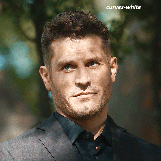
Anyway, let's get started! Before I do the coloring, I ofc make my gif, crop it, set the frame rate, resize, and sharpen. (you can find my sharpening tutorial HERE)
I. BRIGHTENING
(as a quick note, I don't focus much on London's skin tone during this stage, because I'm going to fix it during later steps)
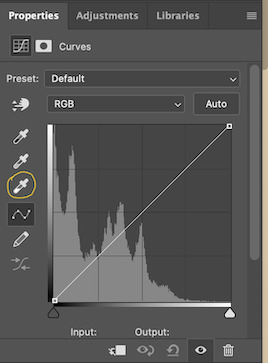
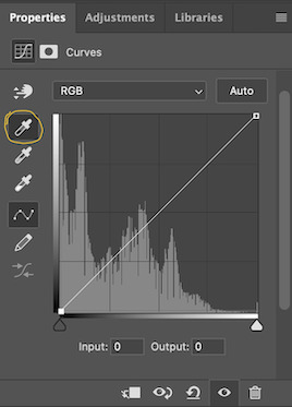
The first thing I do is white balance using a curves layer. To do this, I click the little circle thing in the toolbar below the layers, and then click curves like so (you'll do this every time you want to add a new layer):

And then I click the bottom eyedropper tool on the left-hand side:
Then I click the lightest white part of the gif. (I’m not sure how to explain this well, but it basically white balances that spot to make it pure white. Like, if I clicked on the gold part of London's bracelet, then the whole gif would turn out really blue because it would be trying to white balance the gold) (hopefully that makes at least a little bit of sense)
Anyway, there’s a trick I use to find the lightest part of the gif; hold down the option key (or alt if you’re on windows) and while you’re holding down the option key, drag the little white arrow on the right-hand side:
(i apologize for the quality of the screenshots, tumblr keeps destroying them :/ let me know if I need to clarify anything)
Then I use another curves layer to do the same thing with but with the blacks. So, I add another curves layer, and then click the eyedropper tool at the top this time:
And then I click the darkest, black part of the gif. You can use the same trick by holding the option/alt key and dragging the triangle on the left-hand side:

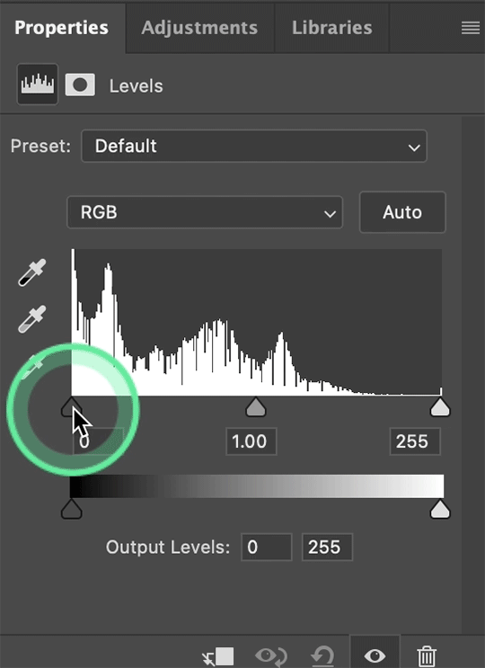
Next, I add a levels layer. I drag the middle lever thing to the left, and the left lever to the right. (I don’t usually touch the little lever thing on the far-right, but it’s really up to personal preference. I learned to color gifs by basically messing around with settings, so I’d recommend doing the same and just seeing what you like best):
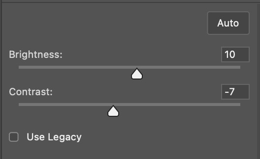
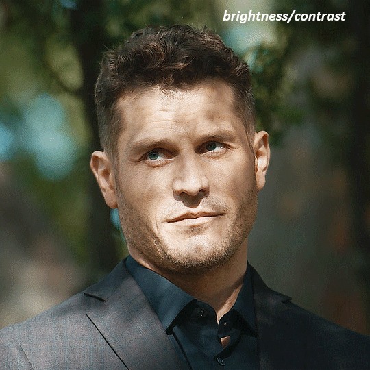
Finally, if I want to go even brighter, I usually add a brightness/contrast layer. I typically turn up the brightness a bit, and turn down the contrast. But, since I brightened a lot with the curves and levels, I usually don’t go that far. These were the settings I used for this particular gif (even though I'm going to share most of the settings that I used, I wouldn't recommend using the exact same ones on your own gif as it'll really depend on the scene you're using):
II. VIBRANCE
Now I add a vibrance layer. I like my gifs to be bright and vibrant, so I usually turn up the vibrance, and turn down the saturation a bit. These are the settings I used for this particular gif:
And this is what the gif looks like so far with just brightening it up a bit and adding vibrance (it might look a bit too bright right now, but I'm going to fix that in later steps):
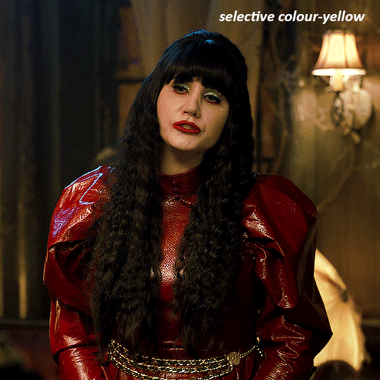
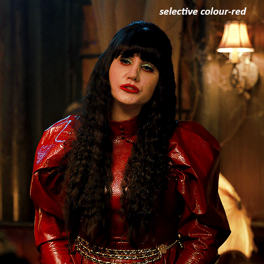
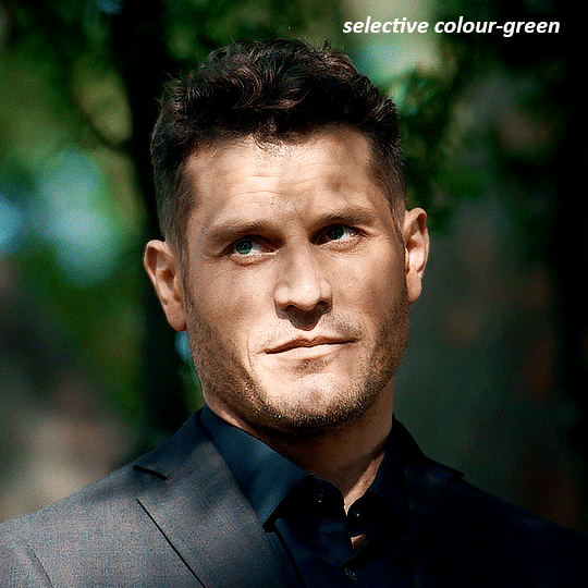
III. SELECTIVE COLOR
Now, I add a selective color layer. The reds and yellows typically affect skin tones, so this is where I'll start to fix London's. These are the settings I used for this gif (I usually wouldn't change all of the colors, but this is just one of those situations where they happened to be present in the scene I'm giffing):
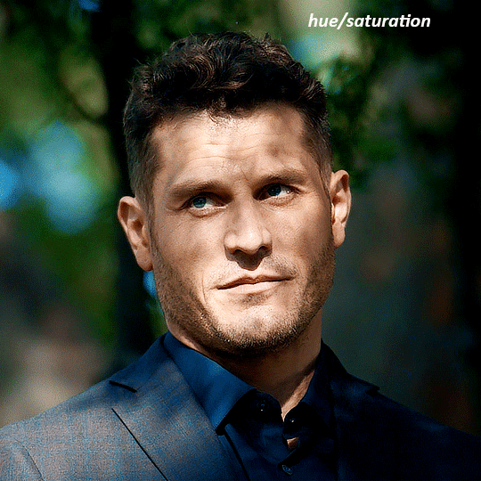
IV. HUE/SATURATION
now I add a hue/saturation layer. I typically turn up the master saturation to +10 and the lightness between +3 - +5 regardless of the gif. Then if I still need to fix skin tones, I'll mess around with the reds and yellows. These are the settings I used:
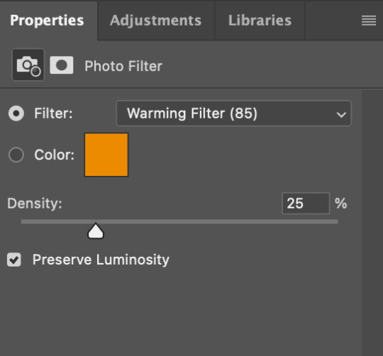
V. PHOTO FILTER
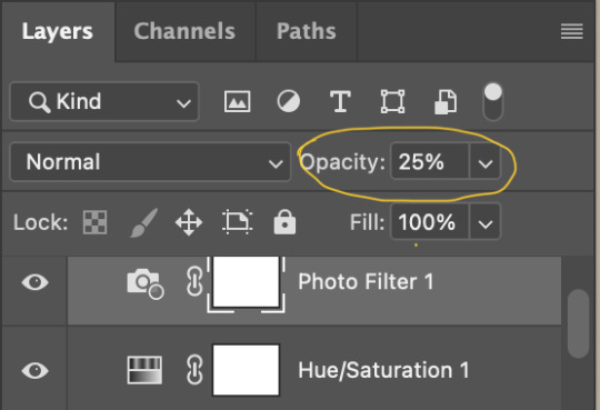
Next, I add a photo filter. I usually stick with the default one, I keep the layer set to normal, and I turn the opacity down to 25%:
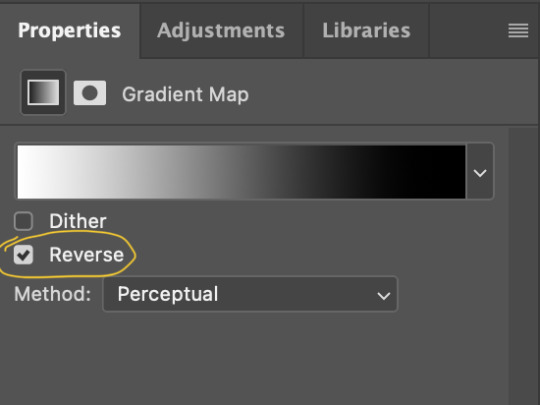
VI. B&W GRADIENT MAP
finally, I add a black & white gradient map, and I click the little box to reverse it:
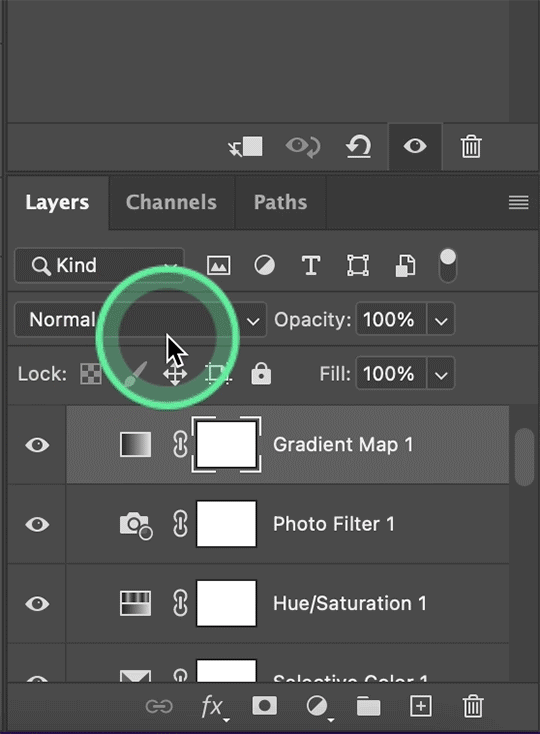
Then I set the layer to soft light and I turn the opacity down, between 10% - 20% depending on the gif:
A lot of times, I'll stop here. If I'm satisfied with the way the gif looks, and London's skin isn't too pale/orange/yellow etc, then I could just add my watermark, export and be done. But, there a few other optional steps I might take if I'm still not quite happy with it.
VII. OPTIONAL
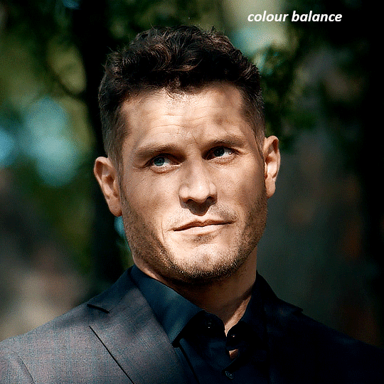
Usually the next thing I'll add if I've decided to keep going is a color balance layer. It obviously does as it says, helps balance out the colors, but some gifmakers also like their gifs to have like, a reddish tint or a bluish tint or what have you, so this can help with that too. I wanted to balance out the reddish/yellowish tint, so these are the settings I used:
and this was the gif before the color balance:
and after:
And if I want to play around with the colors a bit more, or fix the skin tones further, I might add another selective color layer or a hue/saturation layer (or both, depending).
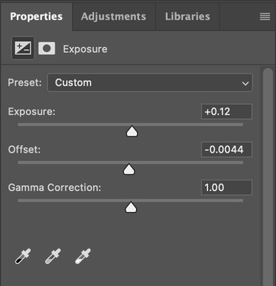
Rarely, I might add an exposure layer. (I added one to this gif for the purposes of this tutorial). These are the settings I used for that:
And if the gif came out a bit too bright, I might add another brightness/contrast layer, except this time I would turn down the brightness and turn up the contrast (again, I did that with this gif for the purposes of this tutorial).
And, that's pretty much it! This is my finished gif!
Like I said earlier, I pretty much learned how to color by messing around in photoshop, so I would really recommend playing with the different layers and settings for yourself, as well as checking out other coloring tutorials and other gifmakers methods and see what you like and what you don't. And finally, the best thing you can do is just,,, practice. I've been gifmaking for about seven years, but I feel like I didn't really become decent at it until this year
Again, If you have any questions let me know! and feel free to tag me in your creations! #userzackmartin 💕
#*tutorials#tutorials#gif tutorials#coloring tutorial#gif coloring tutorial#flashing gif#flashing gif tw#i'm not really sure it counts but just in case#flashing tw#dailyresources#photoshop tutorials#*
64 notes
·
View notes
Text
youtube
Retro Halftone Effects in Photoshop
In this tutorial, I’ll run through the setup I use to create halftone effects in Photoshop. Great for posters, apparel, stickers, or just making cool retro-lookin stuff! This approach will bypass the halftone filters and create the effect from scratch, with the added benefit of being live and adjustable. In the second half of the video, we’ll take a look at some custom settings to bring additional color or transparency into the image.
Thanks for watching!
#graphic design#education#photoshop tutorial#youtube#Retro Halftone Effects in Photoshop#adobe photoshop#photo manipulation#photoshop tutorials#graphic designers#graphic art#photoshop#texture art#textures in Photoshop#Youtube
4 notes
·
View notes
Text
header is a template by @stephysource Mascot/faceclaim is Danielle Campbell - Not updated yet but official blog psd made by @smolresources
this is an under construction blog for lovers of content and content creators. this page endeavors to make things accessible as well as joyful in this community. Wether you make fan art, psds,edits, icons, codes, rp resources paid or otherwise. Feel free to tag in things but we will do our best to reblog tutorials and information as well as commission info or pack or template results. @limoncellocodes is where we have gotten code from. Please feel free to send in asks. Shoutouts for creators is greatly appreciated. We ask that you credit the people you use things from or be blocked as a terrible human and if you can like or reblog if a tutorial is helpful to you
#rph#free rp resources#photopea tutorials#photoshop tutorials#psd coloring#psd commissions#rp commissions#rp community#postivity
7 notes
·
View notes
Text
༄ ⭒ ☾ prompts
prompts
༄ ⭒ ☾ musings
musings
༄ ⭒ ☾ tutorials
tutorials
༄ ⭒ ☾ photoshop tutorials
photoshop tutorials
༄ ⭒ ☾ graphics tutorials
graphics tutorials
༄ ⭒ ☾ writing tutorials
writing tutorials
༄ ⭒ ☾ tumblr tutorials
tumblr tutorials
༄ ⭒ ☾ code tutorials
code tutorials
༄ ⭒ ☾ resources
resources
༄ ⭒ ☾ miscellaneous
miscellaneous
#༄ ⭒ ☾ prompts#prompts#༄ ⭒ ☾ musings#musings#༄ ⭒ ☾ tutorials#tutorials#༄ ⭒ ☾ photoshop tutorials#photoshop tutorials#༄ ⭒ ☾ graphics tutorials#graphics tutorials#༄ ⭒ ☾ writing tutorials#writing tutorials#༄ ⭒ ☾ tumblr tutorials#tumblr tutorials#༄ ⭒ ☾ code tutorials#code tutorials#༄ ⭒ ☾ resources#resources#༄ ⭒ ☾ miscellaneous#miscellaneous
2 notes
·
View notes
Text
How to Capture Stunning Product Photos in 2023
Photography Trends - It is a vital aspect of e-commerce, as it showcases your products in an attractive and authentic way
Photography Trends – Welcome to our blog, where we dive into the exciting world of product photography and explore the top trends that are set to dominate the industry in 2023. As technology evolves and consumer preferences shift, it’s essential for photographers and brands to stay up to date with the latest trends to create captivating visuals that engage and inspire. So, let’s unveil the…
View On WordPress
#360-degree photography#beauty products#ecommerce photography#fashion#photography trends#photoshop tools#photoshop tutorials#Products in motion#professional photographer#professional photography
2 notes
·
View notes
Text
"Why Graphic Designing is More Than Just Art — It’s a Superpower You Can Learn in Dehradun"
Have you ever looked at a stunning logo or a sleek website and thought, “Wow, I wish I could do that”? Guess what—you totally can.
Graphic designing is more than just playing with colors and fonts. It’s a powerful skill that lets you tell stories, build brands, and shape how the world sees things. Whether it's designing an Instagram post, creating digital art, or making a full-blown marketing campaign—graphic design is the silent force behind it all.
And if you're looking to start your journey into this creative world, enrolling in a Graphic Designing Course in Dehradun could be your best first step.
✨ Why Graphic Design Matters More Than Ever
In this visual-first world, people scroll fast. You’ve got about 3 seconds to grab their attention—and graphic design is how you do it. It’s the bridge between information and impact.
Design helps brands:
Stand out on social media
Tell their story visually
Connect with audiences emotionally
Sell products without saying a word
Whether you’re a student, a freelancer, or someone switching careers, graphic designing opens up a world of possibilities—and guess what? You don’t need to be born an artist to learn it.
🌄 Why Learn Graphic Designing in Dehradun?
Dehradun isn’t just about scenic views and cozy cafes—it's quietly becoming an education hotspot. From digital marketing to creative fields like graphic design, the city has it all.
Here’s why a Graphic Designing Course in Dehradun is a smart move:
📚 Affordable, quality education
🧑🏫 Skilled instructors with real-world experience
✨ Peaceful learning environment for creative focus
💼 Placement and freelance guidance included
Whether you’re from Uttarakhand or just looking for a chill place to study away from the metro madness—Dehradun delivers.
🎨 What You'll Learn in a Graphic Designing Course
Most graphic design courses in Dehradun offer a perfect mix of theory and hands-on practice. You’ll explore:

🖥️ Software Tools
Adobe Photoshop
Adobe Illustrator
InDesign
CorelDRAW
Canva for social media creatives
🎯 Core Design Concepts
Color theory
Typography
Layout and composition
Branding and logo design
UI elements and visual hierarchy
🎒 Real-World Projects Build a portfolio that actually shows what you can do—like posters, web layouts, social media posts, and more.
🔎 Where to Find the Best Graphic Designing Course in Dehradun?
This is where AddressGuru makes life easy. It's your go-to platform to find top-rated institutes offering Graphic Designing Courses in Dehradun. Just hop on the website, search by your location, compare reviews, fees, and syllabi—and boom, you're set.
No more Googling through ten different tabs. AddressGuru does the homework for you.
💼 What Happens After You Finish the Course?
You’re not just walking out with a certificate—you’re stepping into a new identity: graphic designer.
Here are just a few career options:
Social Media Designer
Brand Designer
Web and UI Designer
Motion Graphics Artist
Creative Freelancer
Illustrator
Bonus: You can also sell your work online (think Etsy, Creative Market) or build your own brand!
☁️ Still Thinking?
If you've got that creative itch, don't ignore it. Graphic designing isn’t just a job—it’s a way of expressing yourself and making ideas come alive.
So, if you’re ready to turn creativity into a career, a Graphic Designing Course in Dehradun might be your calling. ✨
📌 Explore top graphic design courses on AddressGuru and take your first step into the world of visual magic.
#Learn Graphic Design#Design Institute Dehradun#Creative Courses India#Graphic Design Student#Photoshop Tutorials#Adobe Illustrator#Design Inspiration#AddressGuru#Career in Graphic Design#Freelance Designer#UI UX Design#Digital Art#Dehradun Education#Creative Life
0 notes
Video
youtube
Real-Estate Concept Poster | Social media post for Construction Work | P...
0 notes
Text
Advanced Photoshop Techniques: Elevate Your Design Skills
Introduction
Once you've mastered the basics of Photoshop, diving into advanced techniques can significantly enhance your creative projects and workflow. These advanced skills will allow you to push the boundaries of your creativity, creating professional-grade designs that stand out. In this guide, we'll explore a variety of advanced Photoshop techniques to help you elevate your work.
1. Mastering Layer Styles and Blending Modes
Understanding and utilizing advanced layer styles and blending modes can create stunning effects and bring your designs to the next level. Layer styles like Bevel & Emboss, Drop Shadow, and Gradient Overlay can add depth and dimension to your designs. Experiment with blending modes such as Multiply, Screen, Overlay, and Soft Light to blend layers creatively and achieve unique visual effects.
2. Advanced Masking Techniques
Mastering advanced masking techniques allows for precise control over image adjustments and compositions. Using layer masks, you can seamlessly blend multiple images or selectively apply adjustments to specific areas. Refine Edge and Select and Mask tools help create intricate selections for complex subjects like hair or transparent objects, ensuring smooth and realistic composites.
3. Non-Destructive Editing with Smart Objects
Smart Objects offer a powerful way to apply transformations and filters non-destructively, preserving the quality of your original images. Convert layers to Smart Objects before resizing, warping, or applying filters. This way, you can make changes without degrading the image quality, and you can always revert to the original state if needed.
4. Creative Use of Filters and Effects
Applying creative filters and effects can transform your images and add unique artistic touches. Use the Liquify filter for surreal distortions, the Oil Paint filter for a painterly look, or the Tilt-Shift filter for miniaturization effects. Combine multiple filters and effects to develop your own signature style, and use the Filter Gallery to preview combinations.
5. Advanced Retouching and Healing Techniques
Advanced retouching and healing techniques can help you achieve professional-quality results in portrait and product photography. The Healing Brush and Clone Stamp tools are excellent for removing blemishes, imperfections, and unwanted elements. Frequency Separation is a technique that separates texture and color, allowing for precise and natural-looking skin retouching.
6. Using Actions and Scripts to Automate Workflow
Automating repetitive tasks with actions and scripts can streamline your workflow and save valuable time. Photoshop Actions record a sequence of steps that you can apply to multiple images with a single click. Scripts, written in JavaScript, offer even more advanced automation possibilities, such as batch processing and complex adjustments.
7. Creating Complex Selections with Channels
Channels provide a powerful method for creating complex selections, especially when dealing with intricate details like hair or fur. By isolating the color information in different channels, you can create precise masks. Use the Alpha channel to store and refine selections, combining them with layer masks for detailed compositing work.
8. Advanced Typography and Text Effects
Elevate your text designs with advanced typography techniques and text effects that stand out. Use Layer Styles to add shadows, glows, and textures to your text. Explore the capabilities of the 3D Text tool to create dynamic and realistic text effects. Combine text with clipping masks and layer blending modes for creative and impactful typography.
9. 3D Effects and Compositing
Explore the world of 3D in Photoshop to create immersive effects and complex composites. Use the 3D workspace to build, texture, and light 3D objects. Integrate 3D elements with 2D images to create realistic scenes. Experiment with depth maps, extrusions, and 3D layers to add an extra dimension to your designs.
10. Leveraging the Power of Camera Raw
The Camera Raw filter offers advanced tools for photo editing, providing greater control over exposure, color, and detail. Use Camera Raw to make global adjustments, such as correcting white balance, enhancing contrast, and sharpening details. The local adjustment tools, like Graduated Filter and Adjustment Brush, allow for precise, targeted edits to specific areas of your image.
Conclusion
By incorporating these advanced Photoshop techniques into your skill set, you can push the boundaries of your creativity and produce professional-grade designs. Mastering layer styles, blending modes, and advanced masking techniques will refine your compositing skills, while non-destructive editing and automation will streamline your workflow. Embrace the power of Photoshop's advanced features, and watch your design capabilities soar.
#photoshop#onlineducation#hrishionlinebuddhi#onlinelearing#career#course#graphic design#Photoshop#graphic design tutorials#Photoshop tutorials#learn graphic design online#best graphic design software#free Photoshop course#graphic design courses#advanced Photoshop techniques#graphic design certification online#Photoshop for beginners#graphic design inspiration#Photoshop tips and tricks#online graphic design degree#how to use Photoshop#graphic design portfolio examples#free graphic design resources#graphic design trends 2024#Photoshop editing techniques#graphic design jobs
0 notes
Text
recently, a lot of people have been losing their gifs to reposters, whether that be a whole set stolen or just one gif taken for a textpost. which leads to a lot of us turning towards watermarks to not lose our work. it's not everyone's first choice, particularly because of aesthetics, but it's the best way to keep what you own.
of course, it might seem silly to do a whole "tutorial" on watermarks, but there's a lot of different ways to watermark in a subtle way that still protects your work. i've also seen a lot of people incredibly hesitant to move to watermarks because they believe it marrs their work, which may be true, but there are definitely ways around that. anyway, let's begin !
WATERMARK 1: URL/TRACKED TAG
the most common watermark for people is usually 'thisismyurl.tumblr.com', 'thisismyurl | tumblr', 'thisismyurl' - at least, this is assumed for most people as the best way to watermark.
but if you're like me and constantly want to change your url, you know that there's a good chance a watermark on a gif 3 months ago could be completely different to one now. this is why people are turning to tracking tags.
tracked tags change less frequently, if at all. it's smaller, which makes it more subtle. if you want to go the extra mile like me, you can create a blog under your tracked tag (eg. i track tuserlucie) which means you can reblog anything with your watermark to the blog, showing that it is yours.
placement is key though ! here's 3 different ways you can place it.


NOTE: opacity has not been altered on any of these. depending on how it looks with your gif, opacity looks best at 10-30%.
Font settings: Momcake, thin, 10pt, #ededed.
each of these placements have different advantages.
the first placement (top left) is the one i personally use. it's centered right on the middle but not too high up.
the second placement (top right) is probably the most popular. corners mean people can kind of tuck the watermark away where it doesn't seem obvious. the fourth (bottom right) effectively does the same.
the third placement (bottom left) is 100% the most effective. it sits in a point exactly where it's noticeable, making it less desirable for reposters. on the right opacity too, you hardly notice it.
WATERMARK 2: ICONS/SIGILS
this is an idea that i've seen used mostly by nik @cal-kestis , but is a great and creative way to do it !
an icon or sigil makes your gif totally unique to you. and it's something cute on there which is different to having to put text on there.

(i've put it in orange for the purpose of seeing it)
but you can see here, it doesn't need to be anything special. i've just used an oval shape plus the initials of my url and that's it !
but a sigil can be anything. it doesn't need to have text; it could just be an image. it could just be your icon. either way, it's a cute little alternative to using text.
here's the different options that i preference in action.
SIGIL - bottom right corner

URL - bottom middle

TRACKED TAG - face/body

RESOURCES
here's some resources to use if you want to start watermarking !
FONTS:
Momcake (this one was used throughout all the text watermarks !) Cocogoose Lemon milk Bebas Quicksand PSD
you can access a psd of editable watermarks here.
#tutorials#ps tutorials#resources#**l.myeditss#mine: resources#photoshop tutorials#idk who to tag so sorry 😭#usersmia#usercats#usernorah#userrsun
290 notes
·
View notes
Text
Transforming Images with Photoshop: A Comprehensive Tutorial

Introduction:
In the realm of digital artistry and graphic design, Adobe Photoshop stands as a powerful tool, offering a myriad of features that allow users to unleash their creativity. Whether you're a seasoned designer or a novice eager to learn, this comprehensive tutorial will guide you through the transformative journey of image editing using Photoshop.
Understanding the Basics:
Before diving into the world of Photoshop transformation tools, let's establish a solid foundation. Photoshop Tutorial, a term synonymous with creativity and precision, serves as the perfect starting point for anyone looking to enhance their image editing skills.
Exploring Photoshop Transformation Tools:
1. Understanding the Essentials:
Begin your Photoshop journey by grasping the basics. Familiarize yourself with essential transformation tools like the Move Tool, Crop Tool, and Selection Tools. Mastering these tools lays the groundwork for more advanced transformations.
2. Leveraging Layer Styles:
Photoshop's layer styles play a pivotal role in transforming the overall look of an image. Learn how to use layer effects to add depth, shadows, and highlights, creating a visually appealing composition.
3. Unleashing the Power of Filters:
Delve into the realm of filters to take your transformations to the next level. Explore the myriad of options available, from basic blurs to artistic filters, to give your images a unique and captivating appearance.
4. Manipulating Perspective with Puppet Warp:
The Puppet Warp tool allows you to manipulate the perspective of objects within your images. This powerful feature is particularly useful for adjusting the positioning of elements in a photo, providing a realistic touch to your edits.
5. M0agical Transformations with Liquify:
Photoshop's Liquify tool opens up a realm of creative possibilities. Sculpt and reshape elements in your image with precision, making it an ideal tool for retouching and artistic transformations.
Photoshop Tutorial: A Guiding Light:
As you explore these Photoshop transformation tools, keep in mind the importance of continuous learning. A Photoshop tutorial serves as a guiding light, offering step-by-step instructions and insights into the latest features and updates. Stay updated with the latest Photoshop tutorials to stay at the forefront of the ever-evolving digital design landscape.
Conclusion:
In the realm of graphic design, mastering Photoshop's transformation tools is a journey of continuous learning and creative exploration. This comprehensive tutorial aimed at both beginners and experienced users showcases the diverse ways you can elevate your images using Photoshop. Remember, a Photoshop transformation tools is not just a set of instructions; it's a roadmap to unlocking your creative potential. Embrace the transformative power of Photoshop, and let your imagination soar. Happy editing!
#photoshop tutorials#Photoshop transformation tools#attitude academy#enrollnow#learnwithattitudeacademy#bestcourse#attitude tally academy
0 notes
Text
youtube
Photoshop Game Changer GRAIN SHADED GRADIENT MAPS
Getting back into Photoshop with the results of the latest experiments in the lab! The question: How can we create noisy, grain-shaded Gradient Map Adjustments in Photoshop?
The answer: A little bit of Adjustment Layer alchemy...
#photoshop tutorial#education#youtube#graphic design#photoshop tutorials#adobe photoshop#graphic designers#graphic art#gradient effect#gradient#photoshop#Gradient Map Adjustments in Photoshop#photoshop tips#Youtube
1 note
·
View note
Text
How to Cancel Photoshop Subscription
Are you here as you don’t want to retain your Adobe Photoshop subscription anymore? Oh yes, you can cancel it seamlessly!!
Do you know that even after you cancel your Adobe Creative Cloud subscription, you can still access your Adobe account.
#learn#how to cancel#photo editing#GIMP#GNU Image Manipulation Program#photoshop#graphic designing Adobe#Photoshop Tutorials#manage subscriptions#View Your Plans#cancel subscription#follow the prompts#blogs#confirmation#adobe account#edit your Photoshop files#Status Post Cancellation#Alternatives to Photoshop#Photoshop Elements#Affinity Photo#bloggers#adobe photoshop#Pixlr#cloud platform#indesign#graphic design#illustrator#adobe stock#technical support#bug fixes
0 notes
Text
My GIF Making process: Screen capturing using MPV player, Organizing files, 3 Sharpening settings, Basic Coloring PSD + Actions set

This is a very long post so heads up.
I’ll try to be as thorough and true as much as possible to the way I make my gifs (I already use Photoshop Actions which I’ve long since set up but now for this tutorial I’m reviewing them to show you the exact steps I’ve learned to create my gifs 😃) and present them to you in a semi-coherent way. Also, please bear with me since English is my second language.
First things first. Below are the things and tools we need to do this:
Downloaded 4K or 1080p quality videos (let’s all assume we know where to get these—especially for high definition movies and tv series—so this post doesn’t get removed, okay? 😛)
Adobe Photoshop CC or the CS versions can work as well, but full disclosure I haven’t created gifs using the CS versions since 2020. I’m currently using Adobe Photoshop 2024.
mpv player. Use mpv player to get those frames/screenshots or any other video player that has a screen grabber feature. I’ve used adapter for the longest time but I’ve switched to mpv because the press to screenshot feature while the video is playing has been a game changer not to mention ultimate time saver for me. For adapter you need to play it in another video player (like VLC player), to get the start and end timestamps of the scene you want to gif which takes me ages before I can even open Photoshop.
Anyway! Please stop reading this post for a moment and head over to this amazing tutorial by kylos. She perfectly tells you how to install and use mpv player, both for Mac and Windows users.
One thing I have to share though, I had a tough time when I updated my MacOS to Sonoma since MPV is suddenly either duplicating frames or when I delete the duplicates the player seems to be skipping frames :/ I searched and found a solution here, though it didn’t work for me lol. My workaround for this in the meantime is decreasing the speed down to 0.70 then start screenshotting—it’s not the same pre Sonoma update but it works so I’ll have to accept it rather than have jumpy looking gifs.
Now, after this part of kylos’ tutorial:

you can continue reading the following sections of my gif tutorial below.
I want to share this little tip (sorry, this will only cater to Mac users) that I hope will be helpful for organizing the screenshots that MPV saved to the folder you have selected. Because believe me you don’t want to go through 1k+ of screenshots to select just 42-50 frames for your gif.
The Control + Command + N shortcut
This shortcut allows you to create a new folder from files you have pre-selected. As you can see below I have already created a couple of folders, and inside each folder I have selected screenshots that I want to include in one single gif. It's up to you how you want to divide yours, assuming you intend to create and post a Tumblr gifset rather than just one gif.

Another tip is making use of tags. Most of, if not all the time, I make supercorp gifs so I tag blue for Kara and red (or green) for Lena—just being ridiculously on brand and all that.
Before we finally open Photoshop, there's one more thing I want to say—I know, please bear with me for the third? fourth? time 😅
It's helpful to organize everything into their respective folders so you know the total number of items/frames you have. This way, you can add or delete excess or unnecessary shots before uploading them in Photoshop.
For example below there are 80 screenshots of Kara inside this folder and for a 1:1 (540 x 540 px) Tumblr gif, Photoshop can just work around with 42-50 max number of frames with color adjustments applied before it exceeds the 10 MB file size limit of Tumblr.

Sometimes I skip this step because it can be exhausting (haha) and include everything so I can decide visually which frames to keep later on. You'll understand what I mean later on. But it's important to keep the Tumblr 10 MB file size limit in mind. Fewer frames, or just the right amount of frames, is better.
So, with the screenshot organization out of the way, let's finally head over to Photoshop.
Giffing in Photoshop, yay!
Let’s begin by navigating to File > Scripts > Load Files into Stack…

The Load Layers window will appear. Click the Browse button next.
Find your chosen screenshots folder, press Command + A to select all files from that folder then click Open. Then click OK.
After importing and stacking your files, Photoshop should display the following view:

By the way, I'll be providing the clip I've used in this tutorial so if want to use them to follow along be my guest :)
If you haven't already opened your Timeline panel, navigate to Windows > Timeline.
Now, let's focus on the Timeline panel for the next couple of steps.
Click Create Video Timeline, then you’ll have this:

Now click the menu icon on the top right corner then go to Convert Frames > Make Frames from Clips

Still working on the Timeline panel, click the bottom left icon this time—the icon with the three tiny boxes—to Convert to Frame Animation
Select Make Frames From Layers from the top right corner menu button.
So now you have this:

Go and click the top right menu icon again to Select All Frames
Then click the small dropdown icon to set another value for Frame Delay. Select Other…

The best for me and for most is 0.05 but you can always play around and see what you think works for you.
Click the top right menu icon again to Reverse Frames.
I think Photoshop has long since fixed this issue but usually the first animation frame is empty so I just delete it but now going through all these steps there seems to be none of that but anyways, the delete icon is the last one among the line of feature buttons at the bottom part of the Timeline panel.
Yay, now we can have our first proper GIF preview of a thirsty Lena 😜

Press spacebar to watch your gif play for the very first time! After an hour and half of selecting and cutting off screenshots! 😛 Play it some more. No really, I’m serious. I do this so even as early (lol) as this part in the gif making process, I can see which frames I can/should delete to be within the 10 MB file size limit. You can also do it at the end of course 🙂
Now, let’s go to the next important steps of this tutorial post which I’ve numbered below.
Crop and resize to meet Tumblr's required dimensions. The width value should be either 540px, 268px, or 177px.
Convert the gif to a Smart Object for sharpening.
Apply lighting and basic color adjustments before the heavy coloring. I will be sharing the base adjustments layers I use for my gifs 😃.
1. Crop and Resize
Click on the Crop tool (shortcut: the C key)

I like my GIFs big so I always set this to 1:1 ratio if the scene allows it. Press the Enter key after selecting the area of the frame that you want to keep.
Side note: If you find that after cropping, you want to adjust the image to the left or another direction, simply unselect the Delete Cropped Pixels option. This way, you will still have the whole frame area available to crop again as needed and as you prefer.
Now we need to resize our gif and the shortcut for that is Command + Opt + I. Type in 540 as the width measurement, then the height will automatically change to follow the ratio you’ve set while cropping.
540 x 540 px for 1:1
540 x 405 px for 4:3
540 x 304 px for 16:9
For the Resample value I prefer Bilinear—but you can always select the other options to see what you like best.
Click OK. Then Command + 0 and Command + - to properly view the those 540 pixels.

Now we get to the exciting part :) the sharpen settings!
2. Sharpen
First we need to have all these layers “compressed” intro a single smart object from which we can apply filters to.
Select this little button on the the bottom left corner of the Timeline panel.


Select > All Layers
Then go to Filter > Convert for Smart Filters
Just click OK when a pop-up shows up.
Now you should have this view on the Layers panel:

Now I have 3 sharpen settings to share but I’ll have download links to the Action packs at the end of this long ass tutorial so if you want to skip ahead, feel free to do so.
Sharpen v1
Go to Filter > Sharpen > Smart Sharpen…
Below are my settings. I don’t adjust anything under Shadows/Highlights.
Amount: 500
Radius: 0.4
Click OK then do another Smart Sharpen but this time with the below adjustments.
Amount: 12
Radius: 10.0

As you can see Lena’s beautiful eyes are “popping out” now with these filters applied. Click OK.
Now we need to Convert to Frame Animation. Follow the steps below.
Click on the menu icon at the top right corner of the Timeline panel, then click Convert Frames > Flatten Frames into Clips
Then Convert Frames > Convert to Frame Animation
One more click to Make Frames From Layers
Delete the first frame then Select All then Set Frame Delay to 0.05

and there you have it! Play your GIF and make sure it’s just around 42-50 frames. This is the time to select and delete.
To preview and save your GIF go to File > Export > Save for Web (Legacy)…
Below are my Export settings. Make sure to have the file size around 9.2 MB to 9.4 MB max and not exactly 10 MB.

This time I got away with 55 frames but this is because I haven’t applied lighting and color adjustments yet and not to mention the smart sharpen settings aren't to heavy so let’s take that into consideration.
Sharpen v1 preview:

Sharpen v2
Go back to this part of the tutorial and apply the v2 settings.
Smart Sharpen 1:
Amount: 500
Radius: 0.3
Smart Sharpen 2:
Amount: 20
Radius: 0.5
We’re adding a new type of Filter which is Reduce Noise (Filter > Noise > Reduce Noise...) with the below settings.

Then one last Smart Sharpen:
Amount: 500
Radius: 0.3
Your Layers panel should look like this:

Then do the Convert to Frames Animation section again and see below preview.
Sharpen v2 preview:

Sharpen v3:
Smart Sharpen 1:
Amount: 500
Radius: 0.4
Smart Sharpen 2:
Amount: 12
Radius: 10.0
Reduce Noise:
Strength: 5
Preserve Details: 50%
Reduce Color Noise: 0%
Sharpen Details: 50%
Sharpen v3 preview:

And here they are next to each other with coloring applied:
v1

v2

v3

Congratulations, you've made it to the end of the post 😂
As promised, here is the download link to all the files I used in this tutorial which include:
supercorp 2.05 Crossfire clip
3 PSD files with sharpen settings and basic coloring PSD
Actions set
As always, if you're feeling generous here's my Ko-fi link :) Thank you guys and I hope this tutorial will help you and make you love gif making.
P.S. In the next post I'll be sharing more references I found helpful especially with coloring. I just have to search and gather them all.
-Jill
#tutorial#gif tutorial#photoshop tutorial#gif making#sharpening#sharpening tutorial#photoshop#photoshop resources#psd#psd coloring#gif coloring#supercorp#supercorpedit#lena luthor#supergirl#my tutorial#this has been a long time coming#guys. i'm BEGGING you. use the actions set - it was a pain doing all this manually again ngl LMAO#i've been so used to just playing the actions#so this has been a wild refresher course for me too 😆
762 notes
·
View notes
Text
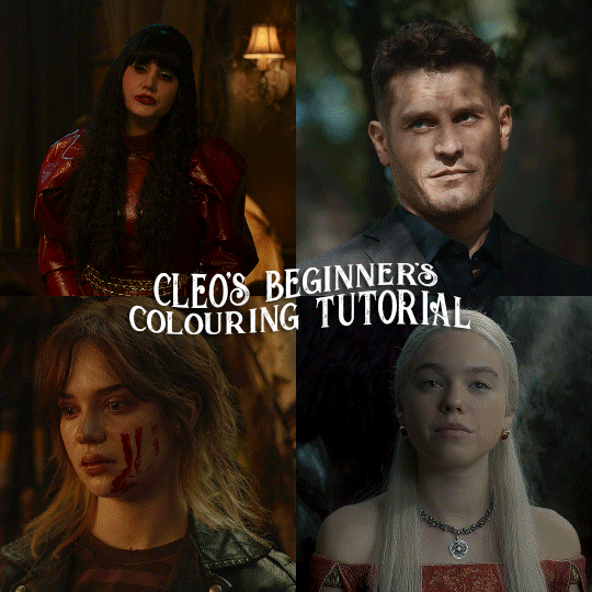
here is the colouring tutorial i promised to go with my beginner's gifmaking tutorial.
to save image space, i've written up a simple explanation of how each adjustment layer works here, so i'm just going to over my colouring for these 4 different gifs.
as always, very image heavy underneath
there are many ways to get the same results and i'll use various methods usually just based on what i'm feeling at the moment. some of it is a little convoluted, but hopefully this will give you a rounded idea of how it all works so you feel more comfortable playing around with your own colouring
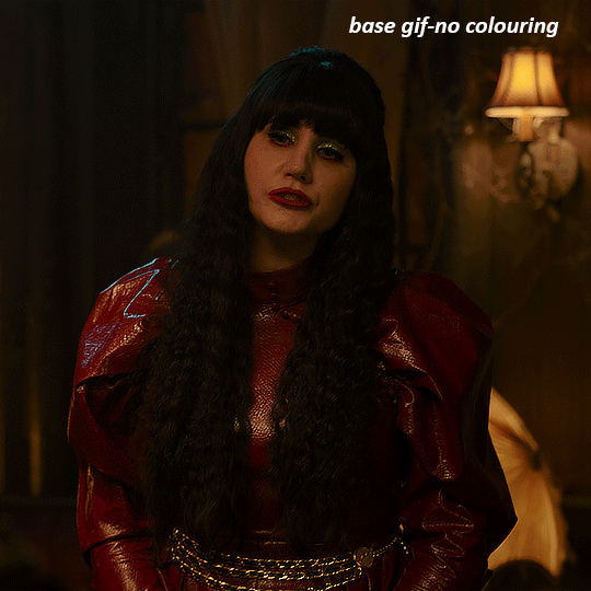
NADJA
this is the base gif with zero colouring adjustments, just resized and sharpened.
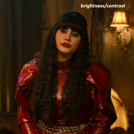
unless the base gif is already very bright, which doesn't often happen because directors nowadays are allergic to light, the first layer i add is always a brightness/contrast layer. i don't adjust any of the sliders, i just change the blending mode to "screen", and then adjust the opacity if needed. this gif was pretty dark, so i left it at 100%,
my next layers are always curves to even out the white and blacks. i use two curves layers, one for white and one for black. i used the white drop-picker and selected just below the lightshade on the lamp behind her, and for the black drop-picker i selected her hair near her neck which gives us this
it's already looking much better, it's not as green tinted, but i want to make the red of her dress pop a bit more. in order to do that without making her face too red, i'm gonna remove some of the yellow. so next i'm gonna add a selective colour layer, and under the yellow channel i moved the yellow slider to -5 and the black slider to -52. now
now that the yellow is reduced, i add another selective layer, and under the red i move the cyan slider to -66 and the black slider to +29. now the red of her dress pops and her face is still a realistic tone. when i first made the gif, i added the red selective layer first, then added another selective layer under it and adjusted the yellows to offset it. you can always shift layers around or add a new layer underneath as you go.
voila
TOMMY
here is our base gif

this scene is better lit than the nadja one, but i prefer bright and colourful gifs, so i'm gonna once again add a brightness/contrast level and keep it at 100%
and then the curves layers to even it all out. since there isn't a spot that is immediately noticeable as white, you can hold the alt button with the white dropper selected and it will highlight all the white/very near white pixels. you can also zoom real close in to select specific pixels. i selected a from the white area around his chin/mouth. the same process works for finding a black spot with the black dropper, and for that i selected from a dark spot in his hair
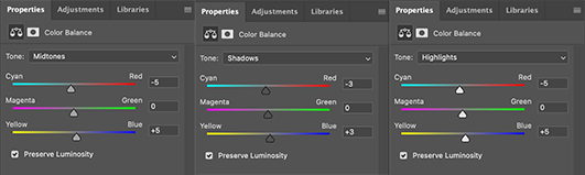
the curves layers evened it out but also made the gif a bit more red and warm toned, and since i've decided i want the end result to be more blue/green, so i'm gonna add a colour balance layer. in the shadows channel i moved the cyan/red slider to -16, and the yellow/blue slider to +11
now the gif already looks great, it's bright, skin tone is accurate, he's not washed out, but like i said i like my gifs colourful, so i'm gonna add two more selective colour layers. in the first i'm gonna adjust the greens, bringing the magenta slider to -87, and the black slider to +81. in the second layer i'm gonna adjust both the blues and cyans, because when you see blue in a gif it's rarely ever straight blue or straight cyan, so always adjust both. (you could adjust the blue and green in the same layer, but i prefer to do them separately in case i need to move the layers around)
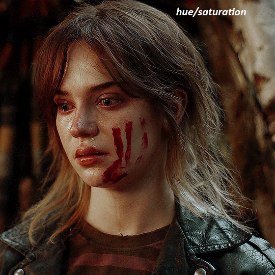
now finally i'm gonna add a hue/saturation layer because i think the blue of his suit is too blue when the sky behind him is more cyan. (also, since you only have 256 different colours to work with, you don't want too many different colours otherwise it will distort the colouring.) in the blue channel i move the hue slider to -12 to make the blue a bit more cyan, and i also move the saturation to +38 to make it pop more
and voila
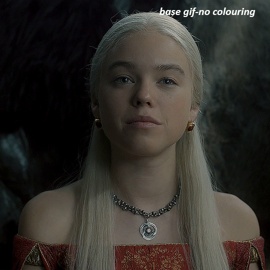
RHAENYRA
here is the base gif (this one is going to get very convoluted and imo best exemplifies what colouring gifs is like most of the time)
as always, a brightening layer set to screen
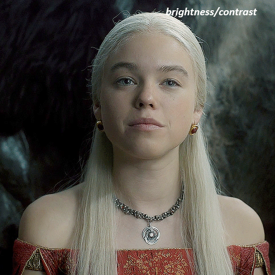
now the curves layers. for the white i clicked on her hair at the top of her head, and for the black i i clicked in the shadows to the left of her.
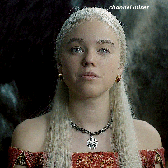
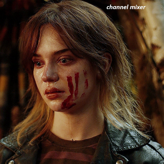
but as you can see, while it added contrast, it also made the gif more green tinted than it was. you could click around more, or manually adjust the red, green, and blue lines on the curves until it looks better but i decided to add a channel mixer layer instead. in the green channel i set the greens to -95, and in the blue channel i set the blue to -97
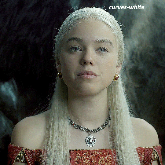
next i wanted to add a little contrast, but i find that using the contrast in brightness/contrast can saturate it too much, so instead i added a levels layer. first i adjusted the bottom bar, moving the right slider to 230 which reduces the overall brightness of the gif, so when i adjust the top bar it doesn't brighten the gif too much. on the top bar, i moved the right slider to 212, and the left slider to 9
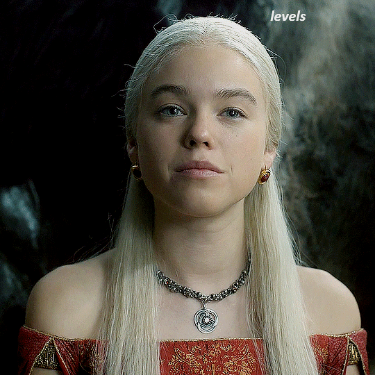
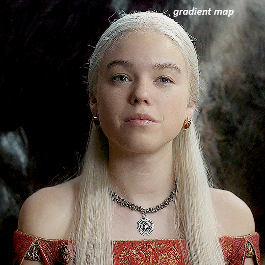
now, i'd like it to be not exactly warm toned, but less cool, and while i could use colour balance or a photo filter, i'm instead going to add a gradient map, using the default gradient pink 08, and setting it to blend mode soft light at 50% opacity

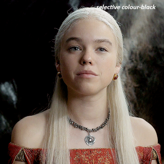
next i just want to increase the blacks a little, so i'm gonna add a selective colour layer and under black i'm gonna set the black slider to +10
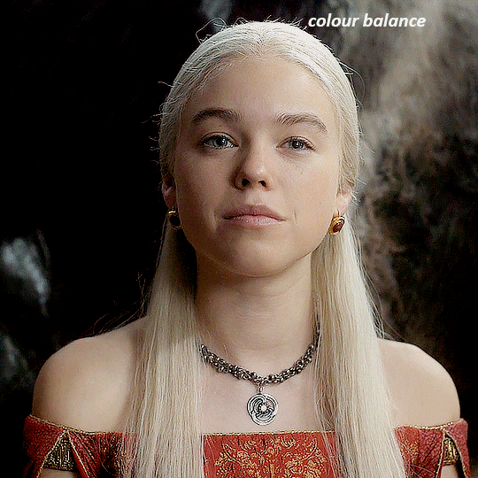
it's still not as warm as i'd like, so i'm gonna add a colour balance layer, in the midtones setting the cyan/red to +10 and the yellow/blue to -5
we're almost done, but i want to make her dress pop a bit more, so first i'm gonna add another selective colour to bring the yellows down a bit, setting the black slider to -15

and finally one more selective colour layer, in the reds, setting the cyan slider to -50, the yellow slider to +10, and the black slider to +15
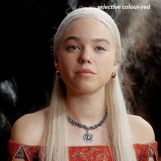
voila
NATALIE
here's the base gif
as always the brightness/contrast layer set the screen
now the curves layer. for the white, i zoomed in and selected a pixel on her cheek under her right eye. for the black i the dark spot just above her head
now she's very yellow, so i added a channel mixer layer. in the red channel i set the reds to +88. in the blue channel i set the reds to +10
she's still a little too yellow for my liking, so i'm gonna add a hue/saturation layer, and under the yellows i'm gonna adjust the saturation to -60
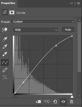
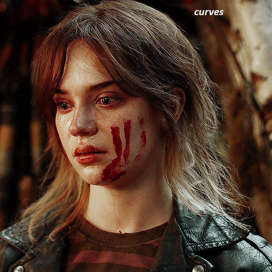
finally, i want her to be a it brighter, so i'm gonna add another curves layer, but instead of using the drop, i'm going to manually adjust it. the two points along the line are where i selected it and then i dragged until it looked how i wanted. i start with the upper dot, which made it brighter and moved the line into an arch, and then selected at the lower end of the line and dragged in back closer to centre to add some darkness and contrast
voila
and that's how i do my colouring. it's generally all trial and error, using a layer to fix one thing and then needing another layer to fix something the previous layer did.
play around, have fun, see what works for you and what doesn't. it will take a while for you to develop your own method and style, and even then you'll come across scenes that make you question if you have any sills at all. you do, directors just hate us
have fun and feel free to ask any questions
#tutorial#gif tutorial#colouring tutorial#photoshop tutorial#gifmakerresource#completeresources#*tutorials
260 notes
·
View notes