#i really like how the 2nd picture turned out....something about that blue gradient at the bottom is so uncanny......
Explore tagged Tumblr posts
Photo
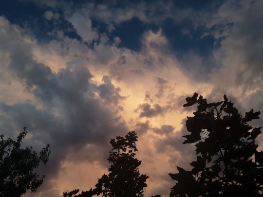
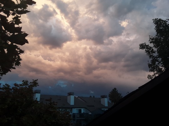
Whoagh
#these are from yesterday. shhhh. its our secret#jordan peele was so right about clouds.#these pictures dont capture how red it was but i dont really know if there's ever been a picture of clouds that really captured them#i really like how the 2nd picture turned out....something about that blue gradient at the bottom is so uncanny......
4 notes
·
View notes
Note
Hey, did you have any coloring tutorials regarding your pride headcanon gifsets? The coloring looks so nice and I wanted to try and attempt to use some coloring for my gifs but I dont know how
thank you !! its usually kinda specific to each gif but i can try! theres usually 2 ways i go about it
using the color overlay feature:
this is probably the easier one as it can be used with more scenes
you need to find a scene where the person you're giffing/the camera moves very little (here she moves a bit but its fine enough for me)
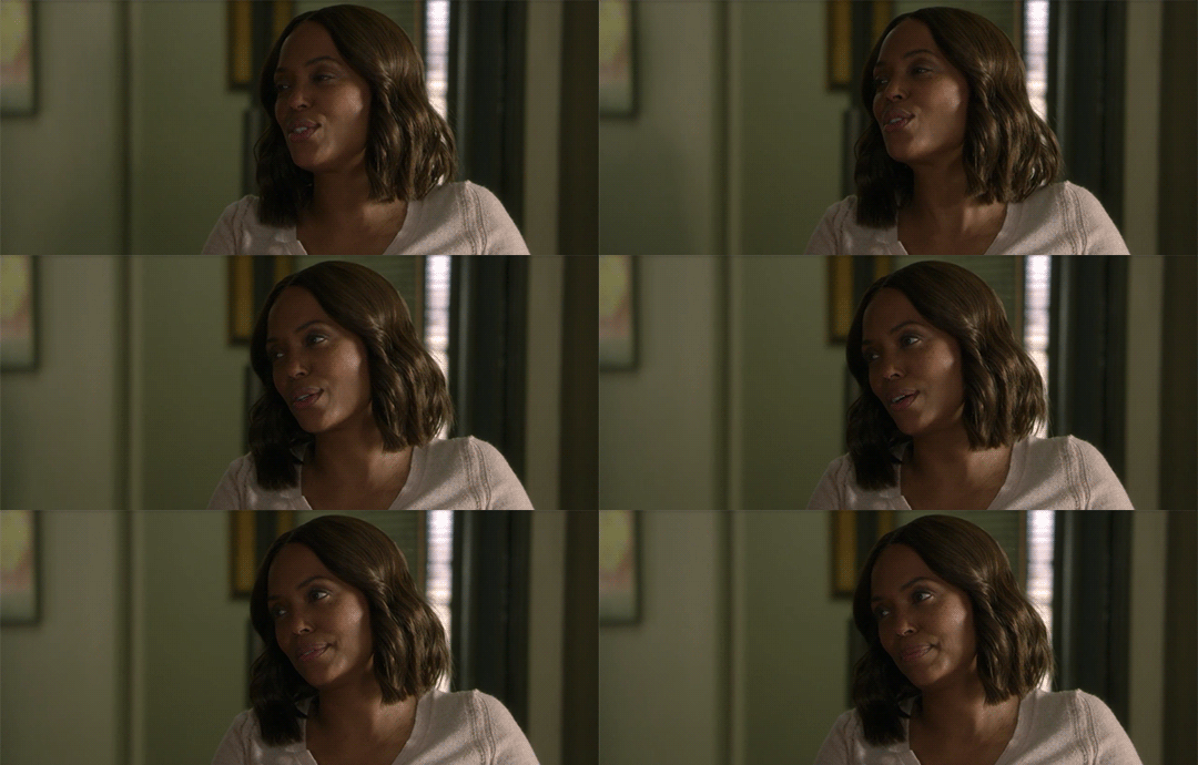
colour and sharpen the gif as you normally would
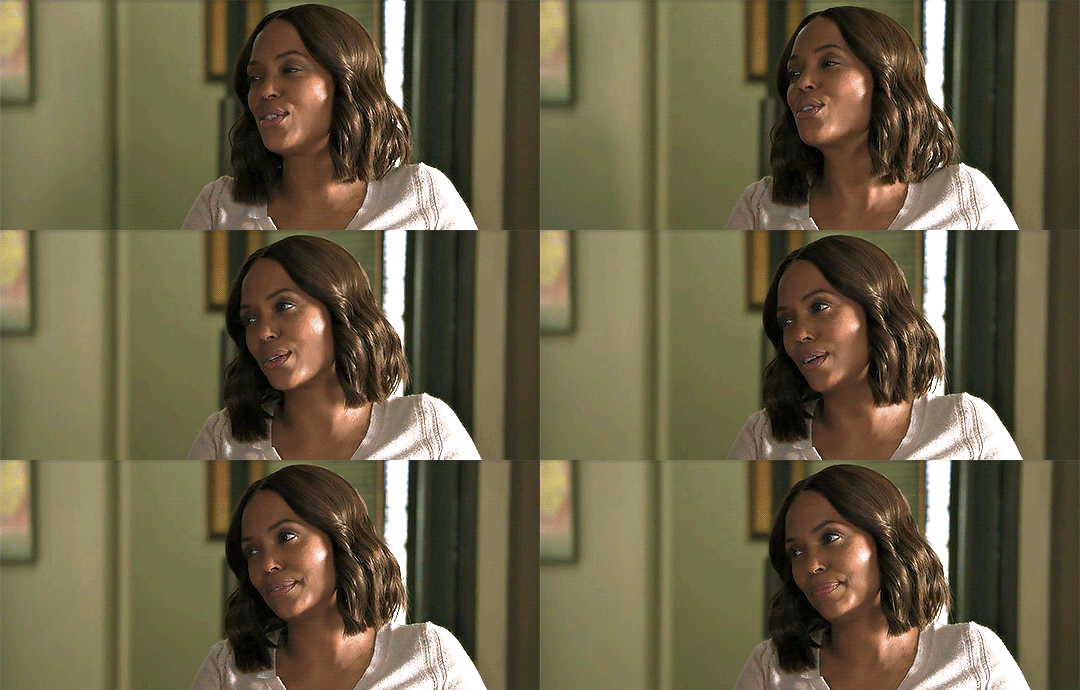
then create a new layer and simply colour the background in the colour you want
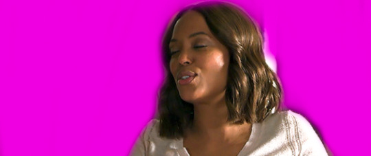
it will look ridiculous at first but then u wanna change the overlay setting from normal to color (the drop-down next to the opacity)
and it should look something like this:
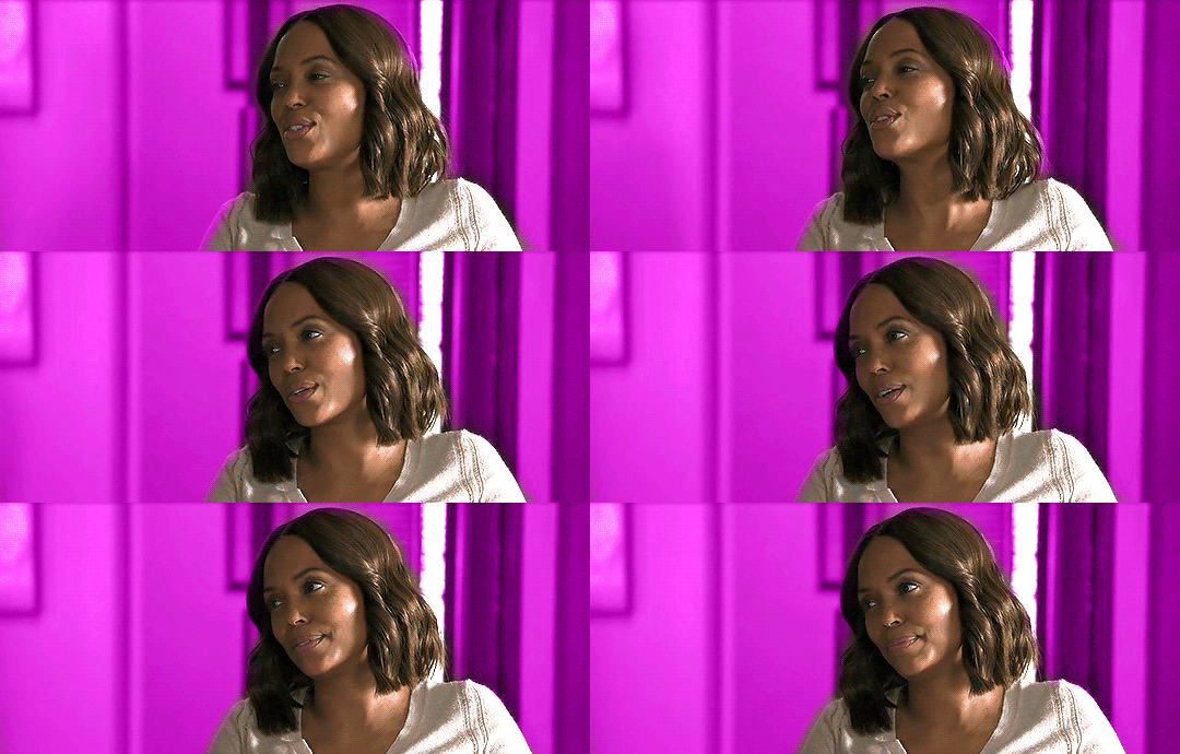
and then sometimes i add a gradient (pink to transparent) on a new layer on each side if i want a bit pinker (i mess around with the opacity of this layer to whatever i think fits this is around 70% opacity)
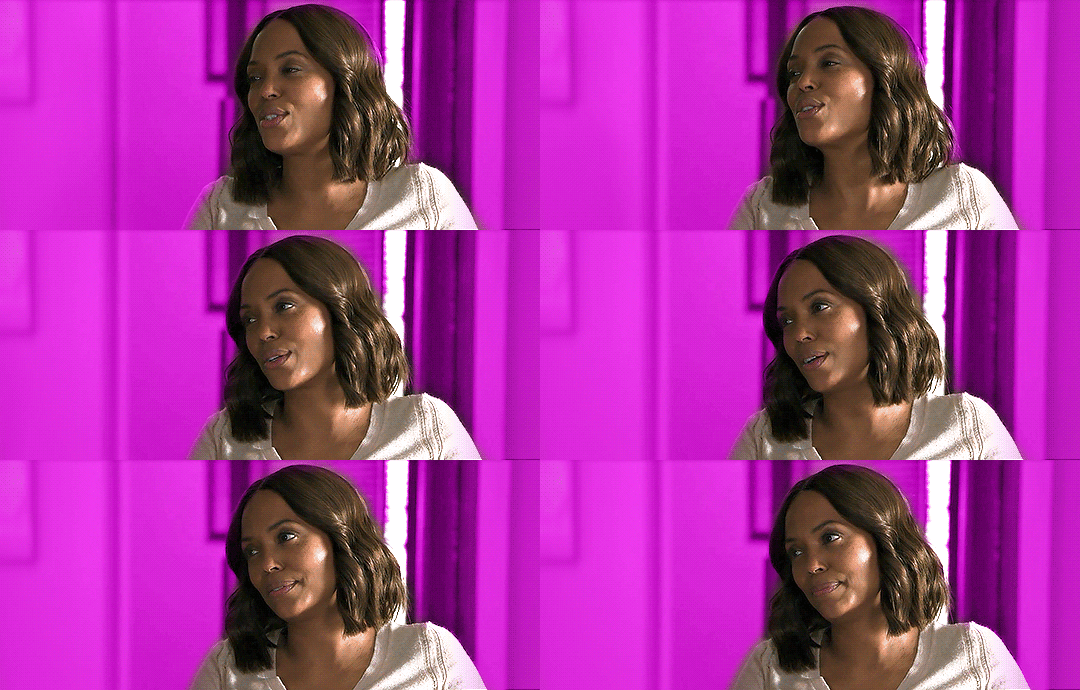
it doesnt make a ton of difference here but i tend to use it more when there are things happening on the far left that i want to draw attention away from as it makes those areas more opaque
and thats basically it for this way!
the cons to this way are sometimes you can see gaps/overlap where the character moves at certain points of the gif
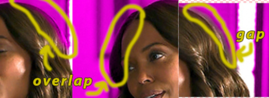
im usually pedantic about these things but its honestly not as noticable as you think it is and ive uploaded gifs that have overlap (i tend to think overlap is better than a gap but thats personal preference)
using selective colour:
this is harder to do as you need the background to be a specific colour (but i think it tends to look better)
this colour can be the colour you want the gif to be but from my experience blue backgrounds tend to be most easily manipulated
red/yellow/pink backgrounds are hardest to change as they affect the skin colour of the character (but it can sometimes work if the character doesnt move much as you can use a layer mask and erase your colouring from the person)
im gonna try and colour this gif (idk if it will work yet as the background is a greyish blue rather than a brighter blue like the sky would be but it should do)
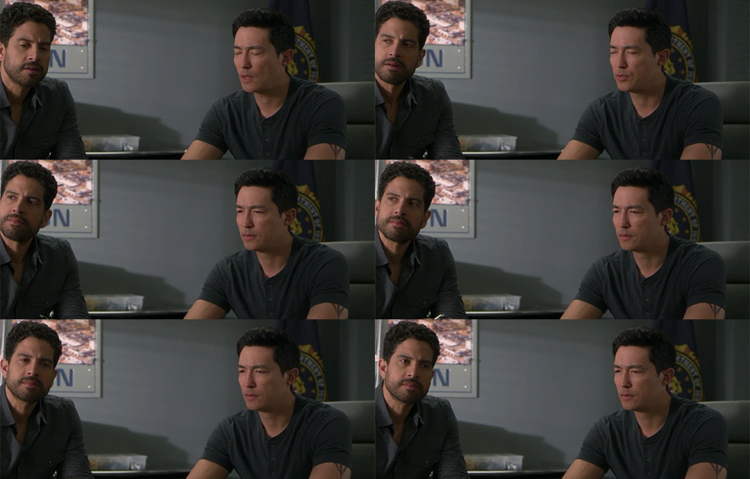
colour and sharpen as normal (i also recommend using a blue/cool photo filter layer to really get rid of the yellow undertones the later cm seasons have it makes a world of difference for me but its up to you/how you colour things)
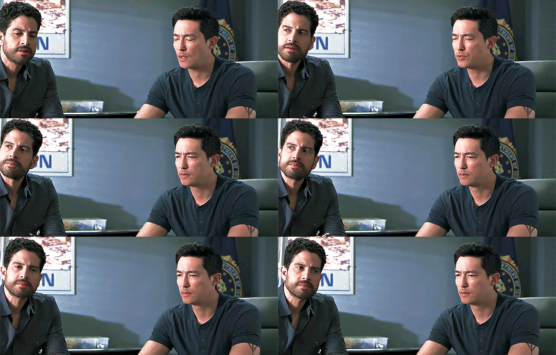
then from here honestly its a lot of trial and error; im gonna try and make it pinky purple
this is gonna be different for each gif but for reference i added 2 selective colour layers (as the bg is blue im only gonna change the cyan/blue and maybe black/green) and one hue/saturation
1st selective colour: GREEN (C = -100, M = +100, Y = -100) CYAN (C = -100, M = +100, Y = -23) BLUE (C = -100, M = +100, Y = -91) BLACK (C = +1, M = +13)
2nd selective colour: GREEN (C = -100, M = +100, Y = -100) CYAN (C = -100, M = +100, Y = -23) BLUE (C = -100, M = +100, Y = -91)
hue/saturation: (the background is now pinky/purple) MAGENTA (hue = +1, saturation = +32, lightness = +19)
this is my result:
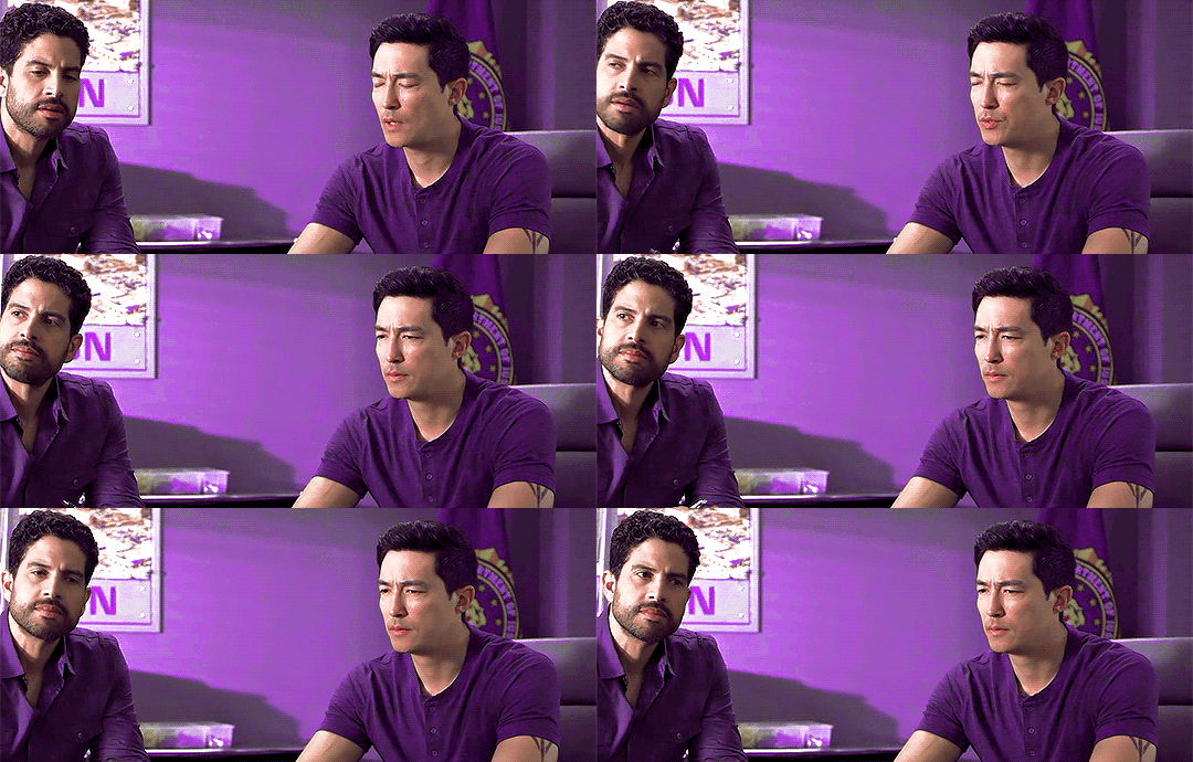
as you can see their skin tone hasnt changed as i didnt touch the red/yellow selective colour options. if your background is one of these colour you could add a layer mask to that selective colour layer and erase the area of the person but this might cause effects similar to first version i showed you (gaps or overlap)
im still not entirely happy with it as firstly, luke is in the picture as we want to draw attention away from him and secondly, there are still some non-purple colours in the background
to fix this is once again use the color overlay feature from the first version to touch up some of the areas (i colourdrop a colour from the background) there shouldnt be much overlap/gapping as im not colouring precisely around their skin (and if there is it wont be as noticable as the background/shirt is the same colour)
and then to get rid of luke i simply draw over him in a colour from the background and then add a gradient and move it so the opaque side of the gradient is near the edge of where i stopped drawing over luke (i also transform it and mush it inwards so the more transparent side doesnt go all the way over to matt just next to him)
this is what it looks like finished!
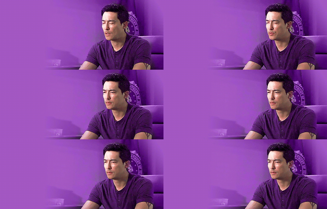
it turned out pretty well considering it was a random video i had on hand !!
also dont be scared to experiment with overlays/opacity etc and its okay to realise that it’s just not working for this gif and scrapping (ive lost many gifs </3)
im not the best at explaining things but i hope this somewhat helped!! if you have anymore questions feel free to ask <3
18 notes
·
View notes