#i was focusing on shapes and simplification and contrast and i think it worked out well!
Explore tagged Tumblr posts
Visit Tumblr Blog
Explore Tumblr blogs with no restrictions, modern design and the best experience.
Last Seen Tumblr Blogs


Fun Fact
Tumblr Inc. has $15.1M in annual revenue.
Note
would definitely love to hear ur thoughts on the cufant line!

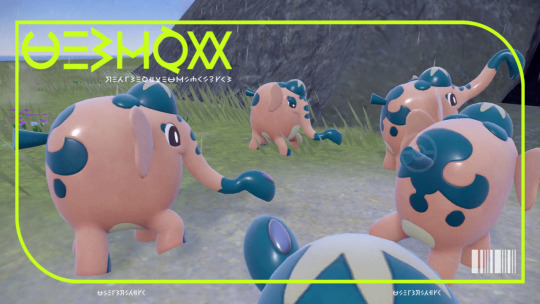
Maybe I'm just biased because this was my second shiny in SV, but I rather like Cufant. It's cute—I like the almost cat-smile effect it has with the trunk and the shape of the eye—and I think the idea of a mining theme that focuses more on the element being mined (in this case, copper) than the equipment is a neat angle to go at it from.
Visually, using green areas to represent oxidization (patina) makes sense and creates a good light/dark contrast with the orange body. The design is ornate enough but not overly busy due to most of the body being left clear, and the little shovel trunk is a nice touch.
That said though, there are a few small things that bug me. Like, I'm not big on the "hat"—it feels very out-of-place, and the shape isn't reflected anywhere in the design. Likewise, it's bothersome that it uses the lighter underbelly color when it the similar-looking trunk and toenails both use white (either the hat should be white or the other accents the light orange, but keep it consistent).
Also, the markings feel a bit random. The ones on the trunk, hat, and toenails are very angular, while the rest of them are more ornate and round. Neither option is bad, but some visual consistency would be appreciated. Other than that, though, it's a fine little design.
Also, side note: it was probably just GameFreak trying to give a good reason for an Indian Elephant to be in Poke-England, but the whole "They came over from another region long ago and worked together with humans" thing combined with the mining accidentally makes this into the British Imperialism Pokemon, which is a big 'ol yikes from me. They definitely should've saved this one for a different region entirely.

Copperajah has something interesting going for it with the patterning on its body, which is very reminiscent of copper deposits. I think these spots look best in areas like the toenail accents, the ears, and the eyes—areas where the placement feels purposeful.
In areas where the placement is less purposeful, however, the body starts to get a bit messy. The swirls on the body pop nicely but feel very random in shape and placement. And then there's the lighter green, which makes the colors a bit garish and adds nothing to the design. I would've dropped the underbelly completely, then made the light green areas on the trunk and tail orange instead.
The boxy look also isn't my favorite. It's probably supposed to look chunky, like copper ore, but it instead it just comes across as inorganic and stuff. Likewise, the random ore chunks on top of the head are a weird shape. It's got the right idea and a neat aesthetic to it, but it could've used a bit of refinement and simplification.

And honestly, I think g-max Copperajah is one of my least favorite g-maxes—which is saying a lot, because I don't like a lot of them to begin with. The body shape is just so freaking bizzare and so ugly—the boxy look was one of my least favorite things about Copperajah, so seeing it emphasized here with a weird upright design just makes it look completely unlike a living creature.
And so much of this design just feels random. Emphasizing the digging trunk is fine enough, but why the speckled underbelly? Why are the legs so much bigger than the upper legs? Why do the toenails go under the foot??? It's just a mess all around.
If GameFreak decides to give this line some other forms in the future that aren't quite as aimless as the g-max, I wouldn't mind seeing a regional variant. It's said to be imported to Galar, so giving it a regional that was what it looked like originally would be a nice bit of world-building.
Anyway, overall: Copperajah has a nice design as a whole and an interesting theme with the copper concept. Copperajah has the right idea, but the design needed cleaned up and simplified a bit. And we don't talk about the g-max.
44 notes
·
View notes
Text
Design Museum—Primary Research Trip
The Design Museum is a museum focusing on contemporary design and showcases work from a range of time periods and areas of design. As a group, the Year 2 graphics students visited this museum as it relates to the work we have done so far surrounding our curious objects and generating ideas from these. Visiting the museum would give us the chance to see how design as a whole has evolved.
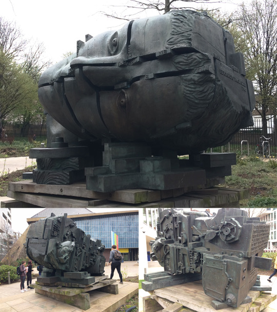
At the entrance of the museum is a sculpture made by Eduardo Paolozzi, a British artist I have previously looked at who was known for having a large influence on pop art. He produced both 2-dimensional artworks as well as sculptures. This piece titled “head of invention” is an example of his sculpting work and features various segments of a human head fitting together with words slotted in between the gaps. When approaching the back of the head, the complex machinery dominates the space. This showcases what I think is the main benefit of creating work in 3-dimensions—the possibility of having different interpretations depending on the viewers’ position. This is elevated by the size of the sculpture as well, which makes the viewing experience completely different from looking at it from a secondary source. The machinery at the back and the slotting together of the segments of the head represents the evolution of technology and I think this is why the sculpture is as big as it is. The size portrays how crucial technology started to become during the industrial revolution.
“I suppose I am interested, above all, in investigating the golden ability of the artist to achieve a metamorphosis of quite ordinary things into something wonderful and extraordinary”
This is a quotation said by Eduardo Paolozzi which relates to my own project. I believe so because this quote talks about making something “wonderful and extraordinary” out of “quite ordinary things” which is something I have been aiming to do so far and will continue to do. Using my 10 curious objects as the main example, I have seen how using seemingly unrelated ideas to generate new ones has been largely beneficial to me by providing a wider scope of inspiration for my project. Paolozzi calls doing this well the “golden ability” of an artist, or the main characteristic a good artist will possess.
Designer/Maker/User
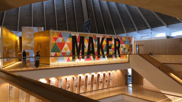
‘Designer/Maker/User’ is the name of the exhibition held at the Design Museum which was the focus of our trip. The name itself relates to the connection between ‘artist’, ‘artwork’ and ‘audience’ which I identified as something I need to constantly look back on and evaluate against. The importance of this is achieving an understanding in all three of the aspects which will carry your work from something which is made to ‘look good’ to something with a real impact. The entrance to the exhibition includes a very large display, where each of the words appear to fade into each other after a period of time. This was an example of a 2-dimensional graphic being applied to a different type of material other than the usual wall or canvas. The effect of this from far away creates the illusion of moving image, but it is instead 3 different images being transitioned into each other by the wall itself.
On the opposite side of the entrance, was the first piece of work. When I saw this, I instantly drew the connection to Lisa Temple Cox’s Lion Walk decoration. This piece used a collection of items which were donated in a similar way to Temple Cox’s display boxes. In both cases, the concept reflects the process I have used so far for generating ideas out of random objects. My 10 curious objects are all unrelated to my ideas at this stage, but I wouldn’t have these ideas without using these items and various practical experimentations to develop them.

The main difference which is striking between this new example of assorted objects and the ones I have looked at is the size. Even the Mark Dion examples which were large boxes of still life are a lot smaller than this wall of objects. It’s a mixture between the large-scaled display boxes and the neat organisation of the small examples. As a result, the wall offers a similar narrative which can be seen in the smaller examples but on a larger scale. The viewer can be intrigued for longer because there’s more to explore and interpret.

The exhibition showcased the evolution of technology throughout the years. With this, the production of type was heavily affected by what was seen to be possible with the technology available at the time. This specific example above is some early work developing a typeface with the assistance of early vector graphics. What I find interesting about type and this image especially is how similar the quality of the letters are from then to now. Looking at the ‘Q’s at the bottom right of the image, it’s hard to differentiate them from type made and used today which is evidence of how timeless successful type is.
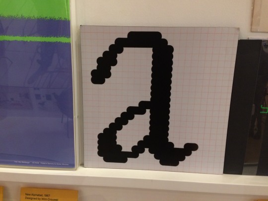
The earliest examples of digital typefaces were made on grids due to the limitations of screen resolutions. All graphics were made on extremely low-resolution bitmap screens which makes the earliest examples of digital graphics have a distinct ‘pixel’ look to them. The Macintosh icons created by Susan Kare are something which follow very similar guidelines and have the same similar distinct look. Susan Kare is an artist I looked at during my ‘Animal Instincts’ project where I looked into the process of limiting myself to sketching on a grid much like she did. Although I am not limited by the grid because of how technology has evolved, exploring this process taught me how revisiting traditional methods and restricting yourself in similar ways can, in fact, produce more effective results. The pixel type is an example of this because when it is sketched onto a grid first, everything is consistent and legible to the viewer.

On the contrary, this bionic arm is an insight into what the future could look like with the advancement of technology. This is a bionic arm which was made completely from the process of 3D printing. A relatively new process for product design which has evolved what is possible with digital software. This was produced by e-NABLE, an organisation where volunteers use 3D printing techniques to produce bionic prosthetics for under-served populations globally. Because of how automated the process of 3D printing is, once you have one digital model to print, the costs become very low which is what allows e-NABLE to give back to communities. The material also works in their favour. The vibrant colours of the 3D printing plastic are a distinction between e-NABLE and other mechanical prosthetics which makes them especially marketable to children.

This is an example of how impactful technology can be. Using design to combat important issues which, without these efficient processes like 3D printing, would not be possible. With the evolution of technology, comes the simplification of the product. Just recently, bionic arms would have been seen as inaccessible, especially by poorer communities. Now e-NABLE produces bionic parts on a mass scale, with construction kits even being an option.

These Olivetti posters and Olivetti posters, in general, are often used as an example when referring to ‘vintage’ design. Although each poster has its own unique qualities, there are certain characteristics which I picked up on which are common. Firstly, the colour and tone. Most of the colours used are flat and saturated with warm colours being used slightly more. There is rarely a lot of gradients being used, but when tonal value is applied, it is done through different flat colours. The large blocks of colour work effectively to draw attention to the posters. I find the posters with the examples of large blocks of colour naturally draw my eye to them, which is the purpose of these. Another thing I noticed, although not as prominent as the use of colour, is the use of shape. Circles are the core in some of the designs and remind me of Saul Bass’ work because of this along with the colour usage. Now I have access to technology which can allow me to produce more ambitious effects in easier ways. But these posters remain effective to this day, which shows how whilst technology evolves, successful design remains that way.

Because branding is something I want to explore with my project; when I saw these examples of logo evolutions I wanted to use them as research. Starting with the leftmost example: Apple. Their logo started off as a complex illustration and the impracticality of this is illustrated by how far away I was standing. The small details become too small to see and the complexity of the logo is lost with its size. In contrast, the simplicity of the next Apple mark remains effective from both close-up and far away. Because of this, once Apple had an effective logo, the changes that followed only became minimal, but eventually leading to the most simple revision of all of them—the plain black version.
A similar instance happened with the ‘Braun’ logotype in the right image. The logo was changed from a minimalistic design to a styled one with a 3D effect added to it. Because this added nothing functionally to the logo, they reverted back to the original concept but with a more modernistic approach applying the logo to a grid.
The middle image shows two variations of the ‘Sony’ logotype. Only being two, the Sony logo has gone through less change but the same elements in terms of legibility have improved. The other logos are companies owned by Sony and are all in my opinion successful logos.
What these teach me is that effective brands should stick with their brand identity for as long as possible as it is over-time that recognisability is created. The Apple logo is the perfect example of this benefitting the company themselves. Over many years the Apple logo has gone through little changes which means the consumers are familiar to the image and link it to the products. This then allows Apple to raise the prices of their products as the customers are more likely to buy into a brand they are familiar with.

I also made sketches as I walked around the exhibition. It’s important to do this because you can portray the feeling you had when reacting to the original object. A photograph can only provide so much to my research, but sketches I made at the time of viewing the research are more insightful into their effects on me.
Review
This trip provided a new element of research to my project in the form of primary investigation. It was a lot more engaging for me as a viewer reacting to the work first-hand as it was intended to be viewed. Secondary research is beneficial due to it taking less time to gather information. However, secondary examples can often provoke a different response to original artworks. Size is something which heavily effects how an audience reacts to art work. From a secondary source, the Paolozzi sculpture or the wall of donated possessions at the Design Museum will not provoke the same reaction that I had when looking at them first-hand. The size adds to the statement the piece is making and makes the work seem a lot more powerful. Large works like these keep me interested to look at because there is often more to look at and interpret.
I have researched designs from other time periods before, but the Design Museum offered a unique outlook on the evolution of technology and how this aided the production of design. The most shocking thing from this visit was how automated the 3D printing was and how cheap it had become to produce products in mass because of this.

Looking Back
As I spectated the numerous examples of design from different times, I kept noticing the similarities between these and my own project. Firstly, the vast wall of donated possessions reminded me of the work I did on my display box and the research I did into artists who produced similar things. Mainly Lisa Temple Cox, who also used donated objects to form various smaller display boxes in the Lion Walk toilets in Colchester. I was also able to observe these in person as they were installed locally, and although the concepts of narrative remain similar between the two, the reaction I had to them both was very different. Lisa Temple Cox herself said that people “don’t go there for it, but they enjoy it while it’s there”. I feel the same way with my experience of looking at her work and found it to be a lot more passive than the vast example at the Design Museum. I was in awe of the size of the. The concept remained the same but the scale alone of the display box altered the reaction from the audience completely.
Next, the examples of type and how they have evolved. Type has been a large of my project so far and I plan to continue this way moving forward. I find type to be so interesting because of how explicitly it can communicate a message but in more ways than one. I have previously looked at type mainly with digital processes; the Lost & Found workshop series allowed me to mirror the same process but with very different materials (such as the garden wire typeface I made in part 1). These seemingly unrelated methods make sense when I view the work at the Design Museum. Restricting myself to garden wire to make a typeface made me feel extremely limited, but as I highlighted when looking at the pixel type work at the Design Museum, limiting yourself to a strict amount of rules to follow can sometimes create more effective outcomes. Even if not, the ideas that spark from challenging yourself allow for a lot more possibilities for outcomes.
Moving Forward
There were some things which I was interested in from the Design Museum that I haven’t yet explore in my project, that now I see as a possible direction to follow. The first one being the Olivetti posters. Looking at these got me interested in poster design as a whole and how it links with type. I then thought about how it could link with animation as that is another area I want to explore. Moving forward, I may consider looking into more abstract poster design which comes from limiting myself and forcing myself to come up with completely different ideas to what I am comfortable with. Much like when I tried screenprinting in the 2nd Lost and Found workshop, I found that being out of my comfort zone may produce results I am less happy with, but the ideas that I will generate can benefit my project.
I highlighted the use of shape in the Olivetti posters. Geometry was something I mind-mapped at the very beginning of the brief as an interest on mine, so I think it would be appropriate to explore using geometry in design in the future. I have already done this with logos in the ‘Animal Instincts’ project, but I want to attempt to combine it with poster design. Looking at gestalt and my display box also let me understand how groups of objects are perceived by a viewer. I could possibly use this knowledge in a 2-Dimensional format such as with poster design and learn about the technicalities of laying things out in 2 dimensions.
On the subject of logos and branding as a whole, this is something I definitely want to explore. I would say it is one of my biggest strengths, which is why I have limited myself away from it so far. But at this stage, I want to start using the ideas I have gathered, combine them with ideas I initially had at the start of the project and use what I am interested in (type, branding, motion etc.) to do so. The Apple, Sony and Braun logos that were showcased at the museum showed me how effective branding works in practice. I want to explore the possibility of creating entire brand identities rather than just a single logo.
Lastly, the type I looked at made me want to continue exploring type but limiting myself more. I know I am comfortable with digital processes so my next step will be to reflect upon early methods of producing type, (such as sketching on grids) to learn about the fundamentals of creating legible typefaces. I believe this will broaden my understanding of the field of type and ultimately allow me to use type more effectively in my own work.
0 notes
Text
Scott McCloud Understanding Comics
“As children, we “show and tell” INTERCHANGEABLY, (in a way that can be exchanged), words and images combining to transmit a connected series of ideas.”
· We can show what is being done using little to no explanation using words, or narrate what is going on so the reader may follow more easily.
· “Generally speaking, the more is said words, the more the pictures can be freed to go exploring and vice versa.”
· Giving pictures narrative can give then a more integral meaning.
· However, you can also change the pictures to show a different perspective then before and make the drawings more abstract.
“I guess the basic difference is that animation is sequential in time but not spatially Juxtaposed as comics are.” p.7
Juxtaposed: The notion placing something close together or side by side, especially for comparison and contrast
Scott McCloud looks at the history of comics by looking at pre-Colombian picture manuscripts and tapestry as well as looking into pictorial languages such as the Egyptians.
The mention of Lynd Ward looking at his work known as the `silent` Woodcut novels that are praised by comic artists for his work due to the negative connotations of comics.
Frans Masereel - Passionate Journey, 1919.
“Yet, despite the lack of a conventional story, there is no mistaking the central role which sequence plays in the work. Ernst doesn`t want you to browse the thing. he wants you to read it!” p. 19
The pictures from Max Ernst`s A week of kindness is very similar to a comic in the way it has been portrayed for it is showing the viewer a story that he presents, not as standalone works of art but a novel to which the viewer should read to understand the story.
“Pictures in sequence are finally being recognized as the excellent communication tool that they are, but still nobody refers to them as comics! `Diagrams` sounds more dignified, I suppose.” p.20
This means that the word comic is conceived negatively by many people. This maybe due to the connection to children's comics and other picture books.
“There is a long-standing relationship between comics and cartoons.” p.21
“But they are not the same thing! One is an approach to picture-making -- a style, if you like -- while the other is a medium.” p.21
“We may try to understand the world of comics around us, a part of that world will always lie in shadow -- a mystery.” p.23
We may never know the understanding of comics as a whole but what we can do is understand what we already know to make a sense of what comics are about and he also states, “our attempts to define comics are an on-going process.” p.23
Symbols could be in one category of icons.
“Words are totally abstract icons.” p.28
We could use words in a creative way when drawing such as on p.28 he has the drawing of a man with the word eye on his face instead of a drawn eye.
That the drawing of people within comic books can also be an abstract character, however if it goes to abstract then it looks more like an icon or as Scott states “the cartoon?” p.29
Cartoons are an icon due to there popularity through comics and cartoons and how people respond more to a cartoon character more then a realistic due to their simplistic nature. Scott McCloud calls this “as a form of amplification through simplification.” p. 30
“Cartooning isn`t just a way of drawing it`s a way of seeing!” p.31
The way of simplifying an idea of something like a story and focusing on that to present to the audience, whether it being a film or comic book.
Another fact is the way the viewer can see themselves as certain iconic characters, especially those who they can relate to and feel sympathy for the character the story revolves around.
“We humans are a self-centered race.” p.32
Humans can make out faces in every day objects and Scott McCloud identifies that “we assign identities and emotions where none exist.” He also goes on to say “we make the world over in our image.” In a sense we believe that we have seen iconic characters in many shapes and forms that we can make characters.
“We don`t just observe the cartoon, we become it!” p.36
Again people see themselves as the character which in turn you feel more connected with them throughout the story. And it could also be another way to escape reality and get lost in the story.
“Non-visual self-awareness can, to a lesser degree, still apply to our whole bodies.” p.37
During an interaction as Scott McCloud shows, two people could be having a discussion but their minds could be elsewhere such has the man talking is more worried about dropping his drink and the woman listening to the man is thinking of her ankle, which could mean she is in pain. This could also say that we wear masks to present a false emotion without showing how they really feel.
Clothes can be a representation of ourselves to show other people what we are interested in, what our personalities could be like or how we want to be seen as, if someone dresses in dark clothing people could perceive them as goth or if they wore baggy clothing, people could perceive them as having a laid back personality.
“Very iconic characters with unusually realistic backgrounds” p.42
“This combination allows readers to mask themselves in a character and safely enter a sensually stimulating world.” p.43
Once people place themselves in iconic characters as to sympathise with the character throughout the adventure and the story.
- Jacques Tardi
- Carl Barks
- Jaime Hernandei
- Dave Sim
- Osamu Tezuka
Complex, (consisting of many different and connected parts). - Simple, (plain, basic, or uncomplicated in form).
Realistic, (representing things in a way that is accurate and true to life). - Iconic, (relating to or of the nature of an icon).
Objective, (not influenced by personal feelings). - Subjective, (based on or influenced by personal feelings).
Specific, (clearly defined or identified). - Universal, (applicable to all cases).
- Mary Fleener
- Jack Kirby
- Stan Lee
- Sergio Aragones
- Dave MsKean
“Capable of expressing each artist`s innermost needs and ideas.” p.57
Artists are capable of creating a comic in their own visual art style to portray the story in their image.
0 notes
Text
The Inevitable Consequence of the Everyday on Architecture
ESSAY by Daniel Norman
I will begin this essay with a short story I once read about the late Zaha Hadid as told by Amanda Baillieu. Whilst attending the opening of the BMW Central Building, Baillieu pointed out how the staff had already personalised their desks with teddy bears, family photos and plants, to which Hadid shrugged saying, “What can I do?”. She did however find it ‘amusing that having designed a building that was all about making staff behave differently, they refused to do so.’ The short anecdote captures how the users of the newly opened building had already come to populate and individualise the space as well as Hadid’s desire to avoid what is in fact out of her control. Upon visiting a few years on, she might not have been so happy to see weathering materials or marks on what were once pristine surfaces.
These are just the inevitable consequences everyday life has on a building. In this essay I will explore what ‘the everyday’ means within the built environment; how architects overlook the everyday and how architects can take pleasure in the everyday. If I criticise architecture at all in the text, it will be in relation to its regard of the everyday and not as a piece of architecture in general – the BMW Central Building is in fact a great feat of engineering so should not be dismissed as an exceptional work of design. The aim of this essay is to emphasise how buildings are ‘inescapably embedded in the everyday world’ and should therefore take into account the effects the inhabitant and natural environment will leave on the building.
To begin with, I will consider the term ‘everyday’ using the graphic novel Here (Fig. 1) by Michael McGuire. Drawing on his own life, McGuire depicts the most mundane incidences that all take place within a single room at various points in time. From throwing a party to cleaning the carpet, to taking a graduation photo or drinking tea with friends, the drawings capture the essence of the ‘everyday’ without need for words.
A snippet of the graphic novel was published in Real Review magazine4, under the title of The home is the stage upon which we act out our lives, which, although more long-winded than Here, I believe is a more fitting title for the drawings. The space is in fact a stage, the everyday incidences just like scenes or dialogues in a play. Whilst the title states the ‘home’ is a stage, one could say all (or most) architecture—the office, the school, the art gallery for example—is a stage upon which the everyday is played out. If a stage could not adapt to the changes of scenery, then the story could not be told; so this poses the question of why architects do not accommodate for the inevitable changes and adaptations of the building.
So in this essay, when I refer to the everyday, I am speaking of the incidences McGuire depicts and the inevitable consequences of these, for once a building is ‘released’ into the everyday dust will accumulate, marks will appear on surfaces, possessions will fill voids, new partitions might be constructed, precipitation will cause weathering—the list could be endless. These processes and incidences are so ingrained into our built environment, that it seems odd to think that an architect might choose to ignore them. It has become almost commonplace for many architects to deliver a building which is not prepared for the inevitable consequences that will occur upon its release into the everyday. I will discuss in the next section how within architectural culture, we have come to dismiss the so very thing that surrounds us.

Fig. 2 — Photography in architectural publications tends to present buildings as idealised versions of themselves, downplaying the habitation or actual use of spaces.
It is not solely physical architecture that often resists its use in the everyday, it is also architecture’s representation in photography and media (Fig. 2). Buildings tend to be presented as an idealised version of themselves, downplaying the habitation or actual use of space; which has now become the norm in almost all architectural publications, where the ‘inclusion of people […] and the marks of time still remain the exception.’ Even prestigious architecture awards ‘favour the extraordinary […] over ordinary’, and will use these idealised images to represent the nominated work.
Recently, Hopkins Architects employed a photographer to shoot the new George Green Library for an award nomination. I happened to be in the library at the time; and before taking any photos, the assistant had gone around the space, lining up the bottom of the blinds, removing bags off desks and unsightly bins from view. Whilst the photographer chose to include people in the shots, the photographs had still become an idealised form of the architecture.
The trends that come along with mass publication and the romanticisation of architecture, has developed a culture in architecture where the architect often ignores everyday reality for the conceptual or beautiful, where the architect (or ‘starchitect’) of the magnificent is celebrated in publications and through prestigious awards.
There are however, a number of publications that are trying to redefine the ‘design magazine’. Apartamento (Fig. 3) is a magazine that focuses on the occupants of spaces and the stories of their homes. Flicking through the magazine, you might see a tangle of wires running across a bedroom floor or a window sill filled with an assortment of paraphernalia; images that contrast the lifeless spaces seen in typical design publications. Another magazine, Dirty Furniture, describes itself as a ‘magazine that uncovers the relationship between people and the things they live with’ and ‘what happens after an item leaves the showroom.’ Featuring the inhabitant over the architect or designer, this publications show a shifting focus in a media culture where ‘signature buildings’ and the ‘name-brand architect’ are the norm. Later in the essay I will discuss a group of architects who break the mould in this idealistic culture.

Fig. 3 — Apartamento is a magazine that focuses on the occupants of spaces and the stories of their homes.
This culture which has developed in the practise of architecture and its representation in publications has been magnified by the influence of mass media and the commodification of styles, but has been present throughout architectural history. It can be traced back to the Classical principles, as written in the works of Vitruvius or more recently to the work of modernists such as Le Corbusier.
In his essay Architecture and Contingency, Jeremy Till argues that architecture is a ‘contingent’ discipline, although architects have, to a degree, retreated ‘to notions of order, beauty and cleanliness.’ This attempt to find order can be seen in the Classical’s principles of natural proportion and mathematics and the modern’s simplification of form and materials. But in this endeavour for order, the classical and modern architect ignores the loss of control that comes with the introduction of an inhabitant, and in this the consequences become only more obvious; the more the architect attempts to rid of disorder, the ‘more it comes back to haunt one […] The whiter the wall, the quicker it succumbs to dirt.’
A desire for order is not only the fault of the architect, the introduction of building regulations particularly in the past century imposed strict guidelines on how buildings are designed. The legal regulations dictate many of the design decisions an architect makes, from the scale and materiality of a building to its heating and lighting strategies. Whilst legislation is necessary to curb the effects of the built environment on the natural environment or to ensure the inhabitant is provided with a satisfactory structure, it limits design and also sets a minimum standard to which ‘lazy’ developers tend to stick.
As a result of the ‘lazy’ mass-production of homes, so-called ‘cookie-cutter housing’, whereby one-architecture-fits-all has become increasingly common. The mass-produced homes tend to ration space to that outlined in building regulations limiting rooms to defined arrangements for specific activities. For example, the dining room fits only a dining table and chairs, the lounge fits only two sofas in a single arrangement. In this, there is no room for interpretation or adaption.
In Japan, the traditional housing (Fig. 4) only has designated kitchen and bathroom spaces; all other living spaces (sitting, dining, sleeping) take place in ambiguous rooms that can be opened up or closed off as desired. Obviously, this vernacular layout has developed in a completely different cultural setting, however our western style of housing has almost become so defined by regulations that it no longer suits our ever diversifying needs. With rise of the professional architect and introduction of building codes, the democratic nature of the vernacular architecture was subsequently lost. Whereas the vernacular develops over a length of time in relation to local cultures, climates and resources, the professional has gained a totalitarian role over the design of buildings, often basing it on cultural and climatic knowledge but also his own ideals.

Fig. 4 — In Japan, the traditional housing only has designated kitchen and bathroom spaces; all other living spaces take place in ambiguous rooms that can be opened up or closed off as desired.
In his book Dwellings, Paul Oliver describes the vernacular as an architecture of ‘intuition rather than intelligence’—the intuition of the inhabitant ingrained in the everyday as opposed to the intelligent architect who shapes the building based on his knowledge. Oliver reveals that modern architects including Loos, Wright and Le Corbusier acknowledged the value of drawing knowledge from the vernacular, but states often their ‘pursuit was one of self-interest’ and ‘importance was placed on the accurate record of the building rather than on its significance to the occupant’.
The totalitarian architect who ignores the consequences of the everyday for the creation of his own desires will surely fail, regardless of how much he desires it to work in reality. Henri Lefebvre, states “To see things properly, it is not enough simply to look…There really is no substitute for participation!” The architect might observe a culture or the vernacular that has developed with this culture, but their architecture will not work as well in reality as the vernacular, for here the ‘architect’ is the inhabitant who is deeply ingrained in reality. Jeremy Till tells of an interview with Elvis Costello, in which he describes how after recording a song he would play it back through a cheap radio to hear how it sounds in real life. Unlike the architect who develops his concept isolated from reality, Costello accepted the means of his works transmission.
In The Book of Tea, Kakuzo Okakura writes on the subject of art vanity. He talks of the modernist, who ‘engrossed in his technique […] rarely rises above himself […] His works may be nearer science, but are further from humanity.’ Whilst the self-interested architect might create works of beauty based on aesthetic or mathematical principles, he rejects the user. Okakura also tells of a Japanese saying, ‘that a woman cannot love a man who is truly vain, for there is no crevice in his heart for love to enter and fill up.’ This is also true of architecture designed by the self-interested; where the crevice is the capacity for the user to interpret the space for their own. The modernist so engrossed in a complete concept, leaves no freedom for the user to interpret or personalise the environment; although the story of Zaha Hadid’s BMW Central Building demonstrates that the inhabitant will always find a way to individualise their surroundings, however minor.
So far I have argued that the ‘self-interested’ or ‘totalitarian’ architect is guilty of ignoring the everyday, though I will now discuss the work of architects and writers who have each to some degree regarded the consequences of the user of the space and the everyday. Up until now, I have also used the term ‘order’ in the pejorative sense, when in fact order can be the foundation to an architecture of the everyday.
In a TED talk given by architectural photographer Iwan Baan, he talks of an architecture without architects and of the Torre David (Fig. 5) in Caracas, Venezuela. The 45-story office building was abandoned during construction in the 90s and instead the unfinished tower is now home to over 3000 residents. The residents have built homes and public spaces between what was essentially just a bare concrete frame. This structure, as Baan explains, gives the residents a framework for them to construct spaces in ‘an organic, intuitive way that responds directly to their needs’. Although initially the structure would have been designed by an architect, it is the fact it was left unfinished which makes the building so interesting; the half-finished building giving the dwellers a basic infrastructure or ‘order’ from which they can build their homes upon.

Fig. 5 — In the Torre David in Caracas, Venezuela the residents have built homes and public spaces between what was essentially just a bare concrete frame.
Many of the observations Baan made of the Torre David are also repeated in Deborah Berne’s manifesto Thoughts on the Everyday, in which she makes a number of suggestions on how one might design an ‘architecture of the everyday’. Three words—’anonymous’, ’common’ and ’crude’—stand out in the text that evoke the structure of the Torre David and the works of various architects I will discuss in due course.
The anonymous building is ambiguous and permits the user to programme the space; the common building is ordinary and might appear quite mundane; and the crude building remains unfinished, but it is purposely unfinished, for it its ‘rough and ready.’ Often from the outside a building might look relatively ordinary or even ‘boring’, but the architect might have left the architecture to take on a life of its own, so does not need to appear special in any way.

Fig. 6 — Alejandro Aravena’s homes are a framework for growth and interpretation, even including space between each dwelling for an extension.
Chilean architect Alejandro Aravena was named as the winner of the 2016 Pritzker Prize for his work in addressing the social housing shortage in Chile. One might wonder how the architect of these seemingly dull unfinished homes could win such a prestigious award, but it is this that makes the architecture so worthy of the award. In the words of Aravena—‘your building is not your own building. The best thing that can happen to a building is that it has a life on its own.’ The architect appreciates that regardless of how he designs a building, the user will find a way individualise or adapt it, so he designed what is like a foundation for the inhabitant. The homes (Fig. 6) are a framework for growth and interpretation, even including space between each dwelling for an extension. This reminds us of the Japanese saying of the man who cannot be loved; whilst the idealistic architect designs the building without a ‘crevice’ to fill, Aravena provides the ‘crevice’ for the inhabitant to interpret and fill.
Architect Herman Hertzberger is known for his ‘incomplete’ Diagoon Housing, which too gives a ‘crevice’ to fill, handing over the control to the occupant. The ‘half-product’ as he calls its provides, like the traditional Japanese house, a series of ambiguous spaces in addition to a stacked core housing the kitchen and bathroom. Whilst the neutral spaces allow the user to adapt the homes to suit their needs and desires, the physical architecture creates a limited sense of order so as to give an indication of the spatial possibilities. The raw appearance of the unfinished blockwork demonstrates the ‘crude’29 architecture that Berne mentions in her manifesto; the rough finish giving the inhabitant a “rough and ready” framework to build upon.
But the building of the everyday does not necessarily have to be ‘bare’ or ‘crude’ in its finish. MVRDV champions its ability to create a house for the everyday and will revisit their buildings long after they have been inhabited to capture how the residents have personalised the spaces. As do Lacaton and Vassal, who’s architectural portfolio is filled with images of the newly constructed space alongside photos that capture the inhabited space. The juxtaposition of the uninhabited and inhabited images (Fig. 7) better communicates the architecture that either of the images would independently. The prior photo shows an ‘anonymous’ space and the latter, the same space programmed by the inhabitant—each a ‘half-product’ of the complete architecture. Although one would say that the architecture is never complete, for it will continually evolve.
Jeremy Till and Sarah Wigglesworth describe the design process of 9 Stock Orchard Street as a conversation of stories, allowing them ‘to imagine and to project new spatial visions’. Till explains that because these stories are founded in everyday experience they avoid any delusions or idealistic abstractions that one might generate developing a concept in isolation. Narratives talk of space in way similar to that of geographer, Doreen Massey, who sees spaces not as contained physically by walls or surfaces, but by memories, thoughts or events. Ignoring the idea of physical space Massey observes a spatial relationship between beings or events set in the everyday, which define how people use choose to use space as opposed to an architecture defining space. Mass produced cookie-cutter homes are often set around a rigid plan that assumes one-size-fits-all, however each household will occupy and interact with space differently. Thinking about space in terms of narratives and experiences avoids getting engrained into the physicality of space or rigidly programmed spaces which so-called cookie-cutter homes have fallen victim to.
Whilst architecture is as much a part of the everyday as the incidences that occur within it, the inhabitant and the everyday remain widely ignored in architecture and architectural culture. This disregard has been present throughout architectural history, from the classical to the modern, where the architect has often chosen the high art or purity of order over the presence of the everyday.
Contemporary architectural photography has also developed order through the idealisation of spaces. Whilst it could be argued that architects are showing the architecture in its ‘raw’ form as a framework for the inhabitant, architects such as MVRDV and Lacaton and Vassal choose to show their work in its pristine form next to an inhabited version of the architecture, showing how architecture can be a product of two halves—one of the architect and one of the inhabitant.
This culture of the idealised concept or representation is being questioned in new design publications, with the likes of Apartmento and Dirty Furniture paving the way towards a new way of looking at architecture and design in publications and architects such as Aravena and Hertzberger being awarded prestigious prizes for their work in the design of social housing.
Whilst, there is no architectural style of the everyday, and in no way should it become a style, there are a number of principles that may be followed in order to implement an architecture of the everyday, as outlined by Deborah Berne and demonstrated by the architects I have mentioned. However, similarly to the modern or postmodern movements in architecture that have become styles in themselves, ‘the notion of everyday life carries its own risk of commodification’.
How thinking of the everyday is applied to architecture will differ depending on the type of building being talked about—for the home needs a greater deal of thought given to its use in the everyday as each household’s needs will differ, whereas the iconic transport hub caters for all persons but will dirty or break quicker. However, there is no argument for designing a building that is not for everyday life, for the everyday ‘surrounds us, [...] besieges us, on all sides and from all directions. We are inside it and outside it.’
0 notes