#i'm using models from (what i'm pretty sure) are official character designs so i don't think any of these models belong to a fan
Note
Hiya! I’ve been a huge fan of your content and have admired your work for a long while, and I’d love to perhaps draw some fanart sometime! Have you by chance posted reference sheets for any of your characters? Or maybe have a fanart tag for other artists? Thank you for your time and consideration! ^-^
Oh my gosh, that's really awesome of you! Thank you for listening, I'm really glad you enjoyed my stuff!
I don't really have reference sheets for my characters, I know some people have character design sheets for their OCs for things like fan art but no I don't have any refs like that. All the art I've used in videos, either commissioned or originally fan art that I asked if I could use, is on the lore wiki though! So for some characters like Mitch, Aru and Cay if you click through to their page there's a gallery for the official art. Most characters don't have an "on model" design though, for some other characters like Llyr there's fan art that other people have made that basically taken over my headcanon for how they look, but nothing official yet.
All this being said, I don't really like enforcing "on model" stuff for character designs. Only a few characters have set designs, like Mitch and the Respawn party, but even then it's really awesome when artists come up with their own things anyway! A while back someone made some really cool Mitch art that was pretty different from his canon design, but was still really amazing! If you want to make any art, please don't feel limited to sticking to a specific design!
Any character art you see in the videos, you'll be able to find it on the wiki. For all the other characters, I often have an idea in my head for how they look, and there may be fanart people may have made for them, but I generally don't have a set design. If you'd lke a written description for how I imagine a character looking, please feel free to ask! But again, it's absolutely fine by me artists want to go off-model, it's amazing seeing what people come up with
I don't have a fanart tag, not entirely sure how they would work? I think I'm still a fairly small-time creator so I've never really thought about it. But if you post anything here on tumblr or on bluesky, if you @ me I love reblogging / reposting to help get more eyes on it!
This really made my day, thank you
11 notes
·
View notes
Text
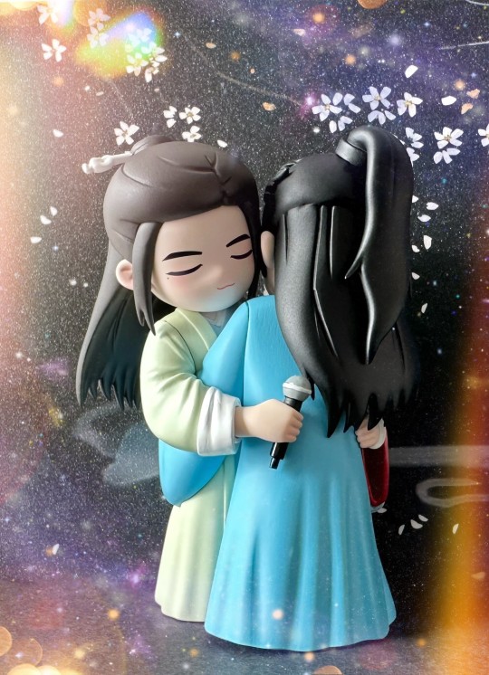
Hug of the Century
I love that there is a specific name for the hug between Zhang Zhehan and Gong Jun at the end of the Word of Honor Concert. Whether it's called "Hug of the Century" or "Century Hug", it's one of my very favorite things.
I watched the Hug of the Century live very, very early in the morning Pacific Standard Time on May 4, 2021. I ended up paying twice for access - once laboriously translating my way through Youku's Chinese portal, and then the second time just paying for premium access on Youku's channel on YouTube, since I was not at all confident I'd be able to get the first access right at 4am or whatever time it was in the morning. It seemed a bit expensive at the time, especially since I watched it without subtitles and therefore had zero idea what was going on, but it turns out it would have been a bargain at 10 times the price.
I have saved every single angle and fancam that I can of this hug, so it's a real shame that I only have one video slot. I'm going to put it to good use with one of my very favorites:
Words cannot describe how much I love this clip, and all my carefully hoarded little clips of this. Let's put a few pics in as well:
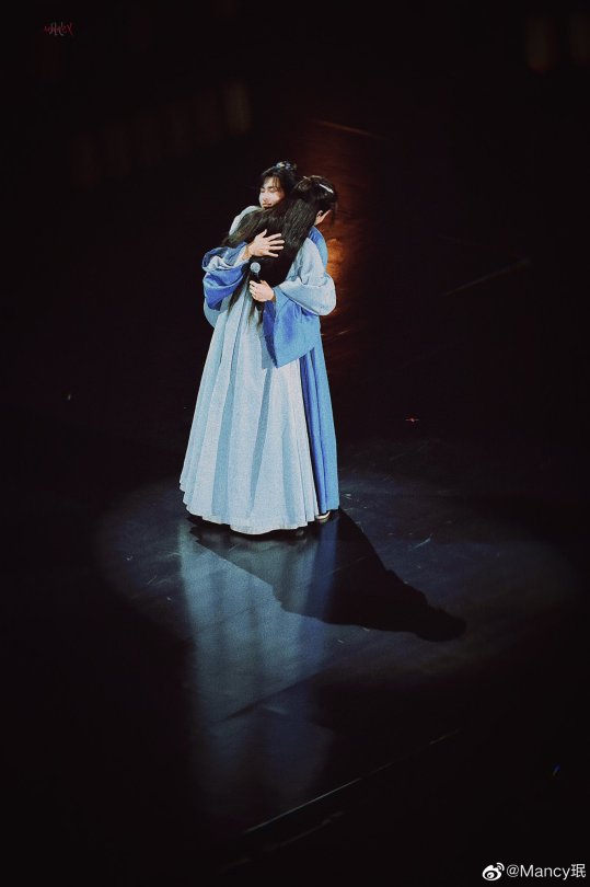
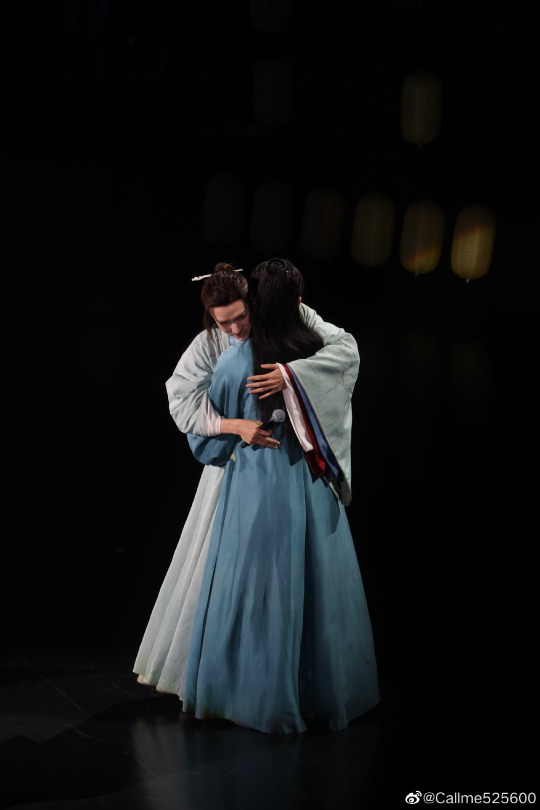
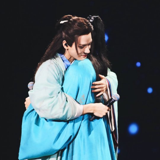
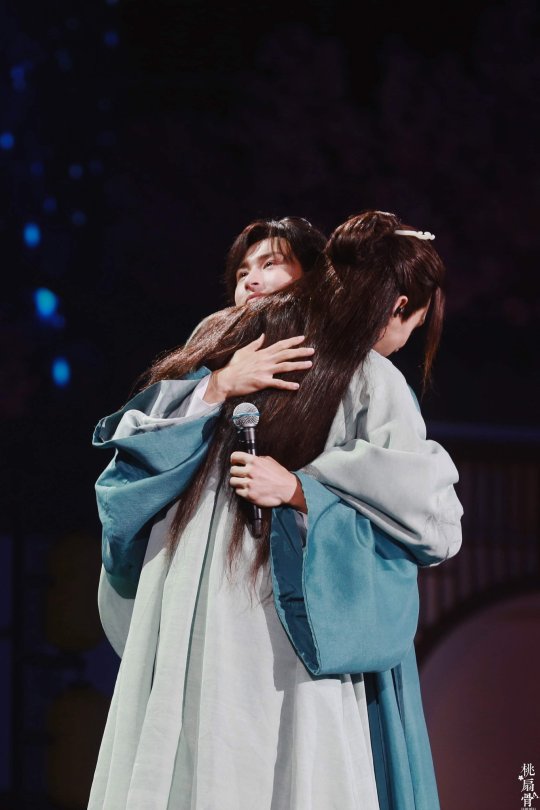
Ah, I feel so emotional looking at these pictures. What an incredible event. It's very worthy of being immortalized in fig form!
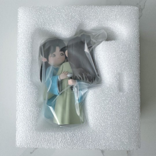
The fig maker had a difficult time with the factory for the engineering for this set. From what I understand, she had originally planned for it to be two characters, but it turned out the difficulty and cost was just too much, so the two ended up being made as a single figure. So you can see it here being shipped as one set together.
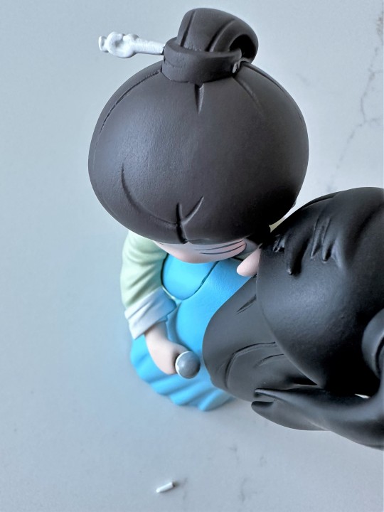
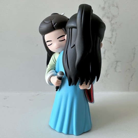
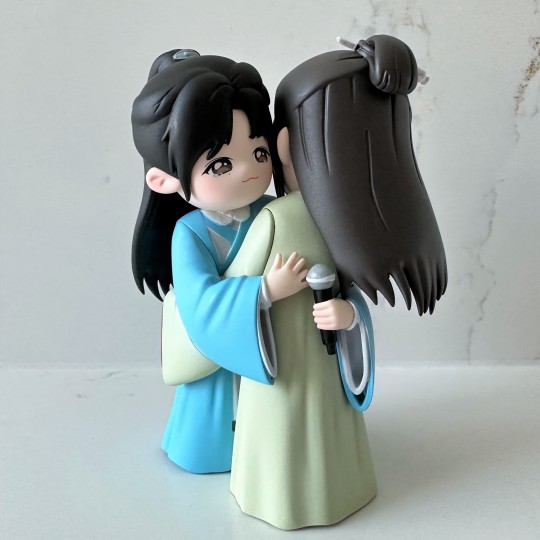
Unfortunately, Gong Jun lost the end of a hairpin! It's not common to lose part of his hairpin...but it's not that uncommon either. As you can tell from this, it was a pretty clean break, so I got out my glue and some tweezers and stuck it back on. It wasn't too difficult.
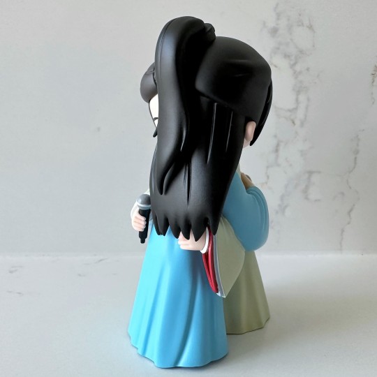
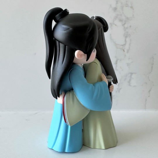
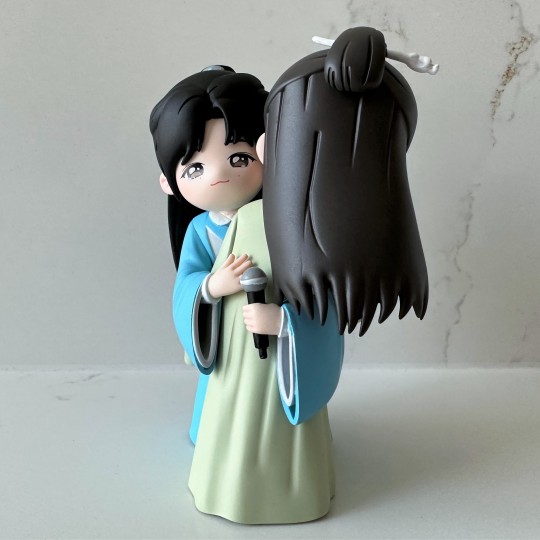
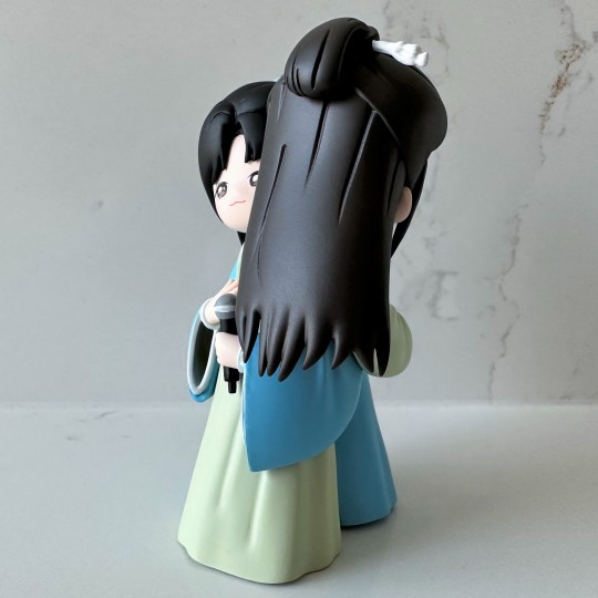
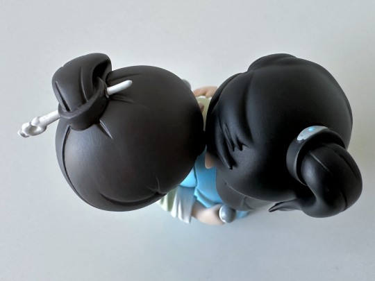
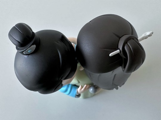
Alright, I'm going to just post the series of photos all in one go, so you can see the full 360 degrees of the Hug.
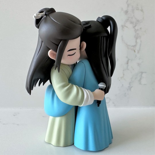
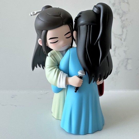
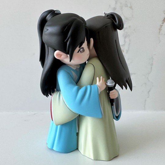
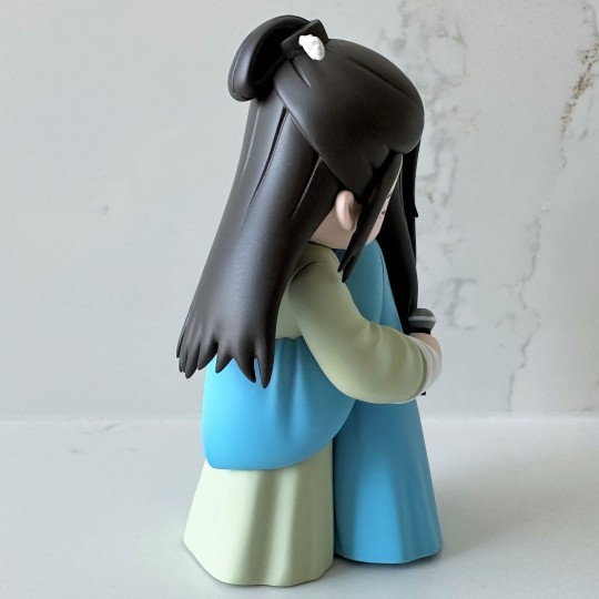
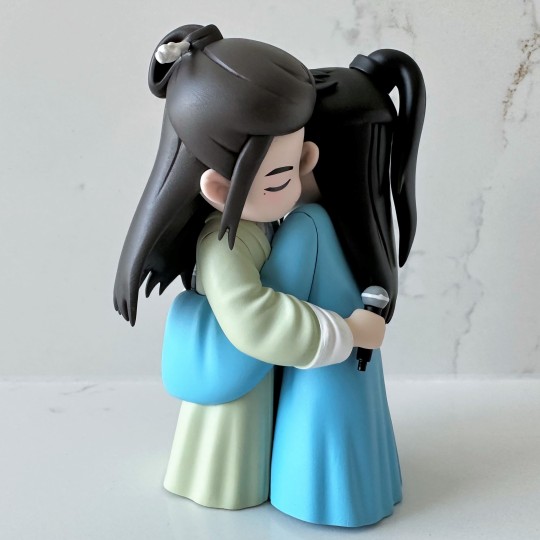
There we go. I don't mind at all the two figs aren't removable - it might look pretty funny if they were.
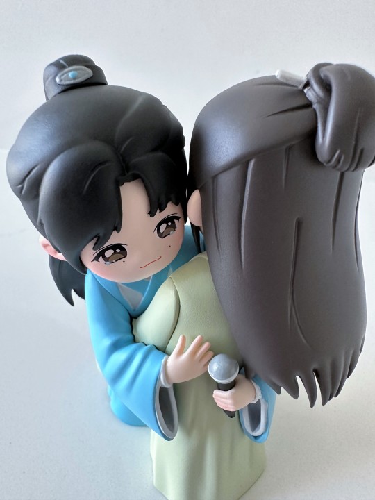
Here's a close up. The fig maker had a lot of issues with Zhehan's face during production - they ended up redoing it and then tweaking it several times. The finished product is much improved over the first draft, for sure. I know the eyes are very difficult for fig makers to get right…I've had a couple figures that got cancelled because they couldn't get the look right.
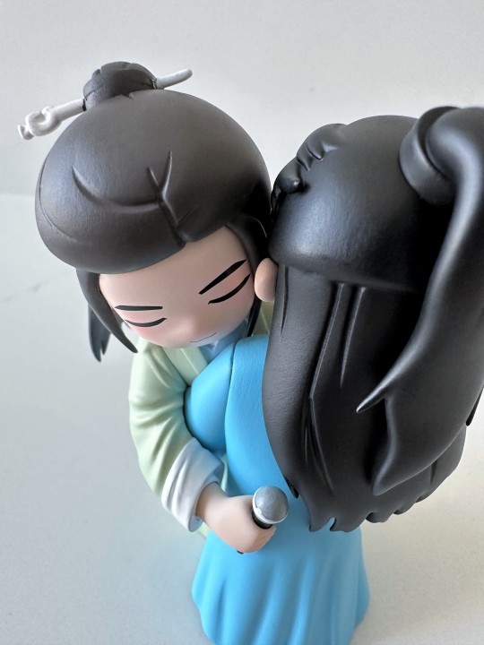
Gong Jun's face is a lot easier, since his eyes were closed. I really like the detail here of his rucked-up sleeve. I checked the pictures and they did model it very closely. It looks really good I think, some very natural looking detail.
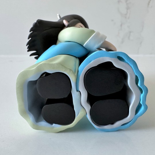
You can see how they were actually designed as two separate figs. It would have been very interesting to see the production pics on this fig to see how they interlocked them together.
Both sides here...I think the hairpin glued on very well! Maybe my most successful one yet.
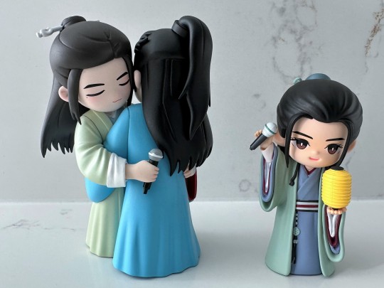
This fig set is quite a bit larger than my typical figs. To illustrate, here's one of the the original official concert figs.
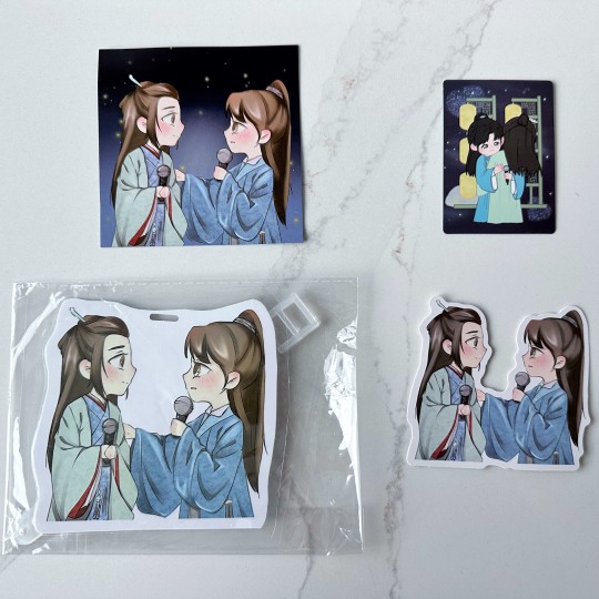
The first-in bonuses for the set included an art card, a luggage tag, and a sticker, all with some really delightful art of Zhehan's speech. I love this so much! I would have bought it just for the extras here. The box card is in the upper top right.
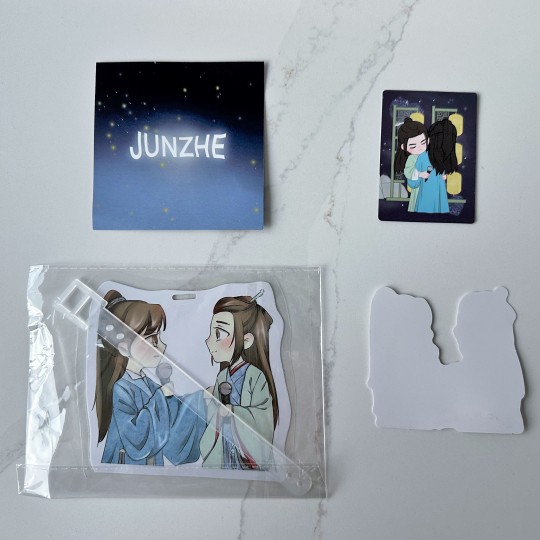
Here's the back of everything...
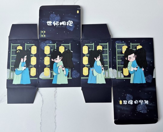
And our box art. The fig maker really went all out on this set - you can tell how much this meant to them. It's the only set they've made - their dream figs. I'm really happy with it. Having all these different visions and styles of figs makes the collection really special to me.
Material: Resin and a lot of emotions
Fig Count: 417
Scene Count: 29
Rating: Love forever
[link back to Master Fig Index for more posts]
#junzhe#zhang zhehan#gong jun#word of honor cast#word of honor concert#shl cast#figthusiast#word of honor merch#hug of the century
15 notes
·
View notes
Note
i come bearing another tale from identity v history. this is something that happened while i was taking a break from the game, so i wasn't aware of it until later, but it's still legendary.
uhhh warning for possible spoilers for the promised neverland???? i don't go into plot details or anything bc honestly i haven't read this far yet but it does involve characters who aren't present at the start of the series so yeah.
so identity v announces a crossover with the promised neverland. the crossover is... relatively successful, with some nice skins, fun events both in-game and on social media, and generally it just goes over well. fans of tpn are happy, though some of the choices for who gets what costume were a little baffling (though that may just be me lmao).
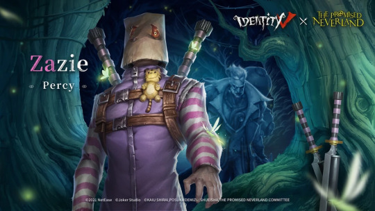
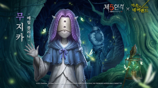
later that year, news breaks of a second part to the crossover. it's based on the sorta second part of the manga, with characters introduced later getting skins (while skins from the first part of the crossover also return). the skins are all revealed, and it turns out we're getting skins of the characters sonju, zazie, mujika, and peter ratri.
sonju, zazie, and mujika look... fine!! in fact, i'd say they even look good!! it's clear the designers paid a lot of attention to details and they're honestly among my favourite crossover skins. faithful, pretty, fitting for the original characters' models, basically what a crossover skin should be.
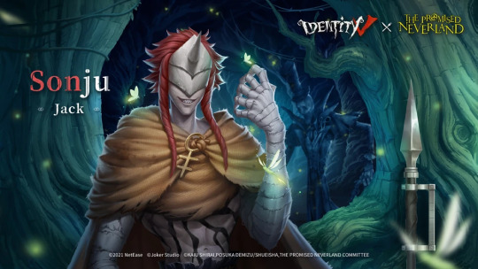
so, what about peter?? surely he, too, got a good, faithful costume, right??
well...
this was his poster.
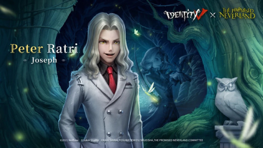
now this was. an unpleasant reveal. why is he making that face?? he looked... goofy. why?? what happened?? how did whoever was doing the art for this manage to make such good art for the rest of these skins for both the first and second parts of the crossover and then drop the ball on a skin for a character who was likely meant to look attractive / pretty??
a lot of people were disappointed, but we hoped he would maybe look better in-game. after all, we've been deceived by art before; hopefully this would be one of those times.
well, uh... he looked like this.
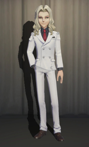
yeah. possibly worse than the poster.
he became the fucking laughingstock of the fandom overnight. no, that's literally what he's referred to on his wiki page. the laughingstock of the fandom. everyone was clowning on this man. and the memes never really went away, if the fact that now, two and a half years later, someone fucking changed the official idv discord server's picture to the mascot of the game with his face superimposed onto her. he came out in late 2021 and we are still making fun of him.
there was never any change to his model as far as i know. they just dropped him and left. idk if they expected us to eat it up anyway, if they were just too ashamed to really ever touch him again, or if they thought he couldn't be fixed so they just abandoned him. dropped him and let us rip him to shreds.
this is the only tpn skin i have never seen in-game. i've encountered every other skin, i even have emma. but i have never seen anyone, not in competitive play, not on streams, not in my own gameplay, use the peter ratri skin. he exists only for us to bully.
that's it for your idv history lesson for today. i'll finish this off with some of my favourite comments on his wiki page, because just scrolling through them is actually really fun lmao
I'M CRYING THIS IS SO FUNNY HELP??? UGLY RAT BASTARD MAN MOCKED BY EVERYONE EVER
Also why do the other skins have six fingers I'm???
0 notes
Text
The process and completion of the dialogue box.

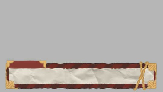
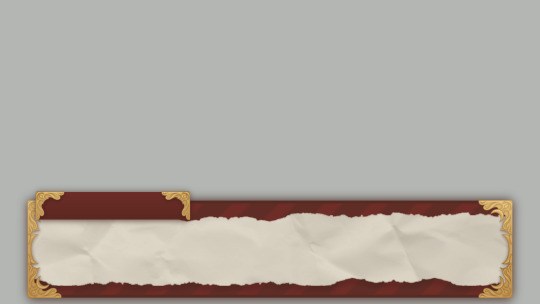
~ Hello there! Tokki here ~
Recently I completed the dialogue box asset, so I thought it'd be interesting to share what the very first prototype looked like! As well as share the concept art with you.
The prototype was made in the quest to really jump into the game and then start developing it from there, it was a starting point. We knew we wanted our game to have dialogue and the ability to speak with different characters, so that's where we began. At first, I made a mock-up with it and then I provided Crisp with a blank version so that he could begin coding a dialogue system.
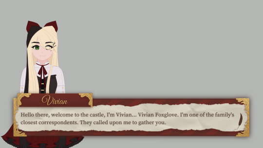
It started off as green because that's both Crisp and I's favourite colour. The characters used for the demonstrations are currently my original characters, I'm using them as placeholders until we have official character portraits of our own characters. Tabitha was used at first, however, once a core aesthetic was decided Vivian made for a better placeholder visually. ( Thank you for your initial help though, Tabi! )
From then on, we started to discuss what kind of themes we wanted to have and what setting it would be in. After that, I started to have a lot of ideas in my head about what it would look like visually and decided on a specific, cohesive aesthetic. A victorian-inspired journal/diary.
So I started to doodle until I fell in love with the look of something, and that's where the concept art was chosen as something to model off of. Part of my artistic process is working until I love what I've made, if I don't feel anything then it's not right yet. And if I've been working on it for a long time and I still feel nothing, I know it's time for me to change directions and try again.
The chain was incorporated as part of an idea I had, where based upon the player's progress/relationship with the character they were speaking to, the chain would gradually weaken until it fell apart. It would have been to give the player a sense of progress, a reward for their work once it fell and a visual metaphor of the storyline.
Ultimately, I decided that it was visually disruptive and based on the nature of a dialogue box, it would have just covered up the dialogue text. I think it was a neat idea, but I just didn't care for it and it would have posed a lot of problems. Honestly, though, I do much prefer how it looks without the chain.
When I was working on creating the official, polished asset, I ended up adding some nice detailing on the golden frames as I wanted to give it a really unique character/style. If the story ends up in the direction that Crisp and I spoke of, the detailing will be visually representative of some of the story's concepts!
At first, the assets did not have any shadows around them but I later added them to make them able to retain visual strength and not have any difficulty with the background art that was to be added in future. It shouldn't blend in, but it also shouldn't stand out. The shadows also helped to make sure everything was visually consistent as the selection boxes I later made also have them. ( Something I heard whilst researching UI was that what makes a good UI, in a way, is that it isn't noticeable at all. It should be so seamless and pleasant to interact with that it's something a player barely notices. )
I later took a ridiculous ( maybe to some ) amount of time deciding on the fonts. I'm very happy with the selection I made! I'm glad I spent so long on it, after all, I believe every single thing matters and adds to the visuals of a game. I believe that the right font can help make a game whilst the wrong one can help break it. ( I'm talking about you, comic sans. ) One font I really loved for the name title didn't have the right licences so unfortunately, I had to remove it and replace it with a different one. I wasn't sure about it at first but after I gave it some time, it grew on me!
I really feel it adds to the victorian feel, I wanted to give the player the sense that they've 'been formally invited' to the location the game takes place in. I feel as though the nameplate feels like it honours the
characters that are speaking. Something about that pretty, gold, handwritten calligraphy feels special to me.
I've been researching like my life depends on it, trying to learn as much as I can about UI design and UX and in my research, I came across a UI/UX designer that said there should be around 15-26 words per dialogue box because it's far easier on the reader. And it also allows the characters more chance to use different expressions alongside their dialogue.
This totally opened my eyes as it was something I hadn't thought of before, and he's right! My prototypes were far too dialogue-heavy, so I resized the box to be smaller and that ended up making it look a lot more visually appealing, too.
I was unsure about the character portrait sizes so I took a look at lots of visual novel games to see what they had done and I realised that my characters were scaled far too small. I personally didn't love the sizes that most games chose to go with, I find them to cover up too much of the screen, so I decided to go with my own in between. Not too big and not too small.
The last thing I'd like to talk about is the indicator! After staring at our mock-ups intently for far too long, I couldn't help but feel as though something was missing like I could add one last thing to really perfect it. The cherry on top. And then it occurred to me that we're going to use an indicator to indicate that the dialogue is finished and you can click to see the next dialogue.
So I played around with it for a bit and then I had the perfect idea! A quill!! What better way to add to the visuals of the dialogue box than to make the indicator a feather quill. I'm ridiculously in love with this detail and think it's the best idea I've had so far, haha.
Sorry to write such a long post, but this is the first update I have and a lot ( not a ton but a significant amount ) has happened since the game's inception. My next updates should be a lot shorter, I just wanted to take you through the process and progress of how we've gotten to the place we are now.
One thing I'd like to mention though is how important these small things are to me. I really truly believe that every single detail is incredibly important and that's why I take it all equally as seriously as I would with any other aspect of the game. I believe it all adds up eventually. If every single thing shines as an individual, the whole thing can shine together to make something beautiful.
Every single thing is part of the game, so every single thing should be treated with care. I want that to show. I want the player to be able to look at this game and see straight away that a lot of love and effort went into it.
Thank you for your time reading this, I hope you have a wonderful day and I hope that it was of some interest to you!
~ Tokki 🌸
1 note
·
View note
Text
Pokémon Sword and Shield Review
So...I've taken some time to fully play Pokémon Shield. Now, I know this is pretty delayed, and I got the double pack so I wanted to play Sword first to see if how I felt was really accurate or if I was being too harsh. That said, let's talk about my experience with the Galar Region.
Initial Impressions
Overall, I was excited to play Shield at first. Everything was bright and exciting and the characters were easy to recognize and not overly generic.
The first few hours of this game, well it's a slow burn. And I do mean SLOW. Even with the text set to Fast and me taking things at my own pace it took me at least a good couple hours to reach the Wild Area. Furthermore, this game has an infernal amount of handholding, even when given the option to say "I know all this already" it still gives a brief explaination for almost anything and STILL makes you sit ALL THE WAY THROUGH the catch tutorial.
It's 2019 and older players still don't get the option to skip this. Come on GameFreak.
That said, the longer I played the more I began to notice...how should I put this? Blatant laziness?
The Wild Area
Now, the CONCEPT of the Wild Area in theory is amazing. It's still not too bad as is, but there are definitely flaws. For starters, the same tree has been copy pasted all over the place to make up 90% of the foliage.
More than that, though, despite the Wild Area having a good selection of Pokémon and a fairly varietied environment (desert, lakes, forest) it feels oddly...empty. There are no real secrets to speak of, no hidden areas, no easily missed items. Everything is all right out there to see and spread pretty far apart. I don't know if it's a lack of Trainers or the fact that I don't have an Online membership so I played alone, but the Wild Area feels like it just needs something MORE.
Dynamax Raid Battles, even when done alone, are fairly fun and sometimes challenging with the turn limit. Radiant AI Trainers spawn in to assist you if you're playing alone so there's no worries about having to take one on with just one Pokémon.
Camping, which can be done anywhere but is introduced to the player here, is an absolute treat. Have YOU played fetch with a unicorn? I have, and I love it. The wide variety of curries you can make with different ingredients is nice, and your Pokémon even get EXP boosts if you play with and feed them while camping.
The Pokémon
Honestly, I'm really not impressed. The Galar Dex of new Pokémon feels painfully small, so much so that playing Pokémon GO and catching a few Unova Pokémon made me yearn for the days when we used to get regions completely FULL of new Pokémon. Remember when you had to wait until AFTER the main game to start catching Pokémon from past gens? I...well, this might be an unpopular opinion, but I LIKED that.
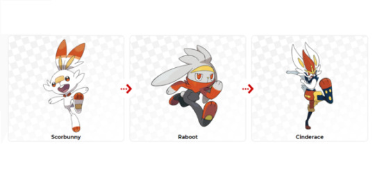
That said, using a sparse selection of Galar Pokémon and Galar Regional Variants on my team definitely made the Gym Challenge more difficult. I picked Scorbunny, because Fire Types, and honestly didn't really care for it or its evolutions at first. Cinderace has really grown on me though and I like Pyro Ball as a move. It's flashy and powerful and that suits me just fine. Most of the new Pokémon's DESIGNS were good and I liked them, there just really weren't ENOUGH of them.
I'm fairly pleased with the regional variants as well. It was difficult to adjust to Ponyta and Rapidash being Psychic Type, but I really liked having them on my team. At the same time...Meowth not evolving into a Persian doesn't really sit right with me.
I'm all for branch evolutions, but Perrserker honestly just looks more like a giant Galar Meowth than anything. I played this with only the info given in the few scattered trailers I'd seen, so I was genuinely excited to see what a Galarian Persian would look like only to end up with Perrserker. The Typing is phenominal, and I think it's great to see a Steel Type Meowth for a change, but I just don't like where they went with it. Eh. Ces't la vie, moving on.
The Story
It's weak. Straight up, the story in this game is poor. There were so many directions they could have gone. I really liked the idea of Rose being this charismatic chairman hype man for the League and being the bad guy. I saw it coming, but it was a nice change to see just based on his personality. Still, it feels rushed. His motivations are really one dimensional and glossed over. Like, "Oh, here's the bad guy. Go get him." It worked in Gen 1 because Giovanni was a MOBSTER. He was MEANT to be a bad guy straight to the core in general, but Rose just doesn't have that vibe.
Not only that, but the "Bad League Members" are kinda meh. That feels REALLY lazy. They didn't even really get a decent uniform change when they started taking on the name Macro Cosmos in Rose Tower. They got black glasses. That's it. Just that. The fight with Eternatus feels painfully rushed and shoehorned in too, almost like they thought "Oh no, we need to give them a big nasty boss to fight! Let's just throw a random monster at them and say Rose summoned it. Seems like a solid plan."
I DID like the after story with Piers though. It really solidifies that older brother sort of nature with him, even if he tries to hide it most of the time.
The Characters
I liked Hop. As a character he's really fun and I like how they gave him this over excited very grand gestured sort of personality. He's really just happy to be ANYWHERE as long as it's with his Pokémon and you. His admiration for his big bro might come off strong and make him seem a little flat at first, but he's overall portrayed as a good kid and I like him.
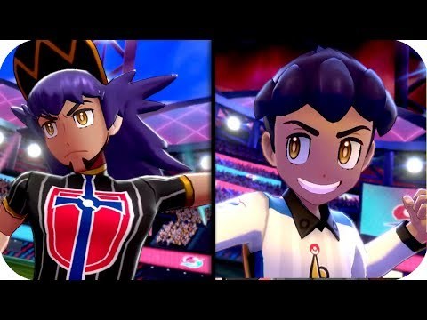
Leon on the other hand...well I hated him for most of the game. His design is great and he looks fabulous, but he just has the most cocky, obnoxious, pandering personality 90% of the time. Still, I have to give credit where credit is due and recognize that he IS actually a multifaceted character. He showboats not just because he's too confident but also to give the crowd a show and put people at ease in times of danger. Not only that, but his recognition of his little brother's accomplishments and his graceful acceptance of defeat when you beat him reveals a really well written character.
I don't DISlike Sonia, and I have no problem with Prof. Magnolia sitting on the sidelines, but she can be a little...irritating at times with the way she speaks about and to people. The Gym Leaders, aside from Piers, feel a little...light.
I mean, most Gym Leaders don't have detailed backstories, but these ones feel paper thin personality wise as well. I had to look at the official GUIDE just to be sure what the relationship between Melony and Gordie even WAS because you only seem him in her Special League Card in Shield and that tells you nothing about him. The only real leaders that stood out to me were Piers and Raihan, and while I was iffy about his design at first I LOVE Raihan. He has so much more personality and ferocity than any of the other leaders. And the social commentary about him needing to constantly take and post a selfie, even after losing, is a nice touch.
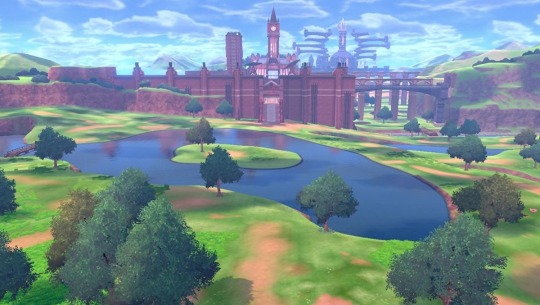
The Galar Region
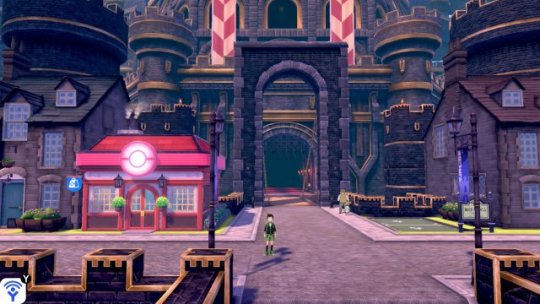
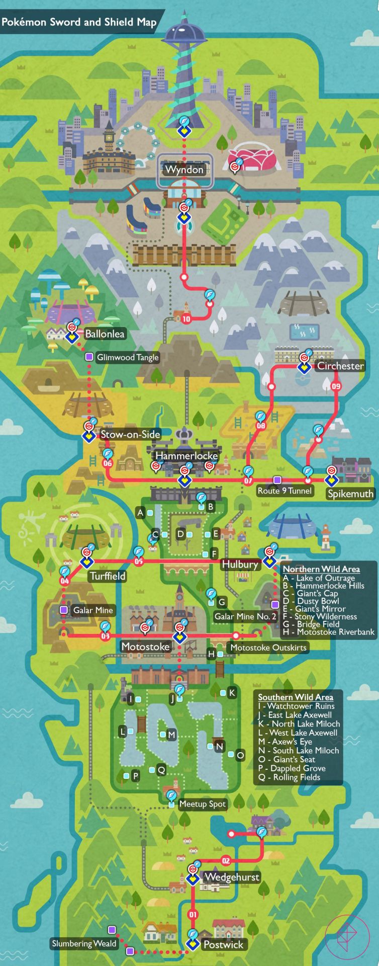
Is very linear. Like, VERY linear. Even when you take a branching path it either loops back around or gives you a free ride to wherever you have to backtrack to. I hope you like Hammerlocke, cuz you're gonna be visiting there several times.
I know that the region is based off the UK, and maybe my Americanized idea of cities is different (idk, I've never been to the UK), but a lot of the towns in this game feel really small. Like, almost smaller than some of the towns in Hoenn small. Maybe it's a lack of significant interactable buildings, but despite many of them having multiple floors you typically can only access one and that's kind of a disappointment. The hotel in Wyndon won't even let you get in the elevator, and while I get that Alola also did that, it's kind of jarring when the hotel in Motostoke WILL let you see other floors.
That said, I kind of expected more than ONE Wild Area. The one we DID get is fine, and I appreciate what it is and lets us do, but I honestly thought there would be multiple places to really explore outside the standard straight lines. Pokémon has never been a franchise to shy away from puzzles before so I expected this to not be any different. Unfortunately, I was wrong.
Moreover, many of the environment pieces are just UGLY. A lot of the ground textures are reused 3DS assets, and those copy pasted trees I mentioned earlier? Also 3DS assets. How do I know? They're pentagonal instead of round. In other words, they have five sides. Why? Because the 3DS hardware couldn't handle complex environmental shapes that well so they could get away with it, but now that we have nice round berry trees the contrast becomes painful. The Wild Area is so ugly the first time you see it is at NIGHT. They were so aware of what they did they hoped making it darker would hide the lazy flop instead of showing off how bad it was.
It isn't like they COULDN'T fix it either. Look at Ballonlea and Glimwood Tangle. They're absolutely beautiful and very well done. The modeling with them is fantastic and I love the glowing effects. They absolutely could've made the poorly done areas look amazing, but for some reason they didn't and the game suffers some as a result.
Other Thoughts
The Gym Challenges...they were not fun. Like, honestly some were ok. Herding Wooloo was easy, but they really didn't feel like anything I would expect from a Gym. The water puzzle in Nessa's Gym was fine, and I personally liked the spinning cup ride, but the rest just felt like agonizingly long padding because they couldn't come up with anything. Look at Circhester's challenge. It's a dowsing rod gauntlet where you have to avoid falling in pits in an artificial blizzard. It. is. SO. SLOW. That said, Spikemuth having just a Trainer gauntlet instead was kind of awkward. I reached the end and asked myself "Was that it? Is this it? Is this all there is to Spikemuth? Just one giant alleyway and a Pokémon Center?"
Raihan's three trials of worthiness challenge? It was more difficult than the battle AGAINST RAIHAN. Speaking of, I beat Hop, Marnie, Bede, all the Gym Leaders, Rose, Oleana, and Leon on my first try every time. While it was more difficult with my specific Pokémon choices, it really wasn't much. And can I just say that the Gym Badges are kinda lame? I get what they were going for, but the designs of each piece could've been really unique and intricate and instead we got glorified stamps.
I liked a lot of the general features of the game. Camping, clothing shops, League Cards. I love designing League Cards, even if I'm the only one who's ever gonna see em. That said, the clothing choices were really narrow based on what we got in Sun and Moon. The variety of different items was pretty small, though I loved all the punk leather stuff but WOW IS IT EXPENSIVE. Like Lumiose Boutique expensive. AND WHY IS THERE NEVER A REDHEAD HAIR COLOR THAT ISN'T JUST AUBURN RED? There are actually A LOT of redheads with LIGHT RED hair (that's more a personal gripe than anything, I know).
A lot of the music felt almost like rehashes of older BGMs. Like, Postwick, Route 1, and Wedgehurst all sound like they have remixed Hoenn music. A lot of the other music tracks just don't feel fitting for the areas or for Pokémon games in general. I like parts of the Slumbering Weald music and I like the Gym Music, but the opening of Slumbering Weald feels awkward and like it doesn't fit a mysterious forest we're not allowed to be in.
I know I've complained a lot, but there were some things I genuinely liked. A lot of the Pokémon designs, place names, and other radiant decor and parts of the region are actually subtle and not so subtle references to cultural points of the UK. Skwovet and its evolution for example are a gray and red squirrel respectively and are a nod to invasive species, which is neat.
In Conclusion
Is Pokémon Sword and Shield amazing? No. Is it bad? No. Sword and Shield fall into that mediocre middle ground of being ok but nothing to write home about. Could I have done without them? Sure, they aren't some world ending imperitive must play. They're ok, and they make for a fine jumping on point and a fine little adventure if you have spare time. Have other mainline games done it better? Heck yeah, but that doesn't mean Sword and Shield haven't done a few good things too.
Overall, it sort of feels like GameFreak bit off more than they could chew, or were afraid to make changes because of unfamiliarity with the Switch's hardware and software limitations. Pokémon Let's Go had a lot more effort, but it also was much safer and had a much easier to work with art style to everything. Chibi proportions are a lot easier to fake than a more realistic counterpart. Things can be not perfect and it's less noticable than with more realistic proportions, and I think they were afraid to push back the deadline any further for the inevitable backlash despite that being what they likely needed. The DLC may change my mind, but as it stands, just the fact that they feel they can JUSTIFY their laziness with DLC packs really upsets me.
I give Pokémon Sword and Shield a 5/10.
It's just, OK.


2 notes
·
View notes
Last Seen Blogs

furtivestar
疎開先のつぶやき
cowlvent
clara who

ottyyyyy
題名未設定
incomprehensiblehorrors-official
officer i have my Totally Real NeuroTypical permit i swear
dates-with-cas
head full of bumblebees