#ibbletips
Explore tagged Tumblr posts
Visit Tumblr Blog
Explore Tumblr blogs with no restrictions, modern design and the best experience.
Last Seen Tumblr Blogs


Fun Fact
In 2020, 44% of users from Denmark used Tumblr daily.
Note
I know this is such a weird question but how do you draw shoulders 😭😭 that feels so weird to say because people don't normally struggle with shoulders 😭😭
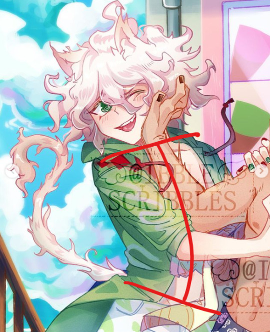
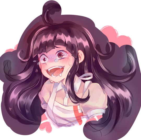
its not that weird! its something i used to struggle w/ and still sometimes do, anatomy is weird,, idk that i have much in the way of tips for it though. shoulders tend to slope down rather than straight across from the neck:
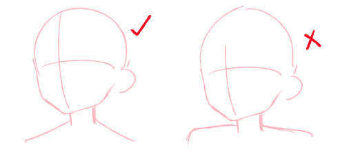
there also tends to be enough space on either side of the head to fit another head (so 3 heads across in total) but in anime/with stylization the head tends to be bigger which means this rule doesnt really apply, especially for extreme stylizations like chibis where the shoulders tend to be smaller than the head and almost directly attached to the head
if one shoulder goes up, it helps to have the other one go down to make the pose a little more natural and add to the line of action
contrapposto posing can also help a character who is just standing there seem more relaxed/natural. for the shoulders this means that they are juxtaposed with the line of the hips (u can google and see more classical examples of this to get a better idea of it)
that’s about all i have, im no expert on anatomy but i hope it helps a little!
183 notes
·
View notes
Note
Hi! I had a question regarding online storefronts and was wondering if you had any tips/suggestions on how to figure out exactly what permits and/or licenses you need? I'm planning on selling things such as charms/stickers but can't find much on what is required when selling those! (If you prefer I could message you off anon, but I wasn't sure of this was something you could help with!) Thanks a bunch for your time anyways! 🙏
ahh, i think it would depend on your state if you’re from the US. different states have different tax laws and such and its still something im learning the ropes w/ bc the govt really doesnt make it easy to figure out ^^; id say if you’re just starting out, you dont *really* need any kind of permit or licenses?? i mean, take what i say with a grain of salt and definitely research the laws in your state, but especially if you’re just testing the waters or doing it as a hobby and arent planning to make a significant amount of income off it at first then there’s not much to report. if you want to start as a business right off the bat though, register for an EIN and look up requirements for reporting state and income tax in your state. you can register yourself as a sole proprietorship and get a business license that way, but i personally dont think its worth the trouble in the beginning. i think states usually have laws regarding selling things as a hobby and they either wont collect taxes under a certain amount of income or only require you to pay sales tax, which you should be able to do online through your state’s specific site. for cons, you are required to pay sales tax on the income you make to that state, and you can register for a temporary sales tax license or a permanent one if your frequent that state for conventions. though with the pandemic that probably wont be a concern until later this year, if at all i want to stress that im by no means an expert at this, this is just what ive learned through personal experience, and i highly advise talking to a tax expert if you’re planning on starting an actual business. taxes are so confusing and like i said, im still trying to sort out how to report and keep track of everything year to year as i grow ^^;
18 notes
·
View notes
Note
If I start drawing on a big canvas and then make it smaller while still drawing does it affect quality? :0 thank u for always sharing tips, they are very helpful!
yep, changing the size of your drawing in any way while youre drawing will affect the quality!! its definitely better to size something smaller than sizing it bigger though! sizing smthing smaller will compress the drawing into using less pixels and therefore it may get a little bit grainy (depending on how small you’re making it) but shouldnt be too bad! making something bigger is trying to fill more pixels than what you originally drew on so it’ll definitely be blurry and lower quality! if you have to resize, sizing down is better but i’d try to wait till youre done to make a canvas smaller since you can also save a bigger version just in case. if you mean transforming bits of your drawing though then i think that’s fine as long as you don’t transform it too many times! I use the transform tool to adjust things all the time and it does make it a little bit more pixely but if youre drawing on a big enough canvas and you’re not making things too much bigger or transforming them too many times it doesnt make much of a difference! you can also always transform smthing and then trace over/reline it to get crisper lines!
27 notes
·
View notes
Note
Hello! Do you have any tips on how do you make the hair so glossy and beautiful? It’s one of the things I adore most out of your style!
hello!! thank u so much! i’m happy that you like it, ive struggled a lot (n still do) to make hair shading look nice ^^; i don’t know if i can give many tips but i can at least walk you through my general hair shading process under the cut! for a less wordy process, you can also check out the speedpaints on my yt!
starting with the base color, i try to pick a bright/light color bc with the way I shade the base color ends up becoming part of the highlight, if that makes sense! It’s a lot easier when I’m coloring white or black hair (see below) bc I just use straight up white for the white hair highlight or a shade of blue/purple for the black hair highlight, but w/ colored hair it tend’s to be a little trickier to envision what color will look best against the shading! i can always paint over the highlights later but it does make the process easier if i pick a color that works well right off the bat!
i started w/ a bright pastel pink for this drawing despite the character having a more muted hair color bc i think the best highlights are vibrant n saturated! also i just like pastel colors!
i then airbrushed a gradient around where her highlight will be. i picked yellow bc i think it compliments the pink tone nicely, and it means the actual highlight will have a slight gradient n appear softer in the end, though i don’t always do this step ^^; as for where to put the highlights, it varies depending on the hairstyle but i put them around the middle of the bangs kind of like a “halo” or crown effect! i use the texture lines that are in the lineart to help me decide placement as well; the HL will go right above those lines! her hair is pretty short but i also airbrushed some yellow near the ends of her hair to act as highlights for the longer strands. the longer the character’s hair the more highlights i’d add lower down
next i took a shade slightly darker than the base color and used it to shape the highlights into the basic form that i wanted them to be in! i think this is probably the most crucial step to achieving that glossy look. even though i’ll be refining it more, the hair already looks shiny w/ just the color and rough shapes! i usually go for rough “tear drop” shapes for the shadows, originating from roots and tips of the hair. the highlight shape looks like?? maybe bat wings, but it kind of naturally forms bc of the teardrops. i can’t really explain why i choose this shape, and i do change it sometimes, but i think it achieves the shiny effect bc it mimics the way reflected light wraps around shiny objects! if you notice, i try to separate the shapes by sections of hair. the more i section it out in the lineart, the easier it is to make the shapes when shading ^^
not much to say here, i just took the base color and used the marker tool to clean up the shapes! at this point since i’ve started blending colors, the eyedropper tool is my best friend
i then took a couple darker shades and used them around the roots as well as the actual shadows of the hair. i’ve also put some right up against the bottom of the highlights, under the texture lines! putting darker shades against the lighter ones creates contrast and adds to the illusion of being reflective and glossy! the texture lines themselves also help bc they darken up those areas, but they’re more of a stylistic choice :3
i added colors and cleaned up the shading a bit by blending it so it’s not as messy! every object reflects the colors of things around it, and shiny surfaces like metal tend to reflect more noticeably, so adding colors that arent the same as the actual hair tone (in this case blue n purple) can make it look more reflective as well!
i changed the lineart color to match which helps soften it up as whole as well as color picked her skin tone and her hoodie to airbrush at the tips of her hair. not a necessary step but i think it gives it a softer look ^^

lastly i made some color adjustments on an overlay layer, and added some final shiny details like small sparkles n lighter colored texture marks, as well as thinner hair strands!! i could have refined the shading more, but since this was a procrastination doodle, i didn’t want to spend too much time on it ^^;
n that’s basically my whole hair coloring process! i’m sorry it was long winded, but since I haven’t done one of these in a while, I wanted to make sure it was thorough. no matter your shading style, i think the most important steps to achieving the glossy hair look are the colors you choose for the highlight vs shade/base and the shapes of the highlights! with those two things you can still achieve a shiny look in flat color pieces:
i often change the highlight shape to be more square or triangular as i see fit! i also find it easier to shape highlights in hair that is drawn with really clear sections, so if you’re having trouble it may help to use your lineart as a guide:
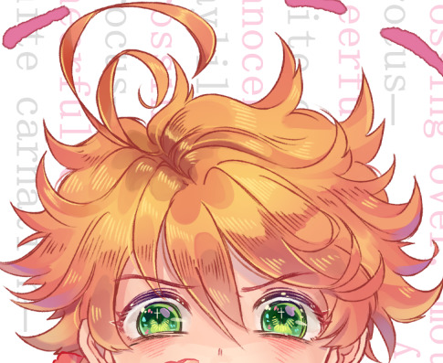

i hope that helps with your hair coloring endeavors a little bit and good luck w/ figuring out your own style of coloring!!final chiaki piece: X
433 notes
·
View notes
Note
Got any tips on figure drawing and anatomy?
tbh, i don’t really know if i have much to offer in terms of anatomy tips?? i get asked this a looot and i never know what to say bc its hard for me to explain, or know what would be helpful,, really all i can give advice on is honing your observational drawing skills and using references! i think drawing from life can be one of the most helpful/important skills for illustrative artists. that doesnt mean you have to sit still for hours drawing a still life or figure (though tbh figure/gesture drawings are a great option for learning anatomy) but making sure you’re referencing from real objects/people, or looking at how other artists stylize certain attributes can be a huge help! with anatomy specifically, its good to actually understand how the human body is put together, and how muscles/bone structure affect the outside shape of the body. You can break down the body into simple shapes, sure, and that’s a great start! but for the more detailed curves and bumps, if you don’t know *why* they exist, its hard to draw them correctly! if that makes any sense?? for example, i see a lot of beginners draw bumps on the sides of the wrist when drawing hands, but sometimes it may look awkwardly placed or wrong because they’re only mimicking what they’ve seen other artists do, and not thinking about the actual wrist bone that causes that bump. same for the collar bone, lots of people learn to stylize it as a line but have you looked at the actual shape of one before? do you know why we draw it curved in or how high in the chest it is? that being said, its not like i consciously think about that every time i draw, and i’m no expert on muscular or skeletal anatomy by any means slfdlmfs,, this may all seem obvious to some, but i think in general its important to consider and understand how the body is put together, even just on a subconscious level! you don’t have to learn all the muscles in the human body and a lot of this stuff is picked up from just drawing or observing real people, which again is probably the best form of practice. don’t be afraid to use references, especially of yourself if you can! I am constantly referencing my own body, by taking pictures of myself in the mirror or of my hands and then stitching those together to form the pose i want to make. using online models can help too, you just don’t want to rely too heavily on referencing them as a lot of times their features can be kinda wonky lol im sorry this advice basically boils down to “practice more and draw from life”! i could try giving specific tips but im not great at making tutorials or explaining my process, and i’m more of a visual/kinetic learner myself, so actually drawing and studying other artists’ works is what helps me best! if you don’t care to draw from life, that’s perfectly fine and understandable, there’s no one right way to do art and its okay to find observational drawing tedious and boring! you can still use observational skills on already stylized art and reference how other artists stylize things to learn, just be careful about heavily referencing and such ^^; i hope i helped a little bit and good luck w/ your art!
#ibbletips#long post#while i heavily advocate for observational drawing its like#yes drawing from life and practicing figures and#all those traditional exercises will help you improve#and if you're main goal is to get better then sure go at it#but also art should be fun and enjoyable and if you're just#not into that stuff then dont force yourself#focus on your own personal goals for art and think about why you create it idk#Anonymous#askibble
32 notes
·
View notes
Note
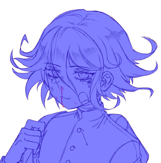
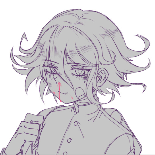
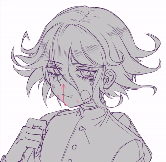
hey!!! I was watching your despair expressions vid and saw that when you selected Mikan's hair, it was outside the lineart!! but when you colored it, none of it was outside the lines!!! I was wondering how you did that!!
oh, sure!! it’s actually a pretty simple process! i’ll put it under the cut~
I’m gonna be explaining using sai’s features, but if you’re familiar with a different program i’m sure you can figure how sai’s functions would translate over!in order to get to the point where i can color without having to worry about the lines too much, i first have to create a base! i do this by selecting outside the entire lineart layer. however, if you’re like me and pretty much just use a cleaner sketch for lines you might have a lot of holes in your lineart. in this case i just take the selection brush and cover those holes up!
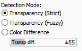
once all the holes are filled, i’m able to select around the full lineart using the magic wand tool:
make sure your magic wand is on the right settings! it should be on Transparency (Strict) for the crispest selection! You can also play around with the bar on the bottom, it really depends on how clean your lines are, but it basically just controls the sensitivity of the selection (whether it picks up as many holes in your lines or not).
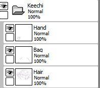
if you do your lines on separate layers, its helpful to put them into a layer group so you can select around them all at once:
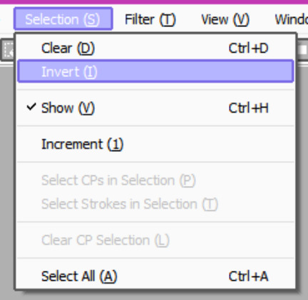
i then go to the selection settings and invert the whole thing!
that leaves me with the entirety of the inside lines selected! you can also just straight up select inside the lines, but i find this is the cleanest way for me since i have a lot of overlapping and fine lines that would disrupt the selection otherwise.
I create a base layer underneath the lineart layers like so:
after that, i just Ctrl + F (or paint bucket tool) to fill in the space and then clear the selection w/ Ctrl + D and our base is finished!!
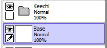
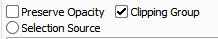
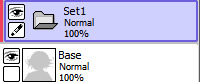
i make a layer folder above my base layer and clip it to the base by making it a clipping group. there are plenty of tutorials out there about how a clipping layer works so i won’t go into it too much, but basically when a layer is clipped it allows you to color anywhere on the layer below it. so any layers that i make in this clipping group will act as if they are clipped to the base layer without me having to individually clip all of them.
now i can color as i please without having to worry about going outside the lines!
any new color layer i make will be inside this folder:
though this helps make it so you don’t have to worry about messiness outside the drawing, within the drawing colors can still overlap! what i do to color the rest of the image (since the skin is usually my bottom most layer) is select around the edges of the area i’m coloring first! remember those holes in my lines from the beginning? this is to cover those up so the selection doesnt leave the inside of the drawing, but i don’t need to be as precise about it because ive already ensured that the color will stay clipped to the base layer:
i then select inside the area that i want to color (in this case the hair) with the magic wand tool, but i have to be cleaner about this to ensure that it doesnt go outside the lines of the hair:
and that last part was basically what you were seeing me do with mikan in the speedpaint! if i go into her file and unclip her colors from her base layer you can see that its actually a mess under there lol:
i hope that helps you out a little anon, it seems a bit convoluted when its typed out like this but once you get the hang of it, it comes as a natural next step when laying down base colors! good luck with your art!!and for anyone wondering, here is the speedpaint in question!
267 notes
·
View notes
Note
Ibbles, do you have any advice or videos you could share for a beginner digatal artist when it comes to colouring? I know to practice a ton but I need some sorta direction, ya know? Btw I ♡♡♡♡♡♡♡ you're art!!! °°°��▪︎☆°••☆▪︎☆☆°••☆▪︎•°▪︎°
thank you sm! hmmm, i think any advice i could give depends on what direction you want to take you coloring style! you’re right when you say practice cause i think a lot of developing any kind of style is about experimenting and seeing what feels comfortable. what helps me when im trying to figure out a new coloring style or upgrade my main one is looking at artists i admire and trying to mimic parts of their shading, or figure out how they create certain effects. for my own coloring style i originally started out wanting a mix between cell shade and soft shade and gradually (like over the course of a few years) moved towards a more painterly style just bc i realized i most admired a more rendered look. and im still developing that! but recently ive wanted to have a secondary more simple style closer to cell shading, so ive been trying to examine how artists who mainly cell shade utilize bigger and more basic blocks of shadow. in general if you’re trying to go for a more simplistic style, maybe focus on color picking and really learning how to choose colors that compliment each other, and if you want a more detailed style, focus on depth and how you can incorporate both subtle color shifts between shades, as well as well placed darker colors for depth. i still struggle w/ using dark colors to make light areas pop ^^; if you specifically want a “tutorial” on how i color, i do have one here...kinda! its specific to shading hair, but the main process is basically how i shade everything else too. im not sure that really helps too much but good luck figuring out your art!!
#ibbletips#when i say simple tho i dont mean easy cause like#simple coloring styles are really hard for me skdkmsdsf#i cant stop myself from wanting to blend#its really hard to get it to look right and not go overboard since you cant blend it out too much#Anonymous#askibble
37 notes
·
View notes
Note
Hello! Do you have any advice for someone who wants to sell merch but lives outside of US? I am especially concerned about the shipping prices.
I think it kinda depends on where you live, but building a basis in the country you live in is gonna be your best bet! Like, if you’re from the UK, or Canada, Australia, France, or Spain I know there’s definitely great local anime communities in all those places as I’ve received many orders from those locations and follow lots of artist based all around the world! And I’m sure there are many others in non-Eurocentric countries as well! Going to cons in person if there are any where you live definitely helps, and I think before this pandemic that’s how a lot of merch artist made the majority of their income. Knowing your customer base is definitely important. If you want to ship internationally though, i’d recommend starting off w/ light items, like prints, stickers, buttons etc, as they will cost less to ship. Look into shipping programs like those offered through Shopify and Paypal as they often give you small discounts on shipping prices and you can print the labels at home which saves time! I can’t really give advice on foreign mail systems as I’m not familiar with them, but your government run postal system is probably going to offer the cheapest prices, as compared to privately run corporations, unless you’re shipping out very heavy items. You could also look into a drop shipping system like Redbubble or Teespring to ship your merch for you, so you won’t have to worry about shipping at all! These services ofc come with certain restrictions, but they’re not bad to start off selling w/! I hope that helps a little and good luck w/ selling your art!!
21 notes
·
View notes
Note
hi!! so i'm about to buy a stylus so i can start doing digital art on my laptop but idk how any of the programs work lmao,,, i heard that paint tool sai is good tho so do you have any tips if that's the program you use? ty!! ❤️❤️
hi!! im sorry if this response is too late haha, but i hope you’re enjoying experimenting with digital art!! it opens up a lot of possibilities <3 i do use SAI, but im not sure if i have many tips about using the actual program 👉👈 ive been using it for years since i was kid so its kinda just second nature to me at this point, although occasionally i stumble across something new that i didn’t realize was a feature lol,, i will say, i personally feel that its a more intuitive program than most others, i like how it doesnt look like photoshop bc i despise working in photoshop, but it also doesnt hurt to try out some free programs like GIMP or medibang too to see what kinda layout/program you prefer! if you’re gonna purchase SAI though, i’d def recommend checking out SAI 2 as it has a couple more features than SAI!! its basically the same program, i’m just too lazy to transfer all my brushes over, so I mainly use SAI 2 for blur and gradient effect, as well as text. every program can have a learning curve (god knows i still cant draw in CSP even though i use it a bunch for after effects in my drawings) but i think the best way to learn it is by continuing to draw in it!! you could also try to find drawing/coloring tutorials that are based in SAI. even if they arent specific to how to use the program, following one where they reference the tools and settings may help make you more familiar with everything! good luck, im sure you’ll become a digital art pro in no time <3
23 notes
·
View notes
Note
Do you have any like,, tips for when you get art block,,,
aaah, not a lot unfortunately, sometimes you just gotta wait it out and sometimes you have to push through and just try to draw anything... other times it could be an outside factor affecting your motivation or inspiration (ik thats often what it is for me) and in that case you probably need to address that first whether that be some well-deserved self care or letting yourself catch a break! otherwise, i like to look at other people’s art to help inspire me! i have an inspiration tag on my main blog that i go through sometimes, and i also save art that i admire to my phone and my personal discord! watching anime or playing games can also help inspire me to make fanart or merch for those series! if all else fails, revert to studies or art challenges, or try something completely different to kick your brain into gear!! if your art is looking stale or seems like its not getting anywhere, that could still be a sign that you’re improving-- your artistic eye is getting better but your hands are having trouble keeping up is all, so try not to get discouraged and keep on drawing, you’ll eventually come out of that block ^^ good luck!!
33 notes
·
View notes
Note
how do you draw poses so well??
uhhh lots of referencing mostly!! taking pictures in the mirror or taking pics of my hands to figure out how stuff works, observing how other artists pose their characters naturally, saving pictures of people that i think look cool/inspire me to draw more dynamically!! im still learning how to draw poses naturally and its often hard to translate what i see in my brain. i often have to compromise when i dont have the skill to portray what i want, but i think its mostly impt to figure out a nice line of movement that draws the eye around the composition and work your way from there by combining references and constantly observing anatomy
25 notes
·
View notes
Note
Do you have any tips for a first time button maker? :3c
sure, i can try to give a few tips! you mean like pinback buttons using a button making machine right? i’m gonna assume thats what you’re talking about!!as far as set up of the digital files go, i personally use a template that i edited down! i think it might have been linked to me when i bought my button maker so im not 100% sure where to find it, but u should be able to find one easily for the size you need online or u can contact whoever sold u the machine! ur template will probably differ but mine has a red safety line that’s about the size of the button:
while you want to keep everything impt inside that safety line, ive found the actual size of the button //is// a bit bigger so the parts just outside that line will show too! but u can get away w/ having unwanted things like the spiral of my sketchbook on the very side of the button bc ultimately its not going to appear on the actual product:
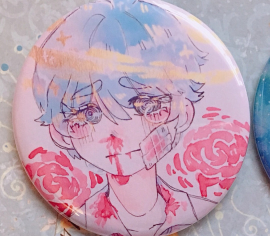
i print my buttons on 4x6 inch matte or satin photo paper! my machine tends to do better w/ thicker papers and the print turns out a lot sharper w/ better quality paper. i print 2 buttons per sheet, n bc its so small its really easy to use my circle cutter from both ends. you can also arrange ur buttons on an 8.5x11 inch sheet and then cut into strips before cutting the circles out :0 once you have all your designs cut out it’s a pretty simple process after u get the hang of the cycle! i recommend having your materials around you within reach, n then you’ll be able to make like a few buttons per minute. i can’t really explain how i line up everything without actually showing you, but if you follow this tutorial on yt you’ll see the process is fairly straight forward! the only other tip i really have is make to make sure you’re not using double materials!! you’ll be able to tell pretty easily when you’ve accidentally used two shells or two pieces of mylar bc when you press down your machine will either stop or make a crunch sound, but by then you’ve wasted ur materials so!! get into the habit of checking if your shells and mylar are stuck together! i like to shake my mylar every time i pick a new piece up bc it makes a cool wobbling sound but also bc when there are 2 pieces it sounds a bit different so i know to separate them!idk if any of that was useful, but i hope at the very least the tutorial i linked will help u! if u have more specific questions feel free to send another ask ^^
#the art on this button is old i should probably redraw it.......#i wanna do more button specific merch in the future oof thats why im gonna discontinue a lot of my button designs bc idk i dont like them t#i hope u didnt mean like..... enamel pins... rip#idk sometimes people say button/pin and they mean the other thing so#hope this helped if not u can send another ask!#ibbletips#FAQ#long post#theheirofheart#askibble
103 notes
·
View notes
Note
Hey as a young artist who really loves your art but can't seem to get something similar right, do you have any tips or pointers that can help me get better? Thank you in advance!
hiya! i’m not sure if i have many general pointers but the best way to improve is to practice!! ik that’s pretty vague but essentially what that means is to draw as often as you can and focus on improving certain parts of your art that you can identify right now. if you have trouble drawing certain things, try some studies from life and do some observational drawings. or if you can’t exactly pinpoint what you want to work on, try looking at other artist’s work! what do you admire about their pieces, the anatomy? the coloring? if you can figure out what you like you can try to incorporate that into your own style! obviously don’t copy a drawing exactly, but maybe try figuring out what techniques and methods they use to get their drawings looking like they do! that always helps me when i want to advance my own style ^^i hope that helps a bit! you can find some more of my tips and tutorials in my #ibbletips tag!
15 notes
·
View notes
Note
Hey I’m new to tumblr and I’m trying out a bit of drawings my but I’m not very good with anatomy AT all and cause of that I get very anxious about drawing do you know any good ways to start drawing anatomy( head, hands, full body)?
hey! I’m so sorry this is such a late response, I’m not sure if you need my help anymore but I’ll try my best!I’m kind of in an awkward place with my art right now so I’m not sure I can give very useful anatomy tips, but I do have some stuff under the #ibbletips tag if you want to check that out! hopefully i can make more updated tutorials once i get past my block ;;anatomy is a very broad subject and a lot of it comes down to learning how the body works. I’m not sure I’m qualified to talk about it like an expert, but maybe try focusing on one part at a time? If you feel your struggling with certain parts of the body, like hands, try doing blind contours and life studies of them. They don’t have to be good, but studying these parts will help you remember what features to include when you’re drawing without reference later, and give you a better idea of how these parts function. studying proportions of the human body in relation to each other will also help you piece together coherent full bodies, and of course doing gesture drawings/life studies of real people will help as well!In the end my advice in the form of text can only do so much and the best thing to do is go out and draw! I believe in you and I hope you can overcome your anxiety soon ❤︎❤︎❤︎
10 notes
·
View notes
Note
Your art is so aesthetically pleasing! I was wondering if you could tell how you draw folds? I mean, how to understand them, I'm terrible at them and look super stiff and unnatural ... if you don't want to, I understand, and I hope I didnt bother you! have an amazing day <3
Thank you so much! I’m sorry this took me approximately 10 years to answer, you’ve probably mastered clothing folds by now and dont need advice from a pleb like me but!! here i am anyway! The usual disclaimer: I haven’t done a proper study of folds in a loong time, now that I’ve left art school I mainly have been focusing on my own stylized art so I’m pretty rusty. That being said, observation and practicing from life is the best way to learn! It doesnt even have to be clothes (though fashion studies are the best and i realize now I should have done some for this tutorial and I am a fool) but just placing cloths over random objects and drawing them can help you learn how cloth works with different shapes. And since the body is essentially made up of a bunch of geometric shapes, this will translate over to clothing!But yeah, this tutorial is pretty hypocritical since I dont always pay attention to fleshing out folds in my art hehe
Let’s start by introducing Blank Slate-chan or Blank-chan for short uwuI’ve given her a Tshirt, and it looks okay but its a little flat. It looks more drawn on then anything.
Right off the bat, before we even begin to cover folds, we can add some details that make the shirt pop off the character. For instance seams on the collar, shoulders and bottom (though I didnt add any on the bottom in the example) and rolled up sleeves/like those fake rolled up cuffs that are sews on to tshirts can already add depth. Furthermore I’ve added some cast shadow from the oversized sleeves onto the arm, and the shirt separated from her skin at the top so its resting on it rather than looking like it’s part of her body.Seams can be especially important when indicating what kind of fabric or style of a piece of clothing your character is wearing. I find them especially helpful in separating jeans from say dress pants, as well as formal clothes. It helps to observe and thing about how a piece of apparel is sewn together to determine where you want to draw the seams.
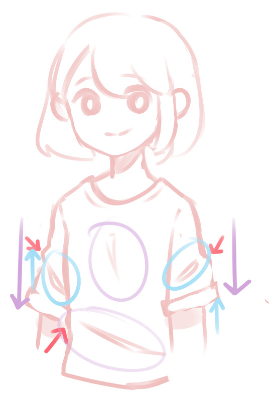
Okay this mess of arrows is my fault but bear with me ;v; In this portion I’ve now moved on to folds. Before we get into the details of the image, there are 3 forces that affect folds, and you should keep them in mind when drawing. Those forces are gravity, compression, and stretch. I’ve color coded each of these forces, though stretch is not shown in this image.So first off the purple arrows represent the force of gravity. This is always going to be a force on earth and cause folds from handing fabric like in between the chest or at the looser areas of the shirt.Then the blue is compression. I don’t have a good example of it here since I’m drawing mostly lose fabric, but its where the cloth bunches up because its met with two forces moving towards each other. In this (poor) example, the clothes are slightly compressed because Blank-chan’s arms are down, preventing the fabric from extending all the way down. I drew up arrows but its not so much as a force moving up as it is the fabric being caught. A better example of this would be tighter fabric gathered around a joint like jeans around a knee when its bending. If you can visualize that you’ve pretty much got the idea.Honestly, don’t let all this force stuff confuse you! I know I didn’t explain it amazingly, but you kind of get used to was looks more natural as you draw more fabric.And lastly the red arrows are just to point out that you need more than just suggestions of folds. Like the collar of the shirt sitting on the skin, the shirt will bend if there are folds so make sure you draw it sticking out rather than just being flat.
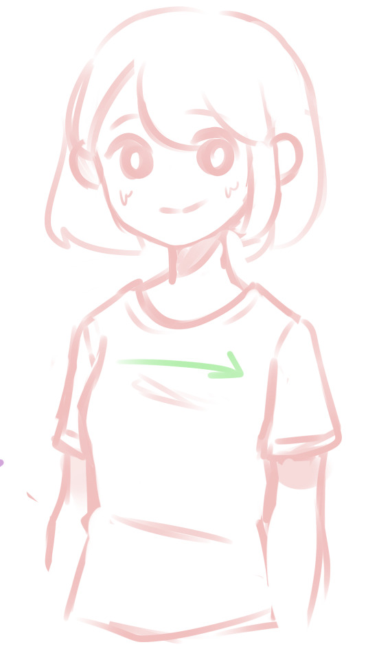
For the sake of an example let’s give Blank-chan a slightly bigger chest and some tighter clothes. The shirt is a little more formfitting and so it stretches over the chest. Cloth that is stretches usually has folds that are more horizontal or vertical depending on the points of tension. With tighter clothes, more of the anatomy shows through which is why you should always consider what the body is doing underneath. Though this still applies to looser clothing and you should be considering the body, you can get away with anatomical errors more easily which, confession, I do a lot.I prefer wearing and drawing looser clothes, so I’m not an expert on tight shirts and folds. Even this shirt I’ve drawn in this example is pretty loose but you can always change it as you see fit.
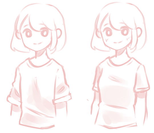
Here’s a comparison of the two without the messy arrows and with some additional shading. Shading can really help define even more shapes and bring depth to the folds, but that falls more under a coloring tutorial so I won’t go into that too much.You can of course exaggerate either of the two examples, either making the clothes a lot looser and adding way more folds or making the fabric tighter and adding more compression folds and showing the form through the clothes. Be careful with adding too many folds though, as it will either looks too crowded or like your character is soaked, unless you’re going for that.
And then last few tips that I wasn’t sure where to put. If you’ve notice, a lot of the fabrics I draw tend to look heavier, like sweaters. In this super messy example you can see that adding tons of compression folds and making the fold rounder makes the fabric look heavier. Like wise using maybe more gravity folds and sharper/thinner edges may make the fabric look lighter!When drawing folds I like to use triangles to represent them. I think those shapes tend to look the most natural. Again, you can round those off or sharpen them depending, its all up to you!
mm, this is a pretty basic tutorial, and there’s lots more information that I could talk about like materials, different styles of clothing, etc etc but I think this is enough to start out with? I hope I helped at least a little and remember that fashion studies are your friend!
432 notes
·
View notes
Note
Can you say how to draw female and male hair? I really love your art, your style is so ... Fluffy? XD
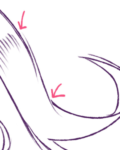
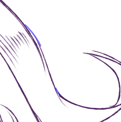
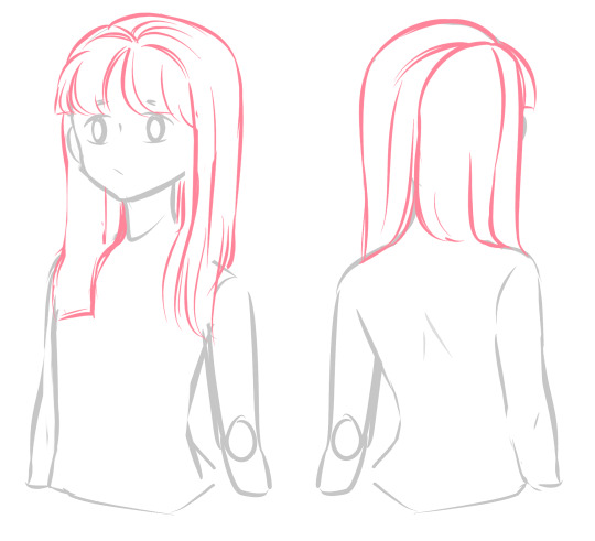
@manekiesorry this took me so long to answer, ive been pretty busy and havent had time to sit down and draw some examples until now!I will start out saying that ive never formally studied hair, so all this will just be my knowledge on stylized hair and how i draw it!
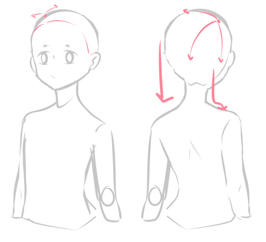
Jumping right into it, the first thing I think about when drawing hair is where the hair is going to part. I decide on the point the hair will start from (represented by the red dot) and then decide what direction I want the hair to go. In this case I’m drawing straight hair in a side part + bangs. When drawing bangs, its important to take note of the hair line. In my head, I separate the bangs from the body of the hair since they don’t follow the main part of the hair but rather start at the hairline.
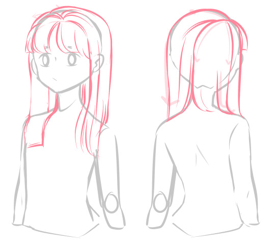
From here I sketch out the sections of hair, using the arrows as a directional guide. You want to think of hair in terms of sections rather than strands. Like any form, breaking the form into parts makes it easier to visualize and draw. I like to think of each section of hair as a ribbon when I’m blocking out the basic shapes. It’s much easier to figure out how hair will twist and turn, especially when in motion or as seen in curly hair, when you visualize it as a bunch of ribbons or streamers radiation from a central point.
Here, you can see the sections I divided the hair into more clearly. I use directional lines to give me a basic idea of how the hair is falling but most of the hair is still in chunks.
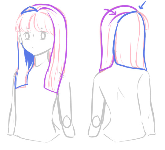
In this image I’ve outlined the two main sections of the hair (excluding the bangs which can be considered a third section). The line the blue arrow is pointing to is where the part of the hair is and the rest of the blue outlines how half the hair falls into a sheet over the shoulder. The purple outline is of course the other half of the hair that comes out of the part. The purple arrow is pointing to a “crease” in this section of the hair. I’m not sure how to describe this well, but still thinking in terms of a ribbon, the ribbon is folding over itself because it is not completely flat. Hair acts the same way; it will overlap itself, especially when the hair is parted to the side. Sorry if that’s confusing, but basically just know having lines coming out of the part helps emphasize it so your hair isn’t all over the place!
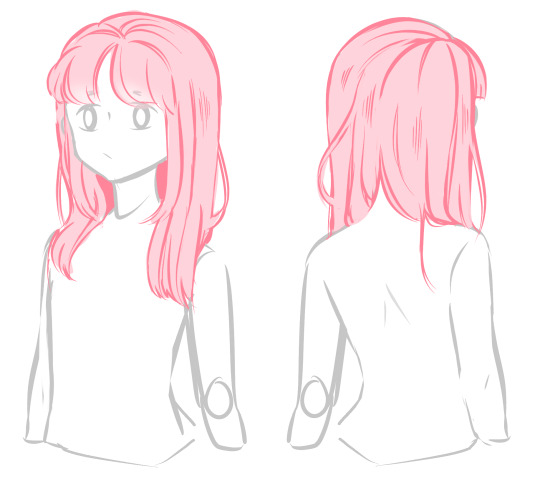
Lastly, I’ve separated the hair further into even smaller sections, though I personally don’t put a lot of detail into my hair so you can see I still have a lot of chunks left. It’s up to you whether you want to push further with this, it’s time consuming to continuously separate the hair, but if executed right it can make your art really pop! However, I prefer simplifying my hair both to save time and just because it fits my style better!In this stage as well, I’ve added strands of hair that go against the direction of the rest of the hair. Hair is almost never perfectly rounded or neat so having strands that stick out or move in an opposite direction can help make it look more natural over all! I also decided to make the part where the nape of the neck comes through a little more evident than the draft to make it clear that it is separating there.
As for the “fluffy” aspect in my style and more specifically the hair I draw (thank you btw that’s such a sweet compliment!) I use rounder shapes and curves to make hair look bouncy or fluffy! Actually, I can’t draw super short, straight hair well because I just love drawing floofy bangs and hair too much.. but its fine because short hair tends to lift away from the rest of the head anyway haha
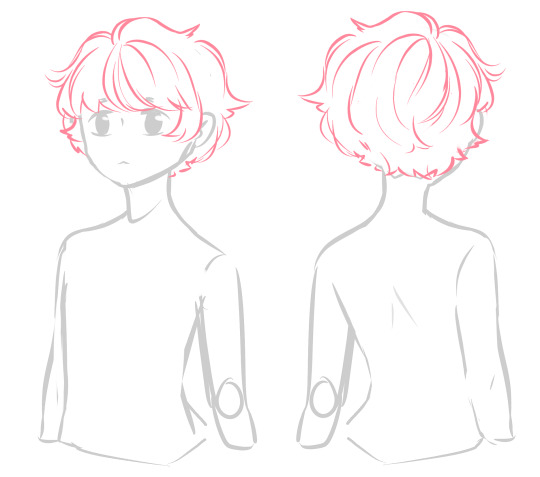
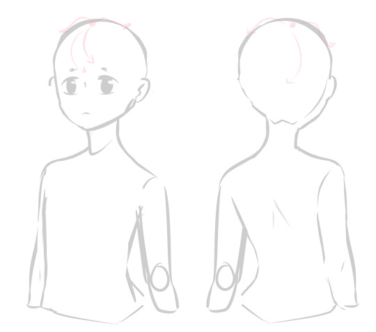
I wont go into much detail for this hairstyle since its essentially the same process but some final advice: It’s always good to draw the head shape before drawing hair. In stylized art/anime especially, hair tends to poof out from the head but that doesn’t mean the head isn’t there. You still need to follow the basic shape of the head and consider how hair falls over it.
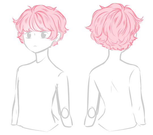
I hope this helped a little! I’m sorry this is such a simplistic tutorial and for the rough drawings, I’d like to go over hair in motion and hair when its pulled back/up or curly but I feel like those need to be in a separate post ;v; maybe i’ll do those at a later date if anyone wants to see those~you can find more of my tutorials/tips here!
#manekie#ibbletips#long post#hair tutorial#art tutorial#the second one's hair looks kind of like lark's it was an accident but i like it#so ill tag it as lark for my reference later#ibbleoc-lark#its a bit different but same idea
706 notes
·
View notes