#ignisvulture
Note
you've stated a couple of times how sonic the hedgehog's design is visually interesting/creative, can you elabore on that and maybe put your own spin on it?
Have a nice day!
Ha, sure! I've never even played the Sonic games but I'm aware of the general pop-culture mythos around them, and I can appreciate how the characters all have unique personalities that stay relatively consistent throughout the series. I do think the Sonic characters in general have a nice variety in proportions (namely, big heads, skinny bodies, big feet) that makes them interesting to look at.

Kinda wish the designs would deviate more from that template for a bit more variety, but I guess Sonic Boom did that? Sort of? At least with Knuckles?
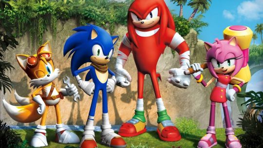
Like I get that these guys are iconic and it's in Sega's best interest to maintain that brand recognition. Of course they wouldn't want to change the designs too much. But personally if I were designing a new character for a Sonic game, I'd try to give them a different body type from what everyone else has. Samebody Syndrome doesn't count as a legitimate stylistic choice imo.
And really, the connected eyes were always a bit nonsensical and terrifying to me. It's like all the hedgehogs in this universe are cyclopses with two pupils and two irises somehow, yet the other species have regular eyes for some reason. Figure that one out.

(But apparently Vector the Crocodile has connected eyes too, so I have no idea what the logic is there. It'd be hilarious if he revealed himself to be a hedgehog in disguise.)

Enough about the cast; let's get into Sonic himself. Looking at his original 1991 iteration next to this 1930 patent drawing of Mickey Mouse, it's clear where a lot of the visual influence came from. Notice the body proportions, face shapes, oval-shaped black noses jutting out from the face, and the white gloves.

This does somewhat explain the connected-eye thing as well, except it looks more natural with Mickey since each pupil is implied to represent one entire eye, with the space around them simply representing differently-colored fur on Mickey's face.
And to reiterate what I mentioned in the shape language post, Sonic's assortment of triangles visually puts him at odds with his nemesis Dr. Robotnik, who's based on round shapes. While it's more common to see villains with triangle-based designs and heroes with circle-based ones, Sonic shows us that vice versa can also work.
If I put my own spin on Sonic's design, I'd make it look a bit more like a hedgehog, separate the eyes, and add more padding to his shoes so they hold up better to running. I also felt the tail and back spikes were a bit superfluous, so I left them out.

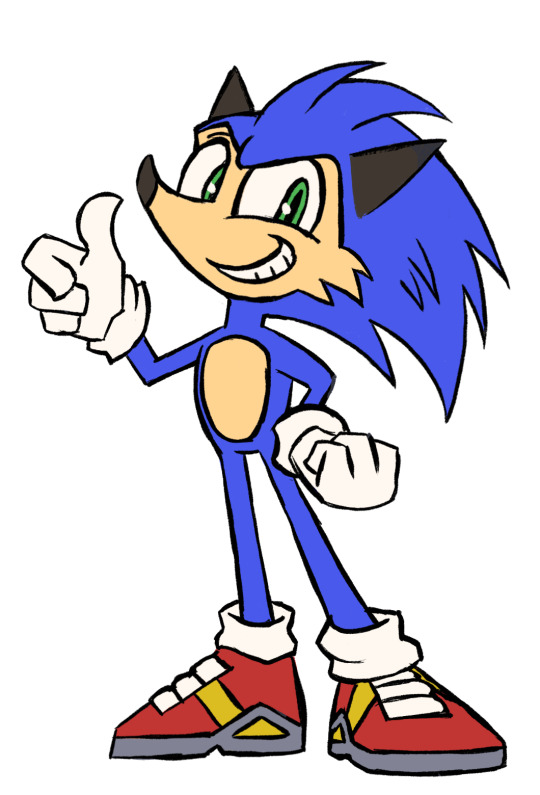
It's a first draft I'd need to explore more thoroughly, but it's a start. Thanks for asking!
6 notes
·
View notes
Last Seen Blogs

bobaryn
Untitled

captainblademan101
Untitled

cotwolf
Circuitry of the wolf.

fuckkmerealgood-blog
CUMpanties

greatfuckinmovie-blog-blog
Great Fuckin' Movie!