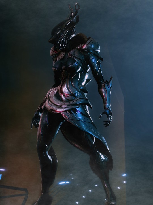
#it won't work for all angles without some photo editing
Explore tagged Tumblr posts
Visit Tumblr Blog
Explore Tumblr blogs with no restrictions, modern design and the best experience.
Last Seen Tumblr Blogs


Fun Fact
Tumblr was named as a finalist in Lead411’s New York City Hot 125 in Aug 2010.
Text
I figured out the secret to tiny irises in Gpose
#you gotta do scaling of course but you then move the eyes as needed based on angles to cover the empty socket space#then you rotate from there and it'll look alright#at least it does in the test I'm doing#it won't work for all angles without some photo editing
1 note
·
View note
Text
I was asked by @x-littlemoth how I do my VGP and I explained the basics here! This is a continuation of that tutorial with my own personal methods! For this tutorial you'll need this mod (in addition to the ones mentioned in the last post):
CharLi This is an excellent lighting mod that allows you to spawn individual lights and adjust their color, brightness, rotation, etc.
And here are some other mods I recommend, though they aren't necessary!:
Additional Portrait Presets I can explain more about why adjusting FOV or rotating the camera 90 degrees is useful below, but these presets save you the effort of tweaking yourself! Photomode Expression Megapack No tutorial needed, this just adds extra facial expressions you can select in photomode! Works exactly the same as the vanilla one and doesn't replace anything.
Appearance Creator Mod (ACM) I won't cover this one here because there is already a wonderful tutorial by PinkyDude who explained it way better than I ever could which you can check out right here! Briefly, this allows you to swap/toggle clothes, accessories, etc. on NPCs.
If you'd like any additional suggestions for pose mods, clothing mods, etc. or wants to know any mods I'm using I am very WCIF (where can I find) friendly so anyone can free to ask me any time! Additionally, if anyone would like a tutorial on my editing process, I pretty much just use my phone and a free app (and sometimes a paid app but that's not necessary) feel free to ask, I'd be happy to share :)
Let's get into the tutorial under the cut! ^^
Okay, let's continue editing our photo of Viktor and V using CharLi! So, open your CET menu and look for the CharLi menu and open it up. First thing I tend to do is go over to the settings tab (the gear) and shut off chromatic aberration and volumetric fog. This is all up to personal taste though, so do what looks best to you! Now, return to the main tab (click the light bulb) and let's spawn a light! Personally I always prefer to start with 1x as the others tend to be way too bright for most scenes. Play around with choosing whichever type of light you like.
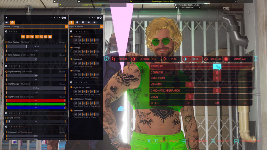
In the end, I went with the type called Favelas as my main light source. Go ahead and play around a bit with the rotation, intensity, and other sliders.
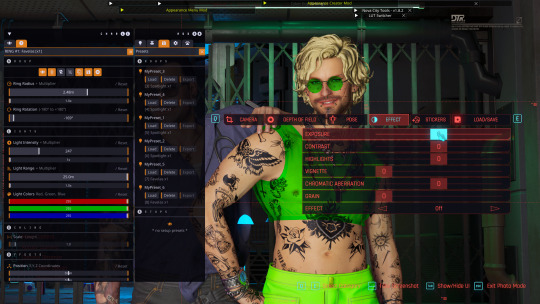
Here's what I ended up settling on! I try to make sure that the character's aren't washed out or too dark and I try to make my first light light the characters fairly evenly. Now, for depth and flavor, let's add a second light! This time I chose spotlight and I adjusted the colors until I achieved a relatively blue color.
One last thing, for each of your lights go ahead and toggle these two badboys off. That will hide both the physical light object and the pink tracker so they don't clutter up your photo.
Adjusting the angles a bit more to my own tastes, here's what I'm left with without any external editing!
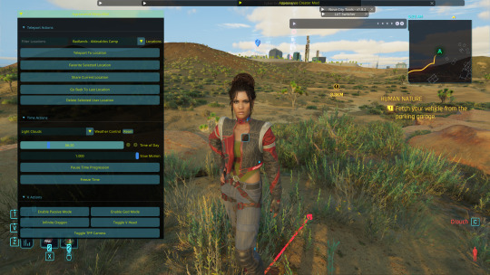
Now, let's try and outdoor photo! Following the steps in the last tutorial, I am going to teleport to my location of choice (I am using a teleportation preset found in PinkyDude's Roadtrip Through The Badlands AMM location addon). While here, I switch my Nibbles replacer to Fem because I'm gonna take some pics with Panam! Now that I'm here, I notice that the lighting out here could be better! I tend to adjust my weather and lighting outside of photomode because it doesn't always shift correctly in it. To make sure everyone is lit correctly, I tend to pick the character with the darkest skin or clothing that will be in my scene and spawn them from the spawn tab. I'll choose Panam, of course!
Note: Going to the tools section and selecting freeze target can help keep your spawned companion from walking away but I forgot to do that here lol For weather conditions, I like to choose light clouds. This makes the sky look nice and it also softs harsh shadows. This is up to personal taste and the mood of your scene though! Additionally, if you want more weather states and deeper control, you can use the Nova City mod. For now, let's just play with the vanilla weather settings.
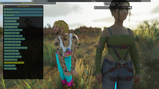
I tend to prefer the look of early morning the best, but again this up to taste! I would definitely recommend avoiding middle of the day though as the harsh lighting can greatly overexpose your image while also muting colors. Now that we've got all that set up, let's banish her just like we did Viktor in the first tutorial. Unlike Viktor, this Panam clone won't respawn (the real Panam is safe and sound, this won't affect her). Now let's return to photomode (and ignore my boy's goofy Us Cracks pose). Follow the steps to set up your replacer just like in the first tutorial. Now that I have my replacer swapped out to Panam, I am going to remove her jacket using one of the built-in presets (for swapping outfits with ones not listed in AMM see the AMC tutorial linked above). To do this I am going to go to tools > target replacer > scan and then scroll to the drop-down and list and pick the one I want to use. Let's keep the harness but remove her jacket!
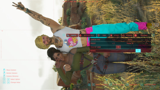
From here, choose whatever poses you like, set up CharLi however you wish, and now let's try taking a portrait shot! This is where those presets come in handy. If you downloaded them, go ahead and flip through to the portrait ones at the end and select the one you like best. Otherwise, let's set this up ourselves! To do this, I will go to Camera tab in photomode and set my rotation to either 90 or -90 degrees. This allows you to fit more into the shot while also allowing your portrait to be higher quality because it fills up the whole screen instead of being a tinier image with a lot of empty space on the sides. Next, I'm going to adjust the field of view. The lower the field of view, the less your image is distorted. While distortion can be nice for some styles and atmospheres, I tend to prefer a lower FOV for my portraits. I tend to prefer to set my FOV lower then 20 but higher than 10. Here I've chosen 15!
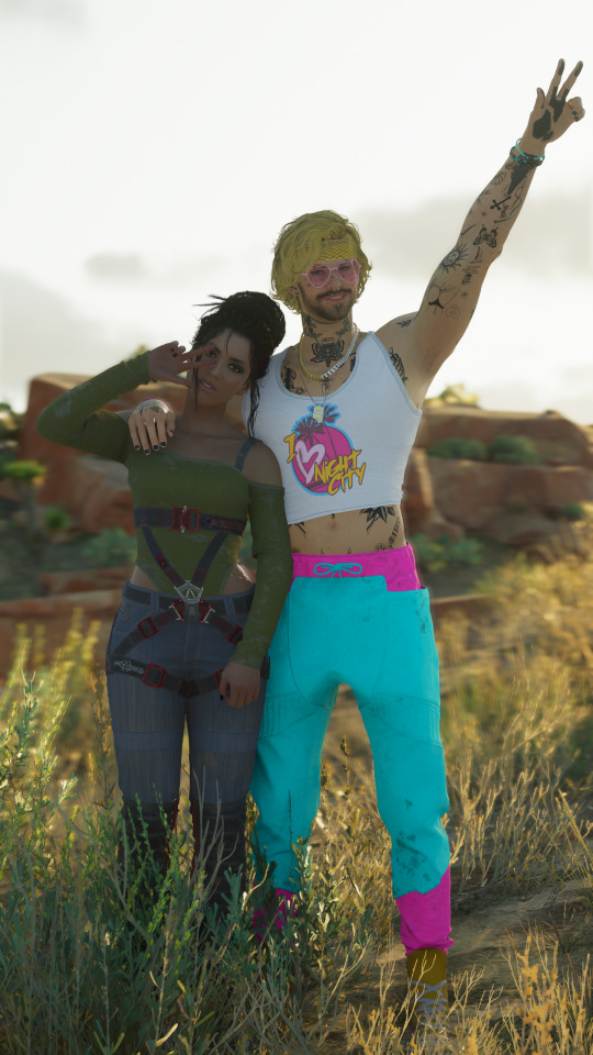
Now you can play around with the angles and take your photo! Here's the unedited one I got in the end:
If you have any questions definitely feel free to ask! This is certainly not the only or even the "best" way to do it, this is just my personal way :) Have fun!
21 notes
·
View notes
Text
Do not put the legs on backwards.
Do not put the legs on backwards.
Do not put the legs on backwa-

Are you kidding me!? 😤

It's fine, everything's fine. My heat gun tried to set it's self on fire and died, but it's fine.
But like, it actually is fine. I don't know what happened, maybe it overheated but it works again now so 🤷♀️ 😂
All jokes aside, I was really stressed about reassembling the body cause I didn't want to scratch the paint. The only real damage was a bit to the knees (which I evidently didn't photograph) that id anticipated and that one largeish scratch on the butt. I ended up just using my hairdryer to heat the plastic when reattaching the limbs, which works fine, it just takes longer.
Before I popped the legs back in I did take my craft knife to the inside of the hips to take off the paint a bit. I've noticed that the most egregious scraping happens when paint rubs against paint, so in areas that you won't even see I preemptively scraped it off.


If I were to do it again, I'd take a little more off and make sure to hit it with the alcohol marker before attaching the legs. I ended up spending a good couple hours very carefully shaving off more of the plastic inside the hip joint after the legs were back on, just to prevent as much contact from happening as I could. Only downside is I can't get the tip of the marker in there now to really color it without hitting the painted legs. Which obviously leaves a dot of marker on the exposed skin (shh it's a freckle now.) but to be honest I don't think I'm going to be looking at or photographing the doll from that low of an angle with nothing covering her that it's going to be seen.
I don't have anything to show for the couple hours of work I did scraping away ~wafer-thin bits of plastic to ensure no paint scraping, so you'll just have to take my word for it for now. I really should have recorded a video or something, but every time I do that I never end up doing anything with the videos. Damn me and my desire to be helpful but also my inability to actually be helpful.
I also realized the other day that to some this might seem like an excessive amount of extra caution being put into what are typically a set-it-and-forget-it piece of art. For me what I really enjoyed about having my first goblin-self doll was that I could take her off the shelf and pose her with things and take mini photoshoots. I made a couple Christmas outfits, the Halloween one I shared as well, and 2 different dollscale versions of my own hoodies. (Well technically one is the hubs, but you know.)
The last thing I want is to go and pose my doll for something and have an obvious gash in the paint take your eye away from the scene. Sure I could probably cleverly pose around it, or even edit the mark away in the photos. But I'd much rather it just not happen in the first place, and if it takes a few extra hours and some clever thinking in the beginning stages to not have to worry about it in the end, I think that's worth it. By no means do I think these little tricks would hold up to like, playing with her as a doll, but I think they should at the very least stand up to multiple movements and outfit changes over the years!
That's all I've got for you folks today! Might be a bit before the next update as I'm trying to put together a Victorian-era elf dressed in 16th century plague doctor garb for a Renaissance Faire in uhh... 24 days 😂
Wish me luck!
And as always, much love 💚
5 notes
·
View notes
Note
How do you get such nice shots in captura? I wanna get better at it could you share some tips? Been trying to figure it out but I admit I'm not the most knowledgeable in photography etc.
Well.... It's a bit of a complicated process and it relies very very much on personal preference. Much like with any type of art there are different styles that each individual artist will gravitate toward. I can only show you how I do things, so I'd recommend asking other Captura folks on here about their own styles to see where our processes and preferences differ.
I'll also include some extremely helpful videos at the bottom, they go extremely in depth as to best practices and technical exploits.
Alright, lets get started with the background stuff... the tools! ReShade: Shader injection, a MUST if you want to take dynamic and customized captura without using a program like Photoshop to do everything in post.
SRWE: Simple Runtime Window Editor.... the god among programs... It's an upscaler, allowing you to increase the resolution of the game beyond the bounds of your monitor. It's how I was able to get 15K panoramas at one point in time.
Any image editing software. Since I rely mainly on compositing to get the lighting I do, I need something to overlay and mesh the images with. I use GIMP cuz it's free, but even Microsoft Paint will work as soon as it add the ability to layer images.
Those are the tools... what about the tactics?
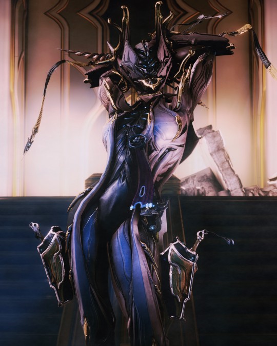
Well, I generally prefer moodier shots with the Warframe being the central focus (though, that's also the side effect of me cropping the image). Just a note! Moody doesn't mean dark, moody is the enigmatic space between dark and light where there is more dark than light... but there's still a good amount of light to be had. Occasionally you can have overexposure in a moody shot even.
Important to note, the overall exposure level of the environment, even is the scene lighting is low, will effect how brightly your Warframe can be lit. Both the Scene Light and Exposure sliders need to be fine-tuned otherwise you won't be able to light your Warframe at all.
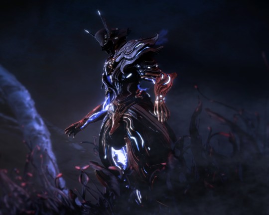
Now, for shot composition I prefer low angles with either a cluttered but familiar/recognizable background, or a simple but abstract background. The Subject, be it a Warframe, an enemy, or an NPC, reside in the center with their feet out of shot.
Like so:
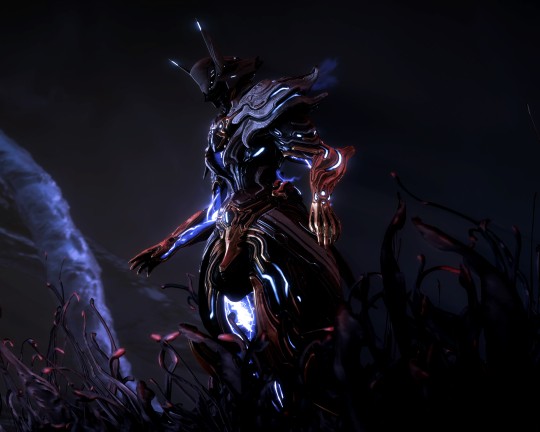
Each of these shots also demonstrate well the way I like to pose my subjects: Symmetry and.... not... not symmetry. The official term for this is Contrapposto, which is Italian for Counterpoise. Basically, even though the Wisp is sedentary, her body is still giving off the impression of movement based on how her waist is curving and hips are tilted, forming a loose 'S' shape. There's a handful of animation sets, Khora (Urushu) Noble, Mesa Noble, and Wisp Noble are excellent for this.
Some examples:
But... what about the lighting? This is where things get technical. So, the standard Captura's three-point lighting system is generally inadequate at properly lighting the entire Warframe. This is where compositing enters the picture, in a very literal sense. Each of these shots, shown above, are composites of between two and four separate images, each with different lighting angles. I actually have an example I made for an earlier explanation made already (thank goodness)

Getting the different lighting angles is really simple, just rotate the 3-way lighting without moving the camera. Then you overlay them in some photo editing software and just start going layer by layer, erasing bits of the topmost layer to reveal your desired highlights or shadows from the shot underneath.
Don't feel obligated to do this compositing process though! Sometimes the 3-way lighting works perfectly well for a shot or environment, don't feel obligated to complicate this process.
And this segues in nicely to the final part of the shot-making process, post-processing and fog layers.
Now, fog layers are important to the overall appearance and vibe of my Captura. They add texture the image that the game doesn't impart naturally, removing large swathes of solid color from the background and foreground. An added bonus is that the added texture makes the image look somewhat better (imo) when compressed, or when viewed at lower resolutions.
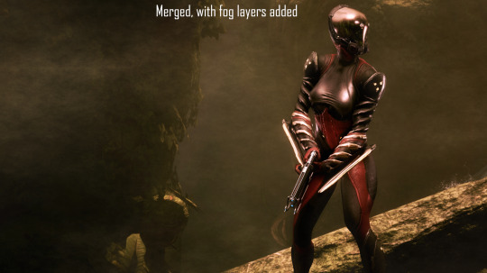
The same image with and without Fog
This shot contains two individual fog layers, one in the foreground, washing out the foliage, giving the general uniformity of it texture and implied depth, it also serves to cover up the manual blurring I did (poorly) around his legs. Then there's the background Fog, which is the deeper blue you see in the sky. It adds a more dynamic air to the generally dour set of greys. And, again, the fog is just something I personally like to add, even if it doesn't serve a practical purpose in a shot. No shade if someone feels the fog ruins the shot, I almost always keep a fog-free version about.
After the fog is added, blended, and blurred slightly, I will apply a few gentle blurring filters to remove any jarring or jagged pixelation from the shot, giving the Frame a somewhat smoother appearance and reducing the file-size dramatically.
That's just how I do it though, it's not a particularly popular style, but it's how I do it and how I love to do it! :3 Remember to ask around, I'm sure there's lotsa Captura Artists out there willing to explain their methods and processes.
Helpful vids! How to Captura by Vash Cowaii Hotsampling in Warframe for High Res Shots by PurpleFlurp
good luck, and happy snapping!
#warframe#captura#warframe tag#warframe captura#sorry for writing an essay... sometimes I don't know when to shut up#-_-
13 notes
·
View notes
Text
From planning to posting, share your process for making creative content!
To continue supporting content makers, this tag game is meant to show the entire process of making creative content: this can be for any creation.
RULES: When your work is tagged, show the process of its creation from planning to posting, then tag 5 people with a specific link to one of their creative works you’d like to see the process of. Use the tag #showyourprocess so we can find yours!
Thank you so much for tagging me @highwarlockkareena 💜
I'm tagging:
@zazrichor and this piece
@mushroomtale-fanart and this piece
@snowyfuxue and this set
@wuxxxian and this piece
@satuwilhelmiina and this piece
Of course, feel free to not do this if you don't feel like it, absolutely no pressure 💜
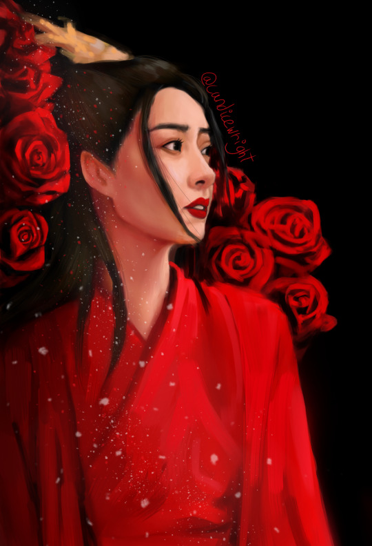
I'll be talking about my process for this art of Wen Qing.
Fair warning that this is going to be a bit of a mess because my process is all over the place, but I'll try my best to explain without it being too confusing.
Planning
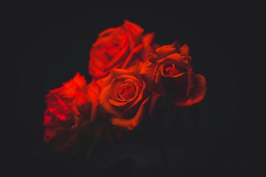
Since this was a request, I started by reading the prompt, which asked for Wen Qing and roses. Roses are my one of my favorite flowers so I claimed the prompt and started thinking about what I was going to do with it.
I knew I wanted to do a portrait with roses surrounding Wen Qing, but I still wasn't sure about what the composition was going to be, so I started looking for references to see what would work and to get some ideas.
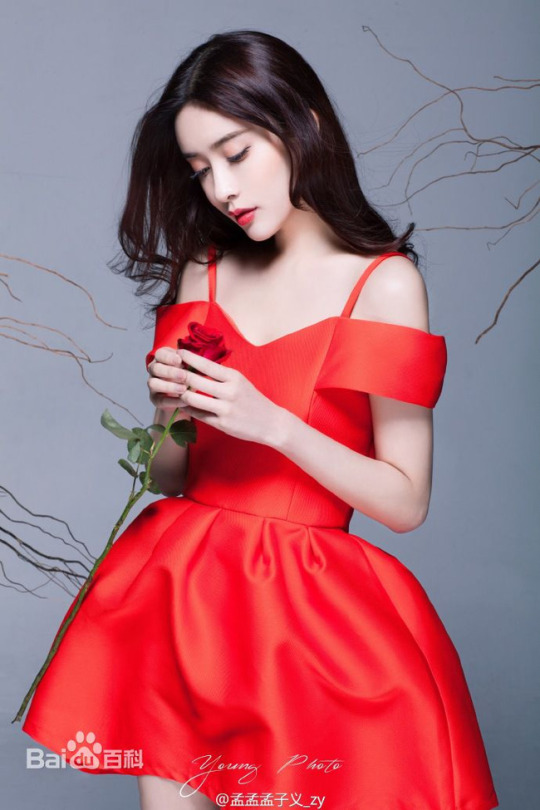
I started looking for photos of Meng Ziyi that I liked and at first I really liked this one.
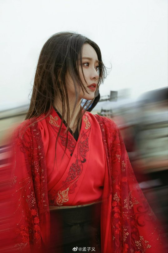
She looks great, but when I tried sketching it I couldn't really get the angle of the face right, so I tried to look for a different picture that was within my skill level. Luckily, I remembered seeing a very pretty pucture the day before so I looked for it and this one was the one I ended up going with.
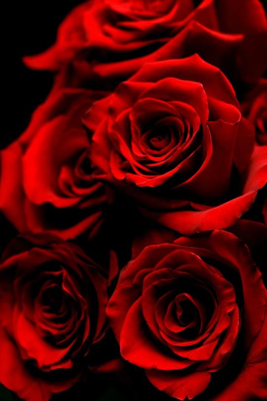
After that, I downloaded some free to use pictures of roses. I really liked the contrast and the color scheme in the pictures so I though I could apply it to the painting itself and so I began getting a clearer idea of what I wanted to do.
Creation
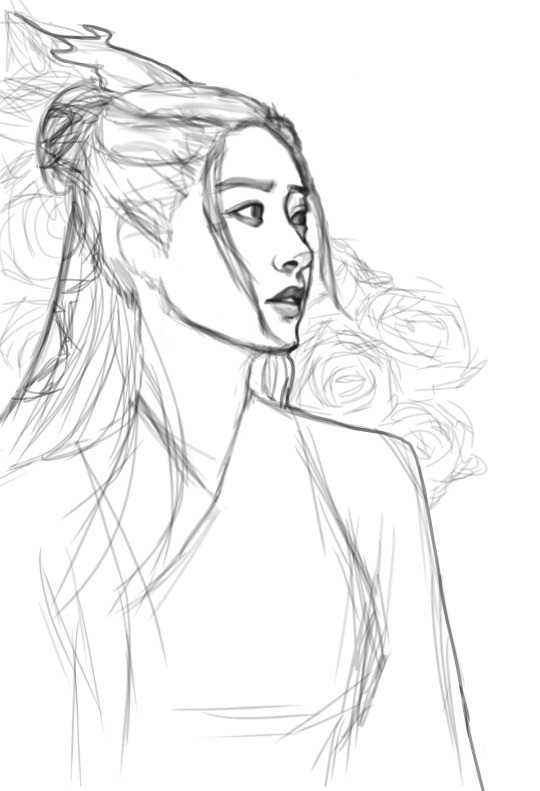
I opened my art program (IbisPaint X) and did a sketch of what I wanted using my references. My sketches are always super messy and I can't be bothered to do lineart, so I usually just clean them up a little bit and work over them directly. I should actually learn how to do proper lineart at some point, but today is not that day 😂
Then, I chose my base colors and filled in the drawing to get an idea of where I was going with the piece. I really likeed how it looked like this so I sent it to my friends for validation. They were extremely lovely to me as always so I was excited to continue working on it 💜
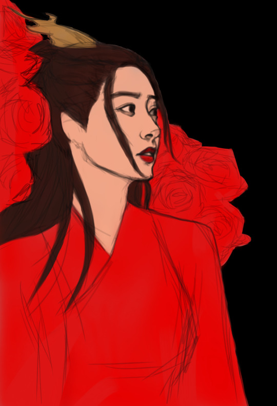
Before rendering, I knew I wanted my light source to be on the right and I wanted the shadows to be quite dark, almost black, but that's the extent of what I knew before going into it.
And then I started actually painting! Unfortunately tumblr won't let me post the process video into this post so I'm going to upload it on twitter. You can see it here! I don't really know how to describe how I paint other than there's a lot of going back and forth and over stuff that I already thought was finished. The whole thing took around 12 hours, which is a bit longer than I usually spend on a portrait but I think it was worth it!
For the main piece I only used three brushes. I did add a bit of glow and sparkles with different brushes on a separate program, but I mostly used these three:
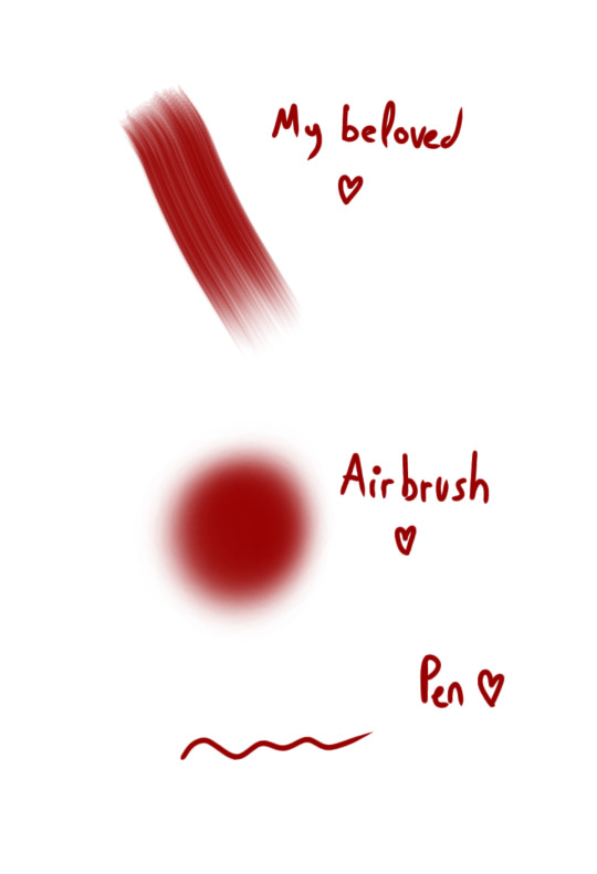
Note that these are at full opacity but I usually work a very low opacity because my stylus doesn't have pressure sensitivity (bc my equipment sucks) and that's the only way I have to blend my colors without the blending tool, which I don't really like because it takes away the texture.
I also had a bit of trouble with the colors in this one because it's not what I usually do, but after multiple adjustments and with help from the references, I ended up with something I really liked!
After the piece was done, I added some of my usual sparkles and a bit of glow and then saved it to my gallery. Then, I opened my editing software and played with the contrast, saturation, brightness and some filters. I was left with three versions of the art that I liked: the one I eventually went with and these two (I still really like the first one tbh).
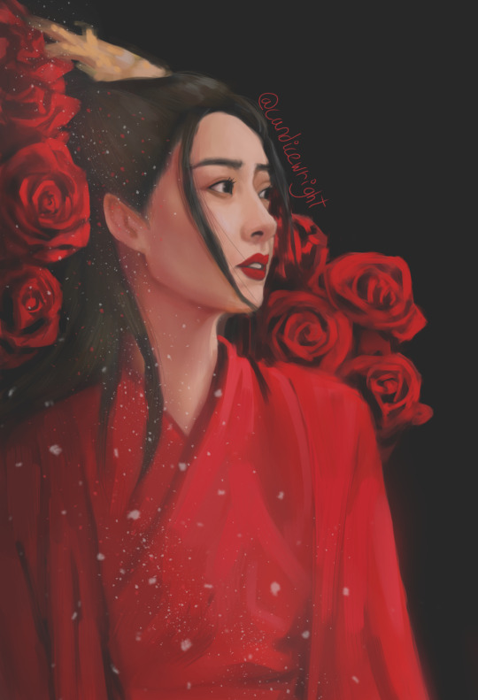

I sent it to my friends so that they could help me pick which one looked better and after a long period of very serious deliberation (read: we all panicked bc we're gay and can't choose) we ended up going with the one that ended up being posted to the mdzs net!
I then sent it to the net for posting and waited (im)patiently for it to go up! ❤
And that's it! I hope someone can get something put of the mess that is my process or that it was at least enjoyable!!!!!
96 notes
·
View notes
Text
documentary
big fat catchup
I haven't written much (actually nothing at all) about this module so far, apologies ://
So, I joined Jack's 'Khanistan' doc. I have to quickly say that it will no longer be called this. Some people know why, if you don't, good for you! (inside jokes 4 the girls). I think we may go with 'The Block', this is what the community call it. Anyways, I liked the idea and was very interested in meeting the people Jack had mentioned. I have always been amazed/impressed by people who "live by their own rules" and "off the grid", in a sense, I'm aware it's not exactly this but was unsure how to word it.
We have our roles:
Director - Jack
Producer - Rowen
Cinematographer - Jenny
Edit - Myself
Sound - Orla
We all got the bus to Glasgow last week to visit Florence, Jack's brothers girlfriend - who was just the loveliest person!! Jenny took many photos, I will show a few throughout the blog!


I won't get too into the visit as I want to focus on aims/visions for the documentary. But I made a Proof of Concept ish, that i'll link: The Block - POC . However, I want to note that I cannot use my camera very well and I have no clue how sound works. Enjoy!
I have been thinking about themes and angles we can push with this project, as there are a few ways we can take it. There's the bond between a community that I like, which I think still follows the brief as we wouldn't be focusing on a specific person, but a community of people making a place a home, without them it wouldn't be as special. Linking to this they all put their own creative spin on rooms and exterior, which is a focus I like. Florence had mentioned the summer at the building, in which they all sat for hours in the garden. With a bonfire, music, drinks, drugs and art. She explained how close they all were during this time, and showed us photos / polaroids / videos. However, now it is not so warm they don't spend much time together anymore, and the garden is not so beautiful and colourful as it once was. Which is another possible focus, changing of season and friendships. Also, there is the whole thing with Mr Khan himself, the man who rents the rooms and owns the buildings. From the stories we heard, everything he does is insane, it's actually not legal I don't think. From not fixing broken windows to 'allowing' squatters. I would love to focus on him and how he came into possession of the building and his morals and his life and everything about this mysterious man, however, we can't focus on a person and he seems like he wouldn't be up for a camera in his face. So, we are still trying to decide a proper direction and focus for this. But something along the lines of community, friendship in hardship.
Onto the more visual side of storytelling. Jack had mentioned he wanted some footage on a cam corder, which I think is a great idea as it links to the idea of family videos and being home, and could also help us create, what would seem like, footage from their summer to go with the photos we get from them. I think we have decided to go with a participatory doc, and show our presence, at least through sound, featuring. I think this will help show the friendly side to the people who live there, as they were so kind and welcoming to silly little students who want to film their homes and invade privacy! Edit wise, I don't have any solid plans yet. I hope for heart warming voiceovers and media given to us by the community that I can use. And sequences along the lines of 'Dark Days' - just filming people in their environment doing activities they normally would, talking to the camera and each other. I know that's not really edit, but it's what I hope to edit...? I'm not too sure on Jenny's plans for cinematography just yet, but after seeing her photos from the visit I'm sure she's got some cool plans!!
We are currently working through our powerpoint for the pitch next week. I'm happy we have the photos and footage, as I feel it's hard to put into words the people and the place. But yeah, feeling confident about this! Once again, can wait to see other groups ideas!
3 notes
·
View notes
Text
Every Summer, I Regret That Fret from a Time Unreachable
... Is a line from a poem I wrote that references my other poems called Thunder Clouds and Lightning Bolts and The Snowball Effect (the latter of which I made a piece based on last year - click here for images of that).
Here's the poem (in image form for formatting's sake):

That untitled poem remains unfinished, but that line really stands out to me. It's about wanting and reminiscing about something you failed to obtain before, when you now have something you should be cherishing instead.
Lead by the theme of reflection I inadvertently carried throughout this semester, I knew I wanted to use high vis reflective material - the kind traffic cones wear - in some way. At first I thought of making a kind of collage piece, inspired by the concept of a scrapbook and looking through the memories in it (reminiscing), but I still want to make less physical, more film-based work. So, I made a few concepts of what I could do.
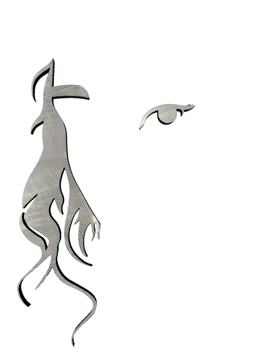
A few things to explain. One: Having the collection of off cuts from previous laser cutter work (some of which I used last semester), it would be a mistake not to use some of it, especially in what I want to be a collage or collage-esque piece. So that's what the eye and hair parts are. I used those ones in particular because the poem refers to a "she," a person (primarily because it's about a "she").
Two: I decided I wanted to use the high vis on those pieces because the idea of the eye, the person, looking back at you light bouncing off it.
Three: The flower shape refers to the flower in the poem, who The Snowball Effect was also partly about. No, you won't understand it without this knowledge, but I like how ambiguous it is. Plus, it's kind of personal. Worth noting that I got the flower shape from the source of the flower motif - a dress.
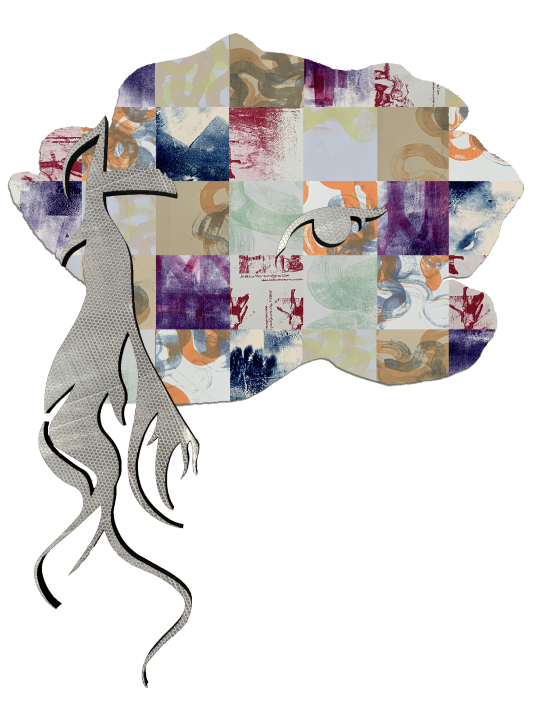
And Four: The different coloured images are junk prints I got from the print department back during Print 101 last year. These were great to use as the 'memories' in this idea due to their abstract appearance and nature. Using them instead of actual photos makes it feel more abstract and subjective.
A description of each concept underneath the image.
This was more of a throwaway, something to make the list longer. Without a background makes it much less visually interesting (in my opinion) but it's also way more minimal, which I kind of like. The idea of just a face - or part of a face - looking back at you is intriguing.

These next couple concepts involve having a physical flower-shaped base, probably laser cut. This one is what I first had in mind. Using the images to mimic the form of the flower itself and the layers its petals make up. This is sort of using the idea of 2D depth I explored before. Probably my second favourite concept.
I called this one "scrapbook" in the file name because that's the idea I wanted to get across with this concept. Like a gallery of memory. However, this sounds much better on paper than in photoshop. Albeit there are other ways to go about the idea.

Moving onto the ones that involve projection. This was a better and more layered version of the scrapbook idea - having the array of images on the wall with the face on top, and the silhouette of the flower being projected onto everything like a spotlight. Quite cinematic when I think about it.

Ignore the stroke, my mistake. The idea behind this one was to have it like a fast-moving slideshow of the different images being projected onto the... face? I'll call it the face from here on. I liked this one because it's more like what you see in your head when you reminisce about memories. A series of moments.
I went with the last one. Now, by this point the last chance to loan a projector had passed, so I had to make a simulation. Here's what I did:
I had four pieces of high vis material and had to use three of them to neatly cover the face. I used the curves of the hair to dictate where each piece ended. A case of getting the outlines, cutting outside the lines and lining each part well.
After getting that in position on the wall, I took some wide angle photographs of it and took a load of macro photographs of the print images. Using depth of field and angles to my advantage, I got a variety of shots.
These were further varied in the editing process. I used Lightroom to make some of them crisper, some less so, some less vibrant, some slightly more so. And of course I masked them so they were in the shape of the flower.
From there, I took the images photos into Premiere and, after editing the perspectives and adding a slight glow to simulate an actual projection, I created this:
That's what I have so far. I won't know how the light from the projection accurately interacts with the high vis until I use an actual projector, but I'm eager to find out. I think it's turned out well do far.
As for sound, I had the idea of adding the sound of flicking book pages in time with the images, but without the visual aid of an actual book, it would just sound like a very fast metronome. I also had the idea about some ambient sound but one: I'm really not sure if it'd fit and two: I never really saw sound being part of this at all to begin with.
0 notes