#it's hard to get much texture with the gouache brush but the pencil is too texturey
Text
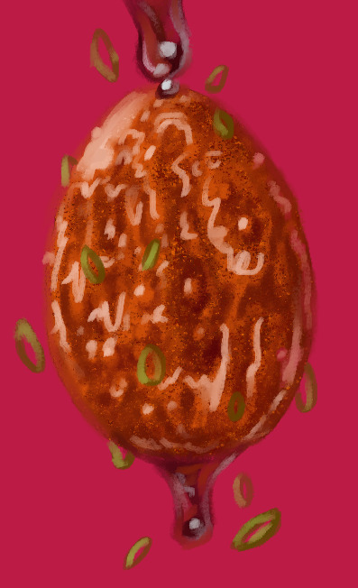
Eggtober 3rd 2023
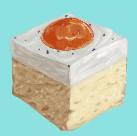
"And Yet a Bit of the True Self Remains in the False Self" or German Fried Egg Cake (Spiegeleierkuchen)
(Clip Studio Paint, Gouache brush and Pencil brush for highlights, 11 colors, ~40 minutes give or take. It felt longer but that's what my timer said and I did take a 10 minute break because my wrist was bothered)
So yeah, apparently my anti-artistblock strategy this time is to just scroll the image results for fried egg until I find something I want to draw? Last year I had lots of ideas and this year I'm just "please send requests, I don't wanna draw the same 12 egg dishes that I like best from last year! I wanna practice with new stuff!"
So yeah, technically it has egg in it because cake, and technically it looks like egg because of the pudding and apricot topping, but it's not technically an egg. But it's edible and egg themed and I really like how humans have decided that eggs are a pleasant thing to emulate. We have Easter egg-shaped candies and indeed many people serve this cake on Easter due to this association. Egg-shaped gummies. Eggy puddings. And the Fabergé egg. Humans just be liking fried dough, onions, and eggs.
I saw one sprinkled with poppy seed on top to look like pepper and I saw one with a cute teal-turqoise table cloth so I combined those ideas and several references for this. It may be sweet and not savory, but I hope you all enjoy! Haven't tried the recipe, but if any egg lovers love the look of this cake and want to try it next Easter, this is the one I found while looking for references.
As always, gotta tag and give props to @quezify for organizing Eggtober. Since this is cake, can we call it birthday cake for him?
#Eggtober 2023#Eggtober 3 2023#my art#Fried eggs#only it's not really#cake#apricot#pudding#I hope I'm getting better at rendering the crumb texture of the cakes and things I draw#it's hard to get much texture with the gouache brush but the pencil is too texturey#Maybe I just need more practice
81 notes
·
View notes
Note
would you consider dropping some tips on how you color? your art always has such a nice feeling to it
Thank you so much, and yes, absolutely!
So... I have been agonizing over how to answer this question for over a week because I tend to make a lot of my major decisions based on what looks and feels good to me in the moment. It’s sort of hard to explain. Then I started getting philosophical with it (“how does one color? How do I explain aesthetic?”), and I started rambling, and had to cut the answer way, way, way down lol.
But here’s what I can help with right now. I think the most important part of how I color is my tools and what they allow me to do. These are currently my favorite brushes to use:

From top to bottom, I use Kyle T’s Gouache for just about everything. A lot of my recent pieces are done entirely in that– I love the chunky texture and how the pressure mimics traditional gouache. It’s great for children’s book illustrations, and filling linework, and realistic portraits. She is my soft wife and I love her.
I practically never use the default hard round. Ignore that.
The roller brush is another one I use for painting. It was my go-to before KT’s gouache, so you’ll find it a lot in my older work (and as a big texture thing in my current works). The “Sampled Tip” below that one I usually use for children’s book styled illustrations. It’s like a really dense, waxy crayon, so it’s fun for textured lines and details.
I always paint in my own shadows and highlights, but I like to use the soft round if I want to blow the shadow or highlight out. It’s for extra large areas.
And finally my pencil. I use it for sketching as well as linework, if I plan on doing a linework-centric piece. I don’t think there’s much of a difference between the two there… one is probably smoother than the other.
______________
The reason why I like textured, pressure-sensitive brushes so much is because they’re important to how I paint. When I blend, I don’t use a blender brush or a smudge tool. What I do is layer two colors– lightly– then use the eyedropper to select the color between them and continue painting with it. That’s probably the key to most of my work. I’ve gotten pretty fast at it, so I’m constantly selecting colors from the painting and reusing it throughout my painting.
I still use the color-wheel to hand-pick what I think will look best, though. This is probably going to be a really frustrating answer, but I choose color palettes based on basic color/lighting theory combined with personal aesthetic preference. It can take some studying (of both theory and other artists’ work). If you’re ever looking for a really great reference on the former subjects, I highly recommend Color and Light by James Gurny. Even if you’re not into watercolor or dinosaurs or realism, the guy is a master at explaining all that different stuff in depth.
Shape and negative space are also pretty important to me, but that's a whole other thing. And as a side-note, I recommend following more children’s book illustrators. Their work may look simple, but a lot of intention goes into how they use color, shape, space, and texture.
Also, on texture, I hand-draw most of mine. I love to add little scratches and drops and splashes when the painting is almost over. It's one of my favorite things to do :')
____
Now, the other most important tip:
Once I’m happy with the sketch/linework, and once I’ve laid down the basic colors of my piece, I do a Really Terrible Thing. I become a graphic designer’s worst nightmare and collapse everything onto one layer.
Then I paint directly on top of it, linework and all.
I do this for a lot of reasons, but mostly because 1) my tiny brain is overwhelmed by the clutter of too many layers, and 2) it forces me to approach a piece as if it was traditional media– a process which I find a lot more comfortable and rewarding. I paint right on top of the base colors, and right on top of the linework, effectively redoing and cleaning up what I already have there. Even if I'm working with a blank background, I'll paint a new blank one on top because it gives the feeling of a more unified piece, if that makes sense.
Basically, I approach my drawings as if I’m using traditional media. I like chunky brushes, utilizing (what I personally think are) interesting color combinations and textures, and smashing everything down onto one page so I can just paint.
Anyway, please let me know if there’s anything specific you’d like me to go into detail on, any pieces of mine you’d like to know how exactly I went about it, etc etc etc. I’m happy to answer ^^
114 notes
·
View notes
Note
soooo sorry if this was asked before i cant find it but what brushes do you use! i absolutely love the texture!
i have a handful of sets that i rotate through/mix and match! :)
retro maxpack: i use the gouache fine brushes for most of the actual painting process + gouache flow rough detail for, well, details, but it has a very interesting texture to it, so sometimes i use it just for that (i used to line and colour with it as well, but it's very hard on my hands like this, so i don't do that anymore. but it's suuuper versatile) + photocopy sketch for extra texture.
kolormarc: these are based on markers and they're amazing for imitating that look, but the brushes have such a lovely subtle texture to them that i also like using these for when i want mostly flat colours with no/very minimal shading. i use the lineart brushes included in this set a lot too
chromograph: i bought these for the coloured pencil brushes, but stayed for the oil pastel brushes (retro maxpack also includes pastel brushes and i think the texture is probably more realistic, but i love how easy the chromograph ones are on my hands. also they're just really fun!)! i love using these on their own, but they pair really nicely with the kolormarc brushes and sometimes i'll use them for my more painterly pieces as well together with the retro maxpack, like i'd use actual coloured pencils and gouache
kraftone comic brushes: this is the set i use for my fake retro comic art and i absolutely adore it, it's so much fun AND tickles my brain just right, but it's the most expensive set of the lot, with a very niche use, so i also can't heartily recommend it unless you want it for the very specific purpose of making fake retro comic art (the brushes intended for linework that are included are great, but if you just want nice brushes for lining, i'd recommend the much cheaper rusty nib inkers set)
dead head: this set is like the quiet kid that gets all the work done in a group task of my art :) i sketch with these, i line with these (not all the time but very often!), the texture brushes are everything i ever wanted and used to look for all the time. what can't she do, honestly
sadly none of these sets are free, so if you're looking to get ONE, i'd recommend either retro maxpack or kolormarc first, depending on which Look you like best! :) i'll also happily answer any further questions about these sets, because i know how much it sucks to buy something while not really knowing what to expect and have it end up gathering dust because you don't like it at all...
#ask#anon#i linked the procreate versions but the true grit texture supply brushes all have photoshop versions as well#...this is secretly a true grit brush promo post lmao i just love them so much!!!
21 notes
·
View notes
Text
tips from a broke artist
I know there's dozens posts like this but I'm just thinkin about stuff i wish i knew when i started so
Paper:
Depends on what media you're using! Sketch paper is fine for dry media like charcoal/chalk/pencil/pen.
If you do washes or heavy ink or watercolor, get mixed-media or watercolor paper
Alcohol-based markers will usually bleed if you use them on sketch paper or watercolor paper, try looking for smooth/untextured marker paper if you wanna avoid that
If you need watercolor board, buy a sketchbook full of it! This always always a good deal, and you can usually find paper thick enough to even use gouache and acrylics on
If you're using thick/mixed media paper, usually one side is more textured and one isn't. Took me a while to figure that out lol.
Theres a difference between hot press paper and cold press. I think cold press tends to have a smoother texture, it could make a world of a difference depending on your feelings about texture!
The weight of the paper tells you how thick it is, which tells you how well it will hold its shape when wet/painted on! I try to get at LEAST 120 lb. for my own watercolor paintings, its thick enough for guoache and thinner acrylics too!
If you have REALLY heavy paper that still buckles/doesnt hold its shape when painted on, try taping it down! It's tedious but it makes it a lot easier in the long run
Some people even do a plain water-wash on the back of the paper, and then blow dry it flat, that also helps with buckling. Just make sure you do this BEFORE you paint the other side and let it fully dry fully flat
Ink:
Copics! Do yourself a favor and don't worry about buying name brand! There are plenty of smaller online brands selling them in bulk instead of 2-3 USD per marker
If you are buying name brand, like prismacolor or windsor newton, make sure you at least get the refill cartridges. **But seriously if youre not doing like, huge poster sized stuff youre probably not gonna need to buy name brand or worry about refills!
Cheap waterbased markers like crayola are great for thinning down with water for ink washes! A lot of times you get brighter colors than actual watercolor paint
India ink, like acrylic paint, can be diluted with water for washes AND are both waterproof when dry! This is why india ink is great for inking watercolor pieces with
Canvas:
you absolutely dont need big expensive glossy canvases if youre using acrylics. there are a TON of dollar stores that sell like, four canvases for a dollar, in varying sizes. look around and see what kind of deals you can get, dont get suckered out of like $5 for one 8*10 canvas
If youre using watercolors on canvas you might want to gesso it first, you might not. gesso just helps it hold the paint more like paper would and dry faster! canvas is definitely more expensive than watercolor board though
everyone says you NEED to start out with the biggest canvases possible so you get used to it: don't! if you have problems with starting projects a huge empty space is hard to approach. Its better to have a bunch of smaller pieces DONE than just never starting a big one bc youre intimidated!
that being said, dont limit yourself to just one size either! do mini pieces, square pieces, round pieces, hexagons whatever!! feel free to experiment with the shape of the space you fill go crazy aaa go stupid
Brushes:
If youre not using your brushes for inking, probably any type of brushes will work, like canvas you can find packs of varied size brushes for a good price
If you ARE using them for inking, you might want to spring for any type of natural-fiber brushes. Natural fibers just tend to hold ink better, which makes for longer lines so you dont have to break them/dip as often
If you use brush pens, like any other type of markers, they dont work as well on textured paper and might bleed
If you use water brush pens, those are great for watercolors but if you use them to water down acrylic paint youll have to clean them more often as acrylic paint dries waterproof and is more difficult to wash out
If you do full wet-on-wet washes, id recommend getting a small house paintbrush, its clunky but much easier to wet the entire paper with
uhh i dunno should i add more to this with brands/links and stuff? lmk
#BLOGGING LOUDLY#art tips#art supplies#long post#feel freee 2 give me feedback or ask me to add stuff i wanna offer any advice i have
882 notes
·
View notes
Note
I've admired your art style for a while, especially your shading technique! I apologize if you've already answered this in the past but what type of art supplies do you use and recommend?
It depends on the kind of art I plan to do. If it’s canvas wise I usually love to use gouache paint(they come in smaller tubes) or I will settle for acrylics if I must. I feel using gouache requires less layers and just looks smoother to me. Though I am super rusty and I am currently trying to get back into the canvases and the painting side of art. It’s been 6 or so years. I used to paint on my bedroom walls too! I am working on a rather large canvas of Kiss, small one too, and I planned on slowly chipping away on it tonight. I’ll show it off if I like it! Sorry I don’t have current examples of my paintings yet.
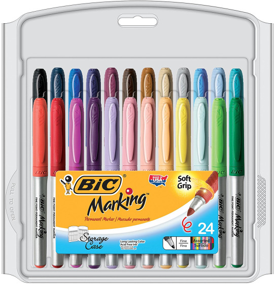
As for traditional, I used to do so much more often especially through out high school up until 2017 ish. I even used markers-- I LOVE MARKERS. I used copics, prismacolors. and markets. I kind of steered away from sharpies as they had a darker look to them and bled through paper so quickly/or ruined the outlines. Markets(BIC) are also cheaper and you can get a set of those (24 pack or there is a larger on too)! It’s been years since I used them for personal art outside of work. Markets have more colors that can pass as natural and certainly worked for coloring dogs! OLD Example of a combination of those markers:

Or you can simply just line your art! Micro line, I believe I have used. I also have used fiber castle and standard sharpie fine tip black works too. Old example below:

I couldn’t afford much for art growing up, but these always just worked for me!
for skin tones I used these!

Worth their price! they also have two different tip sizes and one feels/acts like a paint brush. I always loved it. Just be careful with the strokes.
Or if you don’t wanna use markers, color pencils are cool too. I used my friend’s set of these.

Always, I mean ALWAYS open a sketch book and feel it’s paper before buying. Some of the lower end stores sell them cheap yes, but the paper quality SUCKS. It’s hard to erase lines! They fall out of the sketch book(binding is poor) can rip and tear paper. Smearing the sketch lines...Over all suck. So I usually go for thicker textures. I liked these! I can not tell you how many stacks of sketch books I have from the past. I ALWAYS also take a small one with me on the go~

I hope this helps you out!
as for digital I use a wacom tablet I got for around 50...I use fire alpaca! I downloaded some extra brushes for better looks.
7 notes
·
View notes
Note
Sometimes I see your traditional art and cry cause mine looks like fucking dogshit (same goes for my digital tbh) what are some tips for an artist who just wants to suck alot less, in terms of both.
I don't think your art looks bad at all!! And it's important to know that even if you dislike it now, it means you're at the end or beginning of a learning step!
See, the way one learns is like this!: Start out, and you feel like it sucks. Not because what you're doing is bad, but because you're just starting out! The goal here is to push through, because once you hit the actual learning curve for a particular skill, you start to feel much better about your art! At the end of the curve, is another plateau where you feel bored with your work! And thats when you start learning another particular skill!!
On that note tho, please don't ever compare yourself to other artists! Everyone has a unique style and we're all growing togther! Have faith in your style and in your subject matter, and push forwards!!
As for technical skills and tips on improving, I'll put this under a cut!
[[MORE]]
So! In terms of improving, I have tips! The most obvious and commonly repeated ones, are draw from lif and draw a LOT. Practice doesnt make perfect, but it makes permanence, meanign the more you practice, the better that skill will be, because it'll start to come naturally to you! I won't count those two, because they're so common!
For digital work, I say stay away from a lot of effects, and try to focus more on using textured brushes to imitate a real life paint brush! Always take your values into consideration, and learn to use colors rather than blending tools as a crutch! this proko video explains it perfectly and is kinda cute and funny, so I'll let it do the talking!!
youtube
On the note of traditional, I think the most important thing is to find your niche! Find materials you like, change them up constantly, until you have what you might consider a fail-proof toolkit! For me, I like using small pens or fountain pens, watercolors, and gouache the most! I tend to dislike using pencils, and I hate using pastels or charcoals. Because of this, my toolkit consists of a gouache and watercolor palette, many pens in different colors, but only 2 pencils! But you'll never know what you dislike until you test it out, you know? Related to that, I don't think you should go out and buy all the expensive tools, but definitely don't get the cheapest one out there! If it's too "cheap," it will hinder your work and punish you, making you work harder for your result. And it makes you feel bad! But if the tools are too expensive, you might not like them and have blown a lot of money, or worry about wasting them and never use them at all!
For example, I use White Nights/Leningrad Watercolors! I like them because they're cheap but they do not hinder my work! They're juicy and vibrant! I have used Winsor and Newton cotman (for students) paints, which i hated, but ive also used Daniel Smith (arguably top of the line) paints, which I also hated! Art is all about finding your happy medium and making content that makes you happy!
Art is hard, but don't give up! And always be kind and forgiving to yourself as you work!
#I hope this helps! I like to make sure I'm being helpful and not just saying words#so lmk if this didnt help! or if it did! and feel free to ask questions!
2 notes
·
View notes
Text
7 Best Sketchbooks for Markers
In this article, we will be talking about the best sketchbooks for markers. So if you are looking for a great sketchpad for your drawings, you’ve come to the right place. Read along!
Just like other media, markers need special paper so that you can make the best use out of them. Markers dispense ink that your normal, regular paper can’t handle. When you use thin paper when drawing with a marker, you’ll notice how it bleeds on the other side and sometimes stain the next page.
Wet mediums like markers are demanding and fixing mistakes can be a bit harder. That’s why having the right type of paper to draw on is important to make sure that you don’t ruin your drawings.
Marker IssuesBleeding
The biggest issue about markers for artists is that the marker ink bleeds through the paper very easily. The alcohol-based marker ink is very thin making it dry up faster and it makes the marker lines blur and spread over the contours of a paper.
You’d think that using a thicker paper will solve this issue but the thing with thicker paper is it uses up more ink making your marker finish up faster. For this same reason is why papers for watercolor and acrylic are not ideal for markers.
Most artists have simply lived with the bleeding by only using one side of the paper sheets all the time then just putting something beneath it so that they won’t stain the next page.
Ink Feathering
This term is used when the ink leaks outside the area you’ve drawn the marker to. This can happen when too much ink is applied or if the paper is too textured. Ink feathering shouldn’t be a problem when you use smooth, high-quality paper.
What to Look for in Sketchbooks for MarkersPaper Texture and Finish
Most markers bleed through papers easily and this is an important factor to keep in mind when choosing your sketchbooks. If you want to highlight details, crisp lines, and sharp edges of your art, consider getting smooth papers. They are ideal for alcohol-based markers that can refine these features.
If you want your artwork to have that dramatic brush effects while keeping the vibrance of your colors, choose rough surface papers. Also, this type of paper is mostly bleed-resistant so you can use the other side of the paper.
Avoid highly absorbent paper. Those papers made for acrylic, gouache, and watercolor paints are not suitable for markers because those papers are manufactured to be absorbent.
Paperweight and Thickness
The weight and thickness of your sketchbook paper are other things to consider. Since you will be working with markers that dispense ink, you will need a paper that does not bleed through or smear. Therefore the high-quality heavyweight paper is the most ideal option.
Brands use GSM (grams per square meter) to determine the weight of paper. Your sketchbook will need to have at least 135 gsm for optimum paperweight and thickness.
Paper Quality and Color
Another factor to look out for is the paper quality and color. Check the label of the sketchbook and make sure it is acid-free. Acid-free papers prevent discoloration and fading. It preserves the color of your art over time.
Sketchbooks also come in various paper colors. The most commonly used are white, off-white, and ivory, but there are also sketchbooks that come in darker colors of tan, beige, and gray.
Sketchbook Size
This factor will depend on your personal preference. Are you the type to bring along your sketchbooks when you go out? Do you like heading out to draw landscapes and sceneries? If so, you will want a sketchbook that will easily fit into your bag. There are many different sizes of sketchbooks you can choose from and its portability highly depends on your activities and preferences.
Sketchbook Binding and Cover
A sketchbook’s cover and binding will determine its durability and longevity. Sketchbooks with spiral binding will allow you to flip the pages easily and lay them flat on the surface for easy sketching. This is the perforated type and you’ll want this option if you want to tear the sheets easily.
If you prefer to have your pages without perforations, the glue-bound sketchbooks will be your best pick. The downside for this type is that the binding is not very durable, however, you will be able to tear your sheets neatly.
As for the cover, if you want enhanced durability, go for hardbound sketchbooks.
Price
Lastly, you might also want to consider the prices of the available sketchbooks on the market. If you’ve not yet sure about your preferences, it’s better to try the cheaper sketchbook. Test it out and figure out what you like and don’t like about it before spending more on a more expensive sketchbook.
Best Sketchbook for Markers
Canson XL Series Marker Paper Pad
Canson is one of the most reputable and trusted companies for their quality papers for different mediums and that’s why this product is number one on our list. Right off the bat, you’ll immediately know which medium this pad is for and it is specifically designed for solvent-based and Copic markers.
This sketchpad provides you the ideal drawing surface to show off your rough sketches and artistic masterpieces. Aside from markers, this sketchbook is also great for ballpoint pens and pencils.
Its paper has the right weight that’s neither too light nor too thick and holds inks very well. The paper is smooth and is ideal for detailed strokes and crisp lines. The paper is slightly translucent and can be used as tracing paper to create straight lines and detailed sketch plans. What’s even greater is that even though it is transparent, the markers don’t bleed through the paper.
This sketchpad is glue-bound and the sheets are easy to remove.
Pros:
has 100 sheets
bleed and smudge-proof
smooth paper surface
Cons:
cover is flimsy
Buy on Amazon
Copic Markers SKBK9X12 Sketch Book
If you are looking for a specific sketchbook that will cater perfectly to your Copic markers, look no further because the same company also makes sketchbooks. And this pad is a hefty one. Not only is it bleed-proof, but its papers are also smooth and white that will let you work easily on your sketches.
This sketchbook has fifty 9×12 pages that will give you more than enough space to work on.
Pros:
Spiral-bound that lays perfectly flat
Very ideal for Copic Markers
The portable size that can fit easily in a backpack
Paper is smooth providing excellent blending
The cover is thick and durable
Cons:
there is some bleeding when blending some of the copic markers
Buy on Amazon
Crescent Creative Products 12-00011 Rendr Hardbound Sketchbook
This is one of the best sketchbooks for markers and is made with a special patented technology called the Rendr no-show tech that makes it not only bleed-proof but also makes sure that what you made in front is not visible on the other side. With this feature, you can use both sides of your paper without worrying that you’ll ruin the other side. Great, right?
This sketchbook is also hardbound and has a compact size of 8×11 inches which is very handy for you to take anywhere you go.
Pros:
Hardbound so it’s very durable
Compact and portable
Can be used with other media
Bleed-proof, smudge-proof, and has no show-thru tech
has 48 pages
the paper is smooth and thick (180 GSM)
Cons:
Does not lay flat
Expensive than other options
Buy on Amazon
Bee Paper Company Bleedproof Marker Pad
This brand, although not very popular yet, is known for its quality and affordability. This sketchpad is bleed-proof and acid-free, and the papers are smooth and thick allowing beautiful blending and layering. The paper is stark white which makes your drawings and illustrations pop out with color.
The sketchbook is 8.5×11 inches in dimension and you can choose between having 30 or 50 sheets. It is suitable for ballpoint pens, inks, and alcohol-based markers. The sketchbook’s binding is meant for easy sheet removal, too.
With its acid-free white paper and bleed-free design, this Bee Paper Company book is one of the best sketchbooks for markers.
Pros:
you can choose between 30- or 50-sheets
has a classic size that will allow you enough space for drawing and sketching
this sketchbook comes in different sizes
affordable than other brands
Cons:
some bleeding is noticed when using Copic markers
the binding is not very durable
Buy on Amazon
Strathmore 566-8 500 Series Hardbound Mixed Media Art Journal
Strathmore is a reputable brand that has been providing high-quality paper products for decades. This hardbound mixed media art journal has crisp white sheets that are 8.5×11 inches in dimension. This sketchbook is great not only for markers but also for other mixed media.
This journal has 32 sheets of thick white paper that is highly bleed-proof so you can use both sides of the paper.
Pros:
Hardbound and compact
Paper is pure cotton fiber, acid-free, and lignin-free
Cons:
might have bleeding when you layer on too many colors
Buy on Amazon
U.S. Art Supply Spiral Bound Sketchbook
This sketchbook is spiral-bound and is exquisite for your marker drawings. Its design makes it easy to flip and lay flat every time you sketch or draw.
The paper of this sketchbook is smooth and can hold markers without smudging and ink feathering. It is acid-free, which prevents the paper from discoloration and becoming brittle over time. It’s not only suitable for markers, but it’s also great for pens, pencils, charcoals, pastels, and more.
This sketchbook has durable hard cardboard back so you can draw with ease even when you don’t have a flat surface.
The size is portable as well, as it’s only 5.5×8.5 inches in dimension. You might think it’s too small but it’s really designed to be pocket-sized that will allow artists to take it with them wherever they go.
Pros:
Compact and portable
smooth and acid-free papers
has 100 pages
has sturdy cardboard back for support
Cons:
Pricey for its size
Buy on Amazon
Leda Art Supply Perfect Premium A5 SketchBook for Markers
This sketchbook is perfect to take with you when traveling. Its compact size is highly portable and it has a flexible waterproof cover. The sketchbook lays flat and it has an expandable pocket inside to keep extra papers, and it also has an elastic band to keep it closed.
This sketchbook is 8.25×5.55 inches in size and has 160 pages of 130GSM cream-colored paper. Papers in this sketchbook are smooth and perfect for markers without ink feathering on the pages.
Pros:
Compact and portable
has thick pages
can be used for mixed media
has a smooth writing surface
the cover provides great all-weather protection
Cons:
Copic markers may bleed through the paper
Buy on Amazon
FAQsWhat is a sketchbook for markers?
Just like the name suggests, it is a type of notebook made specifically for markers. The paper for this sketchbook provides a great workable surface for markers that will display your drawings, illustrations, sketches beautifully.
This type of sketchbook is ideal for markers. The paper’s characteristics such as weight, texture, finish, color, and thickness are made to cater to markers.
Why do you need sketchbooks for markers?
Markers dispense ink and regular thin papers can’t handle them. When you use a marker and draw on a regular piece of paper, it would result in bleeding, smearing, ink pooling, and feathering. This will make your artwork messy and unpleasant to the eyes.
If you are serious about making art with markers as your medium, it is highly recommended that you find the best sketchbooks for markers. With these sketchbooks, you won’t have to worry about bleeding and ruined artwork.
What are the most trusted marker sketchbook brands?
Some trusted sketchbook brands include Canson, Strathmore, Bee Paper Company, US Art Supply, and Leda Art.
How to use the sketchbook?
You use these sketchbooks just like how you use any regular sketchbooks. There are no rules or guidelines. You have all the freedom to use them as you want.
Where to buy it?
These sketchbooks are available on your local arts and crafts stores and they are also available on various shops online like Amazon and eBay.
We have linked the products mentioned above and these are affiliate links, which means when you buy through the links on our site, we may earn an affiliate commission to help us keep running this website.
So there you have it, we’ve gathered the best sketchbooks for markers to help you make your purchasing decision easier and more convenient. We’ve highlighted each sketchbook’s pros and cons so as to let you know what to expect when you do get them.
Overall, the choice will be entirely yours and will depend on your preferences and the techniques that you use.
Lastly, we hope this post has been helpful to you. As always, don’t forget to have fun and enjoy your art journey!
For more articles like this, make sure to visit our blog!
0 notes
Text
The Backstory
Throughout my life, there have always been two interests that stand out among the rest: animals and art. I’m pretty sure I’ve loved animals every single day of my life, and I’ve been drawing for as long as I could hold a pencil. As I grew, my preference in media changed from sketching to photography to sculpting to painting.
During summer before my senior year, I found myself short of the minimum community service hours required for graduation, and as fate would have it, my mother found an ad in the newspaper for teen volunteers for our local zoo’s summer program. And it was that volunteer experience that would end up shaping the rest of my life.
During that summer and the year to follow, I would end up logging nearly 500 hours at the zoo before leaving for college. During college, I studied both zoology and psychology and got my first paid position at another zoo as a camp counselor. Unfortunately, my college days would come to an end earlier than I anticipated when my health started to decline.
Upon returning to my hometown with two associates degrees in hand and no idea what I was going to do with my life, I began working as an assistant at a photography studio while also returning to my local zoo as an intern with the hopes of joining the staff someday. A couple years later, my dream came true. I got a job as a full time zoo educator at the zoo I had been visiting since my second birthday.
I adored every second of being a zoo educator, even the ones where I was at my wits ends with the kids or covered in animal feces. I eventually rose to the position of managing the department, but unfortunately, I learned the hard way that my INFP personality was not well-equipped with traits that would allow me to enjoy managing people instead of actually educating. With my health once again deteriorating rapidly, I made the impossible decision to leave my zoo after well over a decade of commitment to them.
Discovering Watercolors
As luck would have it, I found watercolors through the zoo as well. In those last few months I was working there, I was planning a craft for a new program when I came across these little watercolor animal silhouettes and very suddenly, it was like a flip switched in me. I was immediately drawn to the way that watercolors flow and the range of color, texture, and emotion they are able to evoke. I had to learn more about this medium.
So, one thing you might want to know about me is that I have a bit of an obsessive personality. When I latch on to something that I am passionate about, there’s really no turing back. I’m not great with anything technical and my chronic pain makes it difficult for me to remember important dates or what I ate for breakfast yesterday… but it’s been fourteen years since I first learned to handle an opossum and nearly three years since the last time I taught with one, but I could still talk your ear off about all their fascinating adaptions. The same thing happened to me when I found watercolors.
I had painted with oils and acrylics before, but I’m rather embarrassed to admit that I didn’t know professional watercolors were even a thing. For whatever reason, they weren’t a part of either of the only two art classes I was able to take in school and I hadn’t even seen a set of Crayolas for years.
But after that first spark of curiosity, I spent months researching the ins and outs of watercolor, what colors to chose for a palette, how different pigments reacted with each other… I read blogs and watched videos for hours on end, all to learn as much as I could and teach myself.
And to be entirely honest, after two and half years, I haven’t stopped.
Inspiration from Africa
It shouldn’t come to anyone’s surprise that I find my inspiration in wildlife. I have the utmost respect for our planet, and I feel it is our responsibility as a whole to take action and stand up against all the wrong humans have done and are currently doing to the millions of other species we share it with. As cliché as it might sound, I am inspired by a greater desire to help speak up for those who do not have voices, and I hope that my artwork serves as an extension of that passion in some small way.
My ultimate lifelong dream was to visit Africa and after years of saving, I finally took myself on that trip to Botswana and South Africa in 2013. Due to my work schedule, I had to travel during the off season which led to an incredibly interesting adventure in more ways than one. I was traveling by myself to another continent, and the company I booked with changed guides on me at the last minute to someone I had never spoken to and with whom I’d be alone with for the next week and a half. There was plenty of panic, anxiety, mishaps, and rain that trip, but I was standing in Africa and despite all the bad, nothing could compare to the comfort I felt from Africa herself. There aren’t words to express the absolute bliss I felt standing on African soil.
The experiences I shared there are enough to inspire me for a lifetime. I got to watch a small pride of young lions trying to stay cool under a tree in the hot Kalahari sun. One of which was playing gently with a butterfly like a house cat might. We came quite close, a little too close for comfort, to a herd of bull elephants along the road outside the Makgadikgadi Pans and watched them under a moody grey sky. I was privileged to have an incredibly rare opportunity to watch a couple of adolescent hyenas babysit two cubs while we heard the rest of the pack in the distance, presumably in a hunting party. And among many other experiences, I got to fall asleep to the roar of a rare subtropical storm filled with the beautiful chorus of frogs, insects, and birds as it poured down in Maun. It’s been over four years, but the memories are so vivid still that it brings tears to my eyes thinking about what a breathtaking experience the trip was.
Artistic Process
There’s no secret here. Regardless of medium, be it photography, painting, or sculpting, my love for animals inspires nearly every piece I create. Having been a photographer who loves to paint the same subjects that I photograph, I’m well-stocked (pun intended?) as far as references go. Whenever I’m stumped for a subject, I need only to open up my storage files and take a look for something that calls to me on that given day.
In connection with my desire to help spread conservational messages, I love featuring flagship species (beloved animals that help people to focus on a broader conservation effort) and some of the lesser known beauties in my artwork to help spread awareness. I have a very strong preference for painting animal portraits, and one of the comments I get most consistently in regards to my artwork, whether photography or painting, is that people feel very connected through the eyes of the animals I paint. This is perhaps the greatest compliment anyone could give me, and am still humbled each time I hear it.
Tools of the Trade
My first and greatest love in watercolor paints is Daniel Smith. When I first began researching color selections, I came across the wonderful Jane Blundell’s website and, paired with many other resources, began building my palette of Daniel Smith colors, which I used almost exclusively inside an 18-well Mijello Fusion palette for my first year of painting.
I will never be able to say for sure if those paints and that palette are only my favorites because they were my first real watercolor supplies or if they would have ended up there regardless, but I do adore them. My other favorite brands include M. Graham for their vivid pigmentation and eco-friendly business practices and Schmincke for their silky smooth texture and soft coloration.
As far as brushes go, I have several in my arsenal I happily use including a Princeton Elite Size 12, a Silver Black Velvet Size 10, an Escoda Versatil Size 8, the Princeton Neptune Size 4 Quill, and the very convenient Pentel Aquash Water Brushes. Arches 140lb Cold Pressed is my go-to watercolor paper, though also have been using some Strathmore 500 Series lately. I also recently took on the challenge of compiling and testing over 25 types of watercolor paper from different brands and there are some I’m quite eager to add to my collection as well.
Recently I’ve started enjoying other water-based mediums such as gouache and inks, but I owe them a lot more time before reporting any findings.
The Working Artist
A little over a year ago, I decided I wanted to put all of this silly, obsessively-compiled information to good use and started an educational YouTube channel. I primarily focus on product reviews, tutorials, and other geeky mini series like my Color Spotlight series where we focused on a different pigment each week for eight weeks. Last month I also had a ton of fun producing daily time lapse videos for World Watercolor Month!
My chronic pain unfortunately pushed my out of a career I never expected to have to leave. Coming to terms with that has been very difficult, but I have found a renewed joy in sharing both my passion for watercolors and my love for animals with my community. I am diligently working to spread my passion for both watercolors and animals while also making my artistry and educational materials responsible for my livelihood. Thanks to my amazing Patrons and those who support me through my online shops, I get a little closer to that goal every day.
I am very active within my YouTube and Patreon communities and love forging connections with other aspiring artists. I’d be thrilled to see you all around if you’d like to join us!
Thank you so much to Charlie for sharing my story and my artwork with all of you lovelies on Doodlewash. Happy Painting!
Denise Soden
Website
Etsy
YouTube
Patreon
Instagram
Facebook
Doodlewash Gallery
#WorldWatercolorGroup GUEST ARTIST: "In Liquid Color" by Denise Soden - #doodlewash #animals The Backstory Throughout my life, there have always been two interests that stand out among the rest: animals and art.
0 notes
Text
Eggtober 14th 2023
"Sticky": Tiger Skin Egg with Sauce.
(Clip Studio Paint, Gouache Brush, Gouache Blender, Airbrush tool. 10 colors, 45 minutes.)
Cripes, I almost forgot to post this one. Been a busy bee the last few days.
The first time I made this dish it was all going perfectly until it came time to caramelize the sauce. It goes from runny and thin to thick in what feels like 30 minutes and then from thick to CHARRED AND AWFUL in 0.5 seconds. I'm not a stranger to syrups and sugary sauces! Maybe it's the soy sauce that's dangerous because the color can't indicate early signs of caramelization that I can see? But I make brown sugar glazes for fruit all the time. And my standard stir fry sauce has soy, brown sugar, and gochujang in it, which are all dark, and I've never burnt those things.
Anyway, first time I made these was a disaster. The eggs were overcooked because the sauce took too long to thicken and then I burnt it so it tasted terribly perfumey.
But I remade the sauce by itself much more carefully later and it really is tasty! I just had an awful first attempt.
Speaking of which, I need to do a proper study of craggly, crackly fried things. I can get away with a lot here because the rendering is a bit stylized and it's a shiny sauced egg, but trying to replicate that almost-breaded looking fried exterior from my reference was hard. I think we've established I'm fairly effective at drawing smooth things with all my shiny eggies of late but I need to learn how to draw coarser, rougher textures. Maybe more pencil tool next time.
Anyway, here's the speedpaint and the shoutouts.
@lady-quen, Another gravity defying eggy for you to draw your precious brebbugs on. Take your time of course. The breadbugs need time to eat all the eggs they stole already!
Thanks as always to @quezify for all the inspiring fried eggy art.
Despite the unfamiliar textures being a challenge, it was fun. And of course I got to make it deliciously shiny. The speedpaint makes it all look so competent and deliberate and my ass is sitting here like "Past me has the competence of a god, or at least seems like it, but I know that bitch personally and I know for a fact there was internal screaming for part of it. "It's bumpy in the reference! There's texture there! But how do I do that? AUGH!" And then it turned out fine anyway, despite faffing around. Gotta get better at trusting my process and actually treating these as LEARNING experiences like last year. Self mantra of "It doesn't need to be perfect. It needs to be an egg. If it's hard, that mean's you're learning." Actively squash that little voice in my brain that doubts. Making art is about the making. The art is just a coincidence. It can be a product later if I decide so, but that's not the objective. The objective is to turn 1s and 0s and funny little lights on a funny little screen into things that look like eggs and manifest something that didn't exist anywhere before except my brain. No doubts, no stress. Only eggy. Plus at the end I can stare at past me making egg very fast like magic. I do like that part. Bless CSP for having a native timelapse capture feature. I just get to click a button and share with you all my magical process.
41 notes
·
View notes
Last Seen Blogs

georgepin53
The Journaling of Albertsen 704

yakureii
Kabuto’s professional scalpel cleaner 🩵

josecostas-blog
José Costa
zaanx
ZAAnX aka $teve Harvey from the Bottom of the Map

dr-delicatetouch9000
I just love my sons