#just completey ignore the fact that they’re gone
Note
Rank each of Snotlouts looks over the years, go! Also on a separate note, what is your opinion on his freckles in the first film and their tragic lack in any of his other designs?
OHH THIS SOUNDS SO FUN OKAY
#6: Dragon Armor
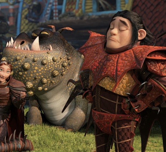
There’s just too much going on, honestly. I prefer his earlier color palettes to the with the greys and the greens and stuff to all of the bright reds and golds in the third movie. They fit better w Hooky and I feel like his third movie colors are much more suited to flashy loud characters, but I preferred the more understated colors that kinda contradicted him a bit better (that was a really long rant sorry lol)
#5: HTTYD 3 Design
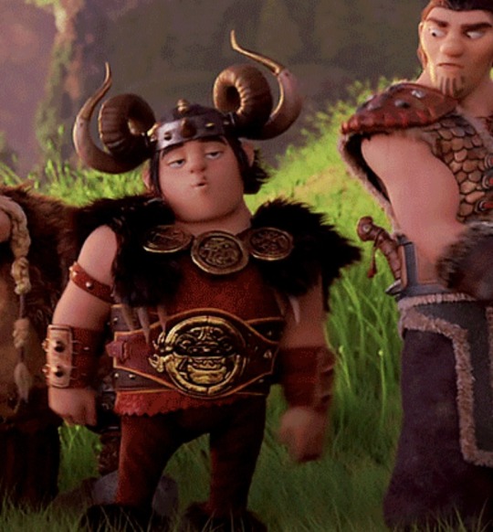
This is down here for the same reasons as the last one, but I do prefer the cut of the tunic/the horns on the helmet to the second movie design
#4: HTTYD 1 Design
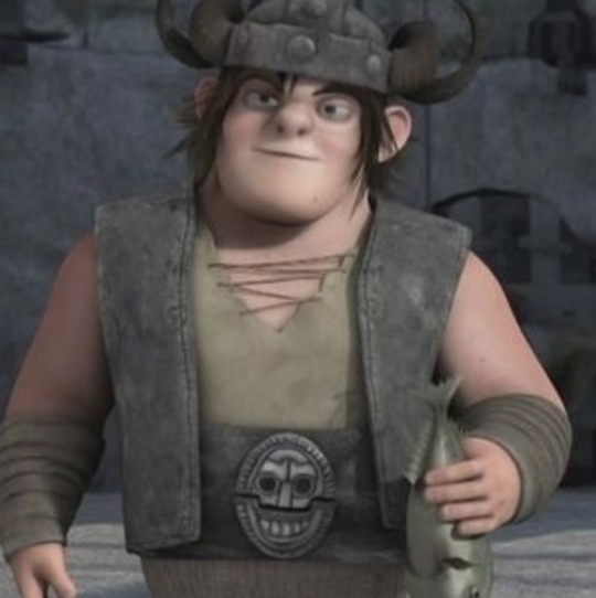
I really do love this design for him he’s so skrunkly and aadljhfankdafljnasfl
Like,,, look at him
#3: RTTE Design
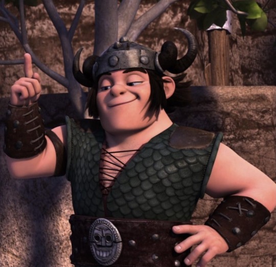
Love his RTTE design. It’s simple, but it’s honestly a pretty perfect look for Snotlout. I love the way the green looks w Hooky, the helmet is on point, he has the arm band, the boob window, the huge belt & belt buckle, it really has everything
#2: HTTYD 2 Design
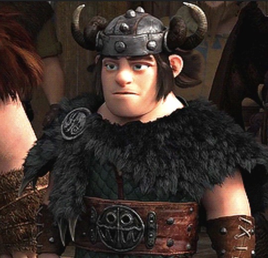
This design has pretty much everything that I love about the RTTE design, but I also really like the striped pants. The thing that really pushes it over the edge though is the bearskin cloak? Cape? I honestly don’t know that that is but dude I love it so much it elevates his entire design so much OMG
#1: Sir Ulgerthorpe
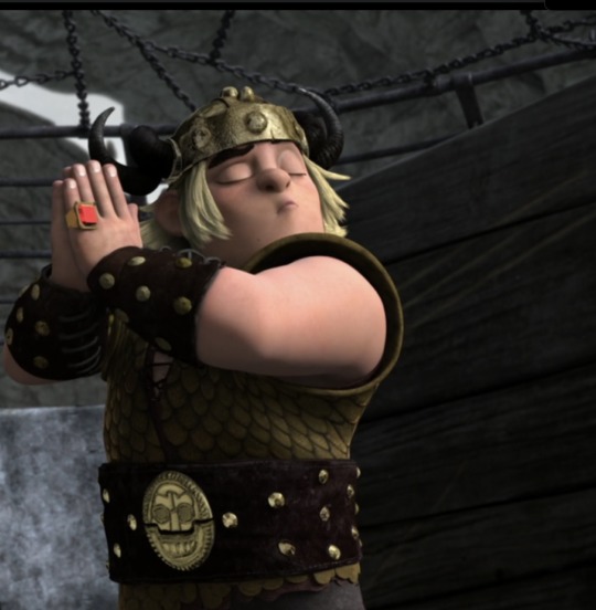
Obviously this is my favorite one. It’s iconic, flashy, it’s everything really. Sir Ulgerthorpe supremacy
(ALSO THE FRECKLE THING IS DEVASTATING WHAT A TERRIBLE LOSS ASJKHJHLFSDHJL)
#we should really just start including the freckles in fanart like they never disappeared#just completey ignore the fact that they’re gone#snotlout snotlout oi oi oi#snotlout#how to train your dragon#riders of berk#defenders of berk#race to the edge#how to train your dragon 2#how to train your dragon: the hidden world#httyd#rob#dob#rtte#httyd 2#httyd thw#thank you for the ask <3
165 notes
·
View notes