#like idk i just thought it'd be fun but maybe i didn't define the rules enough? there just kind of aren't any
Text
Hi guys!
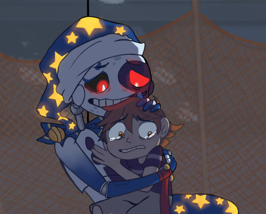
So, this is a while after the initial announcement, but I'm hosting a DTIYS Event for a drawing I made of a scene from chapter 3 of Visions, and I thought I'd post it here so it could reach more folks! It didn't seem necessary to make it into a competition, because it didn't feel right to involve a prize or anything, but I'm open to suggestions if anyone else has ever hosted a DTIYS? It's voluntary of course, I'm just not sure what the standards are for these or how to encourage interaction. BUT I'll attach both the discord announcement and the original image so anyone who'd like to draw it can download it as a reference. You can post drawings in my discord (there's a channel for it) or on here and tag me!
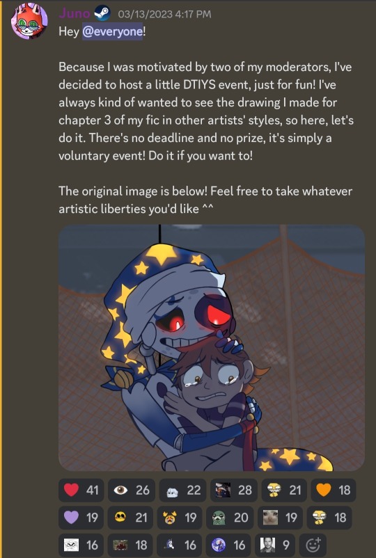
(original image below cut)
#like idk i just thought it'd be fun but maybe i didn't define the rules enough? there just kind of aren't any#but ._.#visions or lack thereof#dtiys#visions dtiys#PLEASE outshine me btw i wanna see what you all can do!!!!!
144 notes
·
View notes
Text
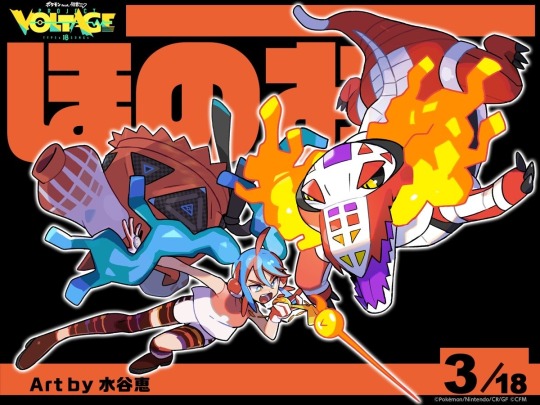
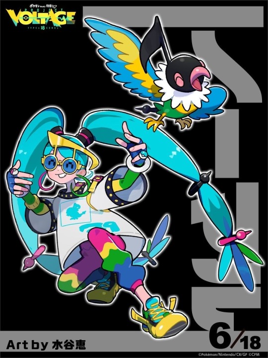
now that we have all 18 i'm posting my personal project voltage ranking :]
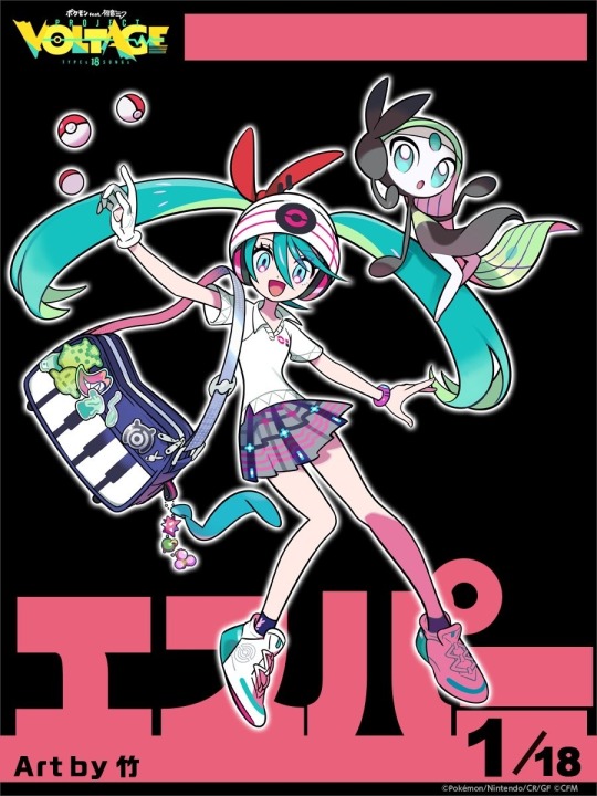
PSYCHIC TYPE MIKU - 4/10 it's fine. its the closest to base miku of all the designs? like this is what i'd imagine if we got a miku collab in the newest games. nothing about ti really says psychic type to me though, which is why its low
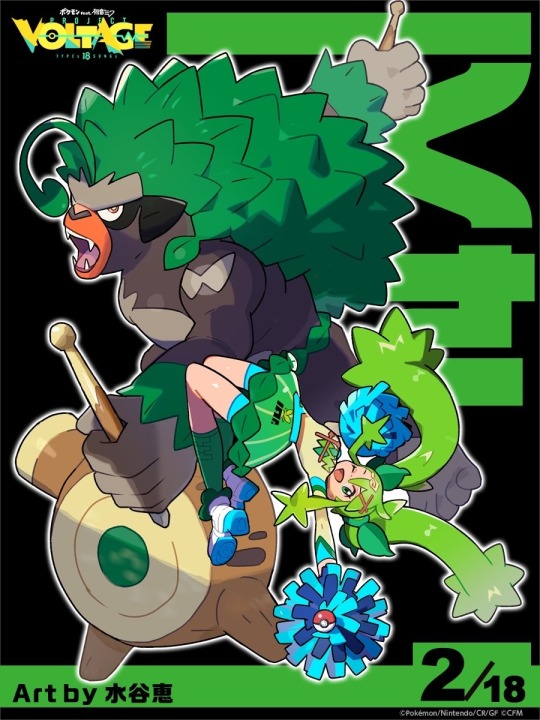
GRASS TYPE MIKU - 2/10 i hate this design. not only is it boring but i don't like the colours, i think it looks messy and it might be the style disconnect or the design itself but if you didn't tell me who this was i wouldn't think it was miku. a grass type cheerleader doesn't sound like a bad shout which is why im so sad it sucks
FIRE TYPE MIKU - 5/10 . its just basic. it gets one point more than psychic because i have fire type bias but other than that its underwhelming. idk whats going on with her legs either? is it like exposed robotics? idk its just a miss for me
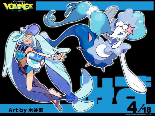
WATER TYPE MIKU - 8/10 this is so cute. the water textured hair, the tan lines, the like lifeguard gear(?) and the pokeball beach ball? it all comes together so well. i don';t think you can really go wrong with a water type design? even if i don't love water types myself you can't deny their designs just come together
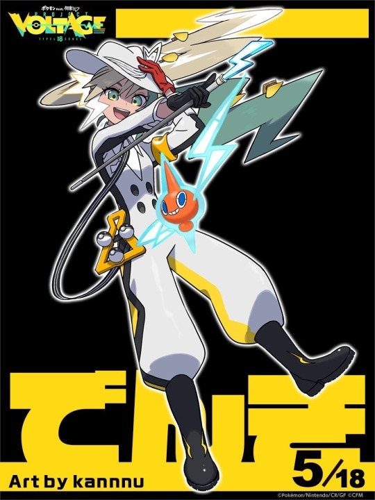
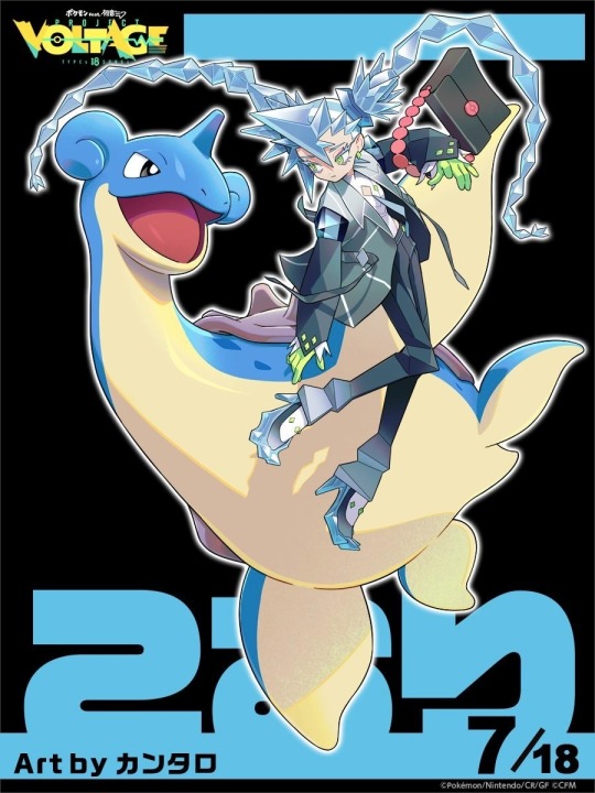
ELECTRIC TYPE MIKU - 10/10 oh baby girl my BIAS i fucking love electric miku. shifting her blue accents into green, giving her a suit and making her a split-dye blonde were all such good decisions. i love the silhouette of the big puff pants tucked into the rubber boots and the suspenders with the lightening cane. everything about this makes me so happy
NORMAL TYPE MIKU - 9/10 i might be going back on what i said with psychic miku but to me even though it's very reminicant of base miku, it works better AND does enough to set her in her own typing. the multicoloured accessories, the rings, the glasses and the body suit. if we ever did get a real collab of her in game i hope this is the direction they'd go
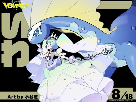
ICE TYPE MIKU - 8/10 full disclaimer so much of this is just because im obsessed with her hair and suit combo. shes not outright evil looking like dark type but i still feel like shes a rival with a lot of power, anbd tbf a lot of ice type characters are made to be Icy in personality. my only gripes are the red bag chain and the open heels
ROCK TYPE MIKU - 6/10 its fine! it might be because i dont like the colour scheme or that i'm not a huge fan of all the flowy fabric, (especially because it directly follows ice type miku which made a point to utalise the sharpness you'd associate with ice) but i just doesn't wow me.

GROUND TYPE MIKU - 7/10 i really love this design, i adore the colour scheme and the cactus braids, i think she looks like a trainer you'd be ambushed by in the desert and the soundtrack would kick up and it'd RULE... my drawback is i don't think she looks like miku? i thought she was gumi at first and now i can't really unsee it. but eh im nitpicking
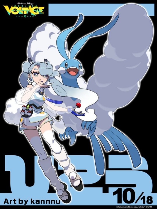
FLYING TYPE MIKU - 5/10 again, i like it but its very standard for a flying type character. the cloud braids and the sheer sleeves are fun! they're definately my favouritre part of the design. idk why her legs are painted white, i think they look kind of silly and im confused about the platform sandles but other than that its fine

FAIRY TYPE MIKU - 6/10 a cute miku design for a cute pokemon type, can't really go wrong with that. i enjoy that they didn't go lolita style with her, which i fully assumed was going to the case, but instead a gal type with the fake nails and pleat skirt. i enjoy that its a different way of doing a look for miku we've seen plenty of times before
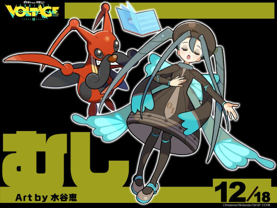
BUG TYPE MIKU - 6/10 i don't hate it! very simple but very effective. i like the segmented limbs, the insectoid braids, the wing bow that looks like butterfly wings. i'm just not super enthusiastic about the colours. maybe i'm just used to bug types being Creepier in my head so to just have her be cutesy is boring to me
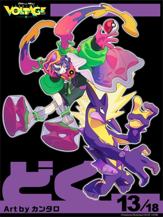
POISON TYPE MIKU - 9/10 this is such a baity designnnn the only reason i didnt give it a 10 is because i hate that shade of green but thats a personal issue. the plastic baggy shoes, the toxtricity, the mad scientist goggles and latex gloves... it all comes together so beautifully. idk if its like too busy or again, maybe i just personally don't love the individual colours used. i really hope elements of this design are used for a future character

GHOST TYPE MIKU - 4/10 i honestly don't like this design. yeah lets make the ghost type miku... a ghost, and nothing else. i think it's really boring compared to all the other ones. the glitch element is really cool but that's... all thats going for it? the colour scheme is the same, the neon is boring and i think everything is very stylish for pokemon but idk i wish it was more unique
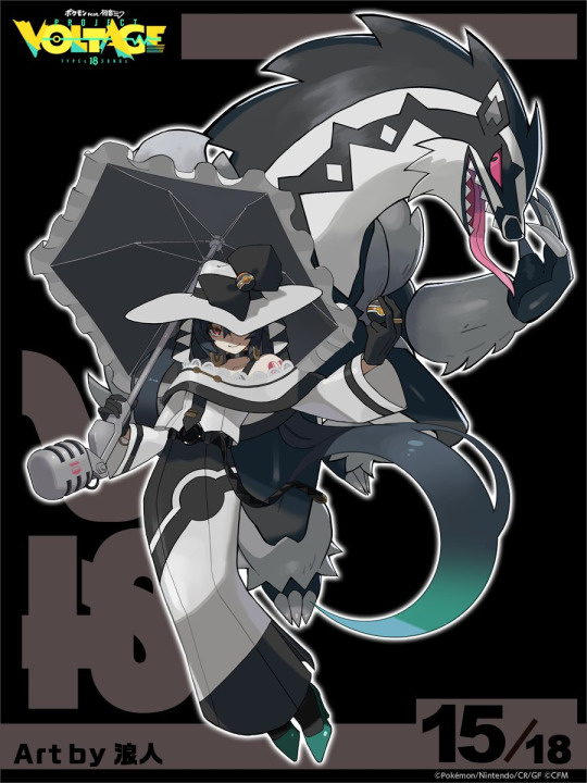
DARK TYPE MIKU - 10/10 babe holy shit. this is a gorgeous design, i'm so happy they went an evil miku route with it. i was going to say i wish there was more red, and then i noticed the underside of the hat in the other concept so i'm happy. shifting the cyan to the bottom of the design is a really good call. she looks expensive as she should
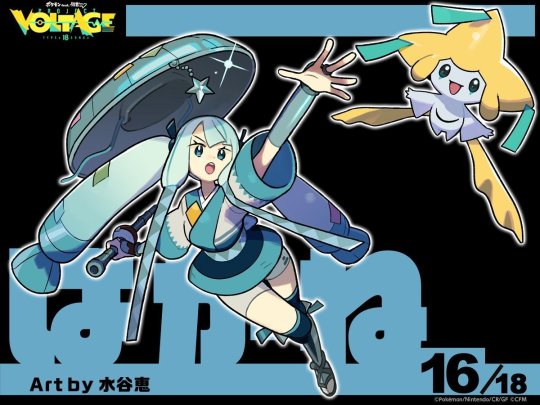
STEEL TYPE MIKU - 10/10 absolutely beautiful colour scheme, shifting everything to metalic shades of blue is perfect. i think it's my favourite overall. very strong typing without them just doing Robot which i assumed. LOVE the metal braids with the welded patches the most, and i jsut noticed theyre kind of shaped like leeks. the charm on the sandogasa and the arm/calf guards really bring it all together
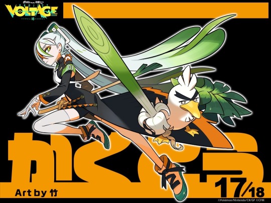
FIGHTING TYPE MIKU - 8/10 the black, white and orange is gorgeous and i love the splash of green connecting to sir farfetched. i'm just not inlove with the leg split tbh, i think if it was a cape i'd like it more. i think my main drawback is idk it doesn't scream fighting type to me other than it being based on the pokemon
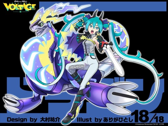
DRAGON TYPE MIKU - 9/10 AND IMMEDIATELY MY PRAYERS WERE ANSWERED. the cape really completes the knight motif of this design perfectly where i think the previous one lacked. the scale decor jumpsuit, the gauntlets and boots, the SWORD MIC and the tail braids. they really did keep getting better and whilst this isnt my favourite its such a strong finisher
11 notes
·
View notes
Last Seen Blogs

whosagodnow
tumblrisnotagod

victeux
for better, for worse

massivenutblog
Без названия
ballplayer22
Softball Fanatic

imightstartriot
don't mind me