#might've gone a little too hard on the saturation on this one
Text
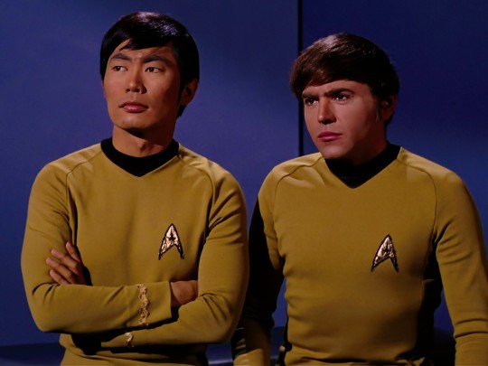
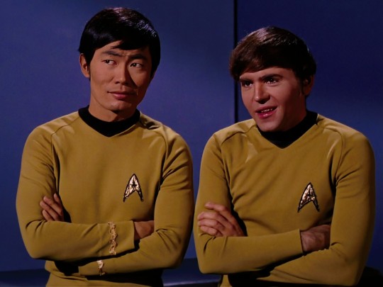
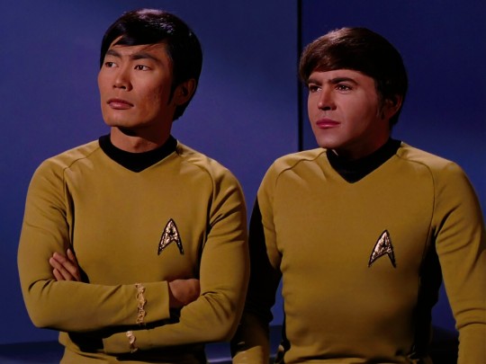
S3E24: Turnabout Intruder ⋆.˚ ✧ · ˚⊹ ·
#star trek#star trek tos#star trek the original series#chekov#sulu#chulu#george takei#walter koenig#1960s#sci fi#science fiction#screencaps#my edit#might've gone a little too hard on the saturation on this one#but i <3 colors#pretty boys#hikaru sulu#pavel chekov
168 notes
·
View notes
Note
DOG! JUST TALK ABOUT A DOG POKÉMON! ANY DOG POKÉMON!/j (aka I’ve just now realized you’ve also talked about Fidough)
(I'm going to do the Electrike line solely because it's one of the few dog (not wolf or hyena) Pokemon I haven't reviewed)

Electrike is an odd little thing. The head is really strange in particular, with lobed three segments (I guess two of them are ears, though they definitely don't look like it). Green is also an usual color for an electric-type, which, points for doing something different, but I'm not sure why they felt the need to change it instead of just using the blue from Manectric. Hell, the shiny actually does already anyway:

It also feels a bit vague and hard to grasp conceptually. The thunderbolt across the eye and spikes along the tail kind of convey electricity, but I don't know what they're going for beyond that. Supposedly it's based off of the raijū, a blue wolf (more obvious in its evo) with yellow electricity, but it doesn't look like one much beyond that.
I think it might've made more sense to make it blue, remove that half stripe from the back (or continue it down into the tail, I don't care, just don't have it end partway down the back), and maybe raise the middle lobe up so the ears and lobe form a vague lightning-bolt shape that would be mimicked by the yellow streak. That might at least help it convey something a big more clearly. As is, I kind of like it for how odd it is, but it's hard to remember it exists at times.

On the one hand, Manectric at least makes the raijū thing a bit clearer... but on the other hand, the awkwardness is unfortunately increased by a lot. None of these elements really go together; you have the super straight head point with the yellow stopping at the neck in weird shapes, the random fur on the front paws and only the front paws that also has no defined shape and leaves a weird blue band on the toes, the spikes on the haunches, which go in a different direction than the ones on the head, and the tail, which goes in a different direction than either of those two.
There's also just one or two more questionable things in there as well; for example, the random hole in the side of the head (is that supposed to be an ear?? that's not how dog ears work) and the incredibly small hind body with a completely messed up haunch (mentally make the yellow bits blue and remove the spikes and you'll get what I mean).
I think that if all the elements—head, haunches, and tail—pointed backwards, if you removed the chest fur and yellow fur on the front, and if you made the yellow accents flow more naturally, there could be an interesting design here.

Thankfully, the mega helps a lot here. Don't get me wrong, it's goofy looking as hell, but... well, so was Manectric, and at least this design gives a clear visual to latch on to, a clearer indication of typing, and a much more streamlined design with sense of flow.
Visually, the yellow bits are now all focused on the lightning-bolt back (and the front legs; still not fond of that, but they probably felt obligated to keep them seeing as they were on the original design). The colors are also more saturated. Everything flows backward, reducing some of the awkwardness of the original design, and the whole thing now has a sense of movement instead of being stiff. It reminds me a bit of a aardwolf, though I doubt that was intentional:

I do think that the back lightning bolt is too large and could've stood to be about 20% smaller; the red nails also distract from the eye. Here's a sloppy five-minute edit to show what I mean (original on left; ignore the weird looking ear placement on the edit):


While I didn't edit it, I also think the middle segment shouldn't have gone down past the body, instead ending at the same spot the thrid does, and the ear should be folded back to match the same diagonals as the lightning bolt. However, the mega is still a substantial improvement over the original design overall.
I really wish that the mega had been its own evolution. Many mega designs look too similar to the originals to work as evolutions; but in this case, the design has been altered so radically as to basically be its own thing. All you'd need to do is change the colors (as Electrike has a different color, and the line would be uneven if it was one green and two blue); maybe white with blue lightning to reference the raijū thing. It's not like there was any reason it shouldn't evolve, after all.
So overall, kind of an awkward line with a massively improved mega that unfortunately isn't around any more. Ain't that just the way.
45 notes
·
View notes
Last Seen Blogs

wintercosmonaut
The Winter Cosmonaut

cinnas-cookie-pals
Cinna’s Cookie Pals
crimsoncityhq
we made this town a canvas

amongstskinwalkers-blog
A Teenager's Photography

manpreetenterprises
Manpreet Enterprises