#myriamdraws
Text
#2022SpotifyWrapped

It’s one of the most waited appointment of the year, and also this year Spotify released it’s #2022SpotifyWrapped, which is a global marketing campaign that, since 2016, allows users to visualize their “Year In Music” on Spotify Platform.
The first time @spotify thought of making a leap into the past to its users was back in 2013, when the marketing ideated a webpage called “Year In Review”.
However, the #SpotifyWrapped creates both a sense of community and belonging and a sense of sharing, comparison and competition analyzing the data visualization of each platform user, giving the results with a winning and pop graphic.
Spotify’s design director Bruno Borges, Spotify’s global head of design and their team worked on a user-centric campaign from months ago to have a final outcome of the data visualization that seems simple and easy.

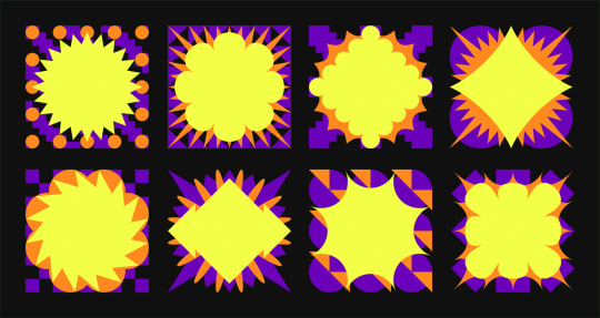
Monograms, which are the real heart of the campaign of this year, was designed within a 16-by-16 grid to make them feel cohesive, even though they each incorporate distinct layer combinations. The goal the team was looking forward to achieve was to work everywhere in the world and in every size, so they studied shapes and to make a visual reference to the diversity and variety in people’s listening habits. This allowed them to arrive to 48 combinations of shapes and colors to make original articulations so that none would feel the same, even if coming from the same place.
Central in this year wrapped was the motion design as well. The goal the team wanted to achieve was to make the designs dynamic and full of life, so they worked together with the New York-based production studio Hornet. Each monogram has so a personality and a behavior different from one another, telling that we’re all unique and special.
Once the identity was build and tested countless times, the creative toolkit was spread around Spotify’s global teams agencies, and only when the ideas for billboards around the world are perfect it comes the fun part of the campaign: seeing it go live.
The graphics used for the #SpotifyWrapped, so captivating, contemporary and pop, are so visually impactful that they are even used by other online communities to convey their messages. This does nothing but increase the popularity of Spotify and, especially, of the long-awaited Wrapped.
The power of Spotify Wrapped is so big that even other important music streaming platforms started to create their “wrapped”: Apple Music called it “Replay”, and the graphics are simple and minimal as the brand is.
Useful links:
How Spotify’s Wrapped campaign for 2022 came together
Marketing Espresso: Spotify Wrapped
Lorenzo Ferrari thanks about Spotify Wrapped 2022
will_ita: Spotify Wrapped used to convey a message
Federazione Italiana Nuoto: 2022 “playlist”
Cose Brutte Impaginate Belle: “Uncomfortbleness Wrapped”
If this article was useful, stay updated by following me on Instagram, on Facebook, and on LinkedIn! And, have a look to my portfolio too!
Are you curious to see my “Spotify Magazine”? Here it is! I’ve only listened 6,821 minutes on Spotify, but it still 65% more than other listeners in Italy.

I’ve also listened 1,412 minutes of music on Apple Music, and this is my Music Replay:

#2022SpotifyWrapped#SpotifyWrapped#Spotify#music streaming#podcast streaming#radio Spotify#katnisshawkeye#myriamystery#lumixrì#myriamworld#myriamworlds#graphic designer#graphic design#motion graphics#motion design#Myriam Sirotto#Rì Sir8#myriamdesign#myriamdesigns#myriamdraws#myriamdrawings#myriamdrawing#myriamdraw#myriamphotos#myriamphotography#Imagine Dragons#Ed Sheeran#The Dubliners#Avril Lavigne#Sabrina Carpenter
2 notes
·
View notes
Photo

Darla fan art 16
Courtesy of myriam (@myriamdraws, Twitter).
#shazam#shazam movie#shazam film#shazam fan art#darla fan art#faithe herman#zachary levi#fan art#darla dudley#tea party#movie fan art#film fan art#shazam fam#shazam family#shazamily#siblings#foster siblings#fiblings#fiblings (foster siblings)
6 notes
·
View notes
Text
Instagram’s Brand Updates
First of all, what is a brand?
“Product are made in the factory, but brands are created in the mind.”
— Walter Landon
The brand is an experience characterized by emotional meanings, and it’s all the all the perceived and the shared in relational terms between the main actors of the firm and the target market.
The brand carries meanings, not products or services, and is one of the reasons why the good marketing is not based on the prices battle, but on a questions of perceptions.
The brand is a promise of a big idea, but is also the reputation of the company, and that’s the reason a good brand needs both a police and strategy.
Only in the end, a brand is all the logo, the slogan and the color palette. This is what it’s called brand design, and it’s all the visual and tonal way it’s communicated the value proposition.
Then... Instagram’s Brand!
Instagram updated their brand to celebrate the Instagram community of creators, updating it’s brand design.

Introducing the Instagram Sans global typeface, Instagram is now able to express a range of styles in any languanges through a contemporary remix of grotesque and geometric styles. It also wants to express friendship and humanity.

Updating the gradient, based on a vibrant 5-colors palette (yellow #FFD600, orange #FF7A00, pink #FF0069, fuchsia #D300C5 and purple #7638FA), helps the intent of pushing the culture forward, create because it’s possible, feature creators, define people and launch shops.

The new layout, more flexible and adaptable, empoweres the community to explore and create on the app, helping people to create dynamics layouts to invite experimentation.
It might be useful to deep:
Instagram Brand
“Brand strategy for designers”, Stegan Murray
“Branding for designers”, Sean Adams
“Personal branding on social media”, Jennifer W. Jessie
If this article was useful, stay updated by following me on Instagram and on Facebook!
#branding#brand strategy#brand design#Instagram branding#Instagram visuals#Instagram visual updates#Visual Design#myriamystery#myriamagic#myriamworlds#myriamdesign#myriamphotography#myriamdrawing#myriamillustration#myriamgraphics#Rì Sir8#Myriam Sirotto#katnisshawkeye#Instagram#small artist support#small business support
3 notes
·
View notes
Text
Drawing makes better Designers
Drawing with pencil on paper helps everyone to open their mind and to put into shapes what they see in the world.
A graphic designer is not an artist, and illustration might not be in hir chords, but hir need to practice hir drawing skills day per day to explore the world as well.
So, the first phase of this work was just taking a week to sketch down seven different animals.
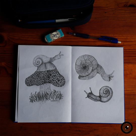


Then, I chose one of the animals I studied, and I created a logo. This second phase of the projects helped me to summarize a complex figure in a simple non-trivial one, and I made some sketches on what my hypotetical logo might look like.
A good logo design, in fact, is not characterized by its complexity, but by its simplicity, capable to be immediately recognizable.

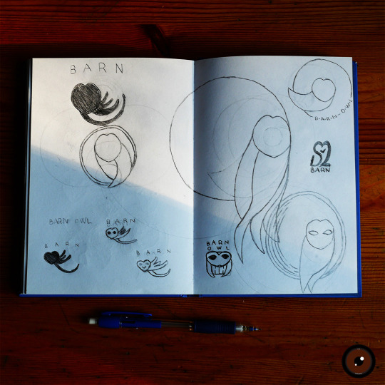
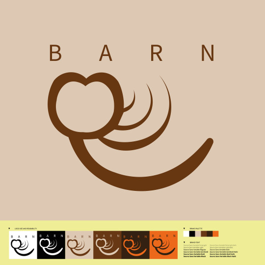
Finally, I studied how to make the logo, and the ways the logo must appear.
#katnisshawkeye#Rì Sir8#Myriam Sirotto#myriamystery#myriamagic#myriamworlds#myriamdesign#myriamdrawing#myriamillustration#myriamphotography#lumixrì#graphic design#logo design#illustration#daily drawings#drawing every day#always drawing#mind open#eyes wide open#world in shapes
2 notes
·
View notes
Last Seen Blogs

teflontavalol
Tef(lon)

dmt-1905-blog
demet🌸

bethkerschen
Photo-Illustrator

d-dl3rr
Amongst The Stars
unreadblogposts
The Dump