#no image id / alt text because I don't know how to describe the symbols
Text
cenelian4cenelian | turian4turian/veldian4veldian | lesbian4lesbian
cenelian4cenelian : a cenelian person who prioritises or prefers relationships with other cenelian people. Can also be used to describe a relationship between two or more cenelian people.
turian4turian / veldian4veldian : a turian/veldian person who prioritises or prefers relationships with other turian/veldian people. Can also be used to describe a relationship between two or more turian/veldian people.
lesbian4lesbian : a lesbian person who prioritises or prefers relationships with other lesbian people. Can also be used to describe a relationship between two or more lesbian people.
(Alt flags and symbols at the end of the post.)
(Also thanks to @julietianboy for the image ids (link).)
──────────✦──────────
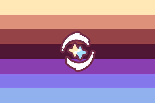
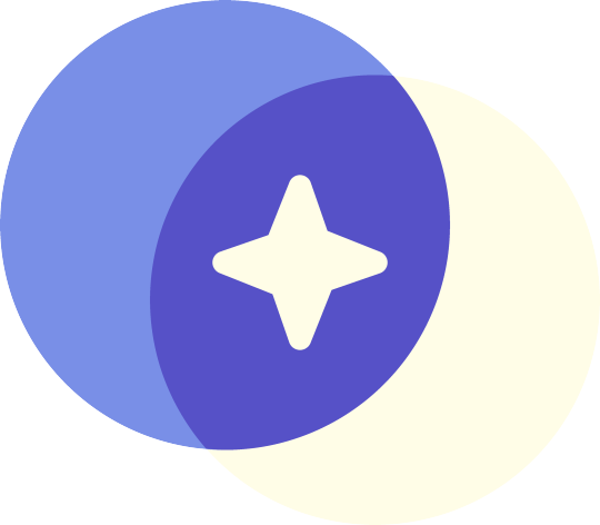
I saw this pretty bi4bi flag, and didn't find any cenelian4cenelian and turian4turian flags, so I made some :3
(I did find a couple of lesbian4lesbian flags, but I wanted to make a alt one in the same style as the others.)
──────────✦──────────
The designs for all these, like mentioned, are inspired by this bi4bi flag.
The stripe colours just come from these cenelian, wintergreen turian, and aurora lesbian flags. I added extra colours so they'd have 7 stripes, and adjusted the colours to be brighter. (There's not really any reason for this, I just went with what felt fitting / looked nice with these flags.)
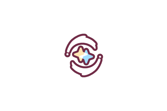
The symbols are also kind of inspired by the bi4bi flag. I liked the idea of overlapping symbols in the middle (which is also kind of like the overlapping gender symbols commonly used). I just chose suns for turian, moons for lesbian, and stars for cenelian. And I think the overlapping connects to the "4" and relationship part of the terms well.
Since turian and lesbian can include nonbinary people, I added stars in the middle of the suns and moons for nonbinary (people who wish to be included under those orientations).
The cenelian4cenelian symbol is a bit different. When I think of two stars, my first thought is having two stars rotate around each other, but that doesn't really match / make sense with the overlapping symbol style of the other two, so the final design here is a combo of both of those ideas.
I kind of just went with a more artsy style for these flags. The stripes don't have any specific meanings, and the symbols I picked based on nebulous "this seems fitting and nice" ideas, so not my usual flag style I guess. That's also why I didn't include plain stripe versions, since these flags really rely on the symbols to make some sort of sense / be distinct.
──────────✦──────────
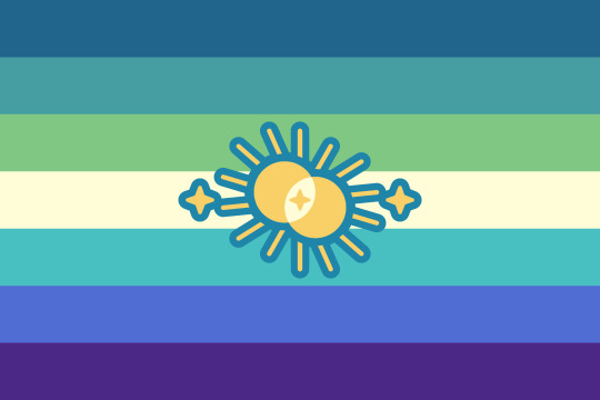

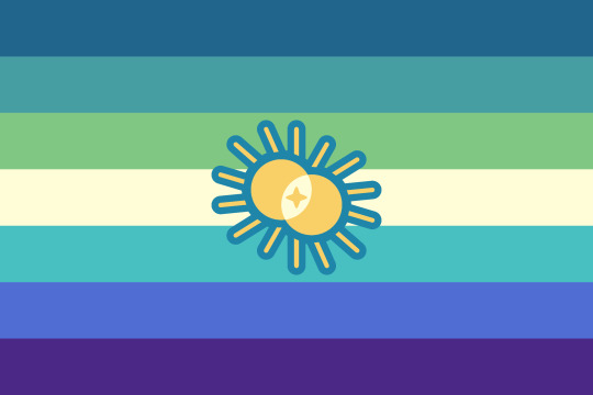
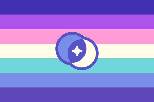
turian4turian/veldian4veldian | lesbian4lesbian
While making these flags, I came up with two designs, one with sparkles on the outside, and on in the middle. Having the sparkles on the inside makes more sense, but I like both sparkle designs, so here's alt versions that use sparkles in the middle and on the outside. Extra sparkly versions haha.


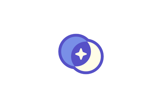
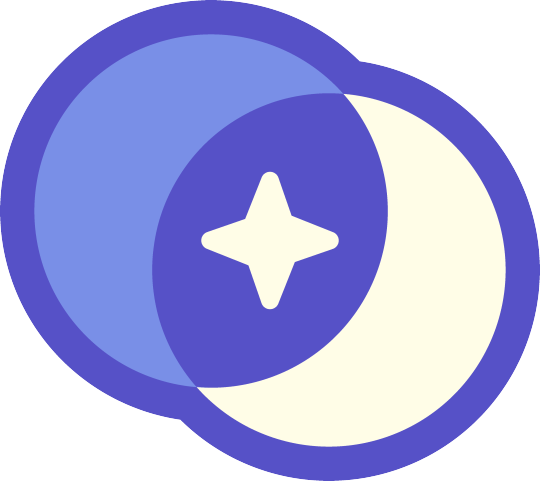
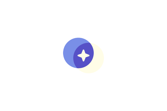
Here are the transparent cenelian4cenelian, turian4turian/veldian4veldian, and lesbian4lesbian symbols if anyone wants them.
I included outline and no outline versions, plus versions with transparent space around them. The transparent space ones are made so that you can overlay them on a 2000x3000px flag and they will be centred, same as on my flag.
#cenelian4cenelian#cenelian#turian4turian#turian#veldian4veldian#veldian#lesbian4lesbian#lesbian#pride flag#new flag#alt flag#no image id / alt text because I don't know how to describe the symbols#and I also just feel too overwhelmed to try to write a image id for all of these#edit: added image ids / alt text thanks to julietianboy
57 notes
·
View notes
Text
Hello, TOH fandom, I am here once again to talk about accessibility!
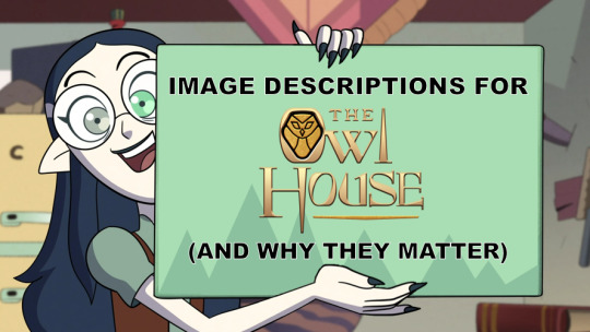
[Image description: a screenshot of Lilith Clawthorne excitedly holding up a sign, which has been edited to read: "Image Descriptions for The Owl House (and why they matter)" in all caps. End description.]
Image descriptions, like the one I just used above, are exactly what it says on the tin: descriptions of the content of an image included to make the image maximally accessible.
Blind and low-vision people who use screen readers, people who rely on increased font size in-app or in-browser to read text, and neurodivergent people who have trouble interpreting elements of an image (for example, expression) all benefit from image descriptions.
And all images on the internet should be accessible regardless of topic, of course, but I've recently been trying to spread awareness in the context of The Owl House specifically because it's a show with multiple disabled and/or neurodivergent characters! In fact, Principal Bump is canonically low-vision with a service animal to help him in that regard — and I'd argue that making content about disabled characters accessible is extra, extra important!

[Image description: a screenshot of Principal Bump with his palisman Frewin removed from his head, revealing the scars over Bump's eyes. Frewin is in staff form, smiling, and Eda looks on from the side. End description.]
I know it's within this fandom's ability to make our posts about the finale as accessible as possible — and I know that because I've already seen a decent increase in described posts over the course of Season 3! I've seen more artist-described posts especially, which means a lot to me, and even more to a lot of other people, too <3
So, on that note, how to write an image description? It may seem intimidating, especially if describing someone else's post or fanart, but honestly, there's no definitive "rubric" to follow, just a list of general guidelines:
Indicate where the description starts and ends, with "end description" or "end ID".
Place the description immediately under the image, not under a read-more (this allows people who rely on IDs to experience the post the same way anyone else would, whereas read-mores are inconvenient, especially if OP changes their URL)
Minimize caps lock, italics, bold, and strikethrough, which can be hard to read and/or troublesome for screen readers. Generally, it's just best to transcribe in lowercase without particular effects, then indicate in the transcription if something is emphasized.
Likewise, don't put descriptions in Tumblr's special small text. It's difficult to read and inaccessible to many.
Don't make jokes or add commentary in IDs. If an image is meant to be humorous, obviously it's fine to phrase things in a way that tries to capture that, but it's not the place to add your own jokes, nor is it the place to declare subjective qualities like "this art is beautiful".
Descriptions can vary in length, but if one is getting long (if you're describing a comic, for example), then be sure to break it up with paragraph breaks.
Specifically, while I've heard that too many breaks (ie, every sentence) are annoying for some screen readers, long walls of text are conversely difficult for people with visual processing problems to parse. So, it's good to strike a balance.
With regards to length and amount of detail, it varies by personal preference! Most images don't need a whole small essay, but there's also value in describing certain small and symbolic details, subjective as it is.
Speaking of which, if you're the original artist, then you are automatically the expert on what you wanted the image to convey — the nuances of expression and body language, which details are important and which details are not — and for that reason, I love seeing artist-described works!
Below the cut: more on describing Owl House images specifically, on IDs versus alt text, and other possible questions!
When I transcribe TOH related posts, there's a few other guidelines I use, though these rules aren't as immediately important as the ones above. I generally start by indicating the type of image we're dealing with (a screenshot? fanart? a photo of a cosplay?), then mention what characters are depicted.
Unless I'm describing something long, like a comic, and relying on summarization, I usually mention which character designs we're dealing with (is Lilith in her dramatic black dress from Season 1? or is she in her low-battery shirt?). If it's fanart and the artist has come up with original outfits to put the characters in, I'll summarize those too.
(This is the other reason I love seeing artist-described works: because I, personally, am just kinda bad at describing fashion lol.)
Now, I'd like to go over some other questions that I've either encountered before, or anticipate:
What about alt text? Doesn't that accomplish the same purpose as image descriptions?
In a lot of senses, yes, so alt text is certainly much, much better than no description! However, remember that not every person relying on descriptions is necessarily someone who uses a screen reader every day, or uses a screen reader period. Some people do in fact read the descriptions themselves.

[Image description, identical to alt text: a screenshot of Luz Noceda from Season 2, smiling and blushing. End description.]
As you can see above, alt text takes an extra click (or tap) to access. In general, it's also prone to displaying walls of text, and — as far as I know — sometimes just doesn't show up if the Tumblr app isn't updated enough. (Not to mention that, in my opinion, making image descriptions visible to people who don't use them is an important part of spreading accessibility awareness in the first place!)
On the other hand, I've heard some people who benefit from descriptions say they actually prefer alt text, so I'm not going to come out and take a hard "absolutely no alt text ever under any circumstances" stance by any means. But, long story short, this is the reason that in my own posts, I almost always defer to in-post descriptions — the only exception might be if I'm writing a meta post, and functionally describing the images in the text anyway.
I've seen that sometimes you use [ ] brackets and sometimes you don't. Is there a reason?
Basically personal preference. I use brackets in posts like this when I have a lot of non-description writing, and want to make it extra clear where the description ends and the non-description begins. If I'm just captioning some fanart in a reblog and not adding any commentary, on the other hand, I leave off brackets because they're pretty redundant.
I'm nervous about describing images, but I still want to help make the fandom more accessible. Is there anything I can do?
Well, my first piece of advice would be to start small! Hell, start with just making sure you include a description whenever you post an image with just text, like a screenshot of a reply or someone's prev tags. You can build up little-by-little from there!
(My personal accessibility journey went from describing only tweet screenshots whose text I could just copy, to describing simple memes like cat pics, to deciding it was important to at least describe fanart of disabled characters like Eda, to finally describing almost every post I reblog. Trying to make that jump without any of the intermediate steps would've been overwhelming, but at this point, it all feels natural to me.)
But secondly, I would encourage showing some love to artists who describe their pieces! Queue up some described fanart, especially artist-described stuff, and help normalize it!
Get into the habit of checking the notes for descriptions (go to reblogs and filter by comments only) before you share! If someone describes your art, copy it into the original post, so the version of the thread reblogged directly from you will be accessible too! (And if you want to make some little tweaks, no one will be offended.)
You can also look into making your blog theme accessible, such as making sure the font size is large enough (and ideally sans serif, for readability). And if you feel more confident with describing audio, then writing transcripts of audio is always incredible as well, to help out those who are deaf, hard of hearing, or have auditory processing disorders!
I've heard that AI is able to describe images for screen readers pretty well these days. Are descriptions still important/going to remain important as the technology advances?
Well, let me say first that I'm very glad this technology exists, for sure! But I'm of the opinion that human described (and especially artist described) captions are, at least generally speaking, still going to be the gold standard for the foreseeable future — AI doesn't have the context we do for our art and our fandoms; it's much less likely than a fan of the show to pick up on what's an important or symbolic detail.
Are there actually people who need image descriptions in cartoon fandoms? I mean, the source material has such a visual component!
First off, blind and low vision people do in fact watch things like TV, movies, and plays — ever notice the "audio description" option to add narration to a given show in a streaming service? That's there to provide basically the real-time equivalent of image descriptions.
And, second, I'll leave you with this — don't you think a lot more disabled people would participate in fandom if fandom were more accessible and accommodating to disabled people in the first place?
279 notes
·
View notes
Note
hey! i've been writing image descriptions for my stim blog but i have a question about alt text practices, my apologies if it's been asked before!
i know the general rules of alt text is keep it under 100-200 characters, and stuff that requires more description, it's better to put an overview and maybe "see ID for more detail". if i'm describing something like a stimboard, and multiple (or all) the images require image descriptions, how would i handle that? i imagine putting "see ID for more detail" on all/most of them would get redundant, but i don't think it'd be correct to just put it on one of them. or would it be better to leave off the "see ID for more detail" :O?
a sort of unrelated question is, if the alt text is short, i don't know if I should use an ID as well. i know it comes to user preference, and I know personally i think the alt text bubble is hard to read, but i don't want it to be redundant for screen readers by putting similar alt text and image descriptions.
thank you :•]
These are really, really good questions, and I unfortunately I don't have definitive answers for you. In particular, I can't say for sure whether it's better or worse to put an ID in an post that is already covered by an image description; I don't personally tend to, but I don't know if it's harmful either to be honest? I might make a poll about it.
However, I love stimboards to death, so I do have a lot of opinions on this subject. My favorite way to write image descriptions for 3x3 stimboards is by using the source credits as the ID. You have to credit your sources anyway, so why not make it more accessible and more clear what each link is (as opposed to using little emojis or x symbols)?
Now, I know this example here doesn't use alt text for the photos, but that's partly because I came to start using it before alt text was more...accessible on Tumblr. But even now, 3x3 stim boards are the one thing I don't know how to do without the legacy editor (so if you know, please tell me!)
I would agree, at the very least, that putting the "See ID for more detail" on every image would probably be excessive, though I would be curious to see what kind of images you are using that you can't describe in 100-200 characters (or at worst, 300 characters).
3 notes
·
View notes
Last Seen Blogs
supermerger
⡫⠿⡟⠯⢝⡗⢺⠯⢝⢯⠯⢝

goldenglobenoms
Golden Globe Noms
cyrtaregina
Le Spectacle De La Nature Est Toujours Beau

ndmery-blog
Alekona
hippie-gemini
Finding myself