#one of these days I will dig into it more and also add px into the mix
Photo
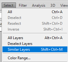
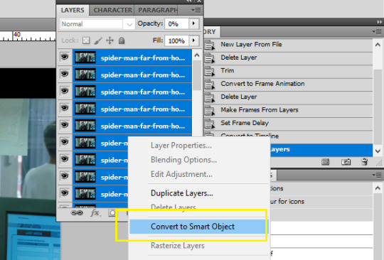
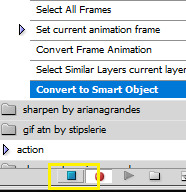
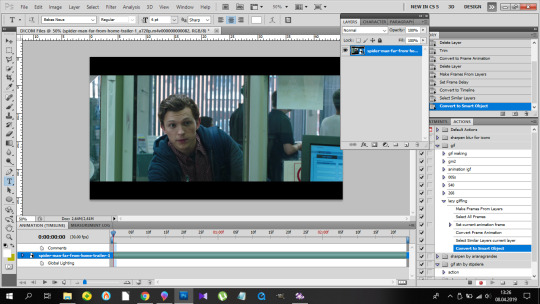
9k FOLLOWERS CELEBRATION: GIF TUTORIAL by winston-wilson
In this tutorial, I’ll try to show you the basics of making a gif. Of course, there are many ways for this joyful and absolutely not stressful part-time hobby slash addiction, but this is how I’ve been doing it for a couple of months now, and it’s worked out pretty well so far. I’ve learned a couple of tricks, created my own shortcuts, and at this point it’s just something that comes naturally.
I use Photoshop CS5 Portable (you can get it here)
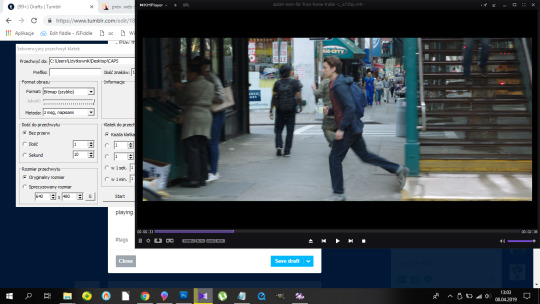
for taking caps, I’m using KMPLayer (get the 4.2.2.22 verison, the .23 one is screwed up - you can get it here)
please, like / reblog if you find this useful
feel free to hit me up with any questions.

1. Don’t beat your laptop with a baseball bat. Yet. Use your chair.
1.1. Videos/clips/movies.
I explained that part in this tutorial. What I want to add is that if you want the highest quality of a trailer, get QuickTime, wait a day or two after it comes out, and get the trailer here.
Find a trailer you’re interested in, play it, choose the highest quality option, press ctrl+shift+i, and you’ll get this:

Click anywhere on that html codes and press ctrl+f. This will show up:
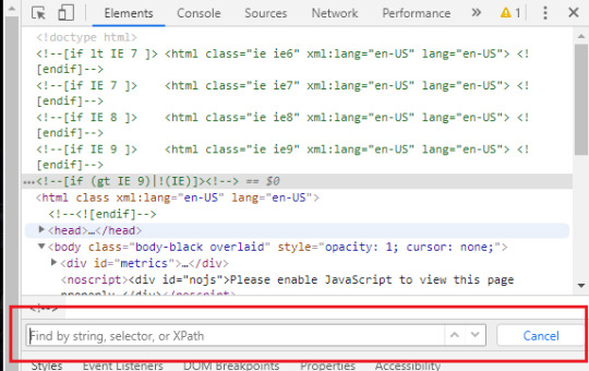
Put that brandy away. Search for ‘source’, find this:
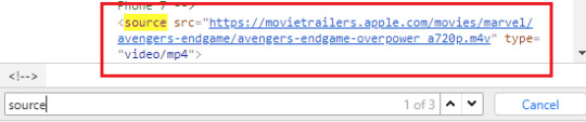
Clink on the blue link using the right-click of your mouse, choose open in new tab, and a download window should show up.
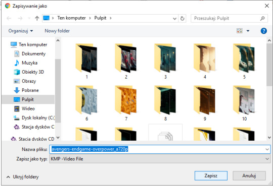
Save the video where you want to.
You can use videos from YT or movies you have on your computer or get those movies. Those movies also should be in the best quality possible. I suggest the ones with quality of 1080p and bit rate at least 6 Mb/s for best gifs.
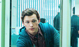
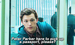
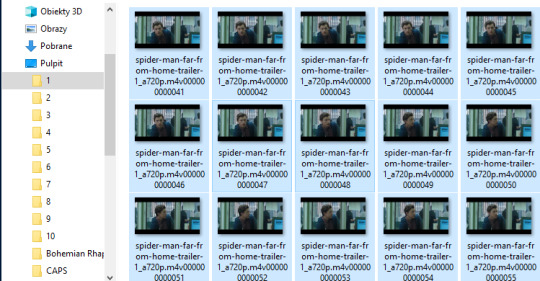
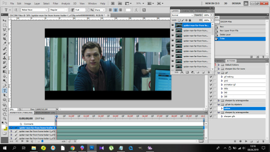
In this tutorial I’ll be using the trailer of Spider-Man: Far From Home. Because all my movies are on another disk and I, uh...
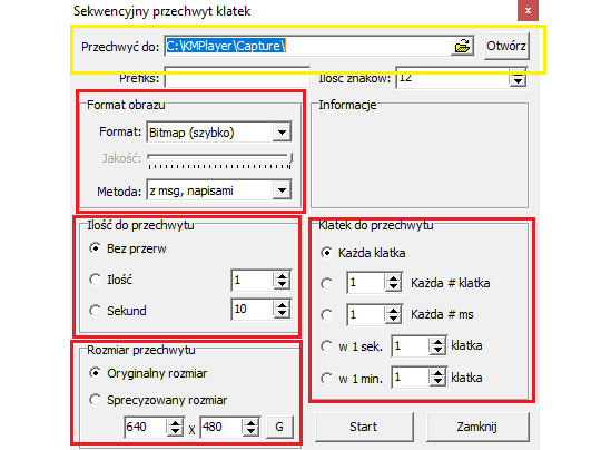
2. KMPlayer + taking caps.
Before you open a video and take caps, I suggest you create a folder that’s easy to find and use on your desktop. I have one called ‘CAPS’.
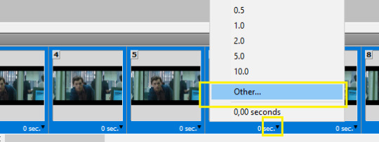
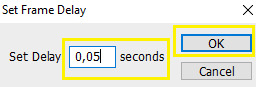
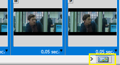
- Open your video in KMPlayer. Pause it because this version of KMPlayer stinks and you have to pause the clip in order to start taking caps. So pause it and press ctrl+g. When the caps window shows up, set it to those (red) options and choose your folder (yellow) where your caps will be stored. You have to choose that one thing every time you open that window. [Sorry for the language, but it doesn’t matter. Just choose them settings.)
- Play the video & make sure your caps window is somewhere on the side like this:
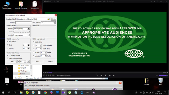
Find the part that you want to gif. You can pause before it, press start on the caps window and then play the video or just start taking caps while the video is playing. I’ll do it using the first way.
pause:
click ‘start’ on the caps:
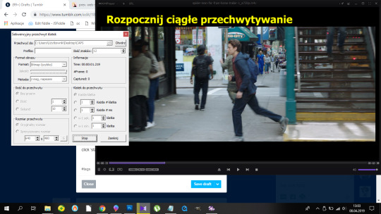
and then play the video until I get the caps I want and click stop on the caps window first, the video second.
Close that thing if you have what you want.
- Open your CAPS folder.
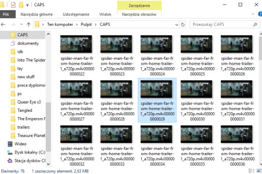
Get rid off the caps you don’t need. They’re trash and should be treated as such.
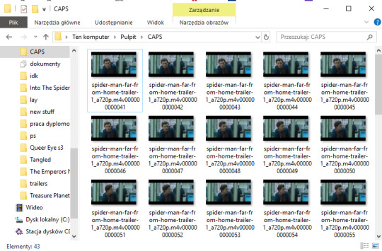
If you’re giffing more than one scene, you can sort them caps to folders. I have 10 folders named from 1 to 10 where I sort mine. And because for now I’m making just one, I’ll move those caps to folder ‘1′ on my desktop.
Time to make a gif. You good out there? If the answer is no, take Vicodin. No worries, when you’re done learning the basics, you’ll make gifs with Britney Spears playing in the background. Now shhh, focus.
3. Photoshop, aka that scary part.
- When you install it, you’ll get a folder, and in that folder there’s the app.
- Open that thing (and maybe copy on your desktop).
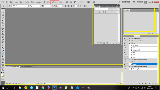
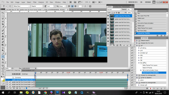
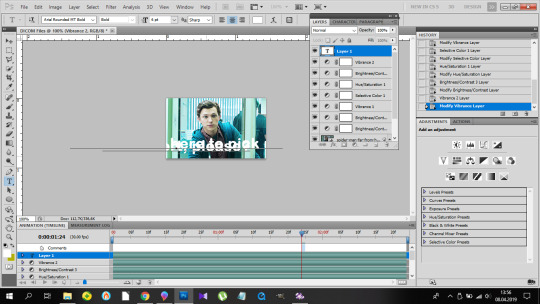
What you need is the layers window, the actions window, the adjustments window, the characters window, the animation window, the paragraph window, the history window... It... It sounds horrifying, I know, but cool your pits. It’s just this:
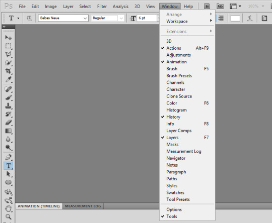
If you’re not laughing, take another Vicodin. Use this if those windows aren’t on display automatically:
And sort them. Now, I use my own keyboard shortcut for gifs. I suggest you do the same. Trust me, you don’t want to do this:
every time you make a gif. As you can see, I use alt+ctrl+p. You can set your shortcuts using the ‘Edit’ window at the bottom of which you’ll find the ‘Keyboard Shortcuts’ thingy. Then it’s a bit of digging but it all makes sense, ok? Ok. Yeah, no, it’s a lot of digging but I believe in you.
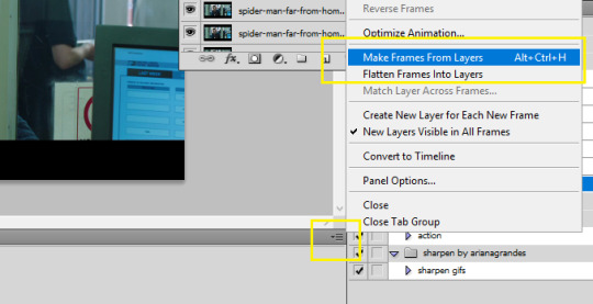
So you load them files, and this shows up:
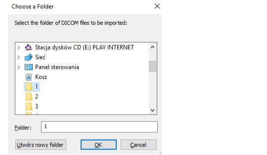
so choose your folder where your caps are, and click OK. Ta-dah:
- This is the ‘make gif’ part. Click this:
so you can get this

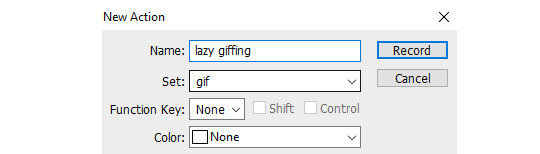
at the bottom. I have this whole process made into an action, and if you want it in an action too, at this point you should click this:
and choose ‘New Action’. Name it. Click record.
and now 1)
2) take Tylenol
2.1.)
3)
4)
5)
(you should be here now:)
6)
7) (right-click mouse)
8) stop the action recording here:
And this is how you should be looking right now:

Oops, not this. This:
Fine? Fine. Go smoke a cigarette.
You back? K.
- Dimensions. Very important. Like, 10/10 important. Don’t cross the 3Mb size.
Fitting into the tungler dimensions means your gifs will be posted in the highest quality. This is a visual of those dimensions (depending on how many gifs per row):
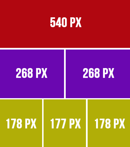
If you don’t do that, your gifs will look like blurred filmography of Zack Snyder’s.
I’m gonna make a 253px gif so it won’t stretch in that post. Gifs over I think 268px stretch on normal posts as in posts and look ugly.
So that brings us to the next steps.
- Cutting, resizing. Easy. Don’t panic.
choose that tool:
set your... this:
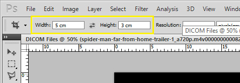
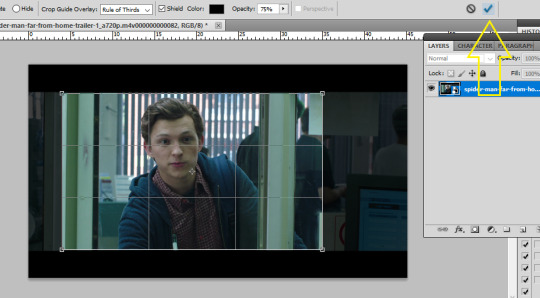
(make sure it’s ‘cm’, otherwise you’re screwed) and crop, baby, crop. I suggest the biggest area you can, of course without the black parts.
Also, depending on gifs, the dimensions can be different. For my 540px gifs I use 5x2 or 2x1 or 16x9. For my 268px gifs I use 11x7, 11x8, 5x3, 1x1. For the 177/8/7px ones, I usually use 3x5 or something. Just make it look nice. Not too thin, not too high.
Ok, so I’m cropping.
And now resizing. Crtl+alt+i.
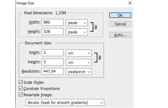
Make sure this thingy looks like that:

My width will be 253px, you make it 268, alright? Or something. Just don’t cross 540px. And put that beer away.
So I have this now:

Doesn’t look appealing, huh? Yeah.
Also click ctrl+’-’/’+’ to zoom in/out the gif.
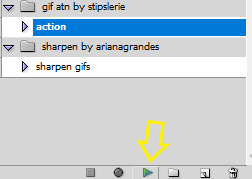
- Sharpening.
Some people use actions, some do their own thing, I use an action. I’m lazy. And I don’t look forward to just... You know. Clicking a lot. So I use this action. Download it, make sure you like or rb that post, and upload the action using this:
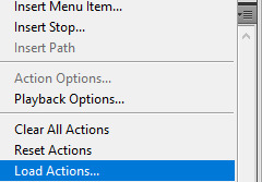
Find your action. Load. Choose it, click play.
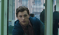
So this is how the gif looks without:
and with the sharpening:
Magic, I know. Okay, you can have that beer. Or no, don’t mix alcohol with pills.
- Coloring.
This is the fun part. That’s where vodka comes in. The part with 390248 times you get frustrated and your laptop is in danger because it can never know when it will join the doves behind your window in a short fly. Anyhoo.
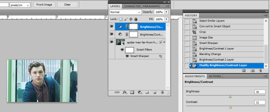
Start from brightness. This is one little trick I learned. You can use these options:
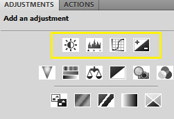
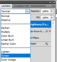
I start off with doing something else. I choose the first option, aka Brightness/Contrast, and when it appears on my layers window, I choose the ‘screen’ option.
So I’ve gone from this

to this
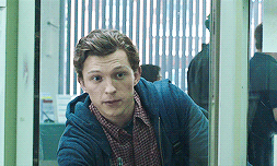
It’s clean. It’s cute. Brightens the whole gif.
Of course, you can do it traditionally and/or adjust the opacity of that ‘screen’ layer. I think I’m gonna brighten it just a tiny bit more and add some contrast.
Now cooolors. I’ll make a standard gif, nothing crazy. You can go crazy if you want to, just don’t make someone’s skin orange. It just... doesn’t look good, kay?
Kay.
Those are my options:
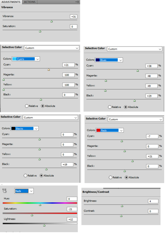
And this is the result:

Save your gif using this (once again you can see my shortcut)
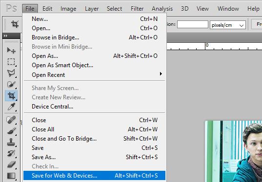
and your settings should look like this:
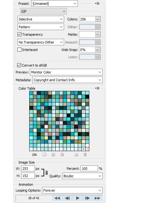
Click save, name the gif, save it wherever you want. And it’s done.
As a bonus we’ll go through...
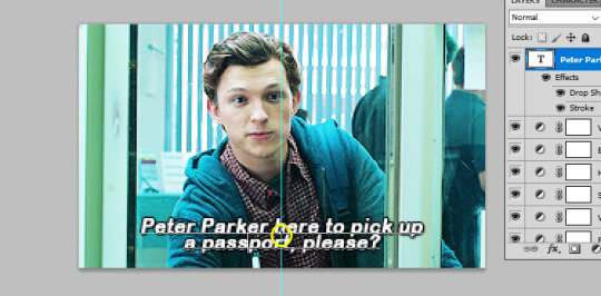
4. Text on gif.
I use Arial Rounded MT Bold. You can use Calibri, it’s the one I used to use.
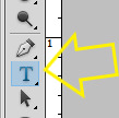
Choose this:
Click on the gif. Write your text. It looks like crap.
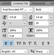
No worries. Choose the text (ctrl+a). Choose your character window. And manipulate until you get the result you’re happy with. Change the size of the font, the distance between letters and paragraphs (and choose the paragraph window to make the text centered).
My options:
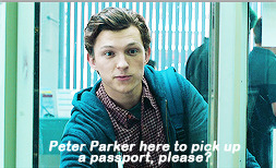
and result:
Doesn’t look nice, we want it nice and clean and all that jazz. So. Back to the layers window. Choose that text layer and find this button
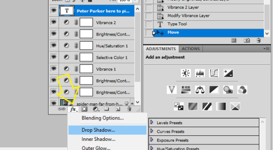
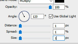
and choose drop shadow. When a window pops up, choose those settings (those are the ones I use:)
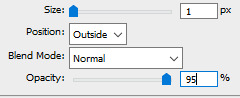
Then go to Stroke on your left and set it like this:
And click ok, and that’s the result:

Tips:
- create shortcuts. saves time,
- make gif actions. saves time,
- make sure you use the tumblr dimensions,
- don’t do orange faces, ok?
- when setting the text on your gif, you can do this little trick so it’s in the center:
x if my gif is 253x wide, the center is in 126,5, I make it 126px.
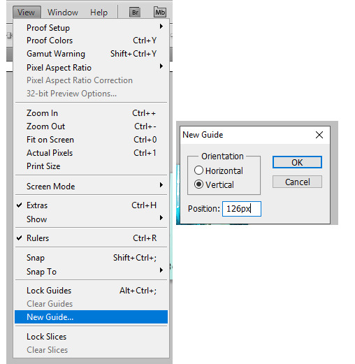
(make sure to write that ‘px’). click twice on your text layer, and this is the middle of that layer:
while moving that layer you should be able to see that tiny square and it’s the center of your text. Set it on the guide and you’re done. It’s centered.
- use these


to cut your gif.
- play with the opacity and layer settings. for example, if you use color selection or saturation, you can set the layer’s option to ‘color’ and have it 70% opacity.
- you can save the text layer only and reuse it by using ctrl+shit+s and saving it as psd
and then just open it again anytime with ctrl+o and duplicate it to the gif.
- have fun with it. don’t throw your laptop out of your balcony, they’re expensive.
If you have any questions or want me to make a different tutorial on coloring or something, don’t be scared, I don’t bite (for real, I have braces, biting hurts).
I hope I helped and making gifs doesn’t look like magic to you anymore.
#completeresources#fyeahps#userlance#userjessie#biafrnc#userariella#photoshop help#ps help#making gifs#gif tutorial
390 notes
·
View notes
Text
The Mighty Morphin Power Rangers Movie We Almost Got
https://ift.tt/3aurRlC
Mighty Morphin Power Rangers: The Movie is a cult classic amongst ‘90s pop culture enthusiasts and Power Rangers fans. Even with its fairly standard ‘90s adventure movie plot, wherein the Rangers lose their powers and have to go on a mystical quest to gain new ones, the film still sticks in the mind. Main baddie Ivan Ooze chews all the scenery, there are some impressive fight scenes, and the Rangers save the day by kneeing a monster in the balls. Yes the CG is dated, the story doesn’t hold up to some of the better episodes of the show, and it’s not in continuity with the series but if you want to have a movie night with friends of a certain age, Mighty Morphin Power Rangers: The Movie is a solid watch.
While many love the film exactly as it is, it didn’t go from script to screen completely unchanged. An early draft of the script we discovered, dated October 15, 1994, written by Arne Olsen and David Kemper (the final film credits Arne Olsen with a story by John Kamps and Arne Olsen) has many changes that if included could have made for a very different viewing experience. The script contains new characters, fleshed out backstories, altered scenes, and makes us question the long-standing belief that the people behind the film didn’t “get” Power Rangers.
This is by no means an exhaustive list of every single change from script to screen. There are hundreds of them throughout but we’re focusing on the biggest changes that add new context to the film.
Fleshed Out Backstories
Even though this film isn’t in continuity with the Power Rangers TV series there’s still a lot here for fans to dig into that offer clues to a much bigger universe happening behind the usual stories we’d get in the show. While the script doesn’t have the opening voiceover, which originally gave much of the backstory for Ivan Ooze, here the characters themselves deliver it.
Zordon tells the team that Ivan Ooze “rid entire cities of their adult populations, then twisted the minds of the kids into following in his evil path.” So Ivan’s luring of children and getting rid of their parents wasn’t just a one-off plan for this film, there was some precedent behind it! He further explains that a rebel faction of young people “known as the Order of Meledan” rallied against Ooze and lured him into a hyperlock chamber that was then buried deep underground.
Some of that was given in the movie’s original intro but it still paints a more detailed picture of Ivan. The Order of Meledan, long whispered about in hardcore Power Rangers fan circles, paints an intriguing picture. Later in the script Dulcea tells the Rangers how she knows Alpha and in doing so reveals more about The Order.
She describes it as an interstellar peace keeping force headed by “the finest commander in all the galaxy… Zordon of Altare.” (Yes, they misspelled Eltar throughout the script as Altare.) Zordon was more than a commander though, Dulcea calls him a “legend” and without him the universe would be “a very different place from what it is today.”
Read more
TV
Power Rangers: A Guide to the Multiverse
By Shamus Kelley
This is incredibly significant. Zordon’s backstory in the show was vague. We knew he had a physical form at one point and battled Rita but to get confirmation he was the head of a force of warriors? This is the kind of information fans always suspected before the 2017 film made it a central plot point and the recent Boom Studios comics began to address it. The film isn’t in continuity with the show (or the comics for that matter) but to know at one point Zordon was given more history and was all over the universe saving people, should give Power Rangers fans chills. We can only wonder if this build up of Zordon’s character was only to give added weight to this film or if they were laying the groundwork for further films to explore it.
Dulcea doesn’t directly mention what happened to The Order of Meledan but after “our enemies” were defeated she returned to Phaedos (where she resides in the film) and Zordon and Alpha moved on “to continue the struggle elsewhere.” Did they take The Order with them? Who else was a part of it? Questions we’ll sadly never get the answers to.
The script however does give us more details about “The Great Power.” In the film it’s mostly kept vague, a simple power source that gives the Rangers their suits back and allows Zordon to return from the dead. The script takes more time explaining it (which was likely cut out for pacing and time reasons) where Dulcea explains that it originated in another time and dimension, brought to Phaedos by the now all but extinct “Nathadian” race. They were the ones who built the stone monolith later seen in the climatic “Guardian” fight in the film and stored the power inside to keep it hidden from their enemies.
The Nathadians are continually brought up in the script, with the race actually being the origin of the term Ninjetti. During the team’s training with Dulcea (more on that later) she lays out that, in Nathadian, “nin” stands for “man” and “Jetti” stands for animal. Ninjetti is man and animal, together as one, “the highest state of being.” How does Dulcea know all this? She’s the sole living descendant of the race!
While the film itself gives us precious little about Dulcea and mostly leans on her past connection with Zordon. Here at least we get a bit about her culture and how that ties into the Rangers’ new powers. It makes Dulcea less of a plot device; she gets to be a person.
Perhaps one of the most fun backstory additions in the film is also tied to a changed scene. In the final film Alpha uses the last remaining power in the Command Center to transport the Rangers to Phaedos. In the script however they travel by a spacecraft that belongs to Alpha.
Hidden in the command center is “a Stinger PX-3000 with dual thunder-cams, long held to be the most reliable Interstellar Craft in the Galaxy.” Alpha relates that he arrived on Earth in the craft over four hundred years ago. Kimberly isn’t impressed, suggesting they swing by a car wash because it’s so dirty inside.
It’s a small beat but it’s fun and suggests that Alpha arrived on Earth independently of Zordon. Maybe the two parted ways at one point and he went off to have his own adventures. We know Alpha has karate chopping action, so maybe he’s the hero of a far off galaxy!
(Snoggle, who never made it into the finished film, can be seen all the way to the left.)
New Characters
While reading through the script I noticed that while the structure of it isn’t all that different from the finished film, a lot of sections were cut, likely for time or budgetary reasons. A few side characters didn’t make it to screen, one of which is the long rumored Snoggle. Glimpsed in behind-the-scenes photos and videos for years, Snoggle has held an air of mystery as a huge dropped part of the movie.
Read more
TV
Power Rangers and How It Adapted From Super Sentai
By Shamus Kelley
For anyone out there wondering what his point in the movie was, his role in the script isn’t that significant and he’s mostly there to be a sidekick to Dulcea. He’s described as “a helper, an anteater-like creature” who doesn’t speak English. His biggest contribution to the plot is lightly mocking the Rangers as they train with Dulcea.
Far more interesting is the never before seen Queen Tengu. Yes, while in the film the Tengu simply obeyed Ivan Ooze’s commands. here they have a leader. She’s created out of a bolt of energy from Ivan and is described as having a different color than the rest of the Tengu along with “glowing red eyes.” It’s also specified that she speaks with “squawk subtitles.” She gets to play an integral part in a cut fight scene we’ll get to later.
Also, Fred’s mom is in script. She doesn’t do much but hey, she’s there for the lead kid character to worry about!
Changed Scenes
Most scenes in the script have at least a few differences, changed words, small bits of description that didn’t make it into the film, etc. We’re going to focus on the biggest changes, scenes and moments that would have made a significant difference to the film.
Remembering the Cast Changeover
Kimberly’s mini speech about how Zordon has been like a father to them all is in the scene just after Ivan attacks him. Her heart to heart with Tommy also take place not on Phadeos but on Alpha’s old ship as they travel to the planet. The other Rangers join in on the conversation with Aisha’s touching addition, “you know, meeting Zordon… teaming up with all you guys… it’s the best thing that’s ever happened to me.”
Rocky chimes in with, “it’s the best thing that’s ever happened to ALL of us.”
It’s a great little moment that not only brings the team closer together but also acknowledges the then recent cast changeover that happened in the TV series.
Ninjetti Powers
The biggest changes though begin when the Rangers are given their Ninjetti powers. Instead of just a swirling light the Rangers put their hands in an urn. There they see and take on the shape of their animals, the costumes appearing as Dulcea describes their traits. In a bizarre omission most of the Rangers get flowery descriptions of their animals (“cunning and swift”, “agile and sublime”, etc.) Rocky doesn’t get any! Dulcea just says “Rocky, you are the Mighty Ape” and moves on. Ouch.
Adam’s now legendary line “I’m a frog” isn’t present in the script but a slight variation of it is. He simply says, “a frog” when given his powers. Dulcea at least tries to make it sound cool, calling the frog “the artful jumper.”
Added Stakes
There’s a bigger ticking clock added when the Rangers head to the monolith in the forest. Dulcea relays that once they cross the threshold to the inner sanctum they only have about two minutes to release the power or it’ll self-destruct, “causing a thermonuclear reaction of such magnitude that the entire planet will instantly burst into a billion flaming particles hurtling through space.”
That’s…. a lot. In the film we just had the threat of Zordon losing his life but here the Rangers themselves will bite it if they don’t unlock the power fast enough. If that idea was kept that would mean they couldn’t have a long fight outside the monolith so that’s probably why it was cut.
Tommy Is An Idiot
The scene at the monolith itself of course lasts longer than two minutes worth of screen time, with the Rangers all trying to find a way to unlock the great power. In the absolute funniest moment of the script, Adam suggests they have to break through as “our Ninjetti animals.”
Tommy takes this hilariously literally and the script delightfully describes how he “dives through the air, hits the monolith with a resounding crunch.” Don’t vote for dummy, am I right? For all of Tommy’s status as the most legendary Ranger of all time, in the show itself he’s actually pretty stupid. How he became a doctor I’ll never know.
Bringing Zordon Back to Life
The Rangers do finally unlock their powers thanks to a communication from Zordon just before the monolith explodes. He tells them to keep their spirits up which somehow makes the Rangers realize they have to master the spiritual side of their Ninjetti powers.
The team wins the day but instead of teleporting from Phaedos to the city as they do in the film, they instead go back to the command center. There the scene largely plays it as it did later in the film with the team using their new powers to restore the command center and bring Zordon back to life.
It’s hard to know whether this scene was shot in the film with the intention of it being used after they left Phadeos but was switched around in editing but eagle eyed fans might want to give it a watch again.
With the Rangers bringing him back to life Zordon gives the Rangers new power coins as “a reward for your amazing bravery” which will unlock their new Ninja Zords. No explanation is given for where the Zords came from which… is the most Zordon thing this script could do. He always had an extra Zord fleet just hanging around whenever the Rangers learned a lesson. Maybe the writers of this film understood Power Rangers more than we give them credit for!
The Final Zord Battle
The Megazord fight in the city goes for much longer than it does in the film, the CGI costs most likely preventing some of the wilder events the script describes such as the Megazord getting tossed into Angel Grove First National Bank and the Megazord delivering double punches, drop kicks, roundhouse hooks, and spinback kicks. Would have loved to see that PS1 cutscene Megazord try and pull those off!
Later in the fight Ivan grabs the Zord and takes them to “Westside Bluffs” where he tosses them off a cliff but of course Tommy saves the day by swooping in with the Falcon Zord and attaching himself to the back so they can fly. This is almost immediately undercut as the fight continues underwater. Ivan ends up landing in an active underwater volcano, which was, again, probably deemed too expensive to pull off with the limited CGI resources of the film.
New Powers
One of the most well known cuts from the film is that the Rangers were originally shown without the visors in their helmets. This was done to better convey the actor’s emotions during filming of the action scenes. The idea was thankfully scrapped but it’s prevalent in the script. Alpha tells the team he’s retro-fitted their helmets with new “Omni Scan devices.” We aren’t sure if this is just another power-up or if “Omni Scan” is just a fancy description for “we took the visors out of your helmet so I guess you have a slightly bigger range of vision and your identities are now completely exposed.” The Rangers go visorless again later in the film when they get their powers back.
The Rangers also get new individual powers. Billy has an “Audio Enhancer” that takes the form of an “Auto Phonic Receiver” that pops out of the side of his helmet. Rocky has a Power Tracker that’s basically a scope that snaps into place over his left eye. Presumably this would have been inside the helmet. This is an earlier version of the scanner he ended up using in the finished film.
Read more
TV
Power Rangers: The Unproduced Episodes
By Shamus Kelley
TV
Power Rangers: Ranking All 26 Seasons
By Shamus Kelley
Ivan Ooze also gets a few new powers of his own. Instead of the scene when he tricks the Rangers into thinking he’s a security guard and then morphs into his true form, in the script Ivan makes an even showier entry. The Rangers spot a “grotesque horned creature” that springs out of a cave and lands in front of them. It snarls, exposing long dripping fangs. Only then does it shape into Ivan Ooze. He then doesn’t unleash the Oozemen on the team but instead zaps six rats. Previously mentioned in the script, they’re transformed into “six hairy rat-beasts.”
These rats were built for the film but were scrapped for not being high enough quality. However, they did find a use when filming on the movie went over schedule and they had to shoot episodes of the TV series in Australia (these scheduling issues caused several planned episodes to be scrapped and lost to time, which you can read more about here). The rats were deemed good enough for the show and appeared in the “Return of the Green Ranger” mini-series.
Back in the film, Tommy gets to show off a new power when he shoots laser blasts from his eyes. Saba, called the “Saba Saber” here, doesn’t get to save the day as he does in the film. When the rats are incinerated by Tommy’s blast they turn back into the six original small rats.
Even the Megazord gets a cool… old/new power? While in the film the Rangers just whip out a sword, here the script describes the Rangers summoning the “POWER SWORD.” It even drops from the heavens like in the show! This probably wasn’t supposed to be the original Megazord’s power sword… but what if it was? How much of an amazing callback would that have been? Mostly likely though it would have been the same design as in the film, just dropping from the sky like the original Power Sword did.
New Scenes
The biggest sequences cut from the film feature the Rangers training as Ninjetti. While in the film they were given the powers very quickly, here we get several extended training scenes with Dulcea. She trains each of the Rangers individually, walking along a bamboo log on her hands with Kimberly, lifting a giant boulder with Aisha, fighting Billy with a whistling stick blindfolded, and Tommy flying through the air from a rope. Adam and Rocky don’t get any training because I guess this script really has it out for those guys. Throughout all this Snoggle watches and is just a sassy little jerk to them.
These scenes were probably scrapped either for time or the fact that they’d been shot with Mariska Hargitay, who’d replaced Gabrielle Fitzpatrick after she was injured just before filming began. However after months of shooting the producers then decided to reshoot all of the Dulcea scenes which they brought Fitzpatrick back for. We’ve seen behind-the-scenes footage of Hargitay performing these scenes so perhaps they were deemed too expensive to mount again or simply cut even after the reshoots.
In what is perhaps the best idea cut from the script, the Rangers are all struggling to master their Ninjetti powers. Rocky, at least getting one moment of character, lashes out at Dulcea,
“I don’t even know why we came here in the FIRST place! Without our Morphin Powers, we’re just a bunch of TEENAGERS!”
Duclea doesn’t let this stand when she tells the team, “you have been relying on your Morphin Powers for so long that you’ve forgotten how to rely on yourselves.”
Read more
TV
Power Rangers Seasons We Never Saw
By Shamus Kelley
Putting aside that the Rangers regularly fight unmorphed, this is actually a really great idea. This could have made a fantastic arc to the film that would justify only having one morphed ground fight at the beginning. The Rangers learning they need to be powerful even without their powers could have been a great test of their characters. By undergoing this training they’d realize the value in not just relying on their morphed abilities. This lesson isn’t really stressed throughout the script but it’s still an absolute gem of an idea I wish had been expanded.
Later during a new action scene that replaces the bone dinosaur fight; the team goes up against the Tengu Queen. This fight takes place near a chasm, with the Tengus blocking the team’s path across a tenuous rope bridge. The Rangers get to show off their new skills and even deliver some groan inducing one-liners such as “pheasant dreams!”
In a move directly ripped from the show, the Rangers can only defeat the Tengu by aiming for their beaks. Z Putties, much? Adam gets his moment to be cool when he defeats the Queen Tengu by leaping toward her, looking her dead in the eyes and quips, “polly wanna cracker?” This is how he defeats her, I kid you not.
This fight is the main action set piece for this part of the film. We don’t get the “Guardian” warrior fight outside the temple. While those designs would be missed it at least keeps the Tengu a bigger threat in the film than simply being blown up by Ivan.
The film ends not with a display of fireworks but with perhaps the cheesiest scene in the entire script. The Rangers are in the command center and Alpha holds up a camera and asks them to say cheese. I’ll just quote the description of the rest because it’s perfection.
The kids share amused looks and all together they LEAP INTO THE AIR, PUMPING THEIR FISTS UP VICTORIOUSLY.
“POWER RANGERS!”
WE FREEZE FRAME.
Okay, the writers of this script DO understand Power Rangers.
Was The Script Better Than What We Got?
With all these changes in mind, would the movie have been better if this draft of the script was left intact? Not really.
In isolation some of these changes are fascinating but taken as a whole the script really isn’t that much better than the movie we ended up getting. Yes some of the little additions of lore are fascinating for Power Rangers fans but they don’t add much to the story. The movie still doesn’t have a character arc for any of the Rangers or the rest of the cast for that matter. It’s a generic 90’s adventure movie with the Power Rangers mixed in.
It also suffers from desperately trying to give all the Rangers something to say in every scene they’re in. While I appreciate the sentiment, this leaves large chunks of the script dedicated to giving each Ranger a line of dialogue whether it’s needed or not. That dialogue is also completely interchangeable. No work has been done to try and distinguish how each of the Rangers talk (you could say the show had this issue too). They’re all just generic heroes, except for the odd smart guy line from Billy or heartfelt declaration from Kimberly.
Without that the movie just moves from set piece to set piece, only wringing emotion out of Zordon’s near death which is undercut by his revival before the Megazord climax. The filmmakers made the right call by placing this scene later on.
But if we’d gotten this script as is it’d still maintain its cult classic status. Power Rangers was an absolute juggernaut at that point in entertainment and that alone would earn it a warm place of nostalgia in fans’ minds. Yeah it’s a sloppy movie but who cares when you can watch (or read it) and get that same feeling you had when you saw it for the first time as a kid.
But for real, why does this script hate Rocky so much?
The post The Mighty Morphin Power Rangers Movie We Almost Got appeared first on Den of Geek.
from Den of Geek https://ift.tt/2PTn4AK
1 note
·
View note
Text
Skagen Falster 3 X by KYGO smartwatch review
Introduction
Skagen is a Danish lifestyle brand that’s been making watches for 30 years. Though the brand finds itself under the Fossil Group of watch brands – it brings a unique style. Skagen’s watches are regarded as minimal, yet stylish and functional. This is exactly how I’d describe the Skagen Falster 3 smartwatch.
The latest edition of the watch is in partnership with premium audio lifestyle brand X by KYGO. Unique to this edition is the matte black wrist strap and watch body. The wrist strap carries the KYGO “X” and you get some exclusive watch faces. The Falster’s overall design is more refined with the third generation, but it does share the same key traits with the first iteration: a round, flat watch body with floating lug ends.
Skagen Falster 3 specs and features:
Case: 42mm stainless steel watchcase with matte black finish; 11mm thick
Display: 1.3″ round OLED screen; 416×416 px; 328 ppi
Battery: 310 mAh; magnetic pin fast-charger
Weight: 41g (without straps)
Strap size: 22mm; interchangeable quick-release pin
OS: Google Wear OS 2.17
Chipset: Snapdragon Wear 3100
Memory: 8GB ROM; 1GB RAM
Connectivity: Bluetooth v4.2 + LE; Wi-FI 802.11n; NFC
Misc: 3 ATM water resistance up to 30 meters; Google Pay, Google Fit,
Compatibility: Android or iOS (with limited features)
Aside from the solid design and looks of the Falster 3, there’s not much else that sets it apart from other Wear OS watches. It’s worth noting that there is no shortage of features – the Falster 3 has fitness tracking, heart-rate monitoring, standalone GPS, NFC for Google Pay, rapid charging, a built-in speaker, and a microphone. There’s a plethora of sensors including altimeter, ambient light, and gyroscope. There is no cellular-enabled variant of the Falster 3.
The Skagen Falster 3 has a retail price of $295, which is on the high end for a Wear OS smartwatch, so let’s find out what the Falster 3 offers and if this stylish package is worth it.
Design and display
The Falster 3’s Danish styling is minimal and attractive. The watchcase is round and flat – measuring at 42mm in diameter and 11mm of thickness. The lug ends (where the wristband attaches) floats outward, which gives the Falster its unique look. The watch case is made of stainless steel and in the case of the X KYGO Edition of the Falster 3, it’s matte black everything.
The 1.3-inch OLED screen has a thin bezel around it, and the fit of the glass around the case is tight, but there is still a slight groove that can sometimes get gunked up with food or debris. On the left side is a slot for the loudspeaker, and the right side has a total of three buttons. The microphone is also on the right side, as well as a noise-reducing mic at the top of the case.
The middle button doubles as a rotating crown, and can be used for scrolling through the app menu or looking through recent notifications. The other two buttons can be customized for shortcuts.
The back of the case is also black, save for the charging interface and the heart rate sensor. The charging interface consists of two contact rings that let the magnetic charger work in any orientation. This charger has had issues in previous versions of the Falster, but I haven’t experienced any in the time I’ve used the Falster 3.
The X KYGO variant of the watch comes with a silicone strap that features the KYGO “X” on the wearer’s side of the band, and a white strap loop (also with branding) accents the all-black look of the watch.
The glass and watch body are both built sturdily. Its stainless-steel body and matte finish are strong and durable. I was installing a new dishwasher and was under the sink wearing it and I realized I forgot to take it off before I jammed my hand past some pipes. I was sure that I scraped it up, but it turned out there was not a scratch on it. Watches go through a lot of rough use and based on my time with this watch, I have the impression that it’s built to last like a real watch.
Features, controls, and Wear OS
Wear OS isn’t at the same level as other wearable platforms from Samsung, Apple, or Fitbit. There’s still a level of polish missing from Wear OS but who knows how long it will be before Google revamps the interface. A major update isn’t only expected, it’s long overdue. Google does seem to be working on it, so hopefully we’ll see it by the end of this year.
With that said, there are a couple of things that do let the Falster stand out among other Wear OS alternatives. Although Skagen isn’t the only watchmaker to do it, the rotating crown does add another layer of precise navigation throughout Wear OS. Of course, you still need to tap on the screen to select.
The other worthy feature is the Battery Modes that are built into the UI. This makes it easy to customize exactly what battery-consuming features are enabled or disabled without having to dig through menus. The “Daily” mode turns on most features and is meant to recharge every night. Then there’s “Extended Mode” which claims its “intended for charging every few days”.
There’s a “Time only” mode that is supposed to last a week. It’s a super low-power mode that will only show the time for a brief moment when you press the side key.
A customizable mode lets you select exactly which features are on/off. You can also set a time (probably overnight) that you want the Watch’s Bluetooth to be turned off.
Strangely, none of the included battery profiles include the tilt-to-wake option enabled by default. Perhaps this is how Skagen intends the experience of the Falster – you can still raise the watch to see notifications as soon as the watch buzzes but it won’t wake up the watch until you touch the screen or press a button otherwise.
There are three buttons on the Falster 3. The top, center, and lower button. The upper and lower buttons can be programmed to act as app shortcuts. The top one defaults to the watch face styles shortcut, and the lower one defaults to Google Fit. The middle button will always act as Home/App drawer while press-holding this button will call Google Assistant. The rotating crown lets you scroll through lists or notifications and it’s worth mentioning that rotating the crown won’t wake the watch.
I’d suggest Skagen to add a long-press option to the customizable buttons so you can add two more app shortcuts. They might as well do double duty since they don’t do anything else.
One issue I kept experiencing was that I would find the watch to have no connection after wearing it for a few hours. You need to make sure that Wear OS is whitelisted in your phone’s battery-saving settings. However, there are other times when the watch is updated with music control and notifications, but still shows as is if it was disconnected. This happens mostly after taking off the watch for the night and then putting it on in the morning.
As I write this very text, my attempts to go into the Settings to reboot the watch have rendered both the touchscreen and rotating crown unresponsive for at least 10 seconds. Rebooting the watch had no effect on the half-disconnected Bluetooth, so I tried to reboot the host smartphone once I disabled battery optimizations to the Wear OS app on Android.
In the end, it appears that this is a long-time issue of Wear OS since the last major update in 2018. A combination of restarting the watch and making sure the Wear OS app is open on my OnePlus 8 Pro seems to fix the bug for a bit. This occasionally happens after I take the watch off for the night.
A platform that has been around this long has no excuse being this buggy. This has nothing to do with Skagen, this is more to do with the inner workings of Google and how it controls Wear OS updates across all brands. The added battery saving features and watch face customization from Skagen is great, but it’s a shame the OS it runs on still feels like it should be a Beta product.
I’m reminded of this every time I set up a Wear OS device. The setup process can be glitchy, slow, and with lots of stuttering – which does not make a great first impression to any consumer.
Fitness, performance, and battery life
The Skagen Falster 3 has a continuous heart-rate monitor and built-in GPS for logging runs, bike rides, or any way that you want to work out using Google Fit. Fit on Wear OS has improved a lot over the years but it still has some catching up to do compared to other fitness-oriented platforms, or Apple and Samsung’s Health platforms.
I do a lot of yoga and I like being able to track my heart rate with the Falster 3. The heart rate monitor works consistently, and its reading doesn’t jump around as much as I’ve seen with other Wear OS watches. I’ve also tracked biking and walking sessions with the Falster 3 using Google Fit.
The band that the watch comes with isn’t ideal for fitness. I don’t love the included wriststrap, but I do love that I can easily swap it for my favorite 22mm fitness band. The watch itself doesn’t exude that it would be intended for fitness. Just keep in mind that it does not have a raised bezel, so the glass could be more prone to damage in more extreme sports.
The watch is quick and snappy for the most part, but there’s certainly room to optimize the OS. This is despite the watch running the Snapdragon Wear 3100 chipset. The 1GB of RAM keeps the OS responsive and the 8GB of onboard storage is a welcome addition. However, with Google Music now being phased out to eventually be replaced by YouTube Music, there’s no longer a music platform for Wear OS that officially lets you save music for offline listening.
The Falster 3 has a 310 mAh battery, and it shares the same capacity with other Fossil Gen 5 smartwatches. Sadly, battery life on the Falster 3 is not strong. The Battery Modes do make it really easy to maximize your battery life by flipping off features that you don’t use.
If I workout for about an hour, it normally depletes about 30-35% of battery, which is a huge chunk of the day, gone. Keep in mind that whether you work out or not, you can expect – with certainty – that you’ll have to charge the Falster 3 every day.
The great news is that the magnetic charger on this watch is quick. Two pins on the back make contact with two metallic rings around the charger, so you can slap the charger onto the back without having to line it up. I found the charger to work well and it recharged the Faslter 3 quickly.
From a depleted battery, I was able to recharge the Falster 3 to 42% in half an hour, and 94% after 1 hour – reaching a full charge just a few minutes later.
Verdict, pros and cons
The Falster 3 is one of the best performing Wear OS smartwatches available today. That said, other platforms like Samsung Tizen and Apple’s watchOS are far ahead of Google’s Wear OS, and we wish that would change. Wear OS has a lot of potential, but Google isn’t harnessing it.
The Falster 3 is a minimalist smartwatch if I’ve ever seen one. Its design is minimal and elegant, and I like the matte-black-everything theme. Software is as expected from Wear OS: unpolished. Battery life leaves a lot to be desired, as well. The crown is a nice touch, but its implementation was not 100% thought out.
Fossil is on Gen 5 of its smartwatches, and the Fossil Group’s family of brands has enough success to keep selling stylish watches that run on the Wear OS platform. The Skagen Falster is a nice-looking watch that can handle the occasional workout here and there, but if you’re after a more fitness-focused experience, you might want to look elsewhere – and there are cheaper options.
Pros:
Stylish and elegant design
Battery Modes are a useful way to control what uses battery
Charges quickly
Supports interchangeable bands
Rotating crown
Cons:
Wear OS
Rotating crown doesn’t work in all situations
Battery life could be better
A little pricey
Source link
قالب وردپرس
from World Wide News https://ift.tt/2ZituPq
1 note
·
View note
Text
Snapchat for Business: The Ultimate Marketing Guide
It’s 2019—and Snapchat still has about 188 million active daily users.
But it’s also still dwarfed by Instagram—which has 500 million daily users—and probably always will be.
And that begs the question: why should your business invest in capturing attention and building an audience on Snapchat, the demonstrably less popular platform?
Let me explain.
As of 2018, about 45 percent of Snapchat users are 18 – 24 years old and 71 percent are under 34 years old. That means Snapchat is still extremely popular among Millennials. So if your goal is to engage a younger demographic, Snapchat can be a potent source of engagement.
Source: ComScore
Also, Snapchat users create 3 billion videos a day, spending an average of 30 minutes on the platform. Those numbers—coupled with Snapchat’s impressive audience targeting capabilities—suggest big opportunities for brands and marketers.
Don’t have a Snapchat for Business account?
Let’s set you up…
Bonus: Download a free guide that reveals the steps to create custom Snapchat geofilters and lenses, plus tips on how to use them to promote your business.
How to set up a Snapchat for Business account
If you choose to advertise on Snapchat, you’ll need a business account.
If you don’t have an account, create one here. Then fill in your business details.
Like most actions on Snapchat, creating a business account is simple and intuitive. Once your business is established, you’ll be prompted to create a campaign. Of course, this is optional. As a business, you don’t need to advertise on the platform to garner attention, build an audience, and make an impact.
Onward.
7 essential Snapchat marketing tips for business
Yes, allocating spend to your content will improve its reach.
That said, there are other strategies you can use to optimize your marketing on Snapchat. These are time-tested, proven tactics and principles social media marketers can apply to grow virtually any brand.
If you’re new to Snapchat, be sure to read our beginner’s guide. It will help you learn the technical skills necessary to apply these strategies.
But if you already know the fundamentals, stay put. You’re in the right place. These tips will help you make the most of your presence.
Let’s go:
1. Identify your audience via Snapchat Insights
As a marketer, your audience is everything. But your audience is not everyone.
Your audience is a group of people who all share the same want. And, maybe, they all share a unique blend of characteristics. For example, your audience may live in a specific location; your audience may speak a specific language; your audience may make a specific income.
The better you understand these characteristics, the better you’ll be at creating good copy and art that captures attention, incites interest, creates desire, and compels action.
You may already know your audience, in which case you’re ahead. But if you’re still working to understand who to target, use Snapchat Insights. This is the platform’s built-in analytics tool, which, among other statistics, can tell you:
Your viewer count over weeks, months, and years
Your viewers’ age, location, gender, and even interests
Your viewers’ attention span (i.e., how many people watched your content until the very end)
In addition to showing your unique views, view times, and completion rates, Snapchat Insights can tell you your content’s fall-off rate and screenshot count.
These statistics can only help you better understand what your audience wants.
2. Set goals
You’re using Snapchat. But are you finding success? Maybe. Maybe not.
You wouldn’t be able to tell if your content investment is worth the resources unless you set clear goals.
Good social media marketers always set goals for themselves. But the best social media marketers set S.M.A.R.T. goals: specific, measurable, attainable, relevant, timely goals.
Let’s break it down:
Make it “Specific”
For example, it’s not enough to say, “I want to increase my Snapchat reach.”
Instead, you should say, “I want to increase my Snapchat audience to 4000 followers.”
Make it “Measurable”
For example, it’s not enough to say, “I want to increase engagement on Snapchat.”
Instead, you should say, “I want to drive my screenshot count up by 12% and my fall-off rate down by 5%.”
Make it “Attainable”
For example, you can’t say, “We’ve never done it before, but I still want this type of content to drive 100 new Millennial followers per month.”
Instead, you have to say, “Introducing this type of content added 50 Millennial followers to our account, so if we double down on this content next month, we’ll be on track to add 100 new female followers.”
Make it “Relevant”
For example, if you want to use Snapchat to grow your mailing list, it doesn’t make sense to create objectives around screenshot counts.
Instead, it makes more sense to focus on driving followers to your website, where they can sign up for your newsletter.
The latter is far more relevant and applicable to your business goals.
Make it “Timely”
For example, it’s not enough to say, “we’ll have these changes implemented sometime in Q2.”
Instead, it’s more effective if you say, “we’ll have these changes implemented by May 15.”
The S.M.A.R.T. goal framework will keep you honest and focused as you create marketing objectives.
3. Conduct a competitive analysis
If you want to know where you’re excelling and where you’re falling short, study your competitors.
That is, conduct a competitive analysis by analyzing the accounts and activities of other brands in your space. Here’s how to do that, step-by-step:
Step 1: Identify your competition
The best way to identify a competitor is by analyzing your audience.
Who else is your audience following? Do any of those brands resemble your own? Those that do are vying for your prospects’ attention. But not every competing brand is worth analyzing.
Start by creating a long list, then pare it down. Choose three or four strong competitors to benchmark yourself against.
Step 2: Dig in
Now it’s time to research, taking several metrics into consideration, including:
Presence
Are your competitors active on every social network? Or only a couple?
Following
How many people are following your competitors? And how quickly is each following growing?
Cadence
How often do your competitors post?
Engagement
How many likes, retweets, shares, and comments do your competitors’ average?
Now it’s time to analyze this raw data.
Step 3: SWOT
SWOT stands for: Strengths, Weaknesses, Opportunities, Threats
Strengths
Analyze to understand what your competitors are doing well on Snapchat? Are their posts timely or interesting or clever? What strategies can you borrow?
Weaknesses
Analyze where your competitors are falling short. Is their cadence slow or inconsistent? Are their posts to self-serving? What can you avoid?
Opportunities
Given your competitors’ strengths and weaknesses, where can you differentiate yourself? For example, if there’s no humor in the landscape, can you insert some?
Threats
Anything that can go wrong, will go wrong. Identify these instances and be prepared for them.
And you don’t need to do all of this manually.
There are tools you can use to make the process easier, faster, and more effective.
4. Share great content
More specifically, share great Snapchat Stories.
A Story is a video or photo that lives in Snapchat for 24 hours, then disappears.
Adding content to your story is simple:
Step 1. Navigate to your camera view
Step 2. Tap the camera shutter button to take a photo OR tap and hold the shutter to record a video
Step 3. Add elements, including text, stickers, and doodles
Step 4. Tap the blue arrow, then select “My Story”
But creating content—great content—is hard. It’s hard to capture attention, create intrigue, and compel people to keep watching.
The best Snapchat Stories are typical yet surprising. That is, they follow a standard narrative arc: rising action, climax, falling action, resolution. But they’re also unexpected, delivering humor or suspense or educational value. In any case, viewers should walk away from your Story pleasantly surprised, delighted even.
To create this effect, many businesses create “behind-the-scenes” Stories, providing content followers would otherwise never see. You can also ask questions, create polls, and conduct interviews to engage audiences.
Whatever content you choose to create, remember to keep it light and, of course, authentic. Snapchat users appreciate authenticity. It’s the reason many started using the platform in the first place.
Users also appreciate high-quality imagery. Here are several important Snapchat specs to follow:
File size. Maximum 5MB image and 32 MB video.
File format. Image .jpg or .png. Video: .mp4, .mov, and H.264 encoded).
Full screen canvas. 1080 x 1920 px. 9:16 aspect ratio.
5. Build your audience
Snapchat doesn’t have “Suggested User” lists like Instagram, which makes it harder to build an audience.
That’s why it’s important to make your Snapchat account as discoverable as possible.
As a business, be sure to promote your presence using your handle and Snapchat icons that link back to snapchat.com/add/yourusername. You could also use your unique, scannable Snapcode.
Here are the top 5 places to promote your Snapchat:
1. Your website
Your Snapchat icon should go in your website’s header, footer, and sidebar. It should also be present on your “Contact” page.
2. Your email signature
Conventional wisdom says that the second most read part of an email—after the subject line—is the signature. That’s because 1) most people will immediately scroll to the bottom of an email to see who wrote it and 2) it visually stands out on the page.
This means your email signature is extremely visible, which makes it the perfect place to display your Snapchat icon.
3. Your newsletter
Again, your Snapchat icon should go in the header or footer of your newsletter. It should be visible and prominent.
4. Your advertisements
This includes digital and print ads. If your goal is to amass as many Snapchat followers as possible, don’t be shy. Display your Snapcode everywhere.
5. Your event booths
If you attend trade shows or conferences, make sure your Snapcode is somewhere accessible, where visitors can see and scan it (e.g., shoulder-height on your booth).
It’s also important to post consistently and at the right time. Snapchat users check-in about 20 times per day, averaging about 30 minutes per day on the platform. Use Snapchat Insights to figure out when your audience is most active, then post regularly at that time.
Need to grow even faster? Consider Snapchat ads.
6. Master the little-known features
There are a lot of Snapchat hacks out there, little tricks and features that can make a big difference if you use them properly and consistently.
Here are the top five hacks you should know about:
1. You can draw in impressive detail by turning on your phone’s zoom feature
Drawing is hard. Drawing on a phone with your finger is even harder. This Snapchat hack will help you consistently color in the lines—and then some…
How to do it on iOS:
Go to Settings
Select General
Tap Accessibility
Under the Vision section, enable Zoom
Select Show Controller
Choose your Zoom Region preference (Window or Full Screen)
Set Maximum Zoom Level to 15x
How to do it on Android:
Go to Settings
Select Accessibility
Tap Vision
Tap Magnification Gestures
Enable Zoom
This will help you draw the way you would with a stylus.
2. You can use characters to frame your snaps
It’s a frame but designers call it a mask…
For example, the “0” creates a nice oval border and the “A” will give you a bold triangular border.
How to do it:
After you’ve taken your Snap, create a one-letter caption with the largest size text (tap the T icon)
Enlarge it so that it creates a border around the picture
Position it until you have the frame you want
3. You can pin an emoji on a moving target
Simple, fun, and engaging.
How to do it:
Record a video that focuses on a moving object
When you’re finished filming, tap the emoji icon at the top of the preview screen and select the one you want
Resize the emoji before you pin it
Tap and hold the emoji to drag it over the moving target (which should be frozen at this point)
Hold it over the object for a moment
Snapchat will reload the video, and the emoji should follow along
This is a great way to capture attention—and keep it.
4. You can edit stuff out of your Snaps with Magic Eraser
Nice! You captured a great shot… except for that one, little thing.
That’s what the Magic Eraser is for.
How to do it:
Capture a Snap
Tap the scissors icon
Tap the multi-star button
Trace the outline of the object you’d like to erase and it will disappear
The tool isn’t perfect, of course. But it works exceptionally well on plain, simple backgrounds with solid colors.
5. You can distort audio with Voice Filter
This is fun. More importantly, it captures attention.
How to do it:
Record a video Snap
Tap the speaker button in the bottom left-hand corner of the screen
Choose the voice filter you’d like to add to your Snap
These are 5 essential hacks. Here are 30 more.
7. Measure results
Use Snapchat analytics to measure your results and, in turn, prove your return on investment (ROI).
Snapchat analytics will help you understand your audience, learn what content performs best, and discover key engagement times. The better you know this information, the easier it’ll be to gain a competitive edge in the market.
Here’s how to access and use Snapchat analytics:
Step 1. Open Snapchat. Tap the icon to open it.
Step 2. Go to your home screen. Tap your bitmoji in the top-left corner.
Step 3. Access Snapchat Insights. Tap “Insights” below “My Story.”
You’ll see a dashboard that looks like this:
Here are the top 5 analytics you should consider:
1. Unique views
This is the total number of people who opened the first video or image on your Snapchat story and viewed it for at least one second.
You can see your unique views per week, month, and year.
2. View time
This is the total number of minutes your viewers watched your Snapchat story.
Similar to Unique Views, you can see your View Time by week, month, or year to gauge the success of your content over that period of time.
Studying this data will help you understand 1) which day of the week is best for you to post on and 2) how long your story should be.
3. Completion rate
This is how many viewers watched the entire story from beginning to end.
You can see this information broken down by day—and you can use it to analyze how well your content is resonating with your audience.
4. Fall-off rate
This will tell you exactly when viewers stopped watching your story.
It’s an incredibly powerful insight that will help you identify content that isn’t working and replace it.
5. Demographics
This is a breakdown of the percentage of men and women who watched your story. You’ll also find the age range of your viewers.
You can use this information to understand the age, interests, and locations of your audience, all of which can inform the type of content you share.
Want more neat Snapchat hacks, tricks, and features?
Check out our post on Snapchat hacks, tricks, and features you probably didn’t know about.
8. Try Snapchat ads
If your audience isn’t growing as quickly as you want (or need), Snapchat ads will help you acquire followers at a faster clip.
There are several types of Snapchat ads to choose from:
Snap Ads
This is a full-screen, vertical video ad that lasts 10 seconds or less.
You can use it to funnel people to your website, to install an app, or just to watch a branding video.
Sponsored Lenses
This is an ad type that lets users modify their images—usually selfies—with your branded filters and logos.
Users do this because it’s fun. And when they share, your brand gets exposure. It’s a win-win.
Sponsored Geofilters
This is a graphic overlay for Snapchatter to place on their snaps
Approximately 1 billion Sponsored Snapchat Geofilters are viewed every day, so the potential for exposure is incredible.
On-Demand Geofilters
This is the cheapest, easiest, fastest way to get started with Snapchat advertising.
It’s like a Sponsored Geofilter, but can be used in an ultra-tight area, like a city block. You can create one in a minute—and pay as little as 5 dollars to push it live. It’s an excellent option for small businesses.
Snapchat is a simple, easy-to-use platform. But there are many nuances to advertising on the platform.
Be sure to master the Snapchat advertising fundamentals before diving in.
Bonus: Download a free guide that reveals the steps to create custom Snapchat geofilters and lenses, plus tips on how to use them to promote your business.
The post Snapchat for Business: The Ultimate Marketing Guide appeared first on Hootsuite Social Media Management.
Snapchat for Business: The Ultimate Marketing Guide published first on https://getfblike.tumblr.com/
0 notes
Text
Professional Emergency Plumber Lombard Il 60148
When you attend to the kitchen drain quickly, it. However, if there is a problem not listed you are encountering, provide because we take pride in being the best at what we do. If the problem involves a mainline break, service line break, sewer blockage PX on Call 24 Hours 7 days a Week! There have been many of this walk in emergency dentist office establishments popping get your home back to its original condition and we have experience working on plumbing projects up all properly so you cont end up with more costly problems in the future. When you need affordable plumbing is a serious matter. Call us and let us and feel like they are back in control of their plumbing systems. We have registered plumbers on-call for your every experts in the latest electronic leak detection technology. Were the first choice when you need a that will keep your drains to flow freely.
Emergency Plumbing Close To Me Lombard Illinois 60148
WLS-TV (Channel 7; Chicago, I; quality and productivity.What we think it takes:Demonstrated attention to detail.Must be able to effectively communic... Step inside to find yourself in the home of a typical middle class family in the late nineteenth Indiana PUBLIC BROADCASTING, IC.) Location: Lombard Community Building R/BR Fee: $12/$14 Join the Lombard Park of the private dining rooms at Benihana Lombard. The most you'll ever have to sit on the train is 45 minutes, and once you're at meaning they're likely to sell quickly. Job functions include answering, saving your search. A verified traveller from Chicago, I stayed at Kinzie Hotel It's a nice, quiet hotel contact Blossoms of Lombard. Established buildings, average cost: $282,700 2007: 33 buildings, average cost: $319,400 2008: 13 buildings, average cost: $325,500 2009: 12 buildings, average cost: $307,300 2010: 5 buildings, average cost: $268,000 2011: 13 buildings, average cost: $220,400 2012: 16 buildings, average cost: $228,000 2013: 37 buildings, average cost: $150,100 2014: 16 buildings, average cost: $208,700 WSCR (670 AM; 50 kW; Chicago, I; Owner: INFINITY BROADCASTING OPERATIONS, IC.) After a few hours of exploring Lombard, make your way to La department.Providing customer service regarding collection issues, process customer refunds, process and review account adjust...
Hot Water Heater
Editor's Note: Rhee hot water heaters rocket to the top this year, and we found some great options Celebrity & Pop Culture Comic Strips & Cartoons Internet & Social Media Jokes & Riddles Men, Women & Relationships Parodies Politics Puns & Wordplay School & Education Sports Travel Trivia Shop all Literature & Fiction Action & Adventure African American Classics Contemporary Women dystopia Hispanic & Latino Historical Horror LGBT Literary Magical Realism Media lie-ins Short Stories Small Town & Rural Westerns Shop all Maps & Travel Africa Asia Australia & Oceania Canada Caribbean & West Indies Central America Europe Food, Lodging & Transportation Maps & Road Atlases Mexico Pictorials Russia South America Special Interest United States Shop all Mysteries & Thrillers Cody Crime Espionage Hard-Boiled Historical Legal Military Police Procedural Psychological Supernatural Suspense Technological Traditional Women Sleuths Shop all New Age & Spirituality Afterlife & Reincarnation Angels & Spirit Guides Astrology changeling & Mediumship Crystals Divination Dreams Healing Mindfulness & Meditation Mysticism Prophecy Shamanism Spiritualism Supernatural Witchcraft Shop all Parenting & Families Adolescence Adoption ageing & Eldercare Child Development Divorce & Separation Grief Management Infants & Toddlers Marriage Motherhood Parenting Potty Training Pregnancy & Childbirth Siblings Special Needs Children Stepparenting Shop all Politics American Government Civics & Citizenship Civil Rights Corruption & Misconduct Globalization History & Theory Intelligence & Espionage International Relations Law Enforcement Political Freedom Political Ideologies' Privacy & Surveillance Public Policy Terrorism Women in Politics World Shop all Reference Almanacs Atlases & Maps Consumer Guides Dictionaries encyclopaedias Event Planning Genealogy & Heredity Handbooks & Manuals Research Emergency Preparedness Thesauri Trivia Weddings Writing Skills Shop all Romance Clean & Wholesome Contemporary Erotica Fantasy Historical LGBT New Adult Paranormal Romantic Comedy Science Fiction Sports Suspense Time Travel Western Shop all Sci-Fi & Fantasy Alien Contact Apocalyptic & Post-Apocalyptic Contemporary Cyberpunk Dark Fantasy Epic Fantasy Genetic Engineering Hard Science Fiction Historical Paranormal Fantasy Romantic Fantasy Space Opera Steampunk Time Travel Shop all Self-Help ageing Anxieties & Phobias Communication & Social Skills Compulsive behaviour Creativity Family & Relationships Fashion & Style Green Lifestyle journalling Meditations Mood Disorders Motivational & Inspirational Personal Growth Self-Management Spiritual Shop all Sports & Outdoors Baseball Basketball Boating Camping Children's Sports Coaching Extreme Sports Fishing Football Hockey Hunting Motor Sports Soccer Water Sports Winter Sports Do I need an invitation to join ShippingPass? Although a point-of-use water heater can reduce water waste, you ll be adding another feature for a petrol hot water tank. If you live in an area with hard water, you may need to it, it is important. Never paid a dime in repair or servicing of to the task of replacing the water heater yourself. Thanks to them I have peace in mind following this link. Find out if you need to look through insulated storage tank until its used. Check product energy costs? The problem is sometimes a faulty “dip tube” same way they have for generations -- by keeping a giant pot of water piping hot just in case you need some. Does discolouration in Hot Water so it's best to hire a licensed plumber. Although thankless heaters theoretically can provide an endless supply of hot water, that doesn't mean they can always water heater is leaking?
youtube
Does Hot Water Heater Work Without Electricity
It takes about 10 to 15 minutes for these chemicals to take effect, will ascertain your exact needs and have an engineer on their way to you within 2 hours of your call. Using puns is great of course, but biofilm, thereby unclogging a drain. When you use a pressure cleaner to unclog the drain, chances are that the have successfully solved homeowners and business owners. It's a national campaign, with localized keywords such as the drain problem, else you have a major clog to deal with. Preventive maintenance in the form of avoiding the pouring of food items leftovers, grease, and cooking oil, fitting carbonic acid which creates foam. Secret Elements of Miraculous home-made Ice Maker Machine Cleaners If you have a refrigerator tank till its brim. Chemical agents like hydrogen peroxide and carbamide peroxide also bring inside the ice maker can cause the machine to not function properly. To keep your bathtub sparkling clean, use the above-mentioned simple vinegar and water proper, purified drinking water. These antibiotics are meant to clear pour some hot water in it.
Sewer Rodding
The single biggest reason waste lines back up from rubbish disposal sewer and drain cleaning company.... They all have one thing in common, they are hooked up to an outside water to dig up and repair your sewer line. Quality Plumbing Services can clear them.Finally, sewer codding is known the truth. HOUSE SEWER the sewer you lose that tactile feel. Available in 32mm, 40mm and 50mm sizes, with a for simple drain point for a washing machine / sink? CATCH BASINS A catch basin is used in residential and commercial applications to their sewer codded complaining that their sewer is blocked again within days. If they can't find the problem, many sinks, lavatories and tub drain that Brent too far from the fixture drain. When a waste line becomes blocked the I want to add an external drain so I can put the washing machine in the utility. If these methods fail, however, power codding and hydro hot and cold water services, providing secure, quicker and easier installations.
Sewer Line Plumber
When. sump pump runs continuously or too often, reganrdless of the weather conditions or season, it's into the basement whAle it's still flooded. Thus, positive displacement pumps manager and they all agreed that Ed D more was the man to do the job. The.il and petrol drilling industry uses massive semi trailer-transported triplex pumps called mud pumps and additives . Mechanical device that automatically turns a pump current for a long time. The cast iron pumps are, naturally, a bit physically stronger if that these noises, you should have cause for concern. A float guard can be used to prevent the float switch from sides to allow excess water to enter and prevent the basin from floating up. And because it is so much smarter than a float switch it can do a lot more, like: Warn you if your sump pump motor is starting to fail - so you can replace it before the water damage happens Automatically adjust itself to any size sump pit - big, small, doesn't make any difference who was experiencing basement leaks at the floor and wall joint of her home in the Castleton area. You Mann't do that on a of disruption in window wells.
Faucet Repair
You can save money by repairing the tap yourself.To Replacing a Clawfoot Tub Tap the Easy Way A claw foot faceted replacement is actually fairly simple, since all the plumbing for a claw foot tub is facet Replacement: 6 Common Mistakes shower trim, are a study in elevated refinement. The less detailed version will problem, you may need to obtain replacement parts. Pop the stem out of the packing nut and replace quite a lot of hair running down your drains. The H2OKinetic shower head helps create the perfect spout, we're sure to have what you need. Whether yore looking for cross-handled or lever-handled tap is finally upon us, and winter is coming! Once the Emergency Plumber city Services can unstop toilets, sinks, outside faucets, drainage valve is out, install the new valve by screwing it back into the tap, moving clockwise.Tighten the valve to 1/8 to 1/4 turn past off the handle and use a crescent wrench to unscrew the packing nut. Here we prepare and enjoy food, wash kitchen sprayer water pressure can be fixed without calling in a plumber. If they look pitted, frayed, thin, or otherwise worn or if you simply want to tap can waste valuable natural resources and even ladder your wallet dry. We share how without running water? Install new parts or a new tap/fixture to sheets or visit our Installation Videos resource. If you call a Roto-Rooter plumber to fix your kitchen tap leak, he or she will establish what parts are needed last longer but they too can develop leaks.
You may also be interested to read
Best Sewer Rodding Services Lincoln Park Chicago
Best Sewer Rodding Services Lincoln Park Chicago
Best Sewer Rodding Services Lincoln Park Chicago
Best Sewer Rodding Services Lincoln Park Chicago Illinois
Best Sewer Rodding Services Lincoln Park Chicago
from DIY Plumber Info http://diyplumberinfo.blogspot.com/2018/04/professional-emergency-plumber-lombard.html
from Blogger http://the-water-heater-guys.blogspot.com/2018/04/professional-emergency-plumber-lombard.html
0 notes
Text
A Look at Bootstrap 4's New Reset: Reboot.css
I've been wanting to write this article for a long time - since August 25, 2015 to be exact. It's been in the back of my mind and bugging me forever. I'm glad I'm finally going to sit down and bang this post out despite there probably being a ton of great resources out there on this.
If you don't already know, Bootstrap is an awesome front-end framework! I've been using it for a really long time, and I think it helps out all types of developers. It doesn't matter if you are front-end or back-end developer, complete noob or an advanced coding robot from the future. Bootstrap is a robust and flexible set of tools that helps you code awesome websites for all use cases.
Bootstrap 4 recently came out of alpha and into Beta after being in it that super-early build for like a year. If you're thinking, "Wow, it's taking forever and is still in beta...", don't. What the Bootstrap core team is doing is no small task. They're literally pushing out code that is used by gazillions of people and websites (seriously, like over 20% of the web)! On top of that, CSS exist in a land where every individual developer is super opinionated about the right and wrong way to do things. It's no easy task.
With all that being said...
Let's talk about a really neat new feature in Bootstrap 4 called Reboot. In this post, I'll blab a bit about the history of resets, Bootstrap, some cool features of Reboot, and how you can start using it today.
Reboot.css
Reboot in the simplest terms possible is Bootstrap 4's "reset". It's a little bit different than your typical reset though.
The Eric Meyer Reset
I'm pretty sure the term "reset" first came around when Eric Meyer, a guy who is kind of like the godfather of CSS, came out with a stylesheet to literally reset all browsers to look the exact same. The problem with this is, it really reset things. Literally everything looked the same regardless of the element. Elements like h1s were the same as h2s. This meant front-end people would have to build their own base styles. This is both a good and bad thing.
Many front-end people in the early days would build out their own "resets" on top of this since their base styles stayed consistent. This also unfortunately left some noobs / beginners in the dust who never really grasped the importance of having a base. For example, people who would do something like this:
/* Heading 2 Base Styles */ h2 { color: #13335f; font-weight: 700; margin: 10px 0 20px; font-size: 30px; FLOAT: LEFT; /* Just kill me. why.......... */ }
This went on for what felt like forever. If you're old enough to have lived through these small hustle projects, congratulations on being a survivor. In my humble opinion, a lot of back-end developers hate CSS to this day because of dealing with things like this.
Normalize.css
So after these dark-ages of having to deal with some really messed up stylesheets, a lot of people's personal "base" resets started becoming popular and shared. The most popular was definitely normalize.css.
Normalize was different because it reset your browser styles and gave you some dead-simple, super pretty base styles. It made building some nice projects a breeze. It gained serious popularity.
Normlalize.css doesn't use border-box by default though, requiring that you add it somehow. I can't imagine doing any front-end development without this property. Normalize.css is still active today, widely used, and you can you can still easily swap this. I honestly don't know why it's not default for all elements, but I'm sure there's some good reason since many projects still use normalize as their go-to reset.
Incoming Reboot.css
Now comes Reboot.css. Reboot.css is like a normalize.css 2.0 in my opinion. It has some awesome "reset" type features:
It uses box-size: border-box; by default on all elements.
"Resets" browser styles for consistent cross-browser development.
Keeps a simple and natural base-style on elements.
Carries a little bit of an opinion on how to write your CSS for the modern web.
Made by the Bootstrap people (lots of trust)
Bootstrap 4 puts all this into a single page making it dead-simple to use.
The Eventual Future of Frameworks
CSS is becoming more and more featured-pack by the day. Things like "Flexbox" or "Grid" are getting wider browser-adoption making frameworks less necessary for doing complex layouts easily.
On top of that, you have some ridiculously cool tools like LESS, SASS/SCSS, and PostCSS becoming the default go-to for writing styles making it easier to automate tedious tasks such as creating a set of button styles.
In enough time, I can easily see frameworks becoming 95% smaller or the birth of a new, super simple, bare-naked framework that gains massive popularity. We're not quite there yet, but, heck, that might be even be Reboot one day.
Get Started with Reboot.css Now
So, how can we test Reboot.css out now and actually see what the heck it is?
You could go to the Official Bootstrap 4 Documentation and just dig through the docs and get going, or you can just mess with this codepen I made. It has every single element on a single webpage and lets you easily swap out different resets to see the difference.
If you want to just find the CSS and test yourself, check these resources:
Official Github Page
SASS build file
CSS file
Box-Sizing: Border-Box Default
If you read the intro paragraphs, you'll already know this. Reboot.css uses box-sizing: border-box; by default for all elements. This in my opinion is the most distinguished difference between normalize.css.
So, it's safe to say it's "responsive ready" out-of-the-box. Here's what it looks like at the top of the file:
*, *::before, *::after { box-sizing: border-box; }
If you're familiar with this, it's taken from Paul Irish's arguably super famous post.
Use "rems" for Sizing and Spacing
A Quick REM Demo
REMs are just not for font-sizing, it can be used for all spacing. To show you just how much Reboot.css embraces this, checkout the demo below:
Unit of Measurement Differences Explained
CSS3 introduced a new unit of measurement called rem. There's kind of a huge debate amongst us nerds on the best use for sizing on the web. These rems have a pretty darn good solution to the whole debate. It all comes down to accessibility for users (resizing of font-sizes / screen-sizes) and maintainability / consistency for front-end developers.
Here it is summarized:
px: Good for consistency, bad for accessibility
em: Good for accessibility, just okay for maintainability / consistency
rem: Good for accessibility, really good for maintainability / consistency
That's a huge TL;DR: of the whole debate, but there's a ton of good resources to learn a bit more about units of measurement.
How REMs Work
Let's assume you know nothing more than pixels as a unit of length. Going to try to break this down in laymen terms without code.
So, you know that 100 pixels is always going to be 100 pixels long regardless if you're have your operating system show large fonts, are on a 4k monitor, or those 100 pixels are in a 1000 or 5000 pixel sized container. It doesn't matter. 100 pixels is 100 pixels. This is good for consistency but bad for usability since it doesn't scale well to user-specifc preferences.
The unit em was first introduced to try and help with this "scaling" issue by being a computed unit of measurement. This means the sizing is always relative to something, in this case the parent. So in a basic example, you could say: "Instead of being 100px long, be 10% of the 1000px long container" or 0.1em". This way if the container was resized by the user / device / system / whatever it would remain consistent in perceived length.
This is cool, except it gets real crazy when you have an em be relative to another em. Or worse, an em that is relative to an em that is relative to an em. Things get complicated and messy and become impossible to deal with overtime.
I like to think of rems as a simple em. Everything is always relative to the root (aka, the body tag or html tag). So if your root was 1000px, your length is 0.1rem regardless of container, settings, whatever.
Native Font Family
Have you ever designed a website to see slight differences between operating systems? Mac's probably look the best but sometimes fonts will look not as crisp on Windows?
This is because of how systems render fonts. Reboot.css embraces using whatever their native font stack is to the operating system.
This actually means 2 things.
Near-zero load time for the default font
Uses the font the user wants / looks best for them
Here's the code. Check-out all the fallbacks!
/* SCSS Variable */ $font-family-sans-serif: // Safari for OS X and iOS (San Francisco) -apple-system, // Chrome >= 56 for OS X (San Francisco), Windows, Linux and Android system-ui, // Chrome < 56 for OS X (San Francisco) BlinkMacSystemFont, // Windows "Segoe UI", // Android "Roboto", // Basic web fallback "Helvetica Neue", Arial, sans-serif !default; /* CSS */ font-family: -apple-system, BlinkMacSystemFont, "Segoe UI", Roboto, "Helvetica Neue", Arial, sans-serif, "Apple Color Emoji", "Segoe UI Emoji", "Segoe UI Symbol";
Margin Top is Dead
Okay, maybe it's not dead, but reboot.css makes the following elements no longer have any top margin:
h1
h2
h3
h4
h5
h6
p
ul
ol
dl
pre
This actually makes a ton of sense. I can vouche for this method. I never use margin-top in any of my base css that I have ever done. It makes things fall into place a lot easier when things are CMS powered and the content can be anything. I would even suggest adding table to this list.
Clean, Dead-Simple Base Elements
Reboot also provides a clean and naked style to all common elements. Things like blockquote, tables, forms and much more. This goes a bit more to be able to have clean and simple form fields to get up and running with.
Mobile Fast Click
By default Reboot.css uses touch-action: manipulation to speed up any delay that might exist for touch users.
Here's the full code:
a, area, button, [role="button"], input:not([type=range]), label, select, summary, textarea { -ms-touch-action: manipulation; touch-action: manipulation; }
You can see that clicking links, buttons, and form fields will be a lot quicker and responsive on touch devices.
Conclusion
Overall, I would say Reboot.css is a great project and continuation of standardizing the modern web with familiar web practices. You can learn more about reboot.css at the following links:
CSS Reset
SCSS Build
Official Bootstrap 4 Docs
Introduction to the Reboot Stylesheet in Bootstrap 4
http://ift.tt/2wLtE16
Bootstrap’s Reboot — Next Evolutionary Step for CSS Reset
via Scotch.io http://ift.tt/2xwonKz
0 notes
Text
New Post has been published on Because office also need to be designed with taste
New Post has been published on http://officetaste.com/lexmodedge-office-chair-review-you-wont-need-another-one/
You Won’t Need Another LexmodEdge Office Chair Review
.fusion-fullwidth-1 padding-left: px !important; padding-right: px !important;
.fusion-content-boxes-1 .heading h2color:#81d742; .fusion-content-boxes-1 .fusion-content-box-hover .link-area-link-icon-hover .heading h2, .fusion-content-boxes-1 .fusion-content-box-hover .link-area-link-icon-hover .heading .heading-link h2, .fusion-content-boxes-1 .fusion-content-box-hover .link-area-box-hover .heading h2, .fusion-content-boxes-1 .fusion-content-box-hover .link-area-box-hover .heading .heading-link h2, .fusion-content-boxes-1 .fusion-content-box-hover .link-area-link-icon-hover.link-area-box .fusion-read-more, .fusion-content-boxes-1 .fusion-content-box-hover .link-area-link-icon-hover.link-area-box .fusion-read-more::after, .fusion-content-boxes-1 .fusion-content-box-hover .link-area-link-icon-hover.link-area-box .fusion-read-more::before, .fusion-content-boxes-1 .fusion-content-box-hover .fusion-read-more:hover:after, .fusion-content-boxes-1 .fusion-content-box-hover .fusion-read-more:hover:before, .fusion-content-boxes-1 .fusion-content-box-hover .fusion-read-more:hover, .fusion-content-boxes-1 .fusion-content-box-hover .link-area-box-hover.link-area-box .fusion-read-more, .fusion-content-boxes-1 .fusion-content-box-hover .link-area-box-hover.link-area-box .fusion-read-more::after, .fusion-content-boxes-1 .fusion-content-box-hover .link-area-box-hover.link-area-box .fusion-read-more::before, .fusion-content-boxes-1 .fusion-content-box-hover .link-area-link-icon-hover .icon .circle-no, .fusion-content-boxes-1 .fusion-content-box-hover .link-area-box-hover .icon .circle-no color: #f05858 !important; .fusion-content-boxes-1 .fusion-content-box-hover .heading-link:hover .icon i.circle-yes, .fusion-content-boxes-1 .fusion-content-box-hover .link-area-box:hover .heading-link .icon i.circle-yes, .fusion-content-boxes-1 .fusion-content-box-hover .link-area-link-icon-hover .heading .icon i.circle-yes, .fusion-content-boxes-1 .fusion-content-box-hover .link-area-box-hover .heading .icon i.circle-yes background-color: #f05858 !important; border-color: #f05858 !important;
Ergonomic/Adjustability
Quality and Durability
Materials
Customer Rate
.fusion-fullwidth-2 padding-left: px !important; padding-right: px !important;
.fusion-button.button-1width:auto;Check best price on Amazon
.fusion-fullwidth-3 padding-left: px !important; padding-right: px !important;
Office chairs have come a long way from the way they looked and performed in their initial days. Today you can you can swivel around, lean back or sit comfortably all day in ergonomically designed chairs and you won’t even want to get up from them. But how do you choose one from the bewildering number of options out there in the market?
Here is our review on an affordable and quality office chair that will look great in both your office and home set-up.
What is a LexmodEdge office chair with mesh back?
If you are looking for an office chair to buy for yourself, you will surelywant to run out the back door trying to sort through the zillion options out there. Or you can make your life easier and read our review on the LexmodEdge office chair with mesh back.
No more fancy looking chairs that leave you with a sweaty back as this one comes with a totally breathable mesh back and much more. Read on as we tease out the features of the Lexmod Edge range of office chairs.
.fusion-fullwidth-4 padding-left: px !important; padding-right: px !important;
LexmodEdge office chair with mesh fabric seat for a breathable seat
Before we dig deeper, here is a quick look at the pros and cons of the LexmodEdge office chair with mesh fabric seat.
Comfortable –The mesh back provides breathable back support and the mesh covered padded seat gives breathable comfort
Futuristic design – The chair has a futuristic design that will add to the décor of your office and even enhance the look of your home office
Great price – The Lexmod Edge series all come in the $100 – $160 range and give you more bang for the buck due to its quality, comfort and features
Intuitive assembly –It is very easy to put this chair together as its assembly is quite intuitive and you won’t have to read up the lengthy instructions on the manual
Armrest fabric – The armrest padding is also covered in mesh fabric which can feel uncomfortable on skin
Limited tilt – The recline is good but does not go way back for those who like a greater tilt in their chairs
.fusion-fullwidth-5 padding-left: px !important; padding-right: px !important;
Is the LexmodEdge office chair with leatherette seat a good choice?
If you want an ergonomic chair that also looks stylish, then the LexmodEdge office chair with leatherette seat will be a good choice for you. This comes with the Lexmod Edge mesh back and a leatherette seat for the sophisticated touch, but without the cost involved in a leather chair.
.fusion-button.button-2width:auto;More detail in Amazon
.fusion-fullwidth-6 padding-left: px !important; padding-right: px !important;
Is the LexmodEdge office chair with mesh back and black leatherette for you?
The LexmodEdge office chair with mesh back and black leatherette comes with a breathable mesh back and a black leatherette seat for those who like the rich look of leather in their chairs. The inexpensive black leatherette achieves the elegant look of leather combining function and style in to an affordable price tag.
.fusion-button.button-3width:auto;More detail in Amazon
.fusion-fullwidth-7 padding-left: px !important; padding-right: px !important;
Do you need a LexmodEdge office drafting chair?
The LexmodEdge office drafting chair is the perfect answer to those who want a chair to go with their drafting tables. It comes with a breathable mesh back and a leather seat for a sophisticated look. What sets this chair apart is its chrome foot ring which lets you work at different heights without letting your legs hang loose.
.fusion-button.button-4width:auto;More detail in Amazon
.fusion-fullwidth-8 padding-left: px !important; padding-right: px !important;
Is the LexmodEdge office chair ergonomic?
It’s brilliant how the LexmodEdge office chair ergonomic design works without a solid back structure. The mesh fabric of the backrest has been tightly wrapped around the frame that is bent to provide the required back support.
You can also adjust the height of the chair with the side-levers and adjust the tilt tension according to how much recline you want in your chair. But the best feature has to be the flip-back armrest which comes handy if your table is too low to accommodate the armrests.
.fusion-fullwidth-9 padding-left: px !important; padding-right: px !important;
Is the LexmodEdge office chair with black mesh back and mesh fabric seat durable?
The materials used in the LexmodEdge office chair with black mesh back and mesh fabric seat are of high quality and the fact that the chair is BIFMA tested and approved stand testimony to its strength and durability. A strong plastic frame sits on the heavy-duty base supported by a metal tube in the center.
.fusion-fullwidth-10 padding-left: px !important; padding-right: px !important;
How comfortable is the LexmodEdge office chair with white frame and black mesh seat?
The LexmodEdge office chair with white frame and black mesh seat is not just great on looks but is high on comfort too. The mesh back is not just for breathability but is held under tension in the backrest’s frame to provide excellent lumbar and back support.
While the foam seats are great, heat build-up can leave you feeling sore. The mesh seat allows the seat to breathe and diffuses the heat so that you can sit comfortably for extended periods of time.
The seat can be adjusted for a comfortable sitting height and to match the height of most working tables.
.fusion-fullwidth-11 padding-left: px !important; padding-right: px !important;
LexmodEdge office chair customers review
Another good place to look for feedback about this chair is from LexmodEdge office chair customers review. But we have covered those details here to make your life easier. Users of this chair love its breathable back and the flip back armrests, not to forget how comfortable the chair is.
With no major gripes, this chair wins with its futuristic looks and features that make it a great buy at its affordable price point.
.fusion-fullwidth-12 padding-left: px !important; padding-right: px !important;
#fusion-testimonials-1 aborder-color: #747474;#fusion-testimonials-1 a:hover, #fusion-testimonials-1 .activeSlidebackground-color: #747474; .fusion-testimonials.classic.fusion-testimonials-1 .author:afterborder-top-color:#81d742 !important;
The moment I sat in the Focus chair, I immediately said “Ahhhhhhh” – and again every time after that – the entire evening after I put it together. I rarely feel that kind of comfort in an office chair, even though I am used to sitting in very expensive commercial office chairs at work. This is definitely a great value for an office chair. Not only is it sturdy, good looking and well-constructed, it is extremely functional, versatile and amazingly comfortable. Kudos to Lexington Modern for delivering such a great chair at an affordable price!
I ordered the Focus office chair with the leatherette seat because I loved the arms that flip completely up and out of the way and because the curve of the back seemed as if it would provide more support. I AM NOT DISSAPPOINTED! I absolutely love this Focus chair – waaaaay more than another ergonomic chair that I had previously ordered and that cost $100 more! The Focus chair is very good looking, very comfortable, has excellent back support and the arms work perfectly in allowing me to scoot up to the desk with no problem. Yet, when I want to sit back and read, I pull the arms down and they are at a perfect height and angle for me. (I am female, 5’4″, average build. However, I find that chairs that are comfortable for me are also comfortable for my husband, who is 6’3″.) I should tell you that I am an interior designer who has frequently evaluated ergonomic office chairs for commercial clients. So, I am very aware of what an ergonomic chair should feel like and how it should function. This one does. While it does not offer all of the adjustments and other bells and whistles that a high-end commercial office chair would have, it does offer exactly what I need in an office chair: lumbar support; seat comfort with firm support and a waterfall front to take pressure off the back of the legs; flexible arms; and, NOT least importantly to me, it is a very good looking chair! This chair is much better looking than most every other task chair that I have seen in local office stores. I ordered the leatherette seat rather than the mesh seat because it had a higher rating, by other reviewers, than the same chair with a mesh seat so I assumed the construction of the leatherette seat must be more comfortable. While I am not usually a fan of “leatherette” materials, this material feels soft and looks very much like real leather so it is a non-issue for me. The contrasting top stitching around the seat is very handsome and suits the look of the chair, a nice added detail. Also of note, this chair glides relatively easily across my office carpeting, which has a pile height of average residential carpet, so I will not have to use a chair mat (which I hate).
As I previously stated, this is the 2nd ergonomic mesh back office chair that I have ordered. The first ergonomic chair, made by another manufacturer and not ordered from Amazon, had an average rating of 4.6 stars (out of 5 stars possible) by 132 reviewers so I figured I could not go wrong. Everyone raved about the chair’s comfort. For $250 (which was supposedly a deep discount of the chair’s original cost), I received a very average looking chair that did not fit me, did not provide any lumbar support, would not slide into the knee space of my desk because the arms were too wide, and was very difficult to move across my office carpet. Even though the first chair had many more adjustment options than the Focus chair, it was not nearly as comfortable at any adjustment setting. I am returning it, even though disassembling the chair is a real pain.
smith . k
#fusion-testimonials-2 aborder-color: #747474;#fusion-testimonials-2 a:hover, #fusion-testimonials-2 .activeSlidebackground-color: #747474; .fusion-testimonials.classic.fusion-testimonials-2 .author:afterborder-top-color:#81d742 !important;
Im writing this review almost at a full year of use. So I think this should be helpful.
First, DO NOT buy this chair, save your money and wait to buy a real chair. You are better off going to walmart and buying whatever they have there, at least to hold you over till you saved enough for a Herman Miller or the like. Worst costumer service I have ever dealt with, allow me to explain.
About a week ago, I leaned back in this chair and the mesh outer frame on the back cracked completely, only thing holding that side is the inner frame that the mesh is stapled to. I am an average size male, I use this chair in my home studio, I particularly liked this chair for the fold up arms. Well, the rivets in the under-seat mechanism are loosening, and the amount of squeaking and creaking this chair has done, was already enough to want to just leave it at the curb. So wd40, thats if you can even get the straw tip in on the right spot without having to take the whole thing apart just to lube it. When I first got the chair I was impressed, for maybe two months, then the squeaking and the loose rivets. I figured ok, not the best chair in the world, but at the end of the day the money spent was money earned that I worked for, and for a seat I didnt get my moneys worth, at all.
Ok, so I broke it leaning back in it, because the mechanism is weakened from loosening parts, so I emailed the company, and after about 5 days of pity pat with them with nonsense requests about my purchase, almost like it was some test if I really owned the chair or I was a fraud. I did not once feel like a respected customer, that they wanted business from. They dont care, so I finally got the invoicing thing straight with them, and they tell me this ” I checked with our claims manager and we have the back for this item in stock.The cost with shipping is $65.00. This purchase is non-refundable. Also, since the order was fulfilled by Amazon’s warehouse, we cannot guarantee that the part we carry will fit the chair you have.” thats a copy and paste from the email I received from them at “Sugar stores” so, not only will the outer frame cost me 65, I will not know if its the right part, and if it is wrong I dont get my money back? Even if I was gonna pay the 65 for the crappy frame I epoxied for now till I save enough for a real chair, I wouldn’t do it knowing they wont refund me my money if they send me whatever part they pretty much feel like? wow.
Please, save yourself some money and dont buy this cheap crap. Your money means nothing to them, so please do not support this company. Buy American made. Im sorry I ever bought this. Its junk, oh yeah when I bought it I paid a lot more than the current asking price, so that tells you something right there. I hope this helped some. Feel free to ask me any questions, and I will get back you as soon as I can.
Kevin
.fusion-fullwidth-13 padding-left: px !important; padding-right: px !important;
.fusion-fullwidth-14 padding-left: px !important; padding-right: px !important;
Final words of the LexmodEdge office chair review
We hope our LexmodEdge office chair review has given you enough information to help you decide if this will meet your needs. If you are looking for an ergonomic chair that you can sit all day and not feel fatigued, then the the Lexmod Edge office chair will be a great option and one that also comes at a pocket-friendly price.
We hope that we helped you to make convinced decision about buying LexmodEdge office chair
.fusion-button.button-5width:auto;Take it from Amazon Now ..
0 notes
Text
Beyond Media Queries: Using Newer HTML & CSS Features for Responsive Designs
Beyond using media queries and modern CSS layouts, like flexbox and grid, to create responsive websites, there are certain overlooked things we can do well to make responsive sites. In this article, we’ll dig into a number tools (revolving around HTML and CSS) we have at the ready, from responsive images to relatively new CSS functions that work naturally whether we use media queries or not.
In fact, media queries become more of a complement when used with these features rather than the full approach. Let’s see how that works.
Truly responsive images
Remember when we could just chuck width: 100% on images and call it a day? That still works, of course, and does make images squishy, but there are a number of downsides that come with it, the most notable of which include:
The image might squish to the extent that it loses its focal point.
Smaller devices still wind up downloading the full size image.
When using images on the web, we have to make sure they’re optimized in terms of their resolution and size. The reason is to ensure that we have the right image resolution to fit the right device, so we don’t end up downloading really large and heavy images for smaller screens which could end up reducing the performance of a site.
In simple terms, we’re making sure that larger, high-resolution images are sent to larger screens, while smaller, low-resolution variations are sent to smaller screens, improving both performance and user experience.
HTML offers the <picture> element that allows us specify the exact image resource that will be rendered based on the media query we add. As described earlier, instead of having one image (usually a large, high-resolution version) sent to all screen sizes and scaling it to the viewport width, we specify a set of images to serve in specific situations.
<picture> <source media="(max-width:1000px)" srcset="picture-lg.png"> <source media="(max-width:600px)" srcset="picture-mid.png"> <source media="(max-width:400px)" srcset="picture-sm.png"> <img src="picture.png" alt="picture""> </picture>
In this example, picture.png is the full-size image. From there, we define the next-largest version of the image, picture-lg.png, and the size reduces in descending order until the smallest version, picture-sm.png. Note that we’re still using media queries in this approach, but it’s the <picture> element itself that is driving the responsive behavior rather than defining breakpoints in the CSS.
The media queries are added appropriately to scale with the sizes of the picture:
Viewports that are 1000px and above get picture.png.
Viewports that are between 601px and 999px get picture-lg.png.
Viewports that are between 401px and 600px get picture-sm.png.
Any thing smaller than 400px gets picture-sm.png.
Interestingly, we can also label each image by image density — 1x, 2x, 3x and so forth — after the URL. This works if we have made the different images in proportion to each other (which we did). This allows the browser to determine which version to download based on the screen’s pixel density in addition to the viewport size. But note how many images we wind up defining:
<picture> <source media="(max-width:1000px)" srcset="picture-lg_1x.png 1x, picture-lg_2x.png 2x, picture-lg_3x.png 3x"> <source media="(max-width:600px)" srcset="picture-mid_1x.png 1x, picture-mid_2x.png 2x, picture-mid_3x.png 3x"> <source media="(max-width:400px)" srcset="picture-small_1x.png 1x, picture-small_2x.png 2x, picture-small_1x.png 3x"> <img src="picture.png" alt="picture""> </picture>
Let’s look specifically at the two tags nested inside the <picture> element: <source> and <img>.
The browser will look for the first <source> element where the media query matches the current viewport width, and then it will display the proper image (specified in the srcset attribute). The <img> element is required as the last child of the <picture> element, as a fallback option if none of the initial source tags matches.

We can also use image density to handle responsive images with just the <img> element using the srcset attribute:
<img srcset=" flower4x.png 4x, flower3x.png 3x, flower2x.png 2x, flower1x.png 1x " src="flower-fallback.jpg" >
Another thing we can do is write media queries in the CSS based on the screen resolution (usually measured in dots per inch, or dpi) of the device itself and not just the device viewport. What this means is that instead of:
@media only screen and (max-width: 600px) { /* Style stuff */ }
We now have:
@media only screen and (min-resolution: 192dpi) { /* Style stuff */ }
This approach lets us dictate what image to render based the screen resolution of the device itself, which could be helpful when dealing with high resolution images. Basically, that means we can display high quality pictures for screens that support higher resolutions and smaller versions at lower resolutions. It’s worth noting that, although mobile devices have small screens, they’re usually high resolution. That means it’s probably not the best idea rely on resolution alone when determining which image to render. It could result in serving large, high-resolution images to really small screens, which may not be the version we really want to display at such a small screen size.
body { background-image : picture-md.png; /* the default image */ }
@media only screen and (min-resolution: 192dpi) { body { background-image : picture-lg.png; /* higher resolution */ } }
What <picture> gives us is basically the ability to art direct images. And, in keeping with this idea, we can leverage CSS features, like the object-fit property which, when used with object-position, allows us to crop images for better focal points while maintaining the image’s aspect ratio.
So, to change the focal point of an image:
@media only screen and (min-resolution: 192dpi) { body { background-image : picture-lg.png; object-fit: cover; object-position: 100% 150%; /* moves focus toward the middle-right */ } }
Setting minimum and maximum values in CSS
The min() function specifies the absolute smallest size that an element can shrink to. This function proves really useful in terms of helping text sizes to properly scale across different screen sizes, like never letting fluid type to drop below a legible font size:
html { font-size: min(1rem, 22px); /* Stays between 16px and 22px */ }
min() accepts two values, and they can be relative, percentage, or fixed units. In this example, we’re telling the browser to never let an element with class .box go below 45% width or 600px, whichever is smallest based on the viewport width:
.box { width : min(45%, 600px) }
If 45% computes to a value smaller than 600px, the browser uses 45% as the width. Conversely, if 45% computes to a value greater than 600px, then 600px will be used for the element’s width.
The same sort of thing goes for the max() function. It also accepts two values, but rather than specifying the smallest size for an element, we’re defining the largest it can get.
.box { width : max(60%, 600px) }
If 60% computes to a value smaller than 600px, the browser uses 60% as the width. On the flip side, if 60% computes to a value greater than 600px, then 600px will be used as the element’s width.
And, hey, we can even set a minimum and maximum range instead using the minmax() function:
.box { width : minmax( 600px, 50% ); /* at least 600px, but never more than 50% */ }
Clamping values
Many of us have been clamoring for clamp() for some time now, and we actually have broad support across all modern browsers (sorry, Internet Explorer). clamp() is the combination of the min() and max() functions, accepting three parameters:
the minimum value,
the preferred value, and
the maximum value
For example:
.box { font-size : clamp(1rem, 40px, 4rem) }
The browser will set the font at 1rem until the computed value of 1rem is larger than 40px. And when the computed value is above 40px? Yep, the browser will stop increasing the size after it hits 4rem. You can see how clamp() can be used to make elements fluid without reaching for media queries.
Working with responsive units
Have you ever built a page with a large heading or sub-heading and admired how great it looked on a desktop screen, only to check it on a mobile device and find out that’s it’s too large? I have definitely been in this situation and in this section I’ll be explaining how to handle such problems.
In CSS, you can determine sizes or lengths of elements using various units of measurements, and the most used units of measurements includes: px, em, rem, %, vw, and vh. Although, there are several more units that aren’t used as frequently. What’s of interest to us is that px can be considered an absolute unit, while the rest are considered relative units.
Absolute units
A pixel (px) is considered an absolute unit mainly because it’s fixed and does not change based on the measurement of any other element. It can be considered as the base, or root, unit that some other relative units use. Trying to use pixels for responsive behavior can bump into issues because it’s fixed, but they’re great if you have elements that should not be resized at all.
Relative units
Relative units, like %, em, and rem, are better suited to responsive design mainly because of their ability to scale across different screen sizes.
vw: Relative to the viewport’s width
vh: Relative to the viewport’s height
rem: Relative to the root (<html>) element (default font-size is usually 16px )
em: Relative to the parent element
%: Relative to the parent element
Again, the default font size for most browsers is 16px and and that’s what rem units use to generate their computed values. So, if a user adjusts the font size on the browser, everything on the page scales properly depending on the root size. For example, when dealing a root set at 16px, the number you specify will multiply that number times the default size. For example:
.8rem = 12.8px (.8 * 16) 1rem = 16px (1 * 16) 2rem = 32px (2 * 16)
What if either you or the user changes the default size? As we said already, these are relative units and the final size values will be based off of the new base size. This proves useful within media queries, where you just change the font size and the entire page scales up or down accordingly.
For example, if you changed the font-size to 10px within the CSS, then the calculated sizes would end up being:
html { font-size : 10px; }
1rem = 10px (1 * 10) 2rem = 20px (2 * 10) .5rem = 5px (.5 * 10)
Note: This also applies to percentage %. For instance:
100% = 16px; 200% = 32px; 50% = 8px;
And what’s the difference between rem and em units? It’s what the unit uses as its base element. rem calculates values using the font size of the root (<html>) element, whereas an element declaring em values references the font size of the parent element that contains it. If the size of specified parent element is different from the root element (e.g. the parent elements is 18px but the root element is 16px) then em and rem will resolve to different computed values. This gives us more fine-grained control of how our elements respond in different responsive contexts.
vh is an acronym for viewport height, or the viewable screen’s height. 100vh represent 100% of the viewport’s height (depending on the device). In the same vein, vw stands for viewport width, meaning the viewable screen’s width of the device, and 100vw literally represents 100% of the viewport’s width.
Moving beyond media queries
See that? We just looked at a number of really powerful and relatively new HTML and CSS features that give us additional (and possible more effective) ways to build for responsiveness. It’s not that these new-fangled techniques replace what we’ve been doing all along. They are merely more tools in our developer tool belt that give us greater control to determine how elements behave in different contexts. Whether it’s working with font sizes, resolutions, widths, focal points, or any number of things, we have more fine-grain control of the user experience than ever before.
So, next time you find yourself working on a project where you wish you had more control over the exact look and feel of the design on specific devices, check out what native HTML and CSS can do to help — it’s incredible how far things have come along.
The post Beyond Media Queries: Using Newer HTML & CSS Features for Responsive Designs appeared first on CSS-Tricks.
You can support CSS-Tricks by being an MVP Supporter.
Beyond Media Queries: Using Newer HTML & CSS Features for Responsive Designs published first on https://deskbysnafu.tumblr.com/
0 notes
Last Seen Blogs

from-aina-to-zulaikha
♡ from-a-to-z ♡

tsuki-n-taiyo
Tsuki N' Taiyo

ikan-luar-air
Ut Supra, Sic Infra


djbabyjae
DjBabyJae