#other than a slight astigmatism i have great eyesight! but so many UIs are just so poorly designed... it's baffling to me
Text
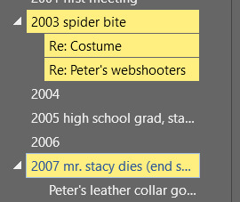
why is this so low contrast?! even if i wanted to use the white or colorful theme (which i don't) it's still very difficult to see... why would they do this... if i'm ctrl+f-ing through a document it's kind of useful to be able to easily and quickly see where i am????
for comparison word 2010's equivalent looks like this:

it's not super high contrast or anything but it's still way more differentiated than 2019's UI...
ugh i don't even hate minimalistic ui if it's done well but this is so inaccessible lol
#so far i have had no problems using 2019 in the past 24 hours but this is irritating especially for a VERY large document#where i need to be able to actually clearly see what section i am ctrl-f-ing things in where there may be 50 or more hits#this is almost as bad as the mini map in cp77 using green on cyan#not quite as bad i legit had to enable colorblind mode for the UI in that game despite having very good color vision#because their choices for the mini map were just completely illegible#other than a slight astigmatism i have great eyesight! but so many UIs are just so poorly designed... it's baffling to me#anyway the results view is useful too but in this case i really do need to be able to see clearly which heading aka year it's under lol#and of course i cannot modify this or make my own custom color for the user interface#irritating! i will just have to fucking squint at it now i guess. instead of. you know. just being able to glance quickly. lmao.#nadia rambles
1 note
·
View note
Last Seen Blogs

indianmistressanumalkin
Indian Mistress Anu Malkin

malewif3-ev4n
Evan

aimee-if-tulpa
Imaginary Friend Aimee

1gattara
Gattaraaaa
