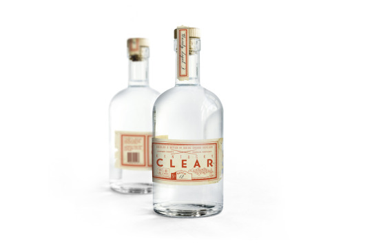
#packaging design
Explore tagged Tumblr posts
Text
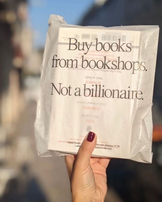
Salted Books
1K notes
·
View notes
Text
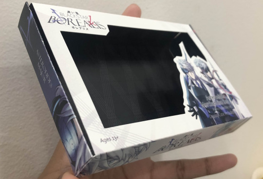
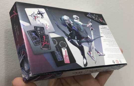
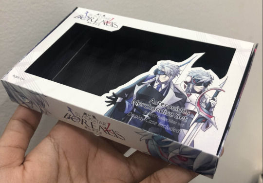
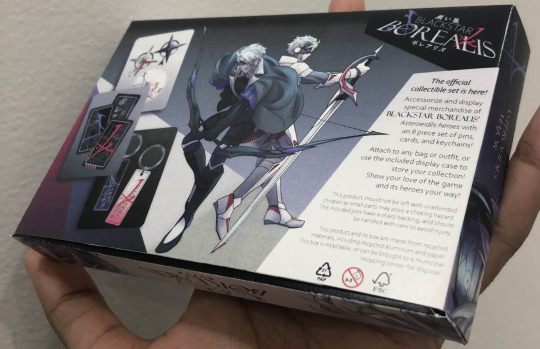
I'm doing product design in school, I loved getting to incorporate these two into project work. They came out surprisingly well in the print, especially considering they were raster and the program I used didn't differentiate CMYK and RGB.
This is an incomplete model case for merchandise of a hypothetical RPG where these two are your main heroes. Gameplay would involve you using both in battle sequences, switching between them to pressure opponents from all ranges.
This is how the illustrations look by the way, I'm really happy with the front cover.
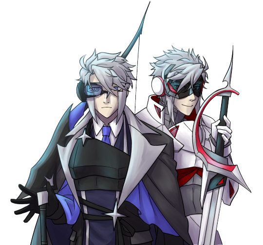



Would you play this?
#submas#submas au#au#ingo#subway master ingo#ingo pokemon#nobori#emmet#subway master emmet#emmet pokemon#kudari#packaging design#character art#character illustration#design mockup#slightly inconvenient timing because the actual submas sygna suit gacha drop just happened‚ but since I can't do personal work right now‚#this is kinda my only way to celebrate them being released#good luck all in getting them‚ I think their designs are very cool!!
159 notes
·
View notes
Text

Bassike By TRiC
#minimalism#design#graphic design#minimal design#typography#minimalist photography#architecture#art direction#photography#packaging design#fashion design#fashion#fashion accessories#fashion styling#fashion style#fashion branding
51 notes
·
View notes
Text
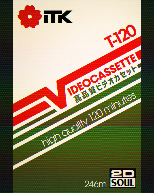
T120 Videocassette
Click here to check out my brand 'Supercassette'!
#vhs#cassette#cassette tape#nostalgia#aesthetic#a e s t h e t i c#retro#80s#90s#pop art#videocassette#design#packaging design#graphic design#graphic art#xmas#supercassette#warakami#retro design
87 notes
·
View notes
Text

Made a starter pack as well!! \(◕ ◡ ◕\)
http://instagram.com/lorenzodalessandro
#illustration#comics#illustrazione#drawing#editorial#digital art#starter pack#packaging design#thief#no ai art#no to generative ai#male portrait#toys#concept art#graphic design#art#for hire#illustrators on tumblr#artists on tumblr#semi realistic#humor#bizarre
40 notes
·
View notes
Photo
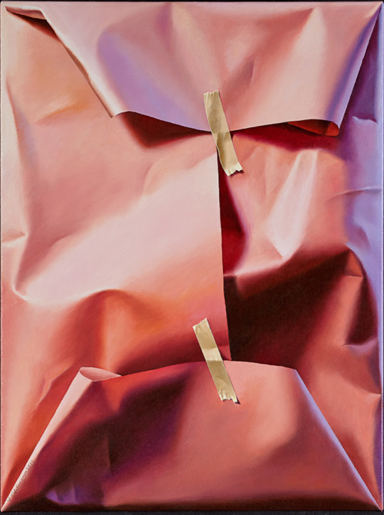
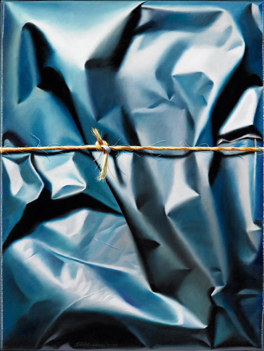
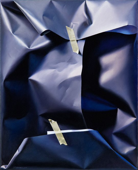
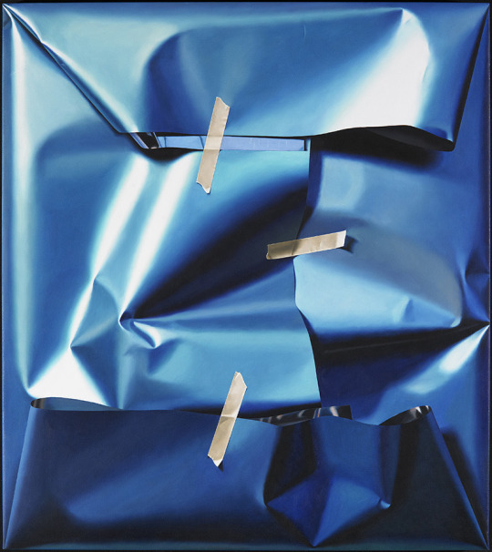
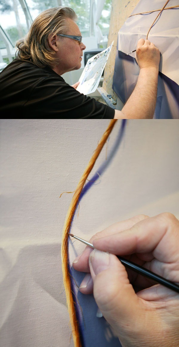
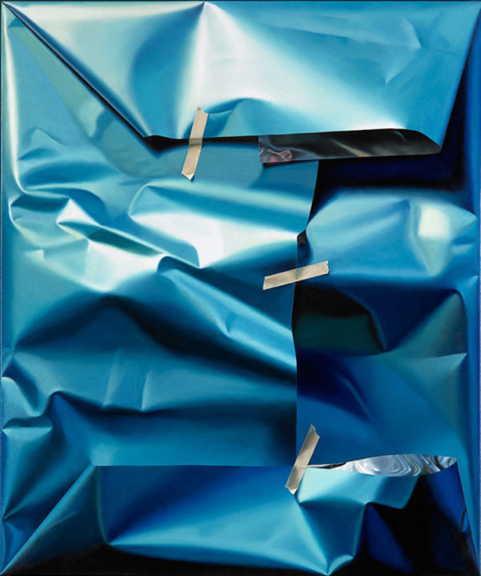
Unboxing Illusions: Yrjö Edelmann's Hyperrealistic Packaging Paintings
109 notes
·
View notes
Text
2024 Velaris Advent Calendar
I had the pleasure of collaborating with Gadget4entertainment on their 2024 Velaris Advent Calendar, officially licensed by author Sarah J. Maas! I illustrated the entire packaging, inside and out.


The main illustration features Velaris, the City of Starlight.

I'd just visited Positano before the shop contacted me for the project, so the memories of some corners of the town were still fresh in my mind. The house on the left was inspired by a hotel built on a curving uphill road, for example, and the houses on the right were vaguely inspired by all those hotels and restaurants you can see from above (at level, you might not notice them, but when you're directly above and you peer down through the trees, you'll go, "Oh, there's a nice, expensive hotel down there!").


The town divided by the river was inspired by the fjords of Kotor, Montenegro, which I visited last year (Kotor is absolutely beautiful, and the food was great to my Italian palate).


It felt wonderful to pour all of my emotions and memories into this piece. I think this might be my 'ultimate' version of Velaris. I don't see myself painting it differently in the future.
Then, we have the cases (house-shaped boxes) containing the single items.

When I first started working on the project, I only thought of drawing something inspired by a combination of gothic and Persian architecture. But then, fortunately, I had this idea to base each house on the Archeron sisters, and that gave me the chance to really get creative and explore different elements, styles of architecture and colours.
Sadly I only recently realised that the back of the house and the left side don't fit together seamlessly because I drew the house from left to right without keeping the wraparound box in mind - so that's totally my fault, and I hope it's not too noticeable!
I also hope these mockups don't look too bad. I used the free transform tool in PS instead of 3D, so the perspective might be a little off.
I truly enjoyed working on this calendar. I rarely get to design packaging or even work with an Italian company, so this project was a breath of fresh air!
Instagram - ArtStation - Website - Inprnt - Etsy - Threads
#Art#Artists on tumblr#Illustration#Velaris#ACOTAR#a court of thorns and roses#Sarah J. Maas#gadget4entertainment#packaging design#advent calendar#fantasy art#Gabrielle Ragusi
39 notes
·
View notes
Text
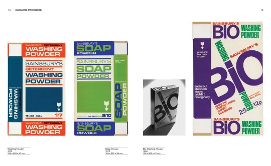
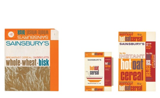
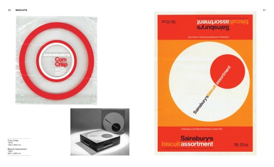
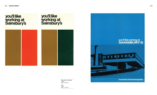
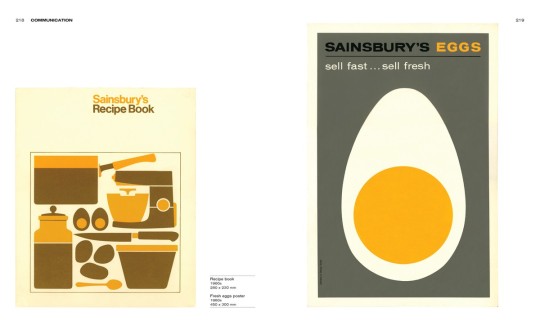

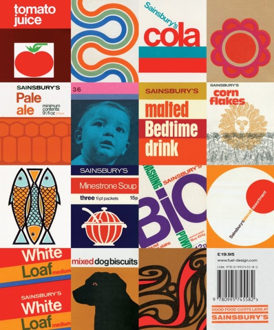
'Own Label: Sainsbury's Design Studio 1962-1977' by Jonny Trunk, published in 2011
#graphics#graphic design#design#sainsbury's#packaging#packaging design#retro style#retro design#bauhaus#type design#composition
73 notes
·
View notes
Text
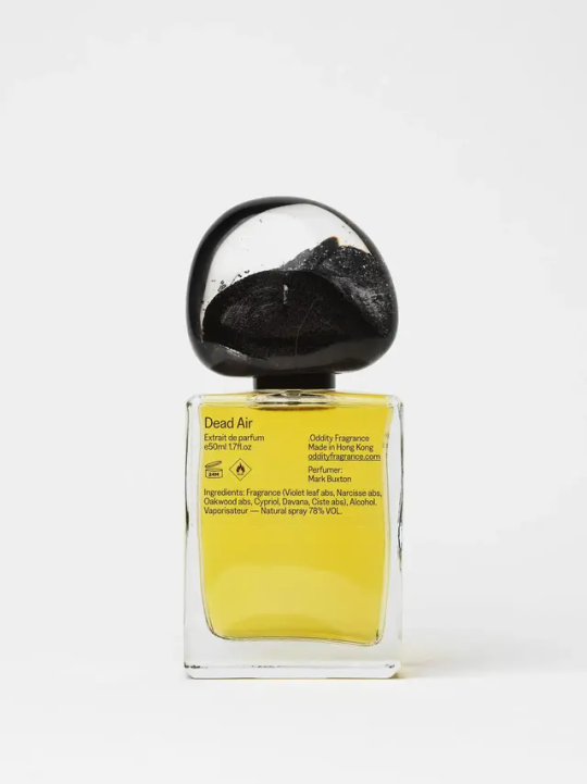
#packaging design#best packaging design#perfume bottle design#scent design#designlove#designers unite#minimal design#bottle design
32 notes
·
View notes
Text
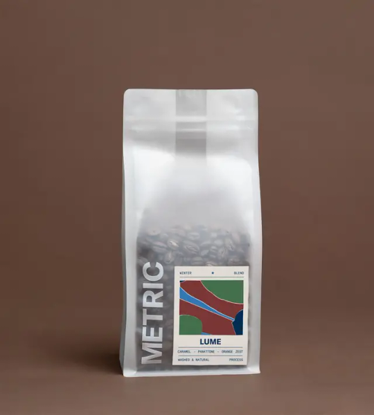
Lume
185 notes
·
View notes
Text
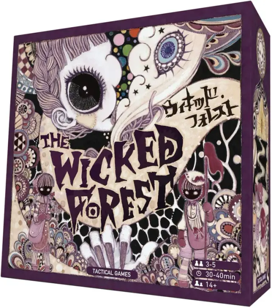
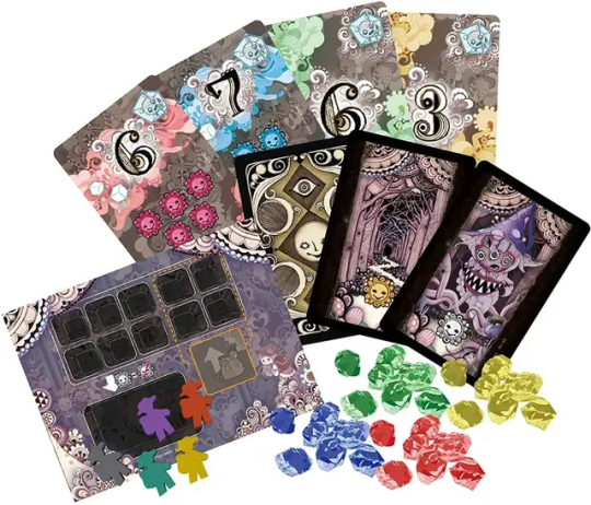
the wicked forest designed by gekidan inu curry.
#gekidan inu curry#劇団イヌカレー#illustration#puella magi madoka magica#packaging design#board game design
83 notes
·
View notes
Text


Coolbeans Roastery - branding by Sarah See
Coolbeans provides a sober experience and space for young people to socialise and enjoy caffeinated beverages without drugs and alcohol. Based in Cape Town and Sydney these cultural hubs are a perfect place to bring young people together and enjoy a cold one!
Learn more about the project at here.
#graphic design#minimalism#packaging#packaging design#brand identity#art direction#food design#art#minimal type#type design#logo design#fresh design#minimalist design#fashion design#fashion style#minimal fashion#minimal design#design#typography#minimalist photography#typeface#fashion campaign#fashion editorial#fashion photography#colour
32 notes
·
View notes
Text


Packaging designed by Helmut Schmidt
Pantocrin (1980)
Hi-Z (1988)
L-Cartin (1988)
Mucosta (1988)
via Designculture
12 notes
·
View notes

