#principlesofgraphicdesign
Explore tagged Tumblr posts
Visit Tumblr Blog
Explore Tumblr blogs with no restrictions, modern design and the best experience.
Last Seen Tumblr Blogs


Fun Fact
The Tumblr app for Google Glass was released on May 16, 2013.
Text


What is a logo redesign ?
A logo redesign refers to a minor change or overhaul of a design. While a logo redesign may be the product of a larger change in brand purpose, core or mission values, redesign itself includes all visual changes made to an existing logo.
@patbarak @uob-funoon
#uob funoon#uob#FA222#drawing#art#art and design#principlesofgraphicdesign#visual metaphor#photography
13 notes
·
View notes
Text
-
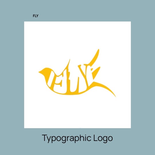
Typographic logo (fly)
@patriciabarakat @uob-funoon
#principlesofgraphicdesign#artwork#decor#drawing#sketch#uob funoon#uob students design artsanddesign
10 notes
·
View notes
Photo

A small guide for all designing aspirants. We are beginning with an educational series. Stay tuned. All of you guys gonna enjoy this ride. #kalapurnaminstitute #kalapurnaminstituteahmedabad #graphicdesign #principlesofgraphicdesign #learninggraphicdesign #digitaldesign #designisinthedetails #designislife https://www.instagram.com/p/Ckk9da8M4W-/?igshid=NGJjMDIxMWI=
#kalapurnaminstitute#kalapurnaminstituteahmedabad#graphicdesign#principlesofgraphicdesign#learninggraphicdesign#digitaldesign#designisinthedetails#designislife
0 notes
Photo


Imaging and Design for Online Environment is an online graphics and layouts that taught me many effective things in order for me to use image design and its advantages.They can improve cognition by utilizing graphics to enhance the human visual system's ability to see patterns and trends.
When we refer to the online environment, we are referring to the virtual space in which learners participate in the learning experience. ... In this process, learners and instructors are emotionally present when they connect with others in an authentic way during the online learning experience.

Balance
Visual balance comes from arranging the elements so that no section is heavier than another. Sometimes elements are thrown out of balance to give emphasis or create a certain mood.
Proximity / Unity The relationship between people or elements in a design is affected by proximity. How close or far apart elements are, suggest a relationship or lack of a relationship with each other. Unity can be created by using a third element to connect distant parts. Are all the title elements together? Is contact information altogether? Are all related elements together? In design proximity or closeness creates a bond or a link.
Alignment
Alignment brings order to the design. How type and graphics are aligned on a page and in relation to each other makes the layout easier or more difficult to read. Has a grid been used? Is there a common alignment? RHS, LHS, centred? Does the alignment aid or hinder readability? Has it been done with a specific goal in mind?
Repetition / Consistency
Repeating design elements and consistency of style shows a reader where to go and helps them navigate the design. Do the page numbers appear in the same place from page to page? Are headlines consistent in size style, placement? Is the style consistent throughout?
Contrast
In design, big and small elements black and white text and graphics all create contrast. Contrast helps different elements stand out. Does the design have enough contrast? Is there enough contrast between text and background for it to stand out and be readable? Are the more important elements, headlines, calls to action contrasting enough to stand out?
White space
Designs that cram too much into a small space are uncomfortable and may be confusing and difficult to read. White space gives the design breathing space. Is there enough space between columns of text? Does text sit clear of the graphics? But beware too much white space and the elements will seem to float on the page.
Excellent graphic design will have all these elements in place producing pleasing and effective designs. Designs that excite the reader and re-enforce the message being conveyed.

An infographic is a collection of imagery, charts, and minimal text that gives an easy-to-understand overview of a topic. As in the example below, infographics use striking, engaging visuals to communicate information quickly and clearly.
Infographics are graphic visual representations of information, data, or knowledge intended to present information quickly and clearly. They can improve cognition by utilizing graphics to enhance the human visual system's ability to see patterns and trends.
0 notes
Link
Learn the fundamental principles of graphic designing and also get to know about the elements of graphic designing. For more information visit us today.
#what makes good graphic design#graphic design#graphc#design#desining#principles#principlesofgraphicdesign#elementsofgraphicdesigning
0 notes
Photo


Drawing Letterforms and Annotating
These are some guides to learning the terms used for typography.
We used letterpress blocks to give us reference letters, we then drew the letters in the correct proportions. I enjoyed being able to study different letterforms and try and replicate them, it was also helpful to have a slight refresh of typography terms.
0 notes
Text

My logo •
spring 2023.
•What is your opinion ?
@patbarak @uob-funoon
#principlesofgraphicdesign#uob#graphic design#FA222#fine art#art#uob funoon#drawing#metaphoricalness#photography#visual#visual metaphor#art and design#my draws
11 notes
·
View notes
Text


Typography Logo •
A typographic logo is a textual logo, although it may contain symbols, images, or geometric shapes.
Typographic logo design is just one of the many possible processes that take place in the creative process. A logo that can be read even if it is displayed or printed in a small size or an abbreviation of its idea and meaning.
@patbarak @uob-funoon
#uob funoon#uob#art#my draws#principlesofgraphicdesign#art and design#photography#visual metaphor#graphic designer#FA222
11 notes
·
View notes
Text

-
@patriciabarakat
#uob_students #design #artsanddesign #designer
#artist #art #illustration #barcode #barcode_design #graphicdesign #art #art_graphic #disiner #artist #uob #sketch#titanic #pfy #color #drawing #fa222 #principlesofgraphicdesign
8 notes
·
View notes
Text

-
#uob_students #design #artsanddesign #designer
#artist #art #illustration #barcode #barcode_design #graphicdesign #art #art_graphic #disiner #artist #uob #sketch#titanic #pfy #color #drawing #fa222 #principlesofgraphicdesign
8 notes
·
View notes
Photo

Size
Size is used in design to convey importance, attract attention and to create contrast.
0 notes
Photo

Space
Space consists of positive and negative space. Positive space is the element that is the focus of the design such as an image or text etc. The surrounding space is considered the negative space. The negative space is used to organise the elements in the positive space, it also helps to guide the audiences eyes.
0 notes
Photo

Contrast
Contrast is when elements in a design are different. This could be contrasting colours, textures, sizes, typefaces etc.
0 notes
Photo

Repetition
This is the technique of repeating elements within a design to give the piece or pieces a unified look. This helps to add consistency
0 notes
Photo

Alignment
Alignment is the arrangement of elements in relation to a line of margin. This could consist of edge alignment where elements are aligned to the margin with their outer edge. This could also be central alignment which is when elements are aligned based on their central axis.
Type can also be aligned within a paragraph, this can be flush right or left, central and justified.
0 notes
Photo

Proximity
The arrangement of related elements to create a visual grouping. This grouping shows the relationship between elements.
0 notes