#richard ljoenes
Text
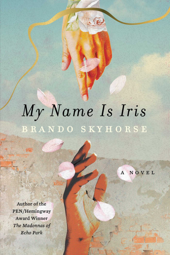
My Name is Iris: A Novel
By Brando Skyhorse.
Design by Richard Ljoenes.
3 notes
·
View notes
Text
Book Covers of Note, June 2023
View On WordPress
#alex merto#beci kelly#ben wiseman#beth steidle#book covers#book covers 2023#book covers of note#Books#design#eric fuentecilla#janet hansen#jaya miceli#jaya nicely#john gall#luke bird#nico taylor#olga grlic#philip pascuzzo#rafi romaya#richard ljoenes#wh chong
5 notes
·
View notes
Text
30 Covers, 30 Days 2018: Day Fourteen
Every November, during National Novel Writing Month, thirty professional designers volunteer to create book cover art inspired by novels being written by aspiring authors from around the globe. Why? To encourage new, diverse voices, and help build a more creative world.
30 Covers, 30 Days is presented in partnership with designer and author Debbie Millman. Read more about these NaNoWriMo 2018 novels-in-progress, and the cover designers, below.
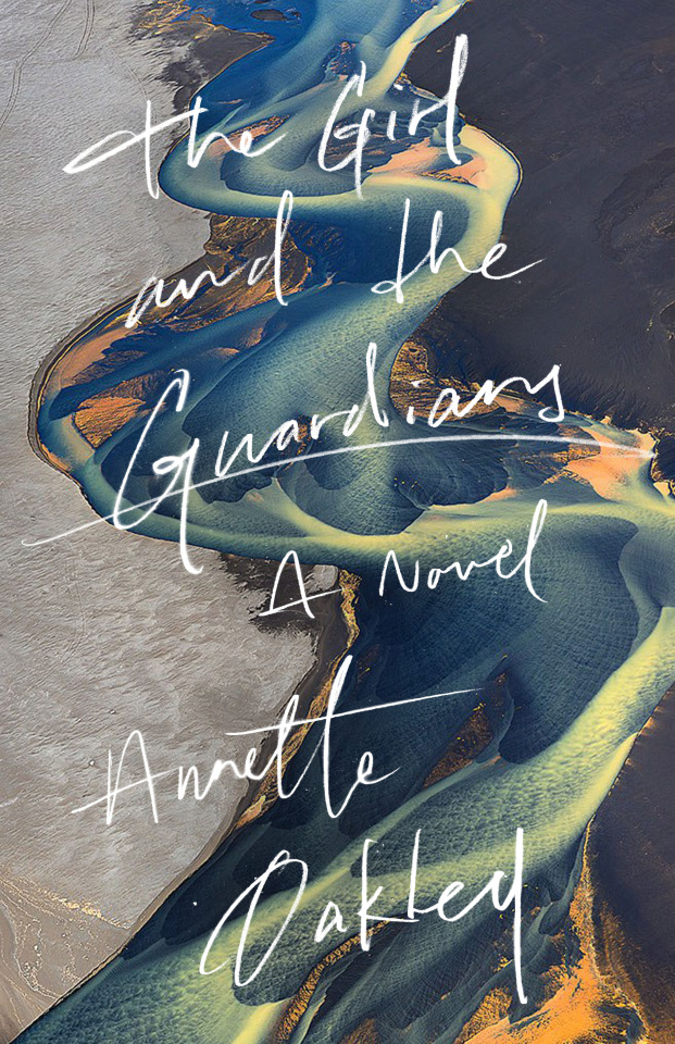
The Girl and the Guardians
An Experimental novel being written this November by NaNo participant Annette Oakley in the United States.
Ellie Sigurd's always been intrigued by her Icelandic heritage. She's read books, took basic Icelandic in university, and scoured the web for photos, but she's never been allowed to visit. Every time she's tried, her family has shut her down, refusing to tell her anything about her history--not even her grandfather's name.
They're scared and superstitious, and she doesn't know why.
After graduating from university, Ellie rebels, taking a solo trip to Iceland to pursue answers to the life-long questions she's had about her heritage. It's there she meets Katla Rosenburg, a wild, adventure-loving native with dreams of taking a "road trip to end all road trips" around the country. She talks Ellie into letting her tag along as a local guide, and it's fabulous and fun ... until things start to go wrong.
Ellie discovers her grandfather was murdered, despite what authorities had claimed for years. Locals talk about a family curse--an ancient bargain with the land spirits they claim she must fulfill. Katla starts to grow distant and warns Ellie to never stray from the main road. And then there's the wooden doll of an old woman following her wherever she goes, begging her to pick it up...
Begging to show her that sometimes, the folklore women tell their children to keep them in bed at night? It's all real ... and coming for her.
Cover designer Richard Ljoenes shared an alternate cover version and some notes about the design process:
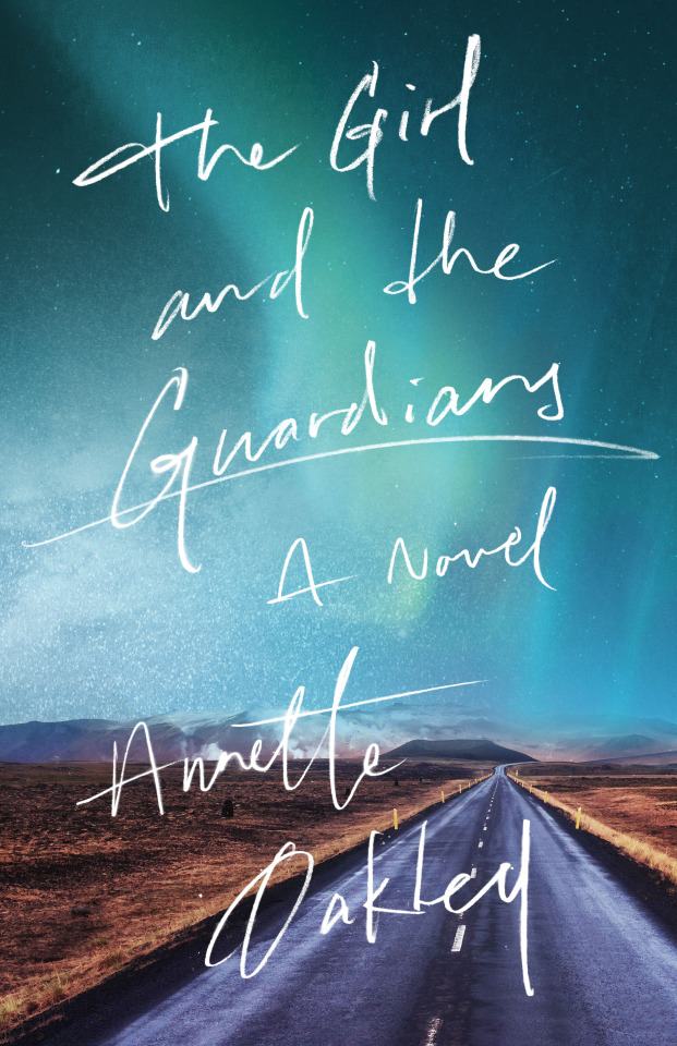
“The photograph is by Russian photographer Andre Ermolaev. It depicts a Volcanic river in Iceland. I thought the beauty and forcefulness of it was a perfect way to capture not only the dramatic Icelandic scenery throughout the book, but also old Icelandic folklore and the violent family curse—the ancient bargain with the land spirits. I hand-lettered the type to be somewhat fitting of young person and their journal entries during the main event—the road-trip through this raw and rugged land.
Outtakes included designs using photos of Icelandic mountain roads against the backdrop of Aurora Borealis, which also suggested some of the spiritual/supernatural qualities of the story, but ultimately felt a bit too familiar.”
Stay tuned for new covers every day of the month!
If you’re interested in entering your novel to the 30 Covers, 30 Days program, check out the instructions here. Don’t forget, November 15 is the last day to submit.
Cover Designed by Richard Ljoenes

Richard Ljoenes is a Designer and Art Director based in New York City. He primarily works on book covers and illustrated interiors, but his background also includes advertising and corporate identity. Ljoenes’s design and art direction has been awarded and recognized by The One Show, Type Directors Club, Communication Arts, The Cannes Lions Awards, Art Directors Club, Graphis, Print Magazine, How Magazine, and Graphic Design USA who named him a designer to watch in 2018. He has worked on over fifty New York Times Bestsellers. Ljoenes currently runs his own studio and is available for projects.
You can find Richard online at www.richardljoenes.com and on Instagram @richardljoenes.
113 notes
·
View notes
Text
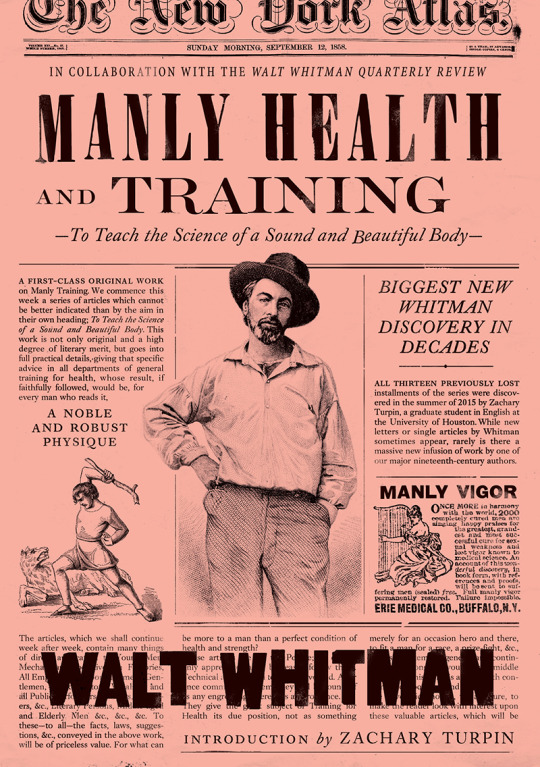
Manly Health and Training
Author: Walt Whitman (author), Zachary Turpin (introduction), Kathy Huck (editor)
Publisher: Regan Arts 2017
Creative+Art Director: Richard Ljoenes
Designer: Richard Ljoenes
Design Firm: Regan Arts
Typefaces: Blackletter for the newspaper logo, condensed serif (possibly Bodoni Poster Std Compressed) for title, old-style serif (possibly Garamond) for subtitle, and a slightly condensed geometric heavy sans serif for smaller titles and author name.
I really appreciate the cover for this book, especially because of the content within the book. This book is a compilation of three articles written by Walt Whitman under his pen name “Mose Velsor,” and was lost for more than 150 years. Recently, these mid-nineteenth century articles were discovered and compiled. This cover feels as if it were made during this time period, and the font choices and illustration style really drive this concept. The fact that the cover is a based on newspaper design not only fits the concept of this book, but the concept of my exhibition catalogue as well.
The old-style serif, which I believe is Garamond, is very successful in this context. The use of small caps, all caps, italics, drop caps, and other styles while using this font really make this feel as if it came from this time period. The grid and justification also drive this point, and are things I can implement into my exhibition catalogue. The font pairings are also very successful, and the slight use of the sans-serif is very dynamic. The illustration style, use of lines, and the all over texture/grain of this cover really tie everything together and make it feel dated, almost as if it were clipped from an actual newspaper. The color of the cover suggests that this book is somewhat modern, showing contrast between the date the content was created and the actual release date of the book. The Authors name over the text is successful in suggesting that this is not a newspaper, but in fact a book cover.
I really think I can take a lot of the design and type choices into consideration here, especially the use of illustration and the all around old-time feel of this cover, while still suggesting that it’s somewhat modern. The hierarchy is really successful, and is something I’m currently struggling with on my exhibition catalogue. The contrast in typefaces really helps this hierarchy.
—Seth
0 notes
Text
30 Covers, 30 Days 2018: Wrap-Up!

That’s a wrap on another NaNoWriMo, which means it’s the end of another year’s 30 Covers, 30 Days series! Whether you wrote fifty words or fifty thousand, you got your stories onto the page! So pat yourself on the back. I’ll wait here.
Excellent! I want to talk a little bit about this project; as this was my second year coordinating the series, I got to read all of your nearly three thousand synopses, and every one of them brought something unique to the table. I’m seriously blown away by how amazing your novels -- and the covers they inspired -- have turned out to be.
Before I get to the fast facts about this year’s series, I need to extend a few words of thanks.
First, immense thanks as always to the amazing Debbie Millman, for facilitating this project every year, gathering all these fantastic designers in one place, and for designing a cover herself! Thanks for all your help getting this project off the ground, and answering all my questions along the way.
This wouldn’t be possible without all the designers who volunteered to make covers this year (and in years past). You made some stunning covers, on a short deadline, for free, frequently ahead of schedule, and with enthusiasm every day. Thanks for your patience and quick responses to all of my emails, and for making covers that thirty authors will cherish, and that amazed, thrilled, puzzled, and inspired writers on the blog, forums, and beyond all month long.
If you received a cover, or just felt inspired by one, please take a moment to let these designers know how cool they are; the complete list of designers, including links to their websites and social media, is available at the end of the post.
If you want to leave some feedback, there’s a form available! This helps us tweak and tune up the project each year.
Finally, thank you to all of you who took on the challenge, submitted synopses throughout October and November, and for keeping up with the blog and forum posts every day.
---
As with every year, of course, November only has thirty short days -- and with them, only thirty lucky writers selected for each edition of the project via our proprietary, time-bending, squirrel-powered synopsis algorithm.
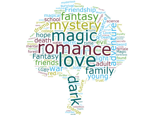
This year, we had winners from all around the world, including from Iceland, Nigeria, and Peru. And, as novels from Young Writers made up about a quarter of submissions, there were set to be seven YWP covers. Alas, a couple of them fell through a hole in time and space and there ended up being only five; next year will have the complete set. There was also a wide range of genres represented:

We also used the keywords and tags from thousands of submissions to create a word tree!
Please give another round of applause to the designers who contributed their time and effort to this awesome project!
John Hamilton designed Enemy Music
Katie Manos designed The Ghosts of Miller Manor
Jesse Hernandez designed Apologize
Michelle Hobbs designed Autumn’s Blessing
Michael Braley designed The White Darkness
Kelly Knaga designed No Results Found
Alberto Rigau designed Shadow of Twilight
Kevin Perry designed Red Riding, P.I.
Henry Sene Yee designed The Killing Thing
Cookie Redding designed Sunsets and Tea
David Hisaya Asari designed We Could Be Heroes
Mark Pagano designed Dragon Kingdom & The Wishing Stone
Don Hollis designed Perspicuus
Richard Ljoenes designed The Girl and the Guardians
Alexandra Alcantara designed The Island
Josh Ege designed Trapped
Val Head designed Cracking Up
Traci Larson designed Monroe & Patsy: A Few Times Too Many
Eva Crawford designed Nursing Holmes
Frances Yllana designed Albion Grove
Courtney Glancy designed To Stand Tall Amongst the Stars
Christopher Simmons designed Unprompted
Tan Le designed Windycrest
Debbie Millman designed The Circle
Roshanak Keyghobadi designed Balaton
Nick Fierro designed Emu
Wesley Sueker designed Combat Mind
Ksenya Samarskaya designed The Author
Adriane Stark designed Bianca, It's Complicated!
Jina Anne designed The Sorcerer’s Maid
It’s been a blast helping coordinate 30 Covers, 30 Days once more. I’m looking forward to seeing next year’s covers!
-Nick Fierro, Editorial & Programs Intern
83 notes
·
View notes
Last Seen Blogs