#spent so long trying to get the green to work with the limited colour pallet we get
Text
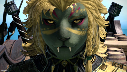

Introducing the Hrothgal that I will fantasia my main into. She needs a name but I love her already!
#im love her#spent so long trying to get the green to work with the limited colour pallet we get#probably wont be a viper but i dont get a choice in the benchmark#hrothgal#female hrothgar#hrothgar#ffxiv#ffxiv dawntrail benchmark#ffxiv character creator#my hrothgals
9 notes
·
View notes
Note
I really love your work and style ~ especially the comic you have going on with Peter and Yondu. I just have a small question to ask; how do you choose your colour pallet? (I have a hard time and I find what I do, looks like a pop art piece)
Thanks so much, @darkotakucatgirl! I��m not that great w/ color still (it’s something that I’ve been struggling with and working on for years now haha…slowly but surely getting better at it, but it’s definitely not something I can intuit like others can). It’d be good to know some basic color theory of course. Understanding the color wheel and the concepts of monochromatic, analogous, complementary, triadic and split complementary colors is a good idea. Also understanding warm colors versus cold colors, and what these can say in a scene (bluer/cooler colors can be sad or calm, red can be angry or exciting, etc etc). Apart from that, my usual process is to actually pick out the pallette before I even start coloring any scene in the comic. I usually pick out three or so colors (usually limit it to 2 or 3 main ones so as not to muddy it too much) based one 1) the local color of the scene and 2) the general atmosphere/feel I want to present. Some other things to keep in mind when you’re picking colors is what colors the characters (if any) or focal point of the piece consist of too. If you want them to pop out in the composition, you can use an opposing color for the backgrounds. If you want them and the background to be more unified you can have the pallette be more similar.
So the Yondu comic for instance…

I had my 3 colors, which I chose for the rusty feeling of the inside of the ravager ship and color scheme + some pop color (which is Yondu’s skin actually lol), and I spent a moment blending them all together and coming up with a pallet of different colors I can use for the background painting. It’s pretty neat because you can come up with a pretty wide breadth of colors by just mixing 3 together, and they’re all generally unified. And since I’m a cheat, if I needed to get any darker with areas, or lighter, I picked one color from this pallette for shadow and another one for light, and I would brush the shadow color on a multiply layer onto the areas needing dark in it, and do the same w/ the light color for light areas, but this time with an overlay layer.
I also did this with my comic Desendi. I have this pallet open while I work to pick and blend from, though it’s a lot less intelligible than the above haha


w/ the color scheme mostly being these adjacent colors of green/yellow/cyan, plus some Orange here and there for pop and warmth. Odessa and the other characters in this scene tend to wear more saturated and warm colors compared to the BG to so they don’t sink in too much through the course of the scene (if I did my job right).
Long story short - Good idea to limit your colors based on both the local colors of the environment and what feeling you want to put across, build a pallette out of those colors with mixing so that it stays generally unified, use saturation and pop colors generally sparingly.
So yeah, relatively basic stuff, but I hope it helped a little? If there are any more questions I’d be happy to see if I can say anything! Like I said, I’m really still learning too, and trying to figure out how to make these things work. Color is hard!!
88 notes
·
View notes
Last Seen Blogs
stillinskisbluejeep
Nikova

brando-thirst
Art & Fear
georgiaturblog
Untitled
razor-tits
What is dead may never die
mylesicy
Myles