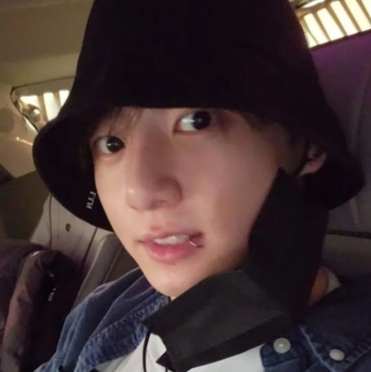
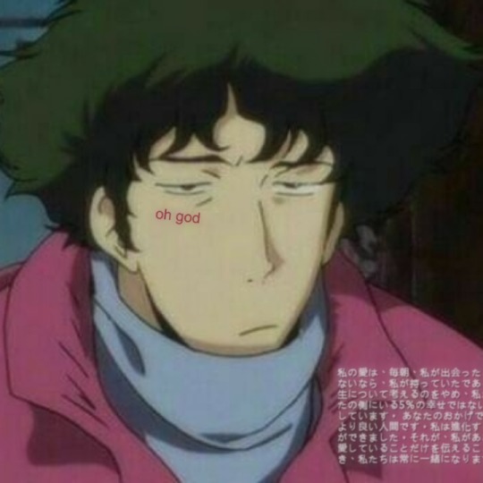
#spike spiegel layouts
Text
cigarettes and daydreams
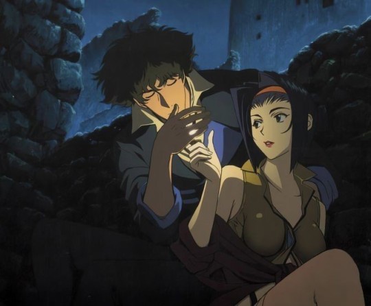


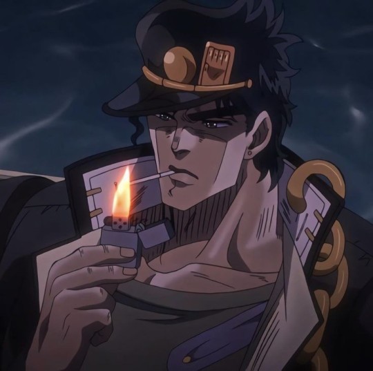

#anime#anime layouts#parallels#hayao mizayaki#cowboy bebop#spike spiegel#the wind rises#chainsaw man#aki chainsaw man#csm#himeno chainsaw man#himeno csm#hayakawa aki#aki hayakawa#asuma sarutobi#shikamaru nara#naruto shikamaru#naruto#naruto shippuden#sanji#one piece#hirotaka nifuji#wotaku ni koi wa muzukashii#jojo's bizarre adventure#black clover#yami sukehiro#cigerette
98 notes
·
View notes
Text

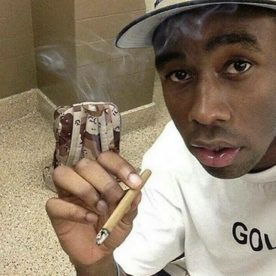


idk what else to say i'm out of creativity 😵💫😵💫
#newjeans#tyler the creator#bts#cowboy bebop#hyein#namjoon#rm#taehyung#yoongi#v#suga#spike spiegel#icons#layouts#headers#funny#gg#lq#aesthetic#kpop#meme#anime
609 notes
·
View notes
Text


言葉よりもっと強RESONANCEい響きが今聞こえるか
#soul eater icons#messy moodboard#layouts#anime#soul eater#anime layouts#soul eater layouys#maka albarn#cowboy bebop#faye valentine#spike spiegel#cowboy bebop icons#headers#messy headers#anime headers#maka albarn layouts#soul evans#maka and soul#2nd header by me#moodboard#anime moodboard#manga layouts#twitter headers#anime icons#anime girl#maka albarn icons#maka ics#carrd stuff#indie moodboard#inspo
16 notes
·
View notes
Text


⌕ cowboy bebop - spike spiegel.
like or reblog if you save/use.
#cowboyb#cowboy bebop icons#cowboy bebop#cowboy bebop spike#spike#spike spiegel icons#spike icons#spike spiegel#90s vintage#90s icons#90s anime#anime layouts#anime icons#manga icons#twitter layouts#animes layouts#manga layouts#anime packs#anime icon
166 notes
·
View notes
Text


꒰ INBOX / TO-DO ! ꒱ ︵︵♡
♡ toya & akito (pjsk) graphics
♡ toya (pjsk) graphics
♡ aubrey, hero, or sweetheart (omori) layouts
♡ q (bsd) graphics
♡ kiara hoshi (jjk) graphics
♡ miku (pjsk) graphics
♡ bandori graphics
♡ makoto yuki (persona 3) graphics
♡ rui (pjsk) or seta kaoru (bandori) graphics
♡ princess (tophamhatkyo songs) graphics
♡ princess (tophamhatkyo songs) discord layouts
♡ spike spiegel (cowboy bebop) graphics
♡ junkrat (overwatch) graphics
♡ luocha (hsr) graphics
♡ shinjiro aragaki (persona 3) graphics
♡ kubz scouts pixels
♡ hayasaka (kaguya-sama love is war) pixels
♡ draculara pixels
♡ emu otori pixels
♡ yusuke (persona 5) pixels
♡ osaka (azumanfa daioh) pixels
♡ rayman legends pixels
꒰ QUEUED . . . ꒱ ︵︵♡
11 notes
·
View notes
Text


#jennie layouts#jennie packs#jungkook messy layouts#messy layouts#anime headers#anime layouts#jennie messy layouts#ggs messy layouts#ggs icons#ggs layouts#jungkook layouts#jungkook dark packs#bts layouts#ergo proxy headers#ryu layouts#ergo proxy layouts#kimi ni todoke#kimi ni todoke layouts#spike spiegel layouts#edgy layouts#blackpink layouts#bp layouts#cowboy bebop#meme layouts#messycore#alt layouts
153 notes
·
View notes
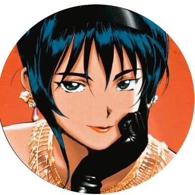
Note
faz users de cowboy bebop por favor? obrigada ❤️
spikemitudo
jetb60s
i4bebop
spiegelMITO
fayevils
_see_you_cowboy
edfolls
spikeT__T

#ask#random users#anime users#manga users#cb#cowboy bebop#cowboy bebop icons#cowboy bebop packs#cowboy bebop users#cowboy bebop layouts#see you in space cowboy#spike spiegel icons#spike spiegel layouts#spike spiegel#edward#ed#faye valentine#jet black
57 notes
·
View notes
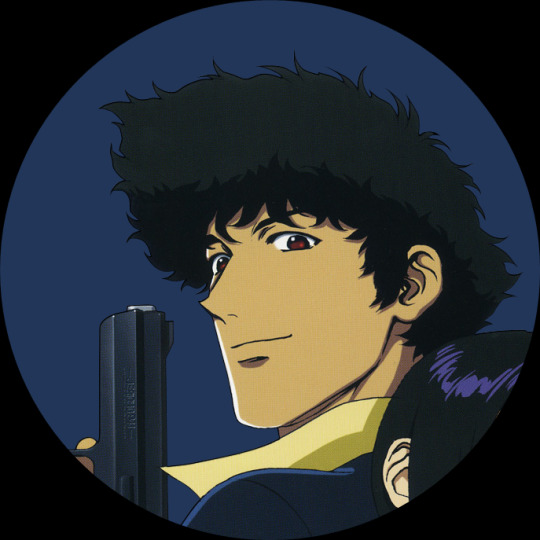
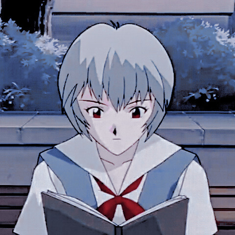
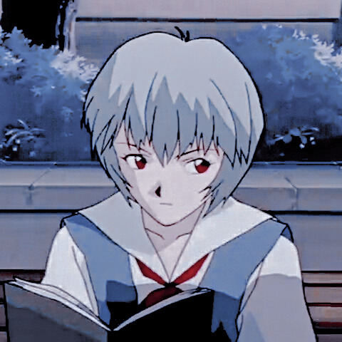
Text


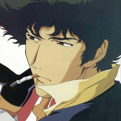


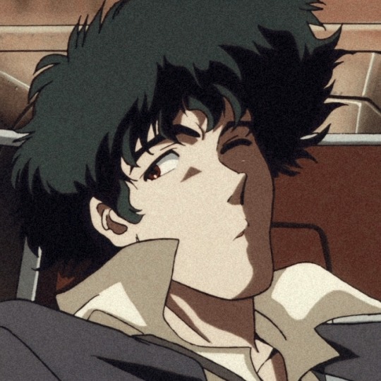
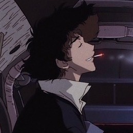
spike spiegel layouts.
♡ like or reblog if u saved.
♡ by @ c4rseat on twitter.
#anime#anime icons#icons#anime edit#anime packs#anime layouts#spike spiegel#spike#spike icons#spike layouts#spike packs#cowboy bebop#cowboy bebop icons#cowboy bebop layouts#cowboy bebop packs#cute#headers#blue#yellow#aesthetic
302 notes
·
View notes
Photo


Cowboy Bebop Match Layout.
#cowboy bebop#cowboy bebop layout#cowboy bebop match#cowboy bebop match icons#cowboy bebop matching icons#match icons#matching icons#anime match icons#anime matching icons#mystuff#faye valentine#spike spiegel#manga#anime#anime copuple#couple icons#couple icon#anime couple icons
290 notes
·
View notes
Text


I wish A*Teens did more Abba songs. Don’t listen to me. I’m just sleepy.
#danger mouse#layouts#edward elric#fullmetal alchemist#cowboy bebop#spike spiegel#pokemon#ash ketchum#blood#fight#a*teens#abba#sleepy#yugioh duel monsters#katsuya jonouchi#joey wheeler
3 notes
·
View notes
Text

˚ ༘♡ ·˚꒰ #ᥕᥱᥣᥴ᥆꧑ᥱ t᥆ ꧑ᥡ bᥣ᥆g‼ ꒱ ₊˚ˑ༄
✧ ∟ 「“ ABOUT ME¡¡ ” ♡
;Hi! My name is Malena but you can call me Male, Sheyla, Belén or whatever you want, my MBTI is INFP, my sign is Gemini and my birthday is May 31, my pronoun is “she / she / her” but any pronoun is fine. I live in Argentina, I stan Lali, Gastón Dalmau, China Suárez, among others, I love acting and I would like to become an actress one day <3
I've watched anime since I was going to kindergarten and I made this blog because I think we all have some character that we want to protect and also to show my editing skills (? Haha
#; ABOUT THE BLOG:
; Mostly I will upload icons / edits / wallpapers / layouts of any character and of any anime / manga / video game / series ^^
#; FAVORITE WORKS:
; Casi Ángeles, Tower Of God, Haikkyu, Slam Dunk, Chiquititas Sin Fin, Rebelde Way, SuperTorpe, Dead Dead Demon's DEDEDEDE Destruction, Dorohedoro, Soul Eater, Love Live!, Black Clover, Monster, HxH, Neon Genesis Evangelion,BanG Dream!, among others ..
#; KINNIES:
; Kika Sanata, Isla, Shinji Ikari, Homura Akemi, Atsushi Nakajima.
#; MY CONFORT CHARACTERS:
; Rei Ayanami, Mash Kyrielight, 707, Legoshi, Luna Vörg, Kenma Kozume, Poli, Nian, Steven Stone, Spike Spiegel, Himari Uehara, Mob, Arturia Pendragon, Kaworu Nagisa, Chiaki Nanami, Alluka Zoldyck ... and if I continue I would never end lol haha
📈; YES:
; anime, manga, novels, artists, interactions by comments, drawings, posters, appreciations, edits.
📉; NO:
; Criticize the likes of others, put bots, believe yourself superior to someone (not ironically), homophobic, transphobic, racists.
_
Also the intention of the blog is to create a place where you can feel safe, if you want you can also send me a dm ^^
And I'm sorry if I sometimes misspell something or misinterpret it, my main language is not English haha...
[cries in latin american :'<]
17 notes
·
View notes
Note
Spike Spiegel (Cowboy Bebop) layouts ? Thankz <3
done !! hope u like it ๑・ᴥ・๑
16 notes
·
View notes
Text
Sunday 4th October
Week 3 focused on Readability, in which we were tasked with looking into good and bad typography design on commercial artwork, the second half of the week will be about us experimenting with page layout in which we have to follow graphic design principles such as grids to design an article while the other half of the experiment was to break the principles and do whatever you want but keeping it readable.
I started by looking into good typography, specifically album covers and remembered a good example of type. This was the Cowboy Bebop soundtrack cover by Toshihiro Kawamoto.
The Cowboy Bebop Soundtrack has a cover that makes minimal use of colours to contrast the type and image together. It comes off as readable and easily accessible because the show title ‘Cowboy Bebop’ is positioned within the top quarter of the cover surrounded by white negative space and is typed in black with a bold, elongated, close kerned and sans serif font. On the other hand, the majority of the cover is an illustration of the main protagonist, Spike Spiegel, in a monochrome-like style with his skin and hair being in red, while the shadows including his eyebrows and background are in black, which keep to the covers use of three colours. In addition, there is text on the top quarter of the illustration which is in white and seems to be in the same font as the show title mentioned before but with less boldness. The white text is track list in no particular order and works well with the cover as it is positioned close to the white negative space, leaving only a red gap between them, the closeness between them give off a sense of relation and contrast, and protrudes effectively on the red background which makes it easier to read.
The bad example of type was difficult as there were surprisingly so many.

Here’s an article I found on google search which displayed some bad use of typography.
The one I chose was Usher’s album, My Way.

The typography on the album cover of Usher’s, My Way, is very unappealing and somewhat hard to read. I believe this is the case as the Times New Roman font the ‘Usher’ text is in, is a silver, serif and thin font with a shadow effect that blends into the navy/black background it is positioned on which make the already thin font look like remnants of letters, this also seems to be the case for the title of the album which is underneath the artist’s name, as the “My Way” is a similar colour to the metallic stairs Usher is standing on and the letters in particular, ‘y’, ‘w’ and ‘a’ , fuse into and make it hard to read, and makes you not want to focus on the type at all. In addition, I noticed both titles are not aligned correctly or centred to the covers size, this may be on purpose as is seems to try and align with Usher’s pose on the cover but comes off as lazy and unprofessional.
0 notes
Text
Snapchat swaps mess for money
Snap Inc. took a major risk when it completely redesigned Snapchat a few months ago -- it's no secret that people don't like change. But the company, after constantly struggling to add new users since going public last February, decided it needed to make adjustments in order to attract people and keep others coming back. The solution was to refine the app, with an easier-to-use layout and to separate friends' posts from media content, Snapchat suddenly became a more refined app. It no longer feels like an overwhelming, discombobulated mix of stories from people you know, others you don't and publishers that are trying to get your attention. And the move, based on Snap's Q4 2017 earnings report, seems to be paying off.
Yesterday, the company revealed that it has finally managed to gain a significant amount of daily active users: 8.9 million during the most recent quarter, bringing its total to 187 million. That's the largest growth since 2016, long before it was a public company. While Snapchat continues to lag far behind rivals like Instagram and Facebook -- which have 500 million and 1.4 billion daily active users, respectively -- the app's progress is notable. This rings particularly true when Snapchat's redesign is still being rolled out and only 40 percent of its users have it thus far.
The response to the major overhaul is indeed a good sign for Snap, and one that it may not have expected. Especially since, for the past three quarters, its future looked quite bleak. There wasn't enough user growth to keep investors happy, it was bleeding money and laying off workers, all signs that Snap needed to change its strategy.
Snapchat's redesigned app.
Naturally, more users means more money. Snap posted a record revenue of $285.7 million in the fourth-quarter of 2017, a substantial 72 percent increase compared to the same period the previous year. Snap CEO Evan Spiegel attributed part of this spike to the popularity of Snapchat's sports content. "This season we entertained more than 30 million football fans in the United States with over 400 NFL Stories," he said, claiming it helped generate over $100 million in revenue for Snapchat's content partners. Spiegel added that Snap's goal is to "deepen these relationships" in the coming years, which presumably means giving users access to more features (like that augmented-reality foam finger) when they're at NBA or NFL games.
Spiegel didn't go into any further detail about the rest of Snapchat's original series efforts, leaving open the question of whether they're actually successful or not. CNN, for instance, killed its made-for-Snapchat daily show last December, after the show failed to catch on. That said, Snapchat continues to draw interest from big, traditional networks like ESPN, which recently launched a Snapchat-exclusive version of "SportsCenter". Part of the goal with the redesign was to do a better job of putting these shows front and center, therefore creating more revenue opportunities, and that plan seems to be working.
One of the Snapchat features that's also turned out to be popular is Maps, which shows a collection of public Stories from events around you so you can see what people are up to at certain locations in real-time. It's the perfect tool for avoiding FOMO or stalking your friends at a concert. Snap said yesterday that Maps now has 100 million monthly active users, a notable accomplishment considering it only launched in June last year. At the moment, Spiegel said, there are no plans to monetize the feature, but don't be surprised if that changes.
"Our work during 2017 is proof that we aren't afraid to make big changes for the long-term success of our business," Spiegel said, referring to Snapchat's redesign. He also highlighted how important was to improve the Android app, where there the focus was to have fewer frame drops and, most importantly, fewer crashes.The challenge for Snap now is to be able keep this momentum up. That's something it plans to do by introducing new features like Live, which is debuting as a partnership with NBC and will let Snapchat users stream "moments" from the network's Olympic Games directly on the Discover feed.
Only time will tell if Snap's new strategy will pay off in the long term, but at least right now, it's in good shape heading into 2018. And that alone is a win for a company that, just a few months ago, was in a downward spiral. Redesigns aren't always the answer to solve an app's problems, though that seems to be just what Snapchat needed.
- Repost from: engadget Post
0 notes
Text


SP1K3 SP13G3L L4Y0UTS
fav or rt if you save— @luffyvoir on twitter
#anime layouts#anime icons#anime packs#anime messy layouts#spike spiegel#spike spiegel layouts#spike spiegel icons#cowboy bebop
131 notes
·
View notes

Last Seen Blogs
within-the-barrier-comic
Within-the-Barrier-comic

kking-64
kking64
gaybirdmom
perhaps
wontrestmyheaduntilimhome-blog
release the anger, cleanse yourself

gwensplanet
Gwen's Planet