#springwave
Explore tagged Tumblr posts
Visit Tumblr Blog
Explore Tumblr blogs with no restrictions, modern design and the best experience.
Last Seen Tumblr Blogs


Fun Fact
In February 2021, Tumblr had 518.6 million blog accounts.
Text
2.1 Sulki and Min - 3 posters to analyse


MMCA PERFORMING ARTS Poster: https://www.sulki-min.com/wp/mmca-performing-arts-2018-poster/
This poster is divided well with the way the text sits on opposite ends of the poster, framing the design in the middle.
It can appear as quite a busy design so having the simplicity of only the turquoise and white colours, works well with the poster, maintaining a good balance.
Where the text makes contact with the design, its colour converts to the turquoise so the viewer is able to clearly differentiate the text from the design as they are both the same colour. It allows for both aspects of the poster to interact and connect well. This also creates a visually appealing and intricate design, and attracts the eyes to the poster.
The text is evenly spaced on both sides, each displaying three lines of type. This adds a sense on symmetry which contrasts with the design in the middle where that appears to be uncontrolled and positioned freely on the poster. This enhances and benefits both aspects as they both stand out against one another.
The thickness of the text also contrasts nicely with the design as it is bold but thin in comparison to the thickness of the lines seen in the design.
SPRING WAVE Poster: https://www.sulki-min.com/wp/springwave-poster/
The header that reads 'SPRING WAVE' is easily communicated due to the use of the line that fills the first half of the poster as it is a strategically wavy shaped line that curves up and down.
There is a variation of weight between the main type text as that one is a thicker weight and significantly larger than the other text that is noticeably smaller and a reduced weighted text. This allows for the viewers eyes to be drawn to the larger text that appears to be the intention to be read first.
The wavy line also works as a connection of both texts and your eyes follow it along, being directed to the other typography on the poster.
There is also a clear line where the poster is divided to separate the content. This makes the poster appear more clear and readable but also they stay connected as the colour palette is all the same being in black and white.
The smaller writing that ends the curved shaped line has a left alignment which suits because it falls in line with the curved design to complete the rest of that line.
THE INTERNATIONAL MODERN DANCE FESTIVAL Poster: https://www.sulki-min.com/wp/modafe-2005-poster/
There is overlapping of the designs and the typography which creates depth and a connection between the two elements.
There is repetition not only seen in the shapes, but also in the text. With the repetition in the shapes, there is scale where some are smaller than other shapes, which creates depth and more creativity to the design.
The division of space is clear where there is 4 sections the writing is distributed to, fitting in a box shape. This separates the writing and gives your eyes a break to read each section. The smaller type are filled in between these big spacings which connects the poster and fills in awkward space.
Same type font for all big headings which makes the poster flow well and adds a layer of simplicity.
The negative space helps to visually see those 4 shapes that the writing is made up of.
2.1 Sulki and Min - A Design Annotation of 1 of these 3 posters:
'What is the intent and/or message the design is communicating?' The intention of this poster is to advertise about an International Modern Dance Festival.
'What design elements are employed in the poster?' I notice 4 square shapes that have been created by the outline of the texts. This adds more shape and structure to the design. Leading on from this, the spacing appears to be grid like because of these shapes created and the position in which they are all placed. There is also lines incorporated in this poster where they are used to separate certain text, making it more visually appealing and fill in empty space.
'How is type used in the design?' Type is used here with quite bold fonts as the headings and smaller sized type for extra information. The types formation is upside-down, vertically and horizontally. However, by using the type repetitively, the text that are not easily readable, have been repeated diagonally to show it the right way up. Also, the use of colour for type has been intentionally used to be able to show two ways to read it. They have used black to show the abbreviations within the text, and the pink to show the rest of the text, which together, can still be read as one.
'How does the design contribute to the communication of its content?' The small and large designs that are circular shaped and placed throughout this poster contributes to the communication of its message because they not only have at first glance, the look of lights which is festive, but at a closer look, they look to be designs of people coming together to perform. Furthermore, this poster incorporates a bright pink colour which is appropriate to the message as it suits the atmosphere of what this dance festival may be like; happy, bright colours, performance.
'How could the design be relevant to your work?' I appreciate the layout that the designer displayed here; how every part of the space is being used and playing with different directions of the text to frame the poster, adding a more structural look. For my site of connection, I am focusing on the Auckland Art Gallery. This type of layout could be interesting to incorporate in my work as the Art Gallery is quite a structural building.
0 notes
Text

The Springwave
This poster uses a simple, clean layout. The main title is placed at the top, clear and bold, catches attention right away. I like the wave line that runs across the page, guiding your eye and adding flow to the design
0 notes
Text

Graphic West 9: Sulki & Min (Kyoto DDD Gallery, 2021)
This design stuck out to me because of its contrast. The poster is split in half, where the heavier imagery ( the picture) is placed at the bottom and the text and lines at the top. The black type and line contrast with the white background, which makes the text and the black wave stand out more. The thick black line at the top is made to look like a wave. This is an expressive and literal way of interpreting the meaning into the design. The title, “Spring Wave,” is positioned on the left side of the poster, cutting into the thick black line. This disruption draws attention to the title, making it more noticeable. The first thing I noticed about this design is the black line at the top, the title, and then the image at the bottom. I paid closer attention to the details after looking at the main parts of the poster because they stand out more. The fonts used are DIN 1451 and Yoon Gothic 500, which give the poster more of a modern feel. Modern styles and aesthetics give more of a cold, minimalistic and slick look in my opinion. And the lack of vibrant colours contributes to that feeling. There is small text on the right side of the poster that is made to look like it’s continuing the thick line to the bottom, which I think is a creative way of displaying text. The way that the poster is split in half makes it look like there are two separate parts to the poster, which makes it more visually striking.

Sulki&Min
Big Bold red texts contrasts well with the white background and the grey image behind
The image is still visible even tho it’s behind the text
The image is in a shape of a parallelogram
Not a very busy poster makes it easy for the viewer to look through quickly
Black thin text in the top corners
Red thin tilted text underneath the image
The image has a tartan sort of texture

Sulki&Min
Black shapes cover the central image
Polaroid type layout
White background creates a frame around the image
Small black text at the bottom that goes over the image
Black shapes and type contrasts with the soft colours of the sky and water
Black shapes cover a good amount of the image makes the viewer look at the poster longer to see the image behind better
2.1 Sulki & Min Contextual Annotation
Week 1 poster notes :)
0 notes
Text

#cottagecore#nature#dinosaur#3 of them#nestcore#springwave#the bees made honey in the lion's skull#dove
1 note
·
View note
Text
Clangen has a hold on me so i present
ChaosClan antics
It definitely stays true to its name, I'll give it that.
alrighty, so we begin with
Buckstar as leader,
Whiskerlight as deputy,
Skymoth as medicine cat,
Thymedusk,
Springwave,
Sandysong,
Floodhorse,
Troutfur,
Flurrypatch,
and finally Fidgetfoot
I love them all.
Sandysong and Troutfur have a LOT of children. Like, fifteen kits.
Floodhorse and his mate Flurrypelt have ten kits, including Hawkfur who is my personal favourite of them.
Whiskerlight and Skymoth only had two kits, Murkthroat and Woodpelt.
Murkthroat is my precious baby, and now she is deputy while her mate, Hawkstar is the new leader after Buckstar and Whiskerstar both died.
Murkthroat and Hawkstar are my favourote cats, along with their transmasc son Dimwind, who is decidely my child.
A random kittypet named Echo joined the clan and I absolutely lost my mind, because Echo is the name of one my favourite ocs. The best part is, both Echos are enby and I didn't even need to change the cat for that to happen.
Their mate is Snipcall, an adorable medicine cat that has healed more of my cats than I can count.
Speaking of medicine cats, the best healer among them is a ginger cat named Garlic and I adore him. He's childish and I see him playing with the many, many kits every few timeskips.
In StarClan, as of writing this, there's thirteen cats, not counting the StarClan Guide, and sadly three are kits (Houndkit, Antkit and Floodkit) and one is an apprentice (Daypaw). Yeah, the vigil messages from the timeskips when they died killed me a little, because their parents are still alive and took a long time to recover afterwards.
On a lighter note, there's a kittypet named Crispy that joined the clan and I could not resist renaming her KrispyKreme, so that's fun.
5 notes
·
View notes
Text
Between Waves
Birds schlepping alto, nicked wit, hope and yay wan and wane when the springwave trudges through in boots, snow to mud and every one delivered unto dirt, a littoral band ampersanding recent sea to interim of detritus where we have no hope of growing; oh, the bones rolling behind, their being scavenged, the last calcium deposit I have the heart for.
- B B Pine
4 notes
·
View notes
Photo

Huge Promotion Sale *You will get a satisfy hairstyle within a lowest price from $3.99.✌️ *Lower price doesn't mean bad quality, we always use good materials to meet your beauty demand. *300+ different hair styles, contact us and we will recommend the best suitable for you!
#blisshair#straighthair#bodywave#springwave#movadocurl#spiffroll#babydeep#deepwave#uniqueroll#loosewave#romancecurl#pixyroll#mogoliancurl#waterwall#hairwig#lacefrontal#laceclosure#virginhair#humanhair#promotionsale#discountsale#eastersale
0 notes
Video
instagram
#Hair ready! @tsdhairextensions #Springwave & #Bodywave #naturallooking Tsdhair.com
0 notes
Photo

Программа CAR BONUS Мы готовы вручать мерседесы !!! 🚘🚘🚘 #autobonus #carbonus #coralclub #springwave#becoral
0 notes
Video
instagram
#Hair ready! #fullsewin #weave by @cheavonhair using @tsdhairextensions #Springwave & #bodywave #hair. Yes it's a mixture of both! #naturallooking Tsdhair.com (at Brooklyn, New York)
0 notes
Link
0 notes
Photo
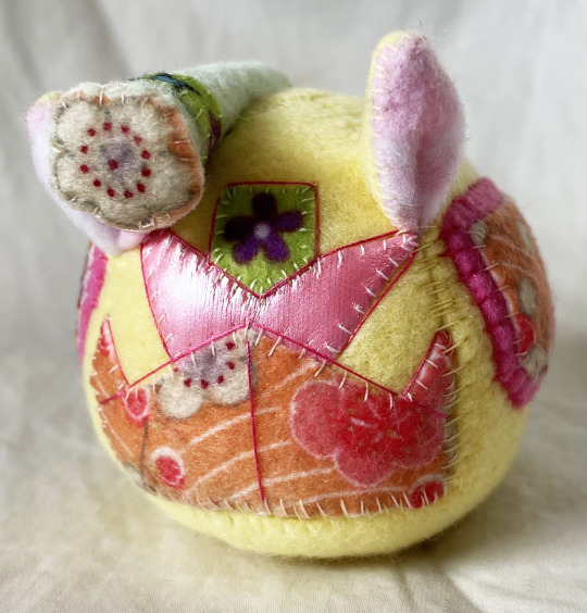
PUGGLE O CLOCK SPRINGWAVE It's spring time Soundwave with FLOWERS https://www.ebay.com/itm/125226528690
#transformers#soundwave#spring#spring time#festive#FLOWERS#easter#pink#yellow#plush#sewing#art#Arts and Crafts#puff puggle#puff puggles#puggleformer#puggleformers
25 notes
·
View notes

Photo

At my backyard, my favourite place, my beach.
#surf #surfgirl #portuguesesurfgirl #springwaves #girl #girlpower #proudofmybackyard #itson
1 note
·
View note

Photo

@hollaceh #tsdhair #springwave ✨
0 notes