#starstruck is also a somewhat biased example for this sort of thing due to the fact she's quite monochromatic in colour
Explore tagged Tumblr posts
Visit Tumblr Blog
Explore Tumblr blogs with no restrictions, modern design and the best experience.
Last Seen Tumblr Blogs


Fun Fact
In 2020, 27% of US Tumblr users had an annual household income of over $100,000.
Note
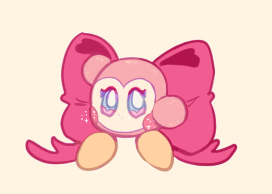
I couldn't help but notice you color your line art sometimes. Do you have any tips on colored line art?
hiii there! thank you for asking!!
just a heads up that i'm notoriously bad at "teaching", and i'm assuming an amount of general knowledge of art programs + layer modes!
i actually don't often "colour" my lineart, at least not in the way a lot of other folks do! i'm used to working as streamlined as possible and developed quick-fire workarounds for most steps during my time in webcomics!
i also have multiple lineart styles! a more textured one with thin lines which i typically use for more polished pieces, and a soft-brush sketch style (inspired by my pal @moonverc3x's lovely lines) that i generally use for less detailed works, though i sometimes get carried away 😅💦
my textured lines don't lend themselves well to those nice and thoughtful coloured lines most folks do. but here's a quick breakdown of my techniques using the soft-brush style!
lines and flats 1) make lineart + flat colour it. my lines are never at 100% opacity, so already some of the colour shows through them anyway! 2) set the lines to multiply mode. because my lines are typically in a colour and not black, this usually works well enough for me, as you can see in the second image! i frequently just call it done here!


hand coloured lines a) if i do want to take the time to colour the lines individually- often things like metals, especially warm golds, require this added detail to really help them pop- i'd just lock the layer opacity and pick a colour that suited and apply where needed. this is fairly standard! b) a second version of the same technique, with higher contrast/more saturation to suit my tastes and a little extra finessing (especially around the eyes). this is very much a "to taste and time/energy" thing! sometimes at this stage i'll add high contrast slaps of colour such as bright purple or blue

my overlay-lines technique a) the second technique that i use is actually very fast and usually gives an okay-enough look. it's what i use for high-speed professional webcomic work (with my textured lines) to give the illusion of individually coloured lines for basically zero effort. so starting with the base lines set to multiply, as seen in (2), then, b) duplicate both the lines and the colours (with shading, if you have it). clip the colours to the duplicated lineart layer, ostensibly "colouring" the copied lines the exact same colour as the colours. set this duplicated layer to overlay, and adjust opacity as needed

you can kinda see that the overlay lines method is not as specific in colour as the hand-picked ones above, and it will suffer from overlap based on where your flats come to underneath the lines. but i find it helps especially when you have high contrast light colours in the work (ie starstruck's face mask) as the lighter colours brighten up the linework in those places significantly.
for highly polished works i would come back and still pick out areas to finesse individually. there's ultimately no quick substitute for spending more time on your work!
there's about a thousand and one other combinations of these effects you can do, such as using the duplicated lines on multiply instead, or further painting over the top, etc etc. but duplicating the colour layer and clipping it to the lineart is one of the techniques i developed that sped up my work process most significantly over the years!
#starflungs process tag#my art#starstruck dee#asks#i don't typically talk about my method because it's pretty sloppy and i really am just not good at teaching!#been told it repeatedly over the years so you get what you get sorry! 😅💦#fwiw i'm working in paint tool sai. most programs should have these kinds of features and layer modes.#if yours doesn't i'm sorry but i don't know how to help!#starstruck is also a somewhat biased example for this sort of thing due to the fact she's quite monochromatic in colour#if you put pink lineart on her she looks good because she's basically just pink all over. when you have high contrast designs-#it's harder to make these quick techniques work and you have to spend a bit more time fiddling around at the end to fix edges.#anyhow! hope this helps some folks!! lmk if it helps you out!
19 notes
·
View notes