#still wondering if i just make a google doc type thing with doodles and notes that summarizes the whole thing
Text

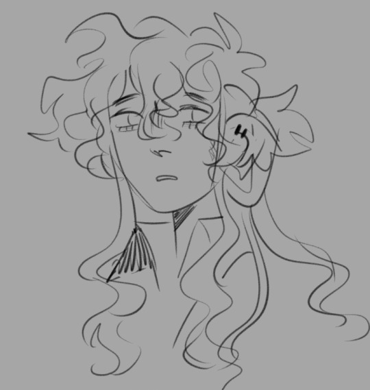
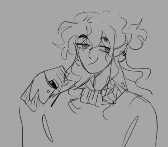
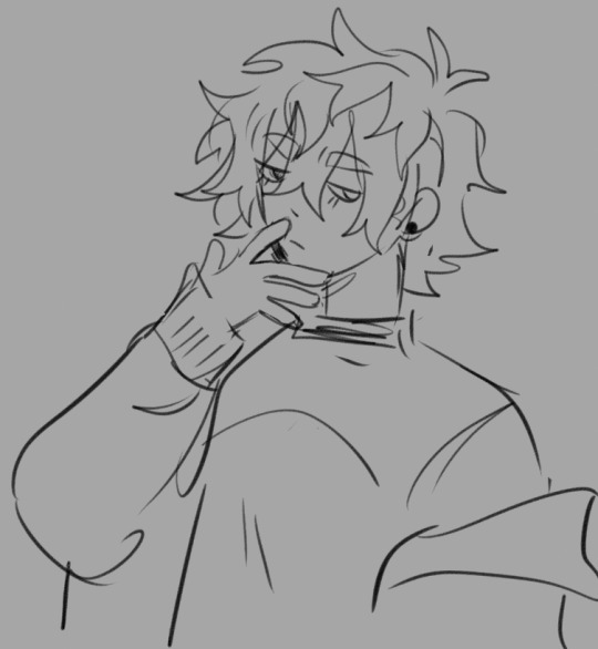
gather around everyone some crumbs from my eternal problem child
#draws#shifter squad!#still wondering if i just make a google doc type thing with doodles and notes that summarizes the whole thing#my storytelling and my goals have changed so much... but i could never abandon them </3#felice#leia#oc
81 notes
·
View notes
Note
Happy STS!
This week I’m asking about the writing process – I’m curious to see how people do it.
Do you refer to anything as you write? E.g. pictures, calendars for the timeline, maps to measure travelling distance? Basically, what references, if any, do you keep on your desk/always open in another window while writing?
Hi Sam!
Happy STS, and thanks for the ask!
My writing process is a bit chaotic, for a self-described planner!
I have a notebook with the story outline which contains all the major scenes that I want to write to progress the story, but once I start writing, those pesky characters tend to deviate and go off on their own. So I either have to rein them back in, find a work around to get when I need them to be, or find a new path to get back on track! It's certainly taken some of WIPs in weird and wonderful directions!!
I try to do as much research as possible when it comes to the topics that I write about- I have a Google Doc for each WIP which contains all the links to webpages that I've used for research so that I can go back and check things if/when needed (mostly when!!) I add to it as I go, as I often find myself having to do some ad hoc research on the fly due to the aforementioned plot/character deviations, so those links get added to the doc.
I also like to be a bit old school and read textbooks that I pick up second hand, or that I have from my time in education (I studied forensic psychology, so have lots of old books on crime scenes, the criminal justice system, people's motives etc etc) that I like to annotate, and add sticky notes to. (Side note- I am a sucker for sticky tab page markers and a smooth highlighter pen. So satisfying!)
I like to collect all the bits and bobs in a notebook. In the past, when I was writing more High Fantasy, rather than Urban, I would doodle maps, family trees, keep a note of made-up words/slang and their meanings etc.
It's all a bit chaotic, having to jump between the different places that I keep everything, and I can get muddled at times- especially with my timelines (as well you know! Which is why I try to keep them vague, but I appreciate that this is detrimental for the reader, so it's something that I'm going to work on! I promise!)
I've seen a lot of other Writblrs mention Scrivener, and I've sort of halfheartedly looked into it. I think it's a tool that I would find useful, but given that I don't even know what I want to do with my WIPs once they're finished, at the moment I don't think it's something that I can justify spending money on. (I've seen folk mention that they often get money off vouchers after NaNo, so I'll maybe look into it more then? I tend to ignore all the NaNo emails and rewards at the end of Nov. I'm in it for the certificate, and the motivation it brings; I'm a terrible procrastinator, and struggle to carve out time to write- although, this hellsite (affectionate) and all the others writblrs on here, yourself included, have been a great source for motivating me, and making me want to write, even if it's just so that I can keep up with all the tag games- as otherwise, you'd just have the same snippets shared over and over again!!)
Once I've finshed a WIP, it just sort of languishes in Google Docs. I used to handwrite my stories, and try to edit them when I typed them up, but editing isn't my forte, as I lack the technical skills for line editing etc, and I've only just had my first beta feedback (thank you again! I will pay you back in Party Rings at some point!!) which has been a really helpful exercise for me. So still learning on the next steps on what other people do after you've actually finished a first draft!
So yeah, that's my process- if you can call it that! ¯\_(ツ)_/¯
0 notes
Text
Filled It With My Feelings Text Translation
Sorry it took so long, but I finished the text translation of Filled It With My Feelings, the Senyuu 10th anniversary book! I didn’t translate the Season 1 Episode 1 redraw though because I’m sure we can all recite what happens in there by heart at this point.
As it’s an illustration book, the translation is meant to be read along with the pictures - you can purchase the digital PDF of the book at hiaruron.booth.pm/items/2329424. You should be able to purchase it through PayPal or some international credit cards.
I’ve included the text under the cut, but you can also read it on the Google Docs here.
Please note I do not give permission to anyone to use this translation for scanlations. There’s a reason why I’m posting this as a text translation rather than as a scanlation - it reads perfectly fine along with the raw book.
However, feel free to use this for text-only translations to different languages, just send me a message about it.
Page 1
Title:
Filled It With My Feelings
10th. senyu.
Page 2
<no text>
Page 3
[Panel 1]
SFX (Slime): *squeak*
SFX (sword): *slam*
[Text Paragraph]
The story of Senyu first arrived on Tuesday, February 23rd, 2010 at 12:39 PM. Naturally, at that point, the name “Senyu” didn’t yet exist - a email was sent to my inbox entitled “A discussion about a new project.”
It was a rather vague email with few details, but at the time, I was working as a day labourer in a certain distribution centre in Tokyo’s Ota Ward. As I hauled around boxes, my days were filled with uneasy thoughts of my future- I gave up on becoming a mangaka, I started work at an anime company but I quit there too, what am I going to do from now on? So I pounced on that vague email- Maybe this will shine some clarity into my life!
Senyu. was the product borne out of that email, and to my great appreciation, it really did shine clarity into my life. My future, which had been dark and uneasy, was illuminated bright by the light of Senyu. I would like to say that was why I made the protagonist’s name “Alba” - which means dawn - but unfortunately, that isn’t the case. I only learned the meaning of Alba’s name later - it was a total coincidence.
Anyways, a lot has happened, but it’s now Senyu’s tenth anniversary.
Thank you very much. I never thought that I could continue for this long. This is all thanks to all of you, for supporting me all this way.
Senyu. is a part of my life at this point - I don’t plan to end it any time soon, so I will be counting on everyone for their continued support.
Haruhara Robinson.
Page 4
Alba
While this may be obvious, the character I’ve spent the most time with in this work no longer feels like a mere “character” to me.
He had a beta design with bangs. But since I thought he might seem more cheerful with his forehead showing, I settled on his current design. I intended to give him a haircut that was similar to characters like Kirimaru, but my lack of artistic skills at the time ended up giving him a hairstyle with a bizarre composition.
I struggle now with how to draw his hair well.
Hero Symbol
I’ve always liked the idea of accessories that had the symbol of a hero, so wanting to have the same concept in my own work, I did my best to think up a design. I was really happy when it came out as merch.
Page 5
Ros
His backstory is really something!
I feel like he carried the entirety of Senyu’s serious plotlines on his back. I thought of Senyu. as like a story that uses the protagonist Alba to give the completed story of Hero Sion a happy ending?
There were times when I was drawing things out that I thought, He feels kinda pitiful? But then in the story, Ros says, “Don’t judge people as pitiful by your own standards,” so then I thought, I-I’m sorry.
His equipment at the start was supposed to be like a machine that let him whip around his heavy sword like it was nothing, but everything ended before I explained any of that.
Page 6
Rchi
At the start, I just thought of her as a cute little girl. But gradually, she grew darker and darker, and by now, the dark aspects of her personality are a part of what makes her unique as a character.
Her hair accessory often disappears. Near the start, there was the explanation that it was confiscated when they were arrested, but beyond that it’s just because I forgot to draw it.
There was an explanation for why she was naked under her cloak during her first appearance, but I’ve forgotten it. I believe it was because since she was camping outside, she washed herself outside as well but her clothes were blown away by the wind - so she wrapped an old cloth around herself…?
Page 7
Foyfoy
The name “Foyfoy” was decided by an audience poll. At first, I was planning to make him Chinese-inspired, but before I realized it that concept had disappeared. His mark is leftover from that original idea.
Foyfoy’s hairstyle is one I drew often when I was a student. I often gave rivals or secondary main characters this hairstyle.
I’m glad I could draw a design like this in an official work.
Page 8
Alles
A character drawn specifically with boobs that a Haruhara who was too embarrassed to draw boobs drew because “I can’t run from boobs!” The reason why I stopped drawing her midway through isn’t because of my embarrassment, but because I wasn’t used to drawing them, so since I never practiced it, I forgot how to.
Princess-chan
TL: This is written with the kanji for “Princess” rather than the katakana for “Hime” as her name is usually written.
She was meant to be a cute, elegant girl, so it shocked me when she immediately ended up as a violent character from her first appearance.
Since I hadn’t decided on a name for her, in the anime her name was listed as ???. I caused trouble for the anime staff.
Page 9
Rudolf
I can’t help but feel that eldery soldiers are cool. When I was doodling for fun, I often drew eldery soldiers.
Himendam
I thought of a development where a cute girl pops out from a nice big suit of armour, so I created the Himendam.
At the time, I thought, “This is a pretty unusual development, it’s great!” but now that I think back on it, it’s actually pretty common.
Slime
The first monster to appear. The first monster you fight should be a slime! Slimes should be blue! I’ve been influenced by Dragon Quest in that way.
I had this child of mine show up as your standard old monster in order to increase the impact of the panda who would show up right after.
Page 10
Minister
While I honestly have no idea why the minister is always standing next to the king, usually that’s the case in RPGs, right?
So I had him stand next to the king in the same way. I feel as though his overall image is influenced by Magical Circle Guru Guru’s Kaya. While I hadn’t realized it while designing him, Kaya’s design affected me unconsciously.
The King
His whole thing was “a super serious old man that makes a stupid face during funny scenes,” but before I realized it, his stupid face became his default expression.
He just may be the nastiest character in the series, considering he wrapped up the entire world in his schemes for his own personal desires.
Mob Characters
The mob characters in my work tend to have this face. I like how they tend to make cutting comments while having non-descript faces.
Page 11
Suit
When Ros’ design went from complicated equipment to this thing, I was shocked at how much easier it was to draw.
I think this thing was what triggered me striving for easiness in my work. Can I blame everything on this thing instead of me?
Just kidding, it’s all my fault.
Fake Foyfoy
If you don’t make careful enough observations, you can’t make a perfect disguise, and you end up in an idiotic costumed-character-like disguise. I wanted to use this plot device a few times more after this, but I didn’t have any chance to use it at all.
Mii-chan
Haruhara happens to have had a stuffed animal for as long as he can remember, and he still has it since he’s never been able to throw it away. I feel as though that stuffed animal served as the model for Mii-chan. In terms of his colour and overall atmosphere.
But my stuffed animal isn’t a pervert like him!
Page 12
Samejima
A delinquent overflowing with manliness. What’s with his hairstyle, I wonder. It’s actually pretty easy to draw.
He just might never lose against anyone so long as he thinks, “There’s no way I can lose.”
Januar
I stuffed in everything my little sister likes into his appearance. “Straight-cut bangs, black-haired, one-eyed, droopy eyes.” But it isn’t as though I went and got her feedback directly so she might just tell me, “He’s not my type at all.”
I chose his personality based on my tastes- “A kind idiot.”
Page 13
Teufel
I thought of a “butler who doesn’t obey orders” around the same time as a “soldier who doesn’t listen to what you say.”
I wanted to have him appear at some point in the future, but then I saw a book called The After-Dinner Mysteries in a book store, which made me think- “M-m-m-m-maybe this book has a butler who doesn’t obey orders as well?!” So I panicked, ran back home, and drew out the head butler’s story.
That’s why the head butler’s story was shoved in out of nowhere.
I read The After-Dinner Mysteries after I wrote in all the butler plot devices I wanted to use, and it was interesting.
At the start, Ros had his three burrs hairstyle so his design was differentiated from Teufel’s, but from Season 2 forwards I struggled with differentiating them.
So Teuf-kun has been going through some small design changes, a bit at a time.
Page 14
Nisepanda
Before Dwango reached out to me, there was a manga I thought up with the plot “a zoo with an easily deceived curator.”
I planned to have a nisepanda appear in that work. The plot device was, “They thought it was a panda, but they were given a mysterious lifeform instead.”
Death Hot Dog-kun
A character that was born during the enthusiastic atmosphere during a meeting with my editor.
We happened to be eating hot dogs during the meeting.
I barely ever have these meetings for my other works, but for Senyu, I’ve been having meetings like this for years. So through sheer enthusiasm and cheer, things like mysterious characters and plot devices end up being created during the meetings.
Page 15
<no text>
Page 16
Dezember
Mysterious characters in manga often show up with their face cast in shadows. Dezember was born because I thought, “Why not make those shadows real?” But he ended up as a cooler character than I expected, using his shadows to attack and such.
I wanted to base him off of a toy for future plot developments, but I’m really glad I decided to based him off of dice. He became a really good character.
August
I think he’s actually a really nice person.
My editor for Main Quest really liked August, so whenever they got the chance they tried to push for more August.
Avril
A character that’s rather rare for Senyuu - one that just genuinely does bad things for bad reasons. I planned to draw her as really evil so you could tell she was a bad person, but she ended up just casually munching on bread - it really surprised me.
Neun
Back when his only appearance was a silhouette, I just wanted to make people think of that character at first. But now that I really think about the design I thought up for him after - isn’t he pretty cute?
Juli
Just like Foyfoy, I often drew characters with this hairstyle back when I was a student. I usually gave it to trustworthy ally characters. I like his design and personality quite a bit - sorry I haven’t used you much…
Page 17
The Shadows
It’s super cool to be able to split your body for each die face. I also feel like it’s a great character setting that each split has his own personality. A thought just crossed my mind - couldn’t I draw a manga just based around the Dezembers’ home life?
...I guess it would end up like Osomatsu-san...?
Page 18
Zwei
I wanted to use the concept that she was old despite her looks because she was a demon, so I had her dentures fly out - but now that I think about it, there’s other old demon characters, including some characters older than Zwei. So that would make her dentures a result of her own problematic lifestyle, not because of her old age…
Wanna Stab~
A mob among mobs, who ranked high in a popularity poll. I shall now grant him a name - “Phoenix the Rich”.
Mortmome
The stuff on his shoulder does some mysterious things, preventing his body from turning as well when the drill turns.
Page 19
The Great Mage
The cape he wears is very warm. His research assistants gifted him the cape as a present for his birthday sometime in his later years of life, as they were worried about his health. That’s why Alba always wears the cape.
Elf
He’s meant to be someone who knows the secrets of the world - but I can’t count the number of times I considered whether it would be better to just make him a regular old funny character. Good on you for surviving through all that, Elf!
Alf
While I did want there to be a “Elf’s best friend” character, I hadn’t thought about his name at all. So when it came time for him to appear, I really struggled with it. I wanted to make his name like Alba and Ros (Albatross) or Salt and Lake (Salt Lake)…
I may have struggled the most with Alf’s name among all my characters, considering I usually just pick names on instinct.
Page 20
Salt and Lake and Lym
The Hero Academy trio. At first, I planned for Salt to become the Demon Lord, but when I sat down to draw everything out, Lake ended up in that role - it really shocked me.
I had always planned for the story to shift from the adventure setting of Seasons 1 and 2 to the school setting of Season 3. Though the end result is completely different from what I imagined.
Season 3 was really fun to draw since it defied my expectations at every turn.
Page 21
Lyman
I wanted to draw a pathetic older man. I also want his scar to be because of some pathetic reason like “He tripped at a bar.”
Elmer
I reused the soldier design I thought up prior to thinking up Alba and Ros. He’s a little older than Rchi.
Justice
Justice is her ally. In other words, I wanted to make a character where no matter what she does, “I’m doing it, so it’s just!”
But it was too difficult to figure out how to deal with a character like that, so I ended up just making a regular old hotheaded reckless character.
In the end though, she ended up as a character I quite like.
Page 22
Grandpa
A character who loves money. Since I love characters who love money, he’s a character that’s fun to use. It doesn’t actually have to be money, I like characters true to their own desires in general.
Hasegawara-kun
He was originally meant to be a silent character, but I got the urge to make him talk right before I was going to send in the manuscript. Since I wouldn’t make it if I typesetted his speech, I wrote his lines myself. By writing his lines in a way that can only be expressed through handwriting, I made it seem like I planned that from the start.
I made his speech typesetted again after I did that plot where he speaks super eloquently.
Rib Man
He requires no explanation!
It was funny when he moved in the anime.
Page 23
Sochi and Co.
There’s a game called Medabots - in that game, a character called Samantha leads a three-person team called the Screws. I’ve always liked that team since I was a kid. And then, I learned that my editor for Senyu was close with people who were involved with creating the original Medabots. So I had my editor tell them, “I want to put in characters I respect! Please leave it be!”
Please google the Screws that I respect, I respect them.
Lucop
I had vaguely thought up what was going to happen until the end of season 4 of Senyu. But since I’ve done everything I originally thought up, F5 - which I’m drawing now - is all based on plot developments I thought up in +.
-I’ve been saying that for a while now. Lucop as well was just a throwaway joke at first. But as I started moving him around, amazing developments like “Huh? No way… you had a past like this…?” burst out of him, and so he became the current Lucop.
Page 24
Midnight
A travelling doctor. As he treats his patients, he’s also searching for a cure to Mom’s mysterious disease. He’s a completely normal person with no special powers. He wanted Alba to become strong through his own power, not through familial connections.
Cecily
A mother who adores her children. I think it’s pretty amazing that she managed to raise Lake up herself and send him off to school despite being blown off to a mysterious place out of nowhere.
Page 25
Rchimedes the Second and his wife
Rchimedes the Second and his wife. (T/N: Yes, it’s written twice.)
Daromeon-san, who’s currently illustrating Kengan Ashura, was the one to draw the ridiculously beautiful backgrounds in the flashback arc in Season 2 when the Second was imprisoned. When I complained that I couldn’t draw it, he drew me amazingly beautiful.backgrounds.
The Second’s design is based off of a mysterious preconception I have that “Demon Lords should wear raggedy capes.” Mama’s design is based on those soothing, kind moms you often see in anime.
The Mana Maker that he holds in this picture isn’t any particular Mana Maker. I just wanted to let a Mana Maker show up in a group picture.
Page 26
Rchimedes
While he’s tremendously evil, he ended up being quite loved. The Senyu characters I designed near the start wear clothes that I would never design now - I really think it’s amazing. Why did I dress him up in a jumpsuit when I decided to draw a Demon Lord?
On a side note, I imagined that the white part of his clothes peels off smoothly like tape if you pull at it from his neck.
Crea
Since he took back his body from Rchimedes, his height shouldn’t have changed, but for some reason he mysteriously shrunk.
Page 27
<no text>
Page 28
Originia
In a way, the story of these three marks the start of Senyu. Originia comes from me messing around with the the word “Original”.
Rchimedes' scariest era just might be when he was living alone with Sion in Originia. Even though at first glance, it seems like he was living a peaceful, cheerful life with Sion, though occasionally getting beat up by him. But in reality, just what was he thinking deep inside, as he lived out his life, watching Crea and Sion?
Since I’m the author, I can generally imagine what my characters think just by thinking about it. But when it comes to Rchimedes during this time, all that comes to mind is “Scary scary scary”, and I can’t really think any further in detail.
I’m often asked “What’s Rchimedes’ original eye colour?”, but I think it was probably blue. I feel like I drew his eyes as blue somewhere, but I can’t remember…
Crea’s clothes slung around his shoulders that don’t fall off for whatever reason are actually sewn on - that’s why they don’t fall off. Crea sewed it on himself. While his threadwork is rough, it’s very sturdy. I think it’s wild and cool.
I showed a bit of what Sion did in the main story, but he generally did things like hauling supplies for hunting, looking far in the distance since his eyes are good, and going shopping in far-off cities for the village. Things like that.
Page 29
The two from Season 4 Episode 0
The two from Elf and Alf’s universe. Since Rchimedes’ magic research hasn’t progressed that much, they mostly fight with brute force. Since Crea never had his body stolen, he’s doing well. (He’s not doing well at all.)
Page 30
Creasion
When I was a kid, I read in a manga, “‘Hero’ isn’t something you call yourself - it’s a title you’re granted by others.” I remember thinking, “I see, that certainly makes sense,” and agreeing with it. I also thought, “While you generally think of heroes as being brave and splendid, the person who’s actually adventuring might not be able to stand expectations like that sometimes.”
Creasion may be a character borne out of those feelings of mine.
Ros, please have tons of sweets and smile tons as well.
Page 31
<no text>
Page 32
Sleepiez
When I thought of the name “Sleepiez” in Senyu+, I didn’t think much of it except “There’s an anti-Alba organization”. I also planned for Boss to be a new character. But after I took the time to think about it properly, the Sleepiez in their current form were born.
Thanks to the current Sleepiez being created, F5 was able to start even though I thought before “I’ve already done everything I want to do with Senyu, I can’t make another proper season.”
If there was no Sleepiez, I feel like + would’ve lazily continued, then at some good cut-off point, I feel like I would’ve been told, “Do you think it’s about time to end it?”
A tenth anniversary for example… it would’ve been a good cut-off point… how scary!
Boss
I can’t write about most of the Sleepiez members just yet, so I’ll be talking about Boss as their representative.
Boss is an alternate universe’s Alba, so despite being Boss, he’s still Alba, and so I want to make him feel like Alba still. But since he’s Boss he can’t retort or make jokes, since it would ruin his dignity. So at the very least, I gave him Alba’s fashion sense to keep his Alba feel. Since his heart stained black and he became evil, his fashion sense naturally became eviller as well, but he’s still Alba, the base is still Alba. He’s wearing clothes that kinda feel like a middle schooler who just discovered fashion for the first time, like he hasn’t managed to go full evil in terms of clothes just yet.
Now I can keep Boss as Boss while still giving him an Alba feel! ...is what I thought, but… does he actually still have that feel…?
Page 33
Alba with Mana
It made me happy that my wish for my protagonist to become the strongest at the end was granted. I thought up a lot of reasons for why only one of his eyes is red, like how it’s because his awakening is still incomplete, etc., but the number one reason is “it’s cool.”
A single red eye is cool, right?! It’s cool right?!
Now that he can use his mana to some extent, he controls his overwhelming mana to hold it back, so his eyes are both back to black now.
Page 34
<no text>
Page 35
SQ Senyuu.
I had this conversation once-
Y-san from Dwango told me, “I want to take Senyu to a magazine to have it serialized!”
I thought it would be awesome if it actually happened, so I approved it. Then I was like, “If you do take it to a magazine, where would you take it?”
Then Y-san responded, “Well, if you say ‘magazine’, you think Jump.”
And I was like, “Nah nah, Jump would be impossible, ahahaha.”
I never thought that Y-san would actually bring me an offer for serialization in Jump - Y-san was way too capable. Since my personal experience with Jump all started from there, I’m really grateful!
Pages 36-43
<Season 1 Episode 1 redraw>
Page 44
Afterword
Since I’ve remade Senyu Episode 1 many times before, I thought that I would never remake it again. But then I thought- why don’t I remake Episode 1 at the exact time it was originally released ten years ago, as celebration! So I ended up remaking it again.
But I think it may be my first time remaking it without changing any of the jokes or content.
21 notes
·
View notes
Text
Be Your Own Designer - The Best Free Resources for when You’re Short on Time
You'll be pleased to hear we recently updated this post. It was originally written in June 2015, but now it contains a whole new suite of design tools!
Has there ever been a time when you’ve realised you’re a day away from a big pitch, but you forgot to book any design time through your creative department? Or perhaps there’s that last-minute blog post that needs some images and banners, but there’s no way of roping in a designer at such short notice! It’s easy to become reliant when you have a Design team at the ready, but when push comes to shove, slightly unwillingly, you sometimes have to don that faux-designer’s hat. The trouble is, where do you even begin? To help you out in such hours of need, I have compiled a list of my favourite design resources for non-designers and designers alike. Oh, and did I mention they’re all free?
Just a quick disclaimer: this isn’t Graphic Design 101 (I’m definitely not ready to declare myself redundant as a designer at Distilled). Instead, think of this as more of a design directory if you will. Whether you’re after a nice font to spruce up your Word doc or you really need some images to dress that presentation to impress, if you’re going to find a fast, free solution anywhere, start here.
Typography & Fonts
Font Squirrel
Font Squirrel does exactly what it says on the tin; all the fonts listed are 100% free for commercial use. Best of all they are hand-picked, so unlike other sites offering free fonts (e.g. Dafont) you have peace of mind that there has been a selection process. Plus, not everyone can submit material to Font Squirrel. The only thing to watch out for are the types of licenses: some fonts may only be allowed for desktop use and not web, so do pay attention before downloading.
Google Fonts
If like me (and Distilled as a whole), you’re partial to a Google Doc, you might already be familiar with the awesomeness that is Google Fonts. The ability to just be able to pick and choose from hundreds of open-source fonts, without even needing to download anything! That’s the thing though, Google Fonts are all about the web and positioning themselves as the best resource for ‘webfonts’, they don’t even advertise the fact that you can download every single one of them to use elsewhere offline, even… (drumroll please) in Microsoft Word. It’s really simple to do. Once you’ve chosen your font and added to your collection, click ‘use’ and on the right-hand side, there will be a small download icon. I’d typically recommend getting the .zip file and installing the font manually.
Font Pair
If you’re feeling adventurous and want to use not one, but two awesome Google Fonts to mix things up, what you need is a good font pairing. Luckily for you, the guys at Font Pair have it covered. Choose between no less than six different style combinations that will be sure to give any copy that exciting edge.
FontFace Ninja
Finally, to round up this section is my absolute favourite: FontFace Ninja. This is really more of a tool than a resource, but I just couldn’t leave it out. Gone are the days of desperately trying to find out the font that I’ve seen used beautifully on a website, but which I don’t know the name of. FontFace Ninja is a lightweight extension, for Chrome or Safari, which allows you to find out the name and details of any font on any webpage, simply by hovering over some text. If it’s a free font it should also give you the option to download it. What more could you ask for?
Images
Although in recent years our screens have become saturated with crisp full-screen images, the trend isn’t quite over yet; users are apparently still hungry for more! Here are a couple of my favourite photo sites that will a) meet your audience’s demands, b) not cost you a single penny, and most importantly c) not get your head in a twist over attribution and licensing issues, because they’re all released under Creative Commons Zero (CC0). In other words, not only are the images completely free to use, no attribution is required either.
Unsplash
Pexels
unDraw
If photos aren’t your thing and you’re after illustrations instead, unDraw offers a neat selection that wouldn’t look out of place on any modern website or banner. The best thing is they’ve made it really easy to change the main colour of each image to suit your needs, for instance, if you ever have the internal brand police on your case!
Screenshots & Mockups
Screenshots can be a tricky one to get right, yet in our line of work, it can play a significant part in things like sales pitches or client presentations.
Nimbus Capture
Apart from Grab, the native Mac OS app (which I also do swear by), Nimbus Capture is definitely one of the better screenshot extensions I’ve used. Capturing a full web page may seem slightly excessive if you just need to show a section, but for those instances when what you want to show extends beyond your laptop screen’s physical height, this works wonders.
Magic Mockups
If you want to take it one step further, for example when selling creative ideas, Magic Mockups might just be the extra boost you need. This impressive and easy-to-use tool lets you create in-situ mockups of your website, app or product in just a few minutes. Not convinced? The following example took me less than 2 minutes to make and download. I barely lifted a finger, so this probably is a secret best kept amongst us lazy bunch.
Icons
A lot of icon sets out there are definitely tailored to a more design-savvy audience, those who have Illustrator or Photoshop at their disposal. But what happened to the plain and simple PNG image that you can just whack next to some text in a banner? Look no further than the following two sites. Sure, they don’t have the same volume as a site like The Noun Project, but as with the photography sites I recommended earlier, the advantage is that they require zero moolah, zero attribution.
iconmonstr
Illustrio
Colours
Colours are things that can often throw up a challenge for even the more experienced of designers, let alone someone whose full-time job is not doodling and colouring in all day.
Coolors
Whenever I need colour inspiration, I head over to Coolors. Hit spacebar to cycle through their generated colour combinations (try not to get too mesmerised and sidetracked when doing this!). If you’re the picky type, it allows you to tweak and lock down on the colours you like, just hover over the colour blocks to configure.
As a side-note, everybody should have a trusty eyedropper extension installed (any will do really). While “guess the hex” may have a catchy ring to it, there’s no good reason in trying to match colours by eye anymore, especially if you want to keep your brand colours in check.
Image Templates
Canva shouldn’t be a revelation for people who have to deal with social media marketing. It’s fast becoming the go-to tool for creating quick images, sized perfectly for your needs whether that be Facebook, Twitter, etc. That said, its capabilities aren’t restricted to these, you can use it for general image creation of any kind. So, if I were you I’d take the advice given on their homepage and “Get your team on brand. Unleash your creativity.”!
Presentation templates
Finally just to wrap things up: if the going gets really tough, and you find yourself having to create and design your own presentation from scratch, my advice for you would be… don’t do it! In recent years there has been a surge in interest for presentation tools claiming to do a lot of design heavy-lifting for you. One of them which has come close to living up to this promise is Beautiful.ai, Even as a designer, I sometimes relish the opportunity to relinquish control and just let someone, or something in this case, take care of things like spacing and alignment, not least because it frees up time to focus on the content of your presentation rather than fretting over the format.
If your team are adamant about sticking with the G-suite though, check out Slides Carnival. They offer a range of free Google Slides templates, which can at least get you going. There’s nothing worse than staring at a blank slide, not knowing where to begin.
That’s all for now, folks. Thanks for sticking around. If you have any questions or thoughts, just drop me a line in the comment section below.
Be Your Own Designer - The Best Free Resources for when You’re Short on Time was originally posted by Video And Blog Marketing
0 notes
Text
Be Your Own Designer - The Best Free Resources for when You’re Short on Time
You'll be pleased to hear we recently updated this post. It was originally written in June 2015, but now it contains a whole new suite of design tools!
Has there ever been a time when you’ve realised you’re a day away from a big pitch, but you forgot to book any design time through your creative department? Or perhaps there’s that last-minute blog post that needs some images and banners, but there’s no way of roping in a designer at such short notice! It’s easy to become reliant when you have a Design team at the ready, but when push comes to shove, slightly unwillingly, you sometimes have to don that faux-designer’s hat. The trouble is, where do you even begin? To help you out in such hours of need, I have compiled a list of my favourite design resources for non-designers and designers alike. Oh, and did I mention they’re all free?
Just a quick disclaimer: this isn’t Graphic Design 101 (I’m definitely not ready to declare myself redundant as a designer at Distilled). Instead, think of this as more of a design directory if you will. Whether you’re after a nice font to spruce up your Word doc or you really need some images to dress that presentation to impress, if you’re going to find a fast, free solution anywhere, start here.
Typography & Fonts
Font Squirrel
Font Squirrel does exactly what it says on the tin; all the fonts listed are 100% free for commercial use. Best of all they are hand-picked, so unlike other sites offering free fonts (e.g. Dafont) you have peace of mind that there has been a selection process. Plus, not everyone can submit material to Font Squirrel. The only thing to watch out for are the types of licenses: some fonts may only be allowed for desktop use and not web, so do pay attention before downloading.
Google Fonts
If like me (and Distilled as a whole), you’re partial to a Google Doc, you might already be familiar with the awesomeness that is Google Fonts. The ability to just be able to pick and choose from hundreds of open-source fonts, without even needing to download anything! That’s the thing though, Google Fonts are all about the web and positioning themselves as the best resource for ‘webfonts’, they don’t even advertise the fact that you can download every single one of them to use elsewhere offline, even… (drumroll please) in Microsoft Word. It’s really simple to do. Once you’ve chosen your font and added to your collection, click ‘use’ and on the right-hand side, there will be a small download icon. I’d typically recommend getting the .zip file and installing the font manually.
Font Pair
If you’re feeling adventurous and want to use not one, but two awesome Google Fonts to mix things up, what you need is a good font pairing. Luckily for you, the guys at Font Pair have it covered. Choose between no less than six different style combinations that will be sure to give any copy that exciting edge.
FontFace Ninja
Finally, to round up this section is my absolute favourite: FontFace Ninja. This is really more of a tool than a resource, but I just couldn’t leave it out. Gone are the days of desperately trying to find out the font that I’ve seen used beautifully on a website, but which I don’t know the name of. FontFace Ninja is a lightweight extension, for Chrome or Safari, which allows you to find out the name and details of any font on any webpage, simply by hovering over some text. If it’s a free font it should also give you the option to download it. What more could you ask for?
Images
Although in recent years our screens have become saturated with crisp full-screen images, the trend isn’t quite over yet; users are apparently still hungry for more! Here are a couple of my favourite photo sites that will a) meet your audience’s demands, b) not cost you a single penny, and most importantly c) not get your head in a twist over attribution and licensing issues, because they’re all released under Creative Commons Zero (CC0). In other words, not only are the images completely free to use, no attribution is required either.
Unsplash
Pexels
unDraw
If photos aren’t your thing and you’re after illustrations instead, unDraw offers a neat selection that wouldn’t look out of place on any modern website or banner. The best thing is they’ve made it really easy to change the main colour of each image to suit your needs, for instance, if you ever have the internal brand police on your case!
Screenshots & Mockups
Screenshots can be a tricky one to get right, yet in our line of work, it can play a significant part in things like sales pitches or client presentations.
Nimbus Capture
Apart from Grab, the native Mac OS app (which I also do swear by), Nimbus Capture is definitely one of the better screenshot extensions I’ve used. Capturing a full web page may seem slightly excessive if you just need to show a section, but for those instances when what you want to show extends beyond your laptop screen’s physical height, this works wonders.
Magic Mockups
If you want to take it one step further, for example when selling creative ideas, Magic Mockups might just be the extra boost you need. This impressive and easy-to-use tool lets you create in-situ mockups of your website, app or product in just a few minutes. Not convinced? The following example took me less than 2 minutes to make and download. I barely lifted a finger, so this probably is a secret best kept amongst us lazy bunch.
Icons
A lot of icon sets out there are definitely tailored to a more design-savvy audience, those who have Illustrator or Photoshop at their disposal. But what happened to the plain and simple PNG image that you can just whack next to some text in a banner? Look no further than the following two sites. Sure, they don’t have the same volume as a site like The Noun Project, but as with the photography sites I recommended earlier, the advantage is that they require zero moolah, zero attribution.
iconmonstr
Illustrio
Colours
Colours are things that can often throw up a challenge for even the more experienced of designers, let alone someone whose full-time job is not doodling and colouring in all day.
Coolors
Whenever I need colour inspiration, I head over to Coolors. Hit spacebar to cycle through their generated colour combinations (try not to get too mesmerised and sidetracked when doing this!). If you’re the picky type, it allows you to tweak and lock down on the colours you like, just hover over the colour blocks to configure.
As a side-note, everybody should have a trusty eyedropper extension installed (any will do really). While “guess the hex” may have a catchy ring to it, there’s no good reason in trying to match colours by eye anymore, especially if you want to keep your brand colours in check.
Image Templates
Canva shouldn’t be a revelation for people who have to deal with social media marketing. It’s fast becoming the go-to tool for creating quick images, sized perfectly for your needs whether that be Facebook, Twitter, etc. That said, its capabilities aren’t restricted to these, you can use it for general image creation of any kind. So, if I were you I’d take the advice given on their homepage and “Get your team on brand. Unleash your creativity.”!
Presentation templates
Finally just to wrap things up: if the going gets really tough, and you find yourself having to create and design your own presentation from scratch, my advice for you would be… don’t do it! In recent years there has been a surge in interest for presentation tools claiming to do a lot of design heavy-lifting for you. One of them which has come close to living up to this promise is Beautiful.ai, Even as a designer, I sometimes relish the opportunity to relinquish control and just let someone, or something in this case, take care of things like spacing and alignment, not least because it frees up time to focus on the content of your presentation rather than fretting over the format.
If your team are adamant about sticking with the G-suite though, check out Slides Carnival. They offer a range of free Google Slides templates, which can at least get you going. There’s nothing worse than staring at a blank slide, not knowing where to begin.
That’s all for now, folks. Thanks for sticking around. If you have any questions or thoughts, just drop me a line in the comment section below.
from Marketing https://www.distilled.net/resources/be-your-own-designer-the-best-free-resources-for-when-youre-short-on-time/
via http://www.rssmix.com/
0 notes
Text
Be Your Own Designer - The Best Free Resources for when You’re Short on Time
You'll be pleased to hear we recently updated this post. It was originally written in June 2015, but now it contains a whole new suite of design tools!
Has there ever been a time when you’ve realised you’re a day away from a big pitch, but you forgot to book any design time through your creative department? Or perhaps there’s that last-minute blog post that needs some images and banners, but there’s no way of roping in a designer at such short notice! It’s easy to become reliant when you have a Design team at the ready, but when push comes to shove, slightly unwillingly, you sometimes have to don that faux-designer’s hat. The trouble is, where do you even begin? To help you out in such hours of need, I have compiled a list of my favourite design resources for non-designers and designers alike. Oh, and did I mention they’re all free?
Just a quick disclaimer: this isn’t Graphic Design 101 (I’m definitely not ready to declare myself redundant as a designer at Distilled). Instead, think of this as more of a design directory if you will. Whether you’re after a nice font to spruce up your Word doc or you really need some images to dress that presentation to impress, if you’re going to find a fast, free solution anywhere, start here.
Typography & Fonts
Font Squirrel
Font Squirrel does exactly what it says on the tin; all the fonts listed are 100% free for commercial use. Best of all they are hand-picked, so unlike other sites offering free fonts (e.g. Dafont) you have peace of mind that there has been a selection process. Plus, not everyone can submit material to Font Squirrel. The only thing to watch out for are the types of licenses: some fonts may only be allowed for desktop use and not web, so do pay attention before downloading.
Google Fonts
If like me (and Distilled as a whole), you’re partial to a Google Doc, you might already be familiar with the awesomeness that is Google Fonts. The ability to just be able to pick and choose from hundreds of open-source fonts, without even needing to download anything! That’s the thing though, Google Fonts are all about the web and positioning themselves as the best resource for ‘webfonts’, they don’t even advertise the fact that you can download every single one of them to use elsewhere offline, even… (drumroll please) in Microsoft Word. It’s really simple to do. Once you’ve chosen your font and added to your collection, click ‘use’ and on the right-hand side, there will be a small download icon. I’d typically recommend getting the .zip file and installing the font manually.
Font Pair
If you’re feeling adventurous and want to use not one, but two awesome Google Fonts to mix things up, what you need is a good font pairing. Luckily for you, the guys at Font Pair have it covered. Choose between no less than six different style combinations that will be sure to give any copy that exciting edge.
FontFace Ninja
Finally, to round up this section is my absolute favourite: FontFace Ninja. This is really more of a tool than a resource, but I just couldn’t leave it out. Gone are the days of desperately trying to find out the font that I’ve seen used beautifully on a website, but which I don’t know the name of. FontFace Ninja is a lightweight extension, for Chrome or Safari, which allows you to find out the name and details of any font on any webpage, simply by hovering over some text. If it’s a free font it should also give you the option to download it. What more could you ask for?
Images
Although in recent years our screens have become saturated with crisp full-screen images, the trend isn’t quite over yet; users are apparently still hungry for more! Here are a couple of my favourite photo sites that will a) meet your audience’s demands, b) not cost you a single penny, and most importantly c) not get your head in a twist over attribution and licensing issues, because they’re all released under Creative Commons Zero (CC0). In other words, not only are the images completely free to use, no attribution is required either.
Unsplash
Pexels
unDraw
If photos aren’t your thing and you’re after illustrations instead, unDraw offers a neat selection that wouldn’t look out of place on any modern website or banner. The best thing is they’ve made it really easy to change the main colour of each image to suit your needs, for instance, if you ever have the internal brand police on your case!
Screenshots & Mockups
Screenshots can be a tricky one to get right, yet in our line of work, it can play a significant part in things like sales pitches or client presentations.
Nimbus Capture
Apart from Grab, the native Mac OS app (which I also do swear by), Nimbus Capture is definitely one of the better screenshot extensions I’ve used. Capturing a full web page may seem slightly excessive if you just need to show a section, but for those instances when what you want to show extends beyond your laptop screen’s physical height, this works wonders.
Magic Mockups
If you want to take it one step further, for example when selling creative ideas, Magic Mockups might just be the extra boost you need. This impressive and easy-to-use tool lets you create in-situ mockups of your website, app or product in just a few minutes. Not convinced? The following example took me less than 2 minutes to make and download. I barely lifted a finger, so this probably is a secret best kept amongst us lazy bunch.
Icons
A lot of icon sets out there are definitely tailored to a more design-savvy audience, those who have Illustrator or Photoshop at their disposal. But what happened to the plain and simple PNG image that you can just whack next to some text in a banner? Look no further than the following two sites. Sure, they don’t have the same volume as a site like The Noun Project, but as with the photography sites I recommended earlier, the advantage is that they require zero moolah, zero attribution.
iconmonstr
Illustrio
Colours
Colours are things that can often throw up a challenge for even the more experienced of designers, let alone someone whose full-time job is not doodling and colouring in all day.
Coolors
Whenever I need colour inspiration, I head over to Coolors. Hit spacebar to cycle through their generated colour combinations (try not to get too mesmerised and sidetracked when doing this!). If you’re the picky type, it allows you to tweak and lock down on the colours you like, just hover over the colour blocks to configure.
As a side-note, everybody should have a trusty eyedropper extension installed (any will do really). While “guess the hex” may have a catchy ring to it, there’s no good reason in trying to match colours by eye anymore, especially if you want to keep your brand colours in check.
Image Templates
Canva shouldn’t be a revelation for people who have to deal with social media marketing. It’s fast becoming the go-to tool for creating quick images, sized perfectly for your needs whether that be Facebook, Twitter, etc. That said, its capabilities aren’t restricted to these, you can use it for general image creation of any kind. So, if I were you I’d take the advice given on their homepage and “Get your team on brand. Unleash your creativity.”!
Presentation templates
Finally just to wrap things up: if the going gets really tough, and you find yourself having to create and design your own presentation from scratch, my advice for you would be… don’t do it! In recent years there has been a surge in interest for presentation tools claiming to do a lot of design heavy-lifting for you. One of them which has come close to living up to this promise is Beautiful.ai, Even as a designer, I sometimes relish the opportunity to relinquish control and just let someone, or something in this case, take care of things like spacing and alignment, not least because it frees up time to focus on the content of your presentation rather than fretting over the format.
If your team are adamant about sticking with the G-suite though, check out Slides Carnival. They offer a range of free Google Slides templates, which can at least get you going. There’s nothing worse than staring at a blank slide, not knowing where to begin.
That’s all for now, folks. Thanks for sticking around. If you have any questions or thoughts, just drop me a line in the comment section below.
from Digital Marketing https://www.distilled.net/resources/be-your-own-designer-the-best-free-resources-for-when-youre-short-on-time/
via http://www.rssmix.com/
0 notes
Last Seen Blogs
quaisqueerdes
poly

chadntattoo
Chad Nicely Tattoos
felinecryptid
and toss all your thoughts to the sea

zostel-hostel-blog
Zostel Hostel