#streamgraphics
Text
Make your stream stand out with overlays!
#StreamingOverlay#TwitchOverlay#GamingSetup#StreamDesign#LiveStream#StreamGraphics#TwitchStreamer#StreamingCommunity#ContentCreator#StreamElements
1 note
·
View note
Text
Visualized: Global CO2 Emissions Through Time (1950–2022)
1 note
·
View note
Photo

Data Visualisation
https://www.tableau.com/en-gb/learn/articles/data-visualization
‘’Data visualisation is the graphical representation of information and data. By using visual elements like charts, graphs and maps, data visualisation tools provide an accessible way to see and understand trends, outliers and patterns in data.’’
Our eyes are drawn to colours and patterns. We can quickly identify red from blue, square from circle.
Data visualisation is another form of visual art that grabs our interest and keeps our eyes on the message. When we see a chart, we quickly see trends. If we can see something, we internalise it quickly.
Common general types of data visualisation:
Charts
Tables
Graphs
Maps
Infographics
Dashboards
Area chart
Bar chart
Box-and-whisker plots
Bubble cloud
Bullet graph
Cartogram
Circle view
Dot distribution map
Gantt chart
Heat map
Highlight table
Histogram
Matrix
Network
Polar area
Radial tree
Scatter plot (2D or 3D)
Streamgraph
Text tables
Timeline
Treemap
Wedge stack graph
Word cloud
It seems that it is important to have strong contrasts in the presentation of data so it is easy for a viewer to decode information and differentiate between the keys.
0 notes
Photo

Screen Commission for https://www.twitch.tv/jellydoughnut__ !
#twitch#twitchcommission#twitchscreen#twitchart#twitchartist#eevee#stream#streamer#streamgraphics#twitch commission#pastel screen#twitch screen#twitch art#twitch artist
15 notes
·
View notes
Photo
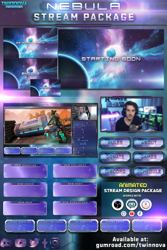
🌌 Nebula 🌌
⭐ Twitch animated overlay package.
⭐ Contains animated alerts, screens, stinger transition, webcam overlays, panels and more!
⭐ Take your streaming channel to the next level with this galaxy themed overlay pack.
⭐ Available at my gumroad shop for streamers.
#twitch#twitchstream#twitchoverlay#twitchgraphics#galaxy#gaming#streamoverlay#streamgraphics#twitchpanels#twitchalerts#twitchscreens
2 notes
·
View notes
Photo

Selling a snowstorm sivir pack! :) individual prices can be found on my website. Let me know if you’re interested! Reblogs appreciated ♥
——————————————————————–
COMMISSIONS OPEN! Message me for info :)
Feel free to follow me elsewhere ♥♥
Facebook // Deviantart // Twitter // Website
8 notes
·
View notes
Photo


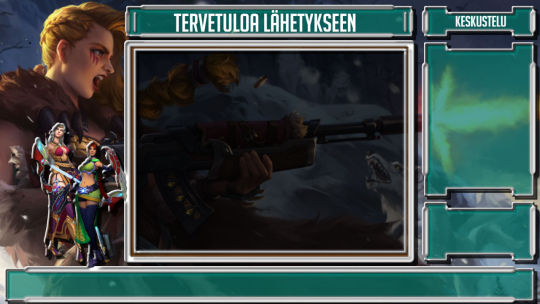

Some of my Overlay’s, If you have and idea for your own Stream overlay, be sure to tell me and we can make you one for free.
0 notes

Link
https://www.eduforbetterment.com/stream-graph-in-angular-using-highchart/
Learn how to draw the stream graph in Angular
#angular #angular10 #highchart #streamgraph
1 note
·
View note
Photo
The staple @FT #StreamGraph morphs from #DeathFunnel to wineglass, but… do we really believe this is its shape yet? It has a nose of Anglo American sample bias and finishes lean for lack of #ExcessDeath. @sdbernard 4/28/20
0 notes
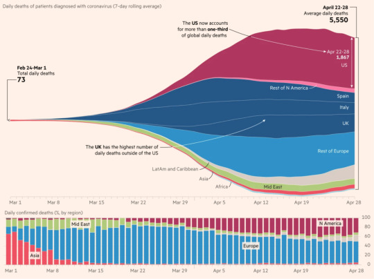
Photo

Streamgraph showing distribution of global Covid-19 deaths as total surpasses 1 million
40 notes
·
View notes
Text
made an interactive streamgraph for my datavis project...feelin proud tbh
1 note
·
View note
Photo

#Justfinished #myfirstblenderanimation @blender.official #blenderrender #menorah #tabernacle #tabernacleofglory #tabernacleofdavid #tabernacleofpraise #goldenaltar #arkofthecovenant #scroll #scrollofisaiah #isaiahscroll #blenderanimation #cyclesrender #rendercycles #diyartist #diyartistofinstagram #diyartistsofinstagram #artistsofinstagram #blenderartist #blenderdesign #project314 #andrewhoy #streamelements #twitchstreamelements #streamgraphics #streamelementdesign #blenderstreamgraphics https://www.instagram.com/goodgodfather/p/CXYNwGOLOrV/?utm_medium=tumblr
#justfinished#myfirstblenderanimation#blenderrender#menorah#tabernacle#tabernacleofglory#tabernacleofdavid#tabernacleofpraise#goldenaltar#arkofthecovenant#scroll#scrollofisaiah#isaiahscroll#blenderanimation#cyclesrender#rendercycles#diyartist#diyartistofinstagram#diyartistsofinstagram#artistsofinstagram#blenderartist#blenderdesign#project314#andrewhoy#streamelements#twitchstreamelements#streamgraphics#streamelementdesign#blenderstreamgraphics
0 notes
Text
Week Six - IXD104
Approaches to Data Visualisation
To communicate information clearly and efficiently, data visualisation uses statistical graphics, plots, information graphics and other tools. Numerical data may be encoded using dots, lines, or bars, to visually communicate a quantitative message.
Effective visualisation helps users analyse and reason about data and evidence. It makes complex data more accessible, understandable and usable. Users may have particular analytical tasks, such as making comparisons or understanding causality, and the design principle of the graphic (i.e., showing comparisons or showing causality) follows the task.
Tables are generally used where users will look up a specific measurement, while charts of various types are used to show patterns or relationships in the data for one or more variables.
Data visualisation is both an art and a science.
According to Friedman (2008) the "main goal of data visualisation is to communicate information clearly and effectively through graphical means. It doesn't mean that data visualisation needs to look boring to be functional or extremely sophisticated to look beautiful. To convey ideas effectively, both aesthetic form and functionality need to go hand in hand, providing insights into a rather sparse and complex data set by communicating its key-aspects in a more intuitive way. Yet designers often fail to achieve a balance between form and function, creating gorgeous data visualisations which fail to serve their main purpose — to communicate information".
Data visualisation is closely related to information graphics, information visualisation, scientific visualisation, exploratory data analysis and statistical graphics. In the new millennium, data visualisation has become an active area of research, teaching and development.

https://graphics.straitstimes.com/STI/STIMEDIA/Interactives/2018/04/marvel-cinematic-universe-whos-who-interactive/index.html


Data visualisation is the graphical representation of information and data. By using visual elements like charts, graphs, and maps, data visualisation tools provide an accessible way to see and understand trends, outliers, and patterns in data.
In the world of Big Data, data visualisation tools and technologies are essential to analyse massive amounts of information and make data-driven decisions.
As the “age of Big Data” kicks into high-gear, visualisation is an increasingly key tool to make sense of the trillions of rows of data generated every day. Data visualisation helps to tell stories by curating data into a form easier to understand, highlighting the trends and outliers. A good visualisation tells a story, removing the noise from data and highlighting the useful information.However, it’s not simply as easy as just dressing up a graph to make it look better or slapping on the “info” part of an infographic. Effective data visualisation is a delicate balancing act between form and function. The plainest graph could be too boring to catch any notice or it make tell a powerful point; the most stunning visualisation could utterly fail at conveying the right message or it could speak volumes. The data and the visuals need to work together, and there’s an art to combining great analysis with great storytelling.
The concept of the citizen data scientist is on the rise. Skill sets are changing to accommodate a data-driven world. It is increasingly valuable for professionals to be able to use data to make decisions and use visuals to tell stories of when data informs the who, what, when, where, and how. While traditional education typically draws a distinct line between creative storytelling and technical analysis, the modern professional world also values those who can cross between the two: data visualisation sits right in the middle of analysis and visual storytelling.
The different types of visualisations
Common general types of data visualization:
Charts
Tables
Graphs
Maps
Infographics
Dashboards
More specific examples of methods to visualize data:
Area Chart
Bar Chart
Box-and-whisker Plots
Bubble Cloud
Bullet Graph
Cartogram
Circle View
Dot Distribution Map
Gantt Chart
Heat Map
Highlight Table
Histogram
Matrix
Network
Polar Area
Radial Tree
Scatter Plot (2D or 3D)
Streamgraph
Text Tables
Timeline
Treemap
Wedge Stack Graph
Word Cloud
Sources:
https://visme.co/blog/best-data-visualizations/
https://en.wikipedia.org/wiki/Data_visualization
https://www.tableau.com/learn/articles/data-visualization
0 notes
Photo

Top 50 Baby Names - 1930-2014, by bigpixel.net
Done in R based on tutorial from Flowing Data:
http://flowingdata.com/2013/10/22/working-with-text-in-r/
Data from
https://www.kaggle.com/kaggle/us-baby-names
1 note
·
View note
Text
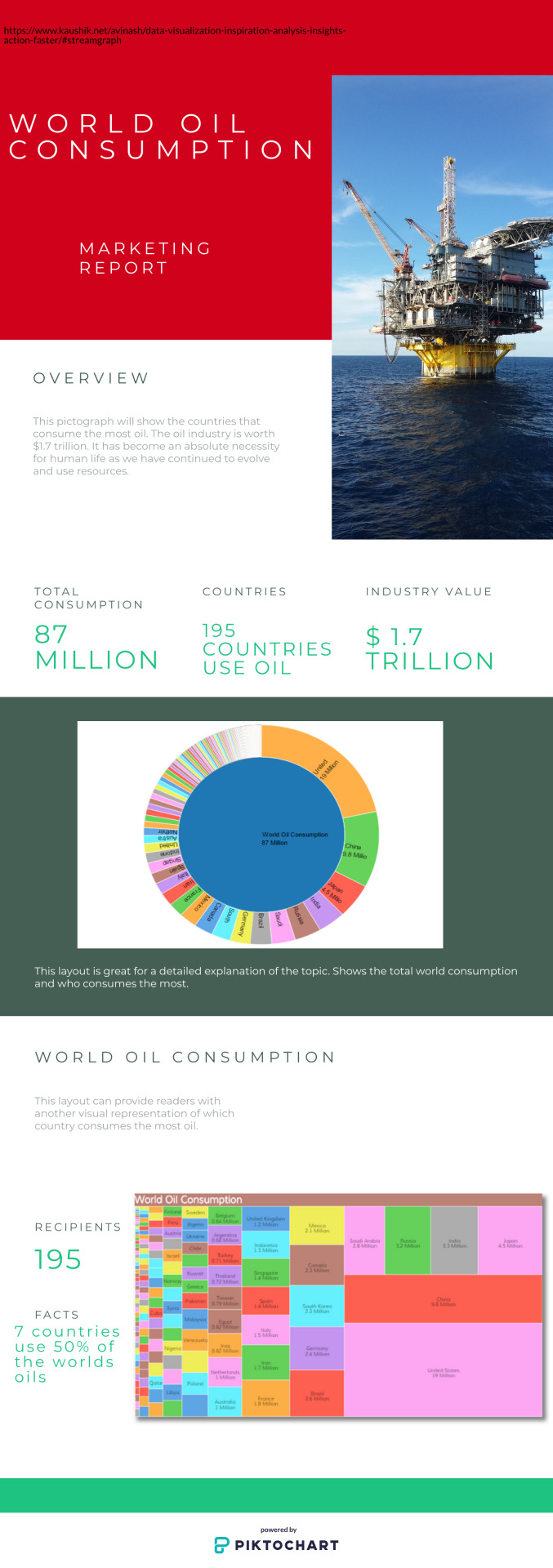
Module 10 - Analysis
For this module it was instructed to create a pictograph to show what we learned from said article. In my case, it was regarding the oil industry.
Original article:
https://www.kaushik.net/avinash/data-visualization-inspiration-analysis-insights-action-faster/#streamgraph
This was the pictograph I made.
0 notes
Last Seen Blogs

fredwkong
Fred W. Kong's Stories

iconscorner-blog
Sin título

iconicboca-blog
Ariana Grande Icons

ponyrific
Ponyrific

icecafelatte0atmilk
Icecafelatte0atmilk