#studioculture2
Text

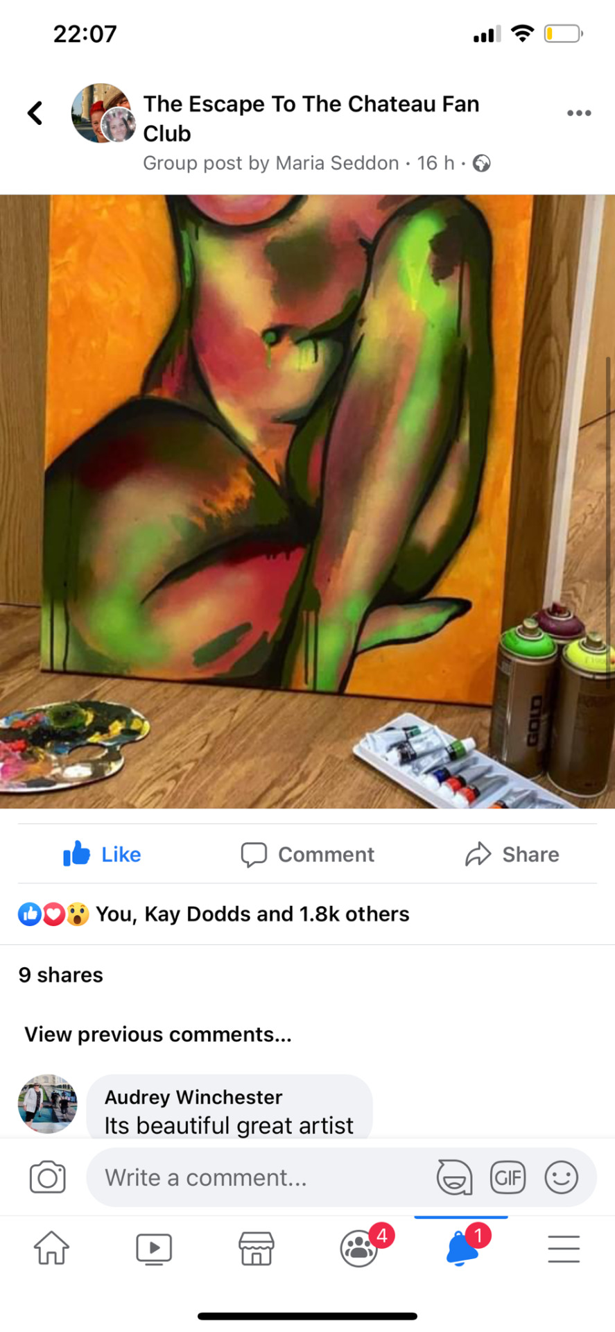
I created this painting for my mum using acrylic and spray paint on canvas as a gift. I love how the bright paint drips are visible through the acrylic brush strokes. My mum posted this work on Facebook and I have had a huge response. The painting so far has had 1.8k likes in less than 24 hours and also I have had 2 people asking to buy my work. I am very happy!
2 notes
·
View notes
Text
LEON KOSSOFF
Leon Kossoff (10 December 1926 – 4 July 2019) was a British figurative painter known for portraits, life drawings and cityscapes of London, England.
One of Britain’s most acclaimed painters of modern times, Kossoff is recognised for his highly worked and gestural impasto paintings and his striking and expressive drawings in charcoal, pastel, and graphite. Alongside his friend and contemporary Frank Auerbach, Kossoff was a key figure in the group of artists who became known as the ‘School of London’ in the mid 1950s.
Kossoff grew up in London's East End and the post-war destruction of the City and neighbourhoods so familiar to him became a focus for his work. His sombre pallette of greys and browns and heavy mark making depicting the desolation and devastation of the local community and industrial landscape.

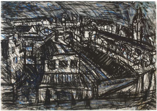

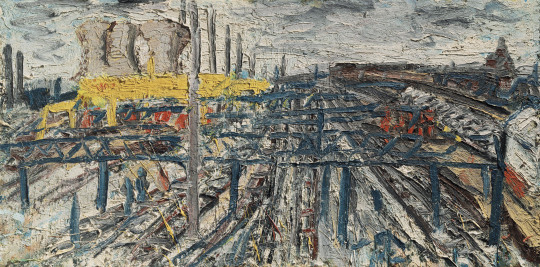
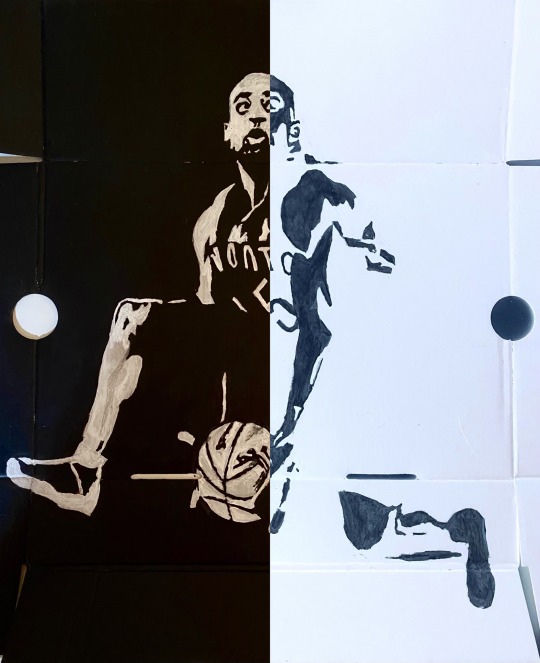
Here are four examples of his works that consist of these bold rigorous marks, his works have a lot of different techniques when it comes to mark-making, which to the viewer gives it a story telling feeling to it. some of the works shown here look to be done in Charcoal where the one just above here looks to be done in Oil Pastel.
This style of technique could be good for producing figure drawings and paintings that relate to the project, by that i mean gaining references of players from different sports that capture them in action within the sports e.g basketball players, football players, tennis players etc. it would be good to capture these figures using this medium and technique showcased here through Kossoff's work.
3 notes
·
View notes
Text
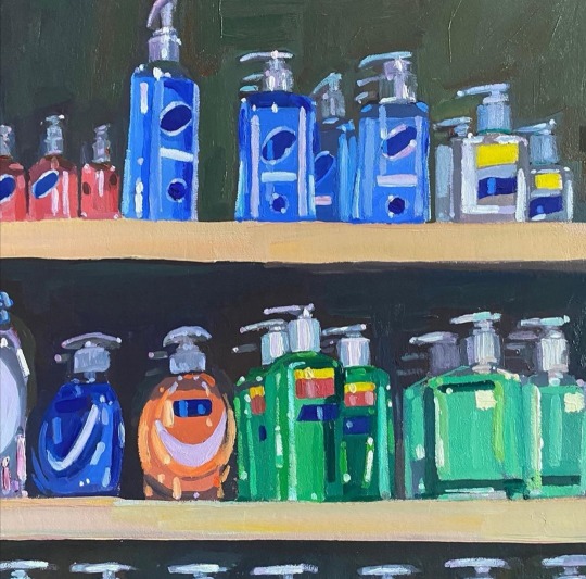


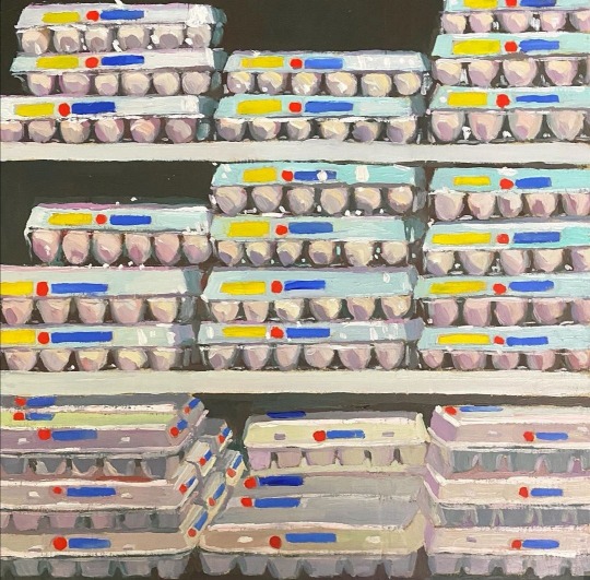
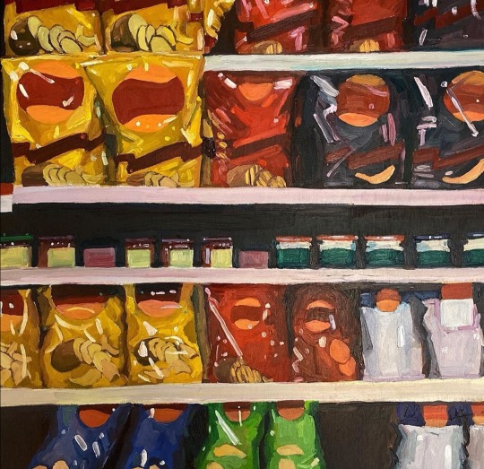
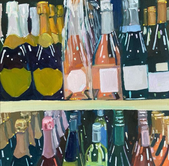
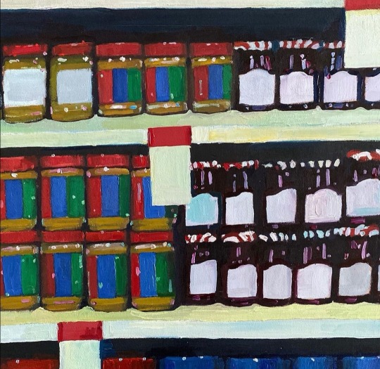


Erika Lee Sears
I came across this artist on Instagram a few years ago, and have been a massive fan of her work ever since. Erika focuses on supermarket isles, painting collections of every day items. Her beautiful colour palette combined with her extensive painting skill creates images that seem so comforting and warm and relatable to everybody's daily lives. These images have become a source of happiness to me during recent times as they come up on my feed and remind me of normality. These images have become a huge inspiration to me in more recent times, and my work seems to reflect her style incidentally, just proving to me what an influence she has been on my artistic career. Creating the small snapshots of supermarket aisles, Erika allows the viewer to see something in a new light, focusing on one product or one section of a supermarket, something we do not often see. This is an idea that I have tried to reflect in my own work, by focusing on areas of the supermarket aisle or specific products such as the milk cartons, the confectionery aisle, the crisps aisle and and the soft drinks refrigerator.
3 notes
·
View notes
Text

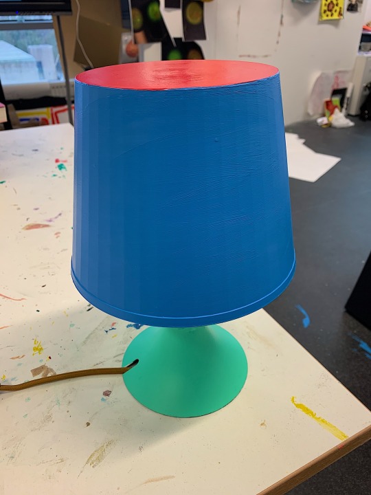
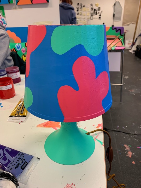

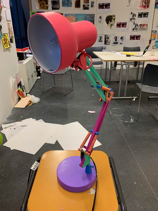
STUDIO CULTURE
“Splidge Lamp “
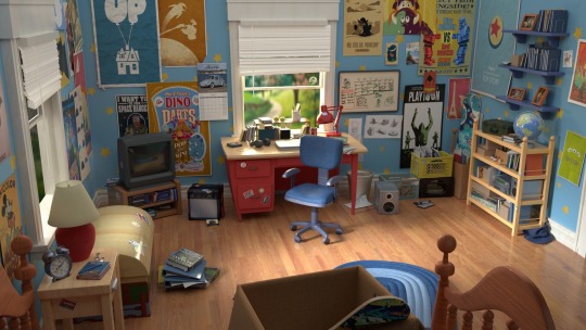
Splidge lamp is a lamp I actually had in my university accommodation last year . It was a cheap plain vintage style lamp I took with me . It was all plastic which was perfect for the mediums I wanted to use, however it was quite battered. I wanted to find objects I already had around me , whether they were broken or not , because I always feel something deserves a second life. As I’ve said previously I wanted to explore deeper into lifestyle . Which is why I chose to use found daily life objects we are surrounded by. I really enjoyed painting this as it was different to work I had created in the past, I was looking further and further into installation artists , as I felt I could really do a “ Kate’s home “ installation show . Aswell as doing a lot of research on artists who focus on installation and daily objects I also took from re watching some of my favourite Pixar films such as toy story , bugs life and monsters ink. The colour schemes which were used in these films were so playful , everything came alive and slotted in perfectly with the scenes.
The shapes used within the design side of the film were so childish curvy playful and fun . Nothing seemed to have a sharp edge . Within the colour scheme it was spot on . I was so influenced by the style of the palette and how widened it was . I wanted to then incorporate the majority of my palette into the objects I was planning to use and paint . The films I watched also gave me the thought to go to a much larger scale , I had ideas of painting wooden bed frames , kitchen ware , cabinets , wardrobes , vintage televisions and coffee tables . In which I hope to Persue over the summer break , and when I come back for second year. “Splidge lamp” overall I thought worked really well , due to the colour palette I have used , and the shapes working well in the composition. I feel it massively relates to my take on popular culture , due to the vibrant bold colour scheme , and my striking black outline . In the future I would like to start creating new designs for my practice so everything doesn’t really look the same .
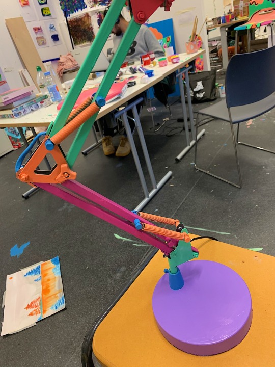
“Bounce Lamp “
Another lamp which was also a found object was “ bounce lamp “ this was on my desk I had in my accommodation with me last year also. It’s fully working and was sadly a very boring grey metal colour. Which I clearly fixed with my colour palette ! I found this lamp a struggle whilest painting due to the tight gaps , nuts ,bolts and screws , everything seemed really squashed together and so small. However I got chatting to someone in another year group on the day of me painting this , and they mentioned why didnt I look into spray paint . At the time I was adamant I didn’t want to use stray paint . But the more I looked into this medium the more I began to get excited , due to the fact you can get a clear bold and flat colour with the medium and would be a lot less time consuming and be easier to use when working with objects such as this one. It’s definatly something I want to look into when I return back to university in September and even over the summer break, as I do feel it would benefit my work quite a lot .
3 notes
·
View notes
Text

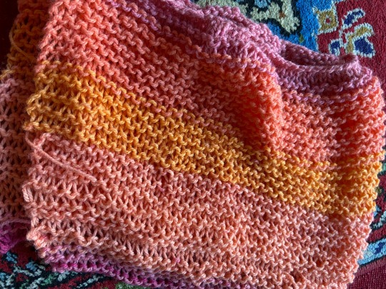


This is the end result of my knitted piece which was mainly inspired by yarn bombing and how people decorate every day objects using yarn, usually exploding with colour. My next plan of action will be to take photographs off my knit wrapped around/on top of random objects that I find and see how it can potentially transform the object or the environment that it is in.
3 notes
·
View notes
Text
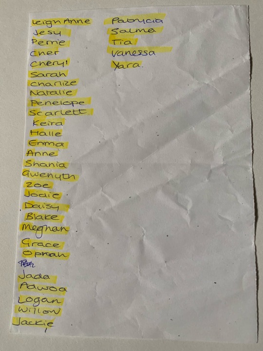
Women of popular culture
For this piece I wanted to create an over emphasised figure of a woman, inspired by the iconic Jessica Rabbit. I threw together a very simple sketch of my initial idea and carried in from there, using references from social media and celebrity icons along the way to influence the overall outcome. For example I chose to take features of Angelina Jolie and Kim Kardashian to form the body and face in a graphic cartoon like style.
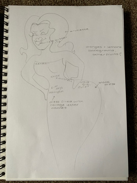
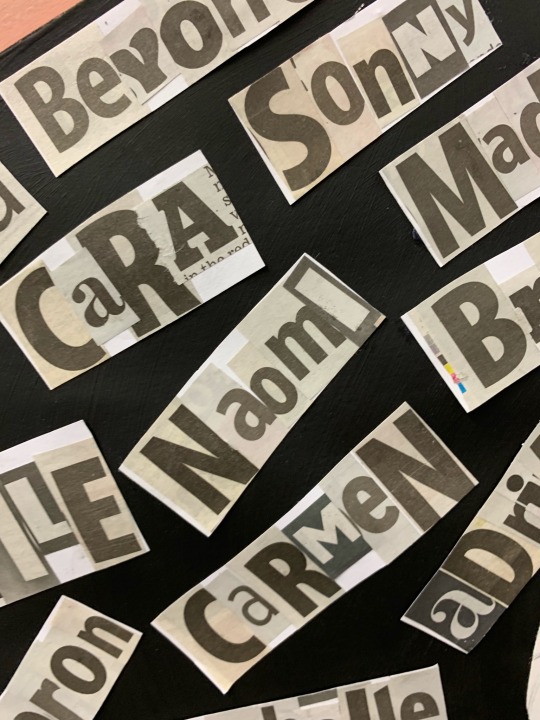
I then had the idea to fill the blank space with graphic lettering to represent a number of influential women in pop culture over the years. Therefore I set out to create a list of names to collage together using letter from newspaper headlines, I think that adding this to the piece gives an extra texture, avoiding a flat looking finish.


In keeping with the sometimes nonsensical way that pop art is presented, I felt that using a colourful background allowed the main feature of the work to stand out. I then wanted to give detail and a fun design to the background, using citrus fruits in a pattern like way to fill the otherwise blank areas.


I have really enjoyed creating this piece, it has a randomness that I never embrace. I usually like to expand my practice on realistic portraiture and this was a way in which I could explore areas and techniques I wasn’t so familiar with, I looked at how comic books and graphic novels exaggerate the proportions of the body when it comes to characters that reside in these pages. Therefore using that and simple pop art stylings to create a stupidly out of proportion human figure.
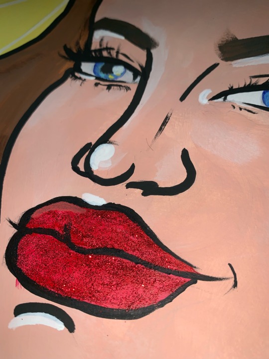
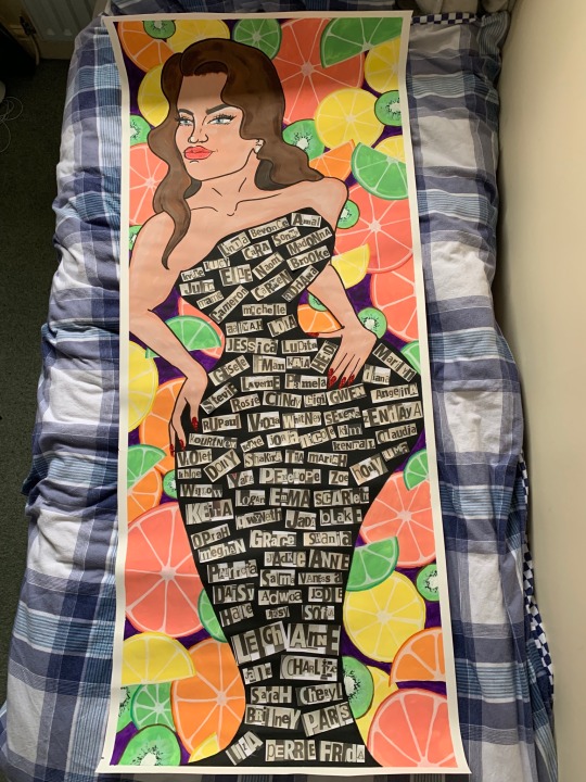
I used acrylic paints to complete this piece as it was my first large scale piece and I’m very comfortable with using this medium, therefore I felt more optimistic about the outcome. I feel that I have created a well blended and comic book style character. To add extra detail to the work I felt that a glamorous approach needed to be taken as my main inspiration was Jessica Rabbit. So I decided that I would use glitter to add finishes to the lips and nails for an extra feminised touch.
2 notes
·
View notes
Text


Whilst attending the abstract and materiality workshop #2 I saw Angela making these butterfly effect abstract works by applying paint to one half of a page and folding it over so that it transfers onto the other side of the page this is almost like symmetry. After coming away from the workshop I was really keen to create my own. I did this as a bit of an experiment and they don't really have a meaning but I really like how they turned out. After attempting my own I was amazed by how it turned out! I didn't really expect or know how it happened as I created these vein like lines with the paint which are these really intricate lines that look really delicate.
Quick Overview -
Overall I really enjoyed experimenting and exploring with this painting process. I think I will experiment print-making over the top of these as its something that I enjoyed creating. I will be making more of the using different folds, paper shapes, and paint as I feel they were very successful as an experiment. I also like the colours that in chose to use so next time I think I will experiment using a variety of different colours and use contrasting colours together.
3 notes
·
View notes
Text
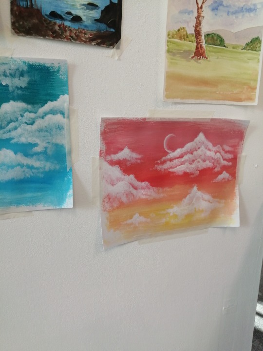
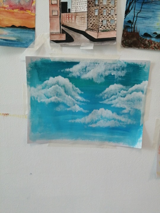
These are three of my acrylic paintings of sky's. They are just experimental but I love how they turned out, since I have never used acrylics before. I think I might have when I was in primary with but not properly with the skills I have developed this year. I think I'll continue to paint in acrylic for now based on an artist that has inspired me. But I also want to experiment with other materials.
2 notes
·
View notes
Text


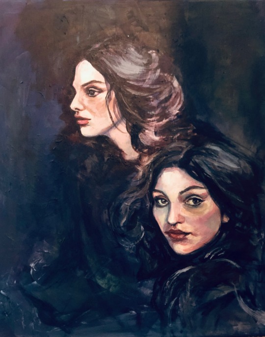
Blessed Wild Apple Girl , acrylic on canvas
My crucial driving force for creating these paintings was the realisation that we suffer in this world, are fastened, and we have terrible irritations and fears for the whole world for our family of our children because we are driven into some strange stand, as if we are in custody and that some unknown force rules individuals, and this is even a non-governmental administration and not a president or Queen, it is something invisible to the eye and the public, and I told you to sit down and draw. My women looked somewhere far precarious destiny and looked towards the viewer to ask the viewer what is happening, and this is a pathological disease in our world when people do not know what is happening. They are looking for the Truth and want to hear and see in this darkness and they desire light.
#Studioculture2
2 notes
·
View notes
Text
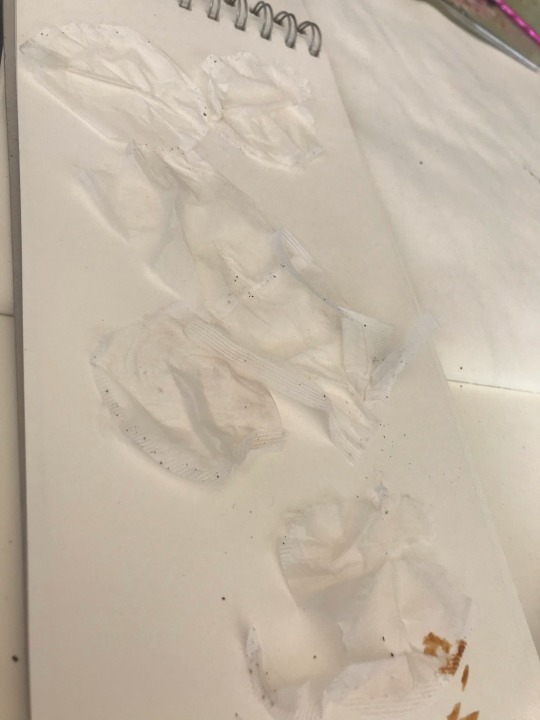
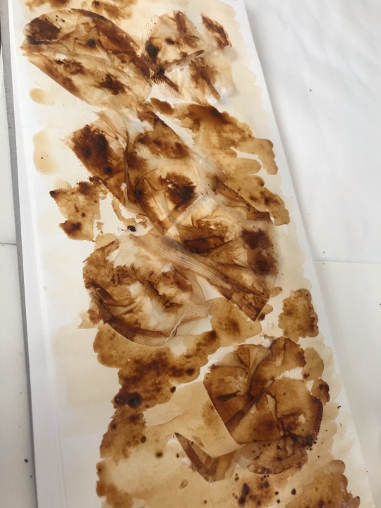
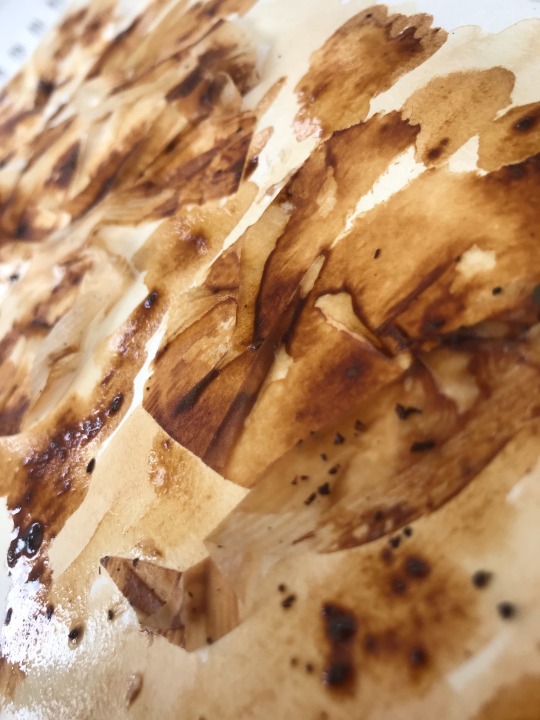
USING NATURAL FORMS
COFFEE & TEA
I decided that I wanted to look into creating work with the natural forms of tea and coffee because when using them as a paint , you can create darker and lighter tones with it due to how much water you add. When cutting the tea bags open I wanted to form a textural piece so I had the idea of using the bag and gluing it down to create the first layer.
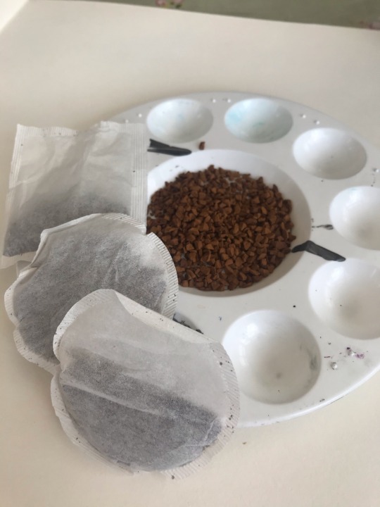
Once I had done this I then formed a diluted mixture of the coffee and created a wash over the tea bags. Then I experimented with how much water I put with the coffee and this is how I created lighter and darker tones to this work.


2 notes
·
View notes
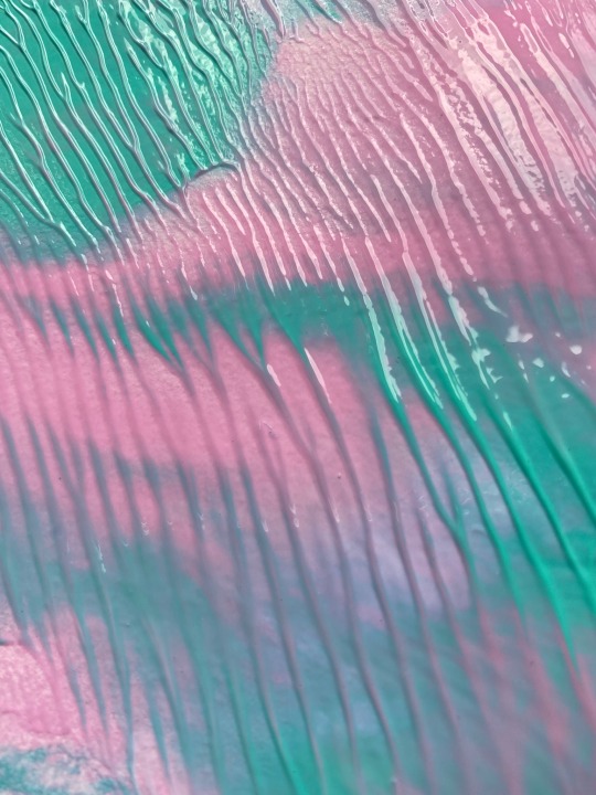
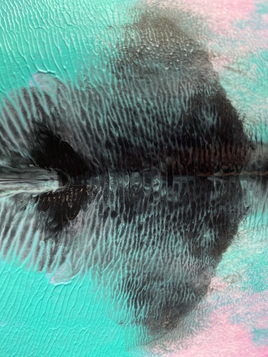
Text
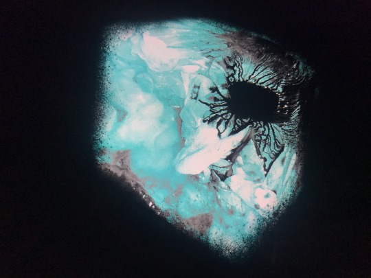
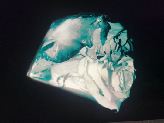


These images were from my ice cube experiment. I wanted to edit the images to make them stand out. I found that I could hide the parts I didn’t like and highlight the successful parts of the cubes as well as distorting a few images into unrealistic but intriguing compositions. I found using a black background was really successful as it made the colours and marks really stand out.
2 notes
·
View notes
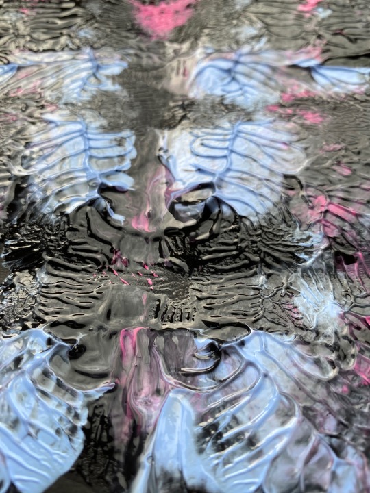
Text
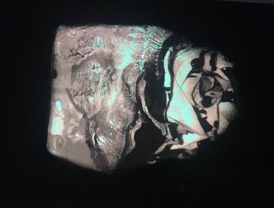
These studies are still using Photoshop and the negative image effect however, I decided to put the positive version and negative version together to see the complete contrast of the 2, this is a nice effect and one I haven’t really seen done often
1 note
·
View note
Text
The last addition to my project was this crate that I managed to retrieve after a shopping food delivery. I decided that I would paint this crate with an image of supermarket aisles that I have used throughout my project. Once I had painted the crate, using my iconic palette of colours, I placed it in my doorstep and took some photographs. The idea behind this was as if the supermarket was being delivered to me. Something I miss so much is simply walking down the aisles of a supermarket and browsing at what I'm going to buy for the week. The crate was almost to bring that memory to life, as if the memory was being left on my doorstep for me to enjoy safely from home.
The lockdown feels as though it has been going on for years although it is only been two months. My project has been a way for me to express my frustration and upset over the current situation through the medium of art, allowing other people to project their own feelings upon my creations and hopefully gain something, whether that be some comfort or perhaps a memory or hope that one day things will return to normal, whatever the new normal may be.
2 notes
·
View notes
Text

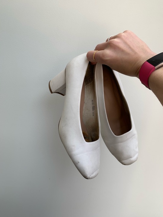
STUDIO CULTURE
“ CAMILLE SHOES “
Whilst in lockdown I had been really limited to uses of materials and objects I could use. My paints finally came after waiting just over a month for them and I got stuck in. I wanted to use objects I had around me and found these battered old looking shoes up the loft. I knew they would be perfect to experiment with. They are by no means finished but I just wanted to show you my initial progress so far with them. The initial inspiration for these shapes came from an outfit of mine which I will tag below,

I love all things 70’s and wanted to incorporate a 70’s style onto these battered old shoes but in my own pastel colour palette . The outcome I want for these shoes are that I want the soles aswell as the inside painted , they are not to be worn , simply a form of art .
2 notes
·
View notes
Text
Inspired by @kittybehandarlington knitted plant pot piece - 09/05/2020
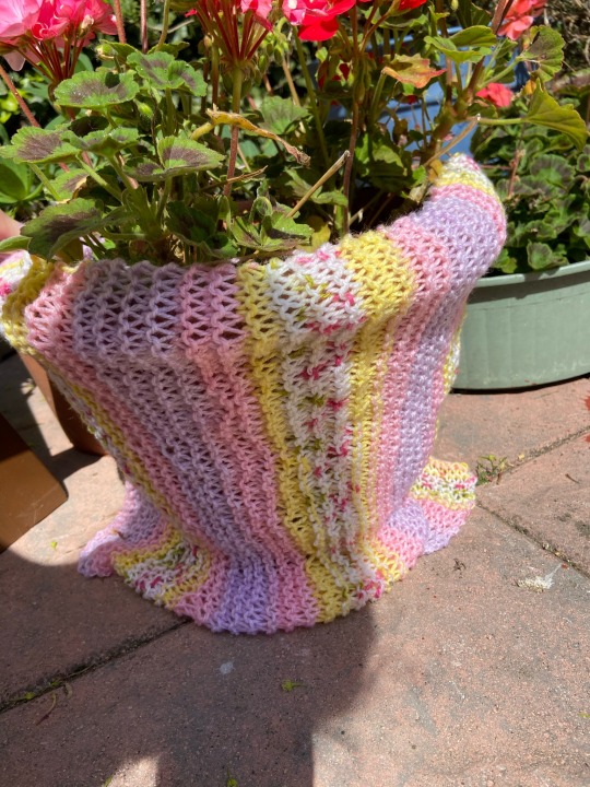


For this piece, I was directly inspired by the way Kitty wrapped a knitted piece that she had made around a plant pot. When I saw it I was really in awe because it looked so aesthetic and really brought the dull pot to life through the use of colour and alternative texture. It made me want to play around with my own knitted piece, putting it on a plant pot too to see if it would have the same affect.
When I wrapped it around, I found that it looked so gentle and subtly exploded with pastel colour which is what I was aiming for. I think choosing the rosiest flower in the garden definitely complimented the knitted piece because they were both vibrant and both were pink/red hues. After doing this for myself, I definitely want to continue with this, and instead of wrapping around natural things like trees, but man made objects. I think including man made objects could be exciting, it could add more depth to them as a whole for example, a foot stool, a sun lounger, or a fence.
2 notes
·
View notes
Text
MORE PHOTOSHOP PIECES -


Something else I have considered since making these pieces, is how they remind me of the textiles prints I created last semester. This has led me to think about possibly printing these Photoshop edits on a larger scale and then stitching into these in a similar way to how I have with my other prints before! Unfortunately, my sewing machine has been inaccessible at uni so I haven't been able to expore this idea; however this is something I hope I can experiment with in the future, with the space and materials available to me.
1 note
·
View note
Last Seen Blogs
probabbee
The Bees Bumble

transthaumaturge
Being Trans Is Magical!
commander-spaceboy
Commander Space Boy

twoonine
Twoonine
whitenoiseclub
whitenoiseclub