
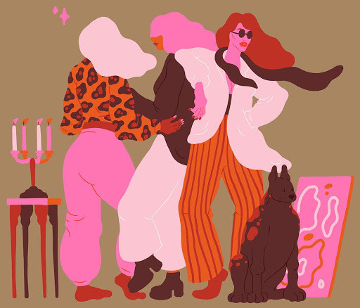
Statistics
We looked inside some of the posts by groovyartekate and here's what we found interesting.
Average Info
Notes Per Post
14
Likes Per Post
13
Reblog Per Post
1
Reply Per Post
0
Time Between Posts
12 hours
Number of Posts By Type
Text
17
Last Seen Tumblr Blogs


Fun Fact
Tumblr posted its first advertisements in May 2012 and subsequently earned $13M in revenue.
Text

ILLUSTRATOR ARTISTS
OLIMPIA ZAGNOLI
An amazing illustrator artist who creates super fresh shapes and voluptuous forms with her clean bright eye catching colour pallets . OLIMPIA has such a bold stance to her work in which I love and inspires me to get into using the digital software provided to incorporate into my practice within the future. Her work has been on shop fronts such as Uniqlo and even done a collection with Prada for a campaign. Her work speaks in so many different ways to me you can’t imagine. I think it’s due to her loud charm of colours and empowering message she gives across when creating her curvy shapey unique girls. I also was very interested in the patterns she uses within various shapes . I love the way she has designed these which also springs to mind how she usually doesn’t put eyes/mouths/noses on the faces of the people she illustrates to me this is so it doesn’t draw any attention away from the extravagant shapes and colours. Overall I am really excited to move forward within the illustrative world.
SARA ANDERREASON
She is a Swedish illustrator creating colourful shapes relating to food and people. Sara has a playful and fun mind which yet such a sophisticated stance. Her cleverly realistic characters are so eye catching with the simply composed use of shapes and vector lines. She looks at the female perspective of life in text photography illustration and art. I love Sara’s work . I feel it’s so relatable and she creates such bright refreshing and off guard scenes of people dancing and interacting . To me both artists are heavily within the pop culture world . I never actually realised until doing my research you could do so much with digital art . I automatically think in a really bad mindset when it comes to working on computers or any tablet to create art as I always felt it’s not art if you can’t physically do it in real life . But my mind set has now changed . Everything looks so real and the colours come out with so much vibrancy and energy giving off a series of mixed emotions. Again I hoping to experiment with the iPad Pro of my sisters to attempt to create some funky illustrations which relate to my practice as I feel this would be a great path to go down and will broaden my practice with different techniques further.
3 notes
·
View notes
Text


CYANOTYPE ARTISTS
Myka Baum
Myka Baum is one of the artists I looked into when I was researching about cyanotype . Even though I may or may not use this process further into my practice as I feel it doesn’t fit I really liked the process and finding beautiful pieces such as Baums to look at and what you can achieve with this technique . Her work is mainly focused on the fragility of nature and the animal . She looks into close observation of what nature actually is and linking intellectually with her heart and the living organisms. Through her work Myka wants to express the unique style a living organism has through her work and show the growing process of one plant into a beautiful thing and then eventually rotting when it dies . I really like Myka’s works due to her reason behind why she does them. I like the way she uses nature such as plants flowers and animals not harmed to produce her works I find it really interesting. Along with the way her papers arnt always evenly covered with the chemical instead she produces and creates ovals / squares and various shapes for her prints to sit in , I think this responds well to her nature of work .


LYNETTE MILLER
Another artist I also came across is Lynette Miller she looks at broken bottles found in her garden which she creates into cyanotypes which I find really interesting and definatly different to most artists who work with the technique. Most artists I have looked into use very flat objects and drawings to create their works . But with Miller I like the way she constructs found objects and spaces within practice . Her work involves a range of media’s such as drawings , textiles , stitching , photography , painting and natural dyes . Miller will often use dyes such as coffee , teas to stain her paper when producing or produced her print to start the dipping process . I think if I was to start creating my own cyanotypes I would also look into staining my paper with natural dyes to get that aim of my popping colour palette within the technique as I am not so fond of the one block traditional colour of the blue . Miller aims to create romantic blue tinted images with an antique style , looking dreamy and having that aged finish which I must admit I do adore within her work. Comparing to mine I don’t think this would fit into my practice but maybe I could explore a way to do this. As I mentioned before Unlike other artists Lynette uses found objects such as broken plastic bottles within her garden and surroundings . I really like this particular direction to her work , as I feel it’s more contemporary and unique , rather than just using flat 2D objects . Even though her work does look rather dated and antique like , I agree it is beautiful and fits well with her chosen objects . Lynettes objects are also really clear , when researching into cyanotype I have noticed quite a lot of them don’t turn out so clear and are often broken and faded and it feels like they are just not their or finished . However with millers her objects are so precise and crisp and I love how she has presented these in individual images .
0 notes
Text


INTRODUCTION INTO MOVING IMAGE/PREMIER PRO
I had to recap this workshop with online sources due to me leaving notes in the studio . I also couldn’t remember the workshop apart from the clips /films Steve showed us. First of all the YouTube video I used to take these notes was interesting and I feel I did learn a lot , however I did get very lost along the way , and did think will I ever be able to do this. I’m hoping when i return back to university for L5 I will be able to experiment with this software a lot more as I do like the thought of being able to make a still image move . I’m hoping to actually purchase an adobe package subscription at the end of the month to experiment with , which isn’t expensive at all to trial all the digital software out which is exciting . However overall I feel this workshop doesn’t really link to my theme popular culture and I probably wouldn’t of used it within my practice if lockdown hadnt had happened , however I was inspired by the short films Steve had showed us within the workshop which seemed to relate a lot more to popular culture . Here is the source I used to create the step by step notes
youtube
In Steve’s workshops the videos I remember him showing us was Andy warhols Empire , which was a black and white silent film taken at one shot for 8hours 5 minutes, which I actually found really interesting . Even though it was a none changing view and would probably be very very very boring if you sat and watched it all for 8 hours , it was actually brill we skipped through the film to certain bits and you can see how the sky changes from light to dark , planes and birds in the sky , how it lights up at night . It was quite beautiful really . I will insert the link to a short clip of the video below as I really do find it amusing to watch especially if it’s on in the background whilest you create work .
youtube
The next guy Steve showed us was Ryan trecartin an American film maker and we watched a video called center Jenny which is a 53 minute film or just over. At first I was shocked , I had no words , it was so loud , the clips and scenes constantly changed from one to the next , I didn’t know whether I felt sick or sucked into this film and couldn’t keep my eyes off it . The language used was awful but also really funny . I got into it straight away . I guess it’s like marmite you either love it or hate it , majority of people hate it from the reviews and comments I have read . But I love it . THE COLOURS , the different scenes , the loud and weirdness , I find it so fun and creative yet so realistic of certain people . It reminded me of various reality tv shows and taking the mic . I think just watching an array of trecartins videos inspired me a lot to have a mess around and try and make my own under influence of him. I feel it was the poppest of the pop culture videos. I will post a link below of the center Jenny video , as it is one of my favourites of all time and definatly an interesting watch .
youtube
0 notes
Text


ILLUSTRATOR WORKSHOP
Due to leaving the notes I had made in the workshop in the studio , I watched a YouTube video on the basics of illustrator. I remember really enjoying the workshop at the time , as even though I don’t warm to digital software or anything to do with computers. I wanted to look into how to create digital drawings. I have seen a lot of people create books / cartoons / really funky things on illustrator and I can’t wait to try it out for myself . My sister has an iPad Pro with that drawing app on their so I may give that a little go if she’ll let me , as I would like to experiment with the digital side of things. The video i watched was short and simple and I found it really straight forward and a lot easier to follow than premier pro . I feel everything is pretty much in front of you and i think once you know the basics you can be creating all sorts. I’m really excited to return to university in level 5 so I can have a play around more with this software and experiment with different things .
The source I used for illustrator
youtube
0 notes
Text


PREMIER PRO workshop
These are my notes I have made in my journal for premier pro. Due to me not taking notes or visuals in Steve’s workshops I took it upon myself to look into premier pro a lot deeper by watching various YouTube videos . I was actually really interested in learning how to make and edit videos using this sort of software as I have been looking into performance art over lockdown and wanted a software I could edit my videos with . When I return to university for second year I would like to experiment with this software a lot more and more in depth as this is just the basics and I know their are many many more things you can do with this .
Resource I took these notes from for premier pro below. The guy who did these videos has a full channel full of videos which specialise in different effects and tools for premier which I want to look into , and possibly purchase a monthly subscription to use.
youtube
0 notes
Text


CYANOTYPE WORKSHOP
Unfortunately I wasn’t able to attend the cyanotype workshop , although I really would of liked to as that’s when I began to get interested into print. However I wanted to learn more about this process , how to do it , what the outcomes are , if you can place flat objects to print and not just draw designs . I found a lot during the time I spent researching into cyanotype and even though I feel it doesn’t link to popular culture , I found it very fun simple and something I would like to get into either over summer and when I return back to university in second year. I feel you can do so much with the prints and after looking into some artists aswell you can create some really funky prints with just the one colour . However I did also learn you can dip your prints into substances like coffee and herbal coloured teas to change the colour of your blue print to the chosen colour way. I found this really exciting and i can’t wait to create some soon! As I didn’t attend the workshop I watched a really simple interesting video on YouTube to guide me through the process in which I made these notes / step by step process from. Georgina Boden also kindly enough let me have a look over the notes she took within the workshop!
youtube
0 notes
Text


ETCHING WORKSHOP
Here is my technical journal notes , and the diagrams I had recently drawn as I didn’t take any pictures . Before we got started with the etching workshop I kind of had my doubts , as this technique isn’t really me , but I wanted to explore deeper into various techniques so I knew I wanted to give this a go. We looked at artists such as Goya Picasso and the chapman brothers who created etchings , and I found it very interesting , especially the chapman brothers how they defaced a series of Goya’s work, which I was interested in to look further into.
The etching process uses strong acid to cut into the unprotected parts of your plate which is usually copper or zinc. It is part of intaglio family which is a printmaking technique . You start off with your metal plate , which you etch into the ink to do your design , the ink will then fall into the etching parts you have created , which is the complete opposite to the relief print.
As you can see I still have my metal etching plate as I sadly didn’t get to attempt to print due to me having a doctors appointment half hour before we were due to print . However I would like to get back into the workshops and look into etching a lot more , because even though I don’t think this workshop relates to popular culture or my practice . I would like to incorporate it into my works, to create various prints. As I do think it is a very interesting process and I thouroughly enjoyed the workshop .
THE CHAPMAN BROTHERS


The chapman brothers are visual artists who’s work is made to look uncomfortable and odd I guess to the viewer. They purchased a series of Goya’s etchings and started to deface them , but of course making a celebration and tribute to his works . They defaced his etchings by painting and drawing on top of his works involving heads of clowns , dogs and weird monsters . To me their work doesn’t link at all to my practice and I feel it doesn’t link to popular culture either , and did make me feel quite uncomfortable. However I do find it really interesting how they did this , and why they even had the thought to deface the works of Goya .
Resources I found interesting into the outlook of the chapman brothers
0 notes
Text


STUDIO CULTURE
“ Quirky Clay “
During the lockdown I wanted to experiment with various different materials which I wanted to include clay. Sadly I do not have a kiln so I had to purchase air drying clay which I can say is actually really different than clay I have used in the past , it’s quite hard sticky at first and seems to crack uncontrollably but I got the hand of it in the end . I love the way you can shape and form this material into any size /width /length , i think it’s a really interesting and creative material to be able to use. Sadly I wasn’t able to finish these beautiful objects due to drying time , but i wanted to paint these in my own unique style and colour palette which I hope will turn out rather groovy. When I was in college I did a ceramics module on my art and design course and I remember really enjoying what you could do. I ended up making two rather large very organic vases whilst taking inspiration from Georgia o’keefe who paints and works with very fragile things such as petals and flowers . I took inspiration from artists such as Ahryn Lee , Erika Emeren , and Takuro Kuwata whom I will picture works of below .


I wanted to create shapes which were quirky , realistic , weird and which looked really fragile to touch. Within these artists works I love the shapes and how the forms created , look so droopy yet stable and hard. The way the clay has been used really inspires me to move forward with this material , as I actually had no idea that you could do all these things . The way extra pieces of clay are stuck onto the fossils creating a more 3D possibly furry sort of look is really fun and creative , they kind of remind of sea critters and objects which live under water at the bottom of the sea , such as coral , weird looking fish and plants , I think the colour schemes used also emphasise this aswell. Again I have really enjoyed so far working with my clay and I am so interested in the subject of ceramics which I would like to work deeper with in my practice . I am currently looking into different clays at this one I purchased wasn’t too great which I did mention before , maybe it’s just me but this clay seemed a lot different than others used in the past . I’ve also noticed the objects I have made are cracked quite badly inside when drying , so I really want to look into how I can stop this and improve my creative works within ceramics .
1 note
·
View note
Text


LOUISE DANEELS
Is a ceramicist focusing on making replicas of everyday life objects , by taking inspiration from personal hygiene . These objects we most likely give little thought about when used beyond their functional uses . She looks into bottles , moisturiser tubs , sponges , toothbrushes , tampons , nail clippers , washing up liquid and the list goes on. She’s also recently started to take up the replicas of various foods such as fruit and vegetables . Daneels self taught her self to use a kiln and how to achieve her colour ways with glazing through watching numerous YouTube videos. She came across ceramics whilst studying a masters degree in illustration and had a project based around space . In which she looked deeper into clay and got inspired by daily objects we use! I really enjoy the whole aesthetic of Daneels work , as it’s different to a lot of ceramicists I have looked into due to her creative unique thought . I feel this links in a range of ways towards pop due to her creating every day objects / looking into advertisements and typography , the use of organic shapes used within her work along with a bright identical colour palette to the real products . I also love The composition daneels has also presented her objects when being photographed or in exhibition it’s so random. For instance the draft washing up liquid pictured with a lemon a watch and some Lego , this composition fits incredibly well but why? Why have these objects all been placed with one another when they don’t link is it the colour scheme fits well all together ? Who knows but it’s random playful and very very fun to look at. Over lockdown I have actually introduced myself to clay , as I’ve always been so interested in the material since I did a module in college based around ceramics and I made vases taking inspiration from Georgia O’Keefe whom paints delicate and very soft petals and flowers . So I would like to take my inspiration from daneels to work with more materials such as clay , and incorporate my own style of work within this material . I feel this would be something fresh and quirky and would love to see my outcome of what I have created .
A very interesting read about daneels work on how why and about her works .
3 notes
·
View notes
Text


“ MARIMEKKO “
Marimekko is a design house , celebrated worldwide for its fabulous bright quirky printed fabrics which are used in fashion and homeware. I absolutely adore marimekkos prints and use of shapes and colours. I feel it’s such a quirky brand which gives me much inspiration for my work by looking into different shapes and forms . I also enjoy the repeated pattern. I was never actually that interested in repeat pattern or print , but After purchasing clothes from here , and looking deeper into the print world I would really like to incorporate screen and possibly digital print into my work within the future . Marimekko also uses a range of colour palettes which look like they fade into one another in various prints , I feel this is a great effect which has been used and has given me inspiration to expand my pallet to a wider range of colours and instead of me using one block colour in one shape to possibly mix two colours together which you can clearly see are faded into one another . Although I feel this research doesn’t necessarily link to pop , however the prints have given me so much inspiration to work with during my practice over lockdown using various different materials .
1 note
·
View note
Text

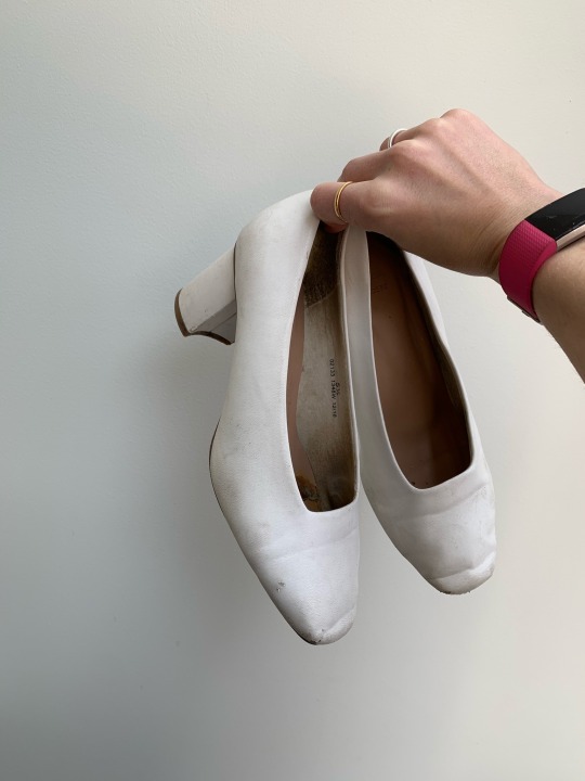
STUDIO CULTURE
“ CAMILLE SHOES “
Whilst in lockdown I had been really limited to uses of materials and objects I could use. My paints finally came after waiting just over a month for them and I got stuck in. I wanted to use objects I had around me and found these battered old looking shoes up the loft. I knew they would be perfect to experiment with. They are by no means finished but I just wanted to show you my initial progress so far with them. The initial inspiration for these shapes came from an outfit of mine which I will tag below,

I love all things 70’s and wanted to incorporate a 70’s style onto these battered old shoes but in my own pastel colour palette . The outcome I want for these shoes are that I want the soles aswell as the inside painted , they are not to be worn , simply a form of art .
2 notes
·
View notes
Text


ADAM NATHANIEL FURMAN
Adam Furman is an artist and designer who is based in London , from Japanese and Argentine heritage . Furman is trained in architecture and fine art aswell as studying in various other areas such as products , interiors , writing and teaching. However he does currently work in 3D print and Design , with work exhibited in London , Paris , New York , Milan , Rome and many many places and countries world wide.
Furmans work is so young and playful and especially fun . He brings colourful aesthetics of paintings and design to life by lifting them into his interior dreams , which are so approachable and cheeky. His practice brings us a sense of joy and fun however by also looking into critical reflection and historical cultural information of visuals and personal experiences he has of looking into people’s domestic interiors and making something totally unique , child like and quirky . Furman takes inspiration from his passionate love for themes such as queerness , colour and ornament which he feels this represents him and his practice at its best. Whilst also taking in his exploration in new cities , shops and people he meets along the way whom have a certain look and style about them . To this day His installations and paintings are embodiments mostly of his roaming cultures that surrounded him when he was growing up which continue to still fascinate him on a daily basis . Furmans work is truely inspirational , a lot of his practice however does remind me of cute little gift shops , I think it’s due to the use of a very pastel young colour palette , and the shapes and forms he has built for his furniture pieces when preparing for installations and commissions. He refers to his work Method as “ dragging architecturual forms , dressing them up in drag , and using the tool of postmodern work” Aswell as doing his own practice over the years he has also been approached for commissions , from hospitals , ITV and various people of the public wanting him to design their interior for their city apartments . I think this is spectacular. He has inspired me in so many ways possible such as to get started on especially building my own furniture in the future , I feel this is a great idea which I have mentioned before . As I would love to get into building and experimenting with sculpture . After also looking at Furmans work I would like to create installations aswell as one off pieces , and have the experience of creating a show . I feel Furman links to my practice and pop due to his use of clear and soft but limited colour palette , and his exploration into culture , people and interior . I also enjoy how his work can flip between very detailed and carefully thought prints and paintings to just a pastel block colour of furniture with a unique shape. Whilst doing my research on Furman I came across a list of works he had done with companies and the public which I will post a link of below . I was so intrigued of how much he has done by doing work for a hospital wall , to ITV creating sculpture for a short animation they aired early in 2020, creating and taking inspiration from 1960’s Japanese shopping centres flamboyant cabinets , doors and windows to place into installations and people’s apartments . It’s wonderful and I feel his style is really distinctive and a classic take on retro interior .
1 note
·
View note
Text


STUDIO CULTURE
“ELENA CHAIR “
The elena chair , which I sadly didn’t get to finish due to the lockdown. She was the last piece of work I made in the studios due to this . However I did still want to post abit about what I was going create . This chair was very kindly handed to me by a masters student who I used to talk to a lot when he was walking around and I couldn’t of been more greatful. This piece is simply mixed acrylic on wood . And the colours turned out a lot better on the wood than the plastic objects I was painting. The paint went on a lot smoother and the colours came out so vibrant and block which is what I wanted. I was influenced a lot by michael Craig-Martin when creating this piece whom is a conceptual artist and painter .

The colour scheme he uses is so full , vibrant and such a mixture between primary and pastel colours. Back to the elena chair I was really disappointed when the studios had to shut as I did have so many ideas for this chair. I wanted to experiment some new free hand designs on this and see what I could do. I also didn’t want a limited colour palette as I tend to stick to 3 sometimes 4 colours per piece and I wanted this to be presented as a full wide ranged energy striking chair which was eye catching and alarming with vibrant colours. In the future I do hope that I could finish this chair and start experimenting back with what I wanted to do .
1 note
·
View note
Text


SEUNGJIN YANG
SEUNGJIN YANG was born 1986 and grew up in the east side of Korea , surrounded by nature and mountains and a very small population. He’s an installation artist who currently lives and works in Seoul . He’s received a BA in metal art and design from Hongik university in 2013. Yang is an incredible breathtaking installation artist his works are so simple yet so creative and unique . He started off by simply having an interest in balloons , he wanted to know if he could do more with them than just blow them up , in which he started to experiment by making unexpected forms with the balloons which are randomly defined when being blown up. Since this moment he has experimented over the years and now uses them as a material to create solid crafts. Yang said “ it’s the easiest way to manipulate volume while containing unexpectedness of being massy and solid , opposite to assumptions on its original quality that is rather weak or soft” his work looks very fragile and of course daring , often giving you the challenging and decision of whether you actually want to sit on one of these chairs , I know that’s the question I would ask , because as soon as you sit upon a balloon it will pop because it’s such a fragile material and not at all one to sit upon. However yangs inspirations to me come across quite differently to what I had imagined they would be . He’s influenced by people who he works with , it says in an article I read that he tends to put more weight onto communicating with these people through a variety of collaborating effort . Which when you think about it , you understand, the more weight you put on something the more it’s either going to break , pop , explode , cry, pain . This is what he wants , he wants to see these people just crack and see the result to create his work , that is my opinion .


I wanted to share with you the process he takes to create his work , as I thouroughly found this so interesting and I wanted to know how ! How does he create these solid furniture pieces out of balloons. Yang will blow his balloons to his chosen size , form, length and width which he then will bend and twist into a chosen intended shape. Once this has been done he then creates the furniture by hardening the forms of his blown up fragile balloons with multiple layers of epoxy which will then harden into a stable solid piece . However yang has experienced many problems along the way of creating his never seen before works . He said it is so difficult to estimate the final size and shapes of the balloons as they do tend to inflate quite quickly , unlike hard materials such as wood and plastic , they are already hard and solid objects not moving anywhere. So he will make mock ups before hand of each piece he is planning onto make by using small balloons and rendering shapes/ sizes . Although even then he does end up with unexpected results . This artist I have took so much inspiration from. He has introduced various colour palettes into his works and also new objects such as lights , tables and wardrobes . His works are something I am extremely interested in and something I thought would be impossible to even do. His very individual aesthetic of work is so adventurous and inventive and something I personally have never seen before . I want to take it upon my self to try a wide range of materials like this to experiment into my practice with as I am so intrigued in what I could do with it. With yang not necessarily linking to pop culture in that way or my practice , I feel he does with his exploration and individuality within his works , he’s fresh , cheeky and colourful , and has given me so much more confidence to go ahead and experiment into different pathways .
Here is a link to a really interesting interview and resource I have read of yang , creating his works definatly worth a read if your interested in his balloon wonders of joy .
0 notes
Text


STUDIO CULTURE
“ FRIDA TOASTER “
Frida was a boring old plain toaster who needed a second life . I knew as soon as I saw this object it would fit perfectly into my studio practice as I wanted to venture out into different house hold daily items we use . Originally I was going to keep this plain , as I wanted this to be a simple piece . I was looking into vintage items at the time aswell as the Brand SMEG. SMEG is an Italian kitchen appliance manufacturer which I own quite a lot of pieces from the company , such as a toaster and kettle , however they are sadly black ones. But the majority of their appliances come a range of different pastel colours which I do take a lot of inspiration from.

SMEG is a very unique , individual homeware brand , as a lot of other kitchen manufacturers and stores often keep their appliances a mutual colour such as black , white and cream due to them selling a lot more of them as they popular colours and will most likely fit into any homes colour scheme. SMEG really influenced me colour scheme wise when it came to me looking at various every day objects , along with artist Patrick Caulfield and Frank Stella who also paint with objects we use every day. I also came across some children’s toys which I actually still own somewhere or another I will post some pictures below .

Looking upon items I had from my childhood really do bring back many happy memories of me playing in my own little kitchen with all these fake kitchen objects and food. It’s so happy and playful when I think back , and gives me so much inspiration to move forward with my work by introducing other things aswell as homeware such as food , shoes , bags maybe even real food. I was hugely influenced by the pastel child like colour scheme it’s fun and quirky , and even having that idea to come up with children’s toys which included items you use everyday as you get older is spectacular really yet abit silly but we all love silly . Moving on back to Frida I knew I had to still persue my style within my work and just had to involve my slimy shapes with the figurative black line. I feel this piece turned out well , apart from again the acrylic peeling on the plastic which I will need to look into other materials in the future when painting onto these surfaces , but unfourtnatly I was unable to finish this piece by not glossing it over due to the lockdown , which would have given this a good stable finish . Lastly I feel this links to my popular culture practice due to the path I have chosen to go down which would be looking into everyday objects, installation , being unique playful and fun and simply loud and different oh and a tad silly .
0 notes
Text


JIRAYU KOO
Jirayu Koo is a Thai artist who lives in bangkok. She works in a range of different media’s such as paintings , screen prints , digital art and murals . Influenced by her exploration , surroundings , and love for food . She also takes inspiration from culture , edible objects and everything in between from fashion , style and still life objects , whilest still retaining that happy edge of child hood memories. When looking deeper into her work I wanted to know where these women come from? Who are they? Is it her are they friends are they simply from exploring colour palettes and shapes! What I found out exactly is that the ladies she paints are called “ The Roly Poly Ladies” they are Koo in different versions of herself she said she’s not curvy on the outside but a chubby soul on the inside for her love for food! She wanted to celebrate herself by creating chubby characters which each tell an individual story within them . I find this so interesting as I’ve never really thought about portraying myself within my practice . I know a lot of people have said to me in the past , is this you you show in your works. And it’s simply not but this is such a great Idea to work with yourself within your own practice , because you know yourself best , you know how you dress , your style , feelings , personality you know yourself inside and out and this would be great to persue in my work , as I do have many crazy energetic personalities . The goal koo approches to each work is mixing together her creative thought and energy into a loving most striking composition! Aswell as working on her own practice koo has also worked with many famous companies who contact her regularly for commissions , which include nike , Uniqlo , Apple Music and news papers such as the guardian and the New York Times. As an active practicing artist I would love to get involved with companies to collaborate , I feel it’s such a good opportunity , especially being able to experiment with different techniques / materials and people from all over the world . And would more than likely get your work out their . Within looking at koos work during my research , i can only say I love her playful pastel yet bright colour palette . Every piece tells us something similar yet different with her use of shapes and energetic techniques. To me I like the way she looks into her practice into a cartoon looking style colliding with realistic traits and manors , it’s a very fun way to do this within practice if you work in a similar way. I feel she links to my popular culture practice due to the voluminous distinctive playful shapes she paints whilest using a striking use of vibrant colours . The inspiration have taken from this artist is to explore more deeply into my surroundings and maybe have myself to look at when I’m painting , and to actually show a story within my self and my work. I also found out that koo works a lot with digital art on her iPad , I don’t actually like the idea of working digitally as I have tried this before using pro create on my sisters iPad , and I found it really difficult to use because I enjoy painting with a real life brush on canvas / object . But after looking into this and what she has created , I feel that it could work well with my colour palette and shapes I create , so it’s definatly something I would like to play around and experiment with one day.
Resources -
0 notes
Text


STUDIO CULTURE
“Martha toilet seat”
During this semester I had no idea where it was going to take me , what I would be doing , which areas I would go into to experiment with , and even due to the circumstances of lockdown and I can very much say I really loved every minute creating funky work like this! I wanted to broaden my work from the chairs and start to let my designs run free on various daily objects . I was in Tesco when I saw this toilet seat casually sat their in the home aisle . And ideas popped up left right and centre . I got this along with quite a lot of other things and went straight into the studios . I knew this would be hard due to the acrylic tending to peel on plastic but I would work my way around this . I started off with the base coat on the lid which was the pink , then moved onto the inside , which I gave all 2 to 3 coats each. Once dried I started on my designs I knew I wanted an out their vibrant look so I decided to do my shapes on the outside which I think worked really well. Moving onto the inside I knew I wanted a shocked face , which I struggled quite a lot with , drawing a shocked face with my drawing abilities just isn’t that good , but I got their I guess. Once finished I was unsure whether to add my black outline or not or to do it in a different colour outline . I’ve noticed sometimes with the outline it can look a tad messy if it’s not perfected on certain pieces , maybe it’s just me but it really does take me a while to decide on this most simple thing . Anyway I went ahead with the outline and also added some text on the inside of the lid just to describe abit more that the face I had drawn is shocked . I think the only thing which went wrong with this was when I was Glossing the outside lid , all the black paint had smudged quite badly I clearly thought it was dried enough but I know next time is to always leave it over night and to start the Glossing the following day . Also due to the lockdown approaching us I unfortunately didn’t get to finish this piece , I still had painting to do underneath and to finish off with the gloss. But when I return in year 2 I would like to experiment with different larger scale objects with various different materials and techniques . I feel maybe a spray paint would work best for plastic objects like this one . Overall I feel this piece turned out the way I wanted it to , it was quirky loud and fun , I wanted something different which defined me as a person , and this was definatly it .
2 notes
·
View notes