#stylostarr
Photo

#prince #legend #stylostarr #blackartist #blackfemaleartist
0 notes
Text
Raising Kain
The Living Room: Self Made at the Art Gallery of Hamilton, June 17 - October 15, 2017. Hamilton, Ontario.
By Anthony Easton
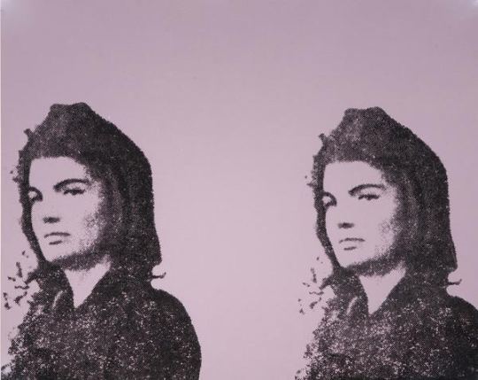
Andy Warhol, Jackie II, 1966. Screenprint on paper, A/P. Collection of the Art Gallery of Hamilton. Gift of Dr. and Mrs. Harold J. Hoffman, 1984. Image courtesy of the Art Gallery of Hamilton.
“Bad taste is real taste, of course, and good taste is the residue of someone else's privilege.”
― Dave Hickey, Air Guitar: Essays on Art and Democracy
The Art Gallery of Hamilton has turned one of its galleries into something called The Living Room. It is intended to be a social space, with a rotating collection. Right now, in it, they have put up three Warhol screen prints, which function as an essay on taste.
One is a double Jackie Kennedy on newsprint; one is a Marilyn on newsprint. The Jackie doesn’t mean as much as the larger ones: two Jackies instead of twelve; black on brown paper instead of black figures on a blue colour field printed on canvas, small size instead of epic scale. The quick and dirty quality of this small Jackie avoids the genderfucking of some of the other Jackies, like the Jackies whose mourning veils look like Wilgefortis beards. Warhol was epic, Jackie was epic, canvas is epic. Even divided, they function as a Mater Dolorosa for an America about to lose innocence. The smaller double print does none of the heavy lifting.
The Hamilton Marilyn is also on newsprint. Drag-ish pink lips printed separately from Monroe’s face– none of the subtlety, none of the care. The material lessens any attempt to push forward ideas of taste. It doesn’t make Warhol any more famous, and it doesn’t make Marilyn any more famous. It’s not even interesting in a vulgar way, like the green on pink ones that were done a few years later.
While these two were facing off, another was placed behind a half wall like a shameful secret.
It screamed Warhol. Jackie and Warhol compound each other’s fame. Marilyn and Jackie compound each other’s aesthetics. They require a kind of mutuality. The 80s Warhol portraits are all about the fame and aesthetic of Andy; they do not push against anything but his personae. Cultural critic Wayne Koestenbaum has tried to defend these works, and art historian Robert Rosenblum’s introductory essay in the book Warhol Portraits has talked about them. When he has something to paint, 80s Warhols have an unapologetic camp vulgarity where pure material pleasure obliterates less corporeal pleasures. His Dolly matches camp step for camp step; his series on living queens has a post-queer wink-and-nod; his Blondie is sexy; his Drag Queen series is properly tawdry.
The Karen Kain portrait behind that half wall does nobody any favours. There is a reason why it is almost hidden. Bob Colacello’s biography of Warhol, Holy Terror, tells about how Warhol would corner vain and insecure women to do portraits, and he would offer them excess. If they wanted more colours, it would cost more; if they wanted glitter, it would cost more; if they wanted more than one variation, it would cost more.
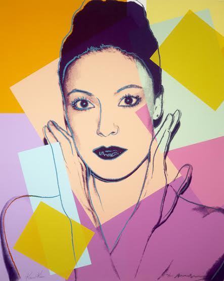
Andy Warhol, Karen Kain, 1980. Screenprint on paper, ed. 46/200. Collection of the Art Gallery of Hamilton. Gift of William S. Hechter, 1987. Photo courtesy of the Art Gallery of Hamilton.
I have no idea who paid for the Kain portrait initially, but it is a four-on-the-floor, super luxe, Cadillac of mid-1980s Warhol vulgarity. 10 colours. Glitter eyeshadow. Glitter lipstick. Highlighting around eyes, hairline, nose. It is an artful example of insecurity: Warhol worried about losing his skill or his fame, and spurted virtuoso excess to prove that he was capable of doing something– anything– new, while ballerina Kain wanted to prove that she was a worthy subject of the artist. Kain was not as famous as other New Yorkers; many of the portraits that Warhol did in the 80s were arriviste or b-list people who did not know how to properly operate in worlds of moneyed taste. In this portrait, artist and subject collide in an upstairs/downstairs moment.
Warhol had great, complicated, theoretically-viable work in the 1980s. It is churlish to judge an artist by their worst work. But Canadian museums and galleries are filled with third- or fourth-rate Warhols. Bought by dentists or doctors, donated to cultural institutions for the tax breaks, Warhols like the Gretzky at the Art Gallery of Alberta are worse than the Kain, mostly due to the lack of glitter. There are six of Gretzky, with each print run numbering hundreds more than the Kains.
But vulgarity is compelling. Luxury is compelling. Sumptuousness is compelling. Being out of fashion is compelling. Committing to complete bad taste is compelling. The worst work by the best artists can tell us something interesting. How we collect can tell us something. This Kain is compelling.
The 80s work of Warhol’s that has been redeemed by critics include prints from the series The Shadows, which are about death, paintings made from piss-oxidized copper, which are about abjectness, and his polaroids, which hold their vulgarity in a tight and tiny little ironic package. The big, whorish, 80s work is still embarrassing. In our hyper-capitalist world, being gauche about money is still considered in bad taste, but not in a slumming, winking style of bad taste. Warhol called this art business art. It was supposed to be about making money, and it did.
This work is so ugly and so vulgar, it is without redemption. Money is toxic, and work so purely about money is toxic. This print is an example of the aesthetic value of capital, but it is a seductive one. Liking things that are bad for you is a good time.
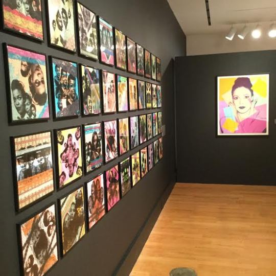
Installation view of The Living Room, Self Made: Stylo Starr’s 89 Dames with Warhol’s Karen Kain at right. Photo courtesy of the Art Gallery of Hamilton.
These three Warhols are in the same room as local Hamilton designer and artist Stylo Starr's 89 Dames. A collection of prints of African diasporic "glamour stars" from the 1950s and 1960s, Starr's work is different than Warhol, and I am not quite sure it is derived from Warhol's work. Starr's 89 Dames are screen prints that kind of look like Warhol's work but lack Warhol's flatness, with collaged lace around some pieces adding complicated texture. They do not play with problems of fame.
Most importantly, even with his Marilyns or Jackies, Warhol's work was always more news than history. Starr's screen prints depict people from the 1950s and 1960s. The choices Warhol made were choices of the market, while the choices that Starr makes are more intimate. Her work develops a canon not so much from the world, but against the world. Lastly, the tension of class and taste in Warhol and the camp self-awareness of the Starr pieces are gorgeous, but prove that bright, or even clashing, colour and patterns can be in good taste. The vulgarity and fame of Warhol does a disservice to the political, subtle, tenderness of Starr.
While the Art Gallery of Hamilton seems embarrassed by that Kain, it reminds me of an Elizabeth Taylor story:
Liz was having dinner with Princess Margaret, and was wearing one of her diamond rings. The diamond on this ring was extravagant. Margaret called it vulgar; Taylor asked if she wanted to try it on. After Margaret put it on, Taylor said “it’s not that vulgar now, is it?”
I feel that way about the Kain: so much to hate about it, so much to think about, so many ways that it is completely wrong.
But, trying it on, it’s not so vulgar, is it?
Anthony Easton is a writer, artist, and theologian. They are interested in class, sex, gender and the west. They have been published in Spin, The Atlantic, Pitchfork, Globe and Mail, and others. They have presented at conferences throughout North America, and in Europe. Their art has been shown in Toronto, New York, Chicago, and is in the collection of the library of the National Gallery of Canada.
#criticalsuperbeast#hamont#artcriticism#anthonyeaston#artgalleryofhamilton#selfmade#thelivingroom#andywarhol#screenprints#jackieo#marilyn#karenkain#stylostarr#portraiture#taste#aesthetics#camp#celebrity#printmaking#mixedmedia
0 notes
Last Seen Blogs

jessimaysavefile
Jessimay's Story Lines

dermalfillersupplies-blog
Dermal Fillers Supplies

laifis
Ekam Eveileb

lesbian-thespians
I Can Do Better Than That

minecraft-aimbot-client-iq
90L№ minecraft aimbot client download