#criticalsuperbeast
Text
Vanquish
by John Haney
National Geographic; December 1973. Photo Courtesy of the artist.
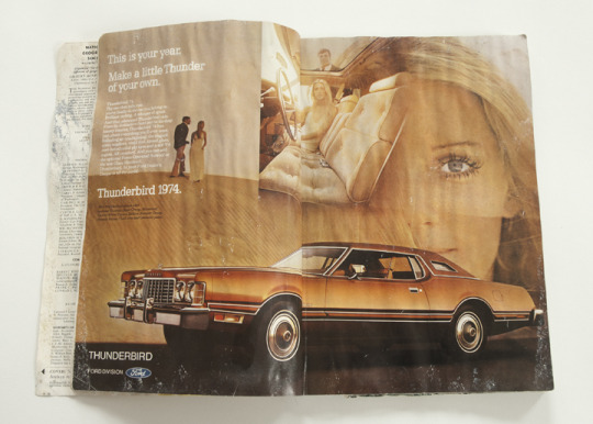
In a cabin in Northern Ontario, I discovered a sole National Geographic magazine. It was the December, 1973 issue. The cover story is about the “Lost Empire of the Incas.” Six pages in is an ad for the 1974 Ford Thunderbird, showing an immense copper-coloured coupe, and an attractive woman. Flip the page and there’s an eight-page insert sponsored by Exxon Oil. It tells us that “Every day the average man, woman and child in the U.S. uses nearly four gallons of oil, 300 cubic feet of natural gas, 15 pounds of coal . . . eight times as much as the world average.” It then spells out countless ways that American oil companies are scrounging for new oil and gas fields, and new techniques to increase production. Listed also, are ways that Americans can hope to cut down their dependency on cheap oil. All of this of course, to alleviate American panic a month and a half after the Saudi Oil Embargo, the use of the so-called “Oil Weapon.”
Get to the end of the cover article about the Incans’ demise. It’s not too much fun to read so much about sacrifice and slaughter, and the Spanish Conquistadors’ insatiable appetite for Incan gold. “Do you eat gold?” the Incans asked them. The final two-page spread has two photographs: one is of two ceremonial Incan gloves made of pure beaten gold. The other photograph is of a field of bleached skulls and bones, under a full moon in a twilight sky: the remains of an ancient Incan cemetery, which apparently, still gets picked over for gold remnants.
Pizarro promised Atahuallpa, the Incan ruler, that he would be released, in exchange for booty: a 17’ x 22’ room, filled as high as the king could reach, once with gold, and twice with silver. The treasures were collected then melted down in nine forges over the course of several months, reducing the artifacts to lumps of metal, which were shipped to Spain. As thanks, Pizarro had Atahuallpa garroted instead of released. As for the treasure, the writer notes, “Not a relic remains of that fabulous roomful . . . It’s anyone’s guess whether it eventually became a bag of barnacled ingots calcified into a Caribbean reef, a bar in a Swiss bank, or the protective sheath of a space probe.”
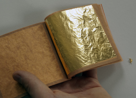
Booty. Photo Courtesy of the artist.
The above is an excerpt from a process piece by Hamilton-based artist John Haney, who is currently working on a sculptural work which uses a 1973 Cadillac Eldorado coupe as its foundation. For that car, he procured a vanity license plate that reads THNATOS, which refers to Thanatos, both the boatman-like Greek god of non-violent death, and the psychoanalytic term that describes the tendency towards self-destruction, or "death-drive". The vehicle's entire painted surface will be gilded with 24 karat gold leaf, and will reference pan-cultural, pan-theistic mythologies. Broadly speaking, this work reflects global events and popular culture of 1973, using that year as a device to speak of our history of folly, going back thousands of years, and pointing forward to our present and likewise our future.
1 note
·
View note
Text
The Closer Together Things Are
At University of Waterloo Art Gallery
September 14–October 28, 2017
By Stephanie Vegh
A useful way to decipher the intent behind The Closer Together Things Are is to begin with two sculptural works by Rhonda Weppler & Trevor Mahovsky, holding the centre of the University of Waterloo Art Gallery as though set to this very purpose. Each creates the impression of physically significant weight – a ramshackle wooden wall seemingly supporting itself through its own clumsy mass, flanked by an opulent train of silver artifacts that cuts the room at a defiant diagonal stroke.

The Closer Together Things Are. University of Waterloo Art Gallery. Installation view. Photo by Stephanie Vegh
Closer scrutiny of both works reveals that each is a paper-thin simulation. The abundance of silver goods, ranging from precious antiques to pocket change and pencil sharpeners, are hollow cast from a single long piece of aluminum foil. The wooden construct is another clever fake, pieced together from remnants of wood veneer. Though seemingly less fragile than that tremulous skin of foil, this wall visibly sags beneath the weight of its forgery, exposing seams in its making that bulge with hollow potential.

Rhonda Weppler and Trevor Mahovsky, Music of Chance 4 (detail), 2017. Photo by Stephanie Vegh
These two sculptures train the eye to slow down, to question all other encounters with a care that is too often lacking in the contemporary gaze. Chris Kline’s three large canvases reveal secretive acts of minimalism that call for this same mode of slower scrutiny, bearing ghostly grids that could be the cast shadows of their stretchers, or painstakingly painted illusions thereof: neither squinting eye nor tilting head resolves the question entirely. Taking a few frustrated steps back, curiosity dissolves in an unexpected impression of light and space – surface, in this case, gives way to unexpected depth.

Roula Partheniou, Twofold, 2016. Photo by Stephanie Vegh
Such tricks of light and space have the capacity to bend the eye towards other ways of seeing. The reflected double is spun from this same cloth, playing out in Roula Partheniou’s apt doubling of found and made objects; that light is also the metaphorical fire crackling through the compelling remnants of heavily annotated pages that document Ève K. Tremblay’s endeavour to memorize and recite Ray Bradbury’s Fahrenheit 451 as a performatively transformed copy of the written form.

Chris Kline, Divider 7, Divider 8 and Divider 9, 2012. Acrylic and aqueous dispersion pigment on poplin on wood stretcher, 60" x 60" (each). Photo by Stephanie Vegh.
Proximity and purpose, smartly orchestrated by co-curators Shannon Anderson and Jay Wilson, draw these artists together in spite of their aesthetic differences. Partheniou’s crisp forms hung in their precisely calculated symmetry are far removed from the romanticized chaos of Tremblay’s table setting of scribbled notes and quietly unnerving ceramic forms, bristling with feeling. The Closer Together Things Are achieves its greatest magic in reconciling these remarkably divergent practices through the lens of slow thinking. In bringing these artists and objects into unlikely conversation with each other, this exhibition encourages the viewer to grant these works and all between the closer attentions they deserve.
Stephanie Vegh is a visual artist, arts writer and is the Manager of Media and Communications at the Kitchener Waterloo Art Gallery.
#criticalsuperbeast#artcriticism#stephanievegh#theclosertogetherthingsare#ontario#roulapartheniou#wepplermahovsky#sculpture#installation#jaywilson#shannonanderson#uwag
1 note
·
View note
Text
Making a Mark: Steven Laurie's Instagram
By Anthony Easton

Photo courtesy of Steven Laurie.
One of my favourite things on Instagram is Steven Laurie’s (Username: _steven_laurie_) use of the mark making tag. Laurie’s tradition is one of found or street photography, and it might be easy to liken him within that space to photographers William Eggleston or Helen Levitt. I am not sure that this would be a wrong opinion— although Laurie photographs very few people.
The mark making hashtag separates him from this tradition. When I say there are very few people in his work, there still remains the influence of people, hints rather than direct portraits. So when he uses the tag #markmaking, it is the ghost of a physical presence, a digital abstraction of a material abstraction of a human intervention. It doesn’t even have to be human— for Laurie, a mark can be made by the excretion of a pigeon as much as it can be made by the tire treads of a car or the orange paint on a utility pole.

Photo courtesy of Steven Laurie.
Part of this is a very old tack. A picture of a mark is a mark itself, just as Magritte’s pipe is both a pipe, and a picture of a pipe. Laurie makes the mark a Duchampian readymade— more complex than the representation of photography, by claiming found marks as drawings. More complex, but not more novel. Having them on Instagram, and having that mark be part of a conversation, suggests that it is liberated from this modernist tradition.

Photo courtesy of Steven Laurie.
When Laurie chronicles mark making, he is doing three things:
This is a mark, because someone or something made it and considered it a mark. This mark does not have to be considered art.
This is a mark, because it can be understood in a tradition of mark making, and as an artist to be part of that space.
This is a mark because I noted this was a mark to a larger community of people who might be interested in mark making. (Laurie has 990 or so followers, and additional people who comment on his photos, and who use the tag #markmaking, without interacting with Laurie.)
The emphasis on these forms is on making— more important than the mark is noting how a mark is constructed, and how a mark is noted.
Making here, can deepen three photographic possibilities:
Making as a curatorial instinct— because I noted that the utility worker, and the tagger and the pigeon are making marks, that I am making an argument about how paint or mud or the like on a surface is constructed. I am arguing about how things are made, by taxonomic category.
This category can be conceptual. Laurie’s generosity plays with the idea of the mark as an aesthetic category— suggesting that it might not be an autonomous gesture, or that it might be a utilitarian one. Bringing us back to the birth of the photograph, where the aesthetic, or the ideological or the prescriptive abutted with the simply documentary.
It marks an extension of Laurie’s own aesthetic. The blankness of his photographic eye, and his noting of the chaos in the midst of the a tightly composed shot, can extend to a larger understanding of an artist's practice, or can be an artist’s practice.

Photo courtesy of Steven Laurie.
This work can function as a sketchbook, or as an ephemeral form, and because it becomes difficult to right click Instagrams, means that the intervention is performative. The making of the mark, and the noting of the mark, entwine in an ongoing mutual problem of erasure. Plus, nestled in the midst of a thicket of other hashtags— some seemingly more serious than others, it might just be a wry joke— which is its own kind of mark.
Anthony Easton is a writer, artist, and theologian. They are interested in class, sex, gender and the west. They have been published in Spin, The Atlantic, Pitchfork, Globe and Mail, and others. They have presented at conferences throughout North America, and in Europe. Their art has been shown in Toronto, New York, Chicago, and is in the collection of the library of the National Gallery of Canada.
#criticalsuperbeast#artcriticism#hamont#stevenlaurie#markmaking#drawing#photography#instagram#socialmedia#hashtags#urbanspace
4 notes
·
View notes
Text
Jennifer Angus: Lookabout
May 7 - June 11, 2017, Annapolis Region Community Arts Council (ARCAC), Annapolis Royal, Nova Scotia
By Emma Lansdowne & Alana Traficante

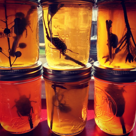
Jennifer Angus, Lookabout (2017). Installation view at ARTsPLACE Gallery, Annapolis Region Community Arts Council.
I happened upon the multi-venue exhibition Lookabout purely by chance: my sister and I, on a drifting road trip through pre-season Nova Scotia, found our way by default to Annapolis Royal. The promise of teeming rain had deterred us from a plan to drive the Cabot Trail; instead, we wandered the sleepy streets of the tiny clapboard town, seeking out the ghosts of its colonial past. By the time we arrived, artist/researcher Jennifer Angus had been working in residence at ARTsPLACE, the artist-space run by the Annapolis Region Community Arts Council, for a few weeks. She had situated installations in various historic sites in town: dioramas of insect specimens under bell jars; pots of preserves lined up on windowpanes, beetle bodies suspended within. Through this odd assemblage of tiny exoskeletons, spread across unexpected sites (the town theatre, a coffee shop, the unattended historic garden gatehouse), Angus wove a haunting narrative, reimaging the mythos of two sisters, Anne and Victoria Oliver, who disappeared from the town without explanation in 1867.

Jennifer Angus, Lookabout (2017). Installation view at ARTsPLACE Gallery, Annapolis Region Community Arts Council.
Finally, after traversing the external sites, my sister and I witnessed Angus’s expansive, central installation at ARCAC. Already familiar with her practice, I knew to expect the installation of insects pinned directly to the wall in repeating patterns, evocative of wallpaper and textiles. Yet my immediate perception of this decorative, critical mass found it wanting. Angus’s promise to chronicle the Oliver sisters’ strange disappearance was played out in an odd aestheticization of insect bodies that only scratched the surface of the mystery, much less the complex layers of the region’s troubled past that are buried beneath it.
Returning home, with many questions left unanswered, I sought insight from my friend Emma Lansdowne, whose scholarly research interrogates the colonial legacy of taxonomical aesthetics. What follows is the result of our collaborative dialogue about the work and about the history of taxonomies and naturalist collections, as well as our joint questioning of perceived relationships among land and the people, plants and insects that inhabit it. — AT
~~~
Jennifer Angus is an artist, designer and researcher who, for over ten years, has centred her practice around the collection and repurposing of insect specimens for intricate wall-based and sculptural installations, displayed in exhibitions such as A Terrible Beauty (Textile Museum of Canada, 2006), lauded for its dazzling, immersive patterns that evoke Victorian-era ornament. She has a particular interest in this period, which she describes as “the age of travel, exploration, [and] scientific discovery.” Angus takes inspiration from the practice of naturalist collecting in pursuit of new knowledge, and uses pattern-making as a means of contemporizing the curio aesthetic of nineteenth-century collections.
Jennifer Angus, Lookabout (2017). Installation view at Annapolis Royal Historic Gardens.
For the exhibition Lookabout, Angus extends her practice by looking through the lens of an unsolved mystery, the unexplained disappearance of two female, budding amateur naturalists. The missing women become her subjects but are present in allusion only, save for one portrait photograph of the sisters mounted on the gallery wall. The show’s small publication and walking guide references an article published two years after the women’s disappearance (titled “The Affecting History Of Two Young Gentlewomen, Who Were Ruined By Their Excessive Attachment To The Amusements Of The Town”), indicating that their disappearance was surrounded in scandal, and that the women were vilified in their absence. Angus reveals that while the sisters were indeed adventurous, they explored the town and riverside with the intent of amassing an impressive collection of local flora and insects. She revisits and re-imagines the Oliver girls’ collection in an immersive wall-patterned installation, and in a small adjacent room that houses objects and furniture reminiscent of amateur taxonomical displays. She presents clues, but very few answers. There are whispers, but there is very little voice.
Angus’s exhibition exudes an infectious intrigue, pulling viewers in through a complex layering of historical mystery, the romance of the unknown, and an aestheticized take on taxonomical science. The artist’s allusion to the contemporaneous account of the girls’ disappearance — an account riddled with presumably unjust implications about their extracurricular activities — prompts viewers to briefly consider the inaccessibility of science to 19th-century women and the potential risks those women ran in defying the societal norms of their day. However, the greater part of Angus’s work — rather than provoking such consideration — seems to use the story of the girls as a convenient narrative framework upon which Angus builds her highly aestheticized insect displays. Rather than further exploring the gendered tensions between the girls’ nature-focused pastimes and their sudden disappearance, Angus draws on their intersecting love of nature and belief in fairies to build a whimsical series of installations modelled on Victorian curiosity cabinets. This whimsicality is a key component of Angus’s work, helping to create an environment of nostalgia for a time when much of the world was still “unexplored,” and when naturalists were to be found at the boundaries between known and unknown.

Jennifer Angus, Lookabout (2017). Installation view at ARTsPLACE Gallery, Annapolis Region Community Arts Council.
There is a danger to such nostalgia, however. The collection and classification of flora and fauna, the display of which led to the foundation of the modern museum, carries the heavy weight of colonial legacy. The process of collecting and naming natural history specimens consolidated a European scientific knowledge system that was both extractive and homogenizing, while specimen displays such as those emulated by Angus were and are carefully curated representational regimes based on scientifically-justified exclusion. Plucked from their natural environments to be pinned onto boards or mounted on blank pages, organic specimens such as insects or plants were forcefully relieved of their environmental, historical, and cultural contexts and, renamed in scientific terms, were given new identities divorced from their own ecology. Based on an assumption of both the availability of “undiscovered” lands and the universalizing correctness of Linnaean taxonomy, natural history collection resulted in an aesthetic, symbolic, and ultimately political erasure of indigenous presence on colonized and to-be-colonized lands.
Although Dr. Laurie Dalton, in her essay about the exhibition, acknowledges a link between such collections and European colonial expansion, commentary by the artist on this fraught connection is largely absent; instead, her installations glorify natural history collection through their highly decorative construction and placement, emulating the reductionist visual structuring of the natural world for which taxonomical science is responsible. As we stand on the verge of a whirlwind summer of national celebration for Canada’s 150 years of confederation, Angus’s failure to unpack the problematic relationship between exploration, science, and colonialism seems especially stark. — EL & AT
Emma Lansdowne is a writer specializing in horticultural history and critical theory. She is currently an MA candidate in Cultural Studies and Critical Theory at McMaster University in Hamilton, Ontario. Emma is also a professional gardener who hopes that the deer haven’t eaten all her plants in her home city of Victoria, BC.
Alana Traficante is an art writer and curator based in her home city of Hamilton, Ontario. She is a recent MFA graduate of OCAD University’s Criticism and Curatorial Practice program, where she researched sensory criticism, feminist theory, installation, and moving image artworks. Alana is currently Acting Curator of Contemporary Art at the Art Gallery of Hamilton.
#criticalsuperbeast#artcriticism#hamont#jenniferangus#AlanaTraficante#EmmaLansdowne#installationart#colonialism#science#naturalism#taxonomy#ARTsPACEgallery#NovaScotia#AnnapolisRegionCommunityArtsCouncil#Canada150
4 notes
·
View notes
Text
Creation Stories
A reflection on Creation: The First Three Chapters by Sylvia Nickerson. An exhibition at Casino Artspace, Hamilton, ON, January 2017 and a limited-edition zine, published by Nickerson, Hamilton, ON, 2017.
By Amanda Jernigan

Cover image from the comic zine Creation. Image credit: Sylvia Nickerson, 2017
I have just unpacked, from a box unopened since I moved to Hamilton in 2010, exhuming them amid a rain of packing peanuts, some small sculptures by Sylvia Nickerson. They have travelled with me since I was an undergraduate. Each sculpture comprises a piece or several pieces of sanded but unfinished softwood, to which a wax figure is affixed — sometimes several figures — with a simple configuration of copper wire. The figures are small, less than two inches high, and abstract — androgynous, their features undefined. Their attitudes vary. In one sculpture, a figure and its pendent double stand poised at the intersection of two crossing wires, funambulists at a point of decision. In another, six wax figures are poised at regular intervals along a wire arc, in a Muybridge-like representation of a leap. There’s another from the series — this one not in my collection — in which two figures face each other to either side of a wall, like the prisoners in Simone Weil’s Gravity and Grace: Two prisoners whose cells adjoin communicate with each other by knocking on the wall. The wall is the thing which separates them but it is also their means of communication. … Every separation is a link.
There was a long period when a small sculpture garden of Nickerson’s wax people adorned a mantle or bookshelf in my husband and my various successive abodes. The sculptures — small meditations on situation and relationship — came to constitute a kind of vocabulary, for me, a language of positional and orientational metaphor. They helped me to think about where I was in life, and who was there with me. Then we packed the figures away for one more move, and this time — because of space or time or work or children — they did not get unpacked. Until now.
I have been thinking about Nickerson’s wax people because a few months ago I went to see her exhibition Creation, at Casino Artspace: a 3-D installation of material from and related to her graphic-novel-in-process of the same title. The story of the graphic novel is intensely personal: the speaker moves to Hamilton, makes art, marries, becomes pregnant, gives birth, and haunts the grimy precincts of her downtown neighbourhood in the somnambulant but sometimes visionary trance of new motherhood. Wiped clean by sleep deprivation, existentially disoriented, she becomes a kind of tabula rasa for the often difficult stories she sees unfolding around her: poverty, violence, the displacements of gentrification. I used to know things, she says. Things I learned from books. Things I read in school. / Now what I know are our bodies, and these streets.

Sample page from chapter three of Creation. Image credit: Sylvia Nickerson, 2017
This is a narrative that I know to be autobiographical, if transmuted here by art. Yet most of the figures in the graphic novel, including the figure of the speaker, are grey-filled, animate outlines: archetypal figures, like the little wax sculptures. They are images of negative capability: emptied-out, but also open for the reader’s or viewer’s inhabitation.
When we were students together at Mount Allison University in the late nineties and early two thousands, I knew Nickerson primarily as a sculptor — though she worked in other media as well — one of the bright lights of the fine arts department. Her sculptures were weird biomorphic assemblages: she used pink dental moulding material to make casts of body parts, and her apartment was strewn at any given time with plaster or bronze torsos, noses, ears, all waiting to be gathered up by art. The visceral nature of her sculptures, their piercing intimacy, was counterpointed by a classical sense of composition and proportion. She studied mathematics alongside fine art, and her works would often put the inorganic forms of that discipline into conversation with the bodily or vegetal forms she had cast or sculpted. When she moved to Ontario, in 2005, Nickerson traded fine art for the history of science, in her academic life; in her studio life she traded sculpture for painting and drawing, eventually performing a quiet takeover of North American illustration venues from her Hamilton studio.
I honour the democratic impulse that led Nickerson away from the more rarefied genre of fine art to the more popular genre of illustration: she once told me that she’s never been comfortable making art for a coterie. Yet I have to say I have missed Nickerson the sculptor. When I walked into Casino Artspace, then, I experienced a joyful flash of recognition. The first piece in the show was a sculpture, a life-sized, life-like wax hand. It was as if the wax people of our mantlepiece sculpture-garden had grown up and gotten personal. Held in this wax hand was a drawing of an infant. The old medium cradled the new, here, just as mother cradled child. At the same time, mother cradled artist, and artist mother. A multiply resonant icon, it made me catch my breath.
Entering the gallery space, I was greeted by works on paper — the original ink-wash drawings for the first three chapters of Nickerson’s graphic novel, neatly alligator-clipped and hanging in staggered rows, on the walls. But the images were constantly escaping their two dimensions: spilling out into sculptural installations in the middle of the room and along one window sill, and onto the ceiling. In the window-sill installation, by Nickerson’s son, Colin Neary, the images escaped their artist, too: here, the infant whose birth is at the centre of Nickerson’s creation story became, before my very eyes, a child, a boy, an artist, his colourful, painted monster-figures overtaking his mother’s monochrome city. It was a literal relinquishing of control on Nickerson’s part, and as such a brilliant enactment of her exhibition’s themes: the loss of control that comes with new parenthood; the new, raw entry into the fray of life and mortality that one makes when one participates in creation in this way.

Cloud figures from installation of Creation: The First Three Chapters, at Casino Artspace. Image Credit: Cathy Coward, The Hamilton Spectator
Nickerson gave me a copy of the limited edition zine she produced to accompany the exhibition. It is to some extent a prototype, a promissory note that suggests something of what this work might be in an eventual, elaborated, printed form. I don’t want to judge it as a finished work, then, but I do want to reflect briefly on some of what is lost and found in the translation between the page and the gallery.
The printed version, which one must experience page by page rather than in the immersive simultaneity of an installation, introduces an element of elapsing time that adds to one’s experience of the story. It has a book’s intimacy and privacy. I go back and forth on the question of how much this serves the story. Certainly, it suits the private mind-space of the work, which takes us very much inside the speaker’s head; yet this is also a work about public spaces, and experiencing it in the public space of the gallery reminded me of that. The zine is artfully designed, making canny use of enlargement, reduction, repetition, and juxtaposition of the drawings, in order to tell its story. But reading it now I miss the deep blacks of the originals on display in Nickerson’s installation; I miss her son’s exuberant intervention (which is also her intervention, as she invited him into the space); and I miss that arresting, physical sense of the words and images escaping their bounds.
I am not a frequent reader of graphic novels: it’s a genre that is for the most part unknown to me. Perhaps Nickerson’s powerful installation work will ultimately be a bridge that can bring a viewer like me into the genre — and into other, future, printed versions of Creation. (The installation “ends”, if we can say that of an installation, with the words “to be continued.”) On the other hand, perhaps Nickerson has moved through the genre of the graphic novel into something new (and this not necessarily to the exclusion of the graphic novel) — a hybrid form that fuses artist and illustrator, printed page and three-dimensional space. I think of the crucible from which I once watched Nickerson pour molten bronze, when we were students. It reappears in the opening pages of Creation, with all of downtown Hamilton pouring into it or possibly out of it: a metaphor for destruction, metamorphosis, and rebirth.
There’s one further thing that I want to say about Creation. For all that motherhood is an archetypally creative experience, and although it’s written about and illustrated to exhaustion in parenting books and blogs, and on all our scattered Mistagram and Chitter feeds, the space of new motherhood, in its averbal intensity, is still a great mystery. I feel a shock of astonishment and welling gratitude, then, when I see art like Nickerson’s that has somehow emerged, an authentic expression, from that space.
Like Sylvia Nickerson, Amanda Jernigan grew up in Ontario, went to school in New Brunswick, then moved to Hamilton, made art, married, and had children. She is a poet, essayist, and editor.
#criticalsuperbeast#hamont#artcriticism#sylvianickerson#amandajernigan#casinoartspace#comics#graphicnovels#zines#installation#autobiography#gentrification#Creation#motherhood
2 notes
·
View notes
Text
Marlene Yuen | After Gold Mountain: Selected Stories of Chinese Labourers in Canada
May 12th – August 19th, 2017, Workers Arts & Heritage Centre, Hamilton, Ontario.
By Tor Lukasik-Foss

Marlene Yuen, Cheng Foo: Story of a Railroad Labourer. Screen printed accordion book, 2017.
I’ve decided I have to be careful how much time I spend trying to understand the Hamilton Art Crawl in its current form; it feels increasingly dangerous the more I try to unravel its economic and social engine. This past Friday I got stuck on the paintings of Batman and other pop culture regurgitations offered by street vendors; they were roughly the same price as two wine goblets of craft beer served within the cinder block chic of the new Merit brewery. I still don’t know how exactly those two things correlate, but in my heart, I’m positive they do.
James Street is throbbing with commerce, which can be either thrilling or unnerving depending on my mood. Yes, there are still a string of galleries and artist-run centres offering consistently sturdy exhibitions (Andy DeCola’s tea stained collages at the Assembly Gallery are a current highlight), but these venues no longer anchor the crawl, not in the way they used to. They can barely pierce the din. There was a time when art had a real mission on James North. Now it seems to be struggling to declare its relevance amid what more and more seems like a tourist event.
These thoughts were still with me the Saturday following, as I wandered down to the Workers Arts & Heritage Centre in mid-afternoon to take in Marlene Yuen’s After Gold Mountain. Yuen is a print and bookmaker based in Vancouver, and this is her first solo exhibition.
Initially I felt a bit deflated by the installation. Uniformly hung with black-and-white comic pages, enlarged from the originals, these images were missing the ‘big gesture’ I am so habituated to expect from a contemporary exhibition. Slowly however, the uniformity stopped being a liability and turned instead into the show’s major strength. There is no dazzle here, and dazzle is precisely what this exhibition doesn’t need.
After Gold Mountain is comprised of seven contained narratives, along with a pair of two-colour screen-printed accordion-fold book works in the center of the room. Each self-contained narrative mines a nugget of the difficult history of Chinese immigrants trying to navigate both the tough conditions and abundant racism of Canada in the 19th and 20th centuries.
There is a matter-of-fact quality to these histories. The tragedies and injustices are never amplified for dramatic effect as much as they are calmly, soberly pointed out. Victorious moments are also quietly delivered: such as that of women like Jean Lumb, whose activism helped reform Canada’s severe immigration laws and who became the first Chinese Canadian woman to earn the Order of Canada or Mary Ko Bong, a jazz performer and fine instrument mechanic trained in Hamilton.

Marlene Yuen, Sam Chong Laundry. Digital print, 2017.
The stories range from a salmon canning factory in B.C., to a lunch counter in Alberta, to a Chinese laundry on John Street in Hamilton, to the systemic exploitation of Chinese workers who mined tunnels through 13 mountains during the construction of the Trans-Canada railway. Taken together, there emerges a troubling pattern wherein Chinese immigrants are dehumanized by arduous, impoverished work, only to endure a second dehumanization when those jobs are mechanized, modernized, or unrecognized. Yuen correctly considers it heroic that her subjects survived or thrived in these conditions.
The mission behind this project, and the pragmatic yet graceful means of its delivery seem hard to challenge. As much as this is an exhibition of Marlene Yuen’s creative output, it is also a lovely demonstration of how an artistic practice can facilitate a larger function, one clearly rooted in history, activism, and community storytelling. I think if I had encountered Yuen’s work in book form outside a gallery context, I would have taken some of this for granted; having a quiet space in which to consider these narratives allowed for a better understanding of the endeavor Yuen has undertaken.
And I think this is why Yuen’s exhibition was such a fine antidote to the art crawl that preceded it. A worker’s museum can use visual art as a means to talk about labour history; it can also argue visual art as worthy labour in itself. After Gold Mountain fulfills both. It is, I think, more of a challenge to carve as venerable a space for visual art in the ever-inflating entrepreneurial economy that is Art Crawl.
Tor Lukasik-Foss is a visual artist, performer and writer. He is a founding member of the artists collective TH&B and currently works as the Director of Programs and Education at the Art Gallery of Hamilton.
#criticalsuperbeast#artcriticism#hamont#TorLukasikFoss#marleneyuen#comics#graphichistory#bookworks#printmaking#screenprinting#workershistory#racism#chinesecanadians#immigration#labour#work
2 notes
·
View notes
Text
Nancy Anne McPhee Fragment 47

Nancy Anne McPhee -- Fragment 47
Redhead Gallery, Toronto -- November 1 to 25, 2017
by Karen Thiessen
During a November weekend, I popped by Nancy Anne McPhee’s exhibition Fragment 47 at Redhead Gallery in Toronto. I spent some time with the work and then went on my way to Type Books, where I bought musician Patti Smith’s newest book Devotion. Before bed, I read half of it. That night Smith’s words and McPhee’s photographs merged into one continuous dream. When I awoke, I knew that I had to write about McPhee’s work. Later, while I was writing this essay, I learned that this phenomenon was an afterglow (1) effect, when an artwork stays with you even if it didn’t have that much impact during your first encounter. Although this has happened to me before, these delayed attractions take me by surprise when they arrive without warning.
Still under the influence of my Smith/McPhee dream, I returned to the gallery. Fragment 47 and Mineralogy were dynamic contrasts in light, mood, and scale. Fragment 47, a 12 by 8 foot installation of the silhouette of an oak tree buffeted by wind, dominated one long wall in a darkened space. The oak was created with anaglypta, an embossed paintable wallpaper, in acanthus leaf and bark patterns. Both wall and tree were painted the same rich dark blue gloss and illuminated with a 4 foot fluorescent light positioned at the base of the tree.
The title of this installation, Fragment 47, comes from part of a poem by Sappho, a female Greek lyric poet, most of whose work is lost. It reads: “Eros shook my mind like a mountain wind falling on oak trees.” (2) In A Field Guide to Getting Lost, Rebecca Solnit writes about “the blue of distance” that relates to landscapes (horizons and far away mountain ridges) and time: “The blue of distance comes with time, with the discovery of melancholy, of loss, the texture of longing, of the complexity of the terrain we traverse, and with the years of travel.”(3) McPhee used deep blue and stark light to convey the loss of poetry, the distant mountain whose wind shook the oak, and the distant past when Sappho wrote of love. Eerie fluorescent light accentuated the heavy texture of the wallpaper and bounced off the gloss paint in this dark space thus creating an unsettling psychological tension of menace and melancholy.
In an adjacent section of the L-shaped gallery was Mineralogy: five images of gleaming minerals photographed against doppelgänger textile backdrops. The 18 by 24 inch images, mounted on aluminum and thus unencumbered by glass and frames, appeared to float on three well-lit white walls. Each artwork was given ample space to breathe, and this had the effect of a palate cleanser between food courses. McPhee photographed selenite, pink halite, sandstone, pyrite, and bismuth against textiles that mirrored the colour, texture, and sheen of each lustrous mineral. With the exception of two minerals, most were photographed against fabrics that were flat. The textiles suggestively draped around the pyrite and bismuth brought to mind sultry nude models photographed on artfully arranged satin sheets. Like Patti Smith’s memoirs, the overall atmosphere was serene, warm, inviting, and dreamy. As Smith wrote in Devotion: “In my sleep genius combines, regenerates,” that night in my dreams of her Devotion and Nancy Anne McPhee’s Mineralogy, my subconscious mind linked the two. (4) To read Patti Smith, whether M Train or Devotion, is to enter into a poetic and reverent world of rituals, dreams, and mundane objects made sacred through her venerable care.
The minerals on which McPhee focussed her lens, are small, beautiful, yet common, substances found unnoticed or invisible in most homes. Selenite, a form of gypsum, is in drywall; bismuth is used in pharmaceuticals and cosmetics; halite, or sodium chloride, is the gourmet salt of the moment. McPhee takes these ubiquitous minerals and amplifies their humble status by juxtaposing them against glittering backgrounds.
Patti Smith, a dream, and the afterglow effect led me to write about Nancy Anne McPhee’s exhibition. The sprawling, sombre, monochromatic Fragment 47 installation offered contrast to McPhee’s intimate, ethereal, colourful Mineralogy. My dream after my first viewing of McPhee’s exhibit was lustrous and shimmering, like the selenite and pink halite against their sparkly backgrounds. Patti Smith repeated one word to me throughout the night, but upon awakening it was gone, just like much of Sappho’s poetry.
Karen Thiessen is a textile and mixed-media artist. She maintains a virtual presence at www.karenthiessen.com and on Instagram via @dayindayoutstudio.
Notes:
1.Thanks to Catherine Leroux for this term found in: Porter, Rosalind. ‘Canadian writers are bold!’ The Globe and Mail. Saturday November 4, 2017, p. R18.
2.Nancy Anne McPhee artist statement.
3. Solnit, Rebecca. ‘The Blue of Distance.’ A Field Guide to Getting Lost. Toronto: Penguin Books, 2005, p. 39.
4. Patti Smith. Devotion. New Haven and London: Yale University Press, 2017, p. 13.
Photo credit: Bismuth, Photograph, 2017, Courtesy of Nancy Anne McPhee.
#criticalsuperbeast#artwriting#karentheissen#nancyannemcphee#fragments#minerals#poetry#patti smith#sappho#afterglow#rebecca solnit#redheadgallery#toronto#hamilton#hamlltonartist
0 notes
Text
The Hand of Craft
The Cotton Factory, November 2 to December 3, 2017
By Melissa Bennett

The Hamilton-based artist collective Shake-n-Make prioritizes collaboration as a mode of working, usually among its two members, Liss Platt and Claudia Manley. With The Hand of Craft, the exhibition recently installed at The Cotton Factory, they extend the reach of this modus operandi by working with over 80 sewers to create a 15.5 by 6 foot quilt top, made of many small fabric hexagons stitched together by hand using the English paper piecing technique.
They organized workshops over two years in Hamilton and Sackville, New Brunswick, including one at Sackville’s annual community event, A Handmade Assembly. In all workshops, they engaged sewers with all levels of experience, bringing people together around the materials in an encouraging way. They favour slowly-made works in order to build appreciation around labour, which is an overarching subject of the work; the term itself is depicted in a bold font. The quilt top is ambitiously large, and took hundreds of hours of work by many hands. The bringing together of people, various skill levels, and various perspectives on the craft itself, are all strengths of the piece.
Shake-n-Make regularly exhibit their works in a fine art context—they’ve been doing so for decades. Past works use a kitschy aesthetic to investigate the ways in which vernacular and contemporary quasi-folk art operates in mass media and within a gallery context—but The Hand of Craft is not kitsch. It is reminiscent of a British regal, and perhaps patriotic, banner in its scale and the use of the colour purple; its construction method also harkens to a golden age of hand sewing in Britain, when decorative sewing became more popular after the Industrial Revolution. By many accounts, paper piecing was a craft that began as an economical and practical way of creating large blankets using available fabric scraps. The craft reached its heydey in the 19th century when, in the western world, women of means and class privilege found more leisure time, advancing textiles in a more artful manner. This pastime could be a solo one, but often included a social element, as does The Hand of Craft in its community-based approach. In its installation at The Cotton Factory, the quilt top is surrounded by large graphic illustrations of hand sewing techniques, which provides an added visual and design element that situates it further as a gallery piece full of historic and contemporary references.
In bringing the art world together with everyday sewers (some of whom are also artists), Shake-n-Make build on the ongoing dialogue they cultivate between fine art, which is often publicly displayed, and craft, which is often part of a private realm. As Shake-n-Make point out, sewing is traditionally women’s work, the effort of which is usually hidden from public view. They raise this idea in part as dialogue around the value of domestic work, which is traditionally gendered.

In a recent video interview, the artist Greg Staats spoke eloquently about collaboration, saying that: “sharing comes from a place of compassion, and it sets up a dialogue for reciprocity.” Indeed this is one of the greatest outcomes of The Hand of Craft: a forum for people to get together in a productive way, and one that includes slow and meditative actions, shared labour, and the achievement of a collective goal.
…
The exhibition is located on the third floor of The Cotton Factory at 270 Sherman Avenue North, in Hamilton, Ontario. It is free and open to the public: November 2 to December 3, 2017. Remaining exhibition hours are: Friday, December 1st: 9am - 5pm and Saturday December 2: 12-5 pm. Full details here: http://www.akimbo.ca/akimbos/?id=112865
Melissa Bennett is the Curator of Contemporary Art at the Art Gallery of Hamilton.
Photo credits: Liss Platt
#criticalsuperbeast#artwriting#craft#shakenmake#claudiamanley#lissplatt#community#cottonfactory#hamont#melissabennett
0 notes
Text
Where Have All The Venues Gone?
By Aimee Burnett
The inevitability of the thing that happened is usually a status conferred only after events unfolded: once their existence is obvious, and usually, taken for granted. Our new job, a standby best friend, the bar that tipped the neighbourhood from cool to Cool. Then the next iteration of each. We missed this event at that spot, but we’ll make the next one.
Sometimes, next time, the spot is gone.

Adam Matak. Arrangement (Trim), 2017, 22"x30", ink, acrylic & spray paint on paper. From exhibition Arrangements, at Oswald's Gallery. Photo Courtesy of the Artist
Hamilton has lost a lot of smaller, accessible cultural spaces recently. Both closure and a shift to more immaterial models have claimed them. Oswald’s, Strangebarn, Casino Artspace, Hamilton Tool Library, all within the past few months have either closed their locations, or are in the process of doing so. I don’t imagine I can create a unifying theory for this sweep of endings despite a temptation to interpret the signs, but it does seem important to acknowledge that these spaces offered a lot of energy, and homed a lot of artistic activity in Hamilton.
It is a comfort to imagine that when something dies, something equal rises to take its place, yet what makes these sorts of places special is their singularity and the mysterious blossom of communal effort that gives them their form. (HAVN is a mainstay in this category.)

We shouldn’t assume others are doing what we aren’t. It’s a million tiny actions rising up like a wave that will carry or crush the objects of human productivity. Places and things exist because we care and show support with some regularity. Patronage is best looked at with a level of rigour - if the only true inevitability is that all things eventually end, we shouldn’t act as if there will always be another opportunity.
Instead, we should take their celebration seriously, go often, express support, and give in whatever way we can to meet a need. These vulnerable, magical efforts that create space in our home cities for new projects, ideas, and communities are among the most impressive and least inevitable manifestations.
Aimee Burnett is a founder of Casino Artspace, and Pedlar Stock Shoemaking. She practices design, art, and writing in a variety of media.
#criticalsuperbeast#criticism#spaces#hamont#closures#casinoartspace#hamonttoollibrary oswalds strangebarn HAVN
0 notes
Text
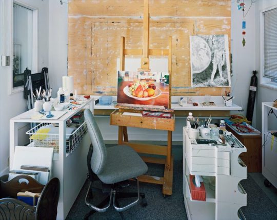
Joseph Hartman The Artist Studio
Art Gallery of Hamilton – Jun 17 - Dec 31, 2017
By Anthony Easton
It is understandable why Melissa Bennett and Alana Traficante curated Joseph Hartman’s photographs of artist studios at the Art Gallery of Hamilton. They are gorgeous prints, and tell interesting narratives about Canadian art, how it is made, and where it is constructed. Hartman is also local, the son of John Hartman, the legendary Hamilton painter. Considering Hartman’s 2016 show at the McMaster Museum of Art featured Hamilton landscapes, working on both a smaller (as in an interior) and larger scale (studios from BC, to Nova Scotia; from Kinngait to Toronto) suggests movement as an artist.
This is a crowd pleasing show: the c-prints printed well, the compositions elegant, and the regional variation well constructed. Hartman’s technical skill as a photographer is unparalleled. There is also something engaging in seeing an artist studio, for those for whom it is not a regular occurrence. Not only does it say something interesting about the methodologies of creators, it offers a certain, Wizard of Oz, peek behind the curtain quality.
Even as someone who has worked as an artist, who has written about art, and curated–who has been welcomed into studio spaces as places to do business and to socialize–there is a distinct thrill to seeing the small details of artists’ lives: an old fashioned slide projector in a basket below Mary Pratt’s easel; the elegant light of a late Yukon summer floating through Joseph Tisiga’s outdoor studio, or the old fashioned CD player on the edge of Tim Pitsiulak’s large desk. The work holds up.
Mary Pratt, Chromogenic Print. 2014
But part of that holding up adds to the complications of what it means for a visual artist to make work in a very specific space, especially in the space of a dedicated studio. These images have obviously been stage managed. The work that is half completed, or is pinned up on the walls, are very much intended to tell stories, but the stories could do with more nuance. The work made in Kinngait, for example, is a large diptych, with Tim Pitisiulak on one side and Shuvinai Ashoona on the other. The statement next to the photo suggests that he chose to present this as a diptych because of the collective nature of the studio. But these works were printed digitally and having them as two prints, as opposed to a larger print, might function conceptually better, as an example of two artists sharing both physical and psychic space (a stated goal of this work).
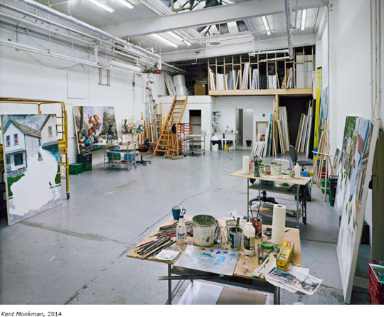
Kent Monkman, Chromogenic Print. 2014
I am also curious about how few people are in some of these shots, and by extension, what it means to represent an artist as a singular producer of a work, when it is an open secret that much well known contemporary painting is done by assistants, or interns. When seeing a half painted work in Kent Monkman’s studio, what does it mean when we just read it as a Monkman? When seeing work in Robert Davidson’s gorgeous cedar studio, what does it mean when we do not note the fabricator?
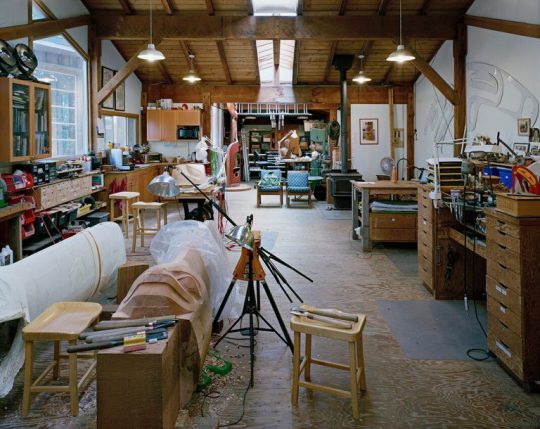
Robert Davidson, Chromogenic Print. 2014.
I know the arguments – about renaissance studios, drapery painters, the post identity of art after Duchamp. I know I am naive to think that all artists work alone, or that seeking help from studio assistants or fabricators dilute the creator’s singular vision, but these photos compound the romantic nature of studio spaces, both by ignoring complicated questions of authorship, and by extending the myth of a singular painter alone in their garrett (an idea further propagated by how many painters Hartman has chosen to depict).
These depictions often ignore the possibility of performance work, internet art, post studio art, or work that is done at home, or by guilds or unofficial collectives. I wonder what Hartman would do with the practices of someone like Jess McCormack, now teaching at Emily Carr, whose work is largely digital, as much about emoji laden memes as it is about paint on a canvas; or the gif work of Toronto artist Lorna Mills, whose international reach and post-material skills should be rewarded with a retrospective.
The work is elegant enough, and art adjacent enough, printed with a material sheen perfect for corporate collections or condo lobbies–thus, blown up big. But seeing them on his Instagram (https://www.instagram.com/jhartmanphoto//) or seeing them in the handsome, accompanying catalog had as much of a visual punch as seeing them as prints, framed on the wall. They are excellent photographs, both as aesthetic objects and as clues to how art is practiced now: limited in their ideological way, but as material objects, they lose nothing in how they are constructed. Considering how unusually smart Canadian post-digital media is, the assumption of a show that places studios above almost anything else, can be seen as disappointingly backward seeming.
Anthony Easton is a writer, artist, and theologian. They are interested in class, sex, gender and the west. They have been published in Spin, The Atlantic, Pitchfork, Globe and Mail, and others. They have presented at conferences throughout North America, and in Europe. Their art has been shown in Toronto, New York, Chicago, and is in the collection of the library of the National Gallery of Canada.
#criticalsuperbeast#artcriticism#anthonyeaston#josephhartman#artiststudio#artgalleryofhamilton#kent monkman#mary pratt#robertdavidson
0 notes
Text
Reflections on a Roadside Elegy
By Greg Davies

Heather Benning, Kil(n) Hand (2014 – present), site-specific installation, Simcoe, Ontario. Image: Greg Davies.
Three years after its opening at the Stickl Farm, just north of Simcoe Ontario, Heather Benning’s sitespecific installation, Kil(n) Hand, is clearly showing signs of inevitable changes. The project consists of a century-old tobacco kiln, modified to expose its interior, illuminated by sunlight during the day and lamps by night. Since its install in 2014, it has been altered by weather, human intervention and environmental growth. A broken plexiglass panel marks an apparent act of vandalism; curling, exterior tar paper reveals the toll exacted by the elements. Inside the aging tobacco kiln the foundation has given way to weeds which wind upwards through hundreds of cast resin hands suspended from the interior rafters by the artist and her team of volunteers.
Although the original structure has been spared demolition, it has been left to age and will eventually crumble to the ground or require dismantlement. In this respect, it mirrors past projects by Benning in which she has carried out architectural interventions only to destroy the works or leave them to the fortunes of vandalism. The most spectacular of these was Dollhouse (2005 – 2013), an installation in an old Manitoba farmhouse which Benning burned to the ground after the building became structurally unsound.
These projects are rooted in a kind of anthropomorphism. They emphasize the lifespan of the buildings, treating them as living organisms on the verge of death. Even Benning’s inclination to peel back the outer skin of the structures draws attention to the anatomy of each building: the interior of the tobacco kiln, like the Dollhouse, is made visible like the inner organs and bones of a flayed body. The associations drawn between architecture and the human body are emphasized by the casts hanging inside the kiln. Benning memorializes the interaction between the farm owners, workers and these structures, literally referring to the hands that once labored to cure the tobacco. Now, the yellowing leaves that once hung from the building’s rafters are replaced by the cast resin hands of the Stickl family members and farm workers who brought the installation to fruition.

Heather Benning, Kil(n) Hand detail (2014 – present), site-specific installation, Simcoe, Ontario. Image: Greg Davies.
The effect of the cast hands is lyrically unsettling. On a summer’s eve, augmented by the sound of buzzing insects in the neighboring fields and the golden light of the setting sun passing through the clear walls of the kiln, the casts glow within the building’s interior. Lazily, they are turned by the breeze. The experience is almost arcadian. Yet the textures, colours and shapes of the casts simultaneously resemble dried tobacco leaves and flayed skin. The work’s pastoral fantasy comes across as macabre. There is as much darkness to this installation as there is light. The elegiac tone of Kil(n) Hand may lead us to reflect upon a fading chapter in farming history with a sense of nostalgia, but the disturbing qualities of the installation soon draw us back to the harsh realities of that past. As Stompin’ Tom Connors once reminded us in his musical tribute to the tobacco pickers of Tillsonburg, the work is both back-breaking and hazardous:
With a broken back bendin' over there,
I was wet right through to the underwear,
And it was stuck to my skin like glue
From the nicotine tar on the morning dew of Tillsonburg. (Tillsonburg)
Tillsonburg. (Tillsonburg)
My back still aches when I hear that word!
Connors’ lyrics refer to the transfer of tar to skin from the damp green leaves, a hazard of picking which which can lead to acute nicotine poisoning. Also known as GTS (Green Tobacco Sickness), this form of poisoning has been the subject of ongoing investigation in regions where hand-picking is still practiced. In the U.S. and Indonesia, the issue has been the subject of intense scrutiny by Human Rights Watch, particularly where child labour is involved. According to a 2016 HRW report on hazardous child labour in Indonesia’s tobacco farming industry, approximately half of the 132 children interviewed experienced symptoms of GTS, including vomiting and headaches. Some also reported skin conditions, respiratory symptoms and eye irritations.

Heather Benning, Kil(n) Hand detail (2014 – present), site-specific installation, Simcoe, Ontario. Image: Greg Davies
Kil(n) Hand pays respect to those who have carried the tradition of tobacco farming, yet it dares to draw us closer to the hardship, sickness and suffering that is equally part of this ongoing chapter in agricultural history and Ontario’s past. With time, as the weeds grow higher in the kiln and the wooden structure continues to rot, the mournful qualities of this rural installation will only become increasingly poignant.
Greg Davies is the Curator of the Cape Breton University Art Gallery and former Administrator of the Carnegie Gallery in Dundas, Ontario. He is also an art historian and practicing artist.
Kil(n) Hand is located at 1823 Windham Road 7, off Hwy 24, just north west of Simcoe.
#criticalsuperbeast#gregdavies#heatherbenning#kiln#hand#simcoe#hamont#artwriting#hamilton#canadian#art
0 notes
Text
Art Spin Hamilton, July 17, 2017 Various Locations, Hamilton, ON
By Tor Lukasik-Foss

Photo courtesy of ArtSpin Hamilton
Let me fully declare that I write this review from the vantage point of an artist participant, not a patron or a critic. I have what I feel to be a deep, affectionate and fruitful relationship with Art Spin Toronto, a project that has been connecting contemporary arts projects and cycling for the last seven years. My arts collective TH&B (Ivan Jurakic, Dave Hind, Simon Frank, me) was in its infancy when it exhibited at Art Spin’s 2nd annual show in 2011; Art Spin has since grown, its projects include last year’s ambitious in/future exhibition encompassing the western leg of what was once Ontario Place. And now it has now branched into Hamilton and launched its first event here, this July, curated by area artists Jordyn Stewart and David Trautrimas
It’s funny what goes through your head, when you take part in an event in its inaugural year, when you don’t know what or whether you might be paid, or how many if any people might participate. It’s a purifying position in a sense, as you are thus obliged by the circumstances to deliver a work that serves your own practice, as that might be the only reward to be had. And because the structure of the event allows only for a single, brief moment of connection—cyclists arrive, spend maybe fifteen minutes with your piece and then move on—there is also no pressure to invest in the material nature of the work; it can be as fleeting as you wish.

Photo by Don Gleeson
TH&B delivered a performance action called Desire Line built around an intentionally futile task—relocating a chunk of grass from the north side of a rail corridor to the south, moving it over an aged Birge Street pedestrian bridge with participants’ help, and then returning via the illegal foot path that cuts right across the tracks.
It would be arrogant of me to postulate on the impact of this action or its aesthetic value. I kind of don’t care. For me, the aesthetic worth of the moment wasn’t centred in our action at all. It happened just after Ivan Jurakic received the text that the tour group was on its way and I scrambled up the Birge bridge to be a lookout. There I saw a stream of, I’d say, close to a hundred bikes crossing a rail intersection and then pouring around the corner into a parking lot on Emerald. Bikes were then leaned and dropped and strewn about, a crowd assembled, participated in our obscure performance assignment, then remounted and departed. It was beautiful.

Photo by Don Gleeson
Cycling is an action that fully engages the body; cycling is its own culturally distinct community; cycling has a potential to form swarm-like entities. The experience of a such a swarm moving and alighting on artworks, engaging with them collectively as opposed to individually, asserting a context for each work based less on its geo-specific site and more on its placement within a route—seems game changing to me. It made me consider that Art Spin has effectively invented a new kind of art patron, with an entirely complex and distinct set of behaviours and tastes.
After our performance action finished, I joined the throng and rode down to Burlington Street to view Lunch Lady by Hamilton collective (F)NOR, (Donna Akrey, Andrea Carvalho, Margaret Flood and Svava Juliusson). Atop a square, relatively unblemished concrete pad, the collective had amassed a dispersion of tiny sculptures rendered in vegetables, skewers and candy. The flat grey concrete background gave Lunch Lady the quality of a Miro painting, of delicate playful forms interacting on top of a droll, slightly menacing surface. It was to me the most perfectly engineered contribution to this event. Cyclists descended, lay their bikes in a pile, viewed the work, hovered over it, disassembled and devoured it, all in seemingly one fluid transaction.

Photo by Don Gleeson
I also loved watching Art Spin grapple with Matthew Walker’s Device for the Emancipation of the Landscape installed within a spacious vacant lot near Pier 8. The work is a gargantuan sound cannon expertly constructed from concrete and wood. It blasts out field recordings in order to juxtapose dissimilar environments, usually the sounds of a natural environment penetrating into an urban one. My understanding of Walker’s work has always rooted itself in the heft and authority of the object itself. However, it looked to me that Art Spin riders were relatively disinterested in the physical part of the work, many of them choosing to cruise in circles in and out of the field of sound, well away from the object.

Photo by Don Gleeson
The final stop was Brandon Vickerd’s Challenger, a flawlessly construed fiction of a space shuttle door crashing into a Canada Post box.It was installed in the courtyard of the Hamilton Artists Inc, which served as the event’s final destination and after-party. It was a strange end to the tour, possibly because all the bicycles had to be dismounted and secured outside the courtyard, thus robbing Vickerd’s work of the same kind of interaction. It was then that I realized that I was no longer looking at the art, I was looking to see how the riders would change the art.

Photo by Don Gleeson
All in all, it made me imagine contemporary art occupying a slightly altered future role, one wherein it still provides an inspiration, but where the audience—collectivized, activated, and enhanced in their abilities—becomes the focal point.
Tor Lukasik-Foss is a visual artist, performer and writer. He is a founding member of the artists collective TH&B and currently works as the Director of Programs and Education at the Art Gallery of Hamilton.
#criticalsuperbeast#artcriticism#artspin#hamont#TorLukasikFoss#th&b#fnor#mattwalker#brandonvickerd#lookingatart#cycling#hamiltonartistsinc#hamiltonart#dongleeson#artspinhamilton2017
0 notes
Text
Raising Kain
The Living Room: Self Made at the Art Gallery of Hamilton, June 17 - October 15, 2017. Hamilton, Ontario.
By Anthony Easton
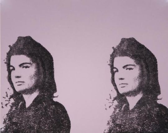
Andy Warhol, Jackie II, 1966. Screenprint on paper, A/P. Collection of the Art Gallery of Hamilton. Gift of Dr. and Mrs. Harold J. Hoffman, 1984. Image courtesy of the Art Gallery of Hamilton.
“Bad taste is real taste, of course, and good taste is the residue of someone else's privilege.”
― Dave Hickey, Air Guitar: Essays on Art and Democracy
The Art Gallery of Hamilton has turned one of its galleries into something called The Living Room. It is intended to be a social space, with a rotating collection. Right now, in it, they have put up three Warhol screen prints, which function as an essay on taste.
One is a double Jackie Kennedy on newsprint; one is a Marilyn on newsprint. The Jackie doesn’t mean as much as the larger ones: two Jackies instead of twelve; black on brown paper instead of black figures on a blue colour field printed on canvas, small size instead of epic scale. The quick and dirty quality of this small Jackie avoids the genderfucking of some of the other Jackies, like the Jackies whose mourning veils look like Wilgefortis beards. Warhol was epic, Jackie was epic, canvas is epic. Even divided, they function as a Mater Dolorosa for an America about to lose innocence. The smaller double print does none of the heavy lifting.
The Hamilton Marilyn is also on newsprint. Drag-ish pink lips printed separately from Monroe’s face– none of the subtlety, none of the care. The material lessens any attempt to push forward ideas of taste. It doesn’t make Warhol any more famous, and it doesn’t make Marilyn any more famous. It’s not even interesting in a vulgar way, like the green on pink ones that were done a few years later.
While these two were facing off, another was placed behind a half wall like a shameful secret.
It screamed Warhol. Jackie and Warhol compound each other’s fame. Marilyn and Jackie compound each other’s aesthetics. They require a kind of mutuality. The 80s Warhol portraits are all about the fame and aesthetic of Andy; they do not push against anything but his personae. Cultural critic Wayne Koestenbaum has tried to defend these works, and art historian Robert Rosenblum’s introductory essay in the book Warhol Portraits has talked about them. When he has something to paint, 80s Warhols have an unapologetic camp vulgarity where pure material pleasure obliterates less corporeal pleasures. His Dolly matches camp step for camp step; his series on living queens has a post-queer wink-and-nod; his Blondie is sexy; his Drag Queen series is properly tawdry.
The Karen Kain portrait behind that half wall does nobody any favours. There is a reason why it is almost hidden. Bob Colacello’s biography of Warhol, Holy Terror, tells about how Warhol would corner vain and insecure women to do portraits, and he would offer them excess. If they wanted more colours, it would cost more; if they wanted glitter, it would cost more; if they wanted more than one variation, it would cost more.
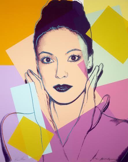
Andy Warhol, Karen Kain, 1980. Screenprint on paper, ed. 46/200. Collection of the Art Gallery of Hamilton. Gift of William S. Hechter, 1987. Photo courtesy of the Art Gallery of Hamilton.
I have no idea who paid for the Kain portrait initially, but it is a four-on-the-floor, super luxe, Cadillac of mid-1980s Warhol vulgarity. 10 colours. Glitter eyeshadow. Glitter lipstick. Highlighting around eyes, hairline, nose. It is an artful example of insecurity: Warhol worried about losing his skill or his fame, and spurted virtuoso excess to prove that he was capable of doing something– anything– new, while ballerina Kain wanted to prove that she was a worthy subject of the artist. Kain was not as famous as other New Yorkers; many of the portraits that Warhol did in the 80s were arriviste or b-list people who did not know how to properly operate in worlds of moneyed taste. In this portrait, artist and subject collide in an upstairs/downstairs moment.
Warhol had great, complicated, theoretically-viable work in the 1980s. It is churlish to judge an artist by their worst work. But Canadian museums and galleries are filled with third- or fourth-rate Warhols. Bought by dentists or doctors, donated to cultural institutions for the tax breaks, Warhols like the Gretzky at the Art Gallery of Alberta are worse than the Kain, mostly due to the lack of glitter. There are six of Gretzky, with each print run numbering hundreds more than the Kains.
But vulgarity is compelling. Luxury is compelling. Sumptuousness is compelling. Being out of fashion is compelling. Committing to complete bad taste is compelling. The worst work by the best artists can tell us something interesting. How we collect can tell us something. This Kain is compelling.
The 80s work of Warhol’s that has been redeemed by critics include prints from the series The Shadows, which are about death, paintings made from piss-oxidized copper, which are about abjectness, and his polaroids, which hold their vulgarity in a tight and tiny little ironic package. The big, whorish, 80s work is still embarrassing. In our hyper-capitalist world, being gauche about money is still considered in bad taste, but not in a slumming, winking style of bad taste. Warhol called this art business art. It was supposed to be about making money, and it did.
This work is so ugly and so vulgar, it is without redemption. Money is toxic, and work so purely about money is toxic. This print is an example of the aesthetic value of capital, but it is a seductive one. Liking things that are bad for you is a good time.
Installation view of The Living Room, Self Made: Stylo Starr’s 89 Dames with Warhol’s Karen Kain at right. Photo courtesy of the Art Gallery of Hamilton.
These three Warhols are in the same room as local Hamilton designer and artist Stylo Starr's 89 Dames. A collection of prints of African diasporic "glamour stars" from the 1950s and 1960s, Starr's work is different than Warhol, and I am not quite sure it is derived from Warhol's work. Starr's 89 Dames are screen prints that kind of look like Warhol's work but lack Warhol's flatness, with collaged lace around some pieces adding complicated texture. They do not play with problems of fame.
Most importantly, even with his Marilyns or Jackies, Warhol's work was always more news than history. Starr's screen prints depict people from the 1950s and 1960s. The choices Warhol made were choices of the market, while the choices that Starr makes are more intimate. Her work develops a canon not so much from the world, but against the world. Lastly, the tension of class and taste in Warhol and the camp self-awareness of the Starr pieces are gorgeous, but prove that bright, or even clashing, colour and patterns can be in good taste. The vulgarity and fame of Warhol does a disservice to the political, subtle, tenderness of Starr.
While the Art Gallery of Hamilton seems embarrassed by that Kain, it reminds me of an Elizabeth Taylor story:
Liz was having dinner with Princess Margaret, and was wearing one of her diamond rings. The diamond on this ring was extravagant. Margaret called it vulgar; Taylor asked if she wanted to try it on. After Margaret put it on, Taylor said “it’s not that vulgar now, is it?”
I feel that way about the Kain: so much to hate about it, so much to think about, so many ways that it is completely wrong.
But, trying it on, it’s not so vulgar, is it?
Anthony Easton is a writer, artist, and theologian. They are interested in class, sex, gender and the west. They have been published in Spin, The Atlantic, Pitchfork, Globe and Mail, and others. They have presented at conferences throughout North America, and in Europe. Their art has been shown in Toronto, New York, Chicago, and is in the collection of the library of the National Gallery of Canada.
#criticalsuperbeast#hamont#artcriticism#anthonyeaston#artgalleryofhamilton#selfmade#thelivingroom#andywarhol#screenprints#jackieo#marilyn#karenkain#stylostarr#portraiture#taste#aesthetics#camp#celebrity#printmaking#mixedmedia
0 notes
Text
Stay woke in art and nature: a rant about fakery
Sean Kenney, Nature Connects at Hendrie Park, The Royal Botanical Gardens. May 20 - August 20, 2017. Burlington, Ontario.
By Ingrid Mayrhofer

Sean Kenney, Life-size Rototiller. Part of the exhibition Nature Connects at the Royal Botanical Gardens, Burlington. Photo courtesy of Ingrid Mayrhofer.
Much criticism of this year’s Documenta 14 (Learning from Athens) and the Venice Biennale is directed at curators’ and artists’ failures to deliver on their stated social engagement goals. “At a time of global disorder,” chief curator of the Venice Biennale, Christine Macel, writes, “the role, the voice and the responsibility of the artist are more crucial than ever before within the framework of contemporary debates.” [1]
The environmental debate is definitely one where I see both the need for and the potential of art to voice concern. So, when the Royal Botanical Gardens organizes an exhibit called Nature Connects, and promises it to be an “inspiring exhibit that teaches people of all ages the importance of connecting with nature [2],” I would expect imagery that broadens my understanding of the issues. Instead, the RBG presents 14 installations by New York-based Sean Kenney, who describes himself as a “full-time LEGO artist.” The introductory blurb on Kenney’s website leads straight to the point, “commission a LEGO sculpture for your event, magazine, TV show, home, or office.” The globe as we know it is in serious trouble – climate change being one of the signs and plastic one of the causes. More than 8 million tons of it is dumped in the oceans every year. Fish, birds and marine mammals are threatened because of plastic, which permeates our food chain. Yet, the RBG wants us to connect with nature through “over (sic) 300,000 pieces [3]” of plastic. “Building with LEGO bricks,” they claim, “is about balance and connections, much like the biodiversity of Royal Botanical Gardens.” [4]
Until last week, I did not know that there was such a discipline as LEGO art. With the exception of Toronto-based Enow Nimako [5] (who builds magical creatures as part of his Afro-Futuristic practice and uses LEGO to engage youth in exploring their identity) my Google search for LEGO art resulted exclusively in plastic brick likenesses of other people’s artwork. Equally futile, an attempt at gathering primary source input from my Facebook “friends” drew a rather venomous exchange between critics and defenders of the RBG (and its price of admission), instead of artistic discourse. A neighbour thought the exhibit worthy because it motivated school visits; another suggested that the LEGO exhibit was proof that the RBG was not an elitist institution (I shall return to this thought). During my site visit, I met up with the “target audience,” a modestly dressed young couple whose little boy may have been motivation or excuse for the expense [6]. The reluctant little one was coaxed into posing with each piece and finally refused when they got to the rendering of an eagle. Dad gently picked him up to better stage the photograph, and son responded by closing his eyes at the camera.

The comment “Royal Disney Gardens” posted by Annerie VanGemerden, one of two Facebook and artist friends who responded to my question, “should I laugh or cry,” [7] resonates with my own gut reading of the RBG exhibit as a discipline of “Imagineering” rather than visual art. A 1995 exhibition at the Canadian Centre for Architecture in Montreal, The Architecture of Reassurance: Designing the Disneyland Theme Parks, provides an interesting, albeit critical, precedent for Nature Connects. In his essay about this project, John Grande suggests that, “Fakery is designed to give one a sense of reassurance, of being protected from reality.” [8] I consulted Grande’s book Intertwining, because he had curated what was in my opinion the best of all the art exhibits at the RBG, in 2008. Remnants from that notoriously under-promoted event, including the artwork Shelter by Arthur de Mowbray are still present on site, but the signage fails to credit the curator. Rather, it encourages us to “text ROYAL to donate $10.” Reality, it seems, is that the RBG needs more money.
Educational signage for the LEGO sculptures offers meta-likenesses in that the support for the text is made of plywood simulations of oversized LEGO blocks, some of them much larger than the pieces they interpret. As an artist, surely, I would want my work to outperform the interpretive armature. “Please do not touch or climb the sculptures,” each sign asks. In other words, connect with the plastic nature from a distance. Trying to make up my mind as to which was the worst of the pieces, I fluctuated between Birds vs. Squirrels at Feeder with a mini picket fence and real plastic bird feeder, and Giant White Triumphator Lily with a strange plywood frame. Then, I saw Kneeling Gardener and selected it as my pick for worst-of-show. My standards for a human likeness to challenge my anthropocentric limitations are simply too high. However, I could accept the Life-size Rototiller, which, as an inanimate object, references human intervention with nature (such as the garden).
More sinister than escapism via LEGO built simulations is an ideological resonance with the need of authoritarian regimes, not only for “safe” but explicitly saccharine narratives such as Vladimirskii’s 1949 painting Roses for Stalin or Hitler’s own drawings of flowers and his dog – a favourite subject of George W. Bush as well. Another association with the longing of dictators for art that calls up a glorious past rather than an achievable vision of a better future, is found in both Disneyland and Nature Connects in that they dish out complacency to “ordinary people.” “The people recognize themselves in their commodities,” Marcuse observed in One-Dimensional Man. [9] Assuming other-than-human self-awareness exists, would the animals and plants represented in Nature Connects recognize their likeness? Nostalgia and happy childhoods play big in the RBG marketing spin. While many artists deconstruct or reinterpret popular culture commodities from their childhood, especially ones that would have been labeled Kitsch in their time, the claim that this exhibition teaches, “the importance of connecting with nature,” [10] refutes any magic that the LEGO memories may hold for my inner child. Rather than educating, the plastic replicas play into consumerist ignorance and dominant culture’s inability to live in harmony with nature. The RBG marketing-addled curatorial department identified the lowest common denominator for its paying audience as middle class commodification of culture and nature. Does that mean that anyone who didn’t have LEGO as a child (because of their social, cultural or geographic location) is not a target and may not identify with the royal gardens? The role of the artist in this garden is to serve the complacent middle class ideal and to challenge neither the viewer, nor the petroleum industry. Building plastic likeness for the sake of likeness in plastic, he denies any space for interpretation, transformation or imagination.
Perhaps placed in a context of post-industrial wastelands, the “imagineered” replicas of what no longer exists on site would bear some meaning. Would the labour-intensive LEGO art production be suitable for a statue of “The Donald” or of Kim Jong-il in order to draw attention to exploitation and forced labour? I think not, and I have no doubt that LEGO art at the RBG is not going to “save our children from nature-deficit disorder” as discussed in the book by Richard Louv. [11] Rather, the plastic displays reinforce the need for rethinking an elitist post-colonial institution that either disdains its audience or simply does not understand the creative potential of the place. It is not likely to reach any youth who might want to hang there and stay woke (as my son would say). On a plus note (or not?), the fact that the plastic likeness may be all that remains after the next great extinction shall no longer confuse archaeologists.
Notes:
[1] https://www.nytimes.com/2017/05/07/arts/design/a-venice-biennale-about-art-with-the-politics-muted.html
[2] RBG exhibition handout, double-sided sheet, 8 ½” x 11 “, one fold
[3] ibid
[4] ibid
[5] http://www.cbc.ca/2017/with-lego-i-explore-identity-and-build-my-own-vision-of-the-canadian-future-1.4117067
[6] I like the gardens, and I do have a membership, but the cost of admission is not going to bring in people who work two jobs at minimum wage.
[7] Artist & Gardener Gene Threndyle suggested I do both
[8] John Grande, Intertwining, Black Rose Books, 1998
[9] Beacon Press, 1964
[10] RBG exhibition handout, double-sided sheet, 8 ½” x 11 “, one fold
[11] Richard Louv, Last Child in the Woods – Saving Our Children from Nature-Deficit Disorder. Algonquin Books, 2005
Ingrid Mayrhofer is a visual artist whose work explores the culture of nature. As a member of the Red Tree Artists’ Collective, she collaborated with Lynn Hutchinson and Neri Espinoza on a critical examination of fascist aesthetic in the project Order in the Garden in 1996.
#criticalsuperbeast#hamont#artcriticism#ingridmayrhofer#royalbotanicalgardens#nature#theenvironment#sculpture#lego#publicart#outdoorart#seankenney
0 notes
Text
The Elephant in the Room
The Nature of Nature: The Photographs of Thaddeus Holownia, 1976-2016. At the Art Gallery of Nova Scotia, February 4 to May 28, 2017. Curated by David Diviney and Sarah Fillmore.
By John Haney
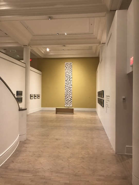
Installation view, The Nature of Nature: The Photographs of Thaddeus Holownia, 1976-2016. At the Art Gallery of Nova Scotia. Rear wall: Icarus, Falling of Birds (2016). Chromogenic print, 487.7 x 76.2 cm.
Not long after Canadian photographer Thaddeus Holownia left Toronto in the mid-70’s, decamping to Sackville, New Brunswick, he became besotted with a bird biologist working at Mount Allison University’s biology department. Her name was Gay Hansen, and Holownia had heard somewhere that she practiced taxidermy, preparing specimens which she would then use in her classroom instruction. Thus he was able to hatch a plan to meet her. When, finally, he found a struck bird on the side of the road, he gathered it up, and knocking on her office door, presented Hansen with the dead blue jay. Four decades later, the couple has fledged four children, and have operated a veritable ark for uncountable legions of dogs, cats, horses, ponies, and birds. Possibly also a weasel. There are, perhaps, more conventional creation myths, but few so prophetic or prescient for Holownia’s concurrent life in art. An incisive gathering of that life’s work has just finished its run at Halifax’s Art Gallery of Nova Scotia with the exhibition The Nature of Nature: The Photographs of Thaddeus Holownia, 1976-2016, curated by David Diviney and Sarah Fillmore.
Aside from being a busy artist, Holownia has taught photography at Mount Allison since 1977, and has been active as a letterpress printer, collaborator, and publisher with his imprint Anchorage Press. For me as for many others, Holownia has been an important teacher and mentor. Flying to Halifax in the dead of winter for the opening of his retrospective was a chance to see both old work that I was intimately familiar with, and work that was unknown to me. It was a joyful and haunting reunion and introduction.
Holownia has long stated that, in the most general sense, his photographic project is an examination of human intervention in the landscape. His massive catalogue of images attests to this; for forty years, the unrelenting scrutiny of his view cameras has fettered out the saw-toothed interface between the natural world and “us”. Four projects well-represented in the exhibition portray this relationship clearly: Rockland Bridge is a 20-year chronicle of a once-proud covered bridge being slowly ground to bits by the Memramcook River. Eventually, all trace of it gone. Holownia’s early magnum opus Dykelands is the close observation of an apparently natural landscape and the spidery, ephemeral human presence there. In fact, this natural landscape was manufactured by the Acadians, one spadeful of red earth at a time, “reclaiming” the once massive Tantramar Marsh from the sea. Three centuries of noisy colonial history have focused attention away from the fact that the dyking of the Tantramar was essentially a slow, massive, agrarian-made ecological disaster. Anatomy of a Pipeline follows the installation of the Sable Gas Pipeline from where it makes landfall in Nova Scotia, traversing New Brunswick, and eventually snaking into Maine. Even the series Jolicure Pond, in which Holownia photographed his own backyard (and the eponymous pond) is a meditation on the metamorphic power of light delivered up by a machine-dug pond.
There is however, something deeper, something more subtle and menacing at play in Holownia’s work — an almost unidentifiable dynamic between the human and the non-human — than is done justice by the term “intervention.” Yes, there are plenty of examples in the gallery of our incursions into the natural world, but what about the natural world’s incursions into us? The relationship is not one-sided. We are making a terrible mess of this planet, but the truth of the matter is that planet Earth will continue without us, and in fact it will thrive, again, without us. So the slow dance that plays out across the frames of these photographs depicts our planet as a formidable and tolerant sparring partner; eventually, it is us that we will tire (or toxify) into oblivion.
Boxing serves as a useful metaphor for understanding Holownia’s work. The physical dichotomy of push-pull and hold-fight is echoed by the seeming contradiction of mirror-window. With his 1978 exhibition and book of the same name, the American curator, writer, and photographer John Szarkowski famously divided photography into the discrete categories of Mirrors and Windows. Seeking an aesthetic, procedural, and conceptual device with which to evaluate American photography of the 1960’s and ‘70’s, he proposed that a photograph is either a window into the external, wider world, or a mirror reflecting the inner world of the artist — it is either a realist or a romantic document. He suggests not that these are absolutes, but that these are two poles between which there is a spectrum. As his essay sharpens towards its conclusion, Szarkowski becomes more and more ambivalent about his dichotomy, convincing himself that perhaps good photographs most often live in the grey zones of that spectrum.
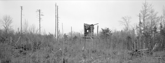
Blind, Near Stewiacke, NS, 2009. Pigment print, 30.4 x 86.1 cm.
Holownia’s work is a superimposition, a double exposure of a window and a mirror. One of the more recent works in the exhibition, Blind, Near Stewiacke, NS, 2009, shows the tattered remnants of a deer blind surrounded by the tattered remnants of a clear-cut forest. The image is pure disarray, save a still-square aperture cut into the wall of the blind: Holownia’s window and mirror. A final human vestige, the blind is made of wood like the surrounding trees. While the wood of the razed forest will now commence to growing, the wood of the blind will commence to decomposing; our artifact will become the nutrients used to build a new world without us. As the audience, we are left to ponder the consequences of the double meaning of the work’s title.
Anatomy Lesson: Moose (2006). 100 toned, silver gelatin prints, 36 x 28 cm each.
The same troublesome superimposition can be found in the behemoth installation Anatomy Lesson: Moose (2006), which consists of 100 black-and-white photographs of individual bones of a moose skeleton, arrayed five high by twenty wide, in thin black frames hung flush together. The bones are photographed positioned on black cloth, centred in the frame, and with consistent sobriety, as museum pieces might be. The remains are coldly catalogued, and yet some combination of the lighting of the objects, the subtleties of tone (one imagines that the bleached bones on the black backdrop would look nearly identical as colour photographs), and the play of scale creates both ambiguity and uncanniness. Are these ancient tools? weapons? One bone is so big (must be a part of the leg) that it playfully spans two frames, adding a jilting continuity (or would it be discontinuity?) that animates what might otherwise be a lifeless grid. It is an iconoclast in a field of icons.
Anatomy Lesson’s 100 images are framed behind non-reflective glass. Looming amorphous reflections however, cannot be entirely eliminated. The black mass on the wall evokes Maya Lin’s Vietnam Veterans Memorial in the way it mirrors its spectators. While Lin’s wall is polished, and one’s clear reflection is superimposed on the names of the dead, Holownia’s wall is murky, and the shadow-form reflections of its human audience are punctuated and perforated by the bones of another animal. The ramifications of this disconcerting superimposition are humility, reflection on mortality, and likely chagrin — the moose’s scapula appears to have been ripped through by a poacher’s bullet. This inter-species substitution, in addition to being an apposite through-line of Holownia’s retrospective, may well be the real lesson of the work’s title.
Detail: Anatomy Lesson: Moose (2006). 100 Toned silver gelatin prints, 36 x 28 cm each.
Icarus, Falling of Birds (2016) is the retrospective’s newest — and, for Holownia, his most un-subtle — work to date, providing a dramatic and condemning full stop to the exhibition. On the foggy night of September 13th, 2013, the Canaport Liquefied Natural Gas plant in Saint John, New Brunswick, belched a massive gas flare that, like a small sun, lit up the night. The timing of this flare broke strict laws about when such flares are permitted to take place. Thousands of migrating songbirds flew towards, and into, this flare and they got incinerated for their effort. 7,500 birds were picked up dead from the ground, but more likely a total of 10,000 birds were killed, their little bodies running the gamut from the black-and-crispy to those that look peacefully asleep. Holownia and his frequent collaborator writer/poet Harry Thurston painstakingly de-tagged and photographed 400 of these birds which have been, ironically, frozen, at the New Brunswick Museum. Two hundred birds, representing all 26 species that were among the dead, occupy a massive, vertical photo-montage that descends the height of a two-story wall. Most of the exhibition’s 151 works are painstakingly framed to museum standards. Icarus, Falling of Birds gets no such treatment. The 200 bird corpses that were photographically documented occupy a ribbon of image that is completely unadorned and unpreserved. This composite photograph, a sad and angry testament, uses the gallery’s architecture as its frame, and scroll-like, unfurls downward as did the birds. Ironically, when one approaches these falling birds, one is forced to look up, creating a powerful and disconcerting dissonance.
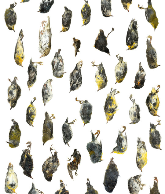
Detail: Icarus, Falling of Birds (2016). Chromogenic print, 487.7 x 76.2 cm.
The complicating wrinkle that Holownia’s work presents is the fact that we are both of and apart from the natural world. The threshold between that ‘and’ is tragedy, comedy, absurdity, irony, or a combination of them all. One of my favourite works in the show is one you might walk by if you’re not looking closely. Hwy 102, Exit 11, NS, 1995 was made at Mastodon Ridge, in Stewiacke, Nova Scotia. In it, workers, an SUV, a pickup truck, and a small bulldozer are scattered across a muddy field and are being bellowed at by a life-sized replica mastodon. This dubious field happens to fall where the 45th parallel crosses, handily, the Trans-Canada Highway. What we are privy to is the installation of a model mastodon for the purposes of serving as a tourist trap. The ancient bones of the original pachyderm were found fifteen kilometres away in a gypsum quarry. “Mastodon Ridge,” the road-side attraction, now boasts a gift shop, a gas station, a KFC, a Taco Bell, a Tim Horton’s, and, inexplicably, cannons. Families can play in the sandbox, the playground, or the mini-putt. The elements of the image are pure Holownian grist, which is to say the residue that is formed at the intersection of two axes — the human/natural and reverent/irreverent. The mastodon has been immortalized mid-gape-mouthed bawl — bawling at a predator? a rival? It seems more likely that it is, clairvoyantly, ushering forth a primal scream towards its future as a circus elephant.
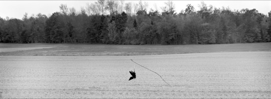
Crow Scare, ME, 2015. Pigment print. 27.0 x 71.1 cm.
Crow Scare, ME, 2015 is a condemnation. I think so, anyway, though it’s difficult to say. It resides between the bucolic and the horrific, the beautiful and the monstrous. In subject and in mood, the image is haunted by Alex Colville’s spirit. The photograph’s wide frame is sectioned up into field, grass, trees, sky. The image’s subtle grey bands are jarringly punctured by the outlandish black of a dead crow, one foot delicately tied to a delicate stick, cantilevering out of the field — a morbid sundial. But in this eerily ambient light, it casts no shadow, as if time were obliterated. The angles of the crow’s body, tail, wings, and beak are both at perfect odds and in perfect harmony with that of the stick, and are set off by the plumb line of the string. Whether this bird was purpose-killed or was found we don’t know, but we hope that the ideal sculptural presentation of its corpse is an accident, for as much as it’s intended to repel other crows, it seduces this viewer, unsettlingly. And so with this crow, as with the blue jay, Holownia has found his dead bird and redirected it with precision.
Retrospective exhibitions can be bulky, lamentatory affairs — a collection of greatest hits, or the bookend of an artist’s career. The Nature of Nature is neither. Holownia has produced a catalogue of work that is expansive and diverse enough that the curators were able to isolate one clear and emphatic stream within it; the exhibit has a propulsive thesis that both cautions and reassures. The Nature of Nature catches an artist mid-stride. Though it wraps up with the emphatic thud of Icarus, the lingering buzz in the gallery is one borne of both hope and despair, like the positive and negative terminals a battery needs to produce a current. One has the sense that the always indefatigable Holownia is just ramping up to something. And so I am led back to the title: The Nature of Nature. Thinking hard about where we fit into this notion, I am struck by the idea that if indeed we are part of nature — aberrations or not — then like nature, we will simply keep going.
John Haney is a photographer/visual artist and sometimes writer who lives in Hamilton in a house populated by animals, including a dog and two boys under five. An upcoming adventure will be a residency at Thunder & Lightning Gallery and Art Projects in where else? Sackville, New Brunswick. As a founding member of the band/art collective SHIT PYRE, he is continuing to explore ritual, improvisation, theatrics, and pyrotechnics.
#criticalsuperbeast#hamont#artcriticism#johnhaney#thaddeusholownia#photography#canadianart#artgalleryofnovascotia#landcape#newbrunswick#sackville#nature#wildlife#retrospective
0 notes
Last Seen Blogs

viibesontheriise
ViibesOnTheRiise

vellobello
Vellobello

industryupdates
Global Market Updates
cinnamonzor
Zor