#sze favorite art museum
Text
Virtual Sketchbook #2
Principals of Design
Unity and Variety - At opposite ends of the spectrum are unity and variety. Unity is homogenous, promoting oneness and can be achieved through the use of a single color or repeating pattern. Variety is unique, different and diverse. Variety can be achieved through the use of mixed media, multiple subjects and can appear chaotic to the viewer. An artist strives for a balance of unity and variety in their work to achieve balance.
Untitled by John McCracken provided and example of unity. Lacking any variety but is interesting partly due to it’s bright color and large scale. The yellow plank stands out against the white background and brings depth to the image.

John McCracken, UNTITLED. 1970. Polyester resin, fiberglass, and plywood. 96″ x 22″ x 3″ .
Triple Point, an installation piece by Sarah Sze, provides an example of variety. Her use of mixed media and outdoor elements give an almost chaotic feel to this work.

Sarah Sze, TRIPLE POINT. 2013 Installation in Venice Biennale. Mixed media. Dimensions variable.
Balance - the use of opposite forces to create a sense of equilibrium. Balance is often achieved through the use of symmetry or asymmetry.
Damien Hirst’s Posterity- The Holy Place makes use of almost perfect symmetry to achieve balance in this work through images of perfect symmetrical butterflies.

Damien Hirst, POSTERITY- THE HOLY PLACE. 2006. Butterflies and household gloss on canvas. 89 5/8″ x 48″.
Emphasis and Subordination - Artists create emphasis, or draw our attention to an area through the use of position, color and size. Subordination refers to an area of lesser interest which prevents distraction from the area of emphasis.
Edgar Degas creates emphasis away from the center in his work Jockeys Before The Race through the use of size, shape and placement of the sun in the background.

Edgar Degas, JOCKEYS BEFORE THE RACE. ca. 1878-79. Oil essence, gouache and pastel. 42 1/2″ x 29″.
Directional Forces - The use of lines or implied lines to direct the gaze of the viewer to or away from the focal point.
Francis Goya uses both actual lines and implied lines to direct viewers in his etching Bullfight. The gaze of the fighter directs out attention down to the bull’s shadow at the same time the bull’s feet and head point us toward the poles balancing point. This creates a sense of dramatic motion.

Fransico Goya, BULLFIGHT. ca 1815. Etching with aquatint. 9 1/2″ x 14″.
Repetition and Rhythm - Regular occurrence of visual elements can give a sense of unity, and create balance in a work. An example of repetition is pattern. Rhythm is achieved through repetition of visual elements with some variation.
Wallace Berman achieves rhythm in his untitled varifax collage by reproducing the shape exactly but changing the element within the hand.

Wallace Berman, UNTITLED. 1970. Verifax collage. 12″ x 13″.
Scale and Proportion - Scale refers to the physical size of an object or work while proportion is the relationship of parts of the work to other parts within the work.
Claes Oldenburg and wife Coosje van Bruggen make playful use of scale in their work, Shuttlecocks. This distortion of scale is meant to be playful and humorous, unfortunately many patrons of the museum found it offensive due to thinking it was demeaning the purpose of the museum.

Michelangelo’s Pieta is an example of changes in proportion affecting the way we view a work. Michelangelo dramatically altered the proportions of Mary’s lap in to accommodate a grown man. If this Mary were to stand she would be an astonishing 8 feet tall! Michelangelo cleverly disguises this extreme proportion through her seated position and folds in the drapery over her lap.

Michelangelo Buonarroti, PIETA. ca 1498-1500. Marble. Height 5′8 1/2″.
2. Recipe for Winslow Homer’s Boys Wading
Materials : Watercolor, gouache, wove paper, graphite, brushes
Ingredients : Analogous colors, position, implied lines and your creativity
Work quickly and accurately as to avoid losing the characteristic freshness of watercolor! You are able to build up watercolor but it is not a forgiving material like acrylic paint, so a plan needs to be in place on where you place your paints.

Winslow Homer, BOYS WADING. 1873. Watercolor and gouache over graphite on wove paper. 9 3/4″ x 13 3/4″.
3. The color I have chosen to talk about is the color yellow. Yellow has always been a color that I have been drawn too due to its bright intensity and the warmth that people can feel from it. Although this is not my favorite color, my favorite is actually mint green. When I was in nursing school, I would wear yellow because yellow represents positivity. I always felt powerful in yellow and confident and with that, I did well with my courses. Yellow’s saturation can be watered down to make a soft glow or bold to really make you notice its presence. Yellow is a primary color in the color wheel and can be mixed with secondary colors to make tertiary colors. It is vital in all paintings and is in every aspect of our daily lives.
4. “Shallow” by Abby Carlson
The art that I chose to exhibit in this virtual sketchbook is a painting I did with acrylic paint, a wet media. I had actually put some finishing touches on this painting a couple days ago. I added the gold metallic acrylic paint to the eye of the dragon as well as too the robes of the woman reaching up to the dragon. I love this painting because it was something I have never done before. I had to add depth to the painting and dragon body as well as create the illusion that the water is endless at the top of the painting. I used my favorite colors In this painting, especially the mint green. It was fun to create and I cant wait to create more!

For the Discussion on Photography, mine are as follows:
1) The Portrait: “The Good Boy” This portrait is of my Goldendoodle/Labradoodle mix, Cooper. He is full of spunk and life and is always looking to me with love and affection. He also doesn’t mind a little dress up here or there, only when there’s a treat involved. He is the best mix of the three breeds and is currently studying what it means to be a “Good Boy.”

2) The Landscape: “Moon Township” This is a picture of my backyard in Moon Township, PA. What I remember most about this picture is how clean the air smelled as well as the bright green hue of the foliage and the sound of the cicadas’ buzzing in the area.

3) The Still-Life: “Wild Roses” This is a photo of wild roses that were planted by my great-grandmother on the family farm. They are still blooming today in PA and are so fragrant, unlike anything I have ever smelled. I know the smell of supermarket flowers, and those could never compare to the wild smell of these roses. I have never seen roses quite like these anywhere else. They are special because of the family connection and for their beauty. The bush was not completely in bloom but when it is, it is a magnificent addition to the farm.

0 notes
Text
MoMA 2019, Part 1: Surrounds & Permanent Collections
Most visits to New York include a stop at the temple of modernism, the Museum of Modern Art (MoMA). But this was my first visit since the massive multi-year expansion and renovation was completed. In some ways, it seems that not much has changed, but in other ways it has changed considerably, starting the members-only entranceway leading to a larger and more open lobby.
The second=floor atrium remains very much the same as it has been since the expansion in the early 2000s, a cavernous space looking up to all exhibition floors of the museum. It often is used to display monumental pieces or immersive performance works. Handles, a performance and sculptural piece by Haegue Yang combined both.
The name refers to the handles on all of the sculptural elements that allowed them to be slowly moved around the space by the performers. In between these motions, the performers gathered for vocal chanting that brought to mind the work of Pauline Oliveros. The sculptures and wall and floor elements had a simple geometric quality that reminded me of children’s building blocks. They also had bells and other sound elements mounted, again something that brought to mind Oliveros.
var quads_screen_width = document.body.clientWidth; if ( quads_screen_width >= 1140 ) { /* desktop monitors */ document.write('<ins class="adsbygoogle" style="display:inline-block;width:600px;height:100px;" data-ad-client="pub-5176416568130778" data-ad-slot="2974773354" >'); (adsbygoogle = window.adsbygoogle || []).push({}); }if ( quads_screen_width >= 1024 && quads_screen_width < 1140 ) { /* tablet landscape */ document.write('<ins class="adsbygoogle" style="display:inline-block;width:600px;height:100px;" data-ad-client="pub-5176416568130778" data-ad-slot="2974773354" >'); (adsbygoogle = window.adsbygoogle || []).push({}); }if ( quads_screen_width >= 768 && quads_screen_width < 1024 ) { /* tablet portrait */ document.write('<ins class="adsbygoogle" style="display:inline-block;width:600px;height:100px;" data-ad-client="pub-5176416568130778" data-ad-slot="2974773354" >'); (adsbygoogle = window.adsbygoogle || []).push({}); }if ( quads_screen_width < 768 ) { /* phone */ document.write('<ins class="adsbygoogle" style="display:inline-block;width:600px;height:100px;" data-ad-client="pub-5176416568130778" data-ad-slot="2974773354" >'); (adsbygoogle = window.adsbygoogle || []).push({}); }
From the atrium, I always head immediately to the sixth floor and gradually work my way back down. The top floor featured Surrounds, an exhibition of large-scale installations by a diverse collection of contemporary artists. Some, like Mark Manders‘ Room with Chairs and Factory, were large singular pieces, with a gallery-sized replica of a factory. Others were large compositions of smaller elements. For example, Dayanita Singh‘s Museum of Chance was composed of numerous photograph prints made by the artist, assembled into large modular panels that could be easily rearranged in any number of configurations.
In his installation Architecture Is Everywhere, Sou Fujimoto challenges us to see the “architecture” in everyday objects. His installation is a field of small objects ranging from colored geometric design elements to potato chips placed on an array of pedestals.
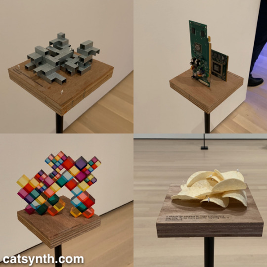
The “architecture” in each object is readily apparent when one is invited to see it. Even the potato chips are curvilinear forms that might be at home in a 1960s futurist public space.
Perhaps the most of fun of all the installations was Sarah Sze’s Triple Point (Pendulum). A colorful collection of everyday objects are arranged, somewhat precariously, around a circle as a pendulum swings freely above, threatening mayhem of destruction. However, that never happens and instead, we end up with an intricate but chaotic dance.
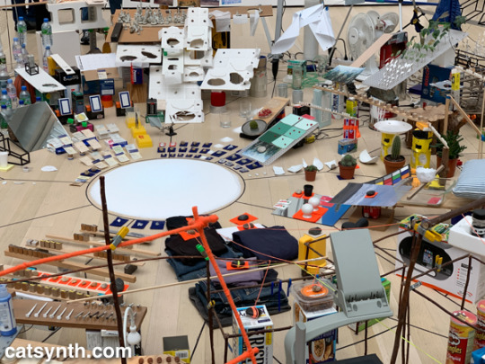
The name of the piece, which derives from the “triple point” where water can exist simultaneously as ice, liquid, and vapor, illustrates the sense mix of chaotic and coexistence in the installation.
Descending to the fifth floor, some of the changes to the museum became more apparent. The terrace cafe overlooking the sculpture garden had been removed (actually, moved to a new location on the sixth floor), and replaced by an open gallery space showing various sculptures by Constantin Brancusi.
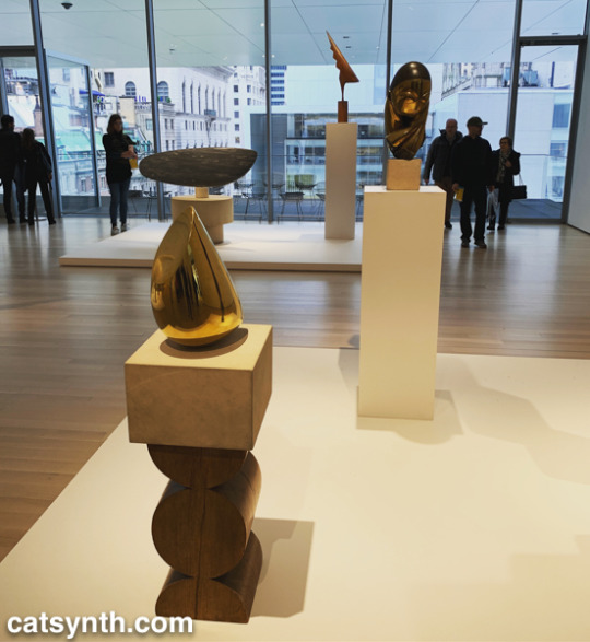
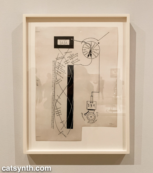
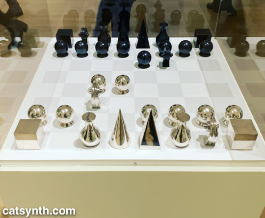
The remainder of the fifth floor and the entirety of the fourth floor housed an expanded and increasingly labyrinthine set of galleries for the permanent collection. The first gallery, which featured the oldest and most traditional works such as Van Gogh and Matisse, was by far the most crowded space in the entire museum. I quickly left to find some more open spaces and truly modern works, which began to appear in the 1910s and 1920s. In addition to Dada favorites, there were works celebrating machines, industry and the break with traditional forms of painting. Francis Picabia’s Dada Movement and Man Ray’s chess set are exemplars of these directions.
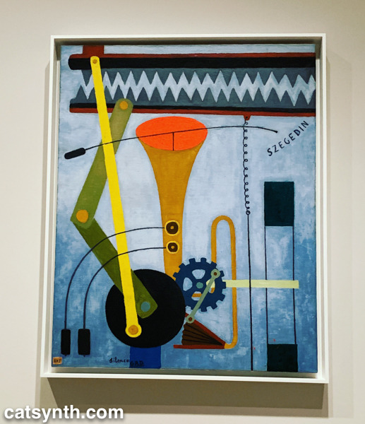
Georges Ribemont-Dessaignes‘ Silence depicts a musical instrument attached to machinery, perhaps speaking to the contradictory nature of music made by machines.
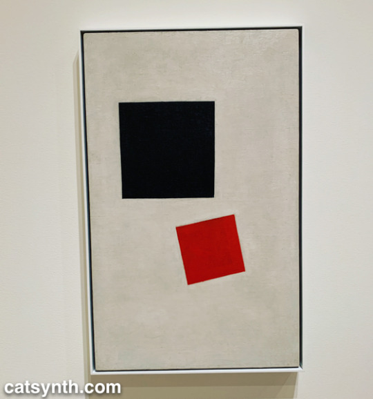
There was also a lively world of modernism and abstraction in Russia before the 1917 revolution, as exemplified by Kazimir Malevich’s minimalist Supremacist Composition: Airplane Flying.
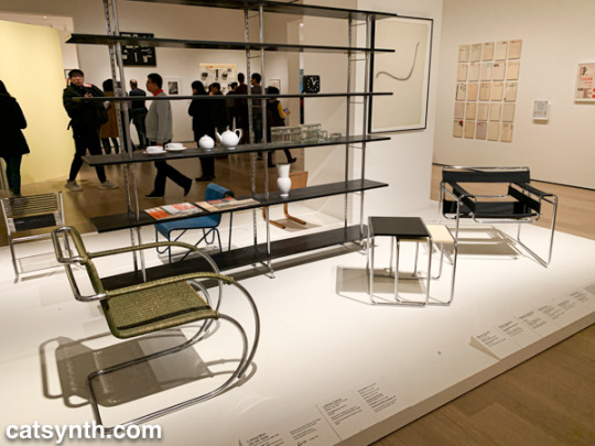
The expanded galleries included a room of design pieces from the interwar period (these were previously displayed in the separate design gallery on a rotating basis).
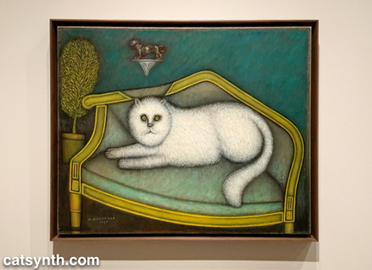
There was also a new space devoted to so-called “outsider artists” of the period, including Morris Hirshfield. I was particularly drawn to his portrait of a white cat titled Angora Cat.
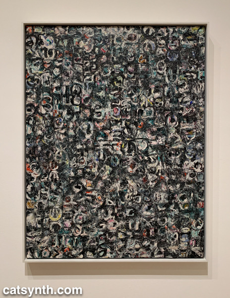
The collection continued on the fourth floor with the period between the end of World War II and the 1970s. This is usually my favorite section to linger in, with many iconic works of the 20th century. The Jackson Pollock’s are of course back on full display, but so is Lee Krasner, who is finally getting her due as a leading abstract expressionist painter.
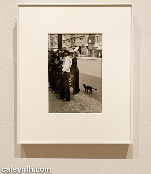
The expanded galleries have given more room for women and other underrepresented artists. The photography of Helen Levitt was featured in a room that also included artists depicting life in Harlem in the 1950s. I particularly liked this photograph of hers with a black cat.
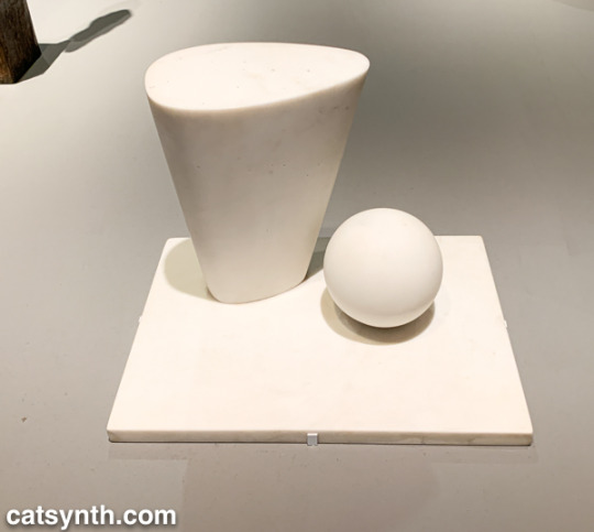
This sculpture by Barbara Hepworth is quite minimal, with the perfection of the sphere balancing with the “squishier” curves of the taller element.
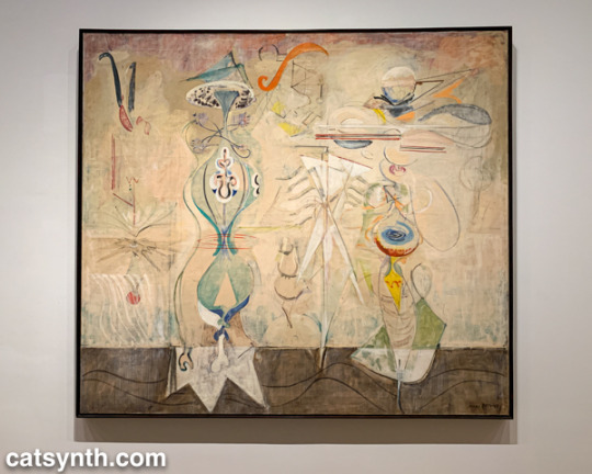
There were also pieces that showed the works of artists beyond their most well-known. I would not have guessed this painting with other-worldly plant-like creatures as the work of Mark Rothko were it not for the title card.
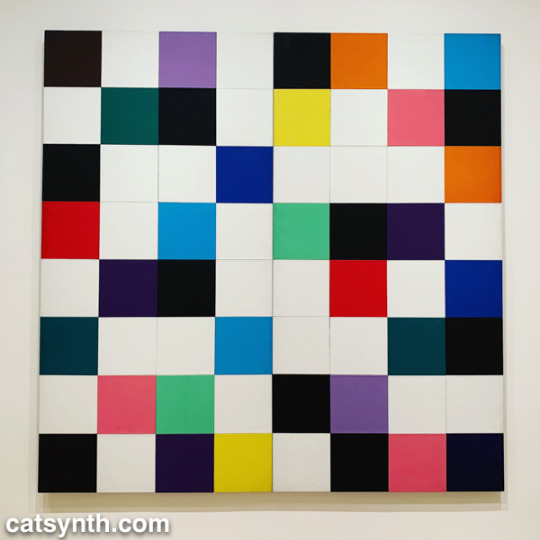
There were of course pieces that did exemplify artists as we know them. Ellsworth Kelly had large geometric blocks of color, as one would expect.
I looked around these galleries in vain for perhaps my favorite work in the collection, Piet Mondrian’s Broadway Boogie Woogie – it’s like visiting an old friend when I see it – but it was nowhere to be found. [Spoiler alert: I did eventually find it and it will be featured in Part 2 of this series.]
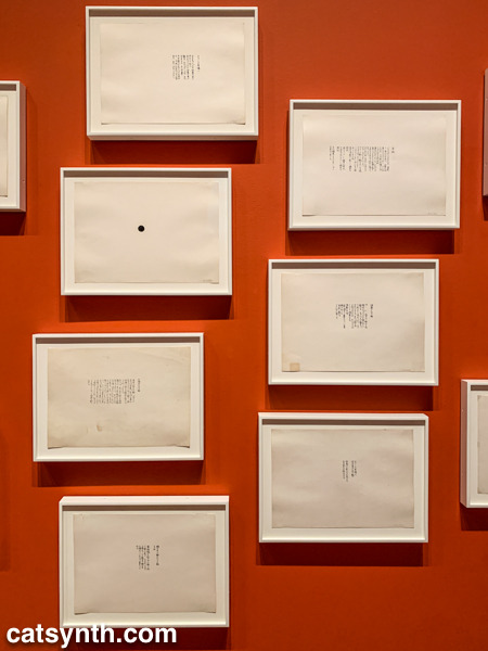
As we move into the late 1950s and the 1960s, abstract expressionism gives way to more conceptual art and works in different media. This was the beginning of Fluxus, with its instructional pieces, happenings, and ephemeral works on cheap materials. There was an entire wall of “scores” for performance works by Yoko Ono. These are always fun – most have clear instructions that one could use to perform them today, though I wonder what was expected from the large black dot.
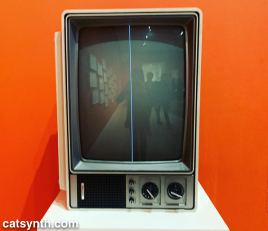
This is also the era of Nam Jun Paik’s experiments with analog video. Zen for Television takes video art to its most minimal, with a single line of a continuous signal on the screen. However, the vintage television set itself becomes a specific idea when viewed in the 21st century.
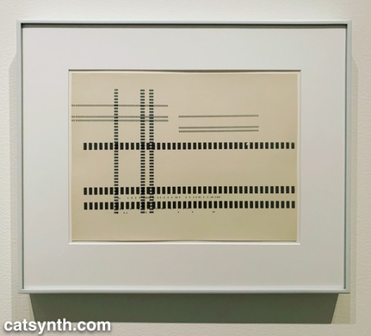
Abstract designs persist in this period, but also take on an industrial and repetitive nature. Sol Lewitt takes this to the extreme, but others Geraldo de Barros left room for variation, and perhaps to the works on paper from Fluxus.
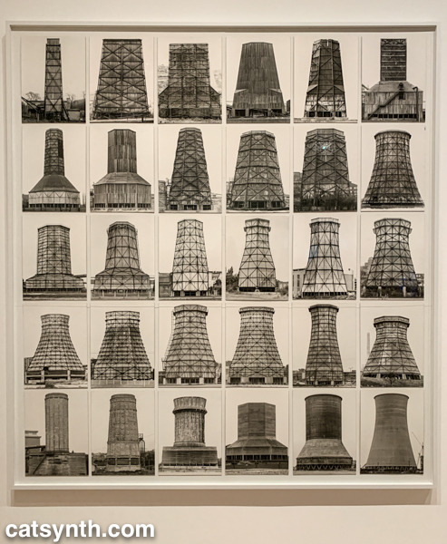
Among my favorite photographers of this period are Hilla and Bernd Becher. There work depicting old industrial buildings and placing them into artistic compositions has been a huge influence on my own photography.
Even after this whirlwind through three floors, seven decades, and multiple exhibits, there was still much of the museum to cover; and I was determined to cover the entirety in one day. In the end, I succeeded, and the remainder of the visit will be covered soon in Part 2 of this series.
MoMA 2019, Part 1: Surrounds & Permanent Collections was originally published on CatSynth
#Art#barbary hepworth#constantin brancusi#dayanita singh#ellsworth kelly#francis picabia#georges ribemont-dessaignes#geraldo de barros#haugue yang#helen levitt#kazimir malevich#lee krasner#man ray#mark manders#mark rothko#modern art#Modernism#moma#morris hershfield#museum of modern art#nam june paik#new york#NYC#review#sarah sze#sol lewitt#sou fujimoto#yoko ono#catsynth
0 notes
Text
Blog thoughts about MOMA

Sarah Sze, Triple Point (Pendulum)
This one is one of my favorites. It’s so lively that I could stare at it for a day; there’s so many details in this piece that it reminds me of a castle of wonders. Many artists had made their attempts to use daily materials in constructing their own works, but many of them failed on their tasks. I think it’s because of the familiar and complicate to one’s daily life; Once you get too familiar with something, it will be extremely hard to judge and alter it into a standard art piece- indeed there shouldn’t be any ‘standard’, but people tend to be overwhelmed by their own feelings which might not be that interested to construct an artwork at.
This one almost fell into that too. I’m not sure if I was understanding the artist’s intention as she put on the label, or if I was just amazed by another human’s daily life. However, overall I like it; It’s always fun to sneak peak into other’s life(I’ll just admit it.).

Sadie Benning, Shared Eye
I really like this one. They look like dollhouses; viewers could link and re-link their own assumption/imagination to what happens here. I think one thing about dollhouse is that players/viewers think they have the control over it; it makes them feel the domination. I also like the small ones over the big ones; the small ones have so many more details, especially half 3D popped out details that made them more readable and requires more time to look at.
Working big and working small have their own pros and cons. I have the idea that for an art work(no matter what size it is), if someone sees it from the other side of the room and can tell it is a good work, then it is a good work. Overall I think working small is more difficult; since it seems to be easier and faster to work on, in fact it will be harder to get good quality on.

Sheila Hicks, Pillar of Inquiry/Supple Column
I just want to point it out that this one made me think of the show by Mrinalini Mukherjee which went on earlier this fall at the Met Breuer. There is something that is very feminine about textiles and knots art works. They are so rich in form and color that they gives overwhelmingly warm feeling. They are soft but heavy status.
However, what I like more about Mukherjee’s works over this one is that she was from India, and her knots works have a very vivid Indian culture background in style. As textiles are viewed as symbols of India/Asia, so there’s a combination answers of ‘who’s the artist’ almost jumping directly on the desk. Culture was really helping a lot over there. So when I looked at this one, I’m less impressed.

Janet Cardiff, George Bures Miller, The Killing Machine
And here comes my no doubt all time favorite one. It’s beyond words and I’m sure there are already fine critics about it; so I would like to go from the interactive side. I sit there for half an hour to see people went in, pushed the button and went out. People reacted differently indeed. I saw one lady went in and pushed the button with hesitation, but got bored quickly and left even before the killing part starts; and gentlemen tended to push the button and went around to get the whole experiences. It’s horrible but wonderful to be put in this single (and not that easy to find out) room; this isolation made it even stands out more.
I didn’t get to push the button(which I regret now), but I think it’s inviting. People can foresee what will happen next; it’s almost like a “DO IT! DO IT!”- and no living creatures will be harmed. So it looks whatever. However when the button is really pushed then it becomes a different story. Weird but loud violin music, funky but horrible lights, and my favorite part- the light by the disco ball that looks like the fragments of the tortured souls that just scattered into the night sky. It also looks like starlight.

Dayanita Singh, Museum of Chance
Finally is the one that I didn’t like. It’s not that I don’t like the photos; I think they are brilliant. I just don’t know why she put them together like that. It’s not helping in both ways; neither the photos or the structures work well. I think it is a good(or bad?) example of not overdo your work. Also this made me think of Susan Sontag’s point when she said that 19th century people shoot photos of people at the bottom of the society as a intentionally curious trip to other social ranks. I just had the same feeling when I looked at those photos.

David Tudor & Composers Inside Electronics Inc: Rainforest V (variation 1)
It’s another art-Disney-land for me. I like to spend time in here, so I’ll suppose that I like it. It’s just that the installation, the window over there and people playing around made me think of the passing winter times as somehow I went to MOMA more during winter times than any season else in a year. Then I got sentiment for no reason. I don’t think it’s a decorative art piece; it’s definitely working on something, so I’m glad to see it in a proper museum space in the winter time.
I also view it as a musical piece. There are all those ASMR videos about sounds in the rain forest to help people work and sleep, so I think they are music. I wish I could see more of them- cover the whole range of a football playground, cover the whole outside world and becomes a true rain forest. Cause that’s what rain forest looks like- overwhelming, and not from this world.
0 notes
Last Seen Blogs

japii-blog-blog
por aca no es

linson007
LINSON MATHEW

capitano-ale
I'm not a wizard, I am just learning
wh0bes
bes

draconicsparkle
Not Clever Enough For A Title