#tableau dataviz pubcrawl
Explore tagged Tumblr posts
Visit Tumblr Blog
Explore Tumblr blogs with no restrictions, modern design and the best experience.
Last Seen Tumblr Blogs


Fun Fact
In 2020, 44% of users from Denmark used Tumblr daily.
Text
Austin Pub Crawler
So, the third Iron Viz feeder contest this year was released just a little bit ago and the theme is mobile! Normally, the Iron Viz themes give me something to go on (Food, Wikipedia, Politics, etc.). I think having no defined data theme is probably one of the hardest things when designing a dashboard since you can do a dashboard on literally ANYTHING! Below I’ll explain my Iron Viz process so that you can get a little peek into how my viz’s come together.
1) Figure out a Theme
Instead of trolling the internet for interesting data (like I normally do for these things) I instead tried to think of what would be the most broadly relevant dashboard I could make for Tableau-ers. I went through a bunch of ideas like grocery lists, diapers, sleep, but eventually I settled on something that pretty much most people like - booze! :)

2) Getting the data
With idea in hand, I tried to think how I could make it even more relevant. The first thing that popped into my mind was of course, TC16! My general idea was to get info about bars near the conference center, since the conference is in Austin this year there would be plenty to choose from.
Tax Data
My first (and most important find) was from the Texas Transparency site. This site houses some awesome public government data, including mixed beverage tax receipts for all the bars in Texas!

Once I had the data I looked up the tax rate for alcohol in Texas and found that it was about 6.7%. Dividing by the ratio gave me the approximate revenue of each bar along with info like bar name, address, month, and city.
Map Data
The next thing I needed to do, was geocode everything to get exact points for all of the bars (this was fundamental to the map-heavy dashboard that I had in mind). To do this, I actually used the free Alteryx Public Geocoding tool. It can only process 1000 lines at a time, but its also super quick so processing the files didn’t take very long!

Drive Time Data
Now that I had all of the geocoded addresses, I really wanted to find out the drive time from the convention center to the bars. In doing this, I’d be able to create a “pub crawler” app that would rank bars by drive time! In order to do this, I again turned to Alteryx. If you have the right version of Alteryx with the data package enabled, adding drive time calculations is pretty simple. You basically just need to turn your lat/lon into spatial objects and then use the drive time tool to get your drive times (my workflow below).

Yelp Data
The final piece of the puzzle was Yelp Data. I wanted the pub crawler dashboard to be able to adjust the crawl it presented based on various rankings (distance, drive time, revenue, and reviews). The reviews would need to come from yelp of course, but how to get them? Well, that’s where my handy dandy friend import.io comes in. This is a really neat tool which makes web scraping super easy. Essentially, I just looked up bars in Austin, got the URL from Yelp, trained the tool on the fields I wanted, added 75 url links to my queue (to get all the bars) and viola, data!!!

The yelp data brought in the overall ranking of the bar as well as the price level ($, $$, $$$, $$$$). These would be key to both my crawl path and selectors for the users of the dashboard.
3) Dashboard Time!
Ah, my favorite part, making the visuals! For this dashboard, I knew there was a contingency that the viz had to utilize device designer in order to format the dashboard to a phone. Now, I know there are a bunch of ways to design a phone-friendly dashboard, one of which is super popular right now - long scrolling dashboards. While I like these dashboards, I knew that I 1 - didn’t have time to make a large dashboard and 2) thought people wouldn’t have the attention span for too much data on their phone. With that in mind I essentially went straight for a single view phone “app” which would help you plan your pub crawl while at TC16 with a few interactive and intuitive filtering mechanisms.
Below is what my “Regular” view dashboard ended up looking like.

and here is my “phone friendly” version created with device designer

The dashboard is really only made up of three main parts:
Selectors - These are a combination of action filters and parameters that allow you to adjust different factors of your crawl. These include pricing, drive distance, ranking, and # of bars.
Map - The map visually displays your crawl and dynamically changes based on your selections. The tooltips show detail about each selection and when clicked, reveal a hyperlink to the google maps address of said bar (easy access from your phone).
List - The list shows all the bars in your crawl based on your selectors, simple as that!
Pains in the Butt
I had several things along the way creating this dashboard that just didn’t work quite right or took a longgg time to figure out. These include
Device Designer - Yeah, I like most other people were pretty new to this tool. One limitation with the designer is that in order to use a sheet in the phone view, it has to be in the main view. The main issue with that comes down to sizing - some things made for the big dashboard, just didn’t fit right on the small one. After searching the forums, I found that there was a workaround involving putting the sheets “beyond the canvas” so that they wer available for the second tab, but invisible on the first. I took this method and applied it to several views which had to be modified.
Ranking - Yeah, so ranking definitely took the longest out of any other technical issues with the dashboard. In order to get the dynamic ranks to work I had to make a bunch of calculations, context filters, etc for it to look right. I also had to modify the data to make the convention center look like the #1 choice no matter what you selected (this was important for the crawl to always start at the convention center).

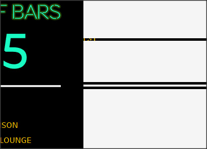
Font - Since we all know that Tableau Public doesn’t like “Weird Fonts”, I ended up having to make the text I ended up using (a downloaded “Neon Sign” font) into png files that would be added as floating pictures. I did this in PowerPoint (one of my Tableau Toolbelt tools!) because it was the quickest way to accomplish the task.

And that’s pretty much it! I don’t know what the other Iron Viz contestants will end up coming up with (awesome stuff most likely) , but I hope that people at least have a little fun playing with the Austin Pub Crawler (Public Link) and maybe even get to use it at the conference! Good luck contestants, see you in Austin!
Dustin
3 notes
·
View notes