
Don't wanna be here? Send us removal request.
Statistics
We looked inside some of the posts by dustydata and here's what we found interesting.
Average Info
Notes Per Post
16
Likes Per Post
13
Reblog Per Post
3
Reply Per Post
0
Time Between Posts
1 month
Number of Posts By Type
Text
17
Last Seen Tumblr Blogs


Fun Fact
Tumblr Inc. is using 66 technologies for its website.
Text
My Tableau Story
Everyone who has used Tableau has one thing in common - they have a Tableau Story! I’ve told my story in bits and pieces to alot of people over the past 4 years, but I think it’s time to bring it all together.
Phase 1: The Dark Years (Pre-Tableau)

I graduated from Bryant University (go bulldogs!) in May of 2009. For you Millennials (yeah I know i’m technically one too) who were born in the 90s/00s, this was pretty much the absolute worst time to graduate. The economy had just crashed HARD and there were not many jobs out there. Luckily, I ended up landing a job shortly after graduation at a company called FGX (think Foster Grant Reading Glasses) where I had various roles. Mainly, I was learning how to analyze data with Excel (and some fun green screen programs!). The tools were OK, but I definitely didn’t love my job yet.

After a couple years I made the switch to go to a big company, hello Staples! The corporate office for the $25B company was only 45 minutes from me and I was very excited to be a “real” analyst. During my 4 years at Staples I became proficient in excel, sql server, and a new program called Think-Cell. Think-Cell was a tool that my group acquired after a stint using the Boston Consulting Group. At the time, it was AMAZING - cool visuals that could be brought into powerpoint and updated on the fly in excel (I know, crazy right?). This was the first time that I was really EXCITED to do something at work. Combined with learning how to create kick-ass powerpoints, using tools to visually represent data was my “thing”.

After 3.5 years of doing bid analytics, contract negotiation support, and other analytics in excel and PowerPoint (and complaining about it) my wife let me know that I should try something else called Tableau. She had been using it at her company, Bose, for the past few years and really liked it. So, being the smart husband that I am (always try something if your wife tells you guys), I downloaded the trial for Tableau. It’s hard to put into words what my first thoughts were other than “HOLY SHIT this is AMAZING and I literally CAN’T use anything else than this!”. The main selling points for me were:
1) I can connect to a butt-load (technical term) of data with this
2) It will automatically update my work
3) It’s SO PRETTY
For reference, below is an image of my first public dashboard - I leave it on my Tableau Public page as a reminder to where I started with the tool.

New analysts today who are given Tableau right away REALLY don’t understand the anguish and sadness that comes with pulling and populating the SAME REPORT for years on end every single week. It’s mind-numbing work that does not inspire you to get up in the morning every day. Seeing a way out of this day-to-day monotony was LIFE-ALTERING for me - I knew that whatever I did, I had to have this program for my sanity alone.
Phase 2: The Great Escape

So, I knew what I had to do - but HOW to do it? My first idea was to go to my boss and ask for the money to buy Tableau for me. The answer was NO. It’s not that she didn’t see the value in my protoype dashboards, it’s just that Staples is NOTORIOUSLY CHEAP. They literally track / limit how much you could PRINT at work. This is a company that 50% of their business is INK and PAPER! She did say that if I convinced the merchants (our analytic customers inside the company) to buy the tool, that I could get it. So I went to the merchants and sold the dashboards - to the tune of $10,000 for licenses for the whole team!
Of course, it wasn’t that easy - my boss said that I should talk to the BI group before doing anything. So, I talked to the group and they of course said NO. Their reasoning was that they were investigating tools for Self-Service analytics (including Tableau) and that they didn’t want us buying Tableau until they made a decision. Now, if you haven’t worked in a big company before this might have been encouraging news, but with my experience at Staples I knew that this meant AT BEST I had a 50/50 shot of getting Tableau in the next YEAR.
So, I did what anyone else would do ------ I QUIT!

Yep, it seems a bit radical from the outside looking in, but for the first time in a long time I KNEW what I wanted to do. Of course, I didn’t quit without another job - I had interviewed (using my public Tableau portfolio) and landed a new gig as a Tableau Developer at EMC! It really was a dream come true that I got a job doing Tableau (especially after not really having any production-level experience using the tool other than POCs). During the first 9 months at EMC I learned a TON about Tableau, Tableau Server, databases, and a host of other things. It was a great experience for me and I really enjoyed using a tool that truly allowed me to be an analyst.
But that’s not the end of the story.....
3) Return of the (Tableau) Jedi

It’s funny, you never know what life is going to come at you with --- you think that each day will be pretty much the same with only little variation. Well, on a random Friday in December I got an email that would again change the course of my career. It turns out that Staples HAD gotten Tableau, and they needed someone to LEAD the Tableau deployment at the ENTIRE COMPANY. A recruiter had reached out saying that some of the BI team leaders wanted to talk to me about the role.
ARE......YOU.....SERIOUS?
So after winging it with some proof of concepts and semi-faking my way into a Tableau role at EMC after losing hope in Staples --- I had the chance to be the leader of Tableau at Staples! Sign me up baby :)
I took the interview and within a month had returned to my familiar Staples stomping grounds. It’s amazing the looks you get when you go back to a company. Right out of the gate I started implementing what would come to be the Staples Tableau community. It included a web portal, Tableau Doctor sessions, Tableau Days, competitions, usage dashboards, user groups, and much more. It was flat-out AMAZING being Tableau lead - I saw so much data, met so many great people, and learned a ton!
4) Going Pro

While at Staples (the 2nd time) I became involved in the Tableau community outside of the company. I built my blog, made a ton for my Tableau Public, started teaching Tableau at Bryant University, competed in Tableau competitions, and learned from Zen Masters. While doing this two thoughts kept coming back to into my head
1) I’m good at Tableau - I wonder what the “next level” is for this role?
2) I’ve done alot at Staples - what else can I do?
Those two questions were answered one day as I had lunch with a friend I met while I was on the Tableau team at EMC. Ron was embedded on my team and had helped us develop our databases and Tableau dashboards. It also turned out that he had his own data & analytics consulting company called Cleartelligence. Ron and I chatted about my work at Staples and what Cleartelligence was doing. I mentioned that it was going well, but the recent Staples/Office Depot merger had been blocked - which left Staples future in question and me wondering what my next step would be.
Then Ron said - “Well, we would hire you right now.”

Me, a consultant? I dunno....sounds scary to “Go Pro”. Ron did his best to convince me that I would be a great fit with consulting and he said to think about it and meet the rest of the team. About a week later I met with Ron, Joe, and Anil - the 3 founders of Cleartelligence. My primary concern was quality of life and time spent with my son. They were very accommodating and assured me that Cleartelligence was a “different” consulting firm that worked hard to keep people at good accounts with great work-life balance.
After receiving an offer from the team I discussed with my wife for over a week what it would mean to make such a big change. In the end, we figured that if I was going to try consulting, it makes sense to try at a small company first. It was hard to leave Staples (again), but I had rode the Tableau rocket to this point - why not take it all the way?
Fast-forward two years later and I know that I made the best decision of my career. I’ve presented across the country, met with countless executives, built an amazing company, come to new heights in the Tableau community, and expanded my depth of knowledge more than I thought I could.
It’s funny thinking back that this all started with one little trial download at the recommendation of my wife - just goes to show that life isn’t predictable and if you get an opportunity to try something new, don’t turn it away!
Dustin
4 notes
·
View notes
Text
Why I’m Not a Zen Master
Over the past 4 years I’ve had an incredible run with Tableau and Data Analytics in general. I’ve seen inside some of the biggest/most influential companies and worked on some truly amazing projects with awesome people. One of my goals in becoming a Tableau developer was to become a Zen Master - the highest rank you can achieve in the Tableau world. I knew that becoming a Zen Master was not going to be a cake-walk, it would take dedication, excellence, and to be honest - exposure in the Tableau community.
So, I did everything I could to achieve that goal - I blogged, I posted, I tweeted, I built some of my best visualizations purely for the public! I came within inches of being an Iron Viz finalist and won a free trip to the Tableau conference for some of my work. I taught Tableau to college students, built Tableau communities in Billion+ companies and ran competitions to challenge the community as a whole. I spoke at user groups around the country.
After all of that, I fell short of my goal - even with the support of the community I had built, the many recommendations from co-workers and the public. Honestly, it crushed me a bit that I just couldn’t make it into that inner circle. I saw those who made it in and I KNEW that I just hadn’t done as much as them for the Tableau community and that was a hard pill for me to swallow.
But why hadn’t I done more?
In April of 2015 my son Callum was born. It was an event that changed my life (and my wife Becca’s) forever. You can only understand this after having a child, but the second that person is brought into the world you are no longer the center of your life - you will FOREVER be number 2 or 3 in priority and you know what --- that is fine with you. You are responsible for every aspect of that little person’s life and everything you do is to try and make that life even a little bit better.
It was then that I instituted a new rule that I follow religiously to this day. If you know me, you know if I have one thing its willpower. Consistency in my food, workout, sleep, and free time are a staple of my personality. So, when my priorities reorganized in a split second to focus on my son, I knew what my number 1 rule was.
I will not work during, be away from, or be distracted by other things while my son is awake and with me.
Obviously, exceptions to this apply in the case of normal work hours and daycare, but otherwise this is the fundamental philosophy I run by. I do this because I know that nothing is as important as time with my son - not my career, not my friends, not even time alone with my wife. We have used a baby-sitter 3 times in the 2.5 years of my son’s life. I have been away for 10 nights (mostly the Tableau conferences) and my wife has been away for 4 total. Friendships have suffered, family birthday parties have been missed, and date-nights out of the house (3 of them in 2 years) are more than scarce.
My normal work-week schedule is the following:
Wake-up/Shower 5:15am - 5:45am
Get up/Dress Callum 5:45pm - 6:10am
Make Cal’s Breakfast/Lunch 6:10am - 6:40am
Drop Cal at Daycare w/ Becca 7:00am
Work 7:40am - 4:00pm
Make Dinner: 4:45pm - 5:15pm
Dinner w/ Becca and Callum: 5:15pm - 5:45pm
Playtime/Bathtime: 5:45pm - 7:00pm
Put Cal to Bed 7:00pm - 7:30pm
Work (Most Nights) 7:30pm - 10:30pm
On weekends I work most nights as well and don’t work during the day while Cal is awake (I work during his lunchtime nap most days).
So as you can probably tell, I work alot, but I leave work every single day at 4:00pm to make sure i’m home for dinner with Cal and Becca. Cleartelligence is run by some really amazing people who allow me to flex my schedule to fit my “Callum Rule”. It was actually my highest priority when looking for a new job in this order:
1) If at all possible, work will not impact my time with Callum
2) I have a job I like and is fulfilling
3) It pays what I deserve
I can honestly say that I said the words “I will quit if work impacts my time with my family (obviously explaining that I would tell them if it was and would look to remedy that. If it could not be remedied, then that would be the result)”.
So what does all this have to do with me NOT being a Zen Master? Well, as you can probably tell, my work schedule is very busy - I am constantly pushing myself to grow Cleartelligence and grow my abilities. Working at Cleartelligence is incredibly fulfilling and the people there really care about you. As part of my role I’ve tried to fulfill the Zen Master dream for the company and myself.
In the end, I’m not willing to sacrifice time with my son and I’m not willing to sacrifice potential growth for the company and success for my friends and co-workers for a Zen Master status. I don’t blame the Zens out there and I’m not saying they haven’t worked their assess off either. I don’t judge other people for what they do and I’m amazed at what they have done for the community. In the end, time is the most finite resource in the world and I just don’t have enough to have that part of my professional life fulfilled, and that’s OK.
I’ll be going to TC17 in a few days (for 2.5 days....taking a red-eye back on Wednesday night so I don’t miss another day more than I have to with Callum). I look forward to seeing everyone and being part of the Tableau community; I just know that I’m not leading that community anytime soon, but I’ll do what I can to help!
Dustin
1 note
·
View note
Text
Directing Darwin - 2017 Iron Viz Feeder 2
It’s been a while since I last posted, but i couldn’t say no to another shot at the Iron Viz competition! The second feeder of this year had a plant or animal theme. I really like having themes that are not centered around new functionality related to data sources. Specifically, the shapefile challenge last feeder was EXTREMELY difficult to find good data to utilize. Not to say that finding data this time was easy (data is always always the hardest thing in these competitions), but I was pleased to have such a broad topic to choose from.
1) Find the Data
I went through various ideas for this feeder including the below:
- Coral Reefs
- BP Oil Spill
- Mythical Creatures
- Deforestation
- Migration Patterns
- Darwin, Mendel, Pavlov
Eventually, I settled on a story that i had seen on an online video once before. One of the keys to winning an iron viz is the story. I know that the judging says that its only worth 25%, but in my opinion its closer to 70%. Reason being, when someone is interacting with your viz, they don’t want to have to figure out why they should pay attention. Just like a good book or movie, the story should grab you immediately so you CAN’T look away!

Taking the logic above into account, I chose the topic of the Russian Fox-Farm experiment. The 2 minute version is that during the late 50′s a Russian scientist started a study to determine if and how domestication could be influenced by selective breeding specifically tailored towards “tameness” traits. After 50 years the experiment had yielded almost completely domesticated animals which closely resembled dogs in personality and visual traits.

2) The Build
For the build I knew that I wanted to have a dashboard that was long and scrolling. Honestly, one of the main reasons for this was because I knew that I would have so much content that it would be incredibly hard to pack it into anything besides a 4000 pixel long dashboard! After some tinkering I figured that my dashboard would be split into two main pieces. The first section would be dedicated to explaining what domestication was and which animals were domesticated. The data around the fox experiment itself was fairly sparse and I felt that having more robust data to investigate would be great for background info and functionality

I wanted to keep the visuals very clean for this dashboard and kept the colors to 3 (yeah three colors) for the entirety of the dashboard. It’s the least amount of color variation i’ve used in a dashboard, but I tend to get lost in dashboards that have too much color and I really wanted to direct users’ attention to the most important pieces of the viz!

The middle of the dashboard is the most dynamic functionality-wise. It breaks down the taxonomy groups of animals who are either fully domesticated or semi-domesticated. The user has the ability to click into each portion of the treemap (sized by number of animals) and it will impact the full listing of animals (in timeline form) on the bottom left. This listing will change the picture displayed by hovering over the line. When you hover over the box to the right it will give you more information including why the animals were domesticated and where they come from.
The meat of the story comes from the Fox Timeline which has points running through the last 50 years of the experiment. The key point of design here was the double helix. This took me a little bit to determine how I was going to accomplish it, but in the end it wasn’t too bad! The basic steps were:
1- Find png of double helix
2- Stack them together in powerpoint, save as image
3- Import as background image, annotate points, save coordinates in excel
4- Map points background shape

The timeline continues and gives various details about the fox farm experiment. I tried to vary between charts and visuals to keep the reader entertained without “mathing” them to death.
The final visually interactive piece of the dashboard is the diagrams of the foxes. Obviously, everyone interested in the story to this point wanted to see what the foxes looked like after domestication. I found some really great drawings online of what the foxes looked like before and after the study and it was stunning. You can really see the transformation into a dog-like fox! Originally, I thought about having traditional bubbles to annotate the visuals, but in the theme of keeping it simple, I kept the icons as simple shapes with tool tips that give further detail.

The final touch was a conclusion paragraph to wrap everything up! All and all, I feel really good about what I created and I hope its an interesting story that everyone can gain some insight from!
Best of luck Iron Viz competitors! (especially my wife who is competing for the first time in this feeder!!!)
5 notes
·
View notes
Text
Chasing the Sun
It’s that time of year again! The first 2017 Iron Viz feeder has been declared and the theme is.....Shape Files! Wait....what the heck is a shape file? If you want a technical definition - “ A shapefile is a simple, nontopological format for storing the geometric location and attribute information of geographic features. Geographic features in a shapefile can be represented by points, lines, or polygons (areas). “
For those non-technical people (like me), it’s an easy way to bring amazing custom geographic shapes into Tableau and with 10.2, it’s as easy as click, drag, map! Like many of my dashboards the first step in my process was finding the right data set to build off of.
1) Find the Data
The was by far the HARDEST iron viz in terms of finding the correct data set. Shape files aren’t too hard to find, but there were two major complications for me when searching. First, most of the shape files out there weren’t super inspiring....just dots on a map or a partial file that didn’t really tell a story. Second, alot of the cool shape files were “multilinestring” which is not compatible with Tableau (yet). So after 50 (YES 50) shape files and 20+ hours of searching I found my shape file and my dashboard topic!
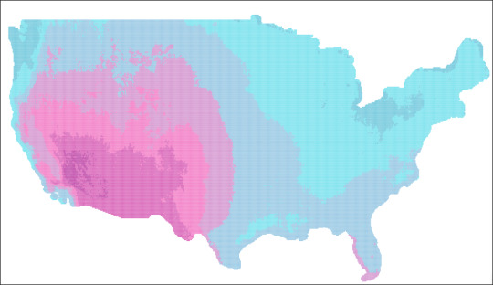
The shape file I found showed a really cool grid map of the US and it’s daily solar energy potential (from data.gov) This ended up being 100,000 marks of data with cuts at the annual and monthly level. Once I had this file, I knew that I would need more data to support my theme (why solar is the future), so I scoured the internet and found 6 other supporting data sets with information ranging from timelines, cost, incentives, fossil fuels, etc! One of the most helpful sites I found was OpenEI. Needless to say, this site was chocked full of super cool green data sets (I will definitely be using it in the future!
2) The Build
The build of this dashboard probably took me about 40 hours in total. A lot of that time was spent on formatting and deciding how to organize everything into a story that could inspire readers. The first chart I made was the map - I mean I’m a sucker for a good map and I knew that the shape file I found would make something pretty interesting. One thing I did do was make the color of my map POP. Typically heatmaps are a green to brown type of spectrum, but I wanted to get the “electric” feel out of my palette so I went with Neon blue to Fuchsia!
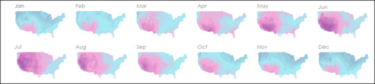
I also made a parameter which changed out the main map to look at annual or any month in detail. I thought this would allow for maximum flexibility on the part of the end user. In addition to the main map, I wanted to have a quick “at a glance” view of the whole year. To save performance time I took images of each month, shrunk them down and lined them up directly under the map. This worked as a trend chart that would help you pick which month to look at in detail.
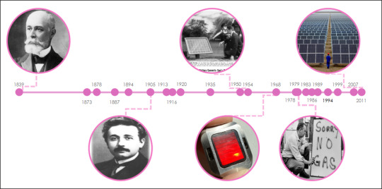
Next, I wanted to give some background to the history of solar cell development. I hoping that like myself, most people would be interested to see how far we’ve come! I learned some really cool stuff making this chart, including the fact that Einstein actually had a hand in solar history! The data was a simple timeline, but I tried to spice it up with bubble images of some of the major events.
Next, I wanted to show the reader where we are now - I mean how many people actually know what % of solar energy is transferred into usable energy? Personally, I wanted to know if my solar panels were any good (I have solar city / Tesla panels on my roof and have a Tesla Model 3 on order - yeah you could say i’m invested in this topic :) ).

The solar cells were split into 3 major types and I was able to find some market share data for 2015. The left portion is a stacked bar and the right is a combination of images, text boxes and lines. I kept everything fairly simple and made the efficiency number a focal point for the viz.
After showing where we came from and where we were with technology, I wanted to dive into what most people discount about solar (without knowing all the facts) --- Cost. Honestly, I have solar panels and I didn’t know how much they cost (I did the “free” solar option, where I pay solar city a fixed cost for energy and get panels for free).
This had to be the biggest “Holy CRAP” moment of all the charts I’ve ever made. Now, its not the most ground-breaking area chart technically speaking, but it definitely told a STORY!
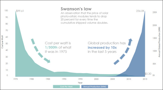
Man, I could not believe the amazing drop in cost paired with the huge increase in production that has taken place over the last 40 years. People have to take notice of this phenomenon - numbers don’t lie!
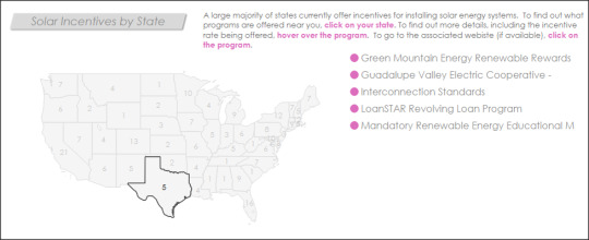
Related to cost, but even more relevant for most people are Solar incentives. Incentives are local/government backed breaks that enable people to go green for a more comparable cost to traditional energy (I will clearly taking full advantage of the $7,500 federal rebate for my first electric car this year!).
The data I found was a collection of incentive programs by state, complete with links to the actual incentive websites! I decided to go with a simple map, paired with action filter that would show the incentive list when clicked. For more detail you could click on the incentive and be taken directly to the site in question!
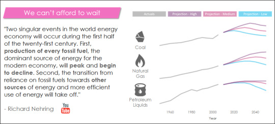
The final piece of my dashboard was one of the most telling pieces of information regarding alternative energy. I actually ended up reading / watching several videos from oil industry conferences (yeah I know, fun stuff!) to get perspective from fossil fuel experts (the other side of the aisle as it were). One paper I found was by Richard Nehring, a 40+ year oil industry analyst. To my surprise he said something I wasn’t expecting - Oil and other fossil fuels were running out! WOW, I really didn’t see that coming. Better yet, he had projections for coal, oil, and natural gas which all said the same thing - fossil fuels WILL PEAK and alternatives like SOLAR were necessary to support the world’s energy needs. If a hardline oil industry analyst agrees with solar experts, you can’t help but take notice.
Overall, I tried to convey a few things with this dashboard
First - Solar is a real technology that has the potential to solve our energy needs
Second - The economics line up, it’s getting cheaper and more accessible for all
Third - We can’t wait, fossil fuels aren’t unlimited and we need to act
I hope that people enjoy this dashboard and take the message it portrays to heart. Thank you Tableau for providing an excellent feeder for Iron Viz, I had a blast making this viz!
Dashboard Link
Dustin
0 notes
Text
Dam.Nation
In February 2017, the Oroville Dam spillway failure caused the evacuation of nearly 200,000 people and between $100M - $200M worth of infrastructure damage. This was my inspiration for my next dashboard, being a dad and a homeowner (and living near dams); I wanted to know if there was any potential risks posed by dams near my family.
My Process
1) Find the data
As always, the hardest part by far (usually) is finding relevant data needed to create what you have dreamed up in your mind. The first spot I thought of was data.gov, as it is always a handy resource for federal/state level infrastructure data. After not too long (wow that’s a first!) I found a good data set!

BUT, I saw that this data was in a shapefile, which (at the time, just before the 10.2 release) could not be directly imported into Tableau. Not to be deterred, I went to the google machine to figure it out. What I found was a new tool that I would add to my handy “Tableau Toolkit” called QGIS. QGIS, tuns out, is a free open source GIS tool that can do all sorts of neat geo-spatial editing. What I ended up needing it for in this case was to push the shape file out as a .CSV.

To convert the file, I followed the steps outlined HERE on the 10.1 help site. Like I mentioned before, 10.2 makes this process easier BUT Qgis is still an excellent tool and 10.2 hasn’t solved for multiline shapefiles as of now (so basically you should still learn this tool).

Once the data was exported to CSV I took a look at it to get my bearings. It looks relatively simple with data like dam height, year built, etc. There were some codes that I didn’t recognize however, like hazard level. For this I went online again and found a useful resource on the FEMA website which listed out hazard levels and a few other missing pieces which I needed detail / alias names for. (LINK)

2) Dashboard Design
Finally, I started my dashboard design! I knew from the beginning that I wanted this dashboard to be BIG! There was so much information and so many ways that I could go with this data set that I wanted as much room as possible to work on this. I maxed out the dashboard height at 4000px first because Tableau is not so great at expanding dashboard size and leaving things in the same place as they were originally.
The first chart I made was the main map, as I knew this would be the centerpiece of the dashboard and the first thing that people would see/interact with. Hazard potential would end up being the key driver of the entire dashboard - impacting the theme, color scheme, and tone.

I decided to go with three main colors for the dashboard (relating back to the 3 hazard potential levels) and to make them pop I went with a dark dashboard (something I haven’t done in quite some time). For bubble size I went with “storage level”, which is measured in something called “Acre-Feet”. I had no idea what this was initially, but it turns out (thanks to wikipedia) that this is the amount of water to cover 1 acre of land in one foot of water (approx 326,000 gallons!). Actually, I ended up needing to throttle bubble size due to the dam at Lake Superior which had 9.7 BILLION Acre-Feet of storage (just an FYI, thats 3.1 TRILLION gallons of water). I made the cutoff 50M Acre-Feet, which looked good visually.
The next piece was a snappy title, which is hard to do in Tableau due to the limited amount of fonts available on Tableau Public’s servers. I turned to my trusty PowerPoint method of creating the text and saving it as a PNG to bring the title to life. Of course, I had to make a pun of the title (it was too much to resist!) and went with “Dam.Nation”.

Since there was so much data that I wanted to show, I decided to break the dashboard up using grey borders with titles such as “How Old?” for the dam age section and “What Type?” for the section detailing different dam types. This helped give the dashboard an infographic type feel.


After completing most of the pieces, I still felt like I was missing a “wow” piece of functionality on the dashboard. What I personally wanted to know was “which dams around me pose the greatest risk?”. Now, this can be seen by zooming into your location on the map, but it was hard for me to tell just how many people were around the dam that could be impacted. So, I went through the Tableau forums to find a “radius” formula that I had seen before. There were a few different posts on this, but the easiest to replicate was from Zen Master Josh Milligan (LINK). His instructions were easy to follow and I quickly had a base for what I needed.

The next piece was finding population data and blending it into my visualization. I eventually found census data which had population by zip, which I unioned with the lat/lons of my dams. I added a Type to be able to filter out Dams on the zip portion of the map.

From here I created my view, which honestly took a bit of time and finagling. After a few tries, I got the blends to work right - turns out I had to bring the zip data in as fake dams in my other data set in order for this to cooperate correctly :).

The last piece was to only have this map show up when I wanted it to. I used the old “parameter hiding” trick and made an image in powerpoint to overlay on the dashboard, which doubled as instructions for the map!

And that was that! Phew....this dashboard did take some time to develop, but I think the end product turned out pretty well. Check out the dashboard on my profile for more details and feel free to download it to see how everything ticks!
Dashboard Link

Dustin
0 notes
Text
3 Things They Never Told You In College
It’s that time of year again! Well, actually it’s that time of year 3 times a year - when I go back to my alma mater, Bryant University, to teach students about Tableau and what working in the real world is actually like :). I’ve been doing this for a few years now, after partnering up with Richard Glass and the Applied Analytics team at Bryant and it’s one of the most satisfying things I’ve ever done. On the surface I’m there to teach Tableau because, well, I’m pretty good at it. But, really beyond that I try to convey to the students what they need to do to be successful and actually enjoy their jobs.
So, for all those other people (excluding the 70 students I taught this semester) here are my top 3 things they never told you in college :) (but you should know).
1) 95% of your classes aren’t useful in the real world

Yeah, I know that this kinda undermines me spending a butt-load of money to attend a private business university, but its true. Honestly, the only classes that helped me after getting in the working world were:
English
- You wouldn’t believe how many people cannot construct a proper business email. I’m not saying I’m perfect, but command of the English language is 100% more valuable than being able to code. If you can’t communicate, you won’t have a job.
Computer Information Systems
- Believe it or not, I wasn’t a computer major - I was a management major! Yeah, a bit of a career change there, but CIS was literally the most valuable class that I took in college. I didn’t realize it at the time, but learning excel and PowerPoint really well put me light-years ahead of other people starting out. I looked like a boy-wonder because I could do vlookups and pivot tables at my first job!
Sociology
- Who says liberal arts are useless in the business world? Actually this class has nothing to do with what my career is, BUT it did help me force myself to be able to argue my point in a coherent and non-abrasive way. You will use persuasion in all facets of your career, including negotiating your salary, signing a deal, deciding on strategy, presentations, etc.
2) Networking, yeah it really is important

Yup, never thought I would be saying this, but networking is 50% of getting a good job and moving up the chains. The other 50%....that’s my next bullet point. I HATED networking in college and that is probably why I didn’t have a job when I graduated. As soon as I stopped being an introvert at work (I still am other places) my career took a huge turn for the better. When I present at Bryant and other colleges I give everyone my contact info and literally say “Network with me, I will get you a job somewhere somehow at some point, DO IT”. Still, probably only 5% of the students take me up on this offer. I know its annoying to do, but what’s the worst that happens, probably that I forget to email you back? To give you an example of what the other 95% of the students missed out on, just by not networking with me - I am likely going to hire one intern and directed two other students to internships at companies that I have connections with and all they had to do was email me. That little email could set in motion your entire career path.
3) Be AWESOME at Something, not ok at alot of stuff

If there is one thing I want to shake into the students (see what I did there?), it’s that people don’t want generalists. They might advertise that they want people with experience in a - z on their job post, but what they really want is a frickin ROCKSTAR, they just don’t know it. Here’s a real life example. When I was interviewing for Tableau jobs in the area I knew that I had to set myself apart. Everyone else had certifications, long resumes, and long winded answers to behavioral interview questions. I wanted to be different, so in my interview I brought a printed (yeah printed!) and bound portfolio of my Tableau work. When the interviewer asked what experience I had with building dashboards / analytics, I pushed the portfolio across the table quietly and said “here’s my work”. Like a photographer, a visual analytics professional is just like all other visual analytics professionals unless you SHOW what you can do. The next day I had an offer letter in my email. Later I learned that I was the ONLY one who had shown actual work and that they had gone through dozens of applicants prior to myself.
Truthfully, you need to be DIFFERENT to stand out!
So those are my words of wisdom guys. And just like my Bryant Students, if any of you want to network, just hit me up! :)
Dustin
0 notes
Text
I Solemnly Swear that I am up to no Good (in Tableau)!
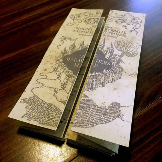
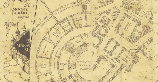
Recently I’ve been watching a Netflix show called “The Magicians”. In a few words, its basically grown-up realish-life Harry Potter. So far its a good show, but what’s my point in telling you? Basically, my mind tends to wander and make connections based on the show I’m watching, actually about half of my dashboards on Tableau Public are related in some way to a show that I’ve watched. Anyway.....this show got me thinking about Harry Potter, one of my favorite book series. One of the things I always really liked about Harry Potter was the idea of the Marauder’s Map. The MM is a map of Hogwarts (Harry’s School) that shows the location of everyone on school grounds. Below is what the map looks like folded up.
I thought, “how cool would it be to make a marauder’s map in Tableau!”. So, I decided to make it :).
Step 1 - Find the Map
This actually turned out to be pretty easy. A quick google search for “Marauder’s Map Printable” and I found an instructable site that had all of the images I needed. (http://www.instructables.com/id/Marauders-Map-1/) I downloaded the pack of images and decided which one(s) I wanted to use (since I wouldn’t be doing the whole map.....you know time constraints with kids and such).

I decided to go with page 1, since it had alot of detail and part of the opening flap visible.
Step 2 - Import the Background Image
This part, if you’ve been around Tableau more than a few months, you probably already know how to do. Basically, I made a new sheet in Tableau, selected Map-background image, pulled my picture in, and set some fake coordinates. Then I pulled my X and Y fields (from my dummy excel sheet - i’ll show you more of that in a minute) onto columns and rows. And BAM! I have a sheet with the map in Tableau!

Step 3 - Design the Data
So one of the keys to the Marauder’s Map, and the cool part that i wanted to do in Tableau, are the little disappearing footprints that show where the individual is located on the map. To get this to work in Tableau, I knew I would need to use the pages function, even though it would have some limitations on server. So I knew what I wanted, there was just one problem...I didn’t have any data!? My next step was to create that data by annotating points on my map. This is easy (if not tedious) in Tableau, just right click and choose “annotate>point”. This will give you nice x,y coordinates that you can jot down. Now i made my grid go from 1-100, but you could use whatever you want!

Ok, so I plotted all my points and then got to work designing my data structure. I knew I wanted to have at least two people walking around, so I would need a Name column. I would need to order the steps - so that they showed up one after another when i hit play. Also, I would plug in the x,y coordinates to place my footstep icons.

The hardest part of all of this would be those icons, because not only did they need a position (x,y) but they also would need a rotation angle. This is because the footprints would need to point in the direction that the individual was walking. To accomplish this, I downloaded one footprint png, duplicated it 11 times, and rotated it to the angles of a clock. By doing this, I created 12 individual icons that could be loaded into the custom shapes folder in Tableau, which would be determined by the rotation number in the associated data set.

And so, I pulled in my data, put rotation on shape (assigning my feet appropriately), put the name on label (similar to the map in the HP movies) and put my order on pages!

And viola! Below is an anmiated GIF of the pages in action. It shows Harry and Snape walking around Hogwarts, with their feet fading behind them.
One final addition, in a nod to the book, is how you open the Marauder’s Map. You essentially need to tap the map and say “I solemnly swear that I am up to no good”. I translated this into Tableau by adding a filter action right below the title, that when clicked on, brings you to the main map!

And that is it! I think it came out pretty well and it didn’t take me all that long. I’m sure this can be expanded upon in the future, and I HOPE Tableau adds full pages functionality to server soon - that would make this all the more amazing!
Dashboard Link
:) Happy Vizzing Guys
2 notes
·
View notes
Text
Oh Tableau 10.2, you autosaved me :)
Normally I don’t write about upgrades for Tableau unless they are full version upgrades, you know - the big ones. Well....10.2 is a different beast. Below are my favorite features!
AUTOSAVE - This Changes EVERYTHING
Holy Crap! Seriously, I think I’ve thought about this feature being added every day I used Tableau for the past 4 years. Finally, it’s here! I downloaded the beta, saved a file....and immediately began beating it to death with table calcs, massive grids, etc - you know, the stuff that usually destroys your workbook :). It took a little bit to break it, but I did and I got a new window that came up with my auto-recovered workbook, just like excel or word!!! :)

LEGENDS PER MEASURE
Ok, so I call this one “Conditional Formatting”, but whatever it is, its great. I can’t tell you how many times I’ve had to implement the whole “ok we need to make fake bar charts and layer the actual values over the bars to get conditional formatting by column” solution. This is going to make life soooo much easier!

Yep it works!

JOIN CALCULATIONS
So this one I probably won’t use AS much as the first two, BUT it’s going to save me alot of valuable time where I won’t have to go in and fix the underlying data before I do my joins in Tableau. Essentially, this tool allows you to “create” fields using the same calculation methodology you use in any workbook but they can be used up front for the join. I tested it out with a very basic test, but it works!

And here’s my “formula” :)

There are so many other great updates in this new version, but these three jumped out at me as the most useful to my immediate needs / current annoyances! :) Keep it going Tableau (still waiting for sheets in tooltips!!!!)
Dustin
0 notes
Text
Charts IRL
Hey Peeps! I’m back after a bit of time off the blog scene. It’s been a crazy few weeks since the conference and between work, family, and getting the flu/pink eye (see family...) I didn’t have a whole lot of time to put pen to paper....er mouse to tableau? Anyway, I was thinking alot about what I wanted to do next with this blog. I wanted to start up a new series for 2017 that would be:
- Interesting
- Not SUPER time consuming (see work / family)
- Let me do some fun stuff in Tableau and learn a little
So, with that in mind and after a few of my patented “shower idea sessions” I came up with “Charts In Real Life”. I changed it to Charts IRL to be hip/cool with the kids nowadays :). There are only a few rules to this new project:
1) Each Charts IRL needs to be inspired by something I see IRL (in real life)
2) The dashboard work itself can’t take me more than 1 hour
3) The data doesn’t have to be super clean, just something that works
and that’s pretty much it! Let’s dive into the first CIRL!
Charts IRL 1
Inspiration - Actually the first Charts IRL came directly from my shower session. I stepped out of the shower one day and was like “wow, that would be a sweet Tableau color palette” - HA “what a nerd!” I thought....but seriously, nice colors - check it out below.

So with that I started. The first thing I did was pull the colors, which I did with my handy dandy PowerPoint picker skills (yeah, I know Tableau has a picker, but I do a bunch of stuff in PP, so I figured why not).
These are the ones I came up with, of course with pictures there are a lot of different colors that can come up, but i went with ones that made sense saturation-wise.

Next, I wanted something to pull some data off of, so I figured “why don’t I just see where these things were made?”

OK - looks like my 3 towels were made in 3 different countries! Awesome, that will work well with my new color palette! Pink - Turkey, Mustard - Pakistan, Blue - India.
Interwebs - The next thing I did was was about 25 minutes trying to find textile import data with historical records....yeah apparently not super easy to find without paying for it, so I ended up defaulting to GDP data and some high level import/export stats from this site https://ustr.gov/countries-regions (the government!)
Next up, the dashboard! With only about an hour to do this (really was on a time clock here - Cal went down for his mid-day nap and it felt like I was 10 again playing PERFECTION, trying to get everything in the right spot before it popped off the board!
Nostalgia pic

Dashboard
I split my dashboard into 3 main bars
Bar 1 - Listing the 3 countries out with the images of my towel tags and some detail on import/exports. This was achieved with a horizontal container and some text boxes
Bar 2 - Floating image of my towels overlaid on a map. I made some sweet chevron arrow lines in powerpoint and floated them over the map to make it a little more interesting and layered in some gdp data in the tooltips of the map. Additionally, I did the trick where you make separate fields for each dimension name (else null) and color them in the tooltip so all the colors matched nicely.
Bar 3 - A parameterized bubble time chart which displayed either GDP % change or GDP dollars. I went with bubbles because they looked neat, pretty much it :). I added the parameter selector in the top right to make it easy to change out.
And that’s it! Nothing too crazy, but a fun way to start connecting real life with Tableau, it’s more fun when I at least semi-care about the data I’m visualizing!

I hope you guys like CIRL, one of the new projects for 2017 that I am starting up! More to come, it’s going to be an awesome year!
https://public.tableau.com/profile/dustiboy21#!/vizhome/ChartsIRL1/ChartsIRL1-Towels
Dustin
0 notes
Text
TC16 - Charts, Bull Riding & Data

Finally, two diametrically opposed forces have met, with their supporters championing their base and vilifying the other....sound familiar? No, I’m not talking about the presidential election, I’m talking about TC16!

Honestly, I’m not sure what Domo was trying to do at TC, but it definitely didn’t make me want to buy Domo. Next time, try handing out free shirts instead of berating me when I walked by, they obviously don’t know that I’m #Tableau4life!
Now that I have that out of the way :), time to talk about what TC16 was really about.
Data
First and foremost, TC is all about the data! The sessions are the cornerstone of the conference content and always provide excellent value. I attended several excellent sessions and won’t list them all out, but my favorite had to be Amanda Pype and Carin Fishel’s “Guerilla Usability for your Dashboards”. It wasn’t a traditional “design your dashboard like this” session, which I thought was great because there are sooooo many of those! In essence, the session really dove into the process of understanding your customer’s needs and how to avoid biases while designing for others! Another fun note was that I met Carin Fishel and got to tell her that her color palette is my favorite!! :)

Networking, Collaboration, and Fun! Honestly, this is one of the best part’s of being at TC - I get to meet up with 13,000 other nerds and geek out for a week! It always has a “revenge of the nerds” feel when I’m there and all of the sudden you....yeah YOU can be the coolest guy in the room! It was a blast to meet new people on the plane, at sessions, on 6th street at bars (and riding mechanical bulls!), and at data night out!
Oh, and the Tableau donuts were spectacular as well!
Keynotes I have to say, the keynotes at this TC were by far the best I’ve seen! Between Christian Chabot, Devs on Stage, Shankar Vedantam (NPR), and Bill Nye it was a really solid turnout that actually delivered value. I feel that often conferences just go for big names without thinking about the participants or the content that would be pertinent to them, but this time was a home run!

That’s my quick update - looking forward to #Vegas next year!
Dustin
0 notes
Text
A/S/L? - Cal’s AOL Themed Word Tracker!
My wife Becca and I are born trackers. We have an excel spreadsheet that auto-plans our grocery list, we tracked all of Callum’s feedings (and I made a dashboard about it - Cal Tracker 5000), so it was only natural that we would track Cal’s words!
The first reason we tracked his words is the most practical - the doctor always asked us how many words Callum could say so he could tell us if that was “normal” for his age. Wanting to know if Cal was a high achiever was obviously priority #1 for tracking his words. The second reason, was that we wanted to remember what words he said and when he said them. We aren’t the best at making baby books or doing all of that - but we cloud backup all our pictures and videos and track the most important stuff!
So, here’s how the creation of the Cal Word Tracker went down.
Step 1 - The Data
Becca had been recording Cal’s words in a notekeeper on her phone as we heard them. Once i decided that i wanted to build a dashboard on this stuff, I made a google sheet with the word, date, and word order #. There were two reasons for this. 1 - we could both enter words into the shared word sheet and 2 - Tableau Public 10 now supports Google Sheet connections that update daily!

Step 2 - The Design
This one took me FOREVER to figure out, mostly because it was such simple data - just a word, a date, and the order it came in. I knew that I wanted it to be different, but I wasn’t sure exactly what that meant. I went through iteration after iteration of running total area chart, sound wave charts, bubbles, etc., all to no avail. Eventually I just started thinking about how I could display text data in a meaningful and fun way. After a week or so of thinking about it on and off, it hit me right in the face (as ideas often do - mostly in the shower)! AOL instant messenger, the most classic way to communicate via text for millennials like me! I mean seriously, how many of you remember talking to your girlfriend on AIM and then a PHONE CALL came in and disconnected your dial up connection! Lives ruined, hearts broken.....and all because of a telemarketer!
Now that I knew what I wanted, I began by scouring the internet for AIM treasures and screenshots. I found animated GIFs, screenshots, and even tapped into AIM itself (that’s right, it STILL exists). It didn’t take me long to close that screen, don’t dig up the past people! Anyway, once I had some neat stuff piled up, I worked out my flow.
Step 3 - The Flow
Dash A - Intro and Start
This page was mostly put together to explain how we record Cal’s words and how the dashboard works. Basically its a “click at will” dashboard where users can investigate what buttons “work”. I PURPOSELY made the dashboard a little clunky, 90′s style, and (oh god) used Times New Roman - all in the name of authenticity and nostalgia! I also included a fun animated GIF from the original AOL startup screen (you can hear the modem noises already!).

Dash B - Old School AIM Login Screen
This brought back memories - good old screennames. If you didn’t know, that’s what my twitter handle actually is “Dustiboy21″ is over 15 years old! Not much else to see here, but the sign on button will take you to the main page!

Dash C - AIM Messenger Box
The meat of the dashboard was made to look like an AIM window with me and Callum talking to each other. I took a screenshot of an old AIM window, layered over our pictures, and made a sheet that looked just like the AIM text did! I also added some buttons that looked like the normal AIM window buttons, but take you to different parts of the dashboard.

Dash D - Buddy Profile
Just for fun, I also made one of those classic “AIM” profiles for Cal, complete with inspirational quotes, an away message and smileys!

Dash E - Charts
Of course, no dashboard would be complete without the charts! I knew that I wanted some charts to go along with the word list in the dashboard, but I wanted them to fit the era of the AIM program. So, I did my research and dug up old screenshots of what excel and powerpoint charts looked like back in the day. All of the colors and chart types are an attempt at being as authentic as possible to the era - excluding normal “best practices” that we typically use.

And that’s it! I really had fun making this dashboard and one day, Cal will see it and be proud (or call me a nerd....probably more likely). Enjoy the nostalgia and the charts!
Dash Link
Keep Vizzing!
Dustin
0 notes
Text
Who’s the Chart Champ?
First off, if I had to describe Chart Champ in one word it would have to be, WOW! We had an amazing turnout of almost 80 people and 8 extremely talented contestants. Everyone brought their A-Game to this event and it showed – everyone in the audience was eagerly anticipating each contestant, and each contestant was seemingly better than the last!
In the spirit of keeping things simple I’ve broken the night down into 4 areas; Rules, Competitors, Judging, and Results.

The Rules
The rules of chart champ were fairly simple – build a one-page dashboard utilizing at least 1 (one) of the provided data sets (Mass Public School Data) and showcase your work in a presentation to our esteemed judges! Winners would receive an Oculus Rift (1st), Amazon Echo (2nd), Galaxy Tablet (3rd).
The Competitors
1st Presenter – Michael Perlis
Mike, an MBA student at Babson, was up first in the contest (lucky him!). His dashboard was designed like a report card you would have given to your parents (sometimes begrudgingly) back in high school. What was really striking about Mike’s dashboard is how effectively it combined regional maps, parameter driven scores, and google map embedding. It was a nice dashboard for sure and our judges only had a few minor critiques.

2nd Presenter – Brian Calvanese
What can I say about Brian? Two things actually – 1) He makes VERY clean dashboards, I mean like eat off the kitchen counter clean and 2) He’s an AWESOME storyteller. Brian had a very well thought out (and presented) story that the judges ate up. His dashboard helped users draw conclusions about metrics that are typically the bread and butter of schooling (teacher performance, teacher student ratios, etc) and helped turn them on their head with some great outlier analysis. His performance was solid and it would be hard to follow him up.

3rd Presenter – Xiaojun Wu
Xiaojun had one of the shorter presentations at Chart Champ, but that’s all he really needed. His dashboard focused on SAT scores and their relationship with both household income and graduation plans. Xiaojun had some good correlations and had a minimalist dashboard that made it easy to hear what he was saying.

4th Presenter – Abe Ahn
Abe, a Business Analyst at Boston Scientific, had a very colorful and I��d add very insightful dashboard. His work clearly focused on income vs. education and provided an easy to use highlight-heavy interface that could quickly call out clusters of under and over performing schools and the correlation to household income. Abe’s presentation was also solid and to the point, which went over well with the judges (and the audience!).

5th Presenter – Jai Singh
Jai’s dashboard was a stunner even before he started talking. It had a sleek chalkboard design (a nod to our school-related data) with a eye-appealing color palette (matched to the pieces of chalk on the board!). After Jai started explaining his work, it really started hitting home that this dashboard was a literal “goldmine”. His crowning feature was a sankey diagram which essentially split out the “golden nugget” outliers of High SAT Score / Least Expensive housing combos. To top it off, he had a snoop dog quote at the end (censored for the audience of course).

6th Presenter – Jason Smith
Jason’s dashboard used the favorite topic (SAT Scores) and combined it with graduate plans. His colorful scatter plots drew the judges and audience in as he showcased the outliers in each of the scenarios. With only 2 years of experience Jason was able to pull together a solid dashboard as well as an insightful presentation.

7th Presenter – Igor Plesca
Igor, a Finance Project Manager at Staples Corporate, took a different approach than anyone else in the competition. Instead of trying to find nuggets of insights in the data, he made his dashboard as utilitarian as possible. His target audience was families, people who wanted to pick where they worked, put in a mile radius, and get a list of schools ranked by the different metrics that interested them. His dashboard was clean – one of the cleanest in the competition and he used color very effectively, being sure to avoid using color for colors sake!

8th Presenter – Brian Halloran
Brian, being a data viz and BI manager, already had street cred before the competition by having some stunners on Tableau Public, but he really gave us a treat in this one! His dashboard was clean, slickly designed, informative, and had RADAR Charts! I mean, who doesn’t LOVE a good radar chart, am I right? Needless to say, Brian did an awesome job knocking the socks off the crowd and the judges with his great work!

The Judging
Once the presentations were complete (they took about 1.5 hours to get through), the judges had to hand in their scores. To expedite the judging process, judges had been given score sheets which they had been filling out while people were presenting. Contestants were scored in 3 main categories
1) Design (40%)
a. Design is always a big part of dashboards. If no one is interested in your work visually, it’s hard to believe that they will gain any insights out of it. Each judge graded the contestants on a 1 – 10 scale, with 10 being the absolute best a contestant could do.
2) Functionality (40%)
a. Prettiness aside, making sure that a dashboard is functionally sound is fundamental to succeeding not only in competitions, but in your day job as well. Just like the Design portion, functionality was also based out of 10.
3) Presentation (20%)
a. Something you don’t typically see in dashboard competitions is a presentation score. Often this is overlooked as being a “soft skill”, but selling your work is sometimes more important than designing well. Presentation was scored 1-10 with a 20% weighting.
Once the judges were done with their scoring sheets, I entered their scores into my master spreadsheet. Prior to the competition, I had built a data feed to a Tableau sheet which would automatically apply the weightings and rank the competitors. After all was said and done, the judging only lasted about 5 minutes!
The Results
While everyone did an amazing job at this year’s inaugural chart champ competition, there were a few standouts who took the prize! Below is a bar chart from my chart champ judging dashboard which lays out the weighted scores and final rankings.


Congrats to Jai, Brian H. and Igor on their wins! It was an unforgettable night and we will be sure to have another competition in 2017!
Special Thanks To
Our Esteemed Judges
- Diana Weldon
- Anthony Chamberas
- Karl Chopelas
- Darren McGurran
Chart Champ MC
- Matt Folgelgren
And last but not least, the Cleartelligence Crew!
0 notes
Text
Austin Pub Crawler
So, the third Iron Viz feeder contest this year was released just a little bit ago and the theme is mobile! Normally, the Iron Viz themes give me something to go on (Food, Wikipedia, Politics, etc.). I think having no defined data theme is probably one of the hardest things when designing a dashboard since you can do a dashboard on literally ANYTHING! Below I’ll explain my Iron Viz process so that you can get a little peek into how my viz’s come together.
1) Figure out a Theme
Instead of trolling the internet for interesting data (like I normally do for these things) I instead tried to think of what would be the most broadly relevant dashboard I could make for Tableau-ers. I went through a bunch of ideas like grocery lists, diapers, sleep, but eventually I settled on something that pretty much most people like - booze! :)

2) Getting the data
With idea in hand, I tried to think how I could make it even more relevant. The first thing that popped into my mind was of course, TC16! My general idea was to get info about bars near the conference center, since the conference is in Austin this year there would be plenty to choose from.
Tax Data
My first (and most important find) was from the Texas Transparency site. This site houses some awesome public government data, including mixed beverage tax receipts for all the bars in Texas!

Once I had the data I looked up the tax rate for alcohol in Texas and found that it was about 6.7%. Dividing by the ratio gave me the approximate revenue of each bar along with info like bar name, address, month, and city.
Map Data
The next thing I needed to do, was geocode everything to get exact points for all of the bars (this was fundamental to the map-heavy dashboard that I had in mind). To do this, I actually used the free Alteryx Public Geocoding tool. It can only process 1000 lines at a time, but its also super quick so processing the files didn’t take very long!

Drive Time Data
Now that I had all of the geocoded addresses, I really wanted to find out the drive time from the convention center to the bars. In doing this, I’d be able to create a “pub crawler” app that would rank bars by drive time! In order to do this, I again turned to Alteryx. If you have the right version of Alteryx with the data package enabled, adding drive time calculations is pretty simple. You basically just need to turn your lat/lon into spatial objects and then use the drive time tool to get your drive times (my workflow below).

Yelp Data
The final piece of the puzzle was Yelp Data. I wanted the pub crawler dashboard to be able to adjust the crawl it presented based on various rankings (distance, drive time, revenue, and reviews). The reviews would need to come from yelp of course, but how to get them? Well, that’s where my handy dandy friend import.io comes in. This is a really neat tool which makes web scraping super easy. Essentially, I just looked up bars in Austin, got the URL from Yelp, trained the tool on the fields I wanted, added 75 url links to my queue (to get all the bars) and viola, data!!!

The yelp data brought in the overall ranking of the bar as well as the price level ($, $$, $$$, $$$$). These would be key to both my crawl path and selectors for the users of the dashboard.
3) Dashboard Time!
Ah, my favorite part, making the visuals! For this dashboard, I knew there was a contingency that the viz had to utilize device designer in order to format the dashboard to a phone. Now, I know there are a bunch of ways to design a phone-friendly dashboard, one of which is super popular right now - long scrolling dashboards. While I like these dashboards, I knew that I 1 - didn’t have time to make a large dashboard and 2) thought people wouldn’t have the attention span for too much data on their phone. With that in mind I essentially went straight for a single view phone “app” which would help you plan your pub crawl while at TC16 with a few interactive and intuitive filtering mechanisms.
Below is what my “Regular” view dashboard ended up looking like.

and here is my “phone friendly” version created with device designer

The dashboard is really only made up of three main parts:
Selectors - These are a combination of action filters and parameters that allow you to adjust different factors of your crawl. These include pricing, drive distance, ranking, and # of bars.
Map - The map visually displays your crawl and dynamically changes based on your selections. The tooltips show detail about each selection and when clicked, reveal a hyperlink to the google maps address of said bar (easy access from your phone).
List - The list shows all the bars in your crawl based on your selectors, simple as that!
Pains in the Butt
I had several things along the way creating this dashboard that just didn’t work quite right or took a longgg time to figure out. These include
Device Designer - Yeah, I like most other people were pretty new to this tool. One limitation with the designer is that in order to use a sheet in the phone view, it has to be in the main view. The main issue with that comes down to sizing - some things made for the big dashboard, just didn’t fit right on the small one. After searching the forums, I found that there was a workaround involving putting the sheets “beyond the canvas” so that they wer available for the second tab, but invisible on the first. I took this method and applied it to several views which had to be modified.
Ranking - Yeah, so ranking definitely took the longest out of any other technical issues with the dashboard. In order to get the dynamic ranks to work I had to make a bunch of calculations, context filters, etc for it to look right. I also had to modify the data to make the convention center look like the #1 choice no matter what you selected (this was important for the crawl to always start at the convention center).

Font - Since we all know that Tableau Public doesn’t like “Weird Fonts”, I ended up having to make the text I ended up using (a downloaded “Neon Sign” font) into png files that would be added as floating pictures. I did this in PowerPoint (one of my Tableau Toolbelt tools!) because it was the quickest way to accomplish the task.

And that’s pretty much it! I don’t know what the other Iron Viz contestants will end up coming up with (awesome stuff most likely) , but I hope that people at least have a little fun playing with the Austin Pub Crawler (Public Link) and maybe even get to use it at the conference! Good luck contestants, see you in Austin!
Dustin
3 notes
·
View notes
Text
5 Things I Like About You (and by you I mean Tableau 10)
Well, it’s been a few weeks since Tableau 10 officially launched and I’ve decided that it’s time I post some feedback on some of the best features of the newest iteration of my favorite dataviz tool! Some of the things on this list might not be the “Flashy” new tools Tableau promotes, but they’ve made a huge difference to me!

1) Pill Color
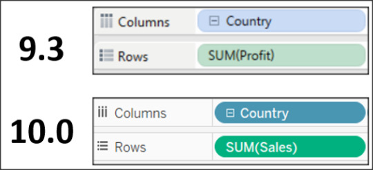
Whether I’m at a client who has a bad projector, on my laptop outside, or in some other hard to see area - nothing has bothered me more consistently about Tableau than the pill colors. Yes, blue means discrete and green means continuous, BUT that is only helpful if you can tell the difference! The colors of the pills pre-10 were so close it was very hard to quickly glance at fields and determine which they were. The simple change from light to dark pill and field colors has made a world of difference in differentiating between the two (example below).
2) Table Calculations


I’m not going to sit here and tell you that I’ve been a master of table calculations, because honestly table calcs have been pretty annoying in Tableau for me. It’s not that quick table calcs are hard - they aren’t. BUT when you have to go into the “edit table calculations” window to realign a calc or change how the metrics are addressing dimensions I admit it is CONFUSING. I’ve been working with Tableau for almost 4 years and really didn’t see improvement in the usability of this function until Tableau 10. This is never more evident than when I’m running a training and my students go blank in the face when I start going through the menu. Tableau 10′s table calc menu is easy to use, much more intuitive than prior versions, and the best part - your changes impact the view WHILE you are changing them. This personally saves me a ton of time when I’m deciding which table calc I want to use. BRAVO Tableau product developers, this is a home run for me!
3) Custom Colors Box

So, this next section you can argue was taken care of with custom color palettes, but I don’t often feel like uploading a text file every time i want new colors to use in a dashboard - sometimes I just want a quick fix to remember my colors for the session I’m in. So, when you go into “Edit Colors” you get a “Select Color” menu. This menu hasn’t changed in 10 in appearance (actually it pretty much resembles the same color menu in MS paint from 1996), BUT there was one HUGE functionality change in the Custom Colors section at the bottom. Previously if you wanted to add more than one color, you had to select a white box first, then use your color picking tool. This was a PAIN, especially if you were trying to pick a color from a website or a picture not in Tableau. And then, like a magically unicorn of color saving :) Tableau 10.0 came to the rescue!!! Now when you add more than one color to this section, Tableau is smart enough to add the new color to the next available box, while NOT overwriting your original! Folks its the little things in life!
4) Groups in Calculations

Yeah, I know, this one is a little less “Hidden” than the others that I’m mentioning in this blog, but I like it too much not to mention. I really like using groups to help organize my dimensions into neat little buckets. What I don’t like is that before Tableau 10, none of my neat little buckets could be used in calculations which STUNK! Now, with Tableau 10 I have the freedom to use my little neat buckets where ever I want! :)
5) Sheet Grid Lines

Something I do literally every time I open a new workbook is remove all extra grid lines from my Tableau worksheet. The lines don’t do much for me or anyone else in terms of understanding the charts (most of the time anyway) and they can clutter my dashboards unnecessarily. In 10 Tableau has reduced (but not entirely removed these lines. While i’d rather have no lines by default, I’m still excited to have 4 less clicks every time I use the program :).
That’s my list! I’m sure I’ll think of more things, but I wanted to highlight some of the lesser hyped new features which I’m thoroughly enjoying!!!!
Happy Vizzing!
Dustin
1 note
·
View note
Text
My Tableau Utility Belt

I’m running Tableau training at my current client this month and often give little tidbits of knowledge sprinkled into my standard training regarding tools that I use while developing in Tableau. I wanted to do a quick blog highlighting what I find to be useful peripheral tools for development! Below is my “Tableau Utility Belt” list (those of you who know me know that I had to do a batman reference here :) )
Icons & Images
I used icons ALOT when creating dashboards in Tableau. Sometimes for buttons, other times just to add some nice design touches, but they always make my work look cleaner. I have two go-to FREE sites that I use almost daily.
Icons8.com

I’ve been using icons8 for years. It has a super easy search feature and provides 30K+ free (color customize-able) icons (100 pixels or less) that you can download. All you have to do is reference their site in your dashboard (I typically use my info icon for this) and you are golden!
TheNounProject.com

Another great icon site. It has less images, but still has a good search feature and has higher resolution images for download. I most recently used this site for my #tableautorch winning dashboard (link). Again, just give credit where credit is due and you can use these for FREE!
PowerPoint

Funny enough, PowerPoint is really where I do my image editing and creation. I know that it’s not as powerful or flexible as some other tools like photoshop, etc, but the difference is that I’m VERY familiar with PowerPoint. It can remove background images, rotate/flip/recolor, etc. I use it alot to save .png images that I use to spice up my dashboards. Don’t overlook the power of MS Office tools!
Colors & Palettes
Paletton.com

I’ve been using Paletton for years. It’s a great site where you can take a base color, input the hex code and get tons of peripheral and complimentary colors. It’s very easy to use and you can export your palettes, which can in turn be easily pulled into Tableau’s custom color palette file!
rgbtohex.net and rgbtohex.net/hextorgb/


Rgbtohex is a great site. Very easy to use and allows you to convert rgb color code to hex and back again. Just use the two sites above to go from one to another. This comes in handy when you are grabbing RGB code or HEX but need the opposite for your dashboard!
Colororacle.org

This is a great tool if you want to design your dashboard with colorblind people in mind (which you should). It’s a free desktop application that allows you to quickly (from your toolbar) view anything on your screen (including Tableau) in 1 of 3 common color blind simulations. I use this all the time since the last 3 companies I worked for had colorblind CEOs.
SQL Code
Sqlzoo.net
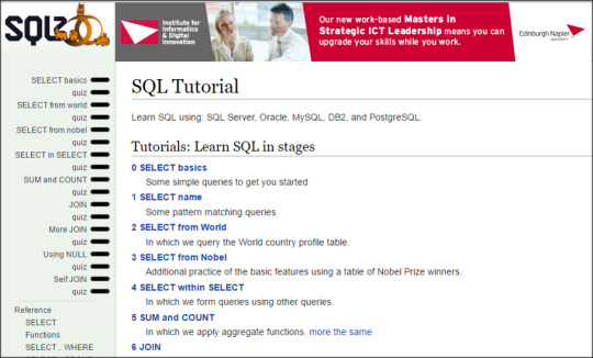
I don’t use this tool as much as I did when I first started developing, but it is a solid go-to that I recommend to everyone I teach. If you don’t know SQL, this is the best free online interactive tool that I’ve found. It takes you through some easy tutorials and allows you to actually run sql code on the site during practice exercises. My favorite bit is when you get something right you get a smiley face, who doesn’t love that!
Notepad ++


One thing that every developer should have, even if you don’t plan on using SQL code, is a good text editor. Sometimes you just need somewhere to paste data to take a look at it. This is especially handy if you have comma delimited or massive csv files. Notepad++ is my favorite tool for this. Its very simple, has great language highlighting features, and a super search tool. Best part, its FREE!
Screenshot & Video
Ducklink.com

Ducklink is a great free screenshot tool. There are a million tools out there, so really you can take your pick, but I’ve grown to like this one alot. Obviously, some of the paid tools like snagit are a bit more robust, but if you need something quick and easy that is free, this is a solid choice.
Davinci Resolve

This one is a bit more advanced and I only use it occasionally, but I had a hard time finding a good free video editing tool so I figured I’d include it. I use this tool to do some basic editing on training videos that I record when I teach Tableau. It’s easy enough to get the hang of if you’ve ever used a video editing tool (even windows movie maker).
Well, that’s all I can think of right now - but I’ll add to this post if I think of anything else! Happy Vizzing guys, I hope this helps!
Dustin
0 notes
Text
Ghostbusting Dashboards - Why Failure is OK

If you didn’t know, the new Ghost Busters movie is officially out in theaters! With the original movies being some of my favorite films, I decided that I wanted to make a fun dashboard (what else would I make? :) ) to go along with the release of the film. Unfortunately, the dashboard process didn’t turn out quite how I thought. Below are the details of the process.
1) Find the Data
Always the hardest part of the process, finding the data is pretty much the bane of my Tableau existence. I began searching for Ghost data sets, but ended up with alot of results around “ghost data” - which is apparently data that accumulates on your hard drive that needs to periodically be “exorcised”. Some of the sites i found, like the below had an awesome amount of information on ghost sightings. The problem was, though, that the data wasn’t in a consumable format!

Ghosts of America
So on and on I looked, probably 20 different sites and even more searches. Eventually I found a site that listed “Haunted” properties in Hong Kong (squarefoot.com.hk). I figured it would be fun to do something international, since usually I do US based dashboards.

The data was in an “OK” format, which I still had to scrape from the site. The main issue was that it didn’t have good address info, just a name of a building and the district it was in. Not knowing Hong Kong addresses, I was hoping that I could run them through my online geocoder to get a lat/lon for the dashboard. Without a map, it would be useless.
2) Prepping the data
Running the addresses through the geocoder was surprisingly easy. Typically if I have a full address, I will run it through the free online Alteryx Geocoder

but I couldn’t get it to work with the Hong Kong addresses I was given. So, I went to my trusty backup geocoder that works every time - findlatitudeandlongitude.com of course! This site is great, just copy and paste from excel or text file, hit geocode and off it goes! However, you only want to do 100 at a time, otherwise it bogs down and doesn’t finish. So this step actually took a few hours to get done.

3) Designing the Dashboard
I knew that I was going to have a very prominent map on my dashboard as that was my main piece of data and maps are a fan favorites. As I build the map, however, I started noticing that what I thought was a “Haunted House” data set had turned out to be something much darker.......basically it was a suicide map.

At this point, I almost just gave up on the dashboard all together. I wanted to make something happy and light-hearted, like ghost busters! We have a joke around the office that I only make “Morbid” dashboards - with my death penalty dashboard, prison exonerations dashboard, etc. After a day or so of thinking it over, I just couldn’t leave the dashboard 1/2 done - I wanted to see it through, even though it was a less and uplifting subject.
Below is what the Haunting Hong Kong dashboard ended up looking like.

I ended up liking the look of the dashboard overall, but again the content bummed me out a bit. But my main point in writing this post is actually my reasoning for why you SHOULD power through those dashboards that you think are lost causes. It’s not necessarily that you think the dashboard is a winner, it’s actually more about what you can learn along the way. Below are some things I learned making this dashboard.
Ghost Month
In my research into the supernatural beliefs of China, I ran across a cultural tidbit that I knew nothing about. Apparently there is a time of year known as “Ghost Month” where people believe that the gates of hell have been opened, allowing the spirits of the dead to return to the land of the living. The month is marked by many traditions, ceremonies, and signs of respect paid to those lost. I found this interesting and read a bunch more about it in my research. Check it out at the site below!
Ghost Month Site

Suicide in Hong Kong
Suicide is a big issue in Hong Kong. I didn’t really realize the extent of it before researching more, but apparently there is a high suicide rate due to many factors including school pressure on students, poverty among the elderly, easy access to highrise buildings, etc. Internationally it ranks at #32 for suicide rates, averaging 12 for every 100,000 people. While this is a hard subject to talk about, let along create a dashboard of, it was eye opening to see the hardships that many live with and leave behind.
Conclusion
So, in the end I did end up completing the dashboard, even though I had reservations about it. The process proved more enlightening than the product, which I believe is the case in many endeavors. If I have one piece of advice, its to keep digging and push through “dashboard block” (my term for Tableau writers block) - most of the time you will come out of the process having learned something new, if not creating something truly original! Remember, FAILURE IS OK. We can’t learn to be better if we don’t make mistakes.
Link to Dashboard
Dustin
0 notes
Text
Mr. Popularity
Tableau’s second feeder contest for the awesome IRON VIZ competition at the conference was announced on June 10th! I figured that since I missed the kickoff for the 1st feeder (food related) that I would give this one a shot! Now, I’m sure that I could have entered my “Presidential Prose” dashboard (pic below - direct link), but I thought that I needed to create something new just for this contest!

Step 1: Think of an Idea
My first task was to think of an idea....and really that is the one of the toughest things to do when creating one of these dashboards, besides actually finding the data. I went through a lot of different ideas - women in politics, highlighting the LOSERS of presidential elections, lobbying money, etc. What I finally landed on was Presidential Approval Ratings. I thought it would be a near universal subject that wasn’t tilted one way or the other and that many people could appreciate.
Step 2: Find a Data Set
Finding data, at least to me, is the hardest part of a contest like this. What data is right? Where do I get it? Has it been used already? Is it clean? Is it relevant? After hours of searching the google machine (as well as my soul) I found a decent dataset from The American Presidency Project. The data wasn’t super-pretty but it was manageable (see below).

After a few attempts, I was able to scrape the data from the site for all the presidents back through 1941! It was simple data, just a few fields wide (Dates, Approval, Disapproval, and President), but that’s what I wanted. Too often I find myself trying to find the most complicated data, when in reality it’s often the simplest data that is the most impactful!
After thinking about what I wanted to do, I decided that I wanted to have a timeline and some key images of the president. Almost immediately I also thought.....no that’s too simple, what are people going to want to know?? I can’t just give numbers. So back to the google machine I went and then I realized what I needed ------ events! If people saw that a president’s approval was high or low, they want to know WHY. Now, you can never truly know all the factors that make up a single point of data like approval, but national events shape approval more than anything else, so that’s the direction I went.
After a few more hours, I realized again that I was overthinking things. What do I use ALL THE TIME to answer my questions about...well...everything? That’s right! Wikipedia! It was the “you can’t use that as a source” site that I knew in school anymore. It actually was considered to be more accurate than most textbooks! And so I found a gem of a page called “Timeline of United States History”. It wasn’t perfectly formatted, but it had all US major events dating back to 1513!
After scraping the data, layering on some other presidential info (# of president, term, party, etc.) my excel file looked like the below.

Ok, so I’ll fast forward through the next details of working and re-working my dashboard until it met my expectations. Below is the initial view of the dashboard that I ended up with.

What I like about the view is that its split into a few neat pieces. The top shows all of the presidents in the data set and their images. Underneath that is a neat chart that I don’t even know what to call (lolipopish?). It shows the max, min, and average (the circle) of the president’s term for approval. Each president has their own corresponding color, which matches the bottom chart. If you click on a picture of the president, it will show a little summary of the president and their highest approval rating / event. I thought this would add some nice detail without being overwhelming.

The bottom chart shows each president’s approval rating by week from the dataset. President Obama actually had daily approval ratings in the dataset, but I used a weekly average so that the total average for all presidents wasn’t skewed. The initial view shows each week as a circle. If you hover over the circles it will show more detail and if a historical event (from the wikipedia dataset) happened that week, it will show up. One cool example is President Truman. I set up the chart to show which points were outliers (3 standard deviations) and one point in particular popped out. In the screenshot below you can see that Truman had an astounding 91% approval rating the week that the Atomic Bombs were dropped on Hiroshima & Nagasaki. This was just one neat insight among others that I found (Nixon’s resignation, 9/11, etc.).

The other piece of functionality that I added was to be able to view the dataset of approvals vs. disapproval in a scatter. I added a parameter to be able to flip back and forth from these views. Below is what the scatter looks like.

I really enjoyed making this viz. It’s neat when you look at your own dashboard and end up playing with it for a few hours finding tidbits of interesting history! Good luck to all the other viz feeder contestants!
Oh, almost forgot - here is a link to my entry!
http://tabsoft.co/1ZRxwpE
0 notes