#take a shot every time the style linework and designs change
Text

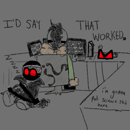
i did, in fact, not put science shit there
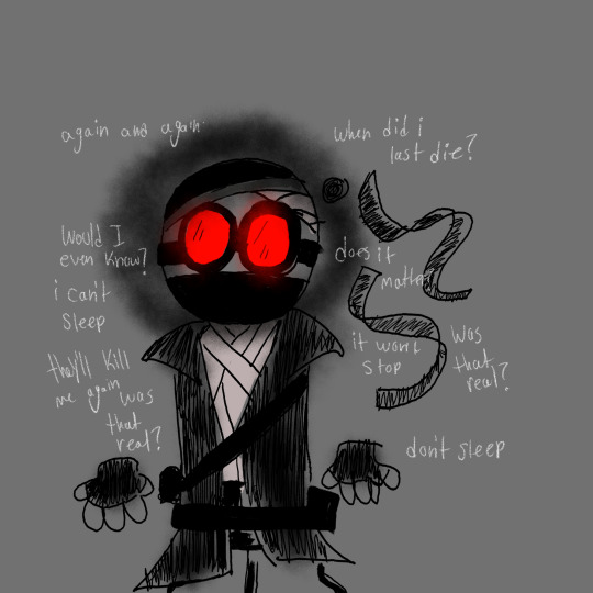
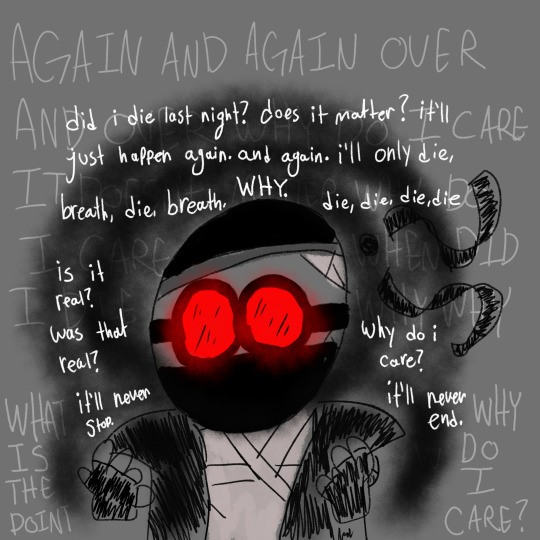
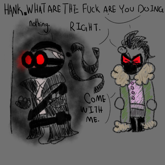
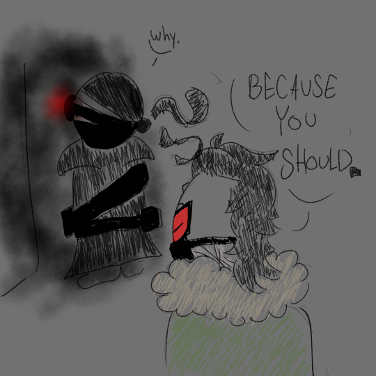
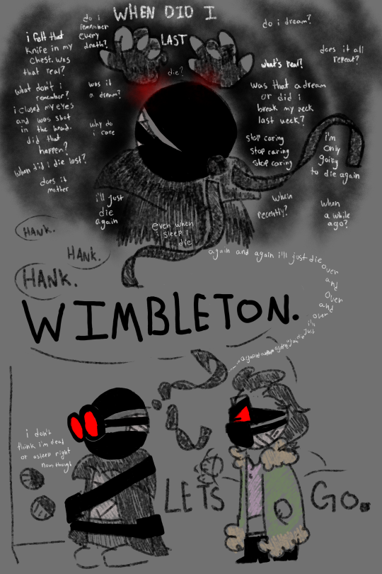
based off of a headcanon i threw at my brother of hank having nightmares about dying and not being able to tell if they actually happened (they were playing roller coaster tycoon btw)
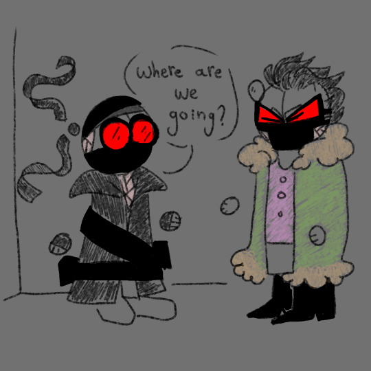
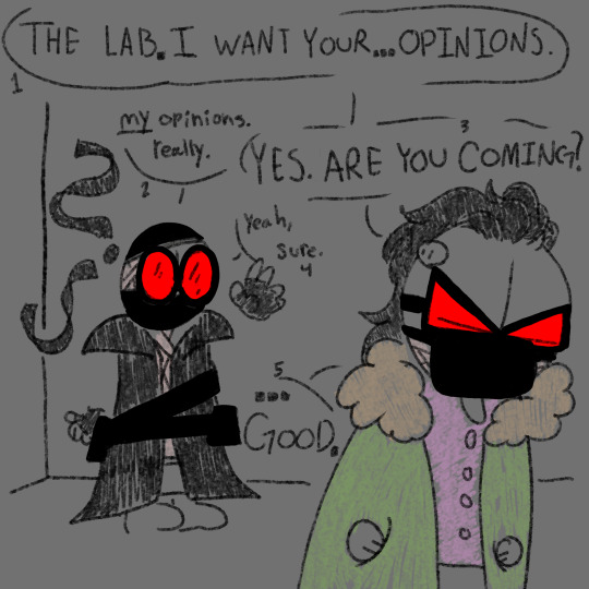
#wimbleton wednesiveday baybeeee#ive been working on this for#too long#this was originally uhhhh 14 more panels but this is the only part that like actually made sense out of all of those so#jazz hands#take a shot every time the style linework and designs change#anywho#trip drew#madcom#madness project nexus#madness combat#hank j wimbleton#madcom doc#2bdamned#madness combat 2bdammed#2bhank#hank madness combat
108 notes
·
View notes
Text
Process Post
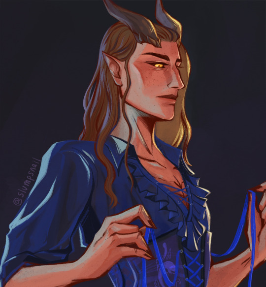
Hi everyone! Here's a process post on my previous Rolan painting study.
Time-lapse from Procreate above.
More details, inspo, references, and writing under the cut:
I haven't drawn or digitally painted in years but Baldur's Gate 3 got me drawing fanart, especially Rolan. I love his design and storyline so much. I draw him almost every day, whether as a warm-up sketch or full illustration - and I can see how much has changed from when I first started drawing him to how I draw him now. More importantly, it's crazy amazing to have found a community because of an NPC. Also, receiving all the love and support here has been crazy wonderful, I read all your reblog tags and they always make my day - thank you sm.
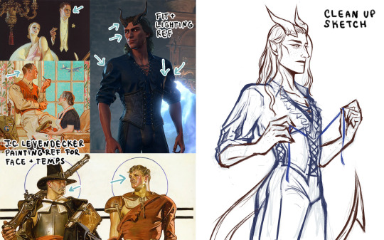
Inspo / ref image board on left, my clean up sketch on right.
Linework and inking are fun for me but I struggle with color, rendering, and digital painting. I find that referencing artists and images helps immensely when I paint, so I often collect images and combine them into a board. J. C. Leyendecker is a big inspo for me, especially his color, mark-making, and poses. I also ref a ton of in-game screenshots, the one above is from @ / emerald_witch9 on twitter. I use the iPad side-by-side window feature so I can look at my image board and Procreate at the same time.
I like painting in this style, but it does take me awhile, so I'm not sure how long I'll continue to paint this way. However, I think it'll help me develop a quicker and more personal sense of render style.
Lastly, here's a detail shot of my paint study because freckles hah.
44 notes
·
View notes
Text
Creating my Piece
The creative process of my project was a lot more time consuming than I had first imagined, however I stuck with it and saw it through to the end. I worked with the Agile design method throughout this project as in the beginning, I was wrestling with two ideas, on one hand I wanted to focus on a single illustrated poster that I was working on, and on the other, I considered creating an entire graphic novel page instead. After asking some of my family and friends as to what they thought would be the best way to approach the task, (similarly to how a graphic designer may ask their client if they were to also use the Agile design method), I decided to implement the poster I was creating into something bigger. The rough poster concept is shown below.

Instead of making a single page, I began to plan out two pages, that would lay out side by side. the reason for their roughness is so that I could quickly plan and visualise an idea without wasting time on unnecessary details.
Layout concept:

When it came to designing the comic page on the left, I wanted something that showcased various perspectives to keep the piece refreshing and new in each scene, symmetry is always a defining feature when composing a scene and I particularly enjoyed planning where each object would be placed as if it were a still frame from a movie. The reason for the two front facing shots were to show the contrast between the big cat and the domesticated kind we as humans are familiar with. In short, the whole reason for this illustrated page was to take something that most Nottingham based people see virtually everyday and show it in an entirely new light and gave these static statues a new layer.
Once I was happy with my choices, I had to design my assets and how I would transform the statues into the hand drawn style I was looking for.

Creating front facing, and profile shots of the lions was an interesting task for me as it allowed me to convey quite a lot of character from these stone structures through the linework I put down. Once my sketching was complete I was left with my final outlines that I would use as the guides when it came to the colouring process,


Both illustrations compiled together in an A3 Photoshop Document:

Rendering the comic with a consistent and appropriate colour scheme.
Colours are very important when trying to set a tone or atmosphere, to have a palette that runs through the whole piece gives the impression that each scene I have created is taking place at a similar time of day to the previous.

My chosen colours represent early morning sky tones as that is the setting I wanted for this graphic novel extract, the idea was that nobody was around to witness what occurs in the comic. By setting the line-work layer’s blending mode to multiply, all white areas were changed to a transparent background which made it a lot easier for me to lay down my colours on layers underneath.
Almost every part of the comic has it’s own colour layer, the reason for this is that I did not want to risk making a mistake on one part that would damage another if I tried to change it. The clouds and birds on the piece were illustrator vectors that I created with the pen tool or image trace.
Accompanying assets
The logo you see below was created in Adobe Illustrator as I wanted to include a title of sorts with a logo that suited the piece without drawing attention away from the main focus.


End Result
After the long task of colouring each individual part of the illustration, I finally finished it and I am happy with the way it turned out, the palette is well matched and the hand drawn pen lines keep the colours in their place with the details remaining apparent.
If I were to make changes, I would first allow myself more time as the deadline was fairly short, I would also make some adjustments to certain scenes such as the lower left as I believe it could have looked better with some kind of two point perspective in the background. However, it did turn out how I wanted it to overall despite these smaller factors.

I then submitted my piece to the Nottingham Young Creative Awards under the appropriate category.

0 notes
Last Seen Blogs
elliespeach
took out your friend!
elliespeach
took out your friend!
elliespeach
took out your friend!

saudadesdoflora
EmÍLio🌱

hojin8485
섹파구함.부산