#teamworkpractices
Explore tagged Tumblr posts
Visit Tumblr Blog
Explore Tumblr blogs with no restrictions, modern design and the best experience.
Last Seen Tumblr Blogs


Fun Fact
Tumblr is used by 21% of adults online aged 18-29 years.
Text
PRESENTATION

My name is Margherita Cantiani. I’m 23 and I’m Italian but England will be my home for the next 4 months. I’m attending the University of Hertfordshire where I can see how people from other countries see the world. This is the learning blog for “Teamwork Practices” module and for “Web Arts” as well, where I’m going to write on my daily homeworks.
0 notes
1 note
·
View note
Text
Learning Journeys (Compiled)
During my stay in the UK, I definitely found the gallery/exhibition scene really vibrant. I got a Student Art Fund card that allowed for discounts/free entries across the UK, which helped me see more exhibits and I would really recommend that other students get it. I wasn’t really in the habit of going to exhibitions where I had to pay for entry (there are quite a few free entry galleries in Singapore) but after going for a few, I definitely left feeling like it was worth the money. For the most part, the exhibits were thought provoking and inspirational, and more often than not I found myself borderline obsessively trying to document what I saw. It definitely raised my standards for what I expect to gain from seeing exhibits in general. As a current benchmark, an exhibit wouldn’t have been satisfying if I don’t walk away with a new idea for a project and questions about life/society/culture/etc.
Here are the various exhibits that I saw during my stay in the UK that are relevant to this course, numbered for easy reference. They are also followed by some of my favourite parts of each exhibit.
1. London Design Biennale 2018 (Somerset House)

Needless to say, the London Design Biennale was amazing. Besides the weird container in the front right of the yard of Somerset House (it was some advertising for the yatch sponsor or something), everything was great.
There was an exhibit (that I forgot to take a picture of the exhibit details) that will become my go-to example the next time someone asks me what Marshall McLuhan’s The Medium is the Message means.

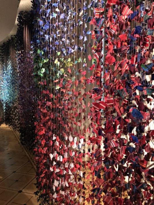
Pictured above is an exhibit about a small, vibrant fishing village somewhere (again, sorry I didn’t take a photo of the card). The entire installation and all its parts were made with something that represented the town (e.g. the lines hanging down were fishing lines weighed down by fishing weights, the fabric of traditional costumes) and held a deeper meaning as a whole. The white fabrics signified the future to come and to be shaped.
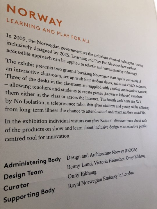
Norway focused on inclusive design, which is something that should be considered when designing anything.

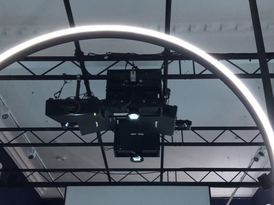
I also took the chance to observe and document how installations were set up. (pictured below)
Hong Kong’s exhibit was also one of my favourites, the four walls surrounding other objects on display were covered in scratch and sniff wallpaper lined with scents familiar to the country and its culture/history.
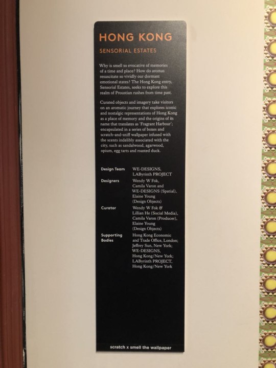

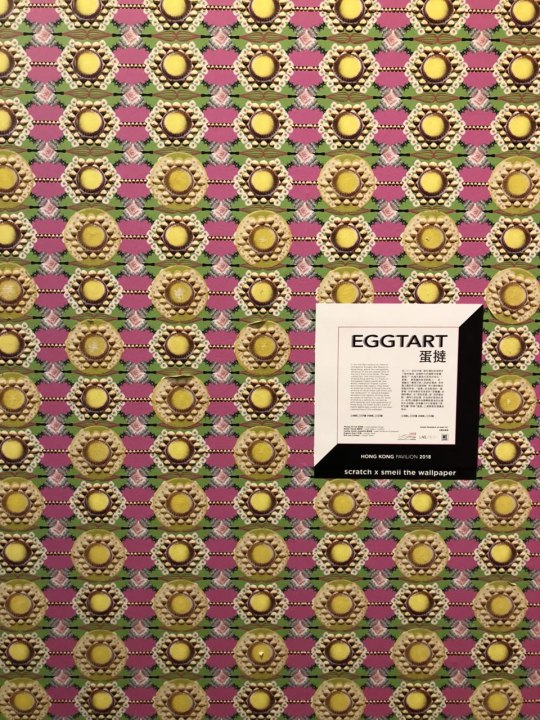
The egg tart and roast duck smells made us hungry.

Another favourite that I forgot to document because I was too busy playing with it was the top of show, a glass piece that used condensation to allow audiences to leave a mark that eventually disappears. (end)

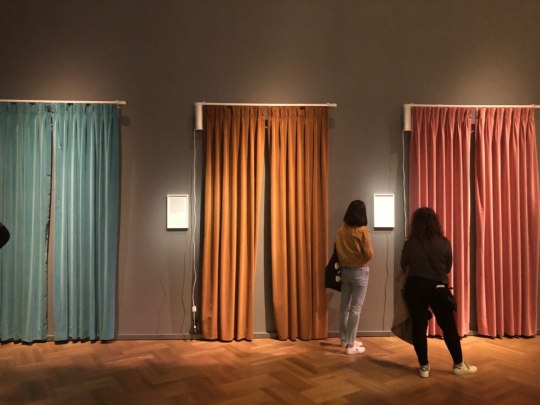
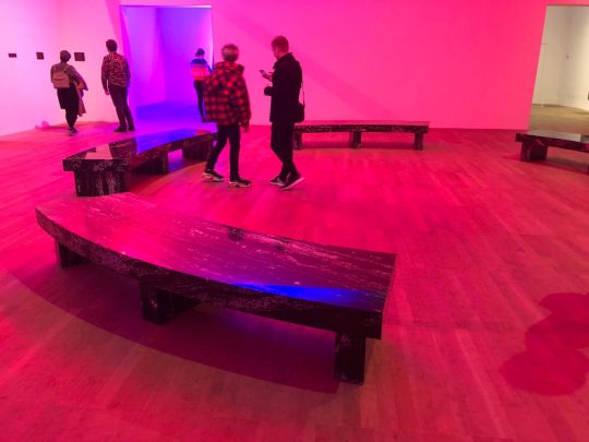
2. The Future Starts Here (Victoria and Albert Museum)
Another great exhibit that was very thought provoking and spanned a whole bunch of technological AND social issues. If anything, I was super overwhelmed by the end of it because I was trying to cram so much information in.
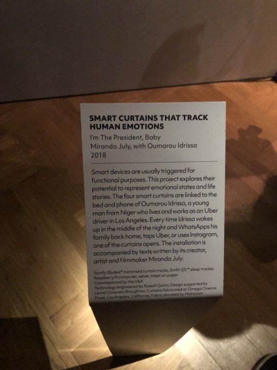
This was one of the more emotionally provocative installations. It details the life of an individual (who by the way, had a really hard life) through the curtains pictured below that would open and close depending on what he was doing at the time. One of the curtains moved if Oumarou Idrissa was tossing and turning in his sleep, which he did while I was there.
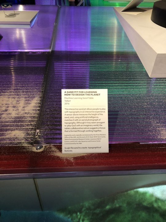
My favourite turned out to be the Sand Pit for Learning How to Design the Planet. You get to play with the sand which changed the lights that are projected on it. The more sand, it becomes a snowy mountain. Dig deep, and it becomes water. Will add the video eventually if I decide to host the video somewhere. (end)
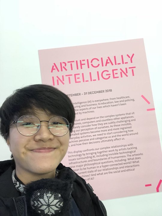
3. Artificially Intelligent (Victoria and Albert Musuem)
I’m not sure if this was meant to be a small exhibit or if the exhibit had ended already but there were only a few installations on display.
It generally didn’t leave much of an impression on me besides the piece on the call for feminist data which perplexed me at first but turned out to be something really important.

One other part that I neglected to document was an AI that you could talk to near the entrance. I didn’t try it because the friend I was with tried it and when he said bye to the AI, the AI pleaded for him to stay because “they will delete me”. Talk about creepy. (end)

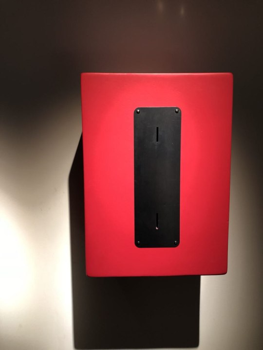
4. Hooked (Science Gallery London)
About addiction. Fairly interesting exhibit with many varying mediums. My favourite was No Change, both on a technical and conceptual aspect.
I also have a video for this (pending upload)
(end)

5. Stedelijk Museum, Amsterdam
My friends wanted to come here to see Metahaven’s exhibit but I honestly wasn’t all too excited about it. (pictured below)

I did, however, find other exhibits that were more interesting to me such as Trip Trip Trap (pictured below) that was a room full of interactive devices that were fun to interact with and visually exciting.

Another piece that I found interesting was an installation about immigration detailed below


(end)
6. Amsterdam Lights Festival (Around Amsterdam)
This Lights Festival was honestly disappointing. At the end of it, it seemed more like a way Amsterdam tried to boost its canal tour revenue (the installations were spaced far apart alongside the canal, and canal tours were available for after dark). It advertised works in line with the whole Medium is the Message thing, but most works were really just reaching except maybe the first one we saw, Desire, details below.

(end)
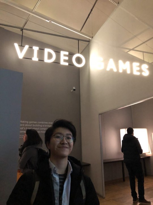
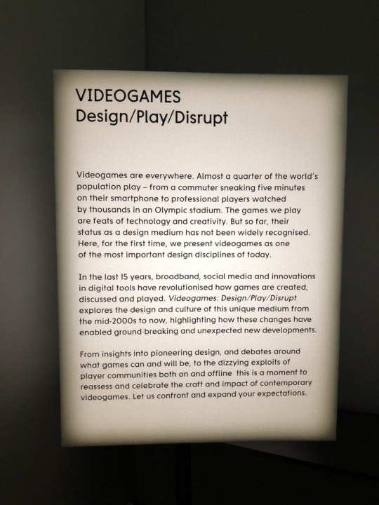
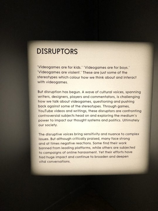
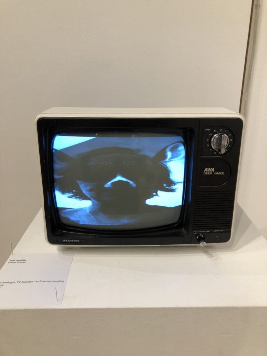
7. Video Games: Design/Play/Disrupt (Victoria and Albert Museum)
To lift the mood a little, the Video Games exhibit was absolutely worth going to. Split into three parts (Design/Play/Disrupt), I felt like there was something to offer for everyone. It was interesting to see the design aspect of games that included things from triple A developers to individual developers.
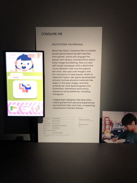
My favourite to read was Consume Me, that detailed the prototyping process of someone who’s really an artist rather than a developer. It opens the possibilities of artists using games as a medium for their art.
There was a curated video (pictured below) that I honestly wish I had the time to finish and wish I could watch it again outside the museum and reference to it (this also happened with another curated video at the Disrupt portion) and I started to wonder about what happens to all the wonderfully curated videos after an exhibit ends. Project idea.

Anyway, this exhibit was great and I’d recommend going for it. (end)
8. The Recent One at UH
This piece (shout out to Julian) was amazing in the technical aspect and also please share about how you made it work.

the exhibit pictured below also showed me something new that could be done for an installation and I have an upcoming idea for it.
(end)

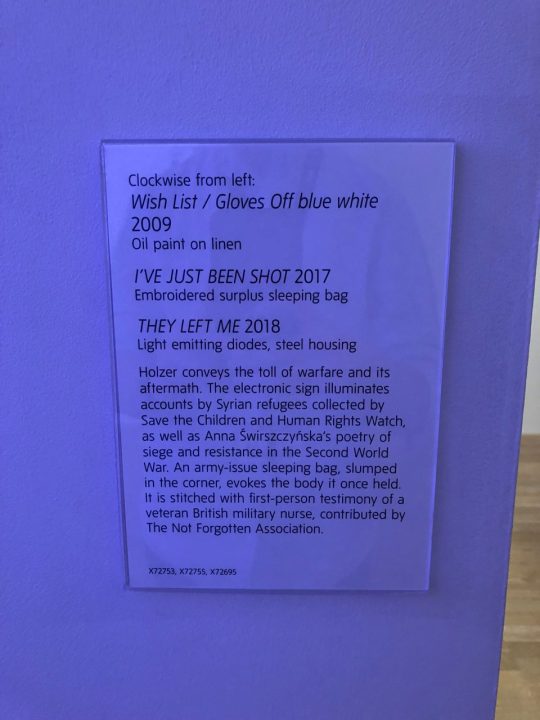
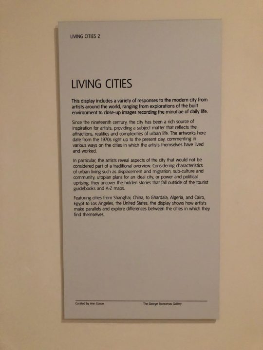
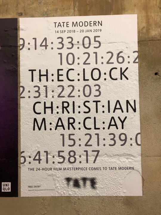
9. Tate Modern
I planned a trip to Tate Modern mostly to see Jenny Holzer’s work. But the Tate Modern is humongous and we ended up looking at a bunch of other great stuff for most of the day and still only saw 2-3 levels of content on one side of the building.
Jenny Holzer’s stuff, pictured below


And we ended up looking at Living Cities (below) where I saw one of the best curated videos I’ve ever seen
(I have some recordings of it if anyone’s interested)

We also saw The Clock by Christian Marclay, and despite seeing the time all the time during the film I could have sat there all day if we didn’t have to leave for dinner plans.

(end)
So that about concludes all the Learning Journeys I’ve been to and it was a great experience.
0 notes
Text
Assignment 3 - Live Industry Engagement
For the live industries brief I (with Margherita Cantiani) chose “The Sustainable Angle” project. We chose this one in particular for three reasons: first of all the deadline for this brief was set before our departure to Italy and it made possible to us to be able to complete the assignment, second reason was the possibility for us to create an installation for a London exhibition that would’ve been a really nice addition to our personal portfolio and, last but not least, it was possible to work in pairs and, working so well with Margherita, we thought that this brief was the one to apply for.
We had to choose between two projects, “AR & ’Augmenting Sustainable Fashion’ ” or “Revealing Transparency”. We chose the second one because that gave us the possibility to make an installation with projection mapping, field in which we are currently studying. We wrote the pitch in order to be chosen between the other students in the module with us for that brief and we were, in fact, chosen.
Next step was to write the actual brief for the company. We followed the template given to us and we explained our idea that was built around the key-phrase ‘Revealing Transparency’. We chose the tulle as leading material on which to project our idea (with a video). The tulle is obviously a semi-transparent fabric and this reflects the topic of this project: we loved it from the very beginning because it’s apparently fragile, but it hides an elegant power. We can see through it and this helped us to develop our communicative message: the waste of water in the fashion industries.
We thought about a hanging black tulle towel on which we will project a video. This video will show a dynamic montage of filming concerning the fashion world (from fashion shows, models to textile industries and clothing processing), with the relative audio which will be muffled in the first place, giving us the impression of being underwater, to return normal only after. All the audio track will be very discontinuous. The interactive part is made by a switch or button positioned in front of the tulle. Every time someone press the switch, a light behind the tulle will turn on and we are able to see something we can’t see before. The front projection, because of that more powerful light, seems to disappear (actually it’s still there but we can’t see it).
Once the backlight is turned on, what we can see will change in relation to the space we will have and the material availability. We thought about three main object the audience can see:
1. A big mound of sand to simulate a desert (fill the space behind the tulle with sand)
2. An fish bowl without water with a (fake) dead goldfish
3. An hanged empty bottle of water
What we are trying to communicate is in that pressed button. We would like to make people curious and active about find a meaning behind something in front of their eyes. What they will see behind the tulle (that represent the fashion world) is the waist of water and the future consequences.
After that we’ve send the brief to our contact, Amanda Johnston, as soon as possible, on the 19th of December 2018. As the correspondence shows, we received, the same day, an empty automatic email. Being an automatic reply we thought that she was already on holiday and so, we waited for a reply from her. As on January 3rd, 2019 we haven’t received nothing from her, we started to get worried and we wrote to her once again asking if everything was ok. Her reply was quick this time and, other than apologize for the late email, she asked us to adapt our idea to the ambiental disaster of the Aral Sea in Uzbekistan.
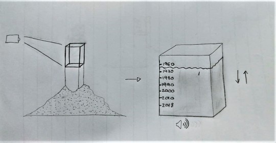
We researched that topic and we found out that this is formerly the fourth-largest lake in the world but now is only 10% of its original size because of the rivers that fed it were diverted by Soviet irrigation projects. This led to an ambiental disaster because the sea is, nowaday, almost non-existent. What shocked us the most were the photos, took over the years, that shows how the sea shrinked and that gave us the core idea for this iteration of our installation.
We removed the tulle and the button but we kept the sand since it's perfect also for this new installation. We thought to put a white cardboard cube over a stand in the middle of the sand, on which we will project an aquarium. The water inside the aquarium will go down until it's empty and then it will raise up again, until full in an endless animation. On the box there will be a series of marks with a written years on the side, these years represent the water level from 1960 until now.
Inside the box we would like to put a speaker that will play an audio track. The track will follow the water animation and will be sounds about sea.
Amanda really liked this idea, especially the marks on the box, and scheduled a call on January 10th, 2019. In the meanwhile she asked for a letter with our course and university details, contact details, any social media where our work is showcased (this letter is in the attached folder on Google drive). We send her the letter and called her on the 12th at noon as scheduled. Unfortunately she had a press conference the day before and she lost her voice so she asked us to call on the 13th hoping for her to recover. We, once again, called her the next day but she didn’t answer us. We waited to be called back but she didn’t. In the evening we wrote to her again asking if we would’ve have any possibility in realizing our project. She replied us that she completely lost her voice and that we would not have been able to make the installation being so close to the expo but she was really happy with our work and she said that “As an organisation we are really happy with your concept, and I would love Nina our Director to see it.”
I think that this experience taught me a lot. We had relate with an organizer of an expo and we stumbled across some issues (some technical and some of pure bad luck). In the end we weren’t been able to have our installation in the expo but I had the confirmation that I would be able to create for a situation like this. What I would've done differently is probably to write her earlier than January 3rd in order to have few more days to work on the project.
In the end I’m pleased anyway of what we’ve achieved and knowing that a fashion organization in London likes my work, is a good incentive to continue to work on that road and it also open up possibilities for future collaborations as Amanda herselfs told us via email.
Here’s the link for a zip file with the project brief, the correspondence with Amanda and my cover letter for her.
https://drive.google.com/open?id=1SKh9zn2u5i21rRfwfoKuO8SdXFUcgSko
0 notes
Photo


CV & Cover Letter
As stated for the assignment I created a CV and cover letter to present to Ogilvy how competitive I can be in the media design field.Since the role I'm applying to is a Creative Technologist I wanted to display that on my CV which is why I chose such contrasting colours to stand out.
0 notes
Text
Live Industry Engagment Assignment
For the Live Industries Assignment, me and my classmate Leonardo had the opportunity to collaborate with Amanda Johnston. She is curator and consultant at The Sustainable Angle which is a not for profit organisation that supports the environment and minimizes industries impact. Our goal was to create a multimedia installation about the theme “revealing transparency” in the fashion industries, with the eventuality of an exhibition in the Future Fabrics Expo. The revealing transparency, indeed, was the key of our entire installation.
We chose to project a series a dynamic montage of filming concerning the fashion world (fashion shows, clothing processing etc.) on a black tulle towel. This material was the perfect one to represent this topic since is a semi-transparent fabric and it’s fragile and powerful at the same time. As we wrote in the brief, we can see through it and find out what it hides. We chose to focus on the water waste in the fashion industries. We made some researches about it and we found out shocking numbers of litres wasted in the fashion fabrics production process. We learnt about how this happens and why. For this reason, the audio of the projected video is muffled in the first place, giving us the impression of being underwater, to return normal only after, with a very discontinuous course. We wanted to introduce an interactive part in it, setting a switch or button in front of the tulle. Every time someone presses it, a light behind the tulle will turn on and we are able to see something we couldn’t see before. The front projection, because of that more powerful light, seems to disappear (actually it’s still there but we can’t see it). What we can see once the backlight is turned on, depended on the space we would have had on the Expo location. Three options have emerged, each of them is, in their unique way, related to a hypothetical future if this situation won’t never change:
1. A big mound of sand to simulate a desert (fill the space behind the tulle with sand); 2. A fish bowl without water with a (fake) dead goldfish; 3. A hanged empty bottle of water.
What we are trying to communicate is in that pressed button. We would like to make people curios and active about find a meaning behind something in front of their eyes. What they will see behind the tulle (that represent the fashion world) is the waste of water and the future consequences. The aim of this project is inform in the first place since most of the people is not aware of big problems like the waist of water in the Fashion industry. The audience will, hopefully, leave the installation with a conflicting emotions and then, the sustainable angle, will give them the means and information that they’ll need to be useful.
The next step was to send everything to our client Amanda to discuss it together and try to meet each other in person, to better share our ideas. We did it on the 19th of December and, the same day, we received an empty email from her (an automatic answer from her office). On the 3rd on January, since we had not received any answer, we wrote her again, asking for a meeting or a feedback in order to discuss the project together. We finally were able to contact her when she answered us few hours later, saying that she would have loved to see how we would have framed our ideas in relation to the ecological disaster of the Aral Sea in Uzbekistan; In the exchange of few emails, we explained her our idea:
I have to admit I was not aware of the Aral Sea situation. This Sea was the world’s fourth largest saline lake and it’s situated in Central Asia, between Kazakhstan and Uzbekistan. The disaster started on 1960, when the Soviet Union which owned the sea at that time, decided to divert the two rivers that feed the sea, with the purpose to irrigate the desert region surrounding the Sea, to help the agriculture. But the important thing is that the majority of it was being soaked up by the desert and wasted. What happened, obviously, was the water level that started to decreasing from that time onward. Pictures of this decreasing are shocking. We found this topic very interesting and we thought about it, trying to adapt our first idea on it. The first thing we did was to remove the tulle and the button, since they represented the revealing transparency theme. We kept the sand since was perfect also for this new installation, was perfect for waste of water in this situation. We wanted to isolate this problem and emphasize it, putting our installation protagonist, a white cardboard cube, over a stand in the middle of the sand. On the box, we would have projected an aquarium, the perfect Sea home surrogate. In an endless animation, the water inside the aquarium will go down until it's empty and then it will raise up again, until full. On the box there would have been a series of marks with some written years on the side, these years represent the water level from 1960 until now. For what concerned the audio, we would have put a speaker inside the box playing an audio track which would have represented sounds about sea, following the water animation.
She loved the idea and she found it very strong. She also asked for a few paragraphs about ourselves, contact details and eventually, social media where our work is showcased. After that, she set a call for Thursday 10th. Unfortunately, she got sick that day and we set a call for the day after but, she wasn’t able to talk the day after either. For this reason, we wrote her an email, on the 11th, asking for a feedback or some indications about it. She answered us that a week was too short to make the installation possible, but that, as an organization, they are really happy with our concept, and she would have loved Nina, their Director, to see it. She, in the end, invited us to the Expo in order to think about how they can support our idea in a future exhibition.
This leads me to conclude this post trying to explain what this learnt me and how I faced this situation. I have to admit that I would have loved to have the opportunity of doing an exhibition in London, it would have been an important occasion of express myself and collaborate with professionals. But time and unpredictable events weren’t on my side. Since I will come back in Italy on the 20th of January, I won’t be able to attend at the Expo event and this is a pity because I could have had something to confront with and something that could have improved me. Making the acquaintance of Amanda was nice, she’s lovely and I would have loved have the opportunity of meet her in person and share some time together. The installation topic and more in general, this Assignment was truly exciting. We created two installations, adapting them in relation to the situation and the task. They both received a positive feedback from my client and I’m pretty happy of this. I couldn’t be deeply satisfied for the previous reasons but I really enjoyed the outcomes and how I relate to a constant events evolution. Here’s the link for a zip file with the Previous project brief, the email correspondence and the self presentation letter she asked: https://drive.google.com/open?id=1BWywQhEOgdjpFS2Wj8EOvVhQyQHnJDPf
0 notes
Text
Salzburg City Points App for Miam Miam
(TBC)
0 notes
Text
Ocado Assignment Self-reflection
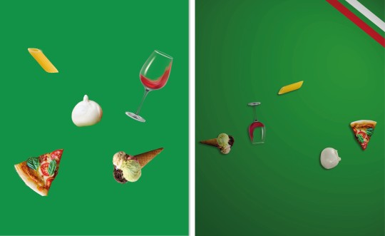
The Ocado assignment was my favourite one so far. Perhaps, it was the one in which I felt more confident. For this project, we had to create a 10-20 second video with the aim to drive more customers to shop on Ocado. Me and my classmate Leonardo wanted to communicate the huge world’s food availability of Ocado using colours, shapes and animations. We showed three representative nations of Asia, Europe and America: China, Italy and U.S.A. for their easily recognizable food. Their movements are just a jump animation and each time the food touch the ground, changes its shape into the food from nation to nation, the background colour will match the colour of the representative flag and a typical music will follow the nation in scene at that moment. In the last jump, the food will turn into the Ocado’s letters, they will move in the middle of the screen and the Ocado Logo will appear. The purpose was to capture the user’s attention in some way and we chose the simplicity that, most of the time, is the most powerful and effective means.
I should start saying that working with Leonardo helped me a lot: we think the same way, we have almost the same vision of art and we have the same work method that is never meticulous enough. We worked together before and this is important to reach better results. I understand that working with strangers or someone who doesn’t agrees with your ideas, would have been more difficult. I have to admit that it was the easier way but thanks to this choice, our idea has built itself. Our work is the perfect union of our respective ideas and we corrected each other during the preparation. This is actually the second idea we thought about. The abandoned idea was represented by a stylized Ocado guy holding a basket full of food who, stumbling, makes the basket explodes, filling the screen with food of every kind and color, to return to walk as if nothing had happened. We finally chose the one we presented because it’s what better contained our key message. I’m pretty proud of our outcome because it matches with the previous storyboard and this is means that we have been able to do what we wanted to do, to make something that was only in our mind real and finally, respect our ambitions and do not change anything.
If I had more time, on the advice of the Ocado’s photographer, I would have changed the size of the food in the foreground to make it more realistic and dynamic. I would also have modified the animation, my main task in this project, because something wasn’t perfect at the temporal level. We had some problems about that: we loved the idea of making the jump and fall animation using a code, an expression that would have made the animation more realistic, bearing in mind gravity, speed and so on. But something went wrong and we spent a full day trying to make it work, without succeed and, since we had no time to waste, we decide to do it by hand making.
In term of regrets, I think we did the right choices. There’s nothing in this project I would have changed except for doing a totally different project; maybe something more complicated like recording a real video with real food. I would have liked to do something more sperimental since we are still studying and we have the right of do mistakes. But like everything, we have to understand the situation in which we are, the context in which we should act and who we are working for. The brief was very clear: “with the ultimate aim to drive more customers to shop at Ocado”, there are not restrictions about being freely creative and being sperimental, however, doing a 360° video, for example, would not have been coherent with the Ocado’s course and style. In my opinion, it would have destabilized the customer and would have obscured the recognisability of their logo. In this sense, we chose to do something that reflected their identity, to give to the customers connections and path to follow, to bring them where I would want.
We received very useful advices from Ocado Team: under their advice, we added the flag’s details on the top right of the screen since the unicolor was not enough to identify the nation taken in consideration. Our first idea was using five Os instead of the five Ocado’s letters and, only after, make them turn in the Logo’s letters, in order to give a plot to follow, something that makes you want to see how it ends. They suggested us to use the five letter from the very beginning. This is because, they explained, people do not have so much brand awareness to recognize it immediately.
Concerning the acquired skills, I feel to have a better mastery of the software. I used After Effects before but every time is like the first time, as there are lots of functions to learn, and it’s always interesting see tutorials about it. Like a said, there were some problems with the animation’s fluidity, we tried to make it smooth as much as possible. I feel more confident in the presentation, talking about the project I create helped me to don’t be nervous and to seem credible.
Having to deal with a real company as Ocado was an amazing experience. It was the first time for me and I appreciated so much the relationship established between them, work team formed by professionals, and us, student team of two. I’m very excited about it because it wasn’t an exercise or a simulation (like ACE experience for instance), everything was real and there was the possibility to be noticed. They assisted us step by step, from the concept to the final project, giving us the feedback and precious advices. For what concerns our feedback, they were impressed from our outcome and we are very happy of this. They like very much the presentation and we are glad they appreciated the simplicity and neatness, we wanted to let the video speak for ourselves. The Ocado’s artistic director liked the idea of add details in the presentation only after saw the video.
Concluding and summing up this experience, I should say that all this will have a positive response in my life. I know better now how to relate with real professionals and how to present them my own project. I’m very proud of what I did, and above all, that what I did was liked by the Ocado’s team. I saw sincere enthusiasm in each of their eyes. I learnt to understand the situation and take a behaviour in response to it and I think I’ve understood what the company wanted from us. For instance, we grasped the concept that they focus a lot on saturated colours, that they prefer stop motion for their promotional video using real food and simple animation. We put all this clues together and we created something that for them was simple, colourful, dynamic, fresh and coherent. We seemed credible and this is the most important thing because means that, with a margin for improvement, we can succeed in our work life. Link to the video:
https://www.youtube.com/watch?v=A8iTLUe03y0&feature=youtu.be&fbclid=IwAR0TYty8_e1bbGH98DHPWVWpr-QeuDV-g_6z_LrOR95CNQsrI7uuv7njZrE
0 notes
Text
Ocado reflection
I was really excited when I first learned about the Ocado assignment, first of all because I like working with After Effects (and I think that every time I use that software I learn something more about it) and especially because I’ve never done a real work for such a big company. As an intern I’ve paginated a book for a small publishing house in Ancona but you can easily tell that this assignment was far more important than that. Everything started to get real when the chief artistic director and the photographer from Ocado went to our class to explain us the brief for the ad and that was pretty much as I was expecting it: straightforward and concise. They explained what they’ve expected from us and off we went, started to research what kind of visual style they use for their ads and think about what we could do.
Being a teamwork, I need to say who my partner was: Margherita Cantiani. I’m here with her in my erasmus and she was the obvious and easy choice and that’s my first thought about this project. As said, choose her as my partner was the easy way to get the work done both because we live in the same house and because we’ve already work together on many projects and we know the weaknesses and the strengths of the two of us and how to relate with those. I know that, working with her, was going to get us the most, professionally speaking but, on the other hand, it could’ve been an interesting situation to work with someone far from me and with a different background. That said, I don’t regret our decision to work together because, being so physically close, allowed us to talk about ideas anytime we wanted.
The relationship with Ocado continued when we visited their offices and I was really pleased to see that they really cared about us, it really make me feel like a part of the team even if for few hours. I didn't expect that at all and it really make like I really wanted to do something to be proud of, even more than a normal assignment.
In the meantime we researched the brand on the web and on social medias in order to understand what their style is for their advertisement. We spotted that unicolours, top down photos, simple animations, photos of real food (and not drawings) were used. We added all of that to the creative proposition “The world’s foods at your fingertips” and to the demographic of reference and we started a brainstorm reach for some ideas. After a bit, we came up with two main ideas: first one was an animation of a stylized guy, holding a groceries basket, who stumbles and, as soon as the basket would’ve hit the ground, all kind of food from all over the world would’ve explode from the basket itself; the second one, that was also the one that we choose, played around the roundness of the logo, making the letters from Ocado bounce and transform those into food every time they would’ve bounce on the “floor” of the screen. We focused on the second one because we felt like it would’ve been the right amount of challenge for the time that has been given to us. While the first one would’ve been more visually striking it would’ve been technically easier because the animation should not have remembered an organic movement (like in the second one) and it also didn’t fit very well with the ad style of Ocado.
So, for the final animation we started to think what we already knew we could do and what kind of knowledge we needed in order to solve the problems that we could have met.
Having already worked with the Adobe suite we knew how to integrate the workflow between After effects (to animate the whole video), Photoshop (to edit the photos of the food we choose) and Illustrator (to extract and edit the materials given by Ocado) and add to that Ableton live for the soundtrack. But those were not the main problems.
What we needed to learn, on the other hand, were the key aspect of that animation: how to make the food bounce in a realistic way (like a bouncing ball), how to work in the 3D environment of After effects in order to create realistic shadows to make them pop from the background (because using only the shadow effect, that would’ve follow the rotation of the objects), how to use null objects to create a continuous animation and link the food to them (in order to have a seamless animation through the whole video) and how to join all together (because we feared that with no transactions between the nations the video would’ve seems weird).
The first problem we solved was the use of the null objects: we found out that with only five objects (one for each letter) we could’ve create a single animation for the whole video. That also meant that, if we would’ve had any problem with the bouncing animation, we would’ve edit only five objects instead of twenty-five. First problem solved, but that one was the easiest make the animation was the real challenge.
Looking online on how to make a realistic animation, we found out that we could’ve use Ae’s expressions. Those are code-like expressions that make an object behave in any way you want. We found a simple expression that looked like we could use and we were pretty excited but after a whole day trying to get that working we gave up and decided, in the end that, for a twenty second video, it was not worth all that effort and that we could’ve done that by hand making the animation. We wouldn't develop it by hand because we know how difficult it is to animate something to make it looks realistic but time was not on our side and even if with expression, the bounce would’ve been perfect, we think we’ve achieved a good result. We choose to make them by hand only because we needed to make only five bounce animations, if we would’ve needed more than that we would’ve probably tried to make the expression work.
Making the shadows was really satisfying because I really like when the computer does the work for me but we made a pretty huge mistake there. We added the shadows as last thing and we activated the 3D function of Ae only in the end. That should be a pretty normal thing but when we moved the objects from the background (on the Z axis) all the other dimensions messed up and we had to redo almost half of the rotating animations for the food. Next time we’ll activate the 3D as first thing, I won't do that mistake once again.
The last problem revealed not to be a problem. When we joined all together everything worked more than we thinked. That was not random because we choose to use the music from the U.S.A. to end the video and that really helped to tie all together. Next time we’ll believe more into our ideas.
We thought that we’ve made a good work and we were really proud of it, last step was to present it to the Ocado team. When the day arrived, we were pretty nervous but everything went really well. We’ve received a lot of congratulations and the whole team was satisfied by both our video and our presentation.
All in all I think that everything went well. I now know how to manage time for a project like this and far I can push myself. Next time I’ll probably try to end the work earlier than the day before the deadline because that’s pretty nerve-wracking and even it’s not the first time that I promise myself that I know that, sooner or later I will achieve this.
youtube
0 notes
Text
ACE full report
As an Erasmus student, this was my first assignment in an university in the Uk and I am really satisfied by it (even if I was pretty skeptical at first). The Assessment Centre Experience goal is to start to achieve confidence with a simulated assessment situation and, the only way to achieve that is by experiencing it. All in all I think it was a good test for me and a productive day. Here’s how it went.
As soon as we arrived we were welcomed in the Sir Elton John Suite at the Watford stadium, by the assessment team that reassured us, gave us the informations for the day and explained how everything would’ve work. Even if I was a bit nervous, being in a suite room just above a football’s club stadium was an exciting event for me especially because I went only once in a stadium in my life. That helped me to calm myself and to focus on my tasks for the day. My biggest fear was the language because not being a native english speaker and being here for only two months, I was scared that i couldn’t express myself at my best (in which I’m really good in italian) so I promised myself to do my best in order to compensate for that. We had three training exercises, a presentation about a topic chosen by us (from a given list), a group exercise and a one-on-one interview. My order for the day was: one-on-one, presentation and, lastly, the group exercise. For the role, I’ve choose to apply for the Creative Technologist because it was the closest one to my studies and because I felt like that i could have fit the description.
The one-on-one interview was the one I feared the most but has turned out to be the one in which I succeeded the most. I was glad to start with that because I wanted to do that as soon as possible. The recruiter was very kind and he started to ask questions about why I’ve chosen that kind of work, what are my strength or weakness, how I like to work on creative projects and, as a last question, if I had anything to ask him. That last one, I must admit, got me confused and as I started to talk, just so i wouldn’t be silent, he stopped me because he saw that I was not prepared for that question and he explained me that, in a case like that, it would be awesome if I would’ve ask something inherent the company that I could found from the news or about any of their projects on the internet that impressed me. It bother me because I actually saw the website of the company and they have an interesting ad (for non-government organisation BRAC) in which a cathode-ray tube Tv is sent into space with a weather balloon and I would’ve ask were that Tv went after the balloon exploded (and the subsequent freefall) and how they achieved the permits to do an experiment like that because I don’t think that it is so straightforward to send Tv into space. Even if that last part wasn’t so good, i think that this interview went pretty well, I’m really satisfied about that and i think that it was the most successful exercise of the day. The thing that I am most proud of is that even if I’ve got some troubles (a bit of fear and the language), the assessor didn’t noticed that at all and he actually ticked with, not one, but two positive ticks my relaxed body language and my enthusiasm and noticed that there is little to work on and that I’m an “excellent base to build on”.
The second one was the presentation. I was in a group with only one other guy from engineering. He hadn’t a powerpoint presentation but only some notes with him but his presentation was really interesting. He talked about artificial intelligence, how that technology could change our world, the work in companies and factories, everyday life and the security and ethical challenges that this kind of automation will face us. From the list of topics, I’ve chose this one: “Present the major challenges faced by independent filmmakers at this time and suggest strategies for overcoming them.”. Studying filmmaking in Italy, I felt pretty confident about that topic and I’ve prepared a Powerpoint presentation about the three main challenges that I’ve spotted (competition with other filmmakers, price of the equipment and the knowledge of the medium itself), some ideas on how to fight them (originality, study the media) and some examples (still frames and videos from major blockbuster movies and an example from a really bad movie). I was spot on time, finishing my last sentence at the end of the five minutes mark. The feedback was a mixed bag of feeling. On one end this confirmed the first one because the assessor wrote that I had good eye contact, I emphasised my explanation, that the topic was well researched and that I made a good use of the computer. On the other end, she ticked that I had no visual aids to support the messaging and that the visual aids were complex and difficult to understand and I’m sorry about that because with the examples I thought that my presentation would’ve been pretty clear but it wasn’t the case. I think that I’m used to talk about this topic with people who have the same background that I have but, doing so, maybe I’ve missed some basic information that I take for granted but that in reality are not.
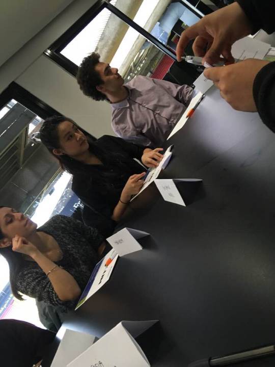
Last one was the group exercise. I am a quiet guy and I was worried that I would’ve been completely silent if the topic of the project we’ve been given wouldn’t be interesting for me. In the end, the subject was interesting and funny: help “The Galleria” (Hatfield’s shopping center) to attract new customers and retain old ones. We came out with the idea of create an app with a news feed which would show events, discounts and infos about the shopping center. We also came up with a couple of events: a marathon (which would’ve been great for the sport shops, for the gear and for the restaurants for the food) and a world food fair (because the restaurants have different kind of food from around the world). I was silent for most of the time but I had two ideas that were quite useful. The first one was the world food fair and, the second one (but also the most important) was the news feed for the app. At the beginning we thought about a menu with different categories (students, family, over 60, events and so on) but I’ve realized that this kind of layout would’ve been messy and not so easy to use for everyone. So I thought to simplify that creating a feed that would’ve bring together all the news and color coding every one of them by the said categories. In this way the fruition of the news is more easy and streamlined and I was satisfied with that idea. Unlikely the previous feedback, this one is a bit more harsh but I deserved it. The only tick in the whole table was in “Makes sensible, balanced and fact based contributions to the discuss”. At least it is a positive one. As I thought, the positive observations are about how helpful my influence was on the group, how engaged I was by the project and how I presented my ideas with confidence. On the other hand, my biggest problem here is that I talked really rarely and, as the assessors make me notice, I cannot be evaluated if I don’t make any contribution to the the discussion. I must find a way to express myself and to show my ideas even if i’m not totally comfortable with the assigned task. Of course the linguistic barrier didn’t helped me but because the previous success i don’t feel like I can hide behind that excuse.
Time for the conclusions. This experience was really helpful and I really enjoyed it. To be honest, the first time that I’ve heard what would’ve been the first assignment for that module I was pretty shocked because, in Italy, we are not used to that kind of test as we usually have theoretical exams but I was pleasantly surprised. Experiencing a situation like that is not something that you can learn on books and the only way to learn about it is to live it, receive a feedback from someone who knows more than you that have an objective view of the situation and, in the end, learn from your mistakes because practice makes perfect. I’m really glad that I had this opportunity as I think that this assignment gave me some real and practical instruments for a situation that I certainly will live in the near future.
Here is the link with the folder containing my CV, my presentation, my cover letter, my application form, evidence from the training sessions and my feedback for the day.
https://drive.google.com/file/d/19NgXl-TkPaNT8Q0YjzdUHIEcVZBzTwRE/view?usp=sharing

0 notes
Text
ACE Experience
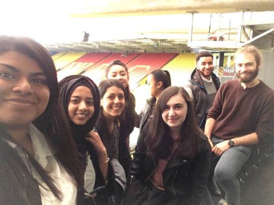
November 6th, at Watford Stadium took place the Assessment Centre Experience and this is the first year that The School of Creative Arts has participated. During this event, we had to complete a group exercise, an interview and a presentation, with the final written feedback from each exercise on the day from the assessors. They gave us a nice welcome in the Sir Elton John Suite where they explained us everything we had to know like the daily programme, the timetable and the map to the rooms. Everything was very clear from the beginning and this was useful to focused only on my exercises. I felt lucky to be there, in the right place of the world, in the right moment of my life. I must say that the structure and the topic of this course are quite far from what I used to do in Italy, and I was pretty sceptic about it. Now that 2 months of my 5 months here are gone, I realized that I need this more than I think and now that this event is gone, I understood the importance of being part of a group to do this kind of job.
I should start saying that I was terrified from Assessment Centre Experience. Everything seemed to me an impassable wall, until a did the first exercise, the presentation. I was glad to start with something that represented me, in which I felt more confident. I chose to talk about the importance of sound design in films and television, a topic I really care about and in which I’m very interested. For the preparation, I did some researches, saw lots of videos, and listening several examples to deeply understand the difference between films and television. As I’m very interested in sound, I read some texts I already had and others I found on Google Books. To support my presentation, I used audio aids as examples and I did an experiment I saw time ago and from which I remained fascinated. I also did a short video to help me in this: I put three videos together and I’ve replaced the audio of one of them, instead of the right sound, I’ve added an audio recorded from me of something totally different from the image. My mates should have guessed which one the clip with the modified audio was, to find out only after that I put my audio in all three videos. The examiner was very kind and friendly from the beginning and makes me and my classmates very comfortable. As soon as I started to talk all the stress disappeared and I felt like if those endless 5 minutes became too few. The feedback of this first exercise was quite good, I didn’t seem nervous as I actually was and this is important to me because it means I was able to handle anxiety situation. The assessor’s questions were about how I worked for my presentation, how I took to prepare all I needed and which researches I made. The question I loved the most was the last one, it was something like: “If you would have had more time available, how would have you used it?”. I was positively impressed because I would have talked hours about that topic, but I couldn’t and this question gave me the possibility to show something more.
The second exercise I went through was the interview one to one: this is the exercise that surprised me the most. I never expected to be so self-confident in such a situation. The Assessor was a very nice and friendly woman and this is helped me to be ready for the imminent interview. I seemed to her very “smiling and warm”, traits of my character I wanted to be noticed. She saw in me also enthusiasm, passion and expression of creativity: nothing better for someone trying to make art. I’m glad that I was able to communicate this part of me. Unfortunately, I appeared nervous and anxious to her throughout the interview exercise, and this is makes me smile because I’ve never been so relaxed, but I evidently did a bad work with my body language. I struggled to explain some ideas during the exercise and I had some problems with the STAR techniques, for this reason, in the feedback she advised me to work on it. I did some exercises about this technique at home but, once I was there, it became hard to explain. I will work on it for sure. Summing up, I was happy of myself and how a manage this situation, a new situation for me, aggravated by my not perfect use of English.
This problem took me to fail the last exercise, the group exercise. We had to find a way to bring new clients to The Galleria, the main shopping centre in Hatfield. The main outcome of the group exercise was a mobile phone application, with the layout, colours and style of The Galleria logo. We had 5 minutes to read the topic and truly understand what we had to do, 25 minutes to discuss it in group and the last 10 minutes to present the final outcome to the assessor. I’m very angry about this, because the topic we had to discuss was very easy and accessible. I know well that place, I’ve been there dozens of times and I had the possibility to express my ideas, but I failed. Unfortunately, the different language represented an obstacle for me in that situation. I was so concentrated on listening my group mates, understanding what they were saying, thinking a way to say what I wanted to say that I wasn’t able to think to my own idea to contribute to the group discussion. I have to admit I was disoriented and I’m sorry about that, I could have done more than just listening. I had what it took to be a success: the topic was easy and inherent, the working group were friendly and above all, were formed by people I knew, and finally, it was an exercise, I could do mistakes, nothing would have happened, I just had to be brave. I need to learn from my mistakes to do better the next time.
In conclusion I have to spend some reflective words about what all this taught me. In the days before this event, I was very worried, I thought I couldn’t do it and that I would have dried up. Despite this I made my preparation trying to not think about it. When the day came, I decided to be brave and give all my best to have a success. I gave myself a challenge. I learnt which my weaknesses are and I understood how to overcome my limits, I just have to work on them. I was surprised by myself in some situations, and disappointed in others contexts. I’m now very happy that I did this experience, it made me strong and more self-confident, despite all my worries. These kind of experience, in my opinion, are very useful for our path out of the University, they let us know how the work environment is, they let us be wrong to improve more and more, they make us aware of ourselves and of others around us. Personally, I found these exercises very useful for everything concerns the group work, I wasn’t so used to work as part of a group, I did lots and more individual projects in Italy. Learn how to interact with my colleagues and gain more awareness of myself were two of my main goals in this Erasmus. I’ve never been good at selling myself as I’ve always thought that my art should have talked for itself but I was wrong, or better, this is partly true. But what a company wants from us first is our ideas, everything starts from an idea and we must be able to tell it as a story, turn it in an experience for who is listening it. In this sense, doing a good practice work isn’t enough. After this event, I know better how to handle a situation in which I have to be the best and where the words are my artwork. I cannot fail to mention my classmates Tamya, Melissa and Anja, they were fantastic mates and I learnt lots of things from them. Obviously, they have more experience than me, and even if they are still learning like me as students, I had the opportunity to listening their presentations and “steal” some attitudes. Between the exercises, we could share our worries but also lots of laughs to reduce the tension. We talked about our work and preparation and we encouraged each other. Summing up, I’m quite happy of what I did, I could do more and better of course, but I learnt more than I expected, I found out my limits and now I know how to overcome them. Experience that, for better or for worse, I will hardly forget.
Here’s the link to the folder in which are my CV, Cover letter, the feedback of the day, the material’s presentation and the evidences od the training sessions.
https://drive.google.com/open?id=1A5aN6KHnMwnVjpP11sZKGxEXFaCitOKO
0 notes
Text
ACE Training Sessions
The training sessions with Jo were very useful, she helped me to deeply understand everything: she explained us how to behave when we work in a group and gave us very interesting tips. She reassured us about the presentation telling that it should have been a pleasure speaking for 5 minutes about a topic we are interested in. She explained us the importance of choosing the role we need and in which we feel very confident, she did that doing an exercise in which we had to underline what we think were the main request from the company for us. We also did an exercise in which we had to shake hands with our classmates, in order to be prepared to the interview, to keep a good eye contact and a strong, but not too much, handshake. The Application Form exercise was very useful for me, thanks to this, during the interview exercise I was able to answer the questions in a short time and with self-confident. The evidences of the training sessions are in the folder linked in the full report.
0 notes
Text
ACE training sessions
The training sessions with Jo were really helpful. As I’ll say in the complete report, i was pretty skeptical about that assignment but the examples, the videos and the enthusiasm that Jo shows us were really encouraging. She showed us the basics for the recruitment day and I’ve really appreciate it because I’ve never done anything like that. I really enjoyed all the tips that she gave us for example how to read, understand and look for what the recruiter will search for in a job description, how to shake our hands, how anybody in the room (or even from the moment you step out your home’s door) could be your recruiter for the day and how it’s important to be professional with them, how to behave in the group exercise and so on. Evidence of the training sessions and the application form are in the folder linked in the full report.
0 notes
Text
That’s a me, Leo
Here it is, my first awesome post for my learning blog.
I’m Leonardo Destro and I’m an Erasmus student from Italy. I will study at the University of Hertfordshire for Semseter A this year.
Here I’ll will post updates on the two modules led by Julian Stadon: Teamwork Practices and WebArts.
Here’s a pic of me doing something competly unrelated (I know, it’s a bit old, i have long hairs now but beauty is unchanged).
Leo

0 notes
Video
tumblr
Ocado Live Brief Self-Reflection and Final Delivery
This self-reflection will be structured accordingly:
Brainstorming Process
Planning Process
Execution
Post-Production Process
Ocado Feedback
Summary of What Went Right
Improvements (Technical)
Improvements (Teamwork)
Improvements (Self)
Brainstorming Process
Mel and I teamed up for this Ocado motion graphic project. Inspired by my past lecturers’ (including Julian when he was briefing us on the Mobile and Web App Brief) act of refraining from showing us too many examples to avoid restraining our creativity, I suggested from the get-go after receiving the project brief proper that we should head back to brainstorm for ideas on our own, then present them to each other so that we’re able to demonstrate our full creativity.
While we came up with several ideas each, both of us decided that we had to review our ideas after the Ocado site visit. The Ocado site visit proved to benefit us greatly, as it gave us a better insight on what is expected of us from the client (Ocado). We were both highly inspired by the ongoing photo shoot Dan ran us through, and we cross-checked this with the existing Social Media material on Ocado’s Instagram. This gave us the idea of using top-down photography for the motion graphic. We were especially inspired by https://www.instagram.com/p/BpASjdMhwMK/ (a top-down photography advert for cakes). Ocado’s reasoning for the top-down photography was to focus on the food, which we both agreed would be great for the motion graphic.
At Ocado, we also saw pin-ups of Ocado’s official font, colour palettes, and images of the Ocado van. We took pictures of these pin-ups for reference (though it proved to be unnecessary since we were provided the assets). This further motivated us to make full use of Ocado’s brand colours in our video.
Again, we went back to review and edit our ideas to better fit what we learned from the Ocado site visit.
When we met with Mikayla(?) for advice on our storyboard, she liked both of our ideas. We left after asking some questions but when we went back to our table, we were left with the question: …So… which idea do we go with?
Thankfully, Mikayla was still listening even after we left (she joked afterwards that this is why she always continues listening after her students leave) and came over to help us with it and suggested that we could combine our ideas and take elements from both to create one video. We both pointed out things that we liked from each other’s ideas (I liked Mel’s idea of dragging and dropping ingredients straight from screen to phone, and we also took the Ocado van idea from mine).
Since I was better with drawing storyboards, I worked on that after we worked out some of the other details, such as the premise of the video and adding the call to action.
Planning Process
I wasn’t present when Ocado came down to take a look at our work, so Mel did a great job at pitching our idea to Ocado and they liked it.
After our storyboard was approved, we had to plan out when and how we were going to do it.
We decided on a day when we both had no classes and gave it time before sunset since we were going to use natural daylight to light the video. Working around some of the limitations we had, we improvised a set up that included – Mel’s digital camera, Mel’s gorilla pod (a flexible tripod of sorts), 2 dining tables from my on-campus accommodation. Props in the video were also mainly things we already had, like a chopping board, white bread, bowl etc. Mel ordered some of the food from Ocado for use in the video, such as bell peppers, buckwheat noodles and edamame peas.
Since we weren’t using a photography studio (we had no idea if such facilities were open to us), we had to 1. Shoot during daylight 2. Do additional post-production editing 3. Improvise a way to shoot top-down photography using everyday tools, as shown below. I propped up one of the two tables so we could use a table leg as a mount for the gorilla pod. We were ultimately lucky that we were able to make everything work, but if we did it again, an equipped photography studio would be ideal.


Execution
Before the actual shoot, we took some test photographs to ensure that we were going to be able to translate the photos taken into the appropriate aspect ratio for this brief. After we decided that it would be alright, we marked the table with some tape so that we knew where the ends of the frames would be. Removing the food and redoing the takes would prove tricky, so we wanted to avoid it as much as possible.
We had several short discussions during the shoot. For example, how we would ‘push’ the chopping board in place and why. Looking back, this should probably have been worked out during the story boarding stage, but seeing the setup helped tremendously and it wasn’t a problem since we were able to voice our opinions with reason and were able to make quick decisions.
The rest of it pretty much went without a hitch, except maybe that we cooked our noodles too early and the nature of the noodle caused it to dry out significantly before we placed in it in the bowl. Luckily, it still looked acceptable and we didn’t have to cook up another batch.
Post-Production Process
After the shoot, we went ahead to create some of the assets we would need to create our desired look and feel to the video. Mel took charge of all the food assets (bell peppers, eggs, edamame, buckwheat noodles) while I did the digital assets (phone, app interface, hand icon, van). This was so that we wouldn’t have too much inconsistencies in the illustrations. One thing that may have potentially frustrated us both would be that we were both working from home, and that made it hard to get opinions from each other quickly. I’d say that working from home still benefited us more than the alternative, since we were both more comfortable with that option and worked through it anyway.
Mel and I both had software we were more familiar with, so she did the After Effects/Premiere Pro parts, while I did the Adobe Lightroom parts.
We also worked on our presentation parts separately, but we do owe the Singapore education system’s continual focus on presentations that allowed us to be comfortable presenting even without practicing together. Thanks, SG Education (though you’re still flawed).
Ocado Feedback
Thankfully, the Ocado staff liked our work! The feedback that we received were mainly that they were impressed that we produced something that was on-brand. They suggested also that we could work on simplifying our video, as well as using the actual Ocado app for the video instead of creating a simplified one as we did.
Summary of What Went Right
Brainstorming individually before presenting our ideas to each other
Moulding our ideas to what we observed from the client
Extracting the best elements from each other’s ideas
Doing test shoots
Delegating based on technical skill strengths
It helped that the both of us were pretty easy-going. We were able to make compromises as needed and make improvements. What REALLY helped though, was that we were both client-focused, which helped us strive towards creating a good end-product, even if we were to say, lose some creative freedom.
Improvements (Technical)
Using an equipped photography studio with top-down photography rig, lights (to prevent inconsistent stop-motion shots), coloured paper background (to avoid one post-production step), using a camera with the specific aspect ratio setting needed for the brief, ensuring that food is in focus.
Be more in-depth during story boarding planning, to plan for each transition
Improvements (Teamwork)
To alter working conditions according to group’s working style (e.g. working from home vs meeting up to work together)
Improvements (Self)
In future projects where we have more time, I’d like to work more on the skills that I have less experience in, so that I may increase my expertise.
While it may not have been particularly important in this project since it was just the two of us, it might be worthwhile to be more consistent in updating whichever collaboration platform for each project (e.g. Slack for this project).
(1395 words)
0 notes
Text
ACE Training and Career Development Project
On Tuesday, 6 November 2018, we (Level 5 Digital Media Design Students) made our way down to Watford Football Stadium for the ACE Training and Career Development Project. For clarity, I’m listing the submission requirements here along with their respective links to Google Drive before the 1500 word written report and reflection:
1. Completed ACE Training Sessions, Evidenced on Learning Blogs – This post 2. Cover Letter – https://drive.google.com/open?id=1InGUUenRaXiiOWm2a3uDVkoWp5cHpV1r 3. A General Personal CV – https://drive.google.com/open?id=1Fif-zskyA3tfyuA4qtM3VMv8hrCNHT9t 4. Presentation Slides – https://docs.google.com/presentation/d/1AbO_Or8U9RG17VdDN9deTD6n1iff1mWhwU3dqoSNONw/edit?usp=sharing 5. Attend Assessment Careers Experience and Participate in Group Activity – Done 6. 1500 Written Report and Reflection on Learning Blog – This post 7. Pre-Event Survey – Done
Note: The link in my CV is to an old portfolio that I did two years ago. So don’t worry about it, the link will be changed to the website that we’re making for Mobile and Web App Design.
The day at Watford Football Stadium started out with us being handed our schedules and groupings. It was slightly nerve wracking to not have known beforehand the order in which we were going to be put through the three assessment exercises, but I guess this could be one tiny detail that could reflect a real-life interview where we may not even know what methods of assessment will be used.
I was assigned to Group 30, and my three assessment exercises were completed in the following order: Interview Exercise, Presentation Exercise, and Group Exercise.
For the interview exercise, I chose to interview for the Ogilvy Junior Account Manager. The reason for this choice was mainly due to my being relatively more interested in this position over the Creative Technologist position. Either way, this was something that was rather out of my comfort zone and I was fairly nervous going in. Thankfully, the assessor was friendly and welcoming.
The interview went fairly well, I was able to bank on some of my past leadership experiences and relate them to the role of Junior Account Manager. Some of the pointers that I received before going into the interview that I found useful were the following:
1. Research about the company 2. Read and assess the job description carefully for qualities that they may be looking for implicitly 3. Prepare questions for the interviewer
Knowledge of the company and analysis of the job description allowed me to frame myself and my answers more clearly. With most of my answers, I tended to think of an intended quality to be showcased through an example, then chose an example and ended the example accordingly.
I used examples of when I was the Social Director of my school’s Student Club, as well as examples of when I was President the next year. As the Social Director of the Club, I was in charge of organizing events for the student body, and often the role also included being a liaison with external vendors for different purposes. As menial as the role can sound, it was a definitely a good learning experience. It was a role of balance, where we had to find out what the student body wanted, then try to get what they want from the vendors at the lowest price. The following year as President, I also had an added responsibility of managing the Student Club and making sure that our members were satisfied working with each other as well. I likened all of this to the client-junior account manager-design team relationship, where I talked about forming a balance between keeping the clients happy for future partnerships and making sure the design team isn’t overworked from client demands, to ensure employee retention.
As cliche as it may sound, I found it to be ideal to view everything as a learning experience. Even smaller leadership roles can give us the foundation to build our experiences on, and in this case, it can help the interviewer understand more about us and our interpersonal skills.
Preparing questions for the interviewer was a pointer that I once read on an article on medium. The premise is that by asking questions of the interviewer, we show a keen sense of understanding and genuine interest in the job. Asking questions isn’t always easy, especially in an interview setting. We may forget out question from the nerves, and may not always find the right time to ask a question. In my opinion, having questions can also show that we have the confidence to sit through an interview well.
After the interview was over, I reflected on my performance and felt that I spoke a little too fast at times and mispronounced some words because of it. I knew I also nearly messed up one of my answers. This was when the interviewer asked about which parts of the job I think I wouldn’t like. I took a short moment to think about it and I answered honestly, which really could have ended poorly. I said that I notice that the job may involve interactions outside of office hours (after all, we’re talking about maintaining client relationships) and I said that it could potentially be my least favorite part of the job considering that I’m an introvert. I tried to save my answer by saying that if I didn’t exceed my capacity for interaction it would be fine. In hindsight, it’s not a good thing to announce that I’m an introvert, because while myths are being debunked everyday about introversion, there is no guarantee that the interviewer will not associate me with the common stereotypes of introversion. Perhaps I could instead say that I still have the confidence to get my job done even if I’m exhausted? Or I could just prepare myself for this question for the next interview that I have.
I’m uploading a scanned version of the feedback here:

Next up was the Presentation Exercise. I chose to present on the importance of sound in film. Here’s the link to the slides again:
In preparation of the slides for the Presentation Exercise, I decided to follow some of the common pointers for presentation slides. Less words, more pictures/graphics. I also chose a black background for less glare, for it to be easier on the eyes.
There’s not much I have to say about the Presentation content. It was something that I was interested in, I attended a few lectures on Sound Design, and the content was well suited for an interactive presentation. I would say that I did kind of well in choosing the topic for my presentation, but I may not be so lucky every time to find something that could fit into my criteria. In that case though, I would then have to be careful of the various pitfalls such as 1. not being interested in the topic, the audience won’t be able to be infected by your energy, 2. it’s something that you have little to no knowledge about and won’t be able to answer questions accordingly, 3. a boring topic that the audience cannot relate to. These pitfalls can be avoided by the respective methods: 1. pretending to be interested and invested in what you’re saying, 2. RESEARCH!, 3. if it’s a topic that’s too simple, frame the presentation to leave them with a question about future prospects regarding that field, or linking it to real life application, if it’s a topic that’s way too difficult, boil it down to be easily understood.
It was, however, a challenge to fit all of the content I wanted to show within 5 minutes and I did exceed the time. In the future, I’ll make sure that my presentations do not exceed the allotted time.
Here is the feedback from the Presentation Exercise:

Finally, we had our Group Task Exercise.
This was by far the exercise that I was most unfamiliar with. It was a pleasant experience in the end, where we all bounced off our ideas off each other. From the feedback that I received, I learned to be more conscious of quieter members of the group and to try to include them in the discussion. What I find is the challenge of doing that is that it’s difficult to find a time to ask quieter members for their opinions when there was always at least one person speaking about their idea and the reasoning at any one point of time and at times it was really difficult to wait for the person speaking to finish before giving a time check. (Advice pls @Julian)
The other behavior that’s ticked for development was that I demonstrated little creativity to the task and relied on others to make suggestions, and again this was really difficult considering the time limit. I did have an idea, but decided not to present it to the group for two reasons: 1. I wasn’t sure if my idea would be effective implemented locally. (for instance, Instagram and Influencers are a huge thing in my home country and would make for an effective ad campaign, but it seems that Snapchat is far more used here, while Snapchat is already dead in Singapore) 2. There simply wasn’t enough time. Reflecting upon it, I guess it would be extra important for me to immerse myself culturally and do my research should I choose to work overseas in the future.
Here’s the feedback from the Group Exercise:

Overall, I found the ACE Training session to be very fruitful. The feedback that we receive from these exercise will go a long way towards our future interviews and I’m thankful for this experience to practice. This was especially so for the Group Task, where we may not be able to get enough people together for practice and even so, it would be very different if we were in a group with strangers on a real interview. The presence of professional assessors and their feedback is highly valued.
To be honest, my home university has an online module on careers, but it doesn’t even come close to this. The content is outdated, and it’s a general required module for the entire school (including medicine, science, environment etc degrees..) so it was pure torture going through a module that perpetuates stereotypes and just isn’t catered to Art students.
So, well done UH, and thanks Jo, thanks Julian! This is an experience that I would bring back as a suggestion to my home university.
(1577 words)
0 notes